Visual Language of Interior Design: Elements and Principles Overview
VerifiedAdded on 2023/06/14
|20
|3365
|191
AI Summary
This presentation provides an overview of the elements and principles of interior design and how they are applied in modern kitchen, open design living room, luxuries ensuite, kid's bedroom, and master bedroom. It covers topics such as balance, rhythm, repetition, emphasis, proportion, scale, harmony, space, line, shape, color, texture, light, and more.
Contribute Materials
Your contribution can guide someone’s learning journey. Share your
documents today.
Interior
Design
Institute
Project -1
Design
Institute
Project -1
Secure Best Marks with AI Grader
Need help grading? Try our AI Grader for instant feedback on your assignments.
PART A -
INTERIOR
ANALYSIS
•Elements and Principles Overview
•Open concept kitchen
•Modern simple living room:
•Luxuries ensuite:
•Kid's bedroom:
•Master bedroom:
INTERIOR
ANALYSIS
•Elements and Principles Overview
•Open concept kitchen
•Modern simple living room:
•Luxuries ensuite:
•Kid's bedroom:
•Master bedroom:
Elements and Principles
Overview A) Elements of design
Space Any spaces that can be brought design elements by a designer’s input. The inputs should have special feeling after
the design processes were completed. Moreover, space is depicted in two dimensions including or three
dimensions that produces “volume” work area.
Line Line is defined as space and create a sense of direction and feeling of a design. Lines can lead the sight, outline an
object, divide the space and communicate a feeling or emotion
Shape In order to develop visual pleasing and suitable interior, we should consider structures. Structures is determined
as spaces and rooms that are basis for interior designer’s applications. Shapes are created by connecting lines to
enclose a space within a structure.
Colour It is an important element and can alter the perceived shapes, size, and locations of an object. Color would change
the characters and the feeling of a space. This can visually bring things forward or make them recede.
Texture This is determined as characteristics of anything people feel or touch. Texture is visual as well as sensory - people
feel through seeing. The texture of all surfaces and finishes in a space can be selected carefully to bring another
dimension of the design
Light This is an element that encompasses two separate aspects of design. Designers should consider and manipulate
both natural and artificial lights to make design elements for their subject
Pattern This is the repetition of a graphic motif on a material. Patterns play an important role in a design to add interest,
create contrast and bring together various kind of elements like color, line and shape.
Elements and Principles
Overview B) Principles of design
Balance It is an idea that when you walk into room, and everything has its place. It gives feeling of
stability and sense of equilibrium. Everything should just complement one another and come
together to form a cohesive final result.
Rhythm and Repetition It can be described as pattern that provides visual movement that invites your eye to move
across the space in a pleasing, choreographed way. Rhythm will support to create the desired
mood that will develop use and emotional content of the space.
Emphasis Emphasis in a room refers to the focus point that creates the attention of clients. It should be
focusing the which your eye is attracted. Space or room can have a build focal point or a
created one.
Proportion and Scale This refers to a general relationship in size between objects or between parts within an object.
Scale is relative and compares an item or space to something of a known size, which could be a
measure or another object
Harmony The success of the design could be contributed the principles of harmony. Harmony is the
combination of similar parts or elements used in the design. The more similarities used the
more composition is called to be harmonious. So, even if a designer has broken some rules, the
success is because they have used other parts that are like achieve harmony
Secure Best Marks with AI Grader
Need help grading? Try our AI Grader for instant feedback on your assignments.
Modern kitchen
Principles of the kitchen design
Balance There is an asymmetrical or informal balance. Lines, pattern and empty spaces of the kitchen are relatively
balanced across the kitchen. This kind of design is commonly used in modern interior design as making
design visually interesting and complex. For example, countertop and double ceiling and two sides empty
spaces of the kichen are a totally balanced in the room. Moreover, dark and bright colors equally
balanced across the room. Balance of positive space and negative space of the kitchen feels as spacious.
The vertical lines made room seems a heigh and dignity and the horizontal lines could create a sense of
intimacy and contemporary. If we see materials that have chosen, there are hard materials (stones,
steel) and warm materials (wood) that have balanced properly. We can see both natural lights and artificial
lights from this design.
Rhythm and Repetition The designer mixed more thhe an 5 different colors in the one room, did not repeat only one texture or
material. This achievement made balance a balance of similar and different elements to keep the space
interesting while maintaining cohesion. Repetition is occurring in various places around the kitchen, such
as countertop, cupboard, chairs, jar, flowers and so on. We can see plenty of materials or textures from the
details of the room.
Proportion and Scale The modern, open concept design of this space allows for the large, customized rectilinear-shaped island
with seating. The island is not only super large to support preparation and entertaining space; the
proportion of the island to the rest of the room allows it to function as a sort of divider that creates
distinct zones for cooking, dining, and living in the space.
Principles of the kitchen design
Emphasis The emphasis/focal point is one of my favorite principles of design to work with. Here the idea is to showcase a
portion of the design and hold the viewer’s attention. Often referred to as the “wow” factor one can be as
creative as they want as long as thought is given to the rest of the design principles. One of my favorite design
projects was a master bathroom that was designed in all marble.
The entire bathroom was jaw-dropping so creating a focal point meant we had to get creative. The solution was
building a false wall to house a fireplace and wall to wall niche tiled in herringbone which was accented with sun
from a skylight. Though the entire space was breathtaking everyone who entered held their attention to the false
wall we created. Focal point achieved!
Harmony The designer successfully used principles of harmony as rectilinear shapes of double ceiling encounter top
double ceiling,
shape, color, texture, size, similar materials, similar detail charactrestics, common decorative style
Paraphrase This Document
Need a fresh take? Get an instant paraphrase of this document with our AI Paraphraser
Open design
living room:
living room:
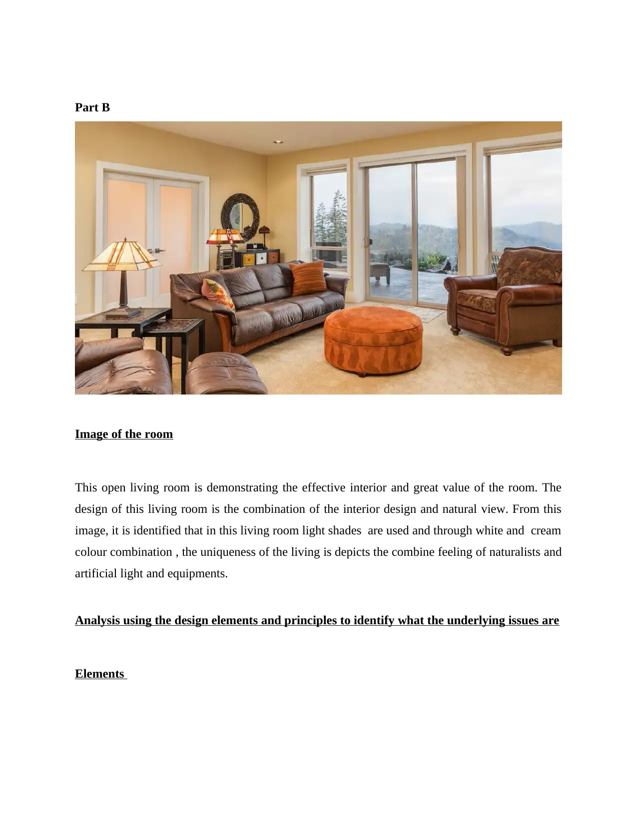
Elements of the Open design living room:
Space Any place that can benefit from the contribution of a designer in terms of design features. After the design procedures
are done, the inputs should have a distinct feeling. Furthermore, space is represented in three - dimensional space,
resulting in a "volume" work area. For the open design living room, natural place is selected with sufficient space
where more than 10 people can do get together.
Shape The shape and structures of this open design living room more and this living room is rectangular shape. In order to
make this living room , interior design is also looks like fancy which attract the people. This living room is the
combination of both beauty natural and artificial. This living room is mainly creating the visually appealing &
appropriate interior. The basic structures of this living room is concerned about the places and also chambers that
serve as the foundation for interior design applications. Connecting lines to surround an area within a building creates
shapes.
Colour It's a crucial component that may change how an object's form, size & placement are viewed. Color would alter the
personalities of the people as well as the atmosphere of the room. The Colour of this living room is cream and the
main concern is on the light shade which attract to the people. The whole combination including mirror windows and
light shades Colour determined the visually of the room.
Light This is considered as the design element which mainly combines two distinct design elements like natural light and
artificial light . To create design aspects in this living room , the main focus on the natural lights that’s why the
windows are covering all the areas.
Principles of the Open design living room:
Balance The design of this living room is different and decent which demonstrate the proper balance with the
light, structure, shape and size of the living room. The lines, structure, and vacant areas in the kitchen
are all provided basis. This is identified that style of design is popular in current interior design because it
makes the space more visually intriguing and complicated. The light and brilliant hues are evenly
distributed across the space. The living room depict the positive space and maintain the balance creates
a feeling of spaciousness.
Rhythm and Repetition the designer mainly used two distinct colours and did not utilise the same texture or material twice. To
keep the space fascinating while keeping cohesiveness, this effort achieved a balance of similar &
contrasting features. Repetition can be found everywhere around the kitchen, including on the
countertop, in the cabinet, in the chairs, in the jar, and in the flowers. The living room's features reveal a
various materials and patterns which make living room more attractive. Te rhythm of this living room is
effective which make the mood happy .
Proportion and Scale The proportion of the scale is determine the applicability of the living room which demonstrate the
properly size, shape of the living room. This living room shows effective area level relationship between
items or even between components inside an item is referred to as this.
Harmony As rectilinear forms of double roof encounter top doubled ceiling, shape, colour, substance, height,
comparable materials, similar detail factors and common ornamental style, the creator effectively
applied elements of harmony.
Secure Best Marks with AI Grader
Need help grading? Try our AI Grader for instant feedback on your assignments.
Luxuries ensuite:
Elements of the Luxuries ensuite
Space The space of this Luxuries ensuite is quite more. The main concern of this Luxuries ensuite is on the interior design .
A place of the Luxuries ensuite is demonstrate the clean and hygiene so that people can feel good. After the design
procedures are done, the inputs should have a distinct feeling. Furthermore, space is represented in some specific
dimensional space.
Shape The shape of this Luxuries ensuite is different and it is analysed that the whole Luxuries ensuite is made on the basis
of the comfortableness .
Colour It‘ s prominent elements that influence the mind set of the people. The colour of this luxuries ensuite is white that
depicts the qiuality of the room. The emotions of the participants as well as the mood of the place would be affected
by colour. This living room's predominant colour is cream, and the light tone is what draws people in. The overall look
of the space was dictated by the colour scheme, which included mirror windows and light shades.
Light This luxuries ensuite is demonstrate the natural light and the major focus in creating design features in this living
room was on natural lighting, and that is why the glass encompass all of the spaces.
Principles of the Luxuries ensuite
Balance It is the belief this because when you enter into a room, everyone is in its proper position. It provides a
sense of stability and homeostasis. Everything must simply compliment each other rather than work
together to achieve a unified end product. This principle is mainly focused about the neutrality which is
the central source of attraction. This Luxuries ensuite show the right balance between the size, shape , light
and patter.
Rhythm and Repetition This Luxuries ensuite mainly create effective rhythm that creates visually movement & encourages their
eye to move around the space in a beautiful, synchronised manner. It is determined that rhythm help to
maintain the effective creation and design in white colour and also focused about the naturality .
Proportion and Scale Luxuries ensuite preferred the rectangle shape and also take sufficient space so that all the proportion can
take equivalent space. The enormous, bespoke rectilinear-shaped island with seating is made possible by
the space's modern, open concept architecture. The island is not only large enough to accommodate
preparation and entertaining, but its proportions to the rest of the room allow it to serve as a type of
separator, dividing the area into discrete zones for preparing, dinning, and entertaining.
Paraphrase This Document
Need a fresh take? Get an instant paraphrase of this document with our AI Paraphraser
Kid's bedroom:
Elements of the Kid's bedroom
Space The space of this Kid's bedroom is more and this Kid's bedroom is mainly concerned about the comfort. The main
focused of the Kid's bedroom is on each and every areas of the room. This room demonstrate the suitable areas where
kids can sit and do their work on chairs and sofas.
Shape The shape of this Kid's bedroom is depicts various dimensions and focused on specifically walls and pillars.
Colour The Colour of this Kid's bedroom is different and unique. Designer mainly used light shades like off white and white . It is
considered as the specific element which focused on the floor because , the colour of the room is set on the basis of the
wooden floor.
Texture The main motive to set the texture is on the shape and size of the kids bedroom. The appropriate characteristics of
whatever individuals feel or touch are used to assess is include in the texture of the kids bedrooms. The texture of all
surfaces and finishes in a place can be specifically selected to add another level of design to the area.
Light In order to make this kids bedroom, the main concern is on the light , because parents are more concerned about the
health of their kids that's why they applied the light shades.
Principles of the Kid's bedroom
Balance It principle is determine the acquired balance between the shape and whole proportion of the Kinds bedroom.
The primary motive of this principle is on the stability and interior so that kids can feel comfortable. It provides a
sense of stability and homeostasis. It should all simply compliment each other and work together to build a
unified end product.
Rhythm and
Repetition This principle is concerned about both concept like Rhythm and Repetition. This pattern mainly create the visual
effects and make this room more beautiful. The overall atmosphere of this room is on the convenient level so
that kids can do their work in their room.
Harmony The principle of harmony is mainly contributed to the interior and design's of the kids bedrooms . Harmony
generally refers to the usage of comparable pieces or features in a design. The more comparable elements in a
work, the more harmonic it is. So, even if a developer breaks some norms, their success is due to the utilization of
similar pieces to establish harmony.
Secure Best Marks with AI Grader
Need help grading? Try our AI Grader for instant feedback on your assignments.
Master
bedroom:
bedroom:
Elements of the Master bedroom:
Space This open design Master bedroom has a rectangular shape, as well as its shape and materials. As per to
create this living room, the interior design has to be stylish in order to catch people's attention. This living
area is a beautiful mix of natural and manufactured beauty. The major goal of this is to create a visually
beautiful and acceptable decor. This living room's basic structures are concerned with t Master bedroom to
maintain the spaces that serve as the basis for interior architecture applications. Shapes are created by
connecting lines to encircle an area within a structure.
Line The primary thing of this Master bedroom is on the some lines which include the shape space & give a
design its sense of direction and mood. Lines may guide the eye, define an item, divide space, and express a
sense or emotion.
Shape The shape of this Master bedroom is on the shape because the main concern of this Master room is to
utilize each and space so that all the space demonstrate the attractiveness so that people can have a good
time in their master room. The designer mainly focus on the visual pleasing & suitable interior, it is consider
that the structures, shape and also size. The entire structures is determined as spaces and Master rooms
that are basis for interior designer’s and its specific applications.
Colour The colour of this Master room is on the light and natural shades. The whole design of this Master room is
on the wooden and the colour is light gray and cream.
Texture The whole texture of this Master room is on the wooden room and also mirror windows which are the main
source to attract the people.
Light This is a design element that combines two distinct design elements. To create design aspects for their topic,
designers mainly examined & control both natural and natural light.
Principles of the Master bedroom:
Balance It is considered as the most appropriate principle that demonstrate the perfect coordination between the
shape & size of Master bedroom. The primary concern of this Master room is on the view which created the
difference between the Master room and normal room. This room is focused about the design and views so
that people can effectively get good comfort in this master room.
Rhythm and
Repetition
It is necessary to full fill the requirement of this principle so that shape and structure of this Master room
inspired the people and this concept become popular on trending on repeat. The pattern that encourages the
mind of the people and also move around the space in a nice, synchronized manner. Rhythm will aid in the
creation of the ideal mood, which will influence how the room is used and how people feel about it.
Emphasis It's a design that invites your eye to roam throughout the room in a smooth, synchronous rhythm. Rhythm will try
to generate the perfect mood, and will have an impact on how the place is occupied and also how people are
feeling about all this.
Proportion and
Scale This principle is focused on the size and structure of the Master Room and it is depicts the effective relationship
between items like between components inside a thing is referred to as this. The term "size" refers to the
comparison of an item & place to something of known size like a measurement or perhaps another material.
Harmony The concepts of harmony may have helped to the design's popularity. Harmony refers to the usage of comparable
pieces or features in a design. The more comparable elements in a work, the more harmonic it is. So, even though
the designer and developer breaks some norms, their growth is based to the utilization of similar pieces to
establish harmony.
Paraphrase This Document
Need a fresh take? Get an instant paraphrase of this document with our AI Paraphraser
Reference:
- Interior design Institute, Module 1, retrieved from
https://www.theinteriordesigninstitute.edu.au/
- kitchen design, retrieved from https://www.pinterest.com.au/pin/643522234228389704/
- Stylish Modern Luxury Kitchen Design, retrieved from
https://cdn.decoratorist.com/wp-content/
- Luxuries ensuite, retrieved from https://www.mosaicslab.com/blog/5-tips-to-turn-
your-old-bathroom-into-a-spa/
1 out of 20
Related Documents
Your All-in-One AI-Powered Toolkit for Academic Success.
+13062052269
info@desklib.com
Available 24*7 on WhatsApp / Email
Unlock your academic potential
© 2024 | Zucol Services PVT LTD | All rights reserved.