Ask a question from expert
Website Design and Responsive Web Design Tester Tools
14 Pages2768 Words317 Views
Added on 2019-11-25
Website Design and Responsive Web Design Tester Tools
Added on 2019-11-25
BookmarkShareRelated Documents
WEBSITE DESIGN AND RESPONSIVE WEB DESIGN TESTERTOOLS1WEBSITE DESIGN AND RESPONSIVE WEB DESIGN TESTER TOOLS.by (Name)[Course name][Proffessor Name][University name][City name][Date]

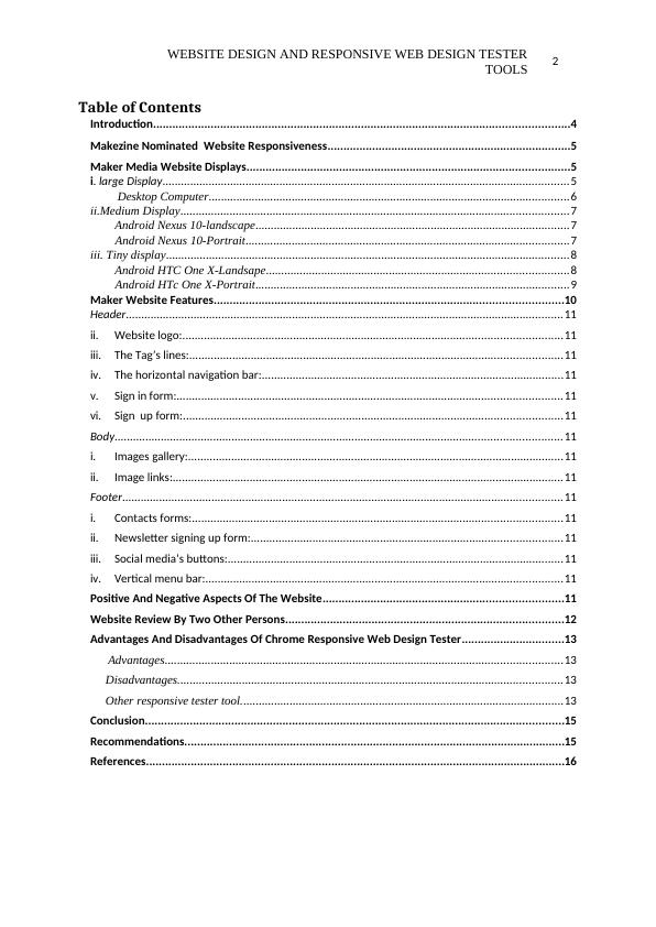
WEBSITE DESIGN AND RESPONSIVE WEB DESIGN TESTERTOOLS2Table of ContentsIntroduction..................................................................................................................................4Makezine Nominated Website Responsiveness............................................................................5Maker Media Website Displays.....................................................................................................5i. large Display....................................................................................................................................5Desktop Computer.....................................................................................................................6ii.Medium Display..............................................................................................................................7Android Nexus 10-landscape......................................................................................................7 Android Nexus 10-Portrait.........................................................................................................7iii. Tiny display...................................................................................................................................8Android HTC One X-Landsape..................................................................................................8 Android HTc One X-Portrait......................................................................................................9Maker Website Features.............................................................................................................10Header..............................................................................................................................................11ii.Website logo:...........................................................................................................................11iii.The Tag’s lines:.........................................................................................................................11iv.The horizontal navigation bar:..................................................................................................11v.Sign in form:.............................................................................................................................11vi.Sign up form:...........................................................................................................................11Body.................................................................................................................................................11i.Images gallery:..........................................................................................................................11ii.Image links:...............................................................................................................................11Footer...............................................................................................................................................11i.Contacts forms:........................................................................................................................11ii.Newsletter signing up form:.....................................................................................................11iii.Social media’s buttons:.............................................................................................................11iv.Vertical menu bar:....................................................................................................................11Positive And Negative Aspects Of The Website...........................................................................11Website Review By Two Other Persons.......................................................................................12Advantages And Disadvantages Of Chrome Responsive Web Design Tester................................13Advantages.................................................................................................................................13Disadvantages.............................................................................................................................13Other responsive tester tool.........................................................................................................13Conclusion...................................................................................................................................15Recommendations.......................................................................................................................15References...................................................................................................................................16

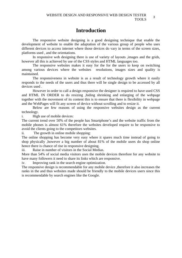
WEBSITE DESIGN AND RESPONSIVE WEB DESIGN TESTERTOOLS3IntroductionThe responsive website designing is a good designing technique that enable thedevelopment of website to enable the adaptation of the various group of people who usesdifferent devices to access internet where those devices do vary in terms of the screen sizes,platforms used , and the orientations.In responsive web designing there is use of variety of layouts ,images and the grids,however all this is achieved by use of the CSS styles and HTML languages too.The responsive websites makes it easy for the for the users to keep on switchingamong various devices where the websites resolutions, images sizes and quality ismaintained.The responsiveness in website is as a result of technology growth where it easilyresponds to the needs of the users and thus there will be single design to be accessed by alldevices used . However in order to call a design responsive the designer is required to have used CSSand HTML IN ORDER to do resizing ,hiding shrinking and enlarging of the webpagetogether with the movement of its content this is to ensure that there is flexibility in webpageand the WebPages will fit any screen of device without scrolling and to resize it.Below are few reasons of using the responsive websites design as the currenttechnology.i.High use of mobile devices:The current trend over 50% of the people has Smartphone’s and the website traffic from themobile phones is almost 61% therefore the websites developed require to be responsive toavoid the clients going to the competitors websites.ii. The growth in online mobile shopping:The online shopping has become very easy where it spares much time instead of going toshop physically ,however a big number of about 81% of the mobile users do shop onlinehence there is chance of rise in responsive designing. iii.Raise in number of visitors in the Social Medias.More than 54% of social media visitors uses the mobile devices therefore for any website tohave many followers it need to share its links which are responsive.iv.Improving rank in the search engine optimization.The responsive design is recommendable for any mobile device ,therefore it also increases theranks in the and thus websites made should be friendly to the mobile devices users since thisis recommendable by search engines like the Google.

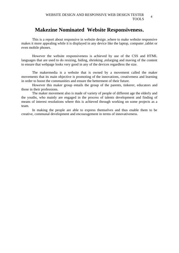
WEBSITE DESIGN AND RESPONSIVE WEB DESIGN TESTERTOOLS4Makezine Nominated Website Responsiveness.This is a report about responsive in website design ,where to make website responsivemakes it more appealing while it is displayed in any device like the laptop, computer ,tablet oreven mobile phones.However the website responsiveness is achieved by use of the CSS and HTMLlanguages that are used to do resizing, hiding, shrinking ,enlarging and maving of the contentto ensure that webpage looks very good in any of the devices regardless the size.The makermedia is a website that is owned by a movement called the makermovements that its main objective is promoting of the innovations, creativeness and learningin order to boost the communities and ensure the betterment of their future.However this maker group entails the group of the parents, tinkerer, educators andthose in their professions. The maker movement also is made of variety of people of different age the elderly andthe youths, who mainly are engaged in the process of talents development and finding ofmeans of interest resolutions where this is achieved through working on some projects as ateam.In making the people are able to express themselves and thus enable them to becreative, communal development and encouragement in terms of innovativeness.

End of preview
Want to access all the pages? Upload your documents or become a member.
Related Documents
Responsive Web Design Processlg...
|20
|3825
|112
Responsive Designlg...
|12
|772
|195
A Guide to Responsive Web Designlg...
|13
|3591
|86
Usability, Accessibility, HTML Semantic Elements and Layout Techniques in Web Designlg...
|3
|537
|337
Evaluation of Responsive Web Design Principles on AWM Websitelg...
|16
|2763
|67
COIT 20268 - Responsive Web Design | Makezinelg...
|13
|3309
|309