Work Plan Analysis Graph: Analysis of Planned vs. Utilized Study Time
VerifiedAdded on 2023/06/04
|3
|520
|497
Practical Assignment
AI Summary
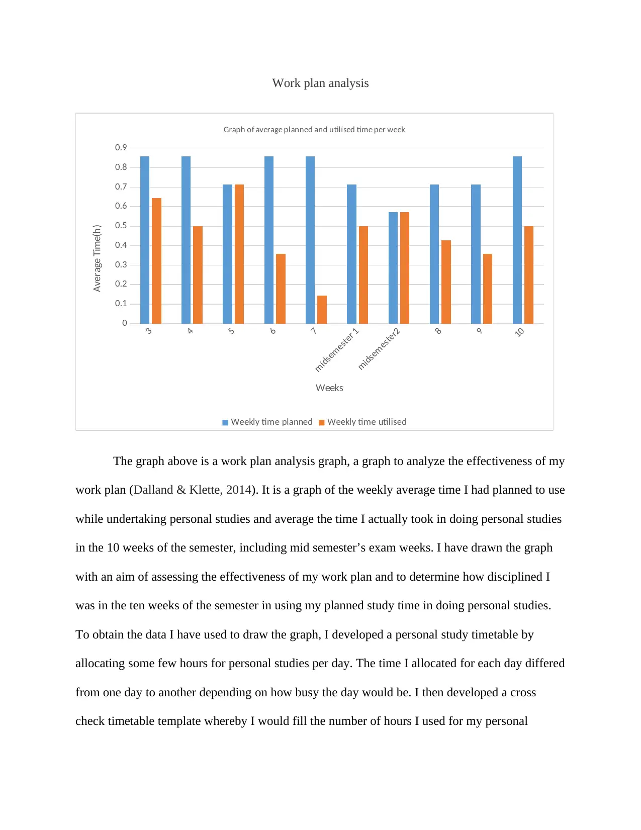
This assignment presents a work plan analysis graph created to assess the effectiveness of the student's study plan over a ten-week semester, including mid-semester exam weeks. The graph compares the average planned study time per week with the average time actually utilized, revealing discrepancies in time management. Data was collected from a personal study timetable and a cross-check template. The analysis highlights weeks where the student successfully adhered to the plan and identifies areas for improvement in time allocation and discipline. References to relevant academic research on self-control and study strategies are included to support the analysis. The assignment aims to visualize the student's study habits and provide insights for better time management. This work is available on Desklib, a platform offering AI-based study tools and resources for students.
1 out of 3


Your All-in-One AI-Powered Toolkit for Academic Success.
+13062052269
info@desklib.com
Available 24*7 on WhatsApp / Email
![[object Object]](/_next/static/media/star-bottom.7253800d.svg)
Copyright © 2020–2026 A2Z Services. All Rights Reserved. Developed and managed by ZUCOL.