Applied Statistical Methods: Exam Module 2 Assignment Solution

Verified

Added on  2022/08/28

|7
|701
|14
Homework Assignment
AI Summary
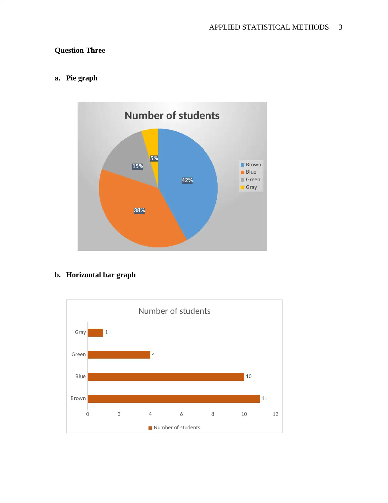
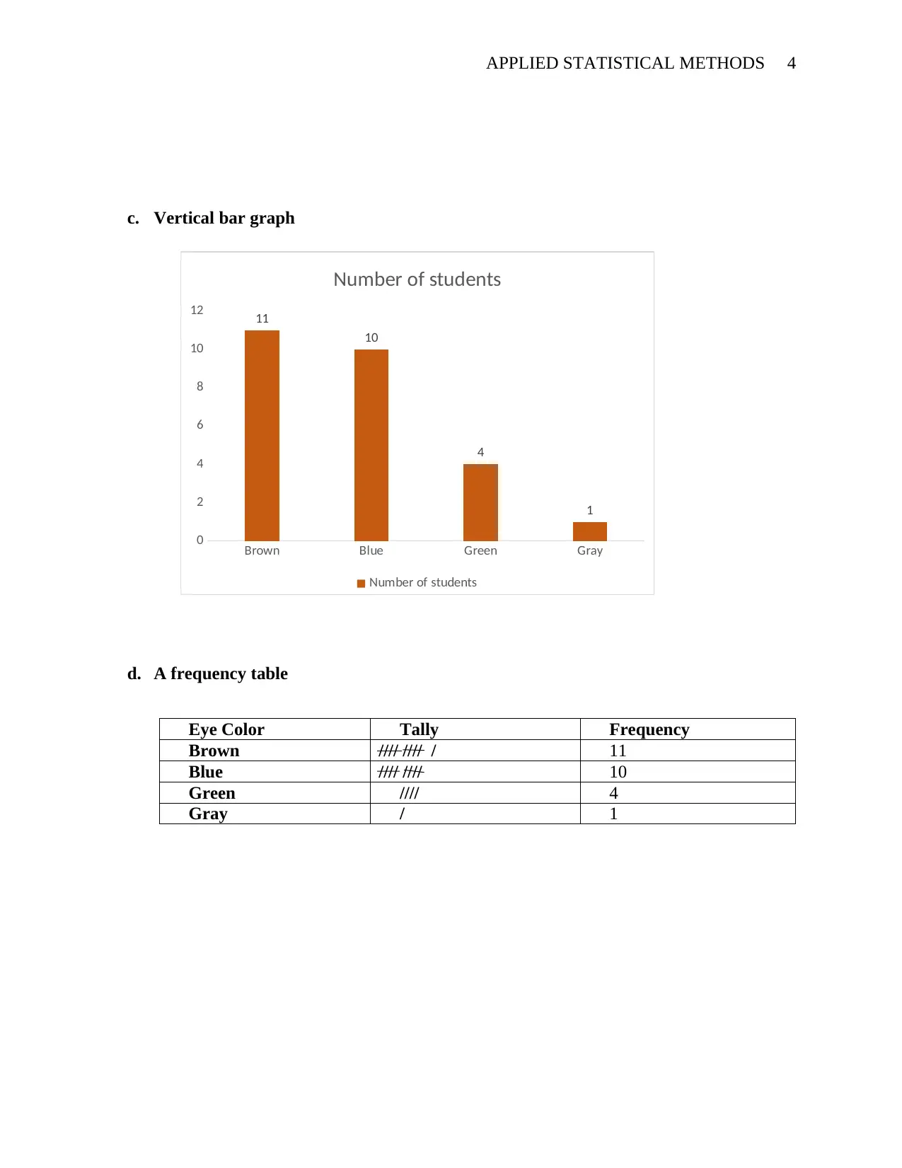
This document presents a comprehensive solution to an applied statistics assignment. The solution addresses questions related to frequency polygons, box plots, data visualization techniques, and skewness. It includes explanations of how to interpret a frequency polygon to determine the most common test grade, as well as how to understand the distribution of data within a box plot. The assignment also involves constructing various types of graphs, such as pie charts, horizontal bar graphs, and vertical bar graphs, based on provided data. Furthermore, the solution discusses methods to improve the clarity and effectiveness of statistical graphs, such as removing gridlines, correctly positioning legends, adding titles, and labeling axes. Finally, the document analyzes different box plots to identify those with positive and negative skewness, providing a detailed understanding of data distribution.
Document Page
APPLIED STATISTICAL METHODS 1
APPLIED STATISTICAL METHODS.
By (Name)
(Course Name)
(Roll Number)
(Course Code)
(Instructor)
(Date)
tabler-icon-diamond-filled.svg

Paraphrase This Document

Need a fresh take? Get an instant paraphrase of this document with our AI Paraphraser
Document Page
APPLIED STATISTICAL METHODS 2
Question One
A frequency polygon is a statistical graph that shows data and their respective frequency.
Normally, data points are plotted on the horizontal axis and the respective frequency of the data
point is plotted on the vertical axis. The peak of the plot represents the data point with the
highest frequency. (Lane 2017). In this question, the peak of the plot corresponds to 85 score on
the x-axis. Thus 85 score was the most common grade.
Question Two
Statistically, the percentage of data points that are contained by the lower and the upper
quartiles of a box plot is considered to be 50%. The lower quartile is at the 25th percentile while
the upper quartile (upper hinge) is at the 75th percentile. A correctly constructed box plot clearly
shows the distribution of the data and other crucial aspects of the data at hand.
Document Page
APPLIED STATISTICAL METHODS 3
Question Three
a. Pie graph
42%
38%
15%
5%
Number of students
Brown
Blue
Green
Gray
b. Horizontal bar graph
Brown
Blue
Green
Gray
0 2 4 6 8 10 12
11
10
4
1
Number of students
Number of students
Document Page
APPLIED STATISTICAL METHODS 4
c. Vertical bar graph
Brown Blue Green Gray
0
2
4
6
8
10
12 11
10
4
1
Number of students
Number of students
d. A frequency table
Eye Color Tally Frequency
Brown //// //// / 11
Blue //// //// 10
Green //// 4
Gray / 1
tabler-icon-diamond-filled.svg

Paraphrase This Document

Need a fresh take? Get an instant paraphrase of this document with our AI Paraphraser
Document Page
APPLIED STATISTICAL METHODS 5
Question four
A correctly constructed, clear and accurate chart is very essential in any statistical analysis
and visualization. To achieve these, some modifications and improvements should be done to
charts and graphs before data presentation commences.
To improve the graph presented in this question, the following would be considered.
a. Remove gridlines and graph border
In most cases, the gridlines and the graph border do not serve a crucial role in
visualization, thus removing them would make the graph clearer.
b. Correctly placing the legend; preferably at the bottom of the graph
The legend explains what the bars present on the graph. The legend should be placed
at a point that is visible to effectively communicate.
c. Adding a title to the graph
The graph title should precisely express the graph's purpose. This creates a more
appealing perception to the reader and a desire to explore the graph more.
d. Adding axes title
For clear visualization and effectively conveying the information displayed on the
graph, correctly labeling axes title is very important to convey variables being
measure on the first sight.
e. Adding data labels to the columns
Labeled data facilitates the reader to quickly identify correct scores from the graph,
hence making the graph more user-friendly and easier to read
Document Page
APPLIED STATISTICAL METHODS 6
Question five
The skewness of a data set is defined as the extent to which the data distribution varies
from the normal distribution. If most of the observations fall along the lower part on the x-axis
(lower score), and only a few falls on the high score; the distribution is said to be positively
skewed. Corollary, when most of the observations of a data set fall on the high score scale, and
only a few on the low score, the distribution is said to be negatively skewed. (Peck 2015).
A clear analysis and visualization of a boxplot will indicate whether the distribution is
normal or skewed. Normally, a boxplot with a line at the center of the box represents a normal
distribution. (Mean=mode=median). Positively skewed distribution exhibit, median>mean>mode
while negatively skewed distribution exhibits median<mean<mode. (Lane 2017)
This follows that the box plot B represents a data with a positively skewed distribution and
boxplot c represents a dataset with a negatively skewed distribution.
Document Page
APPLIED STATISTICAL METHODS 7
References:
Lane, D.M., Scott, D., Hebl, M., Guerra, R., Osherson, D. and Zimmer, H., 2017. An
Introduction to Statistics. Rice University.
Peck, R., Olsen, C. and Devore, J.L., 2015. Introduction to statistics and data analysis. Cengage
Learning.
chevron_up_icon
1 out of 7
circle_padding
hide_on_mobile
zoom_out_icon
[object Object]