Analysis of an Art I Collage: Home and Environment Composition

Verified

Added on  2020/05/11

|6
|1270
|361
Creative Assignment
AI Summary
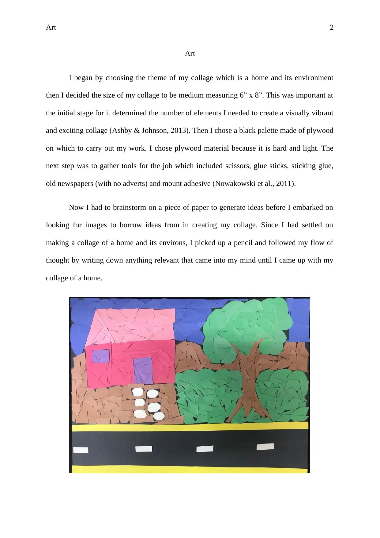
This assignment is an analysis of an Art I collage depicting a home and its surrounding environment. The student begins by describing the initial stages of the project, including the theme, size, and materials used, such as plywood, scissors, glue, and newspapers. The analysis then delves into the visual elements and principles of design within the collage. The student identifies the collage as a colorful representation of a young family's home in a rural setting. They discuss the use of vertical and horizontal lines to create mood, the free-form shape, and the geometric form of the image. The analysis further examines the principles of balance, contrast, proportionality, and emphasis, illustrating how these principles contribute to the overall composition and visual impact of the artwork. The student also discusses the texture, color choices, and the illusion of space, and the lighting and weather representation within the collage. The assignment concludes by highlighting the integration of the design principles and the consistency in the use of elements throughout the composition, referencing scholarly articles to support the analysis.
Document Page
Running head: Art 1
Art
by
Course:
Tutor:
University:
Department:
16 October 2017
tabler-icon-diamond-filled.svg

Paraphrase This Document

Need a fresh take? Get an instant paraphrase of this document with our AI Paraphraser
Document Page
Art 2
Art
I began by choosing the theme of my collage which is a home and its environment
then I decided the size of my collage to be medium measuring 6” x 8”. This was important at
the initial stage for it determined the number of elements I needed to create a visually vibrant
and exciting collage (Ashby & Johnson, 2013). Then I chose a black palette made of plywood
on which to carry out my work. I chose plywood material because it is hard and light. The
next step was to gather tools for the job which included scissors, glue sticks, sticking glue,
old newspapers (with no adverts) and mount adhesive (Nowakowski et al., 2011).
Now I had to brainstorm on a piece of paper to generate ideas before I embarked on
looking for images to borrow ideas from in creating my collage. Since I had settled on
making a collage of a home and its environs, I picked up a pencil and followed my flow of
thought by writing down anything relevant that came into my mind until I came up with my
collage of a home.
Document Page
Art 3
The work is a colourful representation of a home whose set-up is in upcountry, and
the presence of just a single house shows that it is a young family and most probably of a
young couple. The presence of vegetation shows that indeed this house is set out of the city.
The existence of a single-lane tarmac road also shows that the home is located out of town.
Additionally, the existence of only a straightforward structure of a home is proof to the fact
that it is a young family. The lines used to create the edges are both vertical and horizontal
which creates the impression of the potential for movement and a calm and quite mood
respectively (Liu et al., 2015). This gives the picture a calm and quiet mood, and the
potentiality for movement respectively. The shape of the collage is free-form. The image
shape is that of a rectangle and is therefore geometric. The picture has even spacing hence the
viewing is excellent. The texture of the collage or surface quality of the image is somehow
smooth except for the application of the strong pigmentation (Glatstein, 2016).
The principles of design are also evident in the collage (Williams, 2015). For instance,
the principle of balance in the image is formal because both sides are arranged symmetrically
thus making the entire image balanced. Furthermore, the principle of balance is seen in the
harmonious combination of colors, object shapes, texture, and space. The object of balance is
achieved in the image by dividing it into two sections: the first half is composed of the sky in
the background, and the second one with the house, trees and roads. This further explains the
principle of contrast, in which the texture of hills is contrasted with that of the valley thus
holding the attention of the viewer and guiding his/her eyes through the artwork. There is also
proportionality in the picture because the sizes of the elements in the image are harmoniously
combined for example the house figure is relatively smaller in scale compared to the house.
The principle of emphasis is also central in the collage. For instance, the artist has used colors
and size to direct the viewer towards the figures of the road and sky though they are
comparatively small in scale (Gladstein, 2016). The eyes of the viewer are also led to the area
Document Page
Art 4
of emphasis which is the season or weather by the application of the principle of movement
in the artwork. The contrasting colors and shapes of the object below the house cause the
eyes to move through the other forms to the dusty road and sky. There is also a pattern in the
repetition of the colors of the objects to create unity. Lastly, this image has integration
because most of the principles of analysis are present in the composition and are harmonious
(Schell, 2014).
The lighting in the picture is excellent, and the home is surrounded by vegetation and
is accessible by both a feeder road and a tarmac road. There is also green vegetation at the
base of the tree. This tells us that the weather of this area is more of the summer season,
further evidenced by the clear blue sky. The choice of color in this collage is intermediate; a
mixture of both the primary and secondary colors. The hue of the image is a mixture of both
light and dark. The element of shape is also evident in the collage. The shape of the elements
of nature in the image such as the sky and roads are asymmetrical, and they are implied by
the variation of colors. The space that appears to be a two-dimensional painting of the sky,
house, tree and feeder road is an illusion intended to create a feeling of reality. The element
of texture is seen in the collage. The texture is smooth implying the elements in their natural
set-up.
Furthermore, the principles of design are evident in the collage. The principle of
movement is also used in the design of the collage. The movement in the image is directed by
the contrasting colors. The eyes of the viewer move up starting from the hill through the
vegetation to the sky on the background of the mountains in the collage. This is possible by
the use of contrasting shapes and colors. Additionally, the principle of emphasis is evident in
the artwork and is achieved by contrasting the shapes and colors of the items. The collage has
tabler-icon-diamond-filled.svg

Paraphrase This Document

Need a fresh take? Get an instant paraphrase of this document with our AI Paraphraser
Document Page
Art 5
consistency in the use of the element and principles of design as described above but no
replication of symbols or objects.
Document Page
Art 6
References
Ashby, M. F., & Johnson, K. (2013). Materials and design: the art and science of material
selection in product design. Butterworth-Heinemann.
Glatstein, J. (2016). Formal visual analysis: The elements & principles of composition. The
Kennedy.
Liu, T., McCann, J., Li, W., & Funkhouser, T. (2015, May). CompositionAware Scene
Optimization for Product Images. In Computer Graphics Forum (Vol. 34, No. 2, pp.
13-24).
Nowakowski, P., Ciepiela, E., Harężlak, D., Kocot, J., Kasztelnik, M., Bartyński, T., ... &
Malawski, M. (2011). The collage authoring environment. Procedia Computer
Science, 4, 608-617.
Schell, J. (2014). The Art of Game Design: A book of lenses. CRC Press.
Williams, R. (2015). The non-designer's design book: design and typographic principles for
the visual novice. Pearson Education.
chevron_up_icon
1 out of 6
circle_padding
hide_on_mobile
zoom_out_icon
[object Object]