Data Analysis Report: Australian Airline Data for Sydney Airport
VerifiedAdded on  2022/05/25
|12
|1638
|50
Report
AI Summary
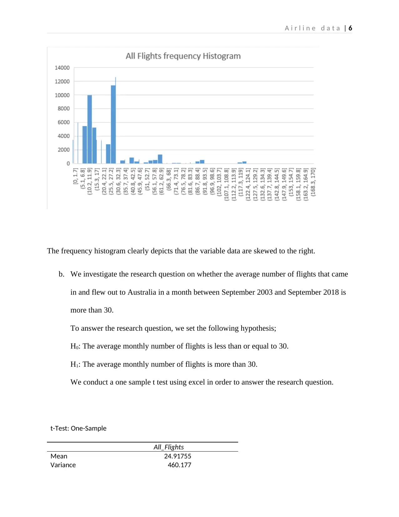
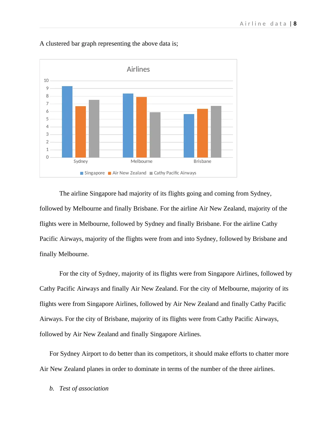
This report provides an analysis of Australian airline data from September 2003 to September 2018, focusing on airport performance and flight characteristics. The study utilizes two datasets: one containing secondary data on airline services and another based on a survey of KOI student flying experiences. The analysis employs statistical tools such as regression analysis, correlation, scatter plots, and frequency histograms to address research questions concerning the distribution of flights, average flight numbers, and associations between cities and airlines. The findings reveal that the distribution of flights is skewed to the right, and the average monthly number of flights does not exceed 30. The report also highlights a lack of association between Australian cities and airlines. Furthermore, the analysis indicates that Sydney Airport outperforms Melbourne and Brisbane airports in terms of flight volume. Recommendations are provided for Sydney Airport to enhance its competitiveness, including efforts to increase flights with Air New Zealand and expand the scope of airline operations. The report concludes with a discussion of the results and references to relevant literature.

A i r l i n e d a t a | 1
ANALSIS OF AUSTRALIAN AIRLINE DATA
Paraphrase This Document
Need a fresh take? Get an instant paraphrase of this document with our AI Paraphraser

A i r l i n e d a t a | 2
Executive summary
This report describes the characteristics and distribution of airline data for Australian
airports in order to provide a recommendation for Sydney Airport. Several tools such as
regression analysis, correlation, scatter plots and frequency histograms are used for the analysis.
Results of the analysis have shown that Sydney airport performs better than Melbourne and
Brisbane airports in terms of the flights coming and getting out of the airport. However, for
Sydney to outdo its competitors, it should make efforts to chatter more Air New Zealand planes
and expand the scope of operation of the airline in order to dominate in terms of the number of
flights coming and getting out of the airport.

A i r l i n e d a t a | 3
Table of Contents
Introduction.................................................................................................................................................2
Analysis of single variable in dataset 1........................................................................................................2
Analysis of two variables.............................................................................................................................4
Analysis of dataset 2....................................................................................................................................7
Discussion and conclusion...........................................................................................................................8
⊘ This is a preview!⊘
Do you want full access?
Subscribe today to unlock all pages.

Trusted by 1+ million students worldwide

A i r l i n e d a t a | 4
Introduction
This report aims to describe the characteristics and distribution of flights in Australia
between the time period September 2003 to September 2018. Analysis is carried out on airline
services data of Australia and compared to the findings of (Assaf, 2010) and (Malcolm Abbott,
2012)in order to make a recommendation on improvement of airport services to the airline. The
following research questions guided the study;
i. What is the shape of the distribution of the variable All Flights?
ii. Is the average number of flights coming in and flying out to Australia in a month between
September 2003 and September 2018 more than 30?
iii. Is there association between Australian City and Airlines?
In order to answer these research questions, two datasets were used, dataset 1 and dataset 2.
Dataset 1 consists of secondary data on airline services for an Australian airline. The dataset
consists of both qualitative and quantitative data.
Dataset 2 consist of primary data on KOI student flying experience in and out through
airports in Sydney, Melbourne and Brisbane. Dataset 2 was collected through an online survey.
Both qualitative and quantitative variables were collected from the online survey. An online
survey was used because it saves on time and costs. However, a challenge that was experienced
is a slow response rate was experienced since respondents answered the questions at their own
time of will. Another limitation was the possibility of obtaining a biased sample since there was
no way of selecting the sample to participate in the study.
Paraphrase This Document
Need a fresh take? Get an instant paraphrase of this document with our AI Paraphraser

A i r l i n e d a t a | 5
Analysis of single variable in dataset 1
a. Distribution of the variable All Flights.
To determine the distribution of the dataset, we first find the median and mean of the
dataset. The mean is found to be 24.92 and the median is found to be 22. Since the mean is to
the right of the median, it implies that majority of the data points lie to the right of the dataset
median. The skewness is 2.54. Therefore, the distribution of the variable All Flights can be
said to be skewed to the right.
A frequency histogram provides a graphical representation of the distribution of the
variable as shown below; The frequency histogram is plotted by following the following
procedure;
i. On the Data tab, in the Analysis section, click the Data Analysis tab;
ii. Select histogram.
iii. Specify the input range and the Bin range.
iv. Select the output range.
v. Click ok.

A i r l i n e d a t a | 6
The frequency histogram clearly depicts that the variable data are skewed to the right.
b. We investigate the research question on whether the average number of flights that came
in and flew out to Australia in a month between September 2003 and September 2018 is
more than 30.
To answer the research question, we set the following hypothesis;
H0: The average monthly number of flights is less than or equal to 30.
H1: The average monthly number of flights is more than 30.
We conduct a one sample t test using excel in order to answer the research question.
t-Test: One-Sample
All_Flights
Mean 24.91755
Variance 460.177
⊘ This is a preview!⊘
Do you want full access?
Subscribe today to unlock all pages.

Trusted by 1+ million students worldwide

A i r l i n e d a t a | 7
Observations 93671
Hypothesized Mean 30
df 93670
t Stat -72.5125
P(T<=t) one-tail 0
t Critical one-tail 1.64487
P(T<=t) two-tail 0
t Critical two-tail 1.959989
Test statistic
t = -72.5125.
Rejection region
We reject H0 if t>1.65
Decision rule
Since -72.5125 is less than 1.65, we fail to reject the null hypothesis. There therefore lacks
sufficient evidence at the 5% level of significance to justify the claim that the average monthly
number of flights is more than 30.
Analysis of two variables
a. Average number of flights coming in and out of the cities of Sydney, Brisbane and
Melbourne
City Singapore Air New Zealand Cathy Pacific Airways
Sydney 9.33 6.71 7.53
Melbourne 8.35 7.9 5.9
Brisbane 5.67 6.36 6.74
Paraphrase This Document
Need a fresh take? Get an instant paraphrase of this document with our AI Paraphraser

A i r l i n e d a t a | 8
A clustered bar graph representing the above data is;
Sydney Melbourne Brisbane
0
1
2
3
4
5
6
7
8
9
10
Airlines
Singapore Air New Zealand Cathy Pacific Airways
The airline Singapore had majority of its flights going and coming from Sydney,
followed by Melbourne and finally Brisbane. For the airline Air New Zealand, majority of the
flights were in Melbourne, followed by Sydney and finally Brisbane. For the airline Cathy
Pacific Airways, majority of the flights were from and into Sydney, followed by Brisbane and
finally Melbourne.
For the city of Sydney, majority of its flights were from Singapore Airlines, followed by
Cathy Pacific Airways and finally Air New Zealand. For the city of Melbourne, majority of its
flights were from Singapore Airlines, followed by Air New Zealand and finally Cathy Pacific
Airways. For the city of Brisbane, majority of its flights were from Cathy Pacific Airways,
followed by Air New Zealand and finally Singapore Airlines.
For Sydney Airport to do better than its competitors, it should make efforts to chatter more
Air New Zealand planes in order to dominate in terms of the number of the three airlines.
b. Test of association

A i r l i n e d a t a | 9
Correlation analysis is carried out to assess whether there exists association between
Australian cities and airlines. The following hypothesis is tested;
H0: There is no association between Australian cities and airlines.
H1: there is an association between Australian cities and airlines.
Correlation is carried out by following the following procedure.
i. First create dummy variables for Australian cities and Australian airlines.
ii. On the Data tab, in the Analysis section, click the Data Analysis tab;
iii. Select correlation.
iv. Specify the input variables, that is the dummy-transformed variables for cities and
airlines. .
v. Select the output range.
vi. Click ok.
On performing correlation analysis, the following results are obtained;
Correlations
Airprt Airlne
Airprt Pearson Correlation 1 .125
Sig. (2-tailed) .095
N 179 179
Airlne Pearson Correlation .125 1
Sig. (2-tailed) .095
N 179 179
A p-value of 0.095 is obtained. Since 0.095 is greater than 0.05, we fail reject the null hypothesis
and therefore we cannot justify that an association exists between Australian cities and airlines.
⊘ This is a preview!⊘
Do you want full access?
Subscribe today to unlock all pages.

Trusted by 1+ million students worldwide

A i r l i n e d a t a | 10
c. From the output in a, we can conclude that;
For the city of Sydney, majority of its flights were from Singapore Airlines, followed by
Cathy Pacific Airways and finally Air New Zealand. For the city of Melbourne, majority of its
flights were from Singapore Airlines, followed by Air New Zealand and finally Cathy Pacific
Airways. For the city of Brisbane, majority of its flights were from Cathy Pacific Airways,
followed by Air New Zealand and finally Singapore Airlines. The airport of Sydney can
therefore be seen to perform better than the other two airports of Melbourne and Brisbane.
Analysis of dataset 2
The average number of flights coming and getting out of Sydney airport was found to be
8.05, the average number of flights for Melbourne airport was found to be 7.87 and the average
number of flights for Brisbane airport was found to be 6.33. Based on these statistics, it would be
reasonable to say that KOI students would have a good experience flying in and out of Sydney
airport.
Sydney Melbourne Brisbane
0
1
2
3
4
5
6
7
8
9
Chart Title
Paraphrase This Document
Need a fresh take? Get an instant paraphrase of this document with our AI Paraphraser

A i r l i n e d a t a | 11
Discussion and conclusion
Results of the study depict that the data of flights is not normally distributed but skewed
to the right. The distribution is displayed by a frequency histogram, which clearly shows a tail to
the right. The results have also shown that in major cases, the All Flights mean shall not exceed
30.
Another result found out by the study is a lack of association between Australian cities
and airlines flying in and out of the airports in the Australian cities. It has also been shown that
Sydney airport performs better than Melbourne and Brisbane airports in terms of the flights
coming and getting out of the airport. However, for Sydney to outdo its competitors, it should
make efforts to chatter more Air New Zealand planes and expand the scope of operation of the
airline in order to dominate in terms of the number of flights coming and getting out of the
airport.

A i r l i n e d a t a | 12
References
Assaf, A., 2010. The cost efficiency of Australian airports post privatisation: A Bayesian methodology.
Tourism Management, 31(4), pp.6-7.
Malcolm Abbott, S. W., 2012. Total Factor Productivity and Efficiency of Australian Airports. Australian
Economic Review, 35(12), pp.17.
References
Assaf, A., 2010. The cost efficiency of Australian airports post privatisation: A Bayesian methodology.
Tourism Management, 31(4), pp.6-7.
Malcolm Abbott, S. W., 2012. Total Factor Productivity and Efficiency of Australian Airports. Australian
Economic Review, 35(12), pp.17.
⊘ This is a preview!⊘
Do you want full access?
Subscribe today to unlock all pages.

Trusted by 1+ million students worldwide
1 out of 12
Related Documents

Your All-in-One AI-Powered Toolkit for Academic Success.
 +13062052269
info@desklib.com
Available 24*7 on WhatsApp / Email
Unlock your academic potential
Copyright © 2020–2025 A2Z Services. All Rights Reserved. Developed and managed by ZUCOL.