In-Depth Analysis and Evaluation of Responsive Web Design: AWM Website

Verified

Added on  2023/03/20

|16
|2763
|67
Report
AI Summary
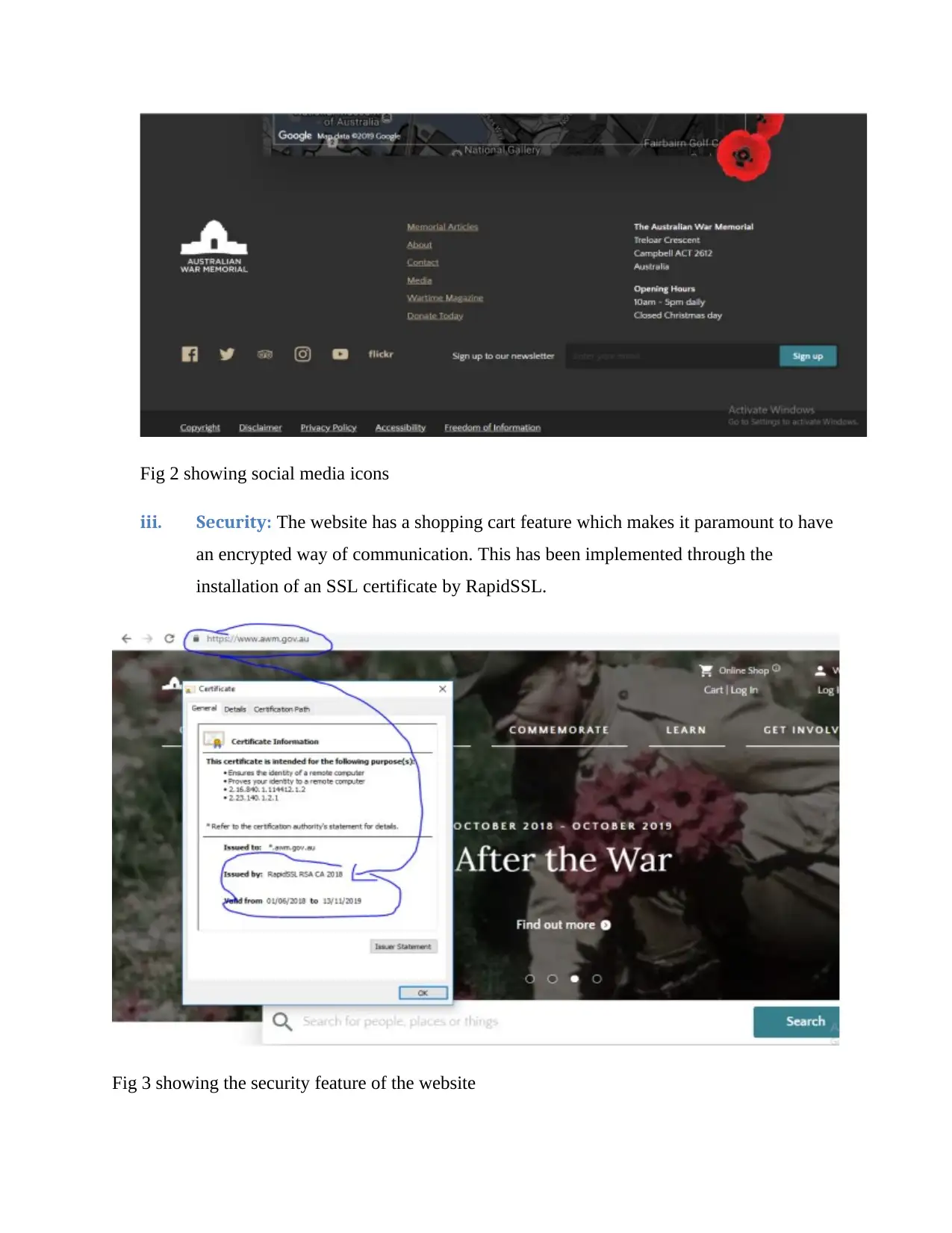
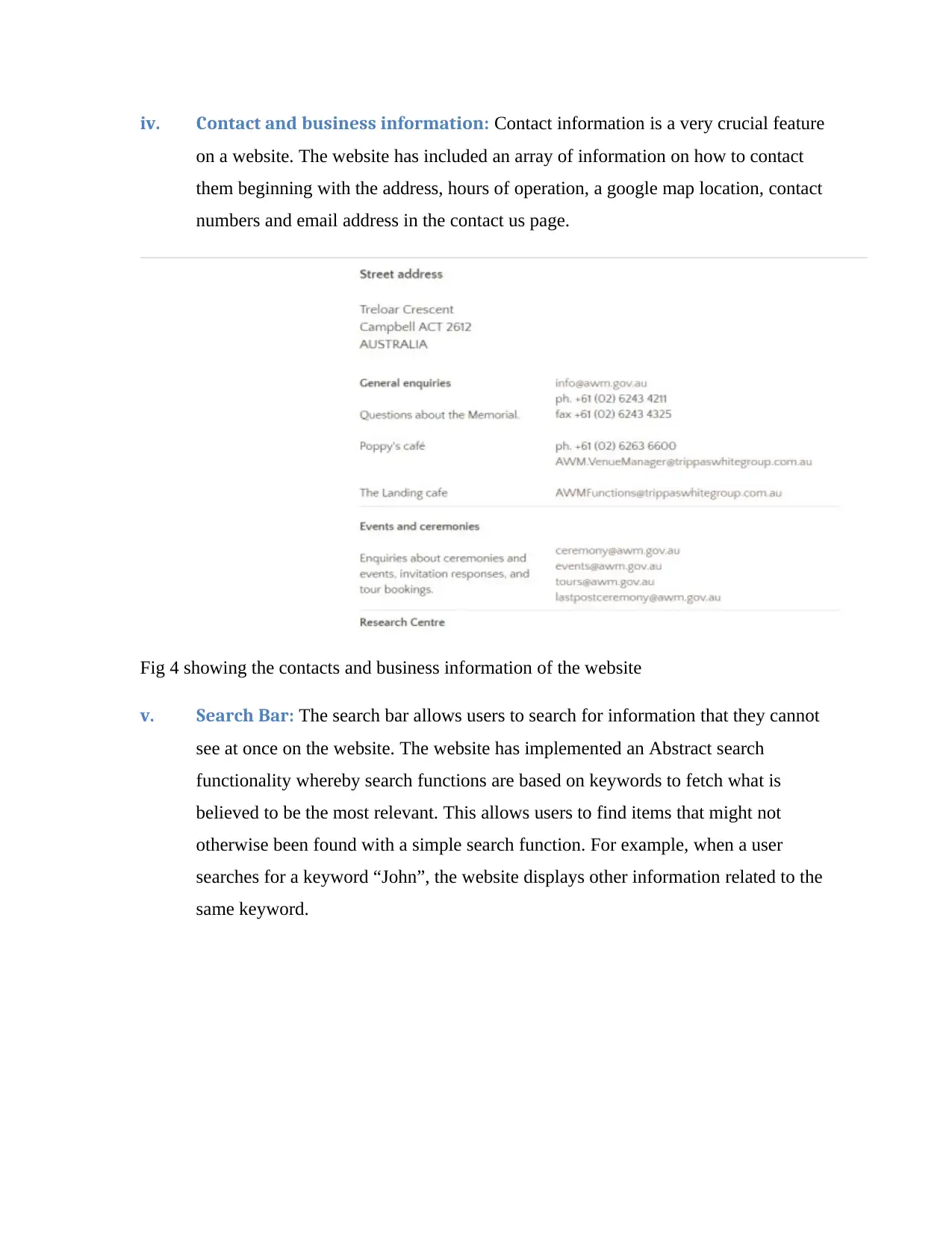
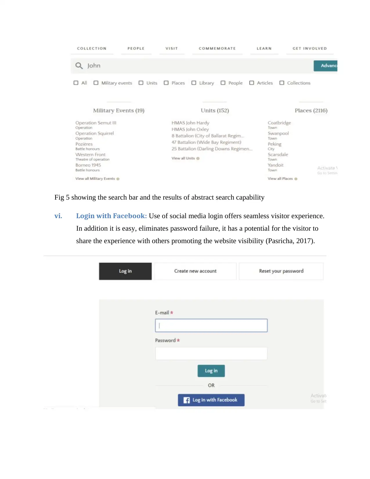
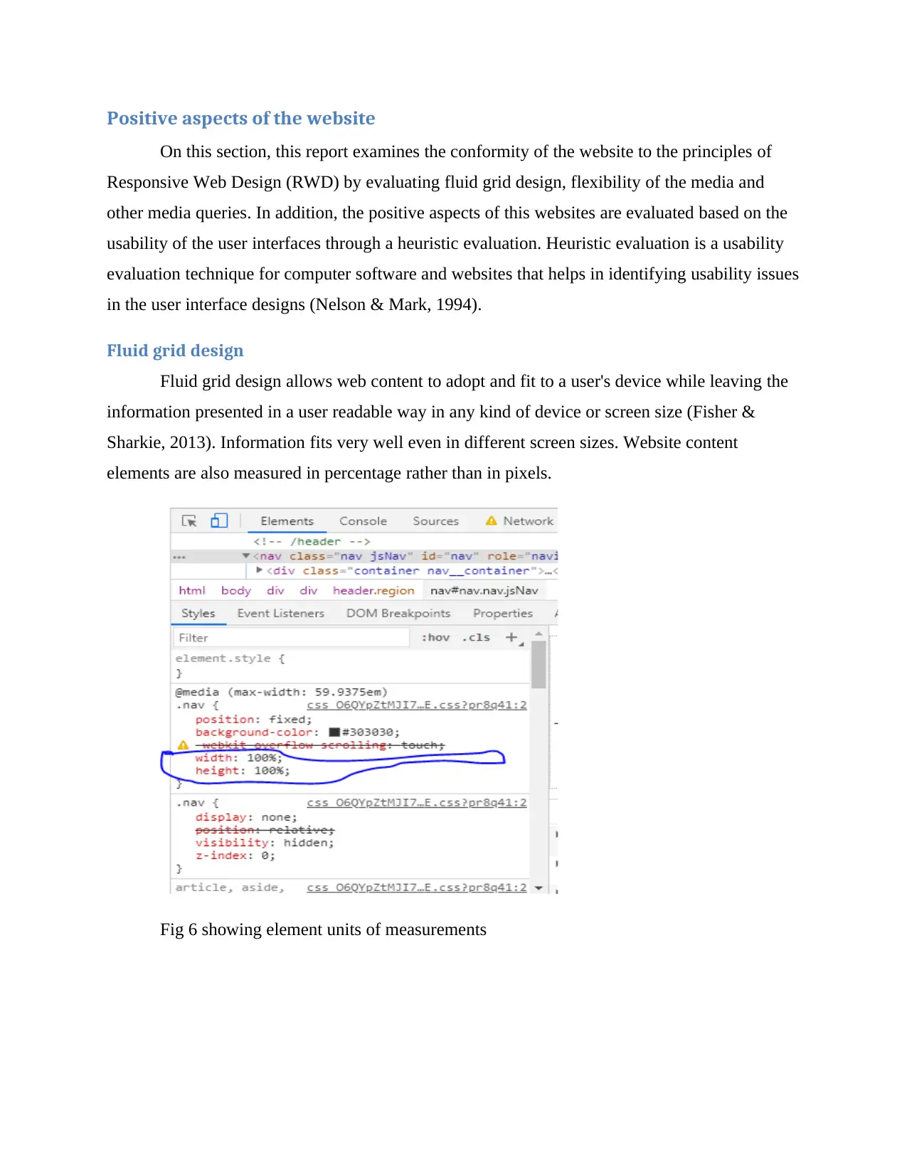
This report provides a comprehensive evaluation of the Australian War Memorial (AWM) website's adherence to responsive web design (RWD) principles. The analysis examines the website's features, including clear navigation, social media integration, security measures, and search functionality, while focusing on the core components of RWD: fluid grid design, flexible media, and media queries. The evaluation utilizes Google Chrome's Developer Tools to assess the website's responsiveness across various screen sizes and devices. Furthermore, the report incorporates a heuristic evaluation to identify usability strengths and weaknesses, such as the website's design consistency, the abstract search function, and the challenges related to menu font sizes and navigation on desktop view. The report concludes with recommendations for improvement, particularly concerning menu design, font sizes, and the addition of features like an auto-complete search and a FAQ section, to enhance the overall user experience. The report also includes advantages and disadvantages of the simulation tool used for the analysis.
Document Page
Name of University
Responsive Web Design
Student Name
Course Name
Submission Date
tabler-icon-diamond-filled.svg

Paraphrase This Document

Need a fresh take? Get an instant paraphrase of this document with our AI Paraphraser
Document Page
Table of Contents
Introduction......................................................................................................................................3
Discussion........................................................................................................................................3
Overview of the website..............................................................................................................3
Main Features in the website.......................................................................................................4
i. Clear navigation:...............................................................................................................4
ii. Social media integration:...............................................................................................4
iii. Security:.........................................................................................................................5
iv. Contact and business information:................................................................................6
v. Search Bar:....................................................................................................................6
vi. Login with Facebook:....................................................................................................7
Positive aspects of the website....................................................................................................8
Fluid grid design......................................................................................................................8
Flexible media.........................................................................................................................9
Media queries.........................................................................................................................10
Negatives aspects of the website...............................................................................................11
Comments..................................................................................................................................13
Advantages and disadvantages of simulation tool used................................................................14
Conclusion.....................................................................................................................................15
References......................................................................................................................................16
Document Page
Introduction
The purpose of this report is to evaluate and analyse “https://www.awm.gov.au/” website
on its conformity with Responsive Web Design (RWD) principal. In addition, the report
evaluates the usability of the website in different user devices like desktop computers, mobile
phones of different screen sizes as well as tablet computers. Under RWD, the report tries the
examine the existence of fluid grid systems, fluid image use and dynamic media queries,
breakpoints, max and min values, nested objects, the idea of mobile or desktop first and fonts
versus images that drive a responsive website design. The evaluation is performed using Google
Chrome Developers tool.
Discussion
Designing a website with responsive web design principles allows visitors to have a
smooth, continuous and uninterrupted experience with every device they use to access it. These
devices include desktop browsers, tablets and mobile phones (Storey, 2013). There are three
fundamental ingredients that make the responsive web design recipe. These are fluid grid,
flexible media and media queries (Medina et al, 2013). Fluid grid design allows for the contents
to adjust to different environments. Most elements are measured in percentages, rem, em, vh, or
vm units rather than pixels, combined with a series of CSS breakpoints defined in CSS media
(Storey, 2013). Flexible media like images should adopt to grow and shrink to fit with a flexible
grid column. Higher resolution images should be set not to load on small screens meant for smart
phones but only on desktop browsers. On the other hand, media queries should be driven by
Cascading Style Sheet (CSS).
Overview of the website
“https://www.awm.gov.au/” is a corporate website for the Australian War Memorial. The
website showcases shrines and world-class museum and an extensive archive of war memorial in
Australia. This is to commemorate the sacrifice of those Australians who have died in war or on
operational service and those who have served the nation in times of conflict. Most importantly,
the website offers a way to remember and understand of Australia’s wartime experience. The
Document Page
website’s audience is the general populous from Australian citizens to visitors from all over the
world. The website has a shopping cart where the visitors can purchase relics and souvenir.
Main Features in the website
i. Clear navigation: The website has logical names for navigating to various pages.
These include Collection, People, Visit, Commemorate, Learn, Get involved and
Shop. All these are placed at the top and bottom of each web page for clear
navigation. Other navigation features like Search bar, the name of the website,
shopping cart and the Login links are also clearly defined. Other navigation features
are also located at the bottom of each page they include Memorial Articles, About,
Contact, Media, Wartime Magazine and Donate Today
Fig 1 showing navigation
ii. Social media integration: Social media platform re meant to promote and market
the website. In addition, they boost the website Search Engine Optimization (SEO)
and improve the website footprint on the social web. The National Register of War
Memorials website has Facebook, Twitter, TripAdvisor, Instagram, YouTube and
Flickr integrated in it at the foot of the website.
tabler-icon-diamond-filled.svg

Paraphrase This Document

Need a fresh take? Get an instant paraphrase of this document with our AI Paraphraser
Document Page
Fig 2 showing social media icons
iii. Security: The website has a shopping cart feature which makes it paramount to have
an encrypted way of communication. This has been implemented through the
installation of an SSL certificate by RapidSSL.
Fig 3 showing the security feature of the website
Document Page
iv. Contact and business information: Contact information is a very crucial feature
on a website. The website has included an array of information on how to contact
them beginning with the address, hours of operation, a google map location, contact
numbers and email address in the contact us page.
Fig 4 showing the contacts and business information of the website
v. Search Bar: The search bar allows users to search for information that they cannot
see at once on the website. The website has implemented an Abstract search
functionality whereby search functions are based on keywords to fetch what is
believed to be the most relevant. This allows users to find items that might not
otherwise been found with a simple search function. For example, when a user
searches for a keyword “John”, the website displays other information related to the
same keyword.
Document Page
Fig 5 showing the search bar and the results of abstract search capability
vi. Login with Facebook: Use of social media login offers seamless visitor experience.
In addition it is easy, eliminates password failure, it has a potential for the visitor to
share the experience with others promoting the website visibility (Pasricha, 2017).
tabler-icon-diamond-filled.svg

Paraphrase This Document

Need a fresh take? Get an instant paraphrase of this document with our AI Paraphraser
Document Page
Positive aspects of the website
On this section, this report examines the conformity of the website to the principles of
Responsive Web Design (RWD) by evaluating fluid grid design, flexibility of the media and
other media queries. In addition, the positive aspects of this websites are evaluated based on the
usability of the user interfaces through a heuristic evaluation. Heuristic evaluation is a usability
evaluation technique for computer software and websites that helps in identifying usability issues
in the user interface designs (Nelson & Mark, 1994).
Fluid grid design
Fluid grid design allows web content to adopt and fit to a user's device while leaving the
information presented in a user readable way in any kind of device or screen size (Fisher &
Sharkie, 2013). Information fits very well even in different screen sizes. Website content
elements are also measured in percentage rather than in pixels.
Fig 6 showing element units of measurements
Document Page
Above Fig 6 (left) and Fig 7 (right) shows the fluid nature of the website on two different
screen sizes
Flexible media
Flexible media which is mainly images looks to solve the difficulties in predicting the
dimensions at which an image will display, and the resolution at which images can display
(Fisher & Sharkie, 2013). This means that images should be able to adjust to the screen
orientation either portrait or landscape with ease.
Document Page
Above Fig 8 (left) and Fig 9 (right) shows the flexibility of an image (left) portrait and (right)
landscape on a similar screen
Media queries
This tries to solve the problem of cross-browser support. Media queries work with the
devices and browsers applications find themselves on, and allow the application to respond to
those devices. For example Google Chrome, Mozilla Firefox and Microsoft Edge may have
different media queries and an application may respond differently in either. For this website,
media types are clearly defined in CSS styles for each breakpoint. This allows the layout to be
broken on a specific screen size. This depicts that the website was developed using a “mobile
first” approach where the developer defined what they want on mobile and then scale up from
there.
tabler-icon-diamond-filled.svg

Paraphrase This Document

Need a fresh take? Get an instant paraphrase of this document with our AI Paraphraser
Document Page
Fig 10 showing existence of media queries attributes declaration within the CSS style
Apart from the positive RWD principles, heuristic evaluation of the website has also
pointed out some other positives aspects on the website. The website has a very good design that
tries to eliminate user errors as much as possible. This is evidence by the availability of very few
data input sections. Moreover, the designers added third party systems for login to eliminate
login errors and irrelevant data collection. There is consistency in the website as texts and
content means exactly as the words depict. In addition, the website is designed to meet the
Australian Government standards as noted under the accessibility navigation menu located at the
bottom of each web page. The abstract search function offers flexibility and efficiency of using
the search bar. This allows all the users from novice to professionals to view information they
would not have seen with basic search.
Negatives aspects of the website
The use of mobile first approach in creating a responsive website may be a tedious process since
the approach may require a developer to test content to see where breakpoints occur and plan
them or different mobile devices. Even though the website utilizes a mobile first approach, some
menu items on a desktop mode flows outside the boundaries of the webpage. For example, when
a user hover a mouse on top of Shop menu, the dropdown menu are outside the web bounds.
However, the menu seem ok on mobile devices. This is a classic example on the extent to which
developers need to test all the breakpoints in the website when they deploy mobile first approach.
Document Page
Fig 11 showing menu flowing outside the bounds of the web page on desktop mode
Another negative aspect is the font sizes. Readable text affects how web visitors process the
information in the content while poor readability scares readers away from the content (Cronin,
2009). The menu font sizes are too large and come with a blurring overlay while a user is in
desktop mode. The link colour is not also very visible. It blends with the pages background
colour. This may affect users especially those with trouble identifying colours.
Fig 12 showing dropdown menu fonts sizes and how they are blurring the background content
chevron_up_icon
1 out of 16
circle_padding
hide_on_mobile
zoom_out_icon
[object Object]