Critical Analysis of Burger King's Print Advertisement Campaign
VerifiedAdded on  2022/08/29
|7
|1137
|40
Report
AI Summary
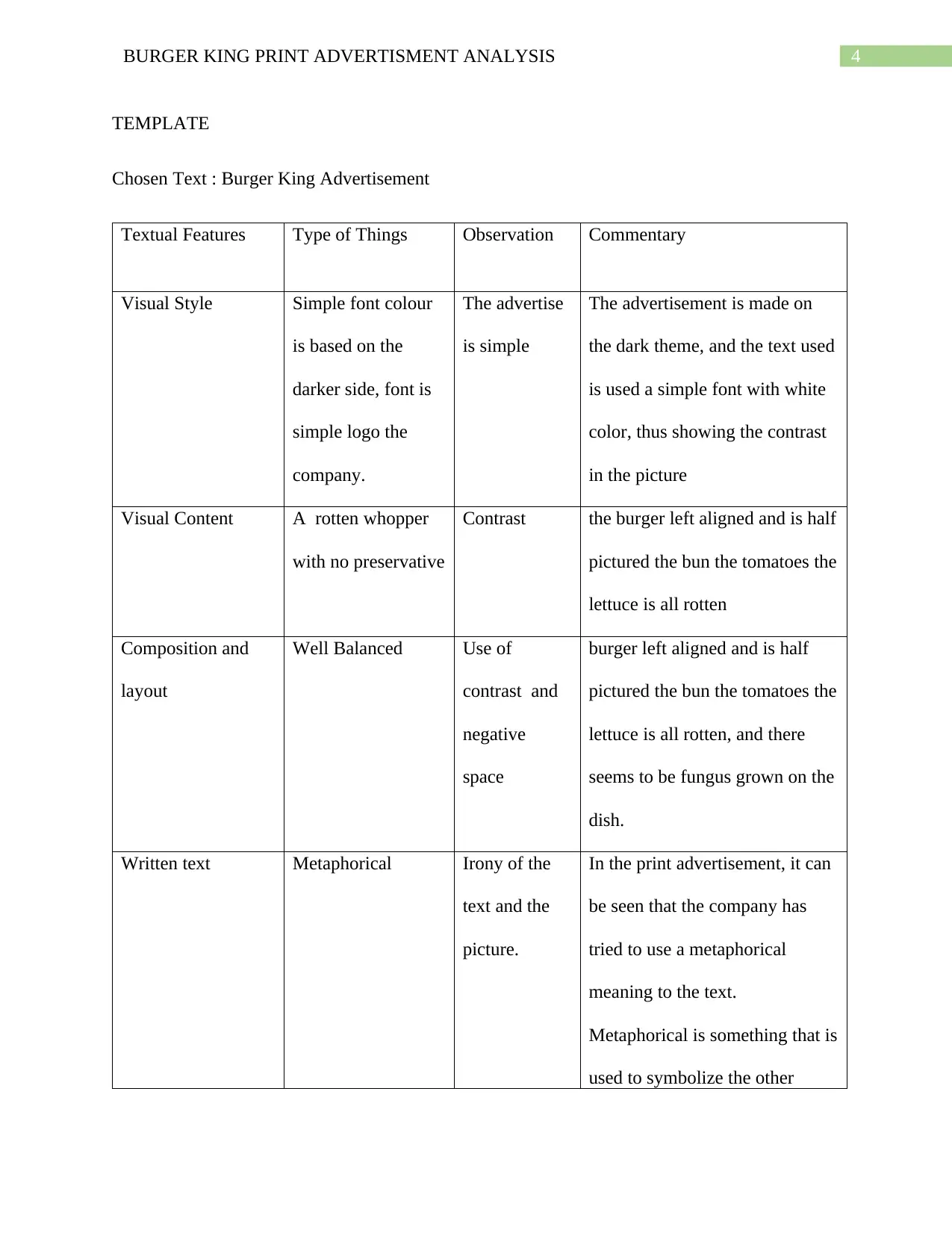
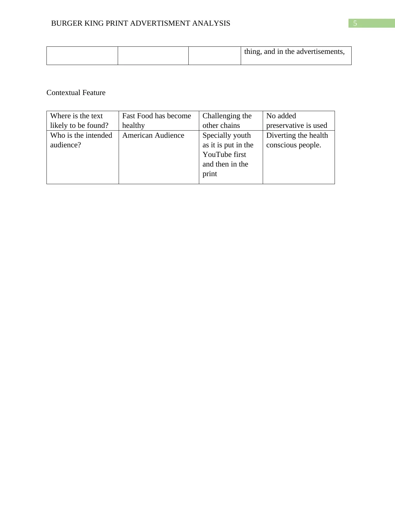
This report provides a comprehensive analysis of Burger King's print advertisement campaign, specifically focusing on the 'moldy whopper' ad. The analysis begins with an overview of the advertisement's context, including its launch in February 2020 and its message of eliminating artificial preservatives. The report delves into the visual style of the advertisement, highlighting the use of a dark theme, simple fonts, and a striking image of a rotten burger to capture attention. The analysis examines the composition and layout, including the use of negative space and the metaphorical meaning conveyed through the text. Furthermore, the report discusses the contextual features of the advertisement, such as its target audience (American youth) and its purpose of promoting healthier food choices. The report also includes a textual analysis template, which summarizes the key observations and commentary on various aspects of the advertisement, such as visual content, composition, and textual features.

Running head : BURGER KING PRINT ADVERTSIEMENT ANALYIS
Burger King Print Advertisement Analysis
Name of the student
Name of the university
Authors note
Burger King Print Advertisement Analysis
Name of the student
Name of the university
Authors note
Paraphrase This Document
Need a fresh take? Get an instant paraphrase of this document with our AI Paraphraser

1BURGER KING PRINT ADVERTISMENT ANALYSIS
In the month of February 2020, Burger King posted a youtube video on the social
networking site, and this was part of the burger king most important campaign where it made a
huge announcement of eliminating any artificial flavor from the burgers and therefore by
imparting the concept that 'natural beauty' has finally reached the fast food of advertising.
Advertising is all about communicating a message to the target audiences; therefore, through the
advertising campaign, the company wanted to share that it has finally moved away from the
preservatives and it is concentrating on the natural flavours, and this advertisement was a way of
communicating this to the mass.
There are many conventions that are associated with the print advertisement, which is a
particular fragment advertisement, and there is a certain common feature that is associated with
the things that are included in this situation. The advertisement that I have chosen is the burger
king's 'moldy whooper' campaign, which highlights the chain was moving away from the
preservative.
The visual style of an advertisement is very significant because it first appeals to the
masses especially in the term of print advertising where people only look for the advertisement,
and if they like it they go through the advertisement. This is especially evident in the case of the
post-testing and pre-testing advertisement research; therefore, the visual style has to be
cooperative. However, the campaign of the burger king is very iconic in the statement because
unlike its other advertisement, and it has just allowed its butter to rot, thereby making a powerful
statement in the situation. The classic burger king logo is used, and just the tagline is used in
simple font 'The beauty of no artificial preservative'. The other text that is present in the text is
that it is written on whooper day 23. The advertisement is made on the dark theme, and the text
used is used a simple font with white color, thus showing the contrast in the picture. The tagging

2BURGER KING PRINT ADVERTISMENT ANALYSIS
of the classic whooper is in small pointer size while that of the tagline is a prominent set against
the classic advertisement.
In the advertisement, it can be seen the burger left aligned and is half pictured the bun the
tomatoes the lettuce is all rotten, and there seems to be fungus grown on the dish. The dark
background in the picture shows how the advertisement tries to grab the attention of the readers.
The advertisement is created by Ingo, David, and Publicist. The visual content in the burger is
striking to the American fast-food lover because it is showing their food rooting and thus
depicting the real picture of the burger. Previously it was all about freshly sliced onions,
tomatoes, and lettuce, and this picture shows the real mold in every piece of the iconic burger.
In designing an advertisement, it is extremely important to create a balance between the
elements of the designs. Otherwise, it will be proved to be the case of the massacre. Negative
space in the advertisement is extremely important as it gives a balance to the print and helps in
viewers' retention as well. The above extreme above left, there is also negative space that is used
by the artist to create a balance in the print advertisement. The right half of the advertisement is
totally covered, thus blocking the space. To maintain the harmony in the advertisement, the left
side of the advertisement is pretty empty with just three texts. It is, therefore, making the
advertisement visually appealing.
In the print advertisement, it can be seen that the company has tried to use a metaphorical
meaning to the text. Metaphorical is something that is used to symbolize the other thing, and in
the advertisements, "the beauty of the other thing' means that the artist is referring the bun as the
beauty and symbolizing the burger with no artificial preservative in. However, the irony lies here
that the picture used in the print advertisement is not alt all beautiful; therefore, the advertiser has
tried to create a contrast with the visual as well as the picture of the print advertisement. The
⊘ This is a preview!⊘
Do you want full access?
Subscribe today to unlock all pages.

Trusted by 1+ million students worldwide

3BURGER KING PRINT ADVERTISMENT ANALYSIS
information that is conveyed is that there are no artificial preservatives used in the burger;
therefore, it is healthy for their target audience.
In the contextual meaning it can be said that it will influence the target audience who eat the
burger and the purpose of the burger advertisement is to entice the fast food lover to divert in the
healthy food as it has burger king has time and again be criticised for the same. The intended
audience is the American Youth.
Therefore from the above discussion it can be said that it is a very clever advertisement
Paraphrase This Document
Need a fresh take? Get an instant paraphrase of this document with our AI Paraphraser

4BURGER KING PRINT ADVERTISMENT ANALYSIS
TEMPLATE
Chosen Text : Burger King Advertisement
Textual Features Type of Things Observation Commentary
Visual Style Simple font colour
is based on the
darker side, font is
simple logo the
company.
The advertise
is simple
The advertisement is made on
the dark theme, and the text used
is used a simple font with white
color, thus showing the contrast
in the picture
Visual Content A rotten whopper
with no preservative
Contrast the burger left aligned and is half
pictured the bun the tomatoes the
lettuce is all rotten
Composition and
layout
Well Balanced Use of
contrast and
negative
space
burger left aligned and is half
pictured the bun the tomatoes the
lettuce is all rotten, and there
seems to be fungus grown on the
dish.
Written text Metaphorical Irony of the
text and the
picture.
In the print advertisement, it can
be seen that the company has
tried to use a metaphorical
meaning to the text.
Metaphorical is something that is
used to symbolize the other

5BURGER KING PRINT ADVERTISMENT ANALYSIS
thing, and in the advertisements,
Contextual Feature
Where is the text
likely to be found?
Fast Food has become
healthy
Challenging the
other chains
No added
preservative is used
Who is the intended
audience?
American Audience Specially youth
as it is put in the
YouTube first
and then in the
print
Diverting the health
conscious people.
thing, and in the advertisements,
Contextual Feature
Where is the text
likely to be found?
Fast Food has become
healthy
Challenging the
other chains
No added
preservative is used
Who is the intended
audience?
American Audience Specially youth
as it is put in the
YouTube first
and then in the
Diverting the health
conscious people.
⊘ This is a preview!⊘
Do you want full access?
Subscribe today to unlock all pages.

Trusted by 1+ million students worldwide

6BURGER KING PRINT ADVERTISMENT ANALYSIS
1 out of 7

Your All-in-One AI-Powered Toolkit for Academic Success.
 +13062052269
info@desklib.com
Available 24*7 on WhatsApp / Email
Unlock your academic potential
Copyright © 2020–2025 A2Z Services. All Rights Reserved. Developed and managed by ZUCOL.