BUS5VA, Semester 2: Data Visualization using R Assignment - 2019
VerifiedAdded on 2022/10/11
|17
|5458
|11
Practical Assignment
AI Summary
This practical assignment focuses on data visualization using the R programming language, addressing four distinct tasks. The first task involves analyzing health data to visualize population health condition trends from 2001 to 2018, highlighting changes and identifying the most significant increases and decreases in health conditions. The second task utilizes stock market data to compare the performance of major companies (Apple, Amazon, Google, and Facebook) over time, and to visualize the distribution of share volume. The third task analyzes tennis data to visualize the top ten Grand Slam title winners and compare their performance across major tournaments. The fourth task leverages the Shiny package to create an interactive data visualization of crime data in Houston, allowing users to view spatial densities of offenses and analyze crime patterns over specific date ranges. The solution includes R code and visualizations for each task, demonstrating the application of various data visualization techniques.

Visual Analytics
Student Name:
Instructor Name:
Course Number:
24th September 2019
Student Name:
Instructor Name:
Course Number:
24th September 2019
Paraphrase This Document
Need a fresh take? Get an instant paraphrase of this document with our AI Paraphraser
Task 1:
In this task, we use the data contained in the file ‘aushealth.csv’ to create a visualization that:
i) A visualization graph/chart that is able to show how the proportion of the population
with each health condition has changed over time from 2001 to 2018.
ii) A visualization graph/chart that is able to highlight the health condition that has
increased the most and the health condition that has deceased the most in the data set.
We begin with a visualization graph/chart that is able to show how the proportion of the
population with each health condition has changed over time from 2001 to 2018.
The code that was used to generate the graph is given below;
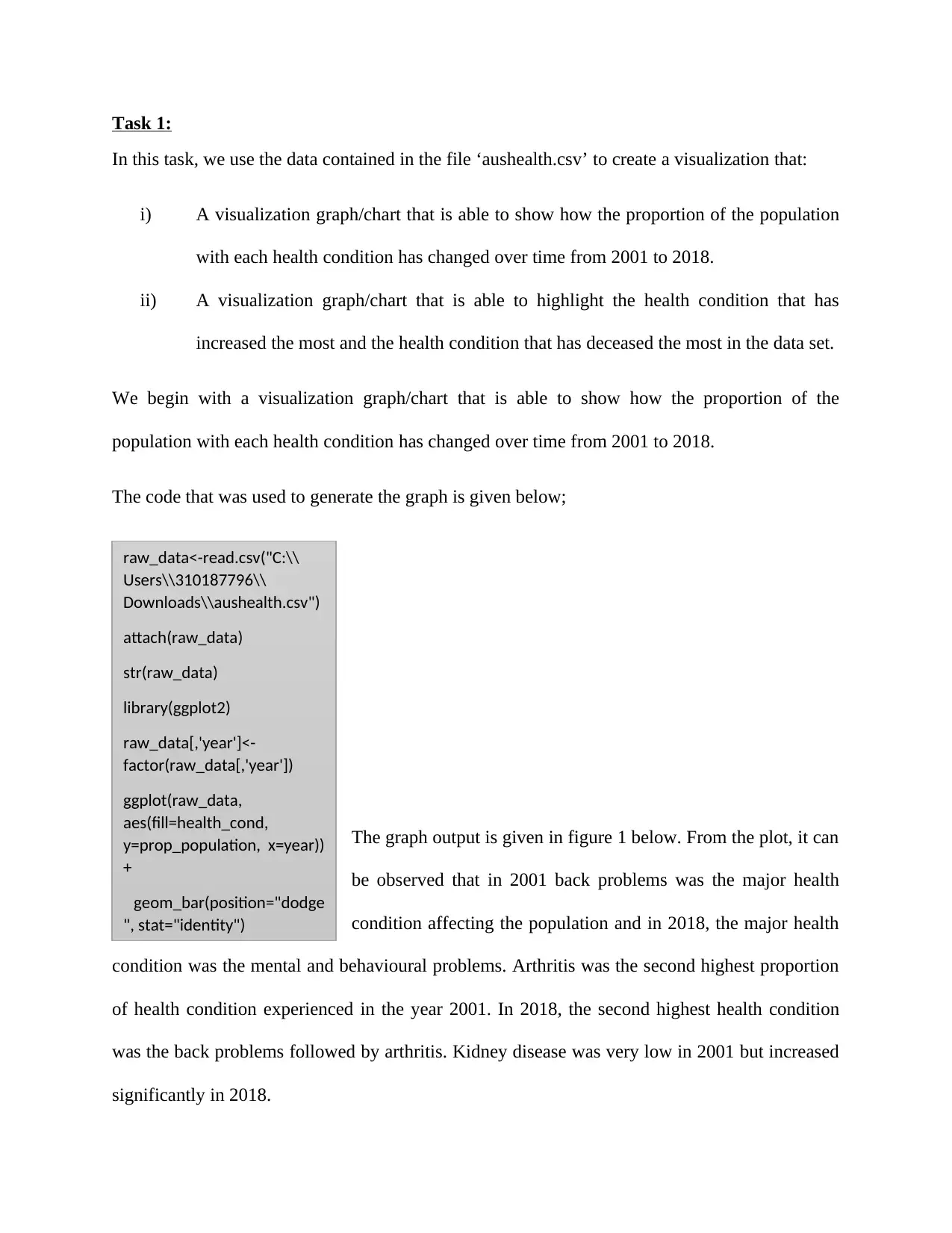
The graph output is given in figure 1 below. From the plot, it can
be observed that in 2001 back problems was the major health
condition affecting the population and in 2018, the major health
condition was the mental and behavioural problems. Arthritis was the second highest proportion
of health condition experienced in the year 2001. In 2018, the second highest health condition
was the back problems followed by arthritis. Kidney disease was very low in 2001 but increased
significantly in 2018.
raw_data<-read.csv("C:\\
Users\\310187796\\
Downloads\\aushealth.csv")
attach(raw_data)
str(raw_data)
library(ggplot2)
raw_data[,'year']<-
factor(raw_data[,'year'])
ggplot(raw_data,
aes(fill=health_cond,
y=prop_population, x=year))
+
geom_bar(position="dodge
", stat="identity")
In this task, we use the data contained in the file ‘aushealth.csv’ to create a visualization that:
i) A visualization graph/chart that is able to show how the proportion of the population
with each health condition has changed over time from 2001 to 2018.
ii) A visualization graph/chart that is able to highlight the health condition that has
increased the most and the health condition that has deceased the most in the data set.
We begin with a visualization graph/chart that is able to show how the proportion of the
population with each health condition has changed over time from 2001 to 2018.
The code that was used to generate the graph is given below;
The graph output is given in figure 1 below. From the plot, it can
be observed that in 2001 back problems was the major health
condition affecting the population and in 2018, the major health
condition was the mental and behavioural problems. Arthritis was the second highest proportion
of health condition experienced in the year 2001. In 2018, the second highest health condition
was the back problems followed by arthritis. Kidney disease was very low in 2001 but increased
significantly in 2018.
raw_data<-read.csv("C:\\
Users\\310187796\\
Downloads\\aushealth.csv")
attach(raw_data)
str(raw_data)
library(ggplot2)
raw_data[,'year']<-
factor(raw_data[,'year'])
ggplot(raw_data,
aes(fill=health_cond,
y=prop_population, x=year))
+
geom_bar(position="dodge
", stat="identity")
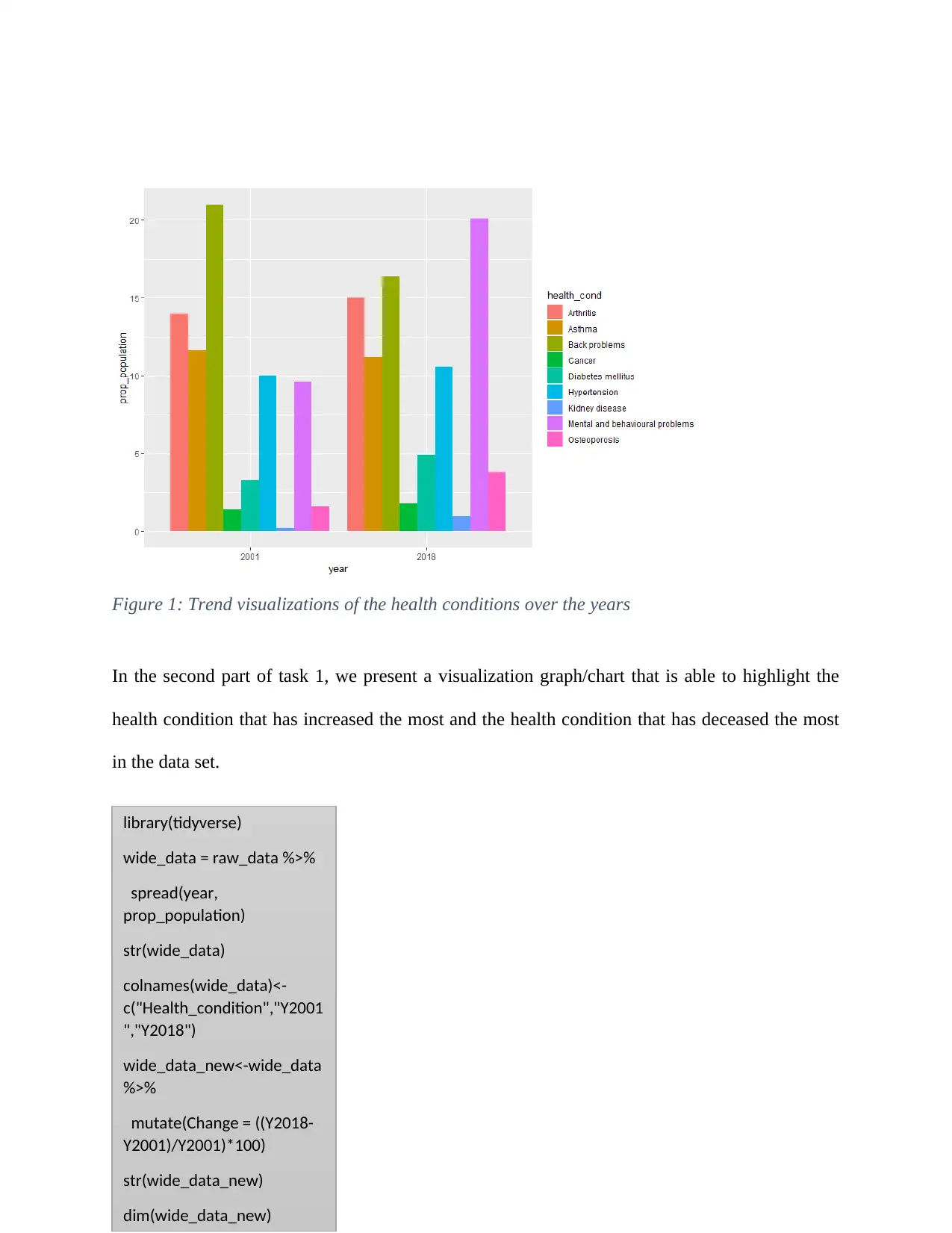
Figure 1: Trend visualizations of the health conditions over the years
In the second part of task 1, we present a visualization graph/chart that is able to highlight the
health condition that has increased the most and the health condition that has deceased the most
in the data set.
library(tidyverse)
wide_data = raw_data %>%
spread(year,
prop_population)
str(wide_data)
colnames(wide_data)<-
c("Health_condition","Y2001
","Y2018")
wide_data_new<-wide_data
%>%
mutate(Change = ((Y2018-
Y2001)/Y2001)*100)
str(wide_data_new)
dim(wide_data_new)
⊘ This is a preview!⊘
Do you want full access?
Subscribe today to unlock all pages.
Trusted by 1+ million students worldwide
Figure 2: Visualizations on the disease changes from 2001 and 2018
From the above plot (figure 2), it can be seen that back problems is the health condition that has
decreased the most and kidney disease is the health condition that has increased the most in the
data set.
Task 2:
In this task, we use the data contained in the file ‘bigstocks.csv’ to create a visualization that:
i) A visualization graph/chart that is able to compare the shares performance of the big
four companies (Apple, Amazon, Google, and Facebook) over time based the closing
price.
ii) A visualization graph/chart that is able to show the distribution of share volume
traded between 2013 and 2015 for the big four companies that highlights which
company has the highest median value.
Paraphrase This Document
Need a fresh take? Get an instant paraphrase of this document with our AI Paraphraser
We begin with a visualization graph/chart that is able to compare the shares performance of
the big four companies (Apple, Amazon, Google, and Facebook) over time based the closing
price.
The code that was used to generate the graph is given below;
stock_data<-read.csv("C:\\Users\\310187796\\Downloads\\bigstocks.csv")
str(stock_data)
dim(stock_data)
library(tidyr)
library(reshape2)
library(manipulate)
library(lubridate)
library(scales)
stock_data_wide<-reshape(stock_data, v.names="close_price", timevar="company",
idvar=c("date"),
direction="wide")
stock_data_wide<-stock_data_wide %>%
rename(Date=date, Apple=close_price.Apple,Google=close_price.Google,
Microsoft=close_price.Microsoft, Facebook=close_price.Facebook,
Amazon=close_price.Amazon, Alibaba=close_price.Alibaba,
Intel=close_price.Intel, SAP=close_price.SAP)
big4stock <- c("Date", "Apple", "Amazon", "Google", "Facebook")
big4stocks_data <- stock_data_wide[big4stock]
str(big4stocks_data)
big4stocks_data$APPL_ret <- c(-diff(big4stocks_data$Apple)/big4stocks_data$Apple[-1] * 100,
NA)
big4stocks_data$AMAZ_ret <- c(-diff(big4stocks_data$Amazon)/big4stocks_data$Amazon[-1] *
100, NA)
big4stocks_data$GOOG_ret <- c(-diff(big4stocks_data$Google)/big4stocks_data$Google[-1] *
100, NA)
big4stocks_data$FAC_ret <- c(-diff(big4stocks_data$Facebook)/big4stocks_data$Facebook[-1] *
100, NA)
tail(big4stocks_data)
big4stocks_data_new <- melt(big4stocks_data, "Date", variable.name = "Stock", value.name =
"Returns")
big4stocks_data_new <- big4stocks_data_new[which(big4stocks_data_new$Stock=='APPL_ret'|
big4stocks_data_new$Stock=='AMAZ_ret'|
big4stocks_data_new$Stock=='GOOG_ret'|big4stocks_data_new$Stock=='FAC_ret'), ]
big4stocks_data_new$Date = as.Date(big4stocks_data_new$Date, format = "%d/%m/%Y")
ggplot(big4stocks_data_new, aes(x = Date, y = Returns)) +
geom_line(aes(color = Stock), size = 1)
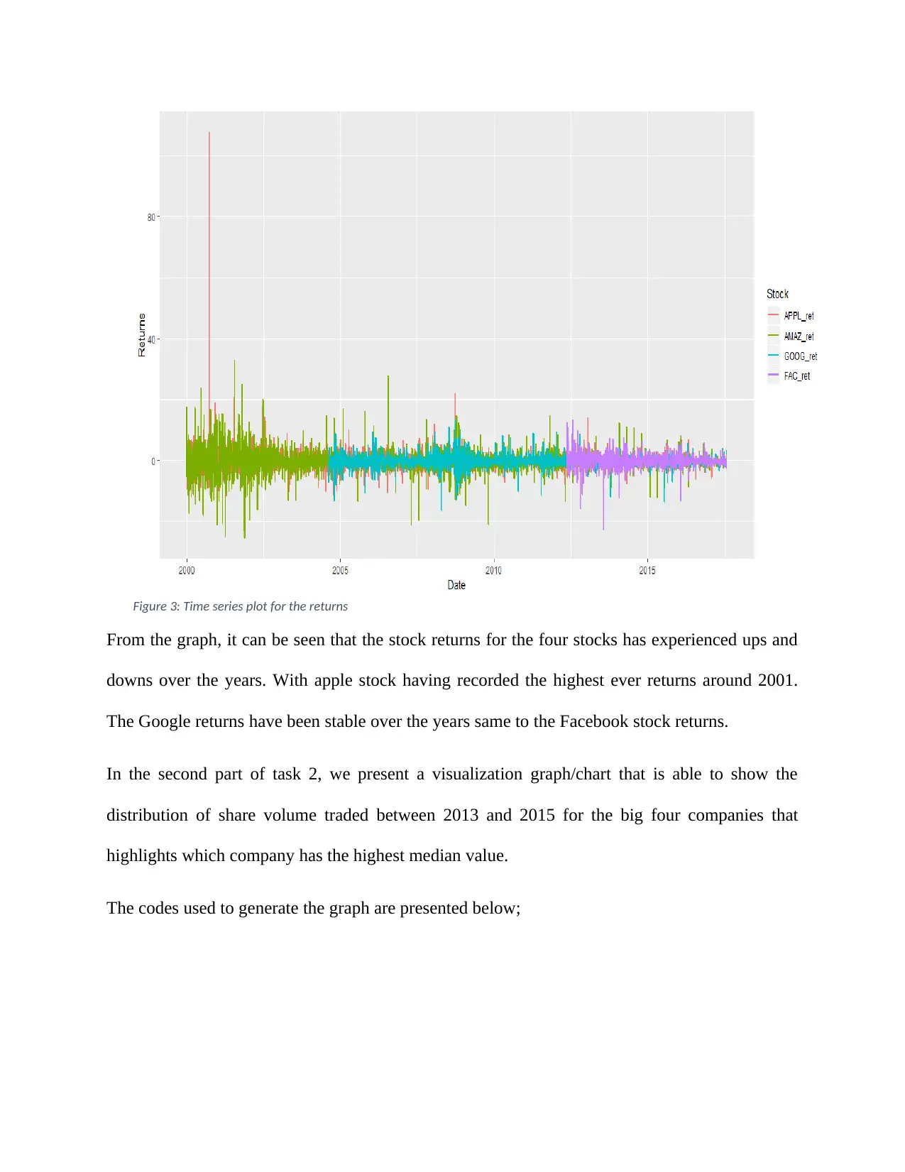
Figure 3: Time series plot for the returns
From the graph, it can be seen that the stock returns for the four stocks has experienced ups and
downs over the years. With apple stock having recorded the highest ever returns around 2001.
The Google returns have been stable over the years same to the Facebook stock returns.
In the second part of task 2, we present a visualization graph/chart that is able to show the
distribution of share volume traded between 2013 and 2015 for the big four companies that
highlights which company has the highest median value.
The codes used to generate the graph are presented below;
⊘ This is a preview!⊘
Do you want full access?
Subscribe today to unlock all pages.
Trusted by 1+ million students worldwide
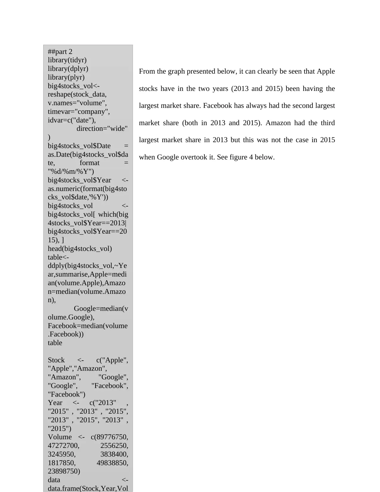
From the graph presented below, it can clearly be seen that Apple
stocks have in the two years (2013 and 2015) been having the
largest market share. Facebook has always had the second largest
market share (both in 2013 and 2015). Amazon had the third
largest market share in 2013 but this was not the case in 2015
when Google overtook it. See figure 4 below.
##part 2
library(tidyr)
library(dplyr)
library(plyr)
big4stocks_vol<-
reshape(stock_data,
v.names="volume",
timevar="company",
idvar=c("date"),
direction="wide"
)
big4stocks_vol$Date =
as.Date(big4stocks_vol$da
te, format =
"%d/%m/%Y")
big4stocks_vol$Year <-
as.numeric(format(big4sto
cks_vol$date,'%Y'))
big4stocks_vol <-
big4stocks_vol[ which(big
4stocks_vol$Year==2013|
big4stocks_vol$Year==20
15), ]
head(big4stocks_vol)
table<-
ddply(big4stocks_vol,~Ye
ar,summarise,Apple=medi
an(volume.Apple),Amazo
n=median(volume.Amazo
n),
Google=median(v
olume.Google),
Facebook=median(volume
.Facebook))
table
Stock <- c("Apple",
"Apple","Amazon",
"Amazon", "Google",
"Google", "Facebook",
"Facebook")
Year <- c("2013" ,
"2015" , "2013" , "2015",
"2013" , "2015", "2013" ,
"2015")
Volume <- c(89776750,
47272700, 2556250,
3245950, 3838400,
1817850, 49838850,
23898750)
data <-
data.frame(Stock,Year,Vol
Paraphrase This Document
Need a fresh take? Get an instant paraphrase of this document with our AI Paraphraser
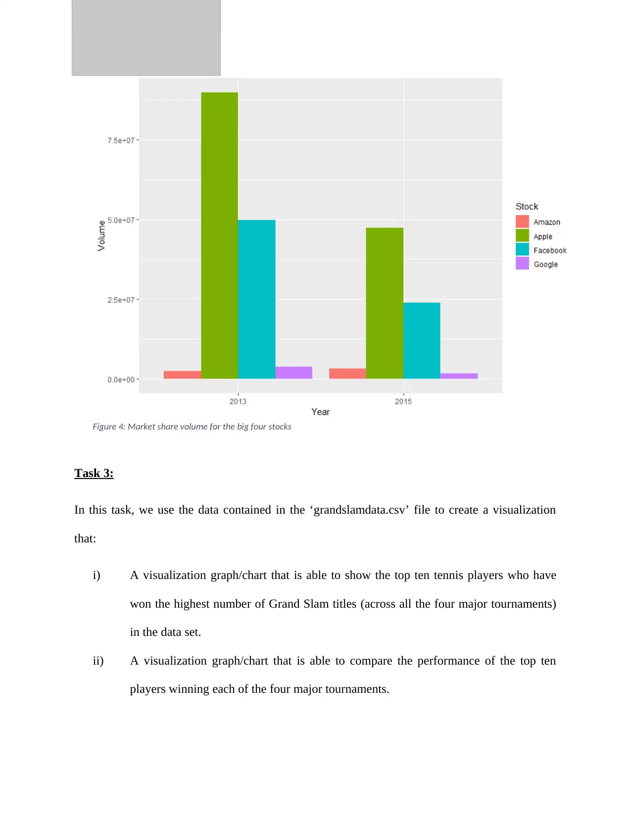
Figure 4: Market share volume for the big four stocks
Task 3:
In this task, we use the data contained in the ‘grandslamdata.csv’ file to create a visualization
that:
i) A visualization graph/chart that is able to show the top ten tennis players who have
won the highest number of Grand Slam titles (across all the four major tournaments)
in the data set.
ii) A visualization graph/chart that is able to compare the performance of the top ten
players winning each of the four major tournaments.
We begin with a visualization graph/chart that is able to show the top ten tennis players who
have won the highest number of Grand Slam titles (across all the four major tournaments) in the
data set.
The code that was used to generate the graph is given below;
From the figure below (figure 5), Roger Federer was found to be
the leading tennis player with about 19 wins. He is closely
followed by Rafael Nadal with a total of 16 wins and Pete
Sampras with a total of 14 wins. Closing the top 10 list of
winners is Fred Perry who has been able to accumulate a total of
8 wins.
grandslamdata<-
read.csv("C:\\Users\\
310187796\\Downloads\\
grandslamdata.csv")
str(grandslamdata)
attach(grandslamdata)
library("viridis")
library(tidyverse)
grandslamdata %>%
group_by(winner) %>%
summarise(n()) %>%
top_n(10)
mytable <- table(winner,
tournament)
mytable
Wins <-
c(19,16,14,12,12,11,11,10,
8,8)
Names <- c("Roger
Federer", "Rafael
Nadal", "Pete
Sampras", "Novak
Djokovic",
"Roy Emerson",
"Bjorn Borg",
"Rod Laver",
"William T.
Tilden", "Andre
Agassi",
"Fred Perry")
# Plot the bar chart
barplot(Wins,names.arg=
Names, main="Best
Tennis players",
ylab="Number of
wins",col =
viridis(10),las=2)
⊘ This is a preview!⊘
Do you want full access?
Subscribe today to unlock all pages.
Trusted by 1+ million students worldwide
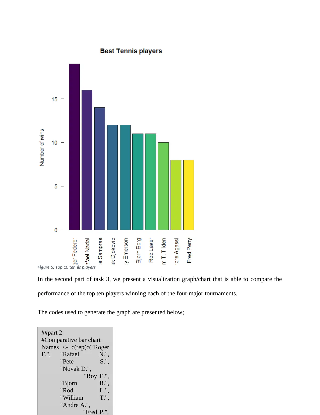
Figure 5: Top 10 tennis players
In the second part of task 3, we present a visualization graph/chart that is able to compare the
performance of the top ten players winning each of the four major tournaments.
The codes used to generate the graph are presented below;
##part 2
#Comparative bar chart
Names <- c(rep(c("Roger
F.", "Rafael N.",
"Pete S.",
"Novak D.",
"Roy E.",
"Bjorn B.",
"Rod L.",
"William T.",
"Andre A.",
"Fred P.",
Paraphrase This Document
Need a fresh take? Get an instant paraphrase of this document with our AI Paraphraser
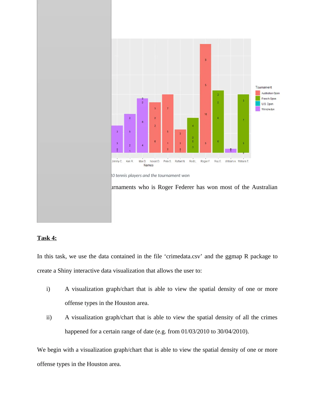
Figure 6: Comparative bar chart of top 10 tennis players and the tournament won
The overall winner of the tournaments who is Roger Federer has won most of the Australian
Open tournament.
Task 4:
In this task, we use the data contained in the file ‘crimedata.csv’ and the ggmap R package to
create a Shiny interactive data visualization that allows the user to:
i) A visualization graph/chart that is able to view the spatial density of one or more
offense types in the Houston area.
ii) A visualization graph/chart that is able to view the spatial density of all the crimes
happened for a certain range of date (e.g. from 01/03/2010 to 30/04/2010).
We begin with a visualization graph/chart that is able to view the spatial density of one or more
offense types in the Houston area.
The code that was used to generate the graph is given below;
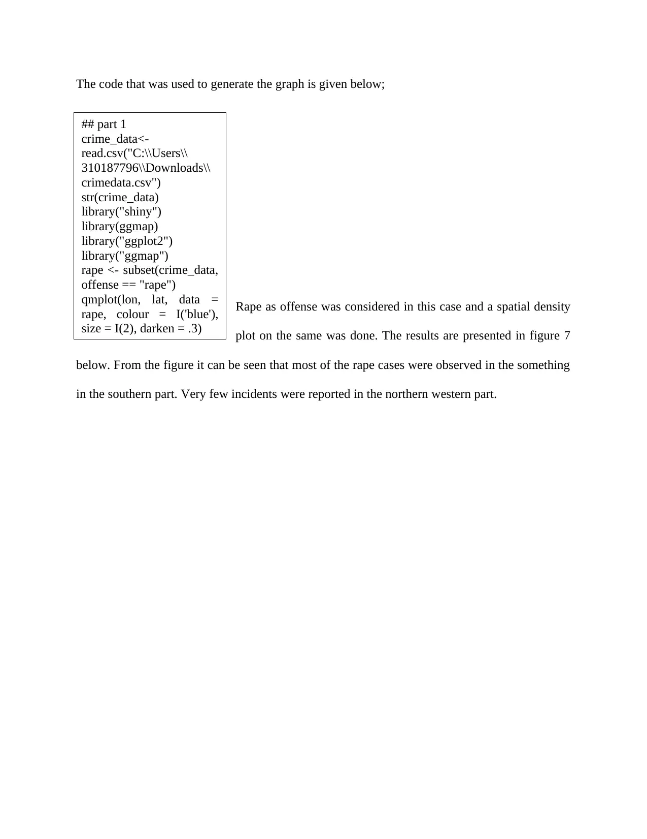
Rape as offense was considered in this case and a spatial density
plot on the same was done. The results are presented in figure 7
below. From the figure it can be seen that most of the rape cases were observed in the something
in the southern part. Very few incidents were reported in the northern western part.
## part 1
crime_data<-
read.csv("C:\\Users\\
310187796\\Downloads\\
crimedata.csv")
str(crime_data)
library("shiny")
library(ggmap)
library("ggplot2")
library("ggmap")
rape <- subset(crime_data,
offense == "rape")
qmplot(lon, lat, data =
rape, colour = I('blue'),
size = I(2), darken = .3)
⊘ This is a preview!⊘
Do you want full access?
Subscribe today to unlock all pages.
Trusted by 1+ million students worldwide
1 out of 17

Your All-in-One AI-Powered Toolkit for Academic Success.
+13062052269
info@desklib.com
Available 24*7 on WhatsApp / Email
![[object Object]](/_next/static/media/star-bottom.7253800d.svg)
Unlock your academic potential
Copyright © 2020–2026 A2Z Services. All Rights Reserved. Developed and managed by ZUCOL.