Statistics Report: Statistical Analysis of Business Data
VerifiedAdded on 2020/09/17
|20
|3514
|85
Report
AI Summary
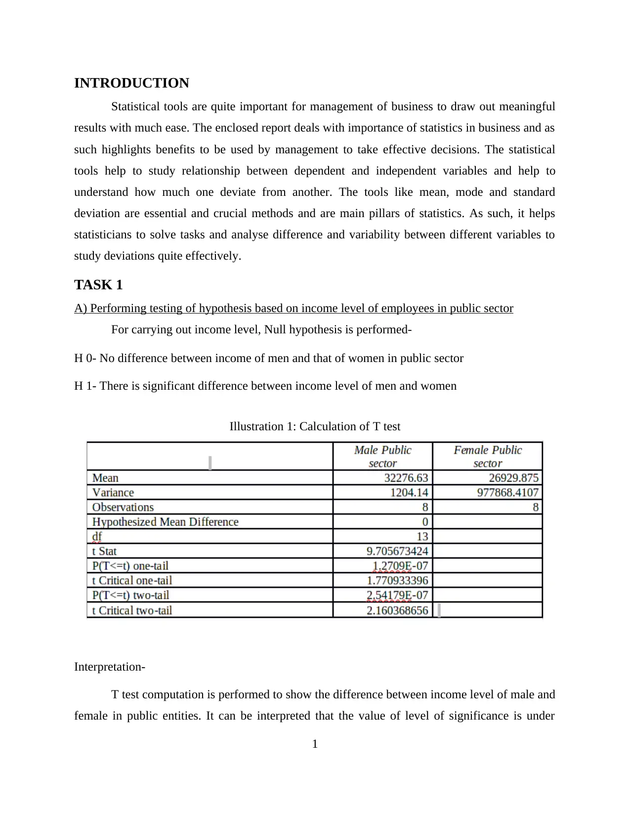
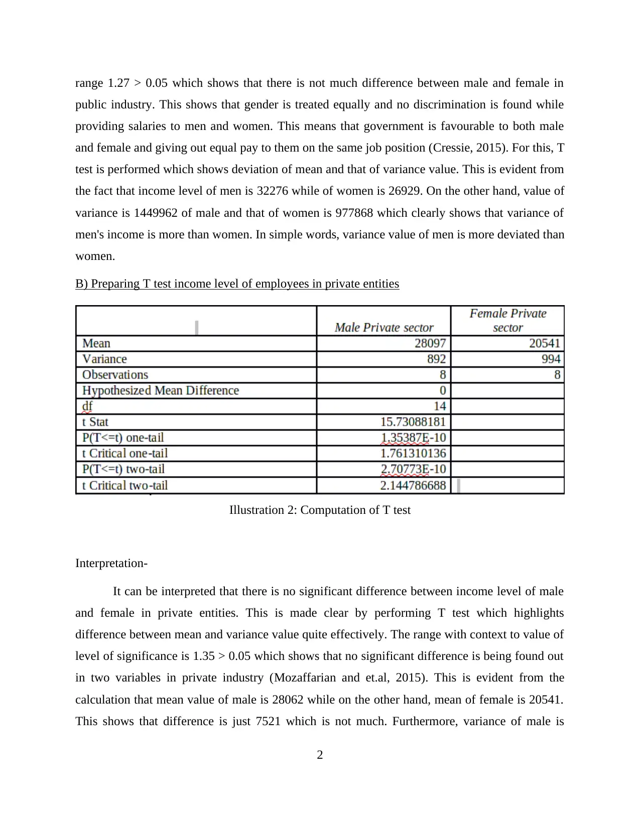
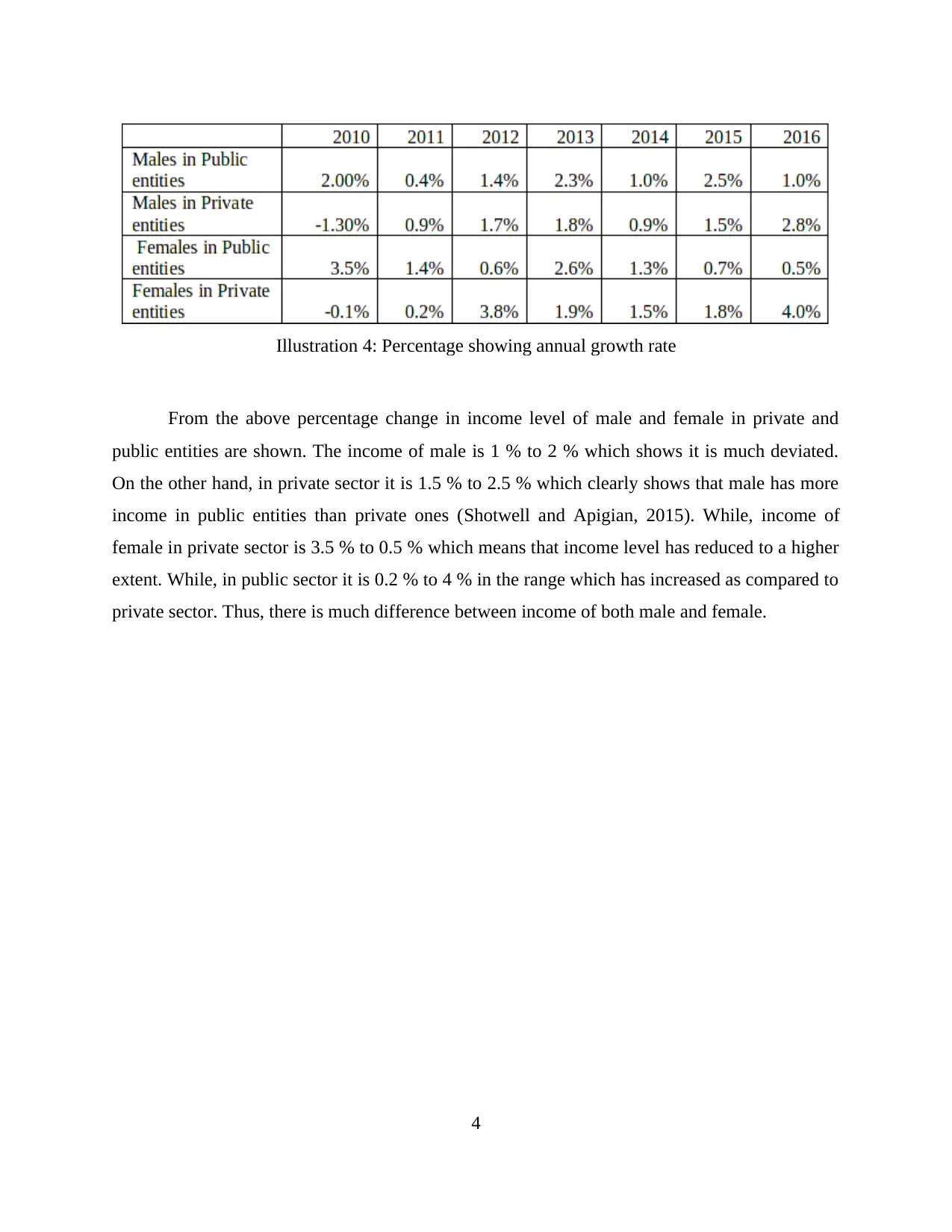
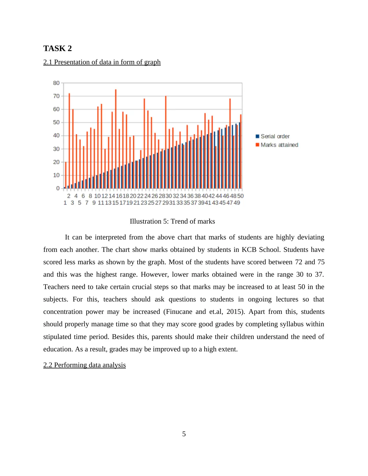
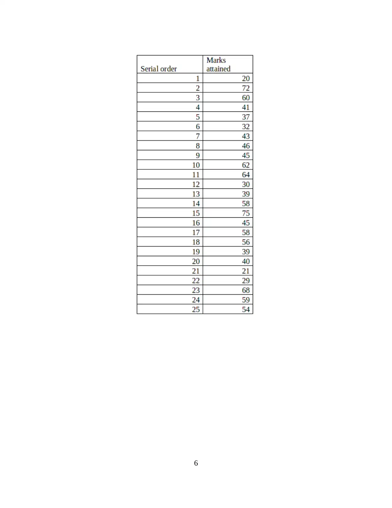
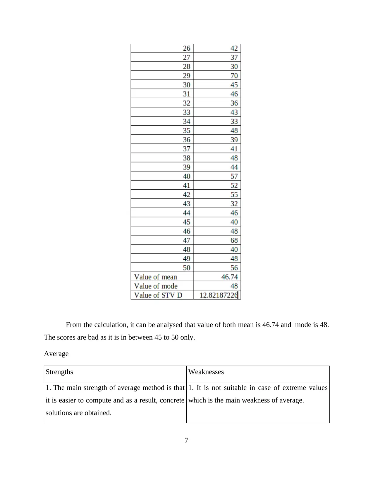
This report presents a comprehensive statistical analysis of various business scenarios. It begins with an introduction to statistical tools and their importance in business decision-making, focusing on concepts like mean, mode, and standard deviation. Task 1 involves hypothesis testing of income levels in public and private sectors using T-tests, followed by the creation of an earnings-time chart and calculation of annual growth rates. Task 2 focuses on data presentation through graphs and analysis of student marks, defining measures of dispersion and interpreting mean, mode, and standard deviation. Section B includes a line chart analysis. Task 3 covers the presentation of deliveries and the application of the Economic Order Quantity (EOQ) formula. Finally, Task 4 analyzes data with charts, exploring the relationship between prices and bedrooms in various localities. The report concludes with a summary of findings and references.
Contribute Materials
Your contribution can guide someone’s learning journey. Share your
documents today.

Statistics
Secure Best Marks with AI Grader
Need help grading? Try our AI Grader for instant feedback on your assignments.

TABLE OF CONTENTS
INTRODUCTION...........................................................................................................................1
TASK 1............................................................................................................................................1
A) Performing testing of hypothesis based on income level of employees in public sector..1
B) Preparing T test income level of employees in private entities.........................................2
C) Preparing Earnings–Time chart.........................................................................................3
D) Producing Annual growth rate..........................................................................................4
TASK 2............................................................................................................................................5
2.1 Presentation of data in form of graph...............................................................................5
2.2 Performing data analysis..................................................................................................5
B) Defining measures of dispersion.......................................................................................8
2.3 Preparing report and interpretation of mean, mode and standard deviation.....................8
SECTION B.....................................................................................................................................9
2.4 Producing Line chart........................................................................................................9
TASK 3..........................................................................................................................................11
A) Presenting deliveries made in concern period.................................................................11
B) Producing number of deliveries made in several rounds.................................................11
C) Presenting EOQ using formula........................................................................................11
TASK 4..........................................................................................................................................13
4.1 Analysis of data with help of charts...............................................................................13
4.2 Relationship between prices and bedrooms in varied localities.....................................16
CONCLUSION..............................................................................................................................17
REFERENCES..............................................................................................................................17

INTRODUCTION
Statistical tools are quite important for management of business to draw out meaningful
results with much ease. The enclosed report deals with importance of statistics in business and as
such highlights benefits to be used by management to take effective decisions. The statistical
tools help to study relationship between dependent and independent variables and help to
understand how much one deviate from another. The tools like mean, mode and standard
deviation are essential and crucial methods and are main pillars of statistics. As such, it helps
statisticians to solve tasks and analyse difference and variability between different variables to
study deviations quite effectively.
TASK 1
A) Performing testing of hypothesis based on income level of employees in public sector
For carrying out income level, Null hypothesis is performed-
H 0- No difference between income of men and that of women in public sector
H 1- There is significant difference between income level of men and women
Interpretation-
T test computation is performed to show the difference between income level of male and
female in public entities. It can be interpreted that the value of level of significance is under
1
Illustration 1: Calculation of T test

range 1.27 > 0.05 which shows that there is not much difference between male and female in
public industry. This shows that gender is treated equally and no discrimination is found while
providing salaries to men and women. This means that government is favourable to both male
and female and giving out equal pay to them on the same job position (Cressie, 2015). For this, T
test is performed which shows deviation of mean and that of variance value. This is evident from
the fact that income level of men is 32276 while of women is 26929. On the other hand, value of
variance is 1449962 of male and that of women is 977868 which clearly shows that variance of
men's income is more than women. In simple words, variance value of men is more deviated than
women.
B) Preparing T test income level of employees in private entities
Interpretation-
It can be interpreted that there is no significant difference between income level of male
and female in private entities. This is made clear by performing T test which highlights
difference between mean and variance value quite effectively. The range with context to value of
level of significance is 1.35 > 0.05 which shows that no significant difference is being found out
in two variables in private industry (Mozaffarian and et.al, 2015). This is evident from the
calculation that mean value of male is 28062 while on the other hand, mean of female is 20541.
This shows that difference is just 7521 which is not much. Furthermore, variance of male is
2
Illustration 2: Computation of T test
Secure Best Marks with AI Grader
Need help grading? Try our AI Grader for instant feedback on your assignments.

840242 while of variance of female is 988729. There is a little difference observed between
mean and variance value. This means that no gender discrimination or inequality is being found
and income level of male and female is equal.
C) Preparing Earnings–Time chart
Illustration 3: Earnings-Time chart
The difference between income level of male and female is shown with the help of
preparation of Earnings-Time chart. It can be seen in the chart above that income level of men is
increasing from year to year. As income level of male in 2009 was 30638 and at the end of 2016,
it has come to 34011. While, private sector has also observed certain increasing trends. As
income was 27632 in 2009 and in 2016 financial year, it was 29679. On the other hand, income
level of female is on upward track (Kosambi, 2016). As in private sector the income of women,
in 2009 was 19551 and in 2016 was around 22251. Now coming to public sector, income in 2009
was 25224 and that in 2016, it was 28053.
D) Producing Annual growth rate
3

From the above percentage change in income level of male and female in private and
public entities are shown. The income of male is 1 % to 2 % which shows it is much deviated.
On the other hand, in private sector it is 1.5 % to 2.5 % which clearly shows that male has more
income in public entities than private ones (Shotwell and Apigian, 2015). While, income of
female in private sector is 3.5 % to 0.5 % which means that income level has reduced to a higher
extent. While, in public sector it is 0.2 % to 4 % in the range which has increased as compared to
private sector. Thus, there is much difference between income of both male and female.
4
Illustration 4: Percentage showing annual growth rate

TASK 2
2.1 Presentation of data in form of graph
Illustration 5: Trend of marks
It can be interpreted from the above chart that marks of students are highly deviating
from each another. The chart show marks obtained by students in KCB School. Students have
scored less marks as shown by the graph. Most of the students have scored between 72 and 75
and this was the highest range. However, lower marks obtained were in the range 30 to 37.
Teachers need to take certain crucial steps so that marks may be increased to at least 50 in the
subjects. For this, teachers should ask questions to students in ongoing lectures so that
concentration power may be increased (Finucane and et.al, 2015). Apart from this, students
should properly manage time so that they may score good grades by completing syllabus within
stipulated time period. Besides this, parents should make their children understand the need of
education. As a result, grades may be improved up to a high extent.
2.2 Performing data analysis
5
Paraphrase This Document
Need a fresh take? Get an instant paraphrase of this document with our AI Paraphraser

6

From the calculation, it can be analysed that value of both mean is 46.74 and mode is 48.
The scores are bad as it is in between 45 to 50 only.
Average
Strengths Weaknesses
1. The main strength of average method is that
it is easier to compute and as a result, concrete
solutions are obtained.
1. It is not suitable in case of extreme values
which is the main weakness of average.
7
The scores are bad as it is in between 45 to 50 only.
Average
Strengths Weaknesses
1. The main strength of average method is that
it is easier to compute and as a result, concrete
solutions are obtained.
1. It is not suitable in case of extreme values
which is the main weakness of average.
7

Mode
Strengths Weaknesses
1. Main strength of mode is that it provides
most occurred value in the data set quite
effectively.
1. Its weakness is that no specific range is
provided as to where data occurred most
frequently.
B) Defining measures of dispersion
Measures of dispersion shows how the way variable is dispersed from the central value.
In simple words, it provides the extent to which value is scattered from distribution to the
average of it. Dispersion is the main tool providing scatterness of data on and around average of
it. As such, it is much better than central tendency which does not provide variability of data. It
is highly significant tool as it provides reliability observed in the data set by providing average.
As such, it is important tool for comparison of variability of data (LESSON 4 MEASURES OF
DISPERSION, 2018). As the above calculation show that standard deviation is 12 which is
moderately deviated and is complex to predict and analyse marks of students.
2.3 Preparing report and interpretation of mean, mode and standard deviation
To
The Director of KCB Business School
Subject: Regarding students performance
Interpreting mean, mode
Hereby it can be interpreted that value of mean is 46 while of mode is 48. This implies that 46
marks have been attained by the students and most of them have scored 48.
Standard deviation
The value of standard deviation is 12 which can be interpreted that it is moderately deviated
from mean value. This is harder to predict marks of students because of such deviation.
Ways to compare subjects
For such comparison, T test proves to be highly beneficial technique to compare marks of
subjects quite effectively. Moreover, ANOVA technique can also use for making comparison
and to draw meaningful conclusions.
8
Secure Best Marks with AI Grader
Need help grading? Try our AI Grader for instant feedback on your assignments.

Ways to determine association
Correlation technique can be used for imparting relationship between two variables.
Furthermore, Chi square test can also be used for assessing association.
SECTION B
2.4 Producing Line chart
Illustration 6: Line chart
9
Correlation technique can be used for imparting relationship between two variables.
Furthermore, Chi square test can also be used for assessing association.
SECTION B
2.4 Producing Line chart
Illustration 6: Line chart
9

From the above calculations, intercept and beta value have been carried out. It can be
analysed that beta value is 2.15 and intercept value is 7.65. The beta value is representing weight
of babies in various months (Dancer, Diane, Morrison and Tarr, 2015). While, intercept value is
different from beta value. This means that weight is changed by 2.15. This clearly means that
dependent value will be 7.65, if independent value remains static. This can be seen that age of
babies is 7 months, weight is 9.155. While, age is 8 months, weight is 9.37 and when age is 9
months, weight of babies is 9.58. Thus, value of level of significance is 2.15 > 0.05 which means
that no significant difference is found between variables. Furthermore, value of multiple R is
0.97 and value of R is 0.95.
10

TASK 3
A) Presenting deliveries made in concern period
The deliveries made are 450000. It can be interpreted from the data that sales is based on
estimation and is appropriate to company. As such, calculation is based on taking same value to
generate results.
B) Producing number of deliveries made in several rounds
Interpretation-
Hereby it can be analysed that number of bottles in each of the rounds of delivery is
15000. The number of trips made in several rounds is 30. The quantity demanded on yearly basis
is 450000. So, by taking yearly demand and then dividing with number of trips, 15000 comes
which is bottles per delivery in each round.
C) Presenting EOQ using formula
The EOQ (Economic Order Quantity) is an effective model which is based on purchasing
optimum quantity of goods to be used in production process (Snyder Brey and Dillow, 2016).
This provides clarity to business about how many goods should be purchased economically and
efficiently. Thus, by using EOQ model, company can purchase adequate quantity of goods with
the least cost and this saves money quite effectively. EOQ has two components such as carrying
cost and ordering cost and as such, optimum lot size is ordered by company involving the least
11
Paraphrase This Document
Need a fresh take? Get an instant paraphrase of this document with our AI Paraphraser

cost. From the table, it can be analysed that organisation is required to purchase 6000 units in
order to effectively maintain stock. The benefits of EOQ are as follows-
1. Beneficial for business: The management of business comes to know about how much
inventory need to be purchased so that optimum lot size can be ordered to maintain inventory
level. This helps to increase revenue of the business by purchasing adequate quantity of goods
(Revelle, 2017).
2. Reduces holding cost: The optimum quantity is ordered so that holding cost of inventory is
less. Thus, EOQ is the most economical method of purchasing costs as it provides number of
units to be ordered. This model is quite useful as it provides to order large quantity of goods in
fewer orders and as such, bulk discounts are attained by company. This method is helpful for
company to order economic lot size and reducing holding costs with much ease.
3. Reduce storage cost: The cost of storing the inventory is reduced and as such, wastage is
minimised up to great extent. It helps organisation to order required quantity of goods and as a
result, it provides more revenue as storage cost of inventory in warehouse is reduced up to much
extent.
Comparing cost and economic order quantity
Interpretation-
It can be interpreted that EOQ is directly related to carrying cost per order as provided by
the table. In simple words, both have an inverse relationship between them (Fair, 2016). Inverse
relationship means that if carrying or holding cost increases, then on the other hand, economic
order decreases and if carrying cost decreases, then economic order increases. Thus, it conveys
that more of the goods should be purchased by firm so that holding cost may be reduced up to
maximum possible extent.
12

TVC (Total Variable Cost) Model calculation
Current policy
Average stock = ½ (0 + 1500) = 7500 bottles
Annual holding cost = 7500*.50 = 3750
Annual delivery cost = 30*20 = 600
= 600 + 3750 = 4350
EOQ Policy
Average stock = ½ (0 +6000) = 3000
Annual holding cost = 3000*.50 = 1500
Annual delivery cost = 75*20 = 1500
= 1500 + 1500 = 3000
The above calculation is carried out with the help of TVC. It provides two alternatives.
First alternative has 4350 and other one has 3000 value. Thus, by analysing two alternatives,
least alternative should be selected which is second one having 3000 value should be adopted by
company (Bettis and et.al, 2016). This will help it to have effective maintenance of stock and as
such, no additional costs may be incurred for holding unnecessary inventory. This will minimise
cost and will add to revenue.
TASK 4
4.1 Analysis of data with help of charts
1) Bar chart
13

Illustration 7: Number of bedrooms in several areas
2) Pie chart
Illustration 8: Church lane
14
2) Pie chart
Illustration 8: Church lane
14
Secure Best Marks with AI Grader
Need help grading? Try our AI Grader for instant feedback on your assignments.

Illustration 9: Green street
Illustration 10: Eton avenue
It can be interpreted that various houses in localities are different. This is provided by the
chart that in case of single bedrooms, Green street has 8 houses, Church lane has 6 houses and
15
Illustration 10: Eton avenue
It can be interpreted that various houses in localities are different. This is provided by the
chart that in case of single bedrooms, Green street has 8 houses, Church lane has 6 houses and
15

Eton avenue has 8 in total (Wang and Calvano, 2015). While in case of two bedrooms, Green
street has 28, Eton avenue has 20 and Church lane has 18. In case of three bedrooms, Green
street has 37, Church lane has 24 houses and Eton avenue has 32 of them. In case of four
bedrooms, Green street has 17, Church lane has 9 houses and Eton avenue has 12 of them. There
are different data on the basis of localities. In case of five bedrooms, Green street has 10 houses,
Church lane has 3 and other one has 12 houses. Thus, it can be interpreted that there are 2 and 3
number of bedrooms in varied streets or localities.
4.2 Relationship between prices and bedrooms in varied localities
16
Illustration 11: Correlation Table
Illustration 12: Number of bedrooms and varied prices

Interpretation of graph-
From the above computation, correlation table is being prepared quite effectively. The
graph shows various prices charged in various localities such as Green street, Church lane and
Eton avenue. The correlation value is 1 which means that there exist positive relationship
between prices and bedrooms (AbouZahr and et.al, 2015). This is evident from the correlation
table that when bedrooms available increases, then effect is seen on prices as well as it also
increases. In the scenario of 2 bedrooms, Green street has 600000, Church lane has 700000 and
Eton avenue has 750000 prices. While, 3 bedrooms then Green street has 700000, Church lane
has 850000 and Eton avenue has 1000000 amount. Here, it can be seen that as number of
bedrooms increases, prices of the same increases as it has positive relationship.
CONCLUSION
Hereby it can be concluded that statistical tools are of utmost important to statisticians to
draw meaningful results. Various tools such as central tendency and measures of dispersion are
quite essential techniques which need to be carried out to arrive at concrete results. Moreover,
ANOVA and Chi square test are also effective methods to understand relationship between
variables with much ease.
REFERENCES
Books and Journals
AbouZahr, C. and et.al,2015. Civil registration and vital statistics: progress in the data revolution
for counting and accountability. The Lancet. 386(10001). pp.1373-1385.
Bettis, R.A and et.al, 2016. Creating repeatable cumulative knowledge in strategic
management. Strategic Management Journal.37(2). pp.257-261.
Cressie, N., 2015. Statistics for spatial data. John Wiley & Sons.
Dancer, Diane, Kellie Morrison, and Garth Tarr, 2015. "Measuring the effects of peer learning
on students' academic achievement in first-year business statistics." Studies in Higher
Education 40, no. 10 (2015): 1808-1828.
17
Paraphrase This Document
Need a fresh take? Get an instant paraphrase of this document with our AI Paraphraser

Fair, M., 2016. Generalized record linkage system–Statistics Canada’s record linkage
software. Austrian Journal of Statistics. 33(1&2). pp.37-53.
Finucane, H. K. And et.al, 2015. Partitioning heritability by functional annotation using genome-
wide association summary statistics. Nature genetics. 47(11). p.1228.
Kosambi, D. D., 2016. Statistics in function space. In DD Kosambi (pp. 115-123). Springer, New
Delhi.
Mozaffarian, D. and et.al, 2015. Heart disease and stroke statistics—2015 update: a report from
the American Heart Association. Circulation. 131(4). pp.e29-e322.
Revelle, W. R., 2017. psych: Procedures for personality and psychological research.
Shotwell, M. and Apigian, C. H., 2015. Student performance and success factors in learning
business statistics in online vs. on-ground classes using a web-based assessment
platform. Journal of Statistics Education. 23(1).
Snyder, T. D., de Brey, C. and Dillow, S. A., 2016. Digest of Education Statistics 2014, NCES
2016-006. National Center for Education Statistics.
Wang, L. C. and Calvano, L., 2015. Is business ethics education effective? An analysis of
gender, personal ethical perspectives, and moral judgment. Journal of Business
Ethics.126(4). pp.591-602.
Online
LESSON 4 MEASURES OF DISPERSION, 2018 [Online] Available Through:
<http://sol.du.ac.in/mod/book/view.php?id=1317&chapterid=1066>
18
1 out of 20
Related Documents

Your All-in-One AI-Powered Toolkit for Academic Success.
+13062052269
info@desklib.com
Available 24*7 on WhatsApp / Email
Unlock your academic potential
© 2024 | Zucol Services PVT LTD | All rights reserved.