BA (Hons) Business Management: Business Decision Making Assignment
VerifiedAdded on 2022/11/24
|9
|2159
|141
Homework Assignment
AI Summary
This Business Decision Making assignment solution covers a range of topics, including descriptive statistics of UK Netflix viewers, grouped and ungrouped data analysis, and linear interpolation to estimate the median age. It also includes a correlation matrix analysis, regression analysis to predict job separation probabilities, and a network diagram to identify the critical path and duration of a maintenance project. The assignment concludes with a reflective section, analyzing the student's learning process, strengths, challenges, and areas for improvement. The solution provides detailed calculations, interpretations, and justifications for each task, offering a comprehensive understanding of the concepts and their application in a business context.

Individual coursework
Paraphrase This Document
Need a fresh take? Get an instant paraphrase of this document with our AI Paraphraser
Contents
TASK 1: To gain some insights into the typical age of UK Netflix viewers, a sample of 115 subscribers was surveyed in March
2021.Some descriptive statistics, computed to summarize the data, are presented in Table A below. NB : Some values are
missing........................................................................................................................................................................................... 3
With reference toTable1above and using a calculator and showing all your working out:........................................................3
Compare the mean and the median values and comment on the distribution of the data............................................................3
TASK 2:........................................................................................................................................................................................... 4
1. Using the frequency table above as a starting point and the tabular method for summarizing grouped data, construct two
tables in Excel............................................................................................................................................................................ 4
2. By comparing the mean and standard deviation values from task 1 and task 2 comment on which findings are more
accurate-the ungrouped or grouped statistics? Justify your answer............................................................................................5
Using linear interpolation and showing your workings clearly, calculate an estimate for the median age of viewers. Give your
answer correct to the nearest whole number..............................................................................................................................5
Lm=35 CFm-1=36 CFm=66......................................................................................................................................................6
Using Excel, construct a cumulative frequency curve, labeling your graph correctly. You need to copy the correctly labeled
graph into your Word document................................................................................................................................................6
TASK 3:........................................................................................................................................................................................... 6
Showing your method clearly, state which variable is the ‘best’ predictor. Justify the reason for your choice..........................6
Interpret the relevant correlation coefficient and the coefficient of determination in context....................................................7
State the regression equation in context and interpret the intercept and gradient.......................................................................8
TASK 4: A maintenance project consists of following activities, as outlined in the table below. Table 3 –Precedence Table........8
Construct a network diagram by going through the forward and backward passes. You may draw your network diagram in
Excel or Word. The network diagram needs to be copied into your Word file..........................................................................8
Identify the critical path and duration of the project..................................................................................................................8
Comment on the distinction between critical and non-critical activities....................................................................................8
TASK 5: This task requires reflection to provide insights into the process and quality of personal learning. Your reflection should
focus on your actions, motivations and emotions and should analyze what changes will be made to practice in light of
experiences, feedback and reflection. A good reflection will help you understand what, why and how you learn. NB: You
should not comment on the theories of reflection. You should also note evaluate teaching or the module for this exercise..........9
What do you think you did particularly well in this assignment?...............................................................................................9
What was the most challenging aspect of this course work and why was this the case?............................................................9
What would you do differently next time?.................................................................................................................................9
TASK 1: To gain some insights into the typical age of UK Netflix viewers, a sample of
115 subscribers was surveyed in March 2021.Some descriptive statistics, computed to
summarize the data, are presented in Table A below. NB : Some values are missing
With reference toTable1above and using a calculator and showing all your working out:
a) Calculate the mean and interpret what the mean suggests in the context of the scenario.
Mean = Sum/Count
Mean = 4702/115 = 40.88 = 40.8
b) Calculate the Minimum and interpret what the minimum value suggests in the context
of the scenario
Minimum = Maximum – Range Minimum = 80-65=15
c) Calculate the standard deviation and interpret what the standard deviation value
suggests in the context of the scenario
The standard deviation = √Sample Variance The Standard Deviation = √163.4
The Standard Deviation = 12.78 = 12.8
d) Calculate the coefficient of variation and interpret what the value suggests in the
context of the scenario provided.
Coefficient of Variation = Standard Deviation/Mean * 100 Coefficient of Variation = 12.8
/ 40.8 * 100 = 31.37 = 32.4%
The average age on Netflix viewers is 41 years old, and the minimum is 15 years old. The
spread between the mean and rest of the data is 12.8. The standard deviation measures how
concentrated the data are around the mean. There is a small gap and more stability between
the age of the viewers. The reliability of the viewers is 32.4% which means a very low
accuracy of the data.
Compare the mean and the median values and comment on the distribution of the data.
If Mean = 40.8 and Median 43.0; Mean ˂ Median. Which means that distribution is
negatively skewed. A negative skewness means a distribution of the data is heavy towards
the higher values. Mean is smaller than Median.
⊘ This is a preview!⊘
Do you want full access?
Subscribe today to unlock all pages.
Trusted by 1+ million students worldwide
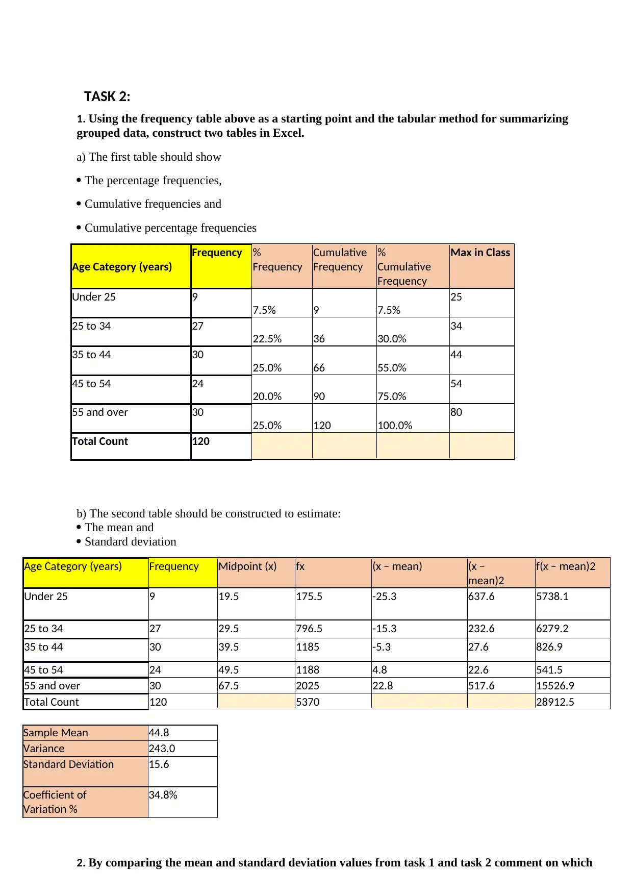
TASK 2:
1. Using the frequency table above as a starting point and the tabular method for summarizing
grouped data, construct two tables in Excel.
a) The first table should show
The percentage frequencies,
Cumulative frequencies and
Cumulative percentage frequencies
Age Category (years)
Frequency %
Frequency
Cumulative
Frequency
%
Cumulative
Frequency
Max in Class
Under 25 9
7.5% 9 7.5%
25
25 to 34 27
22.5% 36 30.0%
34
35 to 44 30
25.0% 66 55.0%
44
45 to 54 24
20.0% 90 75.0%
54
55 and over 30
25.0% 120 100.0%
80
Total Count 120
b) The second table should be constructed to estimate:
The mean and
Standard deviation
Age Category (years) Frequency Midpoint (x) fx (x − mean) (x −
mean)2
f(x − mean)2
Under 25 9 19.5 175.5 -25.3 637.6 5738.1
25 to 34 27 29.5 796.5 -15.3 232.6 6279.2
35 to 44 30 39.5 1185 -5.3 27.6 826.9
45 to 54 24 49.5 1188 4.8 22.6 541.5
55 and over 30 67.5 2025 22.8 517.6 15526.9
Total Count 120 5370 28912.5
Sample Mean 44.8
Variance 243.0
Standard Deviation 15.6
Coefficient of
Variation %
34.8%
2. By comparing the mean and standard deviation values from task 1 and task 2 comment on which
Paraphrase This Document
Need a fresh take? Get an instant paraphrase of this document with our AI Paraphraser
findings are more accurate-the ungrouped or grouped statistics? Justify your answer.
By comparing the mean and standard deviation from task 1 and 2 I could say that Grouped
data is less accurate than ungrouped. Grouped data is continuing. Practically the best way to
really see a more precise distinction is by taking attention to the coefficient of variation
which shows that grouped data less accurate even if it’s just a small difference between two
data.
Using linear interpolation and showing your workings clearly, calculate an estimate
for the median age of viewers. Give your answer correct to the nearest whole
number.
To calculate an estimate for the median age of viewers using Linear interpolation, we have to
use
( ( n+1 ) ÷ 2 ) −CF m− 1
form
ula:
Medi
an = Lm +
C
F
m
−
C
F
m
−
1
× Wm
"Netflix users by age in UK"
120.0%
100.0% 100.0%
80.0% 75.0%
60.0% 55.0%
40.0%
30.0%
20.0%
7.5%
0.0%
25 34 44
Age Category (years)
54 80
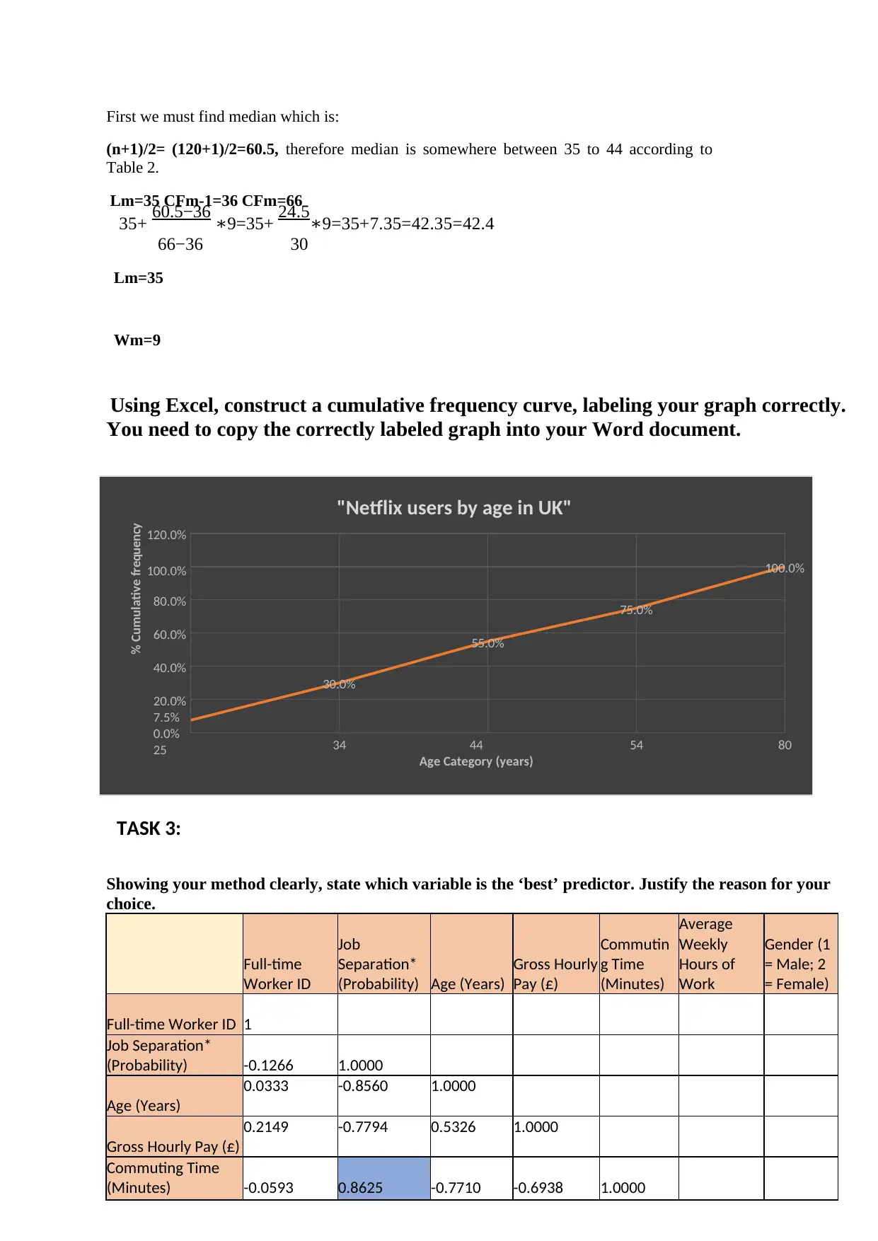
First we must find median which is:
(n+1)/2= (120+1)/2=60.5, therefore median is somewhere between 35 to 44 according to
Table 2.
Lm=35 CFm-1=36 CFm=66
35+ 60.5−36 9=35+∗ 24.5 9=35+7.35=42.35=42.4∗
66−36 30
Lm=35
Wm=9
Using Excel, construct a cumulative frequency curve, labeling your graph correctly.
You need to copy the correctly labeled graph into your Word document.
TASK 3:
Showing your method clearly, state which variable is the ‘best’ predictor. Justify the reason for your
choice.
Full-time
Worker ID
Job
Separation*
(Probability) Age (Years)
Gross Hourly
Pay (£)
Commutin
g Time
(Minutes)
Average
Weekly
Hours of
Work
Gender (1
= Male; 2
= Female)
Full-time Worker ID 1
Job Separation*
(Probability) -0.1266 1.0000
Age (Years)
0.0333 -0.8560 1.0000
Gross Hourly Pay (£)
0.2149 -0.7794 0.5326 1.0000
Commuting Time
(Minutes) -0.0593 0.8625 -0.7710 -0.6938 1.0000
% Cumulative frequency
120.0%
100.0% 100.0%
80.0% 75.0%
60.0% 55.0%
40.0%
30.0%
20.0%
7.5%
0.0%
25 34 44
Age Category (years)
54 80
First we must find median which is:
(n+1)/2= (120+1)/2=60.5, therefore median is somewhere between 35 to 44 according to
Table 2.
Lm=35 CFm-1=36 CFm=66
35+ 60.5−36 9=35+∗ 24.5 9=35+7.35=42.35=42.4∗
66−36 30
Lm=35
Wm=9
Using Excel, construct a cumulative frequency curve, labeling your graph correctly.
You need to copy the correctly labeled graph into your Word document.
TASK 3:
Showing your method clearly, state which variable is the ‘best’ predictor. Justify the reason for your
choice.
Full-time
Worker ID
Job
Separation*
(Probability) Age (Years)
Gross Hourly
Pay (£)
Commutin
g Time
(Minutes)
Average
Weekly
Hours of
Work
Gender (1
= Male; 2
= Female)
Full-time Worker ID 1
Job Separation*
(Probability) -0.1266 1.0000
Age (Years)
0.0333 -0.8560 1.0000
Gross Hourly Pay (£)
0.2149 -0.7794 0.5326 1.0000
Commuting Time
(Minutes) -0.0593 0.8625 -0.7710 -0.6938 1.0000
% Cumulative frequency
⊘ This is a preview!⊘
Do you want full access?
Subscribe today to unlock all pages.
Trusted by 1+ million students worldwide
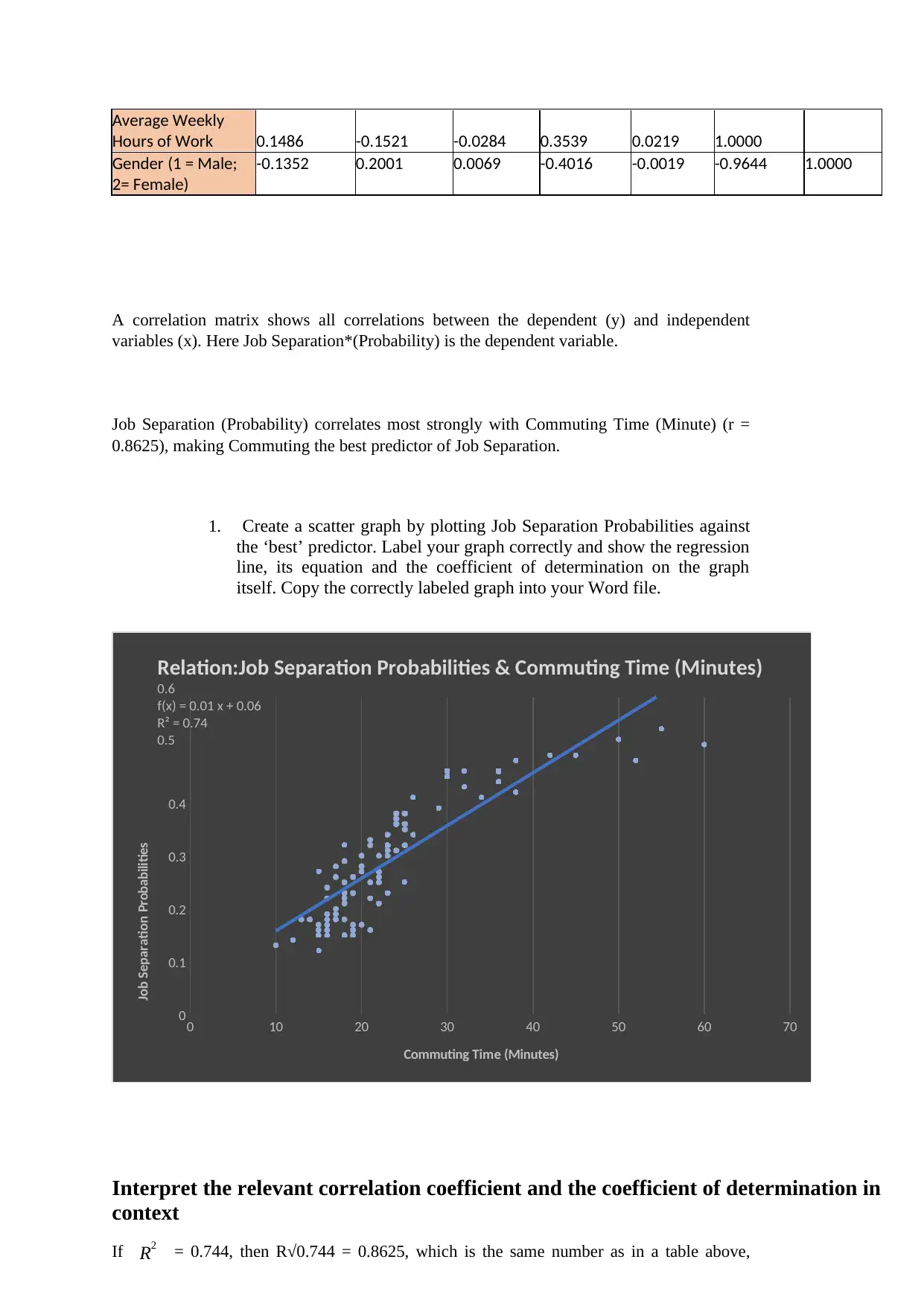
Relation:Job Separation Probabilities & Commuting Time (Minutes)
0.6
f(x) = 0.01 x + 0.06
R² = 0.74
0.5
0.4
0.3
0.2
0.1
00 10 20 30 40 50 60 70
Commuting Time (Minutes)
Average Weekly
Hours of Work 0.1486 -0.1521 -0.0284 0.3539 0.0219 1.0000
Gender (1 = Male;
2= Female)
-0.1352 0.2001 0.0069 -0.4016 -0.0019 -0.9644 1.0000
A correlation matrix shows all correlations between the dependent (y) and independent
variables (x). Here Job Separation*(Probability) is the dependent variable.
Job Separation (Probability) correlates most strongly with Commuting Time (Minute) (r =
0.8625), making Commuting the best predictor of Job Separation.
1. Create a scatter graph by plotting Job Separation Probabilities against
the ‘best’ predictor. Label your graph correctly and show the regression
line, its equation and the coefficient of determination on the graph
itself. Copy the correctly labeled graph into your Word file.
Interpret the relevant correlation coefficient and the coefficient of determination in
context
If R2 = 0.744, then R√0.744 = 0.8625, which is the same number as in a table above,
Job Separation Probabilities
Paraphrase This Document
Need a fresh take? Get an instant paraphrase of this document with our AI Paraphraser
where we found that Commuting is the best predictor of Job Separation.
State the regression equation in context and interpret the intercept and gradient
This is a positive correlation. The two variables move in the same direction. They are both
related, Commuting Time depends of Job Separation Probabilities. R=√0.744 = 0.8625
which is 86% meaning that Number of Commuting Time explaining Job Separation
Probabilities. The 14% influenced by other factors. In conclusion it is very strong correlation
between Commuting Time and Job Separation Probabilities.
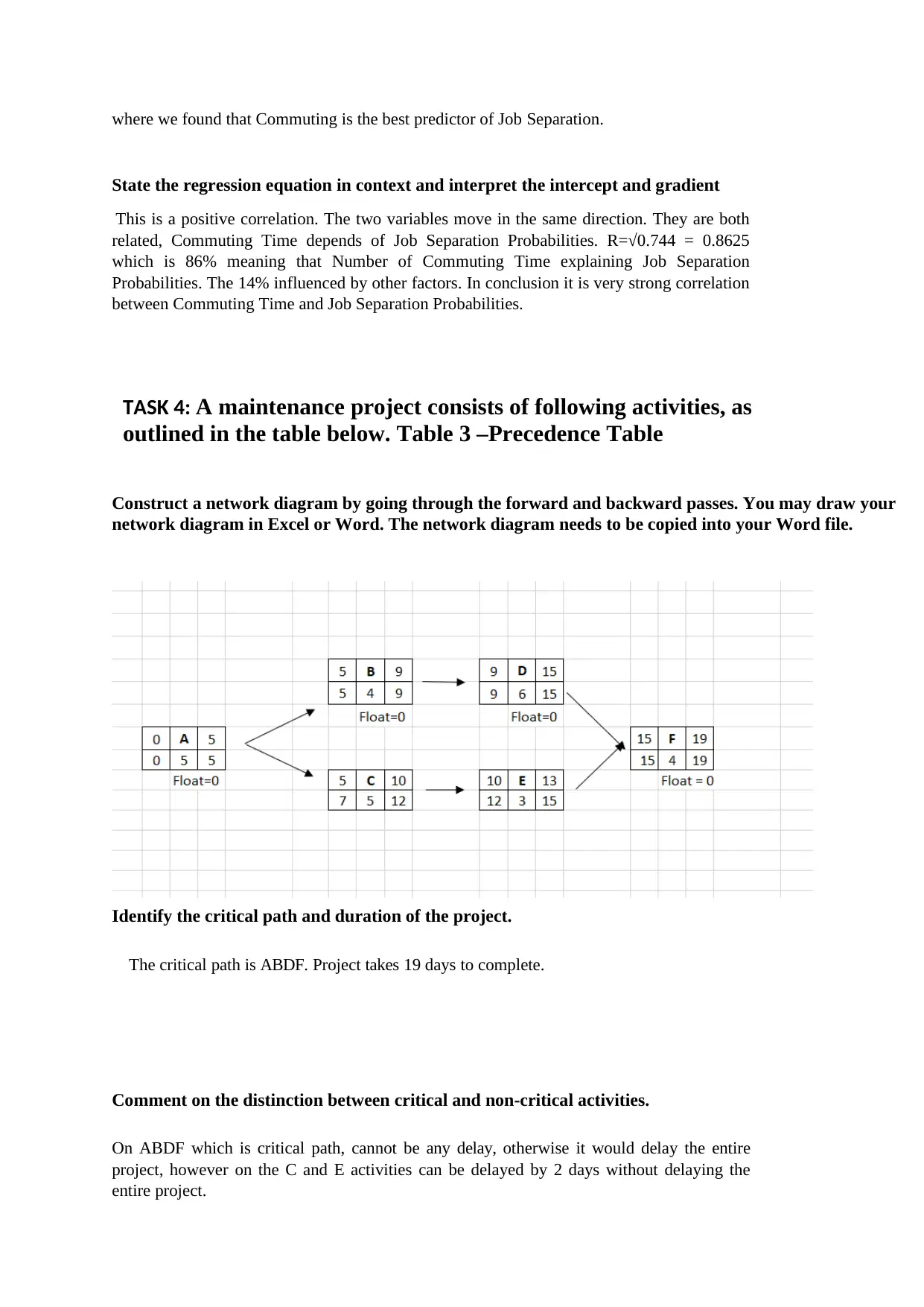
TASK 4: A maintenance project consists of following activities, as
outlined in the table below. Table 3 –Precedence Table
Construct a network diagram by going through the forward and backward passes. You may draw your
network diagram in Excel or Word. The network diagram needs to be copied into your Word file.
Identify the critical path and duration of the project.
The critical path is ABDF. Project takes 19 days to complete.
Comment on the distinction between critical and non-critical activities.
On ABDF which is critical path, cannot be any delay, otherwise it would delay the entire
project, however on the C and E activities can be delayed by 2 days without delaying the
entire project.
State the regression equation in context and interpret the intercept and gradient
This is a positive correlation. The two variables move in the same direction. They are both
related, Commuting Time depends of Job Separation Probabilities. R=√0.744 = 0.8625
which is 86% meaning that Number of Commuting Time explaining Job Separation
Probabilities. The 14% influenced by other factors. In conclusion it is very strong correlation
between Commuting Time and Job Separation Probabilities.
TASK 4: A maintenance project consists of following activities, as
outlined in the table below. Table 3 –Precedence Table
Construct a network diagram by going through the forward and backward passes. You may draw your
network diagram in Excel or Word. The network diagram needs to be copied into your Word file.
Identify the critical path and duration of the project.
The critical path is ABDF. Project takes 19 days to complete.
Comment on the distinction between critical and non-critical activities.
On ABDF which is critical path, cannot be any delay, otherwise it would delay the entire
project, however on the C and E activities can be delayed by 2 days without delaying the
entire project.

TASK 5: This task requires reflection to provide insights into the
process and quality of personal learning. Your reflection should focus
on your actions, motivations and emotions and should analyze what
changes will be made to practice in light of experiences, feedback and
reflection. A good reflection will help you understand what, why and
how you learn. NB: You should not comment on the theories of
reflection. You should also note evaluate teaching or the module for
this exercise.
What do you think you did particularly well in this assignment?
In this assignment, I did enjoy the most to do tasks that were needed to use the excel
program. To refresh my skills as also to remember the new things we were learning during
the first semester. Making a scatter graph and seeing what results I got (hopefully they are
correct) were the most exciting.
What was the most challenging aspect of this course work and why was this the case?
The most challenging aspect was to interpret the results on each task correctly. To fully
understand how to do a task is not enough for Business Decision Making course. One of the
things required is to understand how to interpret results into business language.
What would you do differently next time?
Next time, I would split assignment into every day’s agenda, so I could spend an hour every
day instead of finishing my work in 2 evenings. I would not feel stressed and overwhelmed
with the amount of work.
⊘ This is a preview!⊘
Do you want full access?
Subscribe today to unlock all pages.
Trusted by 1+ million students worldwide
1 out of 9
Related Documents


Your All-in-One AI-Powered Toolkit for Academic Success.
+13062052269
info@desklib.com
Available 24*7 on WhatsApp / Email
![[object Object]](/_next/static/media/star-bottom.7253800d.svg)
Unlock your academic potential
Copyright © 2020–2026 A2Z Services. All Rights Reserved. Developed and managed by ZUCOL.