Statistics and Research Methods for Business Decision Making Report
VerifiedAdded on 2021/02/19
|19
|3516
|305
Report
AI Summary
This report provides a comprehensive statistical analysis of CO2 emissions across various countries from 2009 to 2013, highlighting significant changes and percentage variations. It also delves into the analysis of assembly times, utilizing frequency distributions, cumulative frequencies, histograms, and ogive curves to interpret data. Furthermore, the report explores the relationship between the rate of inflation and the all ordinaries index through graphical representations, scatter plots, and numerical data, including measures of central tendency and dispersion. The study employs statistical techniques such as correlation and regression to assess the relationship between these variables, aiming to provide insights for informed business decision-making. The analysis includes both graphical and numerical data to support findings and conclusions.
Statistics and
Research Methods
for Business
Decision Making
Research Methods
for Business
Decision Making
Paraphrase This Document
Need a fresh take? Get an instant paraphrase of this document with our AI Paraphraser
Table of Contents
INTRODUCTION...........................................................................................................................1
1. CO2 EMISSION..........................................................................................................................1
(a) Graphical technique for comparing values:......................................................................1
(b) Graphical technique for comparing the percentage value................................................3
(c) Comparing a & b:..............................................................................................................4
2. ANALYSIS OF TIME OF ASSEMBLY....................................................................................4
(a) Frequency Distribution and relative frequency distribution:............................................4
(b) Cumulative frequency distribution:..................................................................................5
(d) Ogive:................................................................................................................................7
(e) When data is less than 65:.................................................................................................9
(f) When data is more than 75:...............................................................................................9
3. ESTIMATION AND TESTING SIGNIFICANCE LEVEL .....................................................9
(a) Graphical Descriptive Measure of two variables:.............................................................9
(b) Scatter plot:.....................................................................................................................10
(c) Numerical brief report of data:........................................................................................12
(d) Coefficient of correlation between the rate of inflation and all ordinaries index:..........13
(e) Simple linear regression model and the linear equation:................................................14
(f) Coefficient of Determination R2 :...................................................................................14
(g) Evaluation of significant relationship at 5% significance level:.....................................15
(h) Value of the standard error of the estimate (se):.............................................................15
CONCLUSION..............................................................................................................................15
REFERENCES..............................................................................................................................17
INTRODUCTION
Using their knowledge and experience, corporate leaders and executives used to
take difficult choices. However, they would like to understand more and more what the
figures indicate. Statistics and Research Methods used by operational experts and
analysts in age of big data offer additional definite proof to support management actions
on manufacturing, distribution, advertising, and people management. These techniques
also assist executives in projecting future company circumstances so that they can
improve their practices when required (Berman and Wang, 2016). These tools can be
used for resources, machinery, equipment, cash and time apportionment and
standardization. Projects are planned using quantitative methods and configured with
labour force and material delivery. This study covers practical implications of different
statistical techniques and application of statistical knowledge to summarize data
statistically and graphically.
1. CO2 EMISSION
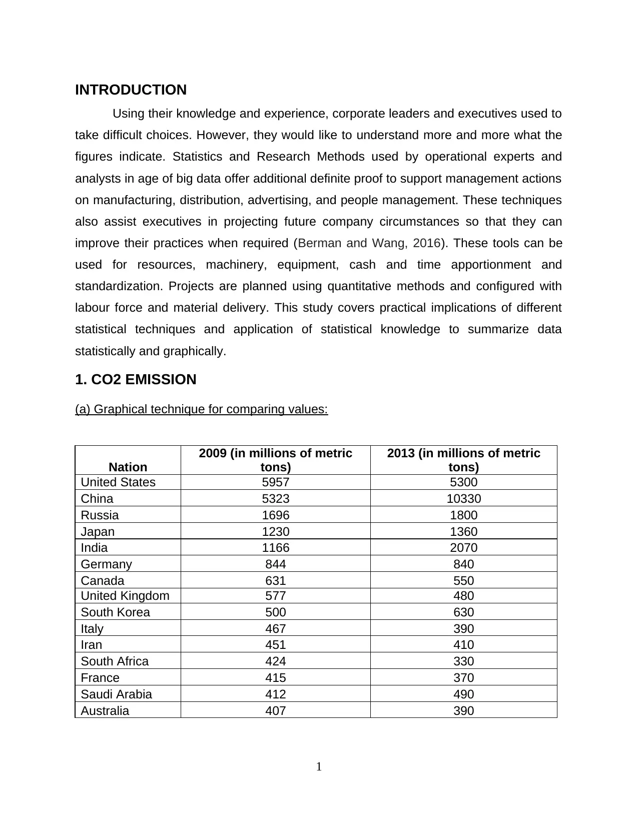
(a) Graphical technique for comparing values:
Nation
2009 (in millions of metric
tons)
2013 (in millions of metric
tons)
United States 5957 5300
China 5323 10330
Russia 1696 1800
Japan 1230 1360
India 1166 2070
Germany 844 840
Canada 631 550
United Kingdom 577 480
South Korea 500 630
Italy 467 390
Iran 451 410
South Africa 424 330
France 415 370
Saudi Arabia 412 490
Australia 407 390
1
Using their knowledge and experience, corporate leaders and executives used to
take difficult choices. However, they would like to understand more and more what the
figures indicate. Statistics and Research Methods used by operational experts and
analysts in age of big data offer additional definite proof to support management actions
on manufacturing, distribution, advertising, and people management. These techniques
also assist executives in projecting future company circumstances so that they can
improve their practices when required (Berman and Wang, 2016). These tools can be
used for resources, machinery, equipment, cash and time apportionment and
standardization. Projects are planned using quantitative methods and configured with
labour force and material delivery. This study covers practical implications of different
statistical techniques and application of statistical knowledge to summarize data
statistically and graphically.
1. CO2 EMISSION
(a) Graphical technique for comparing values:
Nation
2009 (in millions of metric
tons)
2013 (in millions of metric
tons)
United States 5957 5300
China 5323 10330
Russia 1696 1800
Japan 1230 1360
India 1166 2070
Germany 844 840
Canada 631 550
United Kingdom 577 480
South Korea 500 630
Italy 467 390
Iran 451 410
South Africa 424 330
France 415 370
Saudi Arabia 412 490
Australia 407 390
1
⊘ This is a preview!⊘
Do you want full access?
Subscribe today to unlock all pages.
Trusted by 1+ million students worldwide
Graphical representation of table of CO2 emission is showing that China has
reported maximum increase in level of emissions. In 2009, China's CO2 was in 5323
millions of metric tons which has further increased to 10330 millions of metric tons in
year 2013. South Africa has reported maximum decrease in emissions as this country's
figures of CO2 emissions are 424 in year 2009 and 330 in year 2013. Among all
countries Australia is only one country which has reduced the CO2 emission during year
2009 to 2013. Australia's CO2 emission figure was 407 millions of metric tons in year
2009 which has been reached to 390 millions of metric-tons.
2
South Africa
United Kingdom
Italy
Canada
United States
France
Iran
Australia
Germany
Russia
Japan
Saudi Arabia
South Korea
India
China
-0.4-0.200.20.40.60.811.2
-22.17%-16.81%-16.49%-12.84%-11.03%-10.84% -9.09% -4.18% -0.47% 6.13% 10.57%
18.93% 26.00%
77.53%
94.06%
% change in value
Paraphrase This Document
Need a fresh take? Get an instant paraphrase of this document with our AI Paraphraser
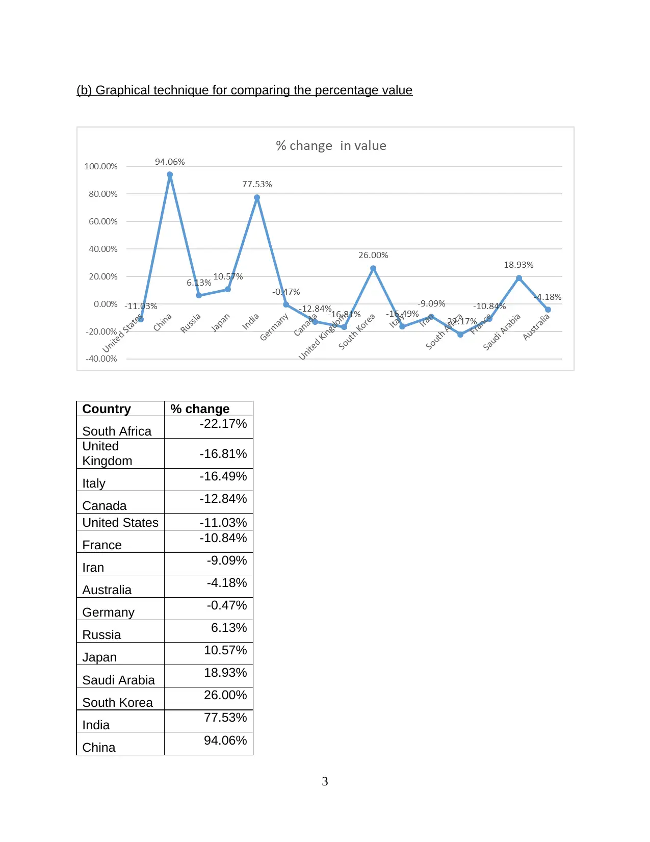
(b) Graphical technique for comparing the percentage value
Country % change
South Africa -22.17%
United
Kingdom -16.81%
Italy -16.49%
Canada -12.84%
United States -11.03%
France -10.84%
Iran -9.09%
Australia -4.18%
Germany -0.47%
Russia 6.13%
Japan 10.57%
Saudi Arabia 18.93%
South Korea 26.00%
India 77.53%
China 94.06%
3
Country % change
South Africa -22.17%
United
Kingdom -16.81%
Italy -16.49%
Canada -12.84%
United States -11.03%
France -10.84%
Iran -9.09%
Australia -4.18%
Germany -0.47%
Russia 6.13%
Japan 10.57%
Saudi Arabia 18.93%
South Korea 26.00%
India 77.53%
China 94.06%
3
This graphical presentation is based on percentage change in figures of CO2
emission. Above table figures out 15 nation's figures and fluctuation in level of CO2
emission. Nations named Australia, South Africa, United Kingdom, Italy, Canada, United
States, France, Iran, Australia and Germany has controlled their CO2 emissions figures
by implementing new rules, modifying existing policies and legislation which are
dedicated towards saving environment, minimize CO2 emission and other environment
friendly activities. Where as China, India, South Korea, Saudi Arabia, Japan and Russia
are countries which are careless about such serious matter. China and India with
largest population in world are top concretes responsible for increasing CO2 emissions
(increase of 94.06% and 77.53% respectively in china and India).
(c) Comparing a & b:
From combined comparison of figures presented in point (a) and (b) it has been
analysed that here among 15 top CO2 producer countries in 2009 and 2013, only 9
countries have successfully minimised their CO2 emissions by implementing strict rules
and policies to minimise use of vehicles producing CO2 and by increasing the habits of
cycling and use of electric vehicles (Bickel and Lehmann, 2012). In point (a) only two
year comparison of each country's figures of CO2 emissions displayed whereas in point
(b) change in values in percentage terms are presented which provides easiness in
analysis of figures.
2. ANALYSIS OF TIME OF ASSEMBLY
(a) Frequency Distribution and relative frequency distribution:
Frequency Distribution: This is a representation which help to show the
number of observation inside a specific interval either in tabular or graphical format.
This is mainly used within a statistical context that is linked with charting of normal
distribution (Dittmar and Duchin, 2015).
Classes Frequency
35 - 45 3
45 - 55 5
55 - 65 10
4
⊘ This is a preview!⊘
Do you want full access?
Subscribe today to unlock all pages.
Trusted by 1+ million students worldwide
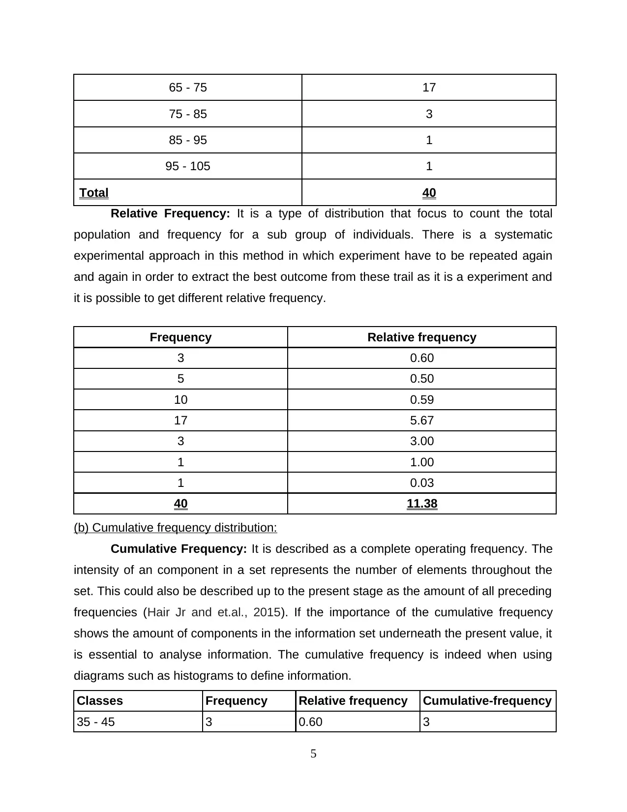
65 - 75 17
75 - 85 3
85 - 95 1
95 - 105 1
Total 40
Relative Frequency: It is a type of distribution that focus to count the total
population and frequency for a sub group of individuals. There is a systematic
experimental approach in this method in which experiment have to be repeated again
and again in order to extract the best outcome from these trail as it is a experiment and
it is possible to get different relative frequency.
Frequency Relative frequency
3 0.60
5 0.50
10 0.59
17 5.67
3 3.00
1 1.00
1 0.03
40 11.38
(b) Cumulative frequency distribution:
Cumulative Frequency: It is described as a complete operating frequency. The
intensity of an component in a set represents the number of elements throughout the
set. This could also be described up to the present stage as the amount of all preceding
frequencies (Hair Jr and et.al., 2015). If the importance of the cumulative frequency
shows the amount of components in the information set underneath the present value, it
is essential to analyse information. The cumulative frequency is indeed when using
diagrams such as histograms to define information.
Classes Frequency Relative frequency Cumulative-frequency
35 - 45 3 0.60 3
5
Paraphrase This Document
Need a fresh take? Get an instant paraphrase of this document with our AI Paraphraser
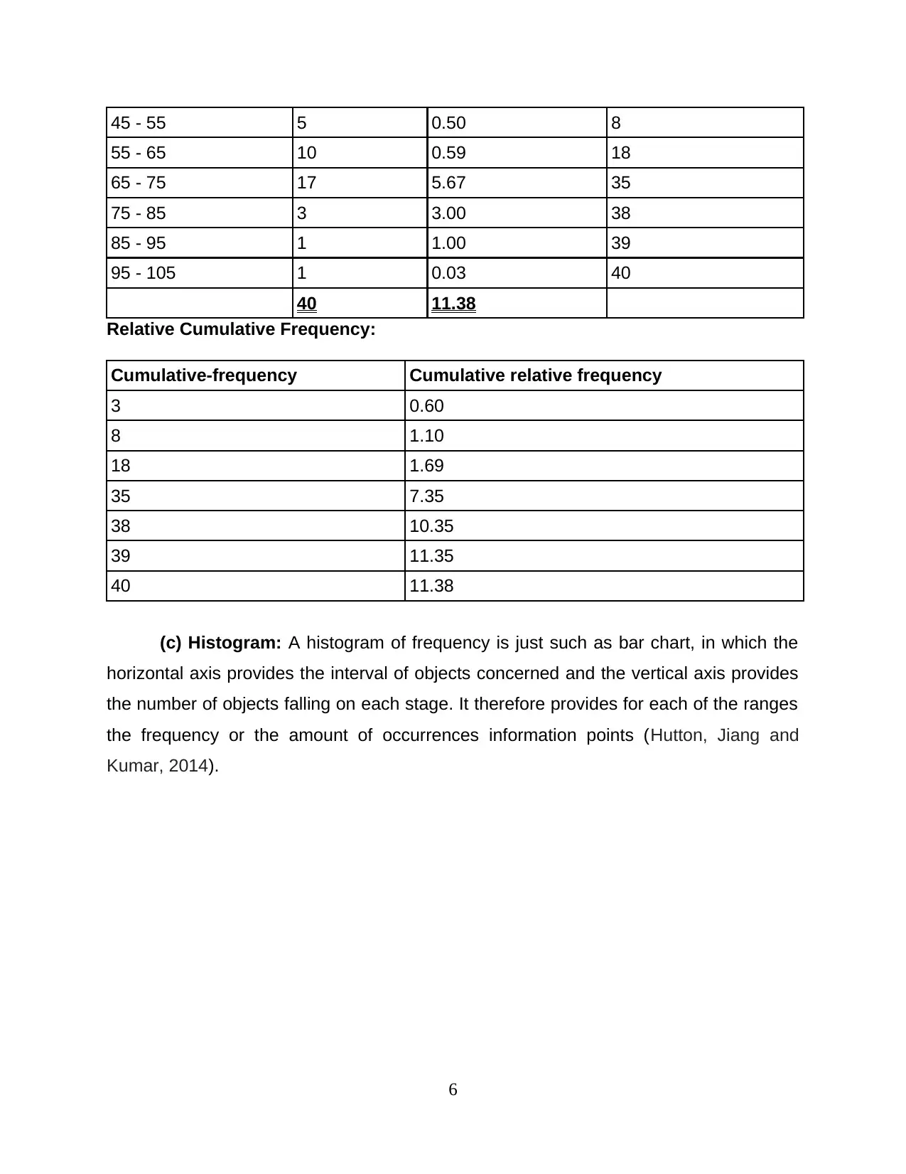
45 - 55 5 0.50 8
55 - 65 10 0.59 18
65 - 75 17 5.67 35
75 - 85 3 3.00 38
85 - 95 1 1.00 39
95 - 105 1 0.03 40
40 11.38
Relative Cumulative Frequency:
Cumulative-frequency Cumulative relative frequency
3 0.60
8 1.10
18 1.69
35 7.35
38 10.35
39 11.35
40 11.38
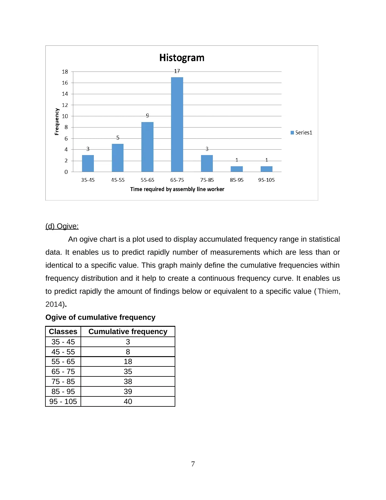
(c) Histogram: A histogram of frequency is just such as bar chart, in which the
horizontal axis provides the interval of objects concerned and the vertical axis provides
the number of objects falling on each stage. It therefore provides for each of the ranges
the frequency or the amount of occurrences information points (Hutton, Jiang and
Kumar, 2014).
6
55 - 65 10 0.59 18
65 - 75 17 5.67 35
75 - 85 3 3.00 38
85 - 95 1 1.00 39
95 - 105 1 0.03 40
40 11.38
Relative Cumulative Frequency:
Cumulative-frequency Cumulative relative frequency
3 0.60
8 1.10
18 1.69
35 7.35
38 10.35
39 11.35
40 11.38
(c) Histogram: A histogram of frequency is just such as bar chart, in which the
horizontal axis provides the interval of objects concerned and the vertical axis provides
the number of objects falling on each stage. It therefore provides for each of the ranges
the frequency or the amount of occurrences information points (Hutton, Jiang and
Kumar, 2014).
6
(d) Ogive:
An ogive chart is a plot used to display accumulated frequency range in statistical
data. It enables us to predict rapidly number of measurements which are less than or
identical to a specific value. This graph mainly define the cumulative frequencies within
frequency distribution and it help to create a continuous frequency curve. It enables us
to predict rapidly the amount of findings below or equivalent to a specific value ( Thiem,
2014).
Ogive of cumulative frequency
Classes Cumulative frequency
35 - 45 3
45 - 55 8
55 - 65 18
65 - 75 35
75 - 85 38
85 - 95 39
95 - 105 40
7
⊘ This is a preview!⊘
Do you want full access?
Subscribe today to unlock all pages.
Trusted by 1+ million students worldwide
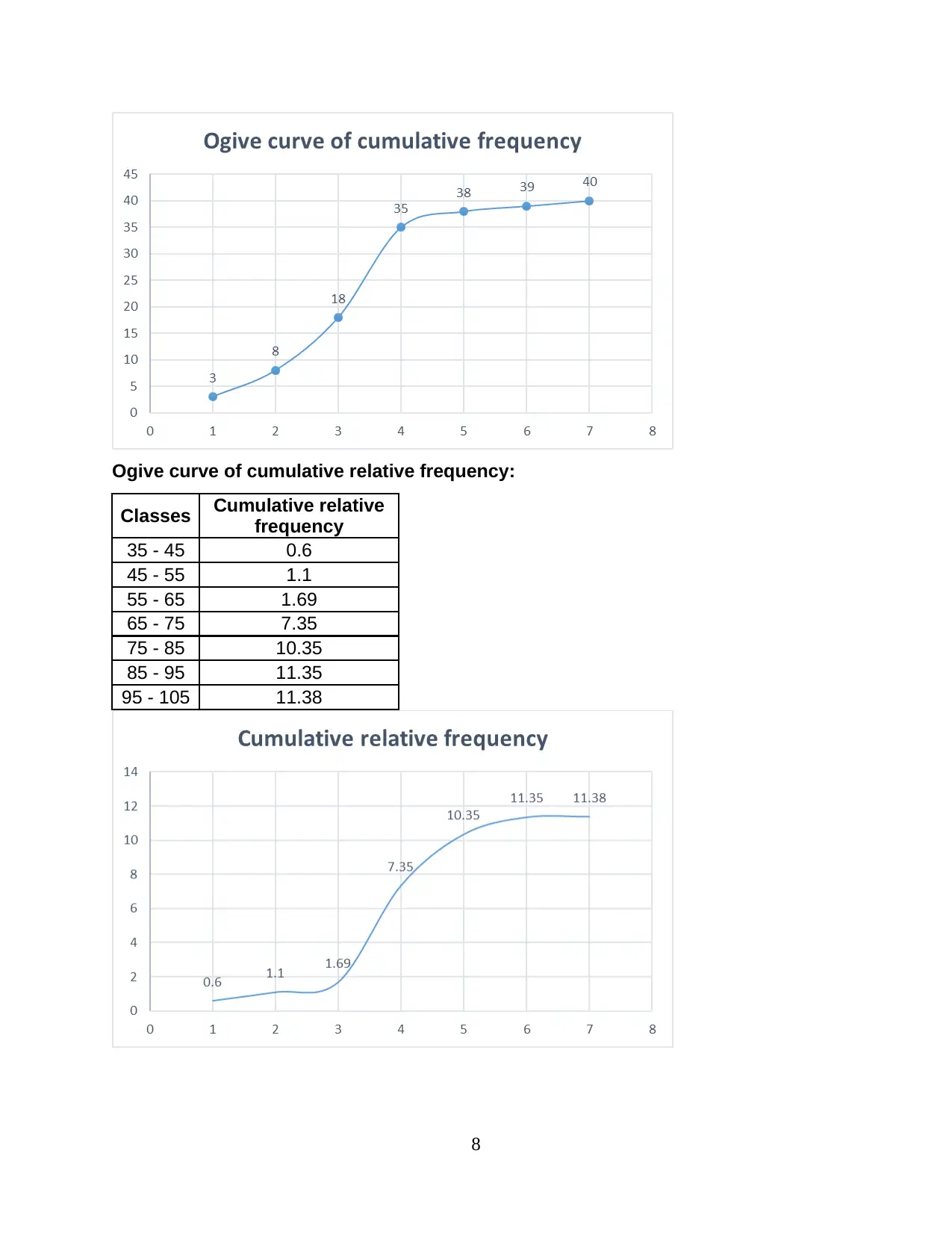
Ogive curve of cumulative relative frequency:
Classes Cumulative relative
frequency
35 - 45 0.6
45 - 55 1.1
55 - 65 1.69
65 - 75 7.35
75 - 85 10.35
85 - 95 11.35
95 - 105 11.38
8
Classes Cumulative relative
frequency
35 - 45 0.6
45 - 55 1.1
55 - 65 1.69
65 - 75 7.35
75 - 85 10.35
85 - 95 11.35
95 - 105 11.38
8
Paraphrase This Document
Need a fresh take? Get an instant paraphrase of this document with our AI Paraphraser
(e) When data is less than 65:
From the table above, it has been determined that different class interval have
been used to define the relative frequency for number of worker working inside the
business firm in order to give best results. The exact information was farmed so that
actual results and strength can be discovered for those worker those are actually taking
time less than 65 second. In order to calculate the outcome, a proper and valid
calculation must be done according to the statistical formula such as
=countif(range,'<65). From this specific formula the result defines that there are total 16
employee those are taking less time than 65 sec in order to complete the allotted work
to weld and assemble the respective project plant.
(f) When data is more than 75:
In the above table, various class interval are used to describe the cumulative
relative frequency for the total number of employees working on a specific project of
company and their actual time take to complete the work. From the results describe the
importance among the results when the collected data was greater than 75 second. To
calculate the total number of worker taking time more than 75 second, particular formula
have been utilized that is =countif(range,”>75”). As a result it has been determined that
there were total 5 individual worker those are taking more time than 75 second in
context to finish the particular assigned work which is to weld a particular car model.
3. ESTIMATION AND TESTING SIGNIFICANCE LEVEL
(a) Graphical Descriptive Measure of two variables:
As inflation decreases Australia's spending power strength. The assessment
says the dollar's buying power reduction condition. Investors ' demands were greater to
assess the investment values in order to be able to obtain appropriate return on their
funds. Consumer-price was impacted by regular modifications in the cost of different
commodities (Meyr, Myers and Pontious, 2014). The client price index and all regular
index from 1995-2015 are provided. The assessment shall be carried out below:
9
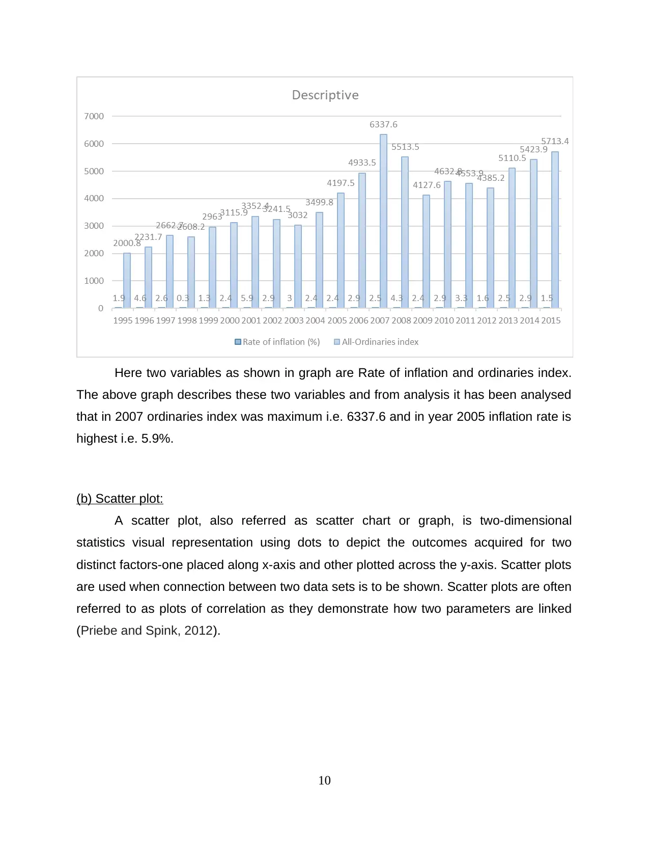
Here two variables as shown in graph are Rate of inflation and ordinaries index.
The above graph describes these two variables and from analysis it has been analysed
that in 2007 ordinaries index was maximum i.e. 6337.6 and in year 2005 inflation rate is
highest i.e. 5.9%.
(b) Scatter plot:
A scatter plot, also referred as scatter chart or graph, is two-dimensional
statistics visual representation using dots to depict the outcomes acquired for two
distinct factors-one placed along x-axis and other plotted across the y-axis. Scatter plots
are used when connection between two data sets is to be shown. Scatter plots are often
referred to as plots of correlation as they demonstrate how two parameters are linked
(Priebe and Spink, 2012).
10
⊘ This is a preview!⊘
Do you want full access?
Subscribe today to unlock all pages.
Trusted by 1+ million students worldwide
1 out of 19
Related Documents


Your All-in-One AI-Powered Toolkit for Academic Success.
+13062052269
info@desklib.com
Available 24*7 on WhatsApp / Email
![[object Object]](/_next/static/media/star-bottom.7253800d.svg)
Unlock your academic potential
Copyright © 2020–2026 A2Z Services. All Rights Reserved. Developed and managed by ZUCOL.