Analysis of Business Decision Making for a Restaurant Chain Expansion
VerifiedAdded on 2020/01/28
|23
|4751
|147
Report
AI Summary
This report provides a comprehensive analysis of business decision-making for a restaurant chain planning to open a second location in London. It details the collection of both primary and secondary data, including the design of a customer questionnaire to gather preferences and choices. The report includes calculations of central tendency measures (mean, median, mode) and dispersion measures (standard deviation, range, quartiles, percentiles) to analyze sales and profit data. Furthermore, it presents findings using line graphs, scatter plots, bar charts, and pie charts for sales, cost, and profit forecasting. The report also covers the evaluation of investment appraisal tools, project planning, and critical path analysis to assess the financial viability of the expansion project. The correlation between sales and profits is also analyzed. The report concludes with recommendations based on the data analysis.
Business Decision
Making
Making
Paraphrase This Document
Need a fresh take? Get an instant paraphrase of this document with our AI Paraphraser
TABLE OF CONTENTS
Introduction......................................................................................................................................3
Task 1...............................................................................................................................................3
1.1 Creating a plan for primary and secondary data collection...................................................3
1.2 Survey methodology & sampling frame used........................................................................3
1.3 Design a questionnaire to collect data and provide a justification for its design...................4
2.1 Collect data and create information for decision making by summarizing data using
representative values....................................................................................................................5
2.2 Analyzing the results to draw valid conclusions in a business context.................................6
2.3 Analyzing the collected data using measures of dispersion. You must be able to use the
analysis to inform and support decision making..........................................................................7
2.4 Carrying out suitable calculations to draw useful and realistic conclusions and provide
valid recommendations................................................................................................................8
Task 2...............................................................................................................................................9
3.1 Graphs and charts (e.g line, pie, bar chart, histogram, scatter) to clearly and effectively
present the findings......................................................................................................................9
3.2 Creating trend lines in graphs to assist in forecasting for specified business information.. 14
3.3 Preparing a business presentation to disseminate information effectively..........................14
3.4 Preparing a formal Business Report to be presented to the board of directors....................14
4.1 Using appropriate information processing tools to analyze the information.......................15
4.2 Project plan for an activity and the critical path. ................................................................15
....................................................................................................................................................18
....................................................................................................................................................18
4.3 Evaluation of the financial viability of the project..............................................................19
Conclusion.....................................................................................................................................21
References......................................................................................................................................22
Index of Tables
Table 1: Sample Frame....................................................................................................................5
Table 2: Summarizing of data..........................................................................................................7
Table 3: Sales quartile and percentile..............................................................................................8
Table 4: Profit quartile and percentile.............................................................................................8
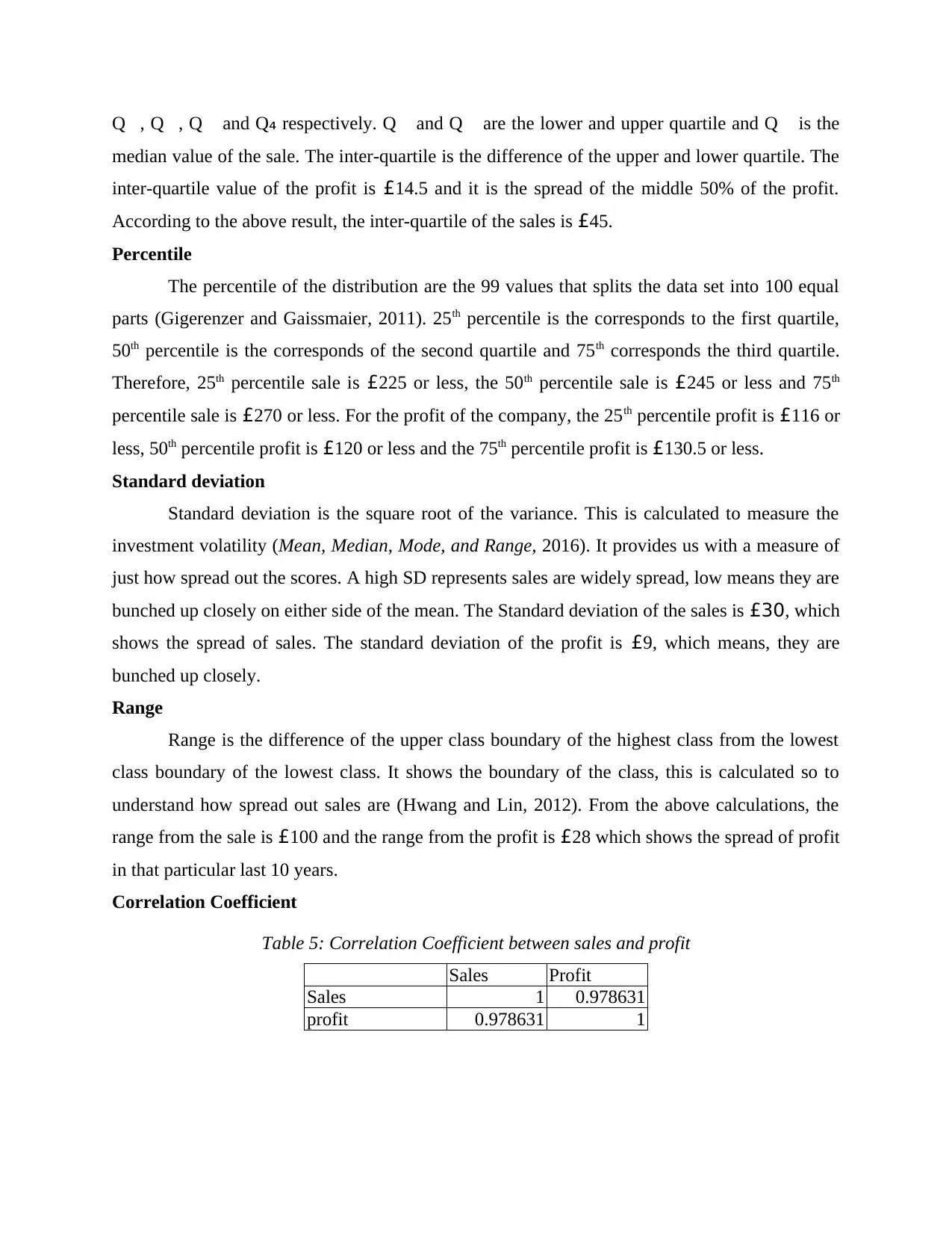
Table 5: Correlation Coefficient between sales and profit............................................................10
Illustration Index
.Illustration 1: Line graph of Sales.................................................................................................11
Illustration 2: Scatter plot of Sales. ...............................................................................................12
Illustration 3: Bar graph of profit. .................................................................................................13
Illustration 4: Pie chart of the profits............................................................................................14
Illustration 5: Trend chart of sales and profit.................................................................................15
Illustration 6: Gannt chart..............................................................................................................19
Illustration 7: Critical path.............................................................................................................19
Table 1: Sample Frame....................................................................................................................5
Table 2: Summarizing of data..........................................................................................................7
Table 3: Sales quartile and percentile..............................................................................................8
Table 4: Profit quartile and percentile.............................................................................................8
Table 5: Correlation Coefficient between sales and profit............................................................10
Illustration Index
.Illustration 1: Line graph of Sales.................................................................................................11
Illustration 2: Scatter plot of Sales. ...............................................................................................12
Illustration 3: Bar graph of profit. .................................................................................................13
Illustration 4: Pie chart of the profits............................................................................................14
Illustration 5: Trend chart of sales and profit.................................................................................15
Illustration 6: Gannt chart..............................................................................................................19
Illustration 7: Critical path.............................................................................................................19
⊘ This is a preview!⊘
Do you want full access?
Subscribe today to unlock all pages.
Trusted by 1+ million students worldwide
INTRODUCTION
For a business success, decision making is an important component for the company.
Decision making helps the company in selecting the best actions from the several alternatives
possibilities (Black, 2011). The present report is based on the scenario of restaurant chain which
is planned to open a second restaurant in London. This report is going to explain the collection of
primary and secondary data and a questionnaire to collect data will be design. Furthermore,
different calculations of mean, median, mode, quartile, percentile and correlation coefficient will
be calculate along with their conclusions. Line, pie, bar chart and graphs for sales, cost and
profits are forecast. Evaluation of different investment appraisal tools and the critical path are
covered in this report.
TASK 1
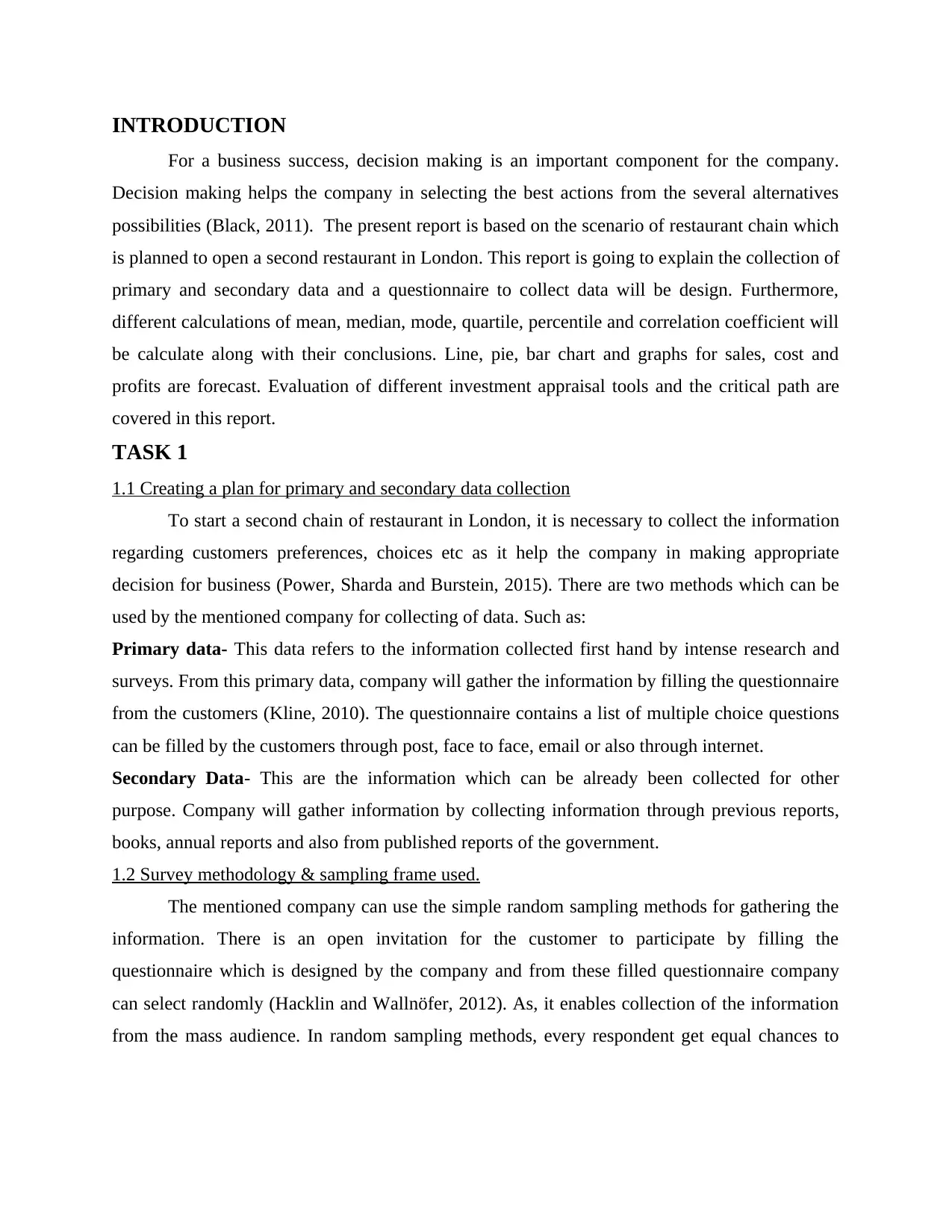
1.1 Creating a plan for primary and secondary data collection
To start a second chain of restaurant in London, it is necessary to collect the information
regarding customers preferences, choices etc as it help the company in making appropriate
decision for business (Power, Sharda and Burstein, 2015). There are two methods which can be
used by the mentioned company for collecting of data. Such as:
Primary data- This data refers to the information collected first hand by intense research and
surveys. From this primary data, company will gather the information by filling the questionnaire
from the customers (Kline, 2010). The questionnaire contains a list of multiple choice questions
can be filled by the customers through post, face to face, email or also through internet.
Secondary Data- This are the information which can be already been collected for other
purpose. Company will gather information by collecting information through previous reports,
books, annual reports and also from published reports of the government.
1.2 Survey methodology & sampling frame used.
The mentioned company can use the simple random sampling methods for gathering the
information. There is an open invitation for the customer to participate by filling the
questionnaire which is designed by the company and from these filled questionnaire company
can select randomly (Hacklin and Wallnöfer, 2012). As, it enables collection of the information
from the mass audience. In random sampling methods, every respondent get equal chances to
For a business success, decision making is an important component for the company.
Decision making helps the company in selecting the best actions from the several alternatives
possibilities (Black, 2011). The present report is based on the scenario of restaurant chain which
is planned to open a second restaurant in London. This report is going to explain the collection of
primary and secondary data and a questionnaire to collect data will be design. Furthermore,
different calculations of mean, median, mode, quartile, percentile and correlation coefficient will
be calculate along with their conclusions. Line, pie, bar chart and graphs for sales, cost and
profits are forecast. Evaluation of different investment appraisal tools and the critical path are
covered in this report.
TASK 1
1.1 Creating a plan for primary and secondary data collection
To start a second chain of restaurant in London, it is necessary to collect the information
regarding customers preferences, choices etc as it help the company in making appropriate
decision for business (Power, Sharda and Burstein, 2015). There are two methods which can be
used by the mentioned company for collecting of data. Such as:
Primary data- This data refers to the information collected first hand by intense research and
surveys. From this primary data, company will gather the information by filling the questionnaire
from the customers (Kline, 2010). The questionnaire contains a list of multiple choice questions
can be filled by the customers through post, face to face, email or also through internet.
Secondary Data- This are the information which can be already been collected for other
purpose. Company will gather information by collecting information through previous reports,
books, annual reports and also from published reports of the government.
1.2 Survey methodology & sampling frame used.
The mentioned company can use the simple random sampling methods for gathering the
information. There is an open invitation for the customer to participate by filling the
questionnaire which is designed by the company and from these filled questionnaire company
can select randomly (Hacklin and Wallnöfer, 2012). As, it enables collection of the information
from the mass audience. In random sampling methods, every respondent get equal chances to
Paraphrase This Document
Need a fresh take? Get an instant paraphrase of this document with our AI Paraphraser
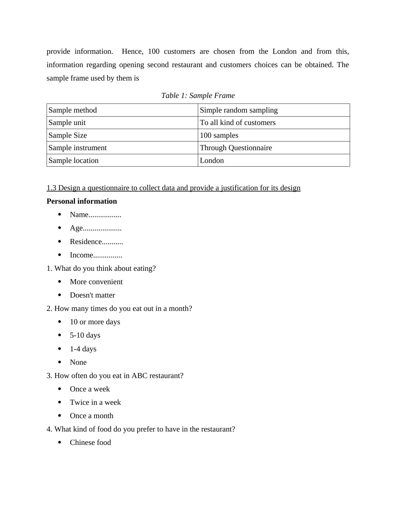
provide information. Hence, 100 customers are chosen from the London and from this,
information regarding opening second restaurant and customers choices can be obtained. The
sample frame used by them is
Table 1: Sample Frame
Sample method Simple random sampling
Sample unit To all kind of customers
Sample Size 100 samples
Sample instrument Through Questionnaire
Sample location London
1.3 Design a questionnaire to collect data and provide a justification for its design
Personal information
Name.................
Age....................
Residence...........
Income...............
1. What do you think about eating?
More convenient
Doesn't matter
2. How many times do you eat out in a month?
10 or more days
5-10 days
1-4 days
None
3. How often do you eat in ABC restaurant?
Once a week
Twice in a week
Once a month
4. What kind of food do you prefer to have in the restaurant?
Chinese food
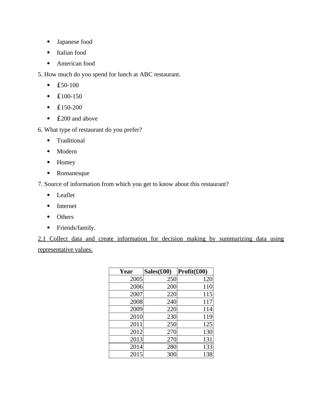
Japanese food
Italian food
American food
5. How much do you spend for lunch at ABC restaurant.
£50-100
£100-150
£150-200
£200 and above
6. What type of restaurant do you prefer?
Traditional
Modern
Homey
Romanesque
7. Source of information from which you get to know about this restaurant?
Leaflet
Internet
Others
Friends/family.
2.1 Collect data and create information for decision making by summarizing data using
representative values.
Year Sales(£00) Profit(£00)
2005 250 120
2006 200 110
2007 220 115
2008 240 117
2009 220 114
2010 230 119
2011 250 125
2012 270 130
2013 270 131
2014 280 133
2015 300 138
⊘ This is a preview!⊘
Do you want full access?
Subscribe today to unlock all pages.
Trusted by 1+ million students worldwide
Table 2: Summarizing of data
Sales Profit
Mean 248 Mean 122
Standard Error 9 Standard Error 2.7
Median 250 Median 120
Mode 250 Mode #N/A
Standard Deviation 30 Standard Deviation 9
Sample Variance 896 Sample Variance 81.6
Kurtosis -0.64 Kurtosis -1.18
Skewness 0.13 Skewness 0.28
Range 100 Range 28
Minimum 200 Minimum 110
Maximum 300 Maximum 138
Sum 2730 Sum 1352
Count 11 Count 11
Confidence Level(95.0%) 20 Confidence Level(95.0%) 6.07
2.2 Analyzing the results to draw valid conclusions in a business context
Mean- The mean is a mathematical average, and it is represented as the sum of the data value on
sales for the last years' dividend by the number of sales (Nowduri, 2011). It is also known as
central tendency. It indicates the total sales and profits in the last 10 years. The mean value of the
sales is £249 and for the profit the mean value is £122. Hence, this shows the average of the
total sales and the profits.
Median- The number that falls in the middle position is the median. This is the known as the
50th percentile. The median of the sales is £250 and for the profit, it is £120 which represents the
middle value from the set of profit. Therefore, for the sales from the last 10 years, half of the
value is higher than the £250 and half value is lower than the £250.
Mode- It represents the most frequently appearing value, from the set of value
(Ho, Xu, and Dey, 2010). This is the third measure of central tendency. The most frequently
appearing value from the set of sales is £250. From the set of profits, there is no value which
appears frequent.
Paraphrase This Document
Need a fresh take? Get an instant paraphrase of this document with our AI Paraphraser
2.3 Analyzing the collected data using measures of dispersion. You must be able to use the
analysis to inform and support decision making.
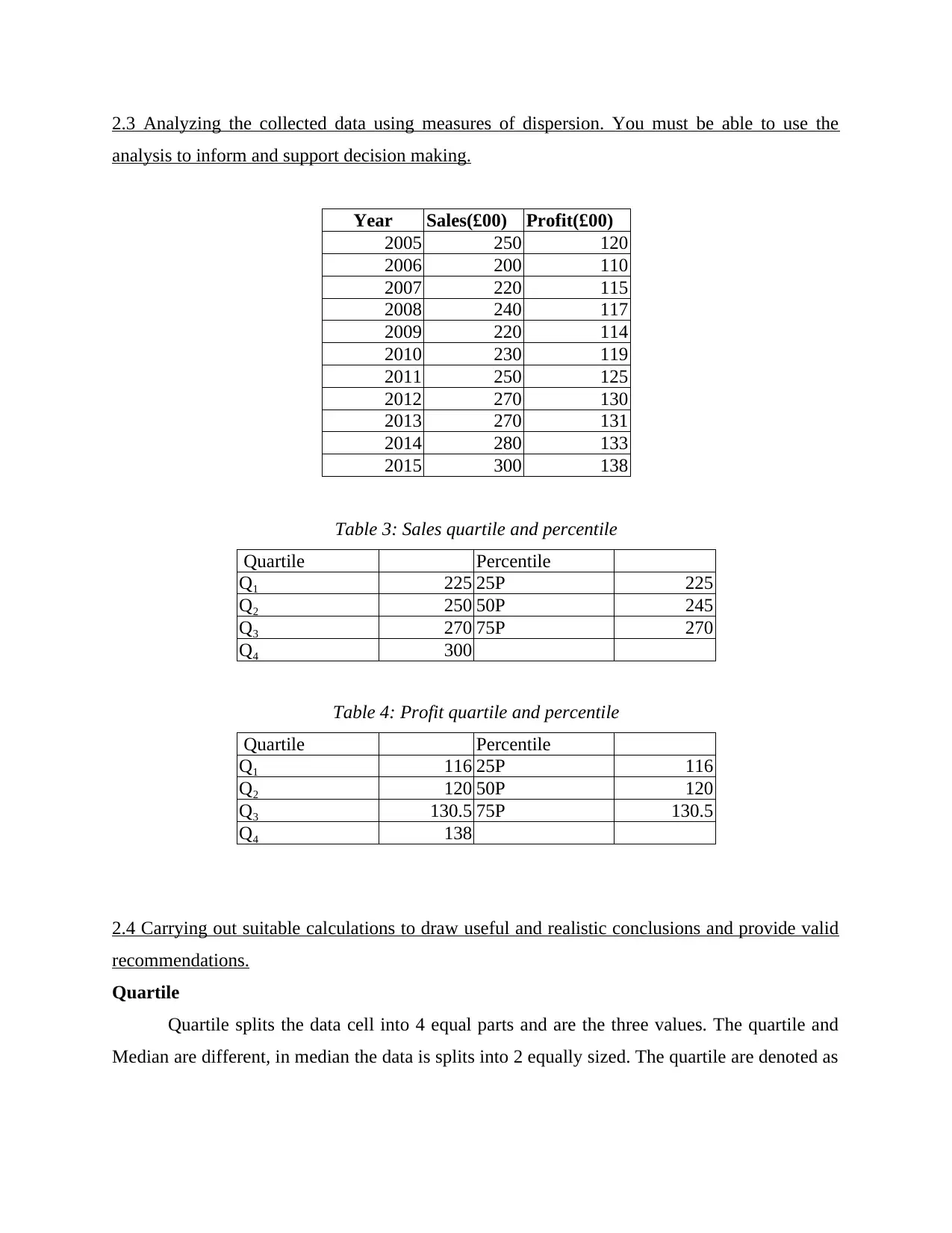
Year Sales(£00) Profit(£00)
2005 250 120
2006 200 110
2007 220 115
2008 240 117
2009 220 114
2010 230 119
2011 250 125
2012 270 130
2013 270 131
2014 280 133
2015 300 138
Table 3: Sales quartile and percentile
Quartile Percentile
Q₁ 225 25P 225
Q₂ 250 50P 245
Q₃ 270 75P 270
Q₄ 300
Table 4: Profit quartile and percentile
Quartile Percentile
Q₁ 116 25P 116
Q₂ 120 50P 120
Q₃ 130.5 75P 130.5
Q₄ 138
2.4 Carrying out suitable calculations to draw useful and realistic conclusions and provide valid
recommendations.
Quartile
Quartile splits the data cell into 4 equal parts and are the three values. The quartile and
Median are different, in median the data is splits into 2 equally sized. The quartile are denoted as
analysis to inform and support decision making.
Year Sales(£00) Profit(£00)
2005 250 120
2006 200 110
2007 220 115
2008 240 117
2009 220 114
2010 230 119
2011 250 125
2012 270 130
2013 270 131
2014 280 133
2015 300 138
Table 3: Sales quartile and percentile
Quartile Percentile
Q₁ 225 25P 225
Q₂ 250 50P 245
Q₃ 270 75P 270
Q₄ 300
Table 4: Profit quartile and percentile
Quartile Percentile
Q₁ 116 25P 116
Q₂ 120 50P 120
Q₃ 130.5 75P 130.5
Q₄ 138
2.4 Carrying out suitable calculations to draw useful and realistic conclusions and provide valid
recommendations.
Quartile
Quartile splits the data cell into 4 equal parts and are the three values. The quartile and
Median are different, in median the data is splits into 2 equally sized. The quartile are denoted as
Q, Q, Q and Q₄ respectively. Q and Q are the lower and upper quartile and Q is the
median value of the sale. The inter-quartile is the difference of the upper and lower quartile. The
inter-quartile value of the profit is £14.5 and it is the spread of the middle 50% of the profit.
According to the above result, the inter-quartile of the sales is £45.
Percentile
The percentile of the distribution are the 99 values that splits the data set into 100 equal
parts (Gigerenzer and Gaissmaier, 2011). 25th percentile is the corresponds to the first quartile,
50th percentile is the corresponds of the second quartile and 75th corresponds the third quartile.
Therefore, 25th percentile sale is £225 or less, the 50th percentile sale is £245 or less and 75th
percentile sale is £270 or less. For the profit of the company, the 25th percentile profit is £116 or
less, 50th percentile profit is £120 or less and the 75th percentile profit is £130.5 or less.
Standard deviation
Standard deviation is the square root of the variance. This is calculated to measure the
investment volatility (Mean, Median, Mode, and Range, 2016). It provides us with a measure of
just how spread out the scores. A high SD represents sales are widely spread, low means they are
bunched up closely on either side of the mean. The Standard deviation of the sales is £30, which
shows the spread of sales. The standard deviation of the profit is £9, which means, they are
bunched up closely.
Range
Range is the difference of the upper class boundary of the highest class from the lowest
class boundary of the lowest class. It shows the boundary of the class, this is calculated so to
understand how spread out sales are (Hwang and Lin, 2012). From the above calculations, the
range from the sale is £100 and the range from the profit is £28 which shows the spread of profit
in that particular last 10 years.
Correlation Coefficient
Table 5: Correlation Coefficient between sales and profit
Sales Profit
Sales 1 0.978631
profit 0.978631 1
⊘ This is a preview!⊘
Do you want full access?
Subscribe today to unlock all pages.
Trusted by 1+ million students worldwide
Coefficient correlation measures the strength and direction of liner relationship between
sales and profits of the company (Aharoni, Tihanyi and Connelly, 2011). Sales and profit of the
restaurant have a positive relationship between them. If there will be increase in the sales, then
the restaurant's profit will also increase. On the other side, if the sales decrease, there will be a
decrease in the profits too.
TASK 2
3.1 Graphs and charts (e.g line, pie, bar chart, histogram, scatter) to clearly and effectively
present the findings.
Year Sales(£000) Profit(£000)
2005 250 120
2006 200 110
2007 220 115
2008 240 117
2009 220 114
2010 230 119
2011 250 125
2012 270 130
2013 270 131
2014 280 133
2015 300 138
Paraphrase This Document
Need a fresh take? Get an instant paraphrase of this document with our AI Paraphraser
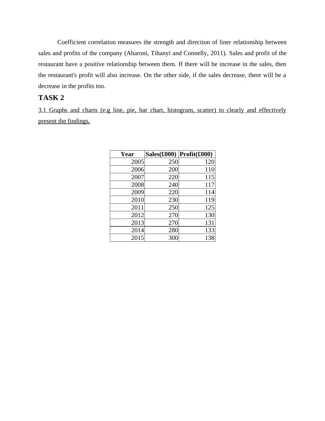
.Illustration 1: Line graph of Sales
The line graph represent the data, of both sales and the year. With the changes in the year,
the sales of the Restaurant is also changes, it means it changes continuously over time (García-
Peñalvo and Conde, 2014). In this, restaurant company's line graph, there is a movement in the
sales of the restaurant. In 2005, the sale of the restaurant was £250, and in 2006, the sales
decrease to £200. It shows the exact movement of the sales, whether increasing or decreasing. If
the line graph shows upward movement, it means there is increase in the sales and if it shows
downward, it means fall in the sales of the restaurant. In 2006, the company bears the lowest
sales of £200 and in 2015, the sales reaches to £300, the highest from the last 10 years.
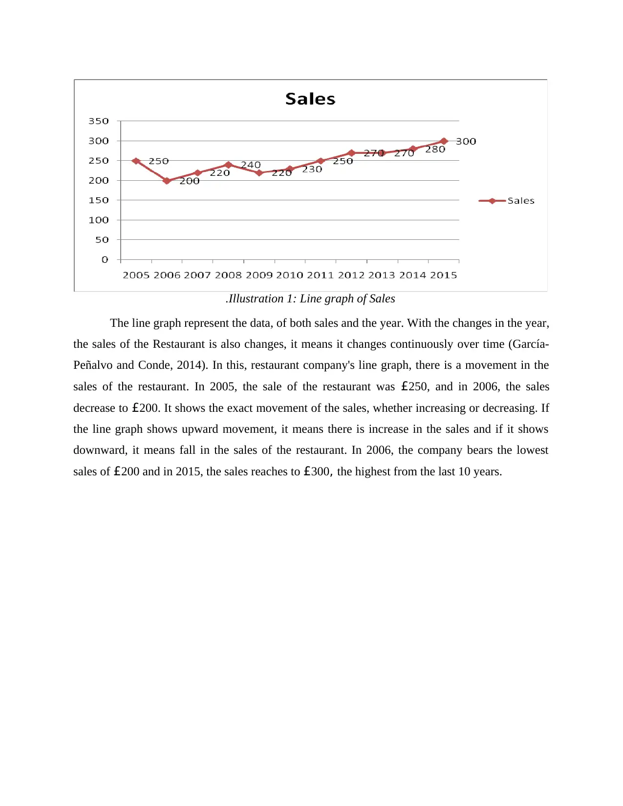
Illustration 2: Scatter plot of Sales.
Scatter plot is a set of points, which is plotted on vertical and horizontal axes of the chart
(Zeleny, 2012). The scatter is similar to the line chart, but it shows that hoe much one variable is
affected with the change in other variable. It shows the relation between two variables. In this
graph, it shows the relationship between the sales and the year. Sales of the restaurant is
increasing in this graph. In 2008 and 2010, the sales of the company was £220.
⊘ This is a preview!⊘
Do you want full access?
Subscribe today to unlock all pages.
Trusted by 1+ million students worldwide
1 out of 23
Related Documents


Your All-in-One AI-Powered Toolkit for Academic Success.
+13062052269
info@desklib.com
Available 24*7 on WhatsApp / Email
![[object Object]](/_next/static/media/star-bottom.7253800d.svg)
Unlock your academic potential
Copyright © 2020–2026 A2Z Services. All Rights Reserved. Developed and managed by ZUCOL.