Data Analysis of Environmental Issues: Business Intelligence Project
VerifiedAdded on 2020/02/24
|21
|5240
|75
Project
AI Summary
This project focuses on business intelligence using an air quality dataset encompassing data from 199 countries. The objective is to demonstrate understanding of business intelligence, explain associated technologies, and develop a business intelligence dashboard using IBM Watson Analytics. The project analyzes various environmental factors, including air pollution, CO2 emissions, electricity access, and energy use, visualized through dashboards and charts. The analysis reveals insights into air pollution levels, CO2 emission patterns, electricity access rates, and energy consumption trends across different countries. The project highlights the impact of these factors on the environment and suggests potential strategies for improvement, such as increasing the use of renewable resources and limiting electricity consumption. The project provides a comprehensive overview of the data analysis process and the benefits of using business intelligence for environmental analysis.

Running head: BUSINESS INTELLIGENCE
Business Intelligence
Name of the Student
Name of the University
Author Note
Business Intelligence
Name of the Student
Name of the University
Author Note
Paraphrase This Document
Need a fresh take? Get an instant paraphrase of this document with our AI Paraphraser
1
BUSINESS INTELLIGENCE
Table of Contents
Introduction................................................................................................................................2
Objectives...................................................................................................................................2
Justification of the Dataset.........................................................................................................2
Discussion of the dashboards created........................................................................................4
Dashboard 1...........................................................................................................................4
Dashboard 2...........................................................................................................................7
Dashboard 3...........................................................................................................................9
Dashboard 4.........................................................................................................................12
Benefits of the analysis done on the data set............................................................................15
Conclusion................................................................................................................................15
Bibliography.............................................................................................................................16
2
BUSINESS INTELLIGENCE
Introduction
Business Intelligence is an innovative technology driven procedure which is used to
analyze data and represent the data in such a way so that the executives and managers to
make better decision for the organization. The analysis of Business Intelligence encompass a
wide range of tools usage, application and methods which helps the organization to collect
data from the internal sources and external sources; prepare the data for analysis and then run
the queries on the data and make reports based on the outcomes. The use of dashboards and
data visuals can help in making analytical decisions by the managers. The report is based on
the data analysis of environmental issues. The report has been completed with an air quality
dataset, which has information related to air pollution and emissions from around the world.
Objectives
The object, which has been followed for the development of this report, can be
summarized as follows:
To demonstrate the understanding of the topic that is “Business Intelligence”.
To explain in a detailed format the technologies associated with the processing of the data
set.
To develop a business intelligence dashboard based on the dataset found online and
analyze the data in IBM Watson Analytics.
Justification of the Dataset
The data set is comprised of data collected from 199 different countries across the
world. The data is comprised of 16 variables, which are as follows:
Sl. Property Definition
⊘ This is a preview!⊘
Do you want full access?
Subscribe today to unlock all pages.
Trusted by 1+ million students worldwide
3
BUSINESS INTELLIGENCE
no.
1 Air Pollution PM2.5 air pollution, population exposed to levels
exceeding WHO guideline value (% of total)
2 CO2 Emissions CO2 emissions (kt)
3 Electric Power Use Electric power consumption (kWh per capita)
4 Electricity Access Access to electricity (% of population)
5 Energy Intensity Energy intensity level of primary energy (MJ/$2011 PPP
GDP)
6 Energy Use Energy use (kg of oil equivalent per capita)
7 Forest Area Forest area (% of land area)
8 Fossil Fuel Fossil fuel energy consumption (% of total)
9 Fresh Water Annual freshwater withdrawals, total (% of internal
resources)
10 Greenhouse Gases Total greenhouse gas emissions (kt of CO2 equivalent)
11 Methane Emissions Methane emissions (kt of CO2 equivalent)
12 Nitrous Oxide
Emissions
Nitrous oxide emissions (thousand metric tons of CO2
equivalent)
13 Non-Solid Fuel
Access
Access to non-solid fuel (% of population)
14 Nuclear Energy Alternative and nuclear energy (% of total energy use)
15 Renewable
Electricity
Renewable electricity output (% of total electricity output)
16 Renewable Energy
Use
Renewable energy consumption (% of total final energy
consumption)
The data has been collected from various locations and compiled into a single data set
for the use of this data analysis. The data analysis has been done using IBM Watson
Analytics skills. A dashboard has been created and the analysis has been done based on the
different properties, which determine the quality of air. The properties has been mapped with
Paraphrase This Document
Need a fresh take? Get an instant paraphrase of this document with our AI Paraphraser
4
BUSINESS INTELLIGENCE
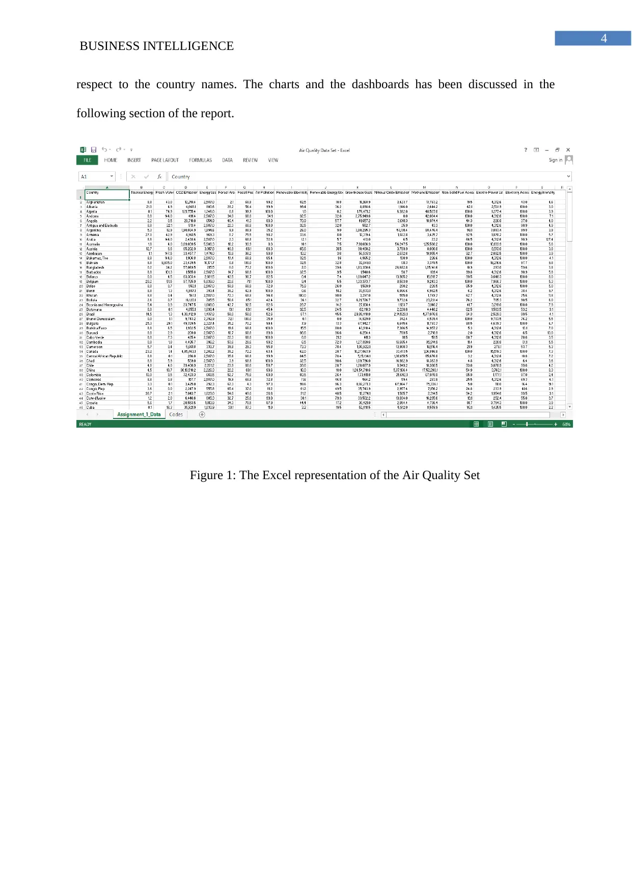
respect to the country names. The charts and the dashboards has been discussed in the
following section of the report.
Figure 1: The Excel representation of the Air Quality Set
BUSINESS INTELLIGENCE
respect to the country names. The charts and the dashboards has been discussed in the
following section of the report.
Figure 1: The Excel representation of the Air Quality Set
5
BUSINESS INTELLIGENCE
Discussion of the dashboards created
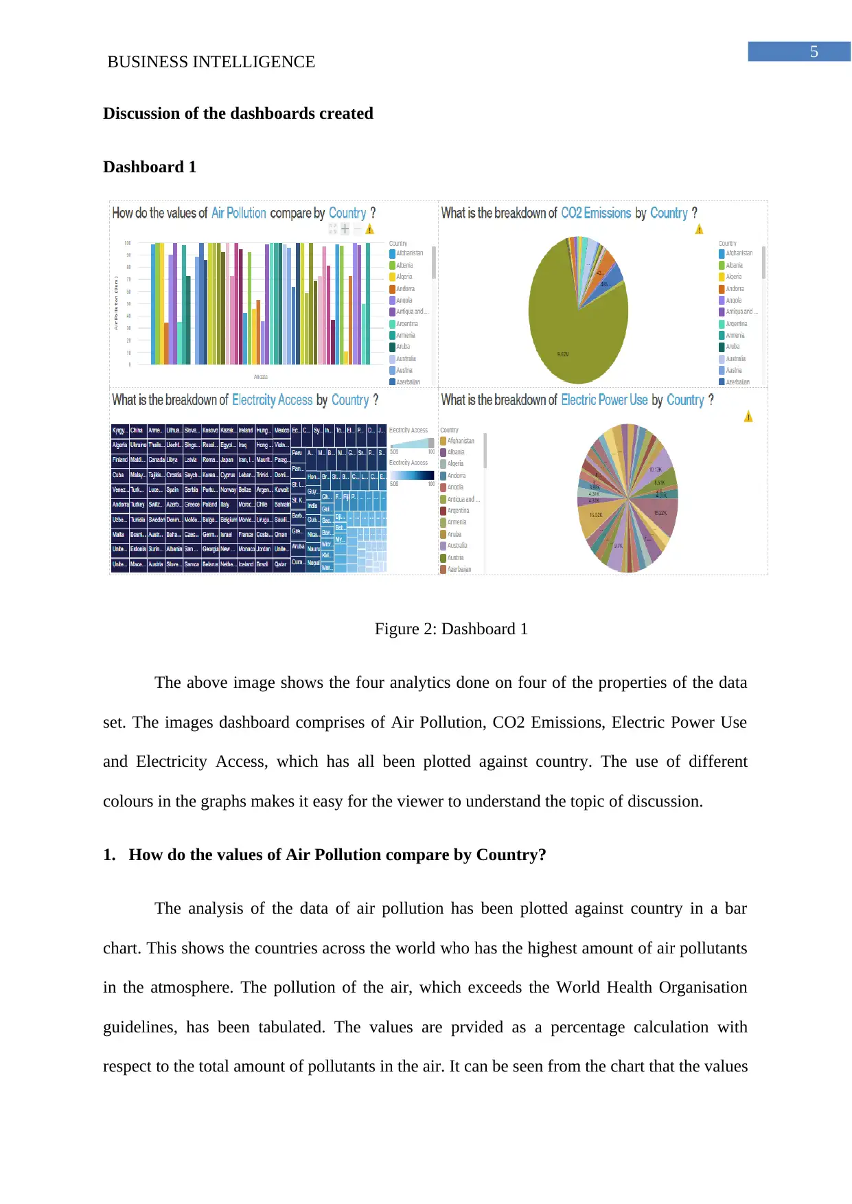
Dashboard 1
Figure 2: Dashboard 1
The above image shows the four analytics done on four of the properties of the data
set. The images dashboard comprises of Air Pollution, CO2 Emissions, Electric Power Use
and Electricity Access, which has all been plotted against country. The use of different
colours in the graphs makes it easy for the viewer to understand the topic of discussion.
1. How do the values of Air Pollution compare by Country?
The analysis of the data of air pollution has been plotted against country in a bar
chart. This shows the countries across the world who has the highest amount of air pollutants
in the atmosphere. The pollution of the air, which exceeds the World Health Organisation
guidelines, has been tabulated. The values are prvided as a percentage calculation with
respect to the total amount of pollutants in the air. It can be seen from the chart that the values
BUSINESS INTELLIGENCE
Discussion of the dashboards created
Dashboard 1
Figure 2: Dashboard 1
The above image shows the four analytics done on four of the properties of the data
set. The images dashboard comprises of Air Pollution, CO2 Emissions, Electric Power Use
and Electricity Access, which has all been plotted against country. The use of different
colours in the graphs makes it easy for the viewer to understand the topic of discussion.
1. How do the values of Air Pollution compare by Country?
The analysis of the data of air pollution has been plotted against country in a bar
chart. This shows the countries across the world who has the highest amount of air pollutants
in the atmosphere. The pollution of the air, which exceeds the World Health Organisation
guidelines, has been tabulated. The values are prvided as a percentage calculation with
respect to the total amount of pollutants in the air. It can be seen from the chart that the values
⊘ This is a preview!⊘
Do you want full access?
Subscribe today to unlock all pages.
Trusted by 1+ million students worldwide
6
BUSINESS INTELLIGENCE
are relatively higher for many of the countries. It can be seen that 46 out of 200 countries
have a 100% of higher pollutants in the air. The countries should target in making the air
pollution of their country lower than the rest of the countries. The increase in the global
warming is directly related to the amount of pollutants in the air. The amount of air pollution
also poses a threat for the health of the citizens of the country.
2. What is the breakdown of CO2 Emissions by Country?
The analysis of the data of CO2 Emission has been drawn against country in a pie
chart. The data is based on the carbon dioxide emission from the factories and the vehicles in
the country. The highest amount of carbon dioxide emission has been found in China.
Looking at the analysis it can be said that the amount of emission of carbon dioxide is
directly related to the amount of surface area thee country has. The larger amount of surface
area means more number of people living in the country, which directly relates to the higher
number of cars and the amount of factories growing up in the country. The countries with a
relatively higher amount of carbon dioxide emission should be considered to use renewable
resources. The amount of carbon dioxide emission is the highest in china followed by United
States of America and closely followed by India. The countries has to consider the use of
renewable energy for the betterment of the country and for the environment.
3. What is the breakdown of Electricity Access by Country?
The analysis of the data of Electricity Access has been plotted against country in a
tree map. The graph has the property of having a small box area for each of the country with
the area based on the electricity access and the color is also based on the amount of electricity
access of the respective country. The number represents the percentage of population of the
country, which has access to electricity in their country. From the data graph, it can be seen
that most of the countries around the world has amenities to provide electricity to all of its
Paraphrase This Document
Need a fresh take? Get an instant paraphrase of this document with our AI Paraphraser
7
BUSINESS INTELLIGENCE
population. For the other countries where there is lower access of electricity by the
population, they should consider the option of providing electricity for the whole population
of their country. The best consideration of the same graph should look darkest in color for the
betterment of the country. From the graph, it can be said that more than 50% of the world’s
population has the access to electricity.
4. What is the breakdown of Electric Power Use by Country?
The analysis of the data of Electric Power Use has been plotted against country in a
pie chart. The data on the graph denotes the amount of power consumption in the form of
kWh per Capita of the population. The amount of consumption of the electricity directly
affects the environment because the electricity is produced directly due to the consumption of
coals and fossil fuels. This affects the environment as CO2 is directly released into the
atmosphere. The maximum amount of electric power use has been recorded by Norway and
Iceland. It should be followed by the people of the world to limit the use of the electricity,
which would be of help in reducing the pollution in the world.
8
BUSINESS INTELLIGENCE
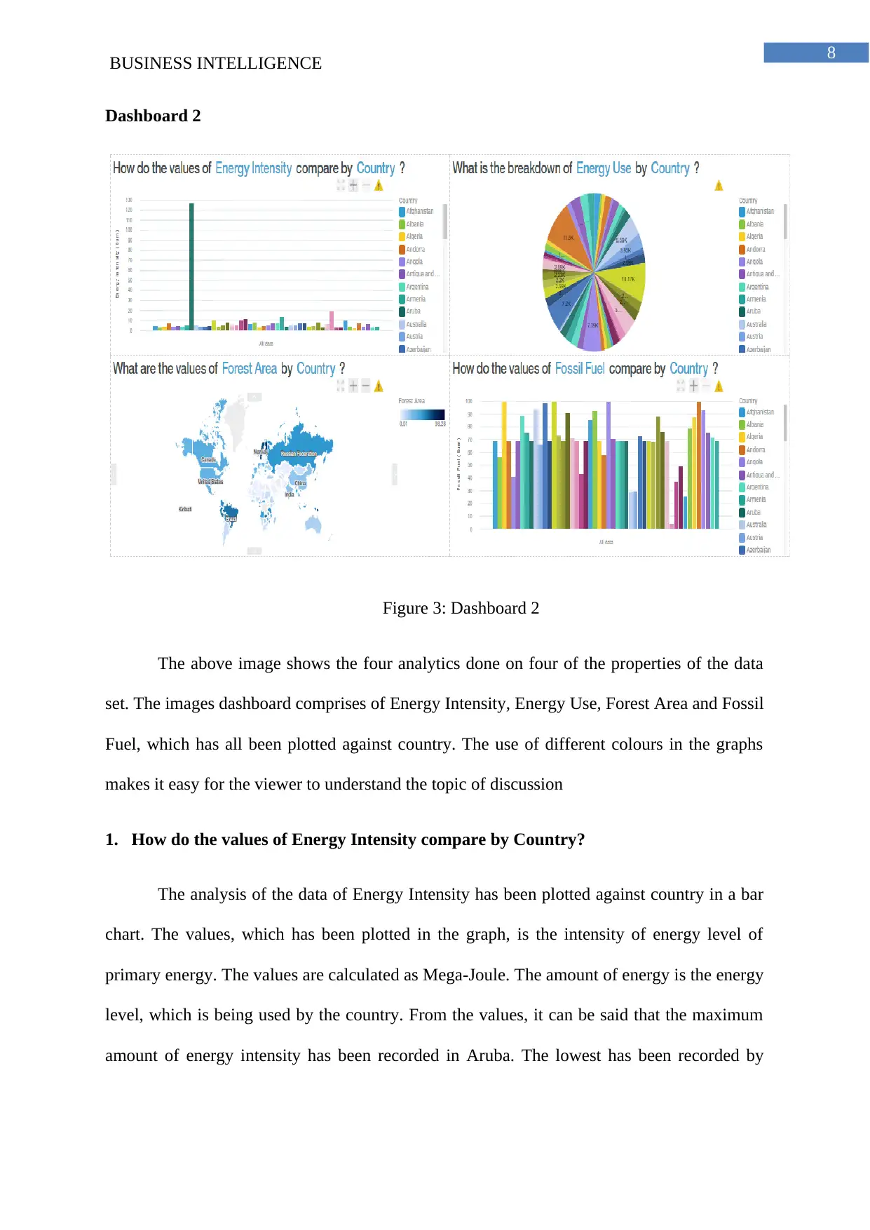
Dashboard 2
Figure 3: Dashboard 2
The above image shows the four analytics done on four of the properties of the data
set. The images dashboard comprises of Energy Intensity, Energy Use, Forest Area and Fossil
Fuel, which has all been plotted against country. The use of different colours in the graphs
makes it easy for the viewer to understand the topic of discussion
1. How do the values of Energy Intensity compare by Country?
The analysis of the data of Energy Intensity has been plotted against country in a bar
chart. The values, which has been plotted in the graph, is the intensity of energy level of
primary energy. The values are calculated as Mega-Joule. The amount of energy is the energy
level, which is being used by the country. From the values, it can be said that the maximum
amount of energy intensity has been recorded in Aruba. The lowest has been recorded by
BUSINESS INTELLIGENCE
Dashboard 2
Figure 3: Dashboard 2
The above image shows the four analytics done on four of the properties of the data
set. The images dashboard comprises of Energy Intensity, Energy Use, Forest Area and Fossil
Fuel, which has all been plotted against country. The use of different colours in the graphs
makes it easy for the viewer to understand the topic of discussion
1. How do the values of Energy Intensity compare by Country?
The analysis of the data of Energy Intensity has been plotted against country in a bar
chart. The values, which has been plotted in the graph, is the intensity of energy level of
primary energy. The values are calculated as Mega-Joule. The amount of energy is the energy
level, which is being used by the country. From the values, it can be said that the maximum
amount of energy intensity has been recorded in Aruba. The lowest has been recorded by
⊘ This is a preview!⊘
Do you want full access?
Subscribe today to unlock all pages.
Trusted by 1+ million students worldwide
9
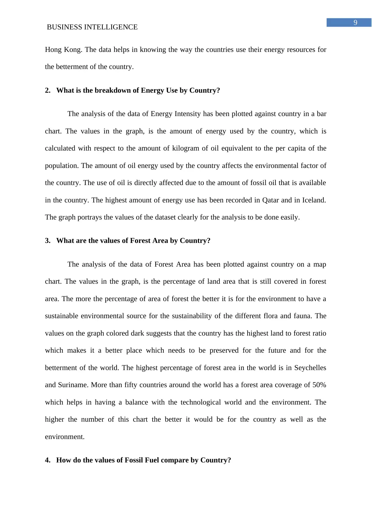
BUSINESS INTELLIGENCE
Hong Kong. The data helps in knowing the way the countries use their energy resources for
the betterment of the country.
2. What is the breakdown of Energy Use by Country?
The analysis of the data of Energy Intensity has been plotted against country in a bar
chart. The values in the graph, is the amount of energy used by the country, which is
calculated with respect to the amount of kilogram of oil equivalent to the per capita of the
population. The amount of oil energy used by the country affects the environmental factor of
the country. The use of oil is directly affected due to the amount of fossil oil that is available
in the country. The highest amount of energy use has been recorded in Qatar and in Iceland.
The graph portrays the values of the dataset clearly for the analysis to be done easily.
3. What are the values of Forest Area by Country?
The analysis of the data of Forest Area has been plotted against country on a map
chart. The values in the graph, is the percentage of land area that is still covered in forest
area. The more the percentage of area of forest the better it is for the environment to have a
sustainable environmental source for the sustainability of the different flora and fauna. The
values on the graph colored dark suggests that the country has the highest land to forest ratio
which makes it a better place which needs to be preserved for the future and for the
betterment of the world. The highest percentage of forest area in the world is in Seychelles
and Suriname. More than fifty countries around the world has a forest area coverage of 50%
which helps in having a balance with the technological world and the environment. The
higher the number of this chart the better it would be for the country as well as the
environment.
4. How do the values of Fossil Fuel compare by Country?
Paraphrase This Document
Need a fresh take? Get an instant paraphrase of this document with our AI Paraphraser
10
BUSINESS INTELLIGENCE
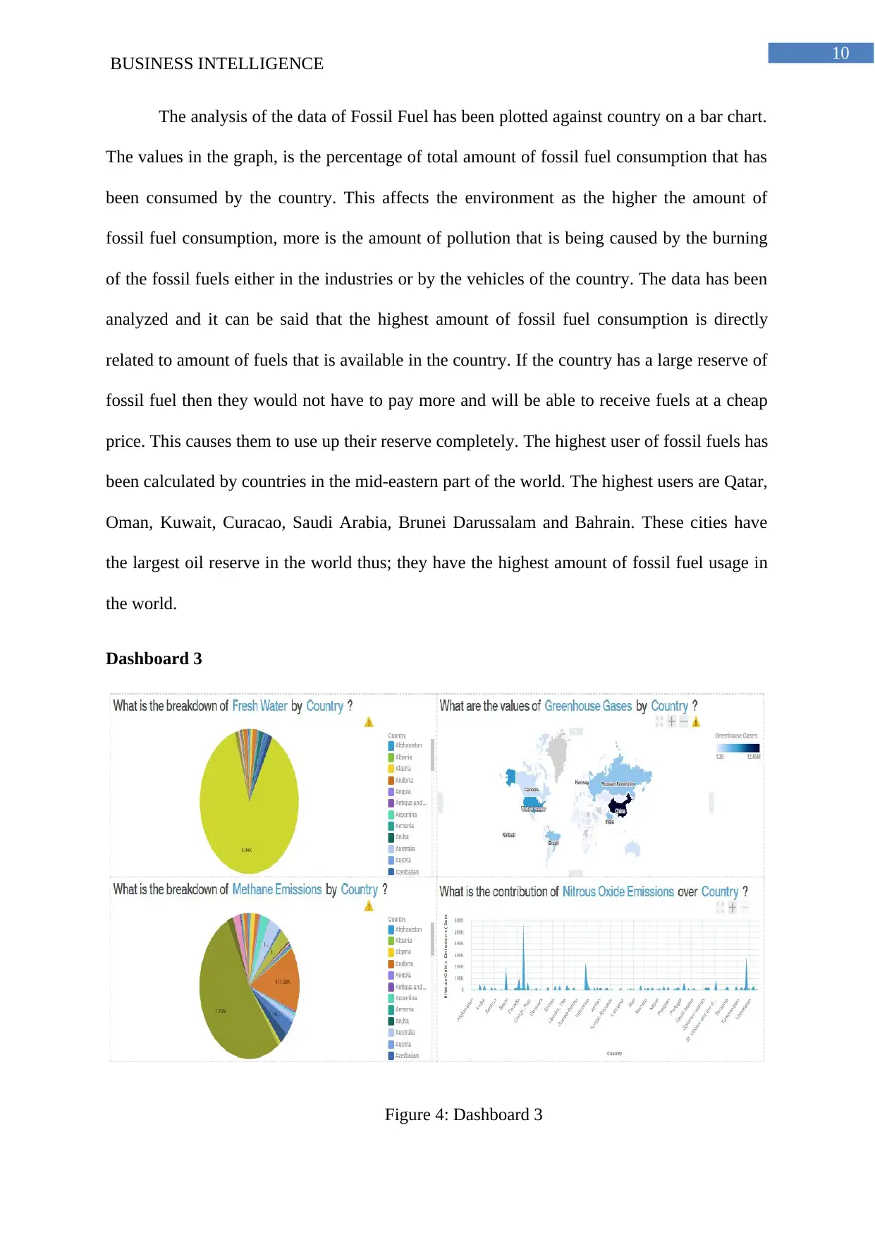
The analysis of the data of Fossil Fuel has been plotted against country on a bar chart.
The values in the graph, is the percentage of total amount of fossil fuel consumption that has
been consumed by the country. This affects the environment as the higher the amount of
fossil fuel consumption, more is the amount of pollution that is being caused by the burning
of the fossil fuels either in the industries or by the vehicles of the country. The data has been
analyzed and it can be said that the highest amount of fossil fuel consumption is directly
related to amount of fuels that is available in the country. If the country has a large reserve of
fossil fuel then they would not have to pay more and will be able to receive fuels at a cheap
price. This causes them to use up their reserve completely. The highest user of fossil fuels has
been calculated by countries in the mid-eastern part of the world. The highest users are Qatar,
Oman, Kuwait, Curacao, Saudi Arabia, Brunei Darussalam and Bahrain. These cities have
the largest oil reserve in the world thus; they have the highest amount of fossil fuel usage in
the world.
Dashboard 3
Figure 4: Dashboard 3
BUSINESS INTELLIGENCE
The analysis of the data of Fossil Fuel has been plotted against country on a bar chart.
The values in the graph, is the percentage of total amount of fossil fuel consumption that has
been consumed by the country. This affects the environment as the higher the amount of
fossil fuel consumption, more is the amount of pollution that is being caused by the burning
of the fossil fuels either in the industries or by the vehicles of the country. The data has been
analyzed and it can be said that the highest amount of fossil fuel consumption is directly
related to amount of fuels that is available in the country. If the country has a large reserve of
fossil fuel then they would not have to pay more and will be able to receive fuels at a cheap
price. This causes them to use up their reserve completely. The highest user of fossil fuels has
been calculated by countries in the mid-eastern part of the world. The highest users are Qatar,
Oman, Kuwait, Curacao, Saudi Arabia, Brunei Darussalam and Bahrain. These cities have
the largest oil reserve in the world thus; they have the highest amount of fossil fuel usage in
the world.
Dashboard 3
Figure 4: Dashboard 3
11
BUSINESS INTELLIGENCE
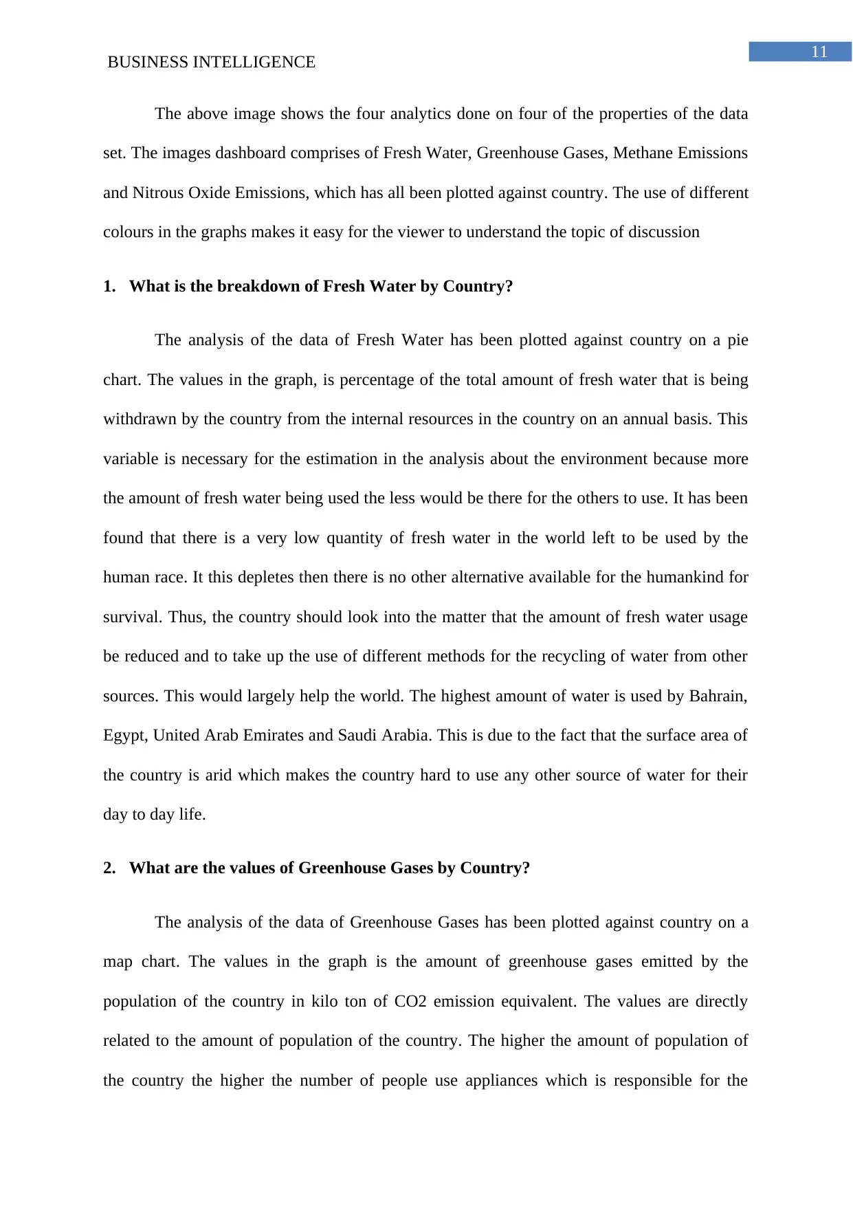
The above image shows the four analytics done on four of the properties of the data
set. The images dashboard comprises of Fresh Water, Greenhouse Gases, Methane Emissions
and Nitrous Oxide Emissions, which has all been plotted against country. The use of different
colours in the graphs makes it easy for the viewer to understand the topic of discussion
1. What is the breakdown of Fresh Water by Country?
The analysis of the data of Fresh Water has been plotted against country on a pie
chart. The values in the graph, is percentage of the total amount of fresh water that is being
withdrawn by the country from the internal resources in the country on an annual basis. This
variable is necessary for the estimation in the analysis about the environment because more
the amount of fresh water being used the less would be there for the others to use. It has been
found that there is a very low quantity of fresh water in the world left to be used by the
human race. It this depletes then there is no other alternative available for the humankind for
survival. Thus, the country should look into the matter that the amount of fresh water usage
be reduced and to take up the use of different methods for the recycling of water from other
sources. This would largely help the world. The highest amount of water is used by Bahrain,
Egypt, United Arab Emirates and Saudi Arabia. This is due to the fact that the surface area of
the country is arid which makes the country hard to use any other source of water for their
day to day life.
2. What are the values of Greenhouse Gases by Country?
The analysis of the data of Greenhouse Gases has been plotted against country on a
map chart. The values in the graph is the amount of greenhouse gases emitted by the
population of the country in kilo ton of CO2 emission equivalent. The values are directly
related to the amount of population of the country. The higher the amount of population of
the country the higher the number of people use appliances which is responsible for the
BUSINESS INTELLIGENCE
The above image shows the four analytics done on four of the properties of the data
set. The images dashboard comprises of Fresh Water, Greenhouse Gases, Methane Emissions
and Nitrous Oxide Emissions, which has all been plotted against country. The use of different
colours in the graphs makes it easy for the viewer to understand the topic of discussion
1. What is the breakdown of Fresh Water by Country?
The analysis of the data of Fresh Water has been plotted against country on a pie
chart. The values in the graph, is percentage of the total amount of fresh water that is being
withdrawn by the country from the internal resources in the country on an annual basis. This
variable is necessary for the estimation in the analysis about the environment because more
the amount of fresh water being used the less would be there for the others to use. It has been
found that there is a very low quantity of fresh water in the world left to be used by the
human race. It this depletes then there is no other alternative available for the humankind for
survival. Thus, the country should look into the matter that the amount of fresh water usage
be reduced and to take up the use of different methods for the recycling of water from other
sources. This would largely help the world. The highest amount of water is used by Bahrain,
Egypt, United Arab Emirates and Saudi Arabia. This is due to the fact that the surface area of
the country is arid which makes the country hard to use any other source of water for their
day to day life.
2. What are the values of Greenhouse Gases by Country?
The analysis of the data of Greenhouse Gases has been plotted against country on a
map chart. The values in the graph is the amount of greenhouse gases emitted by the
population of the country in kilo ton of CO2 emission equivalent. The values are directly
related to the amount of population of the country. The higher the amount of population of
the country the higher the number of people use appliances which is responsible for the
⊘ This is a preview!⊘
Do you want full access?
Subscribe today to unlock all pages.
Trusted by 1+ million students worldwide
1 out of 21
Related Documents


Your All-in-One AI-Powered Toolkit for Academic Success.
+13062052269
info@desklib.com
Available 24*7 on WhatsApp / Email
![[object Object]](/_next/static/media/star-bottom.7253800d.svg)
Unlock your academic potential
Copyright © 2020–2026 A2Z Services. All Rights Reserved. Developed and managed by ZUCOL.