Report: Analyzing Normal Distribution in Business Mathematics
VerifiedAdded on 2021/05/31
|13
|1731
|374
Report
AI Summary
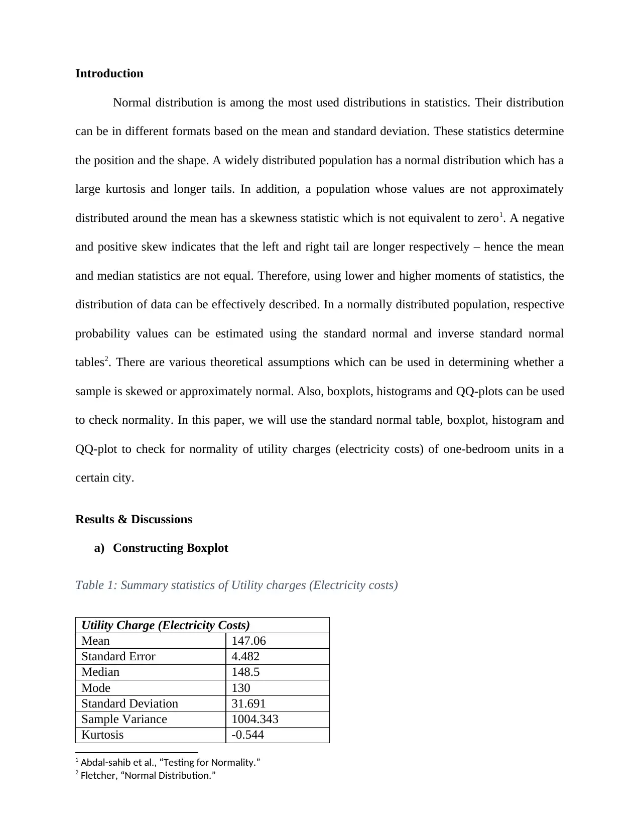
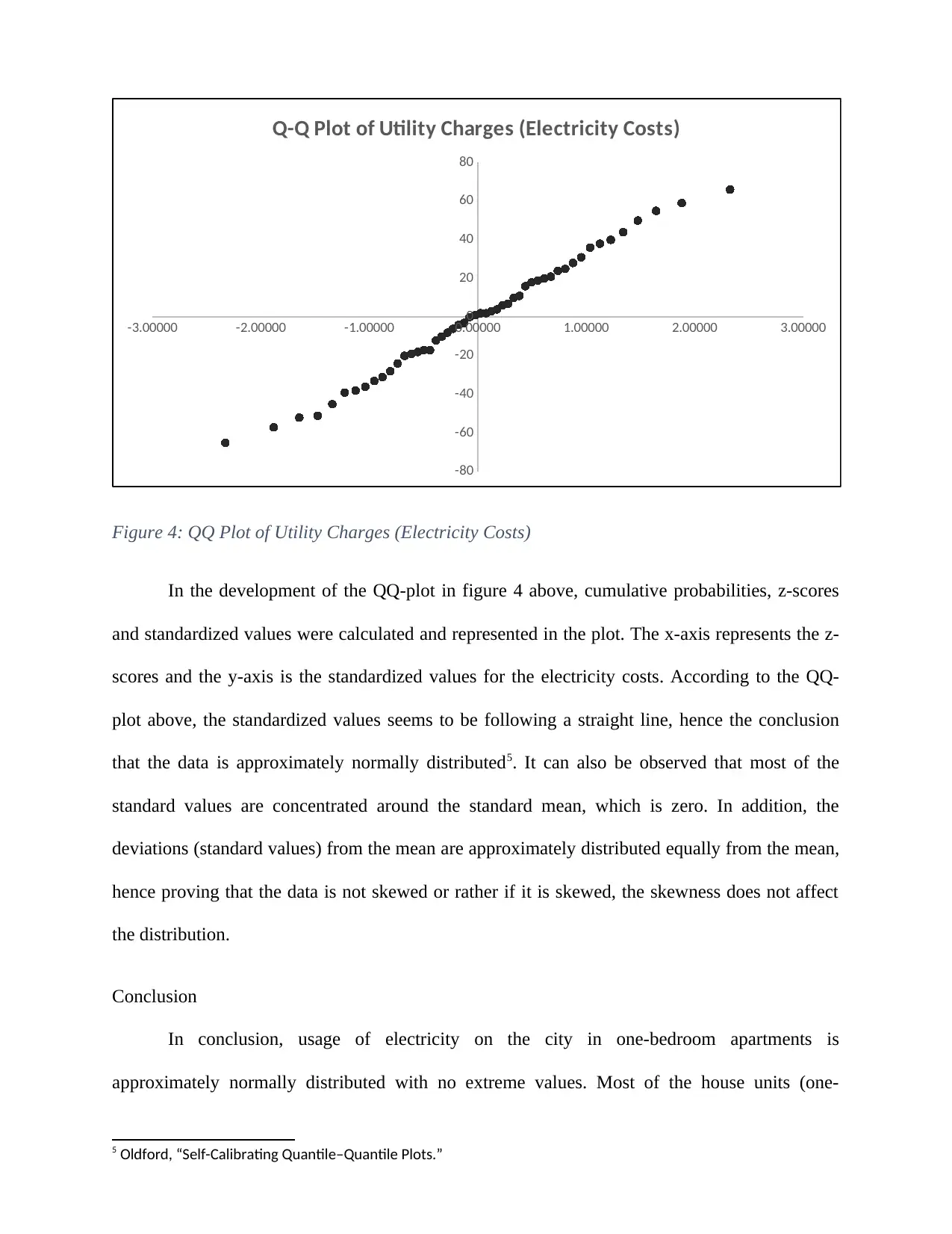
This report delves into the application of normal distribution within a business context, specifically analyzing electricity costs in a city. The study begins by calculating probabilities related to download times, demonstrating an understanding of z-scores and statistical inference. The core of the report focuses on the normal distribution, utilizing various statistical tools and techniques to assess the distribution of utility charges (electricity costs) for one-bedroom units. The analysis includes constructing and interpreting boxplots, histograms, and QQ-plots to determine the normality of the data. Summary statistics, including mean, median, skewness, and kurtosis, are calculated and discussed in relation to the data's distribution. The report also compares the data characteristics with theoretical assumptions of normal distribution, such as the 68-95-99.7 rule. Finally, the report concludes that the electricity costs are approximately normally distributed, with no extreme values, supported by the consistency of the results across the different analytical methods, including the normal table, histogram, and boxplot.
1 out of 13
Related Documents


Your All-in-One AI-Powered Toolkit for Academic Success.
+13062052269
info@desklib.com
Available 24*7 on WhatsApp / Email
![[object Object]](/_next/static/media/star-bottom.7253800d.svg)
Copyright © 2020–2026 A2Z Services. All Rights Reserved. Developed and managed by ZUCOL.