Business Decision Making: Statistical Tools and Analysis
VerifiedAdded on 2020/01/21
|24
|4790
|51
Report
AI Summary
This report delves into the application of statistical tools for effective business decision-making. It begins with data collection methods, including primary and secondary data, survey methodologies, and questionnaire design. The report then explores various statistical tools such as mean, median, mode, standard deviation, quartile, percentile, and correlation coefficients, illustrating their use through the analysis of sales data from Wm Morrison and its competitors. Furthermore, the report presents graphical representations of the data, including trend lines, and incorporates project evaluation techniques like ARR, NPV, and IRR to assess investment opportunities. A network diagram and Gantt chart are included to visualize project planning and execution. The report concludes with a summary of findings and recommendations, providing a comprehensive overview of how statistical analysis supports informed business decisions.
BUSINESS DECISION MAKING
Paraphrase This Document
Need a fresh take? Get an instant paraphrase of this document with our AI Paraphraser
TABLE OF CONTENTS
INTRODUCTION...........................................................................................................................4
1.1 Collection of primary and secondary data........................................................................4
1.2 Survey methodology and sampling frame for the research .............................................4
1.3 Designing questionnaire for survey .................................................................................5
TASK 2............................................................................................................................................7
2.1 Statistical tools for the decision making...........................................................................7
2.2 Analysis of results............................................................................................................8
2.3 Analysis of data using measure of dispersion..................................................................9
2.4 Quartile, percentile and correlation coefficient uses in data analysis...........................10
TASK 3..........................................................................................................................................11
3.1 Graphs on information derived from business scenario ................................................11
3.2 Trend lines......................................................................................................................15
3.3 Covered in PPT...............................................................................................................18
3.4 Formal business report...................................................................................................18
TASK 4..........................................................................................................................................18
4.1 Information processing tools..........................................................................................18
4.2 Network diagram............................................................................................................19
4.3 Project evaluation techniques.........................................................................................20
CONCLUSION ............................................................................................................................22
REFERENCES..............................................................................................................................24
INDEX OF TABLES
Table 1: Calculation of mean, median and mode for Morrison and its competitors.......................8
Table 2: Percentage change in sales.................................................................................................9
Table 3: Calculation of standard deviation......................................................................................9
Table 4: Calculation of quartile and percentile..............................................................................10
Table 5: Calculation of correlation................................................................................................10
Table 6: Percentage change in JS Sainsbury's sales revenue for FY 2009-13...............................13
Table 7: Percentage change in Lidl sales revenue.........................................................................14
Table 8: Sales revenue of Aldi.......................................................................................................15
Table 9: ARR of projects...............................................................................................................22
Table 10: NPV of Project A&B.....................................................................................................23
Table 11: IRR of projects...............................................................................................................24
ILLUSTRATION INDEX
Illustration 1: Wm Morrison's sales revenue.................................................................................11
Illustration 2: Sales revenue of JS Sainsbury's..............................................................................13
Illustration 3: Sales revenue of Lidl from FY 2009- 2013.............................................................14
Illustration 4: Sales revenue of Aldi..............................................................................................15
Illustration 5: Trend line on Wm Morrison....................................................................................16
Illustration 6: Trend line of JS Sainsbury's....................................................................................18
Illustration 7: Lidl trend line..........................................................................................................19
Illustration 8: Trend line of Aldi....................................................................................................19
Illustration 9: Gantt chart...............................................................................................................21
Illustration 10: Network diagram...................................................................................................22
⊘ This is a preview!⊘
Do you want full access?
Subscribe today to unlock all pages.
Trusted by 1+ million students worldwide
INTRODUCTION
Morrison is one of the largest supermarket chains in the UK. This report is prepared on
the statistical tools. In today era, all decisions are taken on the basis of collected data. Due to this
reason it is necessary to have deep knowledge of the collected data. In this regard, in the report,
statistical tools like mean, median and mode etc are applied on the company data. Apart from
this trend analysis is also done and charts are interpreted in the report. Along with this, in the
report, network diagram is prepared and its results are interpreted in proper manner. At the end
of the report, project evaluation techniques are also applied on the given cash flows and best
project is selected for the firm.
1.1 Collection of primary and secondary data
Primary data refers to the data that is collected for the first time by the researcher.
Primary data can be collected by distributing questionnaire, schedules etc. Apart from this, data
can also be collected through telephone calls if respondent are rich people and it is not possible
to approach them. On other hand, secondary data refers to the data that is already collected by
someone. Secondary data can be collected from the books, journals and magazines etc.
Collection of both data is necessary for the research (Krikidis, Devroye and Thompson, 2010).
This is because by conducting secondary research a researcher comes to know about the past
scenario. On the basis of knowledge of past scenario and current business conditions researcher
is in position to draft questionnaire in proper manner. Hence, here secondary research help
researcher in conducting a research (Edge and Compton, 2010). In order to conduct a research
sample of 50 people is taken that resides in to different borough of London. These people belong
to different income level and their social status is also different. Hence, good quality of data will
be collected from the respondents.
1.2 Survey methodology and sampling frame for the research
There are many sampling techniques and some of them are as follows.
Simple random sampling- It is a sampling technique in which all sample units are taken
randomly from the population. Means that on the basis of specific criteria sampling units
are not taken for the research (Piwowarski, Krajewski and Lelito, 2010). This sampling
technique is used in the research when specific category of respondents is not required for
research.
Paraphrase This Document
Need a fresh take? Get an instant paraphrase of this document with our AI Paraphraser
Stratified random sampling- This is different type of sampling and under this entire
population is divided in to several parts and from these parts sample units are taken for
the research. The main benefit of this sampling technique is that in this method data from
specific type of people can be taken by the researcher. Due to this specific feature this
sampling frame is very popular among the researchers.
Cluster sampling- In this sampling technique population of the geographic area is
divided in to several parts and from same sampling units is taken by the researcher
(Basak, 2012). Data from specific type of people can be collected in the specific
geographic area by making use of this sampling method. Hence, it is third sampling
technique that is famous among the researchers.
1.3 Designing questionnaire for survey
Demographic Details
Name:
Age:
Gender:
Occupation:
Marital status
Do you frequently make purchase of food products from WM Morrison?
Yes ( )
No ( )
What are the factors to which you give priority before making purchase from Morrison?
Attractive discounts ( )
Better quality ( )
Near to your place ( )
Value for money ( )
How frequent you visit the retail store of Morrison for the purchase?
Daily ( )
Weekly ( )
Monthly ( )
According to requirements ( )
At the time of offers ( )
From the below given options, in which category services at WM Morrison fall?
Poor ( )
Bad ( )
Average ( )
Good ( )
Excellent ( )
Are you satisfied with the goods and services of the company?
Strongly satisfied
Satisfied
Neutral
Dissatisfied
Strongly dissatisfied
How much money you spend at WM Morrison in a single purchase?
<£200
£200-400
£400-600
> £600
In terms of service, which retail supermarket you mostly prefer?
WM Morrison ( )
JS Sainsbury's ( )
LIDL Ltd ( )
ALDI ( )
Do you wish to give any suggestion for the improvements in the products and services of WM
Morrison?
TASK 2
2.1 Statistical tools for the decision making
Statistical tools that are used for decision making are as follows:
⊘ This is a preview!⊘
Do you want full access?
Subscribe today to unlock all pages.
Trusted by 1+ million students worldwide
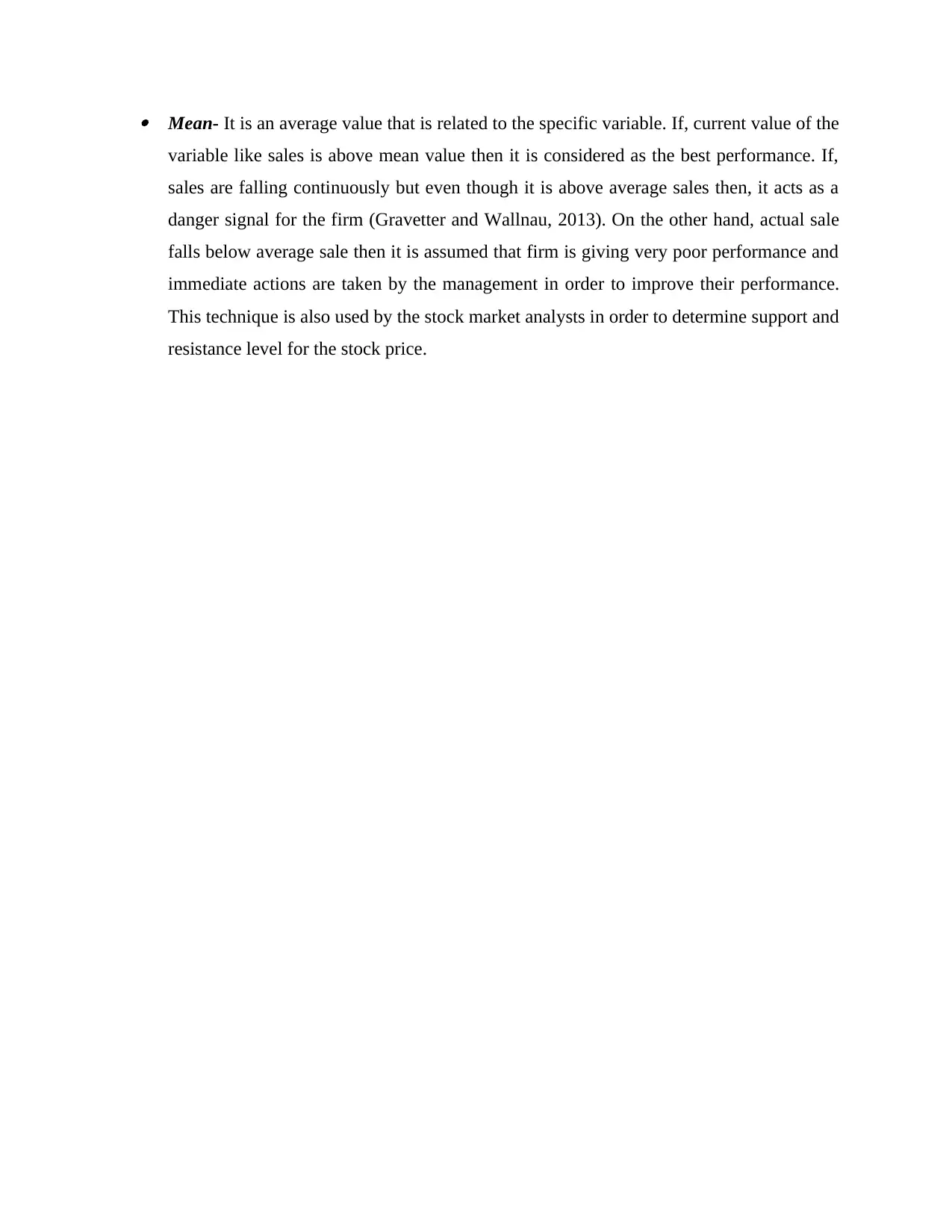
Mean- It is an average value that is related to the specific variable. If, current value of the
variable like sales is above mean value then it is considered as the best performance. If,
sales are falling continuously but even though it is above average sales then, it acts as a
danger signal for the firm (Gravetter and Wallnau, 2013). On the other hand, actual sale
falls below average sale then it is assumed that firm is giving very poor performance and
immediate actions are taken by the management in order to improve their performance.
This technique is also used by the stock market analysts in order to determine support and
resistance level for the stock price.
Paraphrase This Document
Need a fresh take? Get an instant paraphrase of this document with our AI Paraphraser
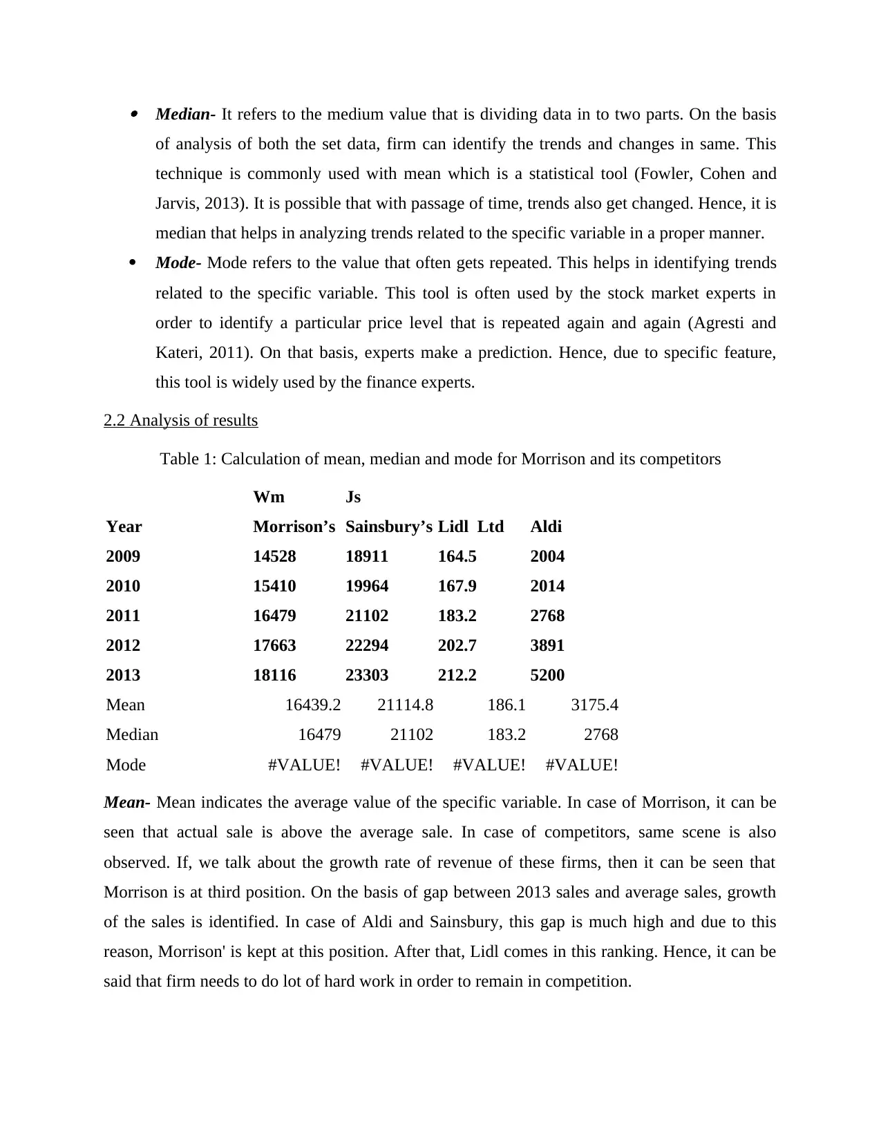
Median- It refers to the medium value that is dividing data in to two parts. On the basis
of analysis of both the set data, firm can identify the trends and changes in same. This
technique is commonly used with mean which is a statistical tool (Fowler, Cohen and
Jarvis, 2013). It is possible that with passage of time, trends also get changed. Hence, it is
median that helps in analyzing trends related to the specific variable in a proper manner.
Mode- Mode refers to the value that often gets repeated. This helps in identifying trends
related to the specific variable. This tool is often used by the stock market experts in
order to identify a particular price level that is repeated again and again (Agresti and
Kateri, 2011). On that basis, experts make a prediction. Hence, due to specific feature,
this tool is widely used by the finance experts.
2.2 Analysis of results
Table 1: Calculation of mean, median and mode for Morrison and its competitors
Year
Wm
Morrison’s
Js
Sainsbury’s Lidl Ltd Aldi
2009 14528 18911 164.5 2004
2010 15410 19964 167.9 2014
2011 16479 21102 183.2 2768
2012 17663 22294 202.7 3891
2013 18116 23303 212.2 5200
Mean 16439.2 21114.8 186.1 3175.4
Median 16479 21102 183.2 2768
Mode #VALUE! #VALUE! #VALUE! #VALUE!
Mean- Mean indicates the average value of the specific variable. In case of Morrison, it can be
seen that actual sale is above the average sale. In case of competitors, same scene is also
observed. If, we talk about the growth rate of revenue of these firms, then it can be seen that
Morrison is at third position. On the basis of gap between 2013 sales and average sales, growth
of the sales is identified. In case of Aldi and Sainsbury, this gap is much high and due to this
reason, Morrison' is kept at this position. After that, Lidl comes in this ranking. Hence, it can be
said that firm needs to do lot of hard work in order to remain in competition.
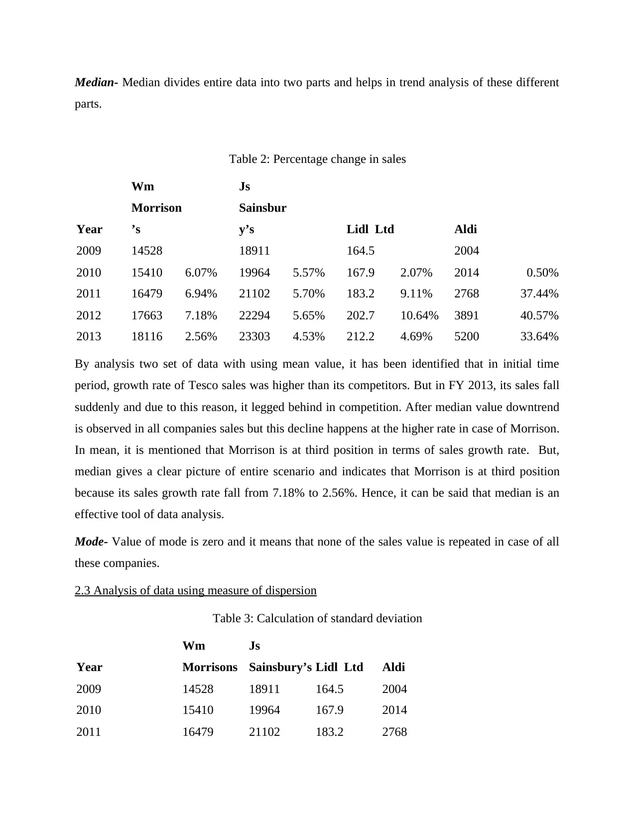
Median- Median divides entire data into two parts and helps in trend analysis of these different
parts.
Table 2: Percentage change in sales
Year
Wm
Morrison
’s
Js
Sainsbur
y’s Lidl Ltd Aldi
2009 14528 18911 164.5 2004
2010 15410 6.07% 19964 5.57% 167.9 2.07% 2014 0.50%
2011 16479 6.94% 21102 5.70% 183.2 9.11% 2768 37.44%
2012 17663 7.18% 22294 5.65% 202.7 10.64% 3891 40.57%
2013 18116 2.56% 23303 4.53% 212.2 4.69% 5200 33.64%
By analysis two set of data with using mean value, it has been identified that in initial time
period, growth rate of Tesco sales was higher than its competitors. But in FY 2013, its sales fall
suddenly and due to this reason, it legged behind in competition. After median value downtrend
is observed in all companies sales but this decline happens at the higher rate in case of Morrison.
In mean, it is mentioned that Morrison is at third position in terms of sales growth rate. But,
median gives a clear picture of entire scenario and indicates that Morrison is at third position
because its sales growth rate fall from 7.18% to 2.56%. Hence, it can be said that median is an
effective tool of data analysis.
Mode- Value of mode is zero and it means that none of the sales value is repeated in case of all
these companies.
2.3 Analysis of data using measure of dispersion
Table 3: Calculation of standard deviation
Year
Wm
Morrisons
Js
Sainsbury’s Lidl Ltd Aldi
2009 14528 18911 164.5 2004
2010 15410 19964 167.9 2014
2011 16479 21102 183.2 2768
⊘ This is a preview!⊘
Do you want full access?
Subscribe today to unlock all pages.
Trusted by 1+ million students worldwide
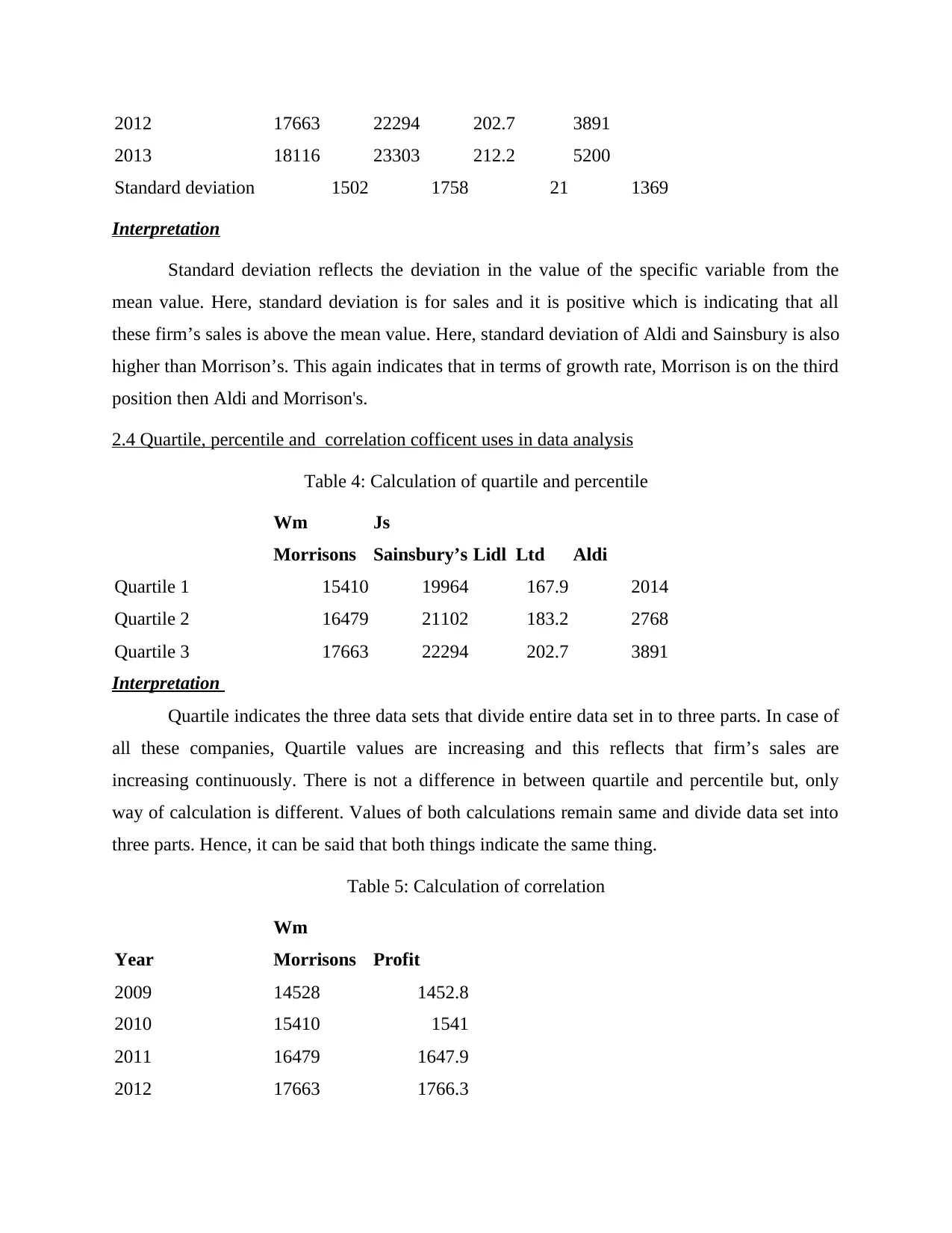
2012 17663 22294 202.7 3891
2013 18116 23303 212.2 5200
Standard deviation 1502 1758 21 1369
Interpretation
Standard deviation reflects the deviation in the value of the specific variable from the
mean value. Here, standard deviation is for sales and it is positive which is indicating that all
these firm’s sales is above the mean value. Here, standard deviation of Aldi and Sainsbury is also
higher than Morrison’s. This again indicates that in terms of growth rate, Morrison is on the third
position then Aldi and Morrison's.
2.4 Quartile, percentile and correlation cofficent uses in data analysis
Table 4: Calculation of quartile and percentile
Wm
Morrisons
Js
Sainsbury’s Lidl Ltd Aldi
Quartile 1 15410 19964 167.9 2014
Quartile 2 16479 21102 183.2 2768
Quartile 3 17663 22294 202.7 3891
Interpretation
Quartile indicates the three data sets that divide entire data set in to three parts. In case of
all these companies, Quartile values are increasing and this reflects that firm’s sales are
increasing continuously. There is not a difference in between quartile and percentile but, only
way of calculation is different. Values of both calculations remain same and divide data set into
three parts. Hence, it can be said that both things indicate the same thing.
Table 5: Calculation of correlation
Year
Wm
Morrisons Profit
2009 14528 1452.8
2010 15410 1541
2011 16479 1647.9
2012 17663 1766.3
Paraphrase This Document
Need a fresh take? Get an instant paraphrase of this document with our AI Paraphraser
2013 18116 1811.6
Correlation 1
Interpretation
Correlation indicates the relationship between two variables. When one variable get
changed other variable also change. Correlation between these values always remains between -
1, 0 and 1. Zero means that there is no relationship between two variables. On other hand, if
value of correlation is one then it means that both variables move in a same direction and there is
a very strong correlation between both of them. If correlation value is negative then it means that
there is negative correlation between both variable values and this also indicates that values of
both variables are moving in different direction. Here, value of correlation is one and this reflects
that firm sales and profit are strongly related to each other.
TASK 3
3.1 Graphs on information derived from business scenario
Wm Morrison's
1 2 3 4 5
0
2000
4000
6000
8000
10000
12000
14000
16000
18000
20000
14528 15410
16479
17663 18116
Column C
Column D
Illustration 1: Wm Morrison's sales revenue
Interpretation- It can be seen from the chart that revenue of Morrison is elevating during 2009 to
2013. This reflects that management of Morrison took sound business decisions in last couple of
years. In adverse economic scenario it earns a good profit. In past years performance on
economic parameters was very poor. Even in such a situation firm sales does not decline and this
is its big achievement.
JS Sainsbury's
Interpretation- Current market share of Sainsbury in the UK retail industry is 16.6%. From the
table given below it can be observed that sales revenue of JS Sainsbury's is continuously
increases from 18,911 to 23,303. Plunge in sales revenue is very impressive and it also reflects
that firm is taking various steps that lead to increase in its revenue. Mentioned firm face lots of
business problems due to adverse economic condition in its business. Even though it successfully
increase its revenue from 18,911 to 23,303. From the table given below it can be observed that
there is stability in the growth rate of sales in case of Sainsbury then Wm Morrison. Up to FY
2012 its sales revenue enhanced at the rate of 5% every year. But in FY 2014 this growth rate fall
to 4%. But this fall was not so big and it can be said that in opposite business conditions firm
book a profit.
1 2 3 4 5
0
5000
10000
15000
20000
25000
Column E
Illustration 2: Sales revenue of JS Sainsbury's
⊘ This is a preview!⊘
Do you want full access?
Subscribe today to unlock all pages.
Trusted by 1+ million students worldwide
1 out of 24
Related Documents


Your All-in-One AI-Powered Toolkit for Academic Success.
+13062052269
info@desklib.com
Available 24*7 on WhatsApp / Email
![[object Object]](/_next/static/media/star-bottom.7253800d.svg)
Unlock your academic potential
Copyright © 2020–2026 A2Z Services. All Rights Reserved. Developed and managed by ZUCOL.