Statistics for Business Decisions and Research: Analysis Report
VerifiedAdded on 2021/02/19
|20
|3185
|81
Homework Assignment
AI Summary
This assignment analyzes Australian export data, comparing export values and percentages across different time periods and countries. It involves constructing frequency and relative frequency distributions, cumulative frequency distributions, and histograms to summarize and interpret the data. The assignment further explores the relationship between retail turnover per capita and final consumption expenditure using graphical representations, summary reports, correlation coefficients, and regression models. It includes interpretations of the coefficient of determination and hypothesis testing to assess the significance of the relationship between the variables. The analysis covers various statistical techniques to draw meaningful insights from the provided economic data, offering a comprehensive understanding of statistical methods applied to business decision-making and research.

STATISTICS FOR
BUSINESS DECISIONS
AND RESEARCH
BUSINESS DECISIONS
AND RESEARCH
Paraphrase This Document
Need a fresh take? Get an instant paraphrase of this document with our AI Paraphraser

Table of Contents
QUESTION 1 ..................................................................................................................................1
a) Comparing the values of Exports for two time-periods..........................................................1
b) Comparing the percentages value of exports for two time-periods........................................2
c) Interpreting the Results...........................................................................................................2
QUESTION 2 ..................................................................................................................................3
a) Constructing a Frequency and Relative Frequency Distribution............................................3
b. Constructing a Cumulative Frequency and Cumulative Relative Frequency Distribution.....4
c. Plotting a Relative Frequency Histogram for the given data..................................................5
d. Constructing an Ogive from given data..................................................................................5
e. Proportion of grades less than 60............................................................................................6
f. Proportion of grades more than 70..........................................................................................7
QUESTION 3...................................................................................................................................9
a. Defining Variables through a graphical descriptive measure.................................................9
b. Graphical Representation of Relationship between two variables..........................................9
c. Creating a Summary Report for the data provided................................................................10
d. Coefficient of Correlation (r)................................................................................................12
e. Estimating a simple linear regression model, estimated linear equation and coefficients for
the two variables.......................................................................................................................12
f. Interpreting Coefficient of Determination (r2)......................................................................15
g. Testing whether FINAL CONSUMPTION EXPENDITURE positively and significantly
increases with
RETAIL TURNOVER PER CAPITA at the 5% significance level........................................16
h. Ascertaining the value of the standard error of the estimate (Se )........................................17
REFERENCES..............................................................................................................................18

QUESTION 1
Australian Exports of goods and Services:
a) Comparing the values of Exports for two time-periods
Australia: Direction of exports
Top 8 export markets for goods and services
A$ bn
Country 2004-05 2014-15
1 China 15.9 90.3
2 Japan 28.2 46.6
3 United States 13.9 20.5
4 Republic of Korea 11 20.5
5 India 7.1 12.7
6 New Zealand 12.2 12.3
7 Singapore 5.8 12
8 United Kingdom 9.2 8.6
Subtotal 103.3 223.5
source: DFAT and Austrade
1
⊘ This is a preview!⊘
Do you want full access?
Subscribe today to unlock all pages.
Trusted by 1+ million students worldwide

China
Japan
United States
Republic of Korea
India
New Zealand
Singapore
United Kingdom
0
10
20
30
40
50
60
70
80
90
100
15.9
28.2
13.9 11 7.1
12.2
5.8 9.2
90.3
46.6
20.5 20.5
12.7 12.3 12 8.6
Australia: Direction of Exports
Top 8 Export markets for goods and services
2004-05
2014-15
Country by Export Destination
Exports (A$ bn)
b) Comparing the percentages value of exports for two time-periods
Australia: Direction of exports
Top 8 export markets for goods and services
A$ bn (%)
Country 2004-05 2014-15 2004-05 2014-15
1 China 15.9 90.3 15.39% 40.40%
2 Japan 28.2 46.6 27.30% 20.85%
3 United States 13.9 20.5 13.46% 9.17%
4 Republic of Korea 11 20.5 10.65% 9.17%
5 India 7.1 12.7 6.87% 5.68%
6 New Zealand 12.2 12.3 11.81% 5.50%
7 Singapore 5.8 12 5.61% 5.37%
8 United Kingdom 9.2 8.6 8.91% 3.85%
Subtotal 103.3 223.5 100.00% 100.00%
source: DFAT and Austrade
2
Paraphrase This Document
Need a fresh take? Get an instant paraphrase of this document with our AI Paraphraser

China
Japan
United States
Republic of Korea
India
New Zealand
Singapore
United Kingdom
0
0.05
0.1
0.15
0.2
0.25
0.3
0.35
0.4
0.45
15.39%
27.30%
13.46%
10.65%
6.87%
11.81%
5.61%
8.91%
40.40%
20.85%
9.17% 9.17%
5.68% 5.50% 5.37% 3.85%
Australia: Direction of Exports
Percentage Comparison of Export Markets
2004-05
2014-15
Market by Destination
Exports (in %)
c) Interpreting the Results
As per the part (a) and (b) presented in both tabular as well as graphical formats, it can be
easily seen that the when the Australian exports market for various goods and services have been
bifurcated on the basis of country of export destination, it mainly includes some of the biggest
countries such as China, Japan, United States and India among others (Babu, 2012). Apart from
this one can also infer that the Total of Exports for 2014-15 have more than doubled since 2004-
05. From the part (a) graph, it can be easily seen that the orange line, denoting Exports of 2014-
15, is much higher than the Blue Line, denoting Exports to countries broken down by destination
for the period 2004-05. This in itself proves that the exports have grown in the recent years with
maximum trade occurring between Australia and China as there is a sharp rise for this country in
2014-15 when compared with Value of Exports to China in 2004-05 by Australia. Countries such
as United Kingdom and New Zealand have been able to maintain their value of exports with
Australian Economy between 2004-05 and 2014-15 timelines.
Part (b) indicates the breakdown of Value of Exports in percentages in order to determine
what fraction of Total exports of goods and services has been contributed by each destination to
the Australian Economy. The table clearly shows that the maximum contribution was made by
Japan which was as high as 27% back in 2004-05 (Berenson, M. and et.al., 2012). On comparing
this with the results of 2017, Japan has grown less in contribution with only 20.85% of the
3

exports going to the South-East Nation. On the other hand, China has again increased in the
number of exports made and contribution given to the Australian Economy by way of Exports.
Although countries such as India and New Zealand have grown or maintained their previous
export relations, there has been an overall decline in the percentage of contribution made towards
the Australian Exports by these countries.
QUESTION 2
a) Constructing a Frequency and Relative Frequency Distribution
A Frequency Distribution is inclusive of values that fall in a certain range or time
interval. Hence, the number of values that are included in a particular class interval can be
known as 'Frequency' (Goodwin, P. and Wright, G., 2014). For a large number of class intervals,
these frequencies become to be known as 'Frequency Distribution'. These distributions are
mostly used to summarize categorical variables. It may be in the form of a list, table or graph
which aims to depict the frequencies of various outcomes for a particular sample data. Hence, it
helps in organizing raw data in a meaningful manner.
A Relative Frequency Distribution, a type of Frequency Distribution, is a percentage or
proportion of total sum of frequencies that are available in a given sample. Hence, one can
calculate relative frequencies as:
Relative Frequency = (Count of Subgroup/ Total Count)*100
Raw Data
63 74 42 65 51 54 36 56 68 57
62 64 76 67 79 61 81 77 59 38
84 68 71 94 71 86 69 75 91 55
48 82 83 54 79 62 68 58 41 47
The above data relates to umbrella sales from a store for a span of 40 day period. This
data has been further utilized to construct the frequency and relative frequency distribution table
provided below:
Classes Frequency Relative Frequency
30-40 2 0.05
4
⊘ This is a preview!⊘
Do you want full access?
Subscribe today to unlock all pages.
Trusted by 1+ million students worldwide

40-50 4 0.1
50-60 8 0.2
60-70 11 0.275
70-80 8 0.2
80-90 5 0.125
90-100 2 0.05
40 1
As per the above construction, it can be analysed that the total number of values present
in the classes is 40. Whereas the Relative Frequency indicates the contribution of each frequency
for every class interval in terms of total sum, that is, 40 (Groebner, D. F. and et.al., 2013).
b. Constructing a Cumulative Frequency and Cumulative Relative Frequency Distribution
A Cumulative Frequency as well as Cumulative Relative Frequency Distribution relate to
the addition of each variable relating to both headings in a quantitative manner. Thus, indicating
a summary of frequencies as well as proportions of these frequencies below a given level.
Classes Cumulative Frequency
Cumulative Relative
Frequency
30-40 2 0.05
40-50 6 0.15
50-60 14 0.35
60-70 25 0.625
70-80 33 0.825
80-90 38 0.95
90-100 40 1
As per the above construction, it can be analysed that the total number of values present
in the classes is 40. Whereas the Cumulative Relative Frequency indicates the contribution of
each frequency for every class interval in terms of total sum, that is, 40. These both indicate an
additive nature of frequency as well as relative frequency distribution(.Lind, D. A. and et.al.,
2012).
5
Paraphrase This Document
Need a fresh take? Get an instant paraphrase of this document with our AI Paraphraser

c. Plotting a Relative Frequency Histogram for the given data
30-40 40-50 50-60 60-70 70-80 80-90 90-100
0
0.05
0.1
0.15
0.2
0.25
0.3
0.05
0.1
0.2
0.275
0.2
0.125
0.05
Relative Frequency Histogram
Relative Frequency
Classes
Relative Frequency
d. Constructing an Ogive from given data
An Ogive is mainly the graphical representation of Cumulative Frequencies for a given
sample. In the context of present case scenario, the following graph indicates the Ogive for
grades received by pupils with a maximum strength of the class being 40 (Newbold, P., Carlson,
W. L. and Thorne, B., 2013).
30-40 40-50 50-60 60-70 70-80 80-90 90-100
0
5
10
15
20
25
30
35
40
45
2
6
14
25
33
38 40
Ogive
Cumulative
Frequency
Classes
Cumulative Frequnecy
6
30-40 40-50 50-60 60-70 70-80 80-90 90-100
0
0.05
0.1
0.15
0.2
0.25
0.3
0.05
0.1
0.2
0.275
0.2
0.125
0.05
Relative Frequency Histogram
Relative Frequency
Classes
Relative Frequency
d. Constructing an Ogive from given data
An Ogive is mainly the graphical representation of Cumulative Frequencies for a given
sample. In the context of present case scenario, the following graph indicates the Ogive for
grades received by pupils with a maximum strength of the class being 40 (Newbold, P., Carlson,
W. L. and Thorne, B., 2013).
30-40 40-50 50-60 60-70 70-80 80-90 90-100
0
5
10
15
20
25
30
35
40
45
2
6
14
25
33
38 40
Ogive
Cumulative
Frequency
Classes
Cumulative Frequnecy
6

e. Proportion of grades less than 60
Classes Frequency
Relative
Frequency
Cumulative
Frequency
Cumulative
Relative
Frequency
Less than 40 2 0.05 2 0.05
Less than 50 4 0.1 6 0.15
Less than 60 8 0.2 14 0.35
Less than 70 11 0.275 25 0.625
Less than 80 8 0.2 33 0.825
Less than 90 5 0.125 38 0.95
Less than 100 2 0.05 40 1
40 1
Less than 40 Less than 50 Less than 60 Less than 70 Less than 80 Less than 90 Less than 100
0
5
10
15
20
25
30
35
40
45
2
6
14
25
33
38 40
Ogive
Cumula
tive
Frequen
cy
Classes
Cumulative Relative Frequency
As per the above Ogive, it can be ascertained that there are 0.35% of the pupils received a
grade less than 60. This means that 14 (=0.35*40) students received a grade below 60.
f. Proportion of grades more than 70
Classes Frequency
Relative
Frequency
Cumulative
Frequency
Cumulative Relative
Frequency
More than 40 2 0.05 40 0.05
More than 50 4 0.1 38 0.15
More than 60 8 0.2 34 0.35
7
Classes Frequency
Relative
Frequency
Cumulative
Frequency
Cumulative
Relative
Frequency
Less than 40 2 0.05 2 0.05
Less than 50 4 0.1 6 0.15
Less than 60 8 0.2 14 0.35
Less than 70 11 0.275 25 0.625
Less than 80 8 0.2 33 0.825
Less than 90 5 0.125 38 0.95
Less than 100 2 0.05 40 1
40 1
Less than 40 Less than 50 Less than 60 Less than 70 Less than 80 Less than 90 Less than 100
0
5
10
15
20
25
30
35
40
45
2
6
14
25
33
38 40
Ogive
Cumula
tive
Frequen
cy
Classes
Cumulative Relative Frequency
As per the above Ogive, it can be ascertained that there are 0.35% of the pupils received a
grade less than 60. This means that 14 (=0.35*40) students received a grade below 60.
f. Proportion of grades more than 70
Classes Frequency
Relative
Frequency
Cumulative
Frequency
Cumulative Relative
Frequency
More than 40 2 0.05 40 0.05
More than 50 4 0.1 38 0.15
More than 60 8 0.2 34 0.35
7
⊘ This is a preview!⊘
Do you want full access?
Subscribe today to unlock all pages.
Trusted by 1+ million students worldwide
More than 70 11 0.275 26 0.625
More than 80 8 0.2 15 0.825
More than 90 5 0.125 7 0.95
More than 100 2 0.05 2 1
40 1
30-40 40-50 50-60 60-70 70-80 80-90 90-100
0
5
10
15
20
25
30
35
40
45
2
6
14
25
33
38 40
Ogive
Cumulative
Frequency
Classes
Cumulative Frequnecy
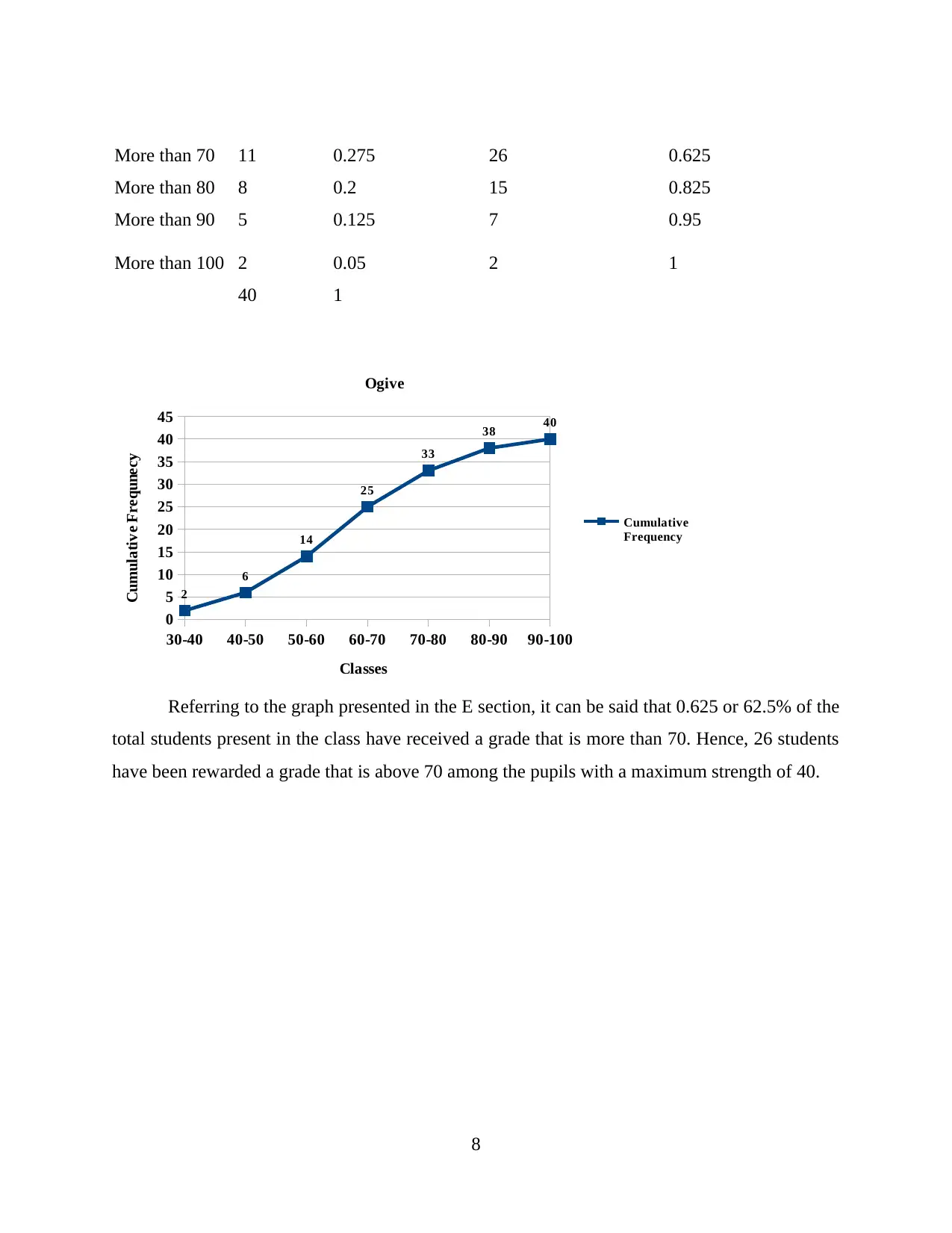
Referring to the graph presented in the E section, it can be said that 0.625 or 62.5% of the
total students present in the class have received a grade that is more than 70. Hence, 26 students
have been rewarded a grade that is above 70 among the pupils with a maximum strength of 40.
8
More than 80 8 0.2 15 0.825
More than 90 5 0.125 7 0.95
More than 100 2 0.05 2 1
40 1
30-40 40-50 50-60 60-70 70-80 80-90 90-100
0
5
10
15
20
25
30
35
40
45
2
6
14
25
33
38 40
Ogive
Cumulative
Frequency
Classes
Cumulative Frequnecy
Referring to the graph presented in the E section, it can be said that 0.625 or 62.5% of the
total students present in the class have received a grade that is more than 70. Hence, 26 students
have been rewarded a grade that is above 70 among the pupils with a maximum strength of 40.
8
Paraphrase This Document
Need a fresh take? Get an instant paraphrase of this document with our AI Paraphraser

QUESTION 3
a. Defining Variables through a graphical descriptive measure
1983
1985
1987
1989
1991
1993
1995
1997
1999
2001
2003
2005
2007
2009
2011
2013
2015
0 100000 200000 300000 400000 500000 600000 700000 800000 900000 1000000
2915.5
5874.3
6027.5
6096.7
6157.2
6317.9
6496.8
6502.9
6530.1
6720.9
6789.1
7120.5
7477.8
7672.3
7895.9
8112.2
8576.1
8746.2
9022.9
9466.3
9967.3
10575.6
10625.8
10870.9
11254.6
11211.9
11240.8
11396.5
11366.1
11517.5
11591.9
11805.9
11996.3
3014.6
164299
329825
342775
354662
363099
377209
396805
407148
411462
422245
429485
445580
463800
477293
496916
521346
548712
567597
584382
608795
633223
669123
691564
717213
757329
773237
780413
806177
832459
850443
865809
889948
915080
233148
Final Consumption
Expenditure
Retail Turnover per
Capita
Years
Amount in Million ($)
The above graph depicts the two variables, Retail Turnover Per Capita and Final
Consumption Expenditure for the Australian Economy on a time series of 1983 to 2016. The
Purple bars depict the Final Consumption Expenditure whereas the Blue Bars depict the Retail
Turnover Per Capita. As one can observe, these values have grown over the years as far as
consumption expenditure is concerned whereas there is almost little increase in the Retail
Turnover Per Capita. The Final Consumption Expenditure is that part of macro-economics which
is concerned with the direct satisfaction of individual or collective needs of members of the
community, mainly defined in the terms of goods and services. On the other hand, the Retail
Turnover Per Capita relate to the total Retail Sales made by per person on an average basis.
Thus, it can be inferred that the turnover is less than the final consumption expenditure incurred.
b. Graphical Representation of Relationship between two variables
9

05/06/1905
1984
1985
1986
1987
1988
1989
1990
1991
1992
1993
1994
1995
1996
1997
1998
1999
2000
2001
2002
2003
2004
2005
2006
2007
2008
2009
2010
2011
2012
2013
2014
2015
2016
0
100000
200000
300000
400000
500000
600000
700000
800000
900000
1000000
Relationship between Retail Turnover Per Capita & Final Consumption Expenditure
Years
Amount inMillions ($)
c. Creating a Summary Report for the data provided
The following Table shows a summary report in regards to the data provided for two
Macro-economic Variables, Retail Turnover Per Capita and Final Consumption Expenditure.
This summary report outlines numerous statistical measures of both central tendency such as
Mean, Median, Ranges, Quartiles as well as dispersion such as Variance and Standard Deviation.
Time-Period
Retail Turnover per Capita
($) (in Millions, AUD)
Final Consumption
Expenditure ($) (in Millions,
AUD)
1983 2915.5 164299
1984 5874.3 329825
1985 6027.5 342775
1986 6096.7 354662
10
⊘ This is a preview!⊘
Do you want full access?
Subscribe today to unlock all pages.
Trusted by 1+ million students worldwide
1 out of 20


Your All-in-One AI-Powered Toolkit for Academic Success.
+13062052269
info@desklib.com
Available 24*7 on WhatsApp / Email
![[object Object]](/_next/static/media/star-bottom.7253800d.svg)
Unlock your academic potential
Copyright © 2020–2026 A2Z Services. All Rights Reserved. Developed and managed by ZUCOL.