Statistics and Research Methods for Business Project
VerifiedAdded on 2023/01/06
|11
|2087
|81
Project
AI Summary
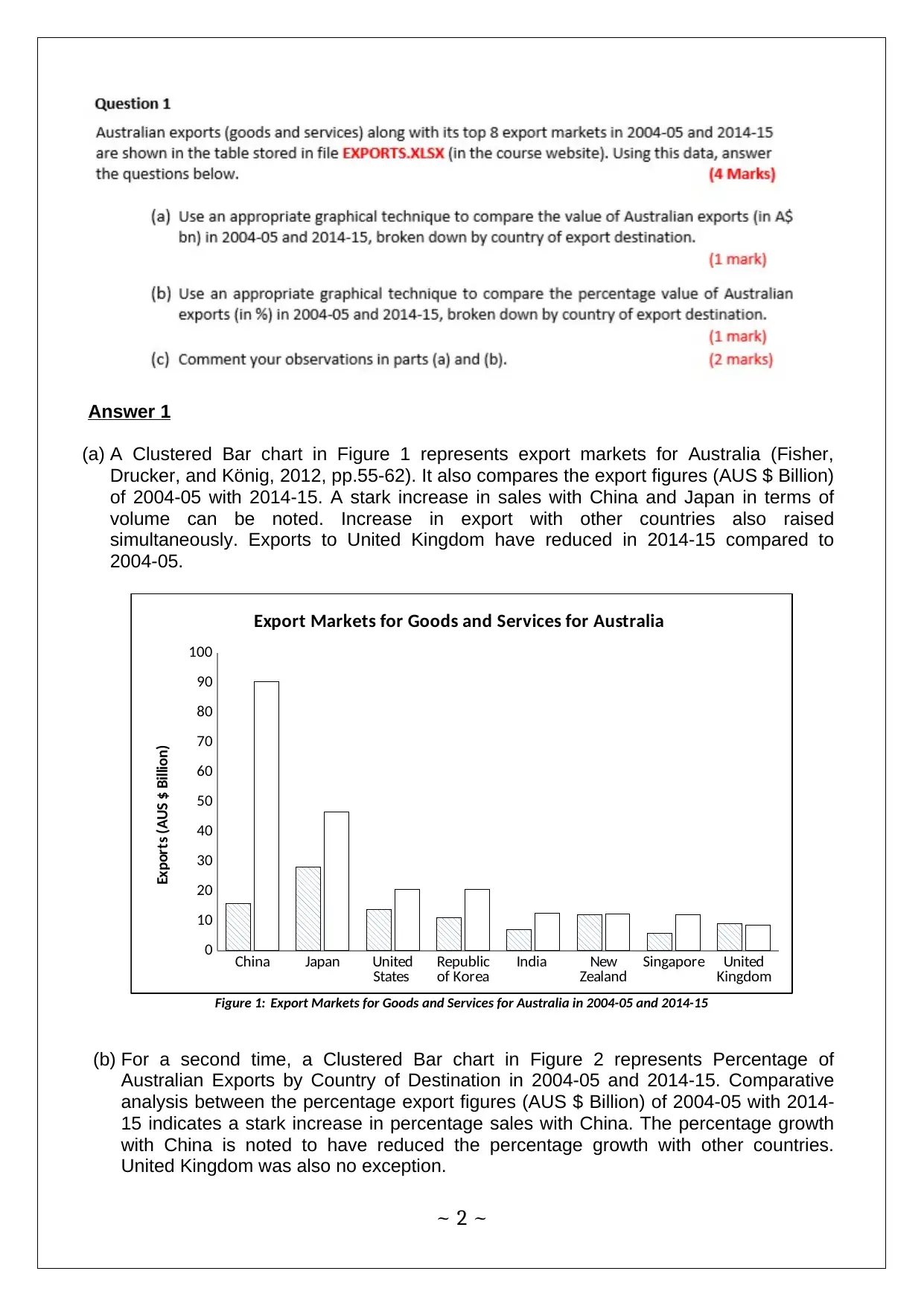
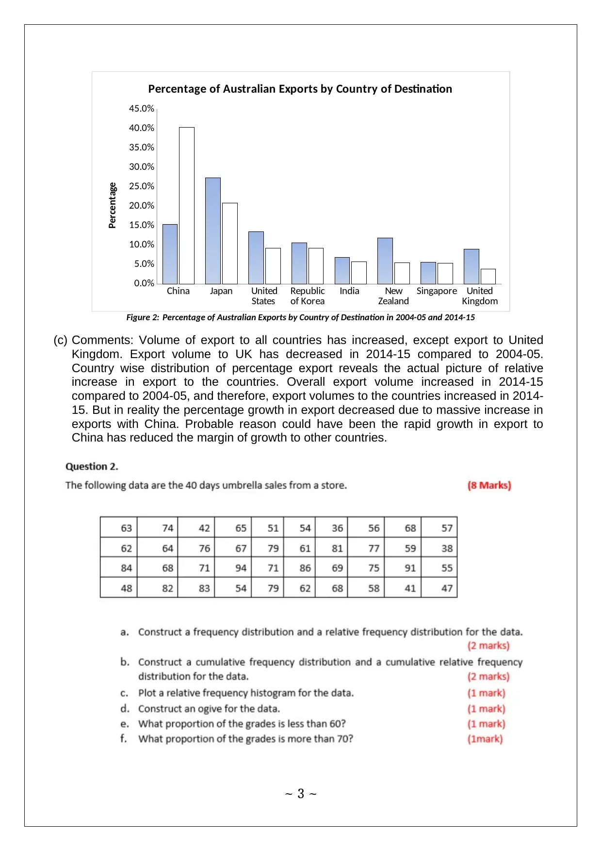
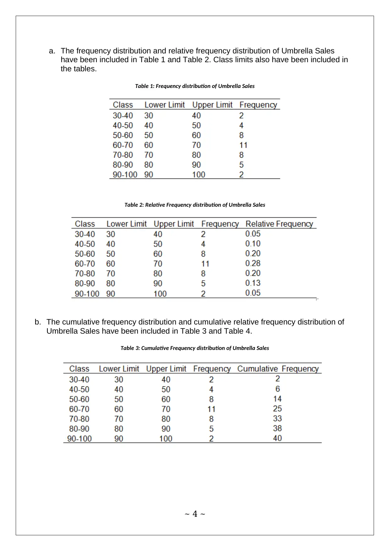
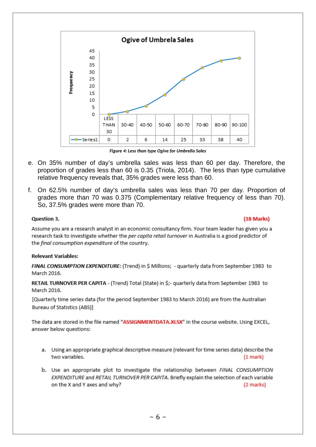
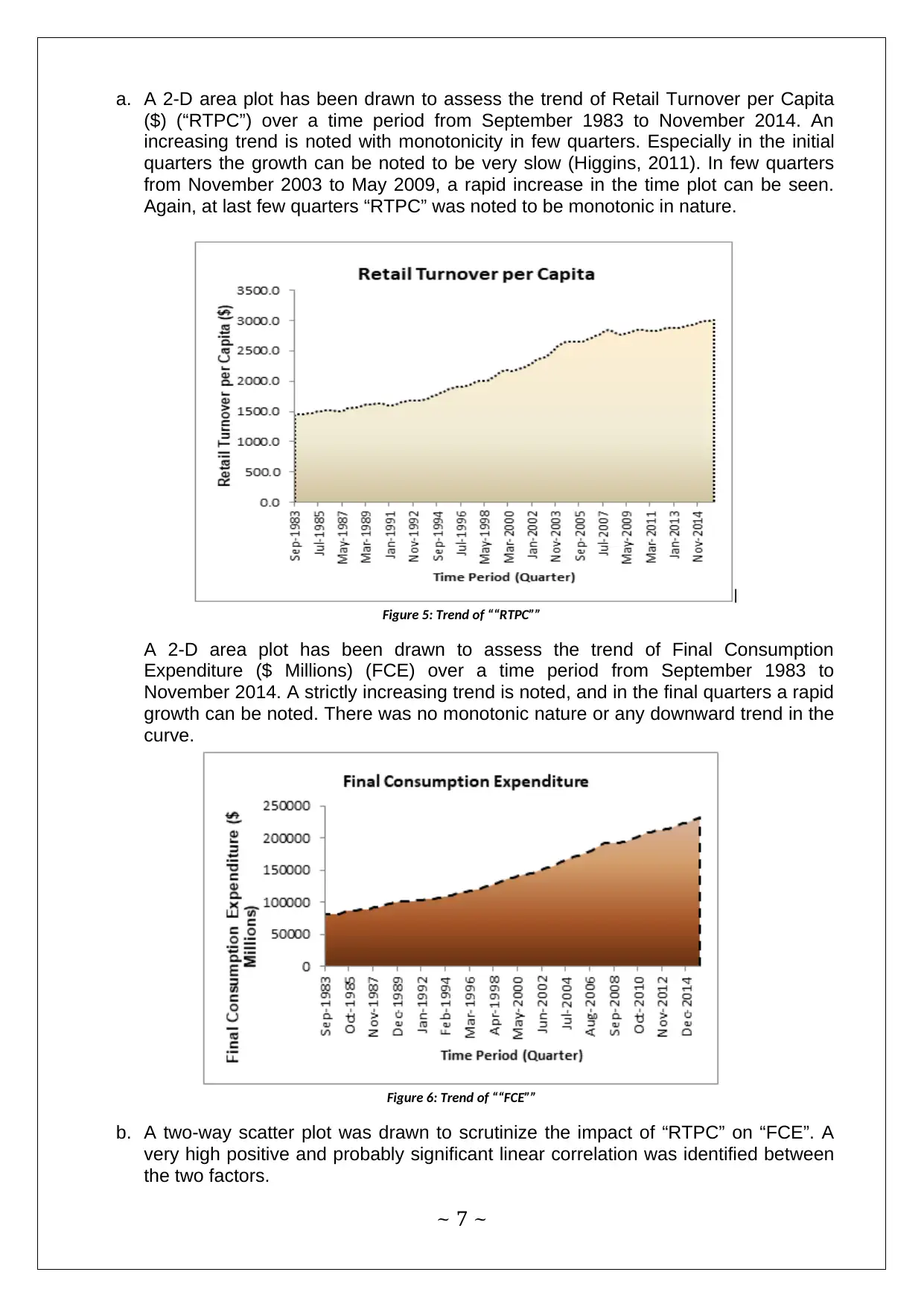
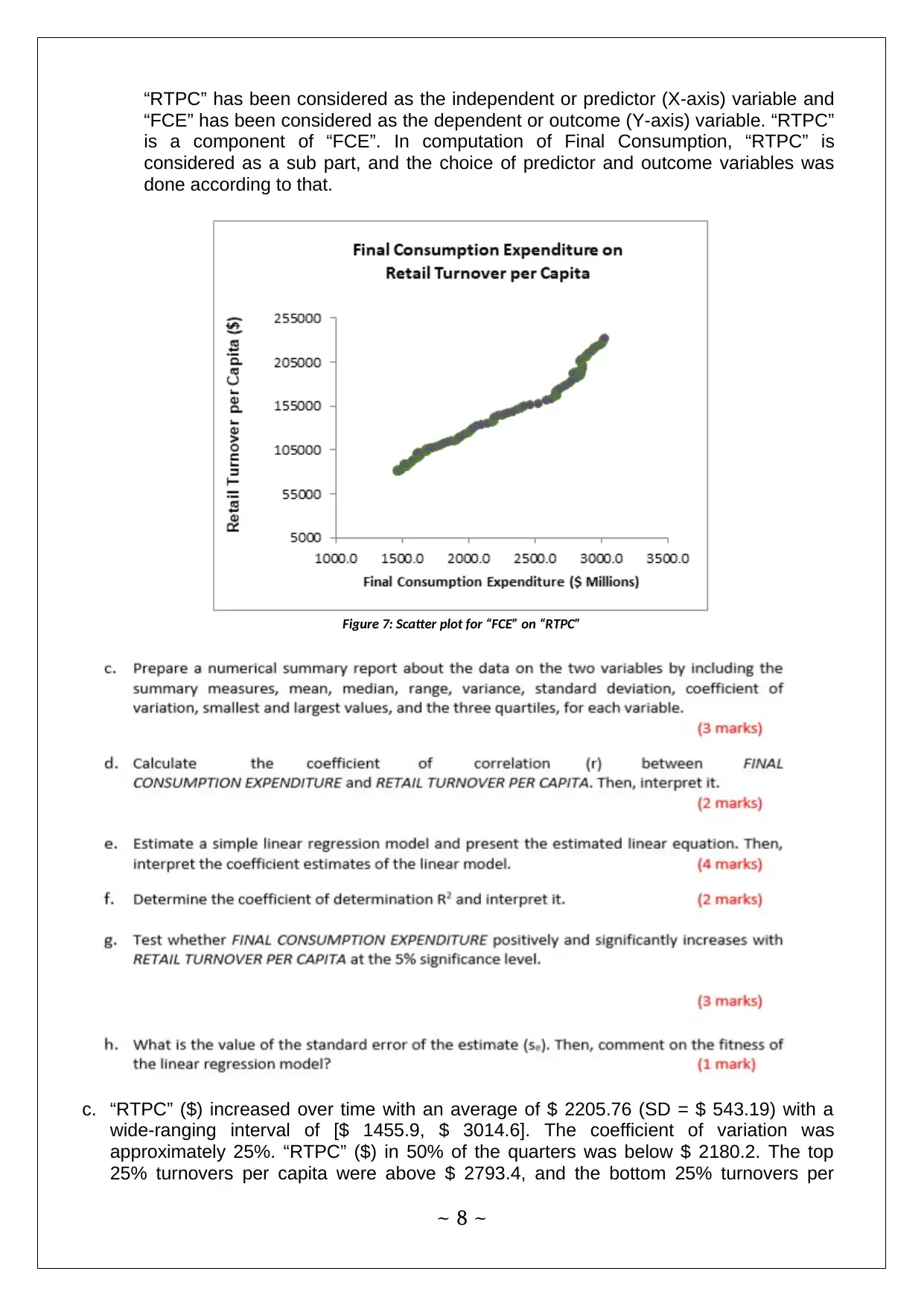
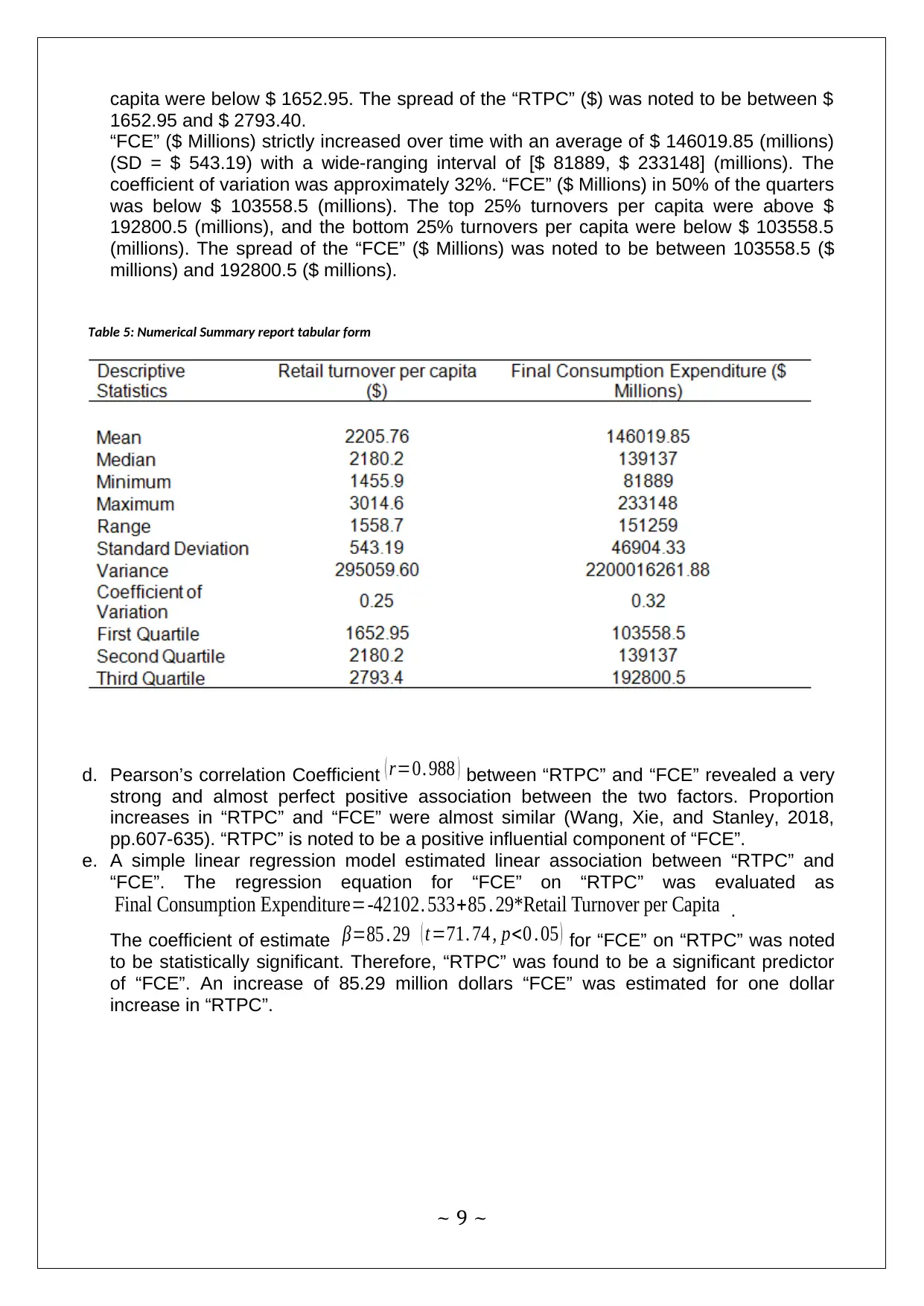
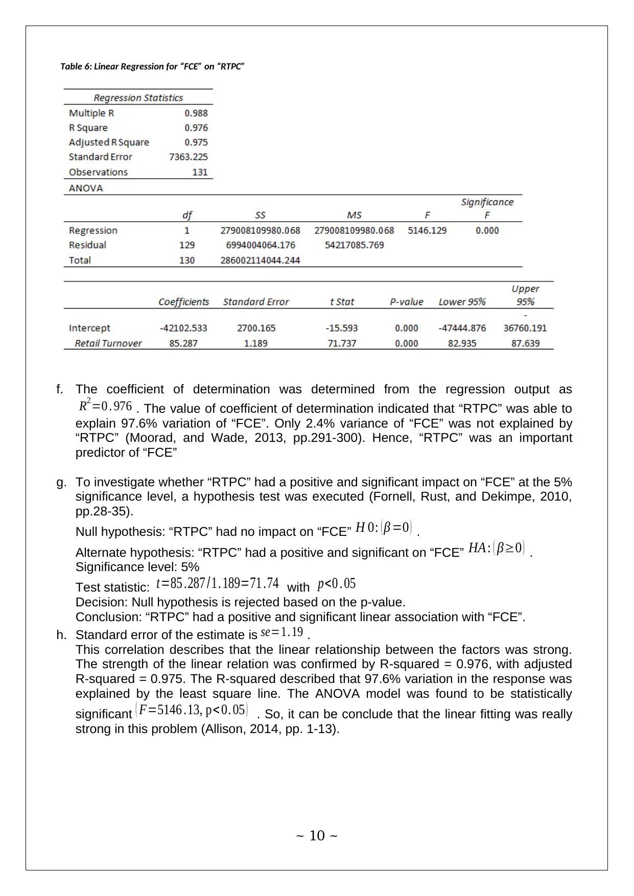
This project analyzes business data using statistical methods. It includes a clustered bar chart comparing Australian export markets between 2004-05 and 2014-15, and a second clustered bar chart representing percentage of Australian exports by country. The project also includes frequency and relative frequency distributions, cumulative frequency distributions, histograms, and Ogives for umbrella sales data. Furthermore, the project examines the trend of retail turnover per capita and final consumption expenditure using 2-D area plots and scatter plots, along with statistical summaries and Pearson's correlation. A linear regression model is also evaluated to assess the impact of retail turnover per capita on final consumption expenditure, including hypothesis testing and interpretation of the coefficient of determination. The project concludes with a discussion of the statistical significance and the strength of the linear relationship between the variables.

Methods for Business Decision Making
~ 1 ~
~ 1 ~
Paraphrase This Document
Need a fresh take? Get an instant paraphrase of this document with our AI Paraphraser

Answer 1
(a) A Clustered Bar chart in Figure 1 represents export markets for Australia (Fisher,
Drucker, and König, 2012, pp.55-62). It also compares the export figures (AUS $ Billion)
of 2004-05 with 2014-15. A stark increase in sales with China and Japan in terms of
volume can be noted. Increase in export with other countries also raised
simultaneously. Exports to United Kingdom have reduced in 2014-15 compared to
2004-05.
China Japan United
States Republic
of Korea India New
Zealand Singapore United
Kingdom
0
10
20
30
40
50
60
70
80
90
100
Export Markets for Goods and Services for Australia
Exports (AUS $ Billion)
Figure 1: Export Markets for Goods and Services for Australia in 2004-05 and 2014-15
(b) For a second time, a Clustered Bar chart in Figure 2 represents Percentage of
Australian Exports by Country of Destination in 2004-05 and 2014-15. Comparative
analysis between the percentage export figures (AUS $ Billion) of 2004-05 with 2014-
15 indicates a stark increase in percentage sales with China. The percentage growth
with China is noted to have reduced the percentage growth with other countries.
United Kingdom was also no exception.
~ 2 ~

China Japan United
States Republic
of Korea India New
Zealand Singapore United
Kingdom
0.0%
5.0%
10.0%
15.0%
20.0%
25.0%
30.0%
35.0%
40.0%
45.0%
Percentage of Australian Exports by Country of Destination
Percentage
Figure 2: Percentage of Australian Exports by Country of Destination in 2004-05 and 2014-15
(c) Comments: Volume of export to all countries has increased, except export to United
Kingdom. Export volume to UK has decreased in 2014-15 compared to 2004-05.
Country wise distribution of percentage export reveals the actual picture of relative
increase in export to the countries. Overall export volume increased in 2014-15
compared to 2004-05, and therefore, export volumes to the countries increased in 2014-
15. But in reality the percentage growth in export decreased due to massive increase in
exports with China. Probable reason could have been the rapid growth in export to
China has reduced the margin of growth to other countries.
~ 3 ~
⊘ This is a preview!⊘
Do you want full access?
Subscribe today to unlock all pages.

Trusted by 1+ million students worldwide

a. The frequency distribution and relative frequency distribution of Umbrella Sales
have been included in Table 1 and Table 2. Class limits also have been included in
the tables.
Table 1: Frequency distribution of Umbrella Sales
Table 2: Relative Frequency distribution of Umbrella Sales
b. The cumulative frequency distribution and cumulative relative frequency distribution of
Umbrella Sales have been included in Table 3 and Table 4.
Table 3: Cumulative Frequency distribution of Umbrella Sales
~ 4 ~
Paraphrase This Document
Need a fresh take? Get an instant paraphrase of this document with our AI Paraphraser

Table 4: Cumulative Relative Frequency distribution of Umbrella Sales
c. The relative frequency histogram of Umbrella Sales has been provided in Figure 3. On
the X-axis, classes have been plotted, and relative frequencies are on the Y-axis.
Figure 3: Histogram of Umbrella Sales
d. An Ogive of less than type for Umbrella Sales has been constructed. The less than type
cumulative frequency distribution has been used to construct the Ogive. The Ogive
denotes the cumulative sales of umbrellas for 40 days. For the less than type Ogive, a
class of less than 30 was created for proper construction of the Ogive..
~ 5 ~

Figure 4: Less than type Ogive for Umbrella Sales
e. On 35% number of day’s umbrella sales was less than 60 per day. Therefore, the
proportion of grades less than 60 is 0.35 (Triola, 2014). The less than type cumulative
relative frequency reveals that, 35% grades were less than 60.
f. On 62.5% number of day’s umbrella sales was less than 70 per day. Proportion of
grades more than 70 was 0.375 (Complementary relative frequency of less than 70).
So, 37.5% grades were more than 70.
~ 6 ~
⊘ This is a preview!⊘
Do you want full access?
Subscribe today to unlock all pages.

Trusted by 1+ million students worldwide

a. A 2-D area plot has been drawn to assess the trend of Retail Turnover per Capita
($) (“RTPC”) over a time period from September 1983 to November 2014. An
increasing trend is noted with monotonicity in few quarters. Especially in the initial
quarters the growth can be noted to be very slow (Higgins, 2011). In few quarters
from November 2003 to May 2009, a rapid increase in the time plot can be seen.
Again, at last few quarters “RTPC” was noted to be monotonic in nature.
Figure 5: Trend of ““RTPC””
A 2-D area plot has been drawn to assess the trend of Final Consumption
Expenditure ($ Millions) (FCE) over a time period from September 1983 to
November 2014. A strictly increasing trend is noted, and in the final quarters a rapid
growth can be noted. There was no monotonic nature or any downward trend in the
curve.
Figure 6: Trend of ““FCE””
b. A two-way scatter plot was drawn to scrutinize the impact of “RTPC” on “FCE”. A
very high positive and probably significant linear correlation was identified between
the two factors.
~ 7 ~
Paraphrase This Document
Need a fresh take? Get an instant paraphrase of this document with our AI Paraphraser

“RTPC” has been considered as the independent or predictor (X-axis) variable and
“FCE” has been considered as the dependent or outcome (Y-axis) variable. “RTPC”
is a component of “FCE”. In computation of Final Consumption, “RTPC” is
considered as a sub part, and the choice of predictor and outcome variables was
done according to that.
Figure 7: Scatter plot for “FCE” on “RTPC”
c. “RTPC” ($) increased over time with an average of $ 2205.76 (SD = $ 543.19) with a
wide-ranging interval of [$ 1455.9, $ 3014.6]. The coefficient of variation was
approximately 25%. “RTPC” ($) in 50% of the quarters was below $ 2180.2. The top
25% turnovers per capita were above $ 2793.4, and the bottom 25% turnovers per
~ 8 ~

capita were below $ 1652.95. The spread of the “RTPC” ($) was noted to be between $
1652.95 and $ 2793.40.
“FCE” ($ Millions) strictly increased over time with an average of $ 146019.85 (millions)
(SD = $ 543.19) with a wide-ranging interval of [$ 81889, $ 233148] (millions). The
coefficient of variation was approximately 32%. “FCE” ($ Millions) in 50% of the quarters
was below $ 103558.5 (millions). The top 25% turnovers per capita were above $
192800.5 (millions), and the bottom 25% turnovers per capita were below $ 103558.5
(millions). The spread of the “FCE” ($ Millions) was noted to be between 103558.5 ($
millions) and 192800.5 ($ millions).
Table 5: Numerical Summary report tabular form
d. Pearson’s correlation Coefficient ( r=0. 988 ) between “RTPC” and “FCE” revealed a very
strong and almost perfect positive association between the two factors. Proportion
increases in “RTPC” and “FCE” were almost similar (Wang, Xie, and Stanley, 2018,
pp.607-635). “RTPC” is noted to be a positive influential component of “FCE”.
e. A simple linear regression model estimated linear association between “RTPC” and
“FCE”. The regression equation for “FCE” on “RTPC” was evaluated as
Final Consumption Expenditure=-42102. 533+85 . 29*Retail Turnover per Capita .
The coefficient of estimate β=85 . 29 ( t=71. 74 , p<0 . 05 ) for “FCE” on “RTPC” was noted
to be statistically significant. Therefore, “RTPC” was found to be a significant predictor
of “FCE”. An increase of 85.29 million dollars “FCE” was estimated for one dollar
increase in “RTPC”.
~ 9 ~
⊘ This is a preview!⊘
Do you want full access?
Subscribe today to unlock all pages.

Trusted by 1+ million students worldwide

Table 6: Linear Regression for “FCE” on “RTPC”
f. The coefficient of determination was determined from the regression output as
R2=0 . 976 . The value of coefficient of determination indicated that “RTPC” was able to
explain 97.6% variation of “FCE”. Only 2.4% variance of “FCE” was not explained by
“RTPC” (Moorad, and Wade, 2013, pp.291-300). Hence, “RTPC” was an important
predictor of “FCE”
g. To investigate whether “RTPC” had a positive and significant impact on “FCE” at the 5%
significance level, a hypothesis test was executed (Fornell, Rust, and Dekimpe, 2010,
pp.28-35).
Null hypothesis: “RTPC” had no impact on “FCE” H 0: ( β =0 ) .
Alternate hypothesis: “RTPC” had a positive and significant on “FCE” HA : ( β≥0 ) .
Significance level: 5%
Test statistic: t=85 .287 /1. 189=71 .74 with p<0 . 05
Decision: Null hypothesis is rejected based on the p-value.
Conclusion: “RTPC” had a positive and significant linear association with “FCE”.
h. Standard error of the estimate is se=1. 19 .
This correlation describes that the linear relationship between the factors was strong.
The strength of the linear relation was confirmed by R-squared = 0.976, with adjusted
R-squared = 0.975. The R-squared described that 97.6% variation in the response was
explained by the least square line. The ANOVA model was found to be statistically
significant ( F=5146 .13, p< 0. 05 ) . So, it can be conclude that the linear fitting was really
strong in this problem (Allison, 2014, pp. 1-13).
~ 10 ~
Paraphrase This Document
Need a fresh take? Get an instant paraphrase of this document with our AI Paraphraser

References
Allison, P.D., 2014, March. Measures of fit for logistic regression. In Proceedings of the
SAS Global Forum 2014 Conference (pp. 1-13).
Fisher, D., Drucker, S.M. and König, A.C., 2012. Exploratory visualization involving
incremental, approximate database queries and uncertainty. IEEE computer graphics
and applications, 32(4), pp.55-62.
Fornell, C., Rust, R.T. and Dekimpe, M.G., 2010. The effect of customer satisfaction on
consumer spending growth. Journal of Marketing Research, 47(1), pp.28-35.
Higgins, M. (2011). Advances in economic forecasting. 1st ed. Kalamazoo, Mich., USA:
W.E. Upjohn Institute for Employment Research.
Mario F. Triola. (2014). Elementary statistics. New York: Pearson Education, Inc.
Moorad, J.A. and Wade, M.J., 2013. Selection gradients, the opportunity for selection,
and the coefficient of determination. The American Naturalist, 181(3), pp.291-300.
Wang, G.J., Xie, C. and Stanley, H.E., 2018. Correlation structure and evolution of
world stock markets: Evidence from Pearson and partial correlation-based
networks. Computational Economics, 51(3), pp.607-635.
~ 11 ~
1 out of 11
Related Documents
Your All-in-One AI-Powered Toolkit for Academic Success.
+13062052269
info@desklib.com
Available 24*7 on WhatsApp / Email
Unlock your academic potential
Copyright © 2020–2025 A2Z Services. All Rights Reserved. Developed and managed by ZUCOL.


