Statistics for Business: Emissions, Frequency, and Regression

Verified

Added on  2022/10/10

|10
|776
|110
Homework Assignment
AI Summary
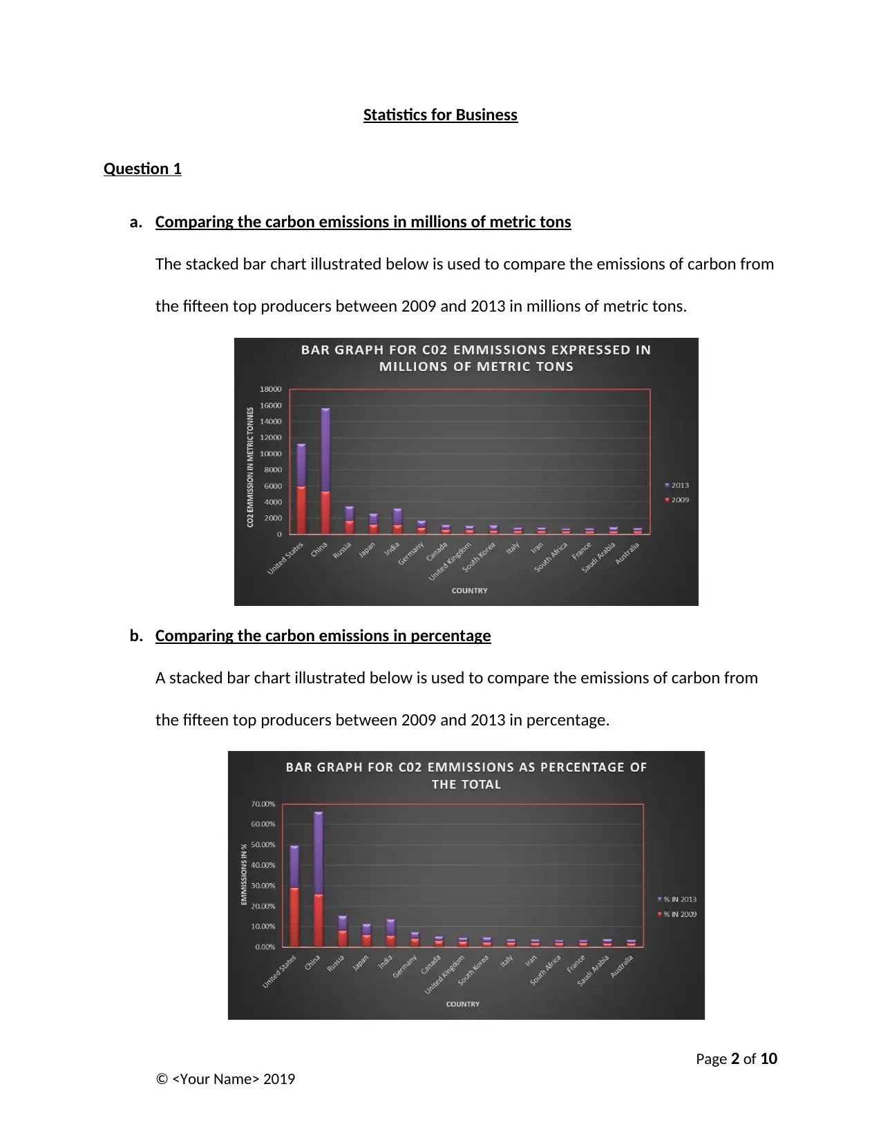
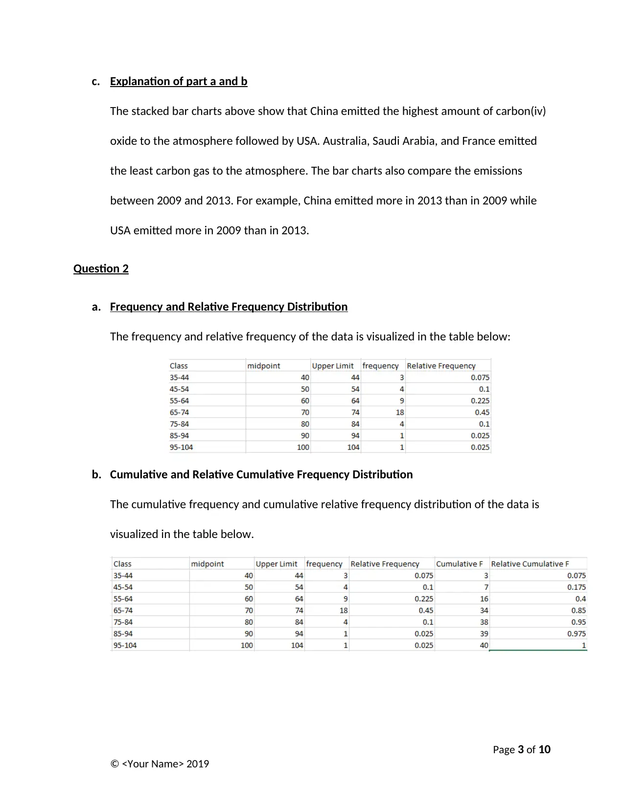
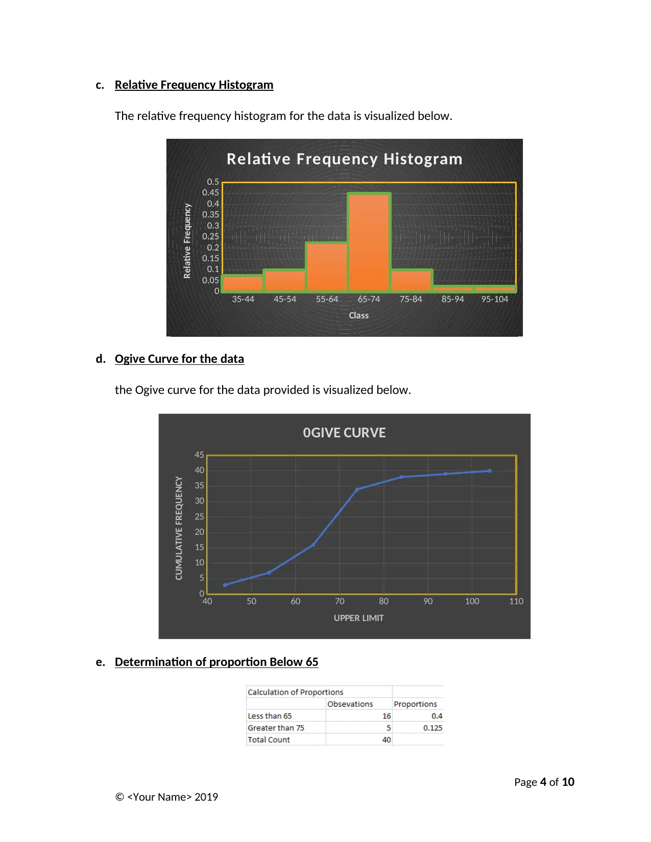
This statistics assignment focuses on analyzing business data, beginning with a comparison of carbon emissions from top producers using stacked bar charts to visualize emissions between 2009 and 2013. It then delves into frequency and relative frequency distributions, including cumulative frequency and relative cumulative frequency, presented in tables, histograms, and ogive curves. The assignment further explores time series plots for inflation rates and all ordinaries index, followed by a scatter plot illustrating the relationship between these two variables. Numerical summaries, including the coefficient of correlation, are provided, along with a regression model. The regression equation, slope, intercept, and coefficient of determination are discussed, along with a test of significance at a 5% significance level and the value of the standard error. The analysis leads to the conclusion that the regression model is not statistically significant to explain the relationship between the variables, and the value of the standard error suggests collinearity.
Document Page
University
Statistics for Business
By
Your Name
Date
Page 1 of 10
© <Your Name> 2019
tabler-icon-diamond-filled.svg

Paraphrase This Document

Need a fresh take? Get an instant paraphrase of this document with our AI Paraphraser
Document Page
Statistics for Business
Question 1
a. Comparing the carbon emissions in millions of metric tons
The stacked bar chart illustrated below is used to compare the emissions of carbon from
the fifteen top producers between 2009 and 2013 in millions of metric tons.
b. Comparing the carbon emissions in percentage
A stacked bar chart illustrated below is used to compare the emissions of carbon from
the fifteen top producers between 2009 and 2013 in percentage.
Page 2 of 10
© <Your Name> 2019
Document Page
c. Explanation of part a and b
The stacked bar charts above show that China emitted the highest amount of carbon(iv)
oxide to the atmosphere followed by USA. Australia, Saudi Arabia, and France emitted
the least carbon gas to the atmosphere. The bar charts also compare the emissions
between 2009 and 2013. For example, China emitted more in 2013 than in 2009 while
USA emitted more in 2009 than in 2013.
Question 2
a. Frequency and Relative Frequency Distribution
The frequency and relative frequency of the data is visualized in the table below:
b. Cumulative and Relative Cumulative Frequency Distribution
The cumulative frequency and cumulative relative frequency distribution of the data is
visualized in the table below.
Page 3 of 10
© <Your Name> 2019
Document Page
c. Relative Frequency Histogram
The relative frequency histogram for the data is visualized below.
35-44 45-54 55-64 65-74 75-84 85-94 95-104
0
0.05
0.1
0.15
0.2
0.25
0.3
0.35
0.4
0.45
0.5
Relati ve Frequency Histogram
Class
Relative Frequency
d. Ogive Curve for the data
the Ogive curve for the data provided is visualized below.
40 50 60 70 80 90 100 110
0
5
10
15
20
25
30
35
40
45
0GIVE CURVE
UPPER LIMIT
CUMULATIVE FREQUENCY
e. Determination of proportion Below 65
Page 4 of 10
© <Your Name> 2019
tabler-icon-diamond-filled.svg

Paraphrase This Document

Need a fresh take? Get an instant paraphrase of this document with our AI Paraphraser
Document Page
From the table above the proportion of the data that is below 65 is 0.4
f. Determination of proportion Above 75
From the table above, the proportion of the data that is above 75 is 0.125
Question 3
a. Time Series Plots
The time series plot for the rate of inflation is shown below.
It shows that the rate on inflation decreased overly through the years.
The time series plot for all ordinaries index is shown below.
It shows that all ordinaries index increased overly through the years.
Page 5 of 10
© <Your Name> 2019
Document Page
b. Scatter plot
The scatter plot is used to visualize the relationship between Rate of Inflation and All
Ordinaries Index.
The inflation rate is chosen as the independent variable while all ordinaries index is
chosen as the dependent variable. This is because we are investigating the how inflation
rate affects the index of all ordinaries (Rumsey, 2007). The scatter plot shows that there
is a positive linear relationship between rate of inflation and all ordinaries index.
c. Numerical Summaries
The numerical summaries for the two variables are shown in the table below.
Page 6 of 10
© <Your Name> 2019
Document Page
d. Coefficient of Correlation (r)
The coefficient of correlation is shown in the table below.
The value is 0.039 and it shows that rate of inflation is directly proportion to the all
ordinaries index (Positive Relationship).
e. Regression Model
The regression model is visualized below:
The regression equation is:
Y =40.31 X1+3874.29
The slope is the coefficient of the inflation rate and it shows it indicates the magnitude
with which inflation rate affects all ordinaries index (Croucher, 2016). The intercept or
Page 7 of 10
© <Your Name> 2019
tabler-icon-diamond-filled.svg

Paraphrase This Document

Need a fresh take? Get an instant paraphrase of this document with our AI Paraphraser
Document Page
the constant in the equation shows the value of all ordinaries index if inflation rate is
zero.
f. Coefficient of Determination
The coefficient of determination is the r-square value (0.0015). It shows that 0.15% of
the variability in the relationship between the variables can be explained by the
regression model.
g. Testing Significance at 5% significance level.
We compare the value of significance f (0.87) with the significance level of 0.05. The
significance f is greater than the significance level and therefore we say that the
regression model is not statistically significant to explain the relationship between the
variables (Bruce, 2015).
h. Value of standard error.
The value of standard error is 1268.43. This value is too large and shows the possibility
of existence of collinearity between the variables. Besides, it affirms that the regression
model is not fit enough to explain the relationship between the variables (Linoff, 2008).
Page 8 of 10
© <Your Name> 2019
Document Page
Page 9 of 10
© <Your Name> 2019
Document Page
References
Bruce, P. 2015. Introductory statistics and analytics. New Jersey: Wiley.
Croucher, J. S. 2016. Introductory mathematics & statistics.6th ed. Australia: North Ryde,
N.S.W. McGraw-Hill Education.
Linoff, G. 2008. Data analysis using SQL and Excel. Indianapolis, Ind.: Wiley Pub.
Rumsey, D. 2007. Intermediate statistics for dummies. 1st ed. Hoboken, N.J.: Wiley
Page 10 of 10
© <Your Name> 2019
chevron_up_icon
1 out of 10
circle_padding
hide_on_mobile
zoom_out_icon
[object Object]