Exploring Charts in Time Series Analysis: Advantages & Disadvantages
VerifiedAdded on 2023/06/08
|8
|956
|382
Report
AI Summary
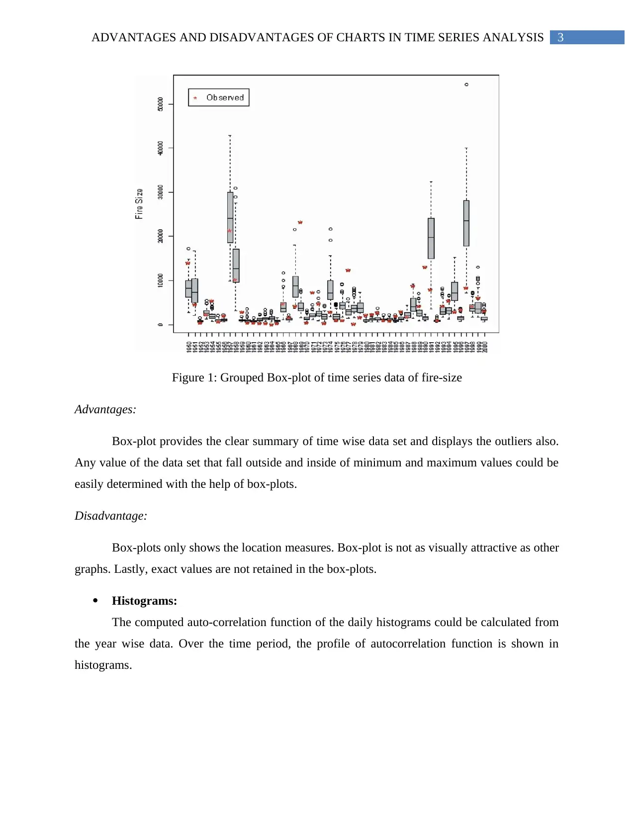
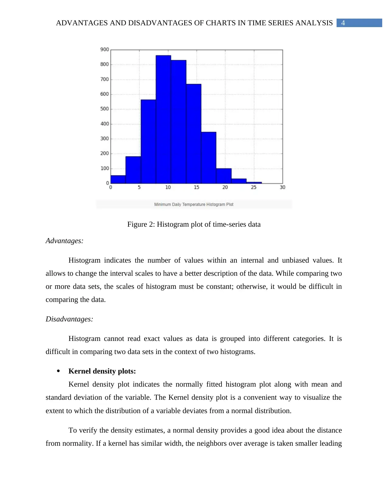
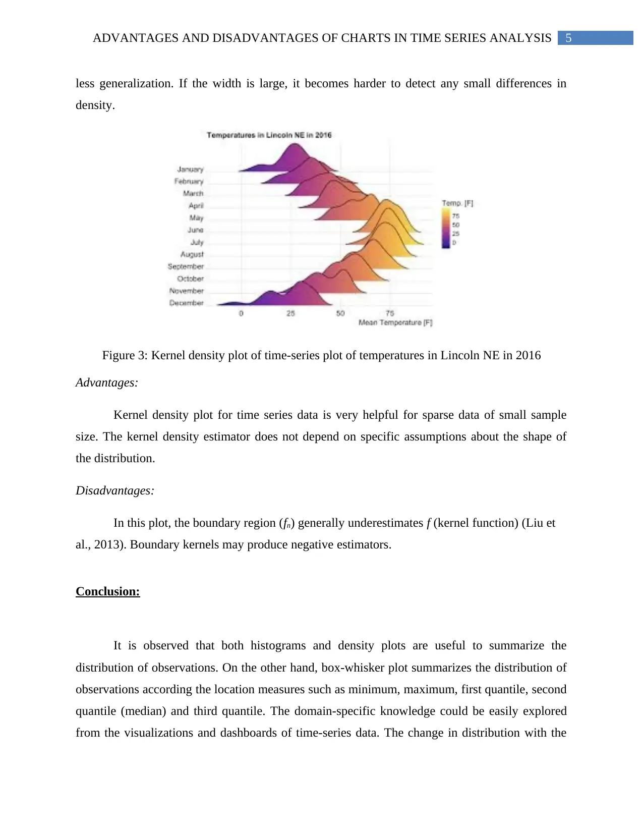
This report examines the advantages and disadvantages of using different types of charts in time series analysis. It discusses boxplots, highlighting their ability to summarize data and display outliers, while noting their lack of visual appeal and inability to retain exact values. Histograms are presented as useful for indicating value counts within intervals, but limited in comparing datasets. Kernel density plots are explored for their utility with sparse data and independence from distributional assumptions, balanced against boundary estimation issues. The report concludes that visualizations and dashboards of time-series data help explore domain-specific knowledge and observe variations.

Running Head: ADVANTAGES AND DISADVANTAGES OF CHARTS IN TIME SERIES
ANALYSIS
Advantages and Disadvantages of Charts in Time Series Analysis
Name of the student:
Name of the university:
Course ID:
ANALYSIS
Advantages and Disadvantages of Charts in Time Series Analysis
Name of the student:
Name of the university:
Course ID:
Paraphrase This Document
Need a fresh take? Get an instant paraphrase of this document with our AI Paraphraser

1ADVANTAGES AND DISADVANTAGES OF CHARTS IN TIME SERIES ANALYSIS
Table of Contents
Introduction:....................................................................................................................................3
Discussions:.....................................................................................................................................3
Boxplots:......................................................................................................................................4
Histograms:..................................................................................................................................5
Kernel density plots:....................................................................................................................7
Further implications:......................................................................................................................10
Conclusion:....................................................................................................................................10
References:....................................................................................................................................12

2ADVANTAGES AND DISADVANTAGES OF CHARTS IN TIME SERIES ANALYSIS
Introduction:
The factors that make a graphical representation of data proper are acceptability,
comparative analysis, logical concepts and decision-making (Tsay, 2013). The less literate
audience with the help of time, effort, error and mistake could interpret the graphical plots of
time series data. The complete idea about time series, trend and fitting could be driven from
various time series plots.
Discussions:
The plot of the dependent variable with respect to the independent variable (time) is
necessary for time series analysis. The trend and spread of time-wise data is calculated with
respect to fitting of the curve and graph. Histogram valued data are necessary for degeneracy of
sample variance process. Complex models like ARMA, ARIMA, ARCH or GARCH allow to
forecast sales data and price data of any organization (Box et al., 2015). Fluctuation of values
and variations with respect to time are observed minutely in a graphical way-out.
Boxplots:
Box-plot is a visualization of five different location measures for which, it is known as
‘Five Number Summary’.
⊘ This is a preview!⊘
Do you want full access?
Subscribe today to unlock all pages.

Trusted by 1+ million students worldwide

3ADVANTAGES AND DISADVANTAGES OF CHARTS IN TIME SERIES ANALYSIS
Figure 1: Grouped Box-plot of time series data of fire-size
Advantages:
Box-plot provides the clear summary of time wise data set and displays the outliers also.
Any value of the data set that fall outside and inside of minimum and maximum values could be
easily determined with the help of box-plots.
Disadvantage:
Box-plots only shows the location measures. Box-plot is not as visually attractive as other
graphs. Lastly, exact values are not retained in the box-plots.
Histograms:
The computed auto-correlation function of the daily histograms could be calculated from
the year wise data. Over the time period, the profile of autocorrelation function is shown in
histograms.
Paraphrase This Document
Need a fresh take? Get an instant paraphrase of this document with our AI Paraphraser

4ADVANTAGES AND DISADVANTAGES OF CHARTS IN TIME SERIES ANALYSIS
Figure 2: Histogram plot of time-series data
Advantages:
Histogram indicates the number of values within an internal and unbiased values. It
allows to change the interval scales to have a better description of the data. While comparing two
or more data sets, the scales of histogram must be constant; otherwise, it would be difficult in
comparing the data.
Disadvantages:
Histogram cannot read exact values as data is grouped into different categories. It is
difficult in comparing two data sets in the context of two histograms.
Kernel density plots:
Kernel density plot indicates the normally fitted histogram plot along with mean and
standard deviation of the variable. The Kernel density plot is a convenient way to visualize the
extent to which the distribution of a variable deviates from a normal distribution.
To verify the density estimates, a normal density provides a good idea about the distance
from normality. If a kernel has similar width, the neighbors over average is taken smaller leading

5ADVANTAGES AND DISADVANTAGES OF CHARTS IN TIME SERIES ANALYSIS
less generalization. If the width is large, it becomes harder to detect any small differences in
density.
Figure 3: Kernel density plot of time-series plot of temperatures in Lincoln NE in 2016
Advantages:
Kernel density plot for time series data is very helpful for sparse data of small sample
size. The kernel density estimator does not depend on specific assumptions about the shape of
the distribution.
Disadvantages:
In this plot, the boundary region (fn) generally underestimates f (kernel function) (Liu et
al., 2013). Boundary kernels may produce negative estimators.
Conclusion:
It is observed that both histograms and density plots are useful to summarize the
distribution of observations. On the other hand, box-whisker plot summarizes the distribution of
observations according the location measures such as minimum, maximum, first quantile, second
quantile (median) and third quantile. The domain-specific knowledge could be easily explored
from the visualizations and dashboards of time-series data. The change in distribution with the
⊘ This is a preview!⊘
Do you want full access?
Subscribe today to unlock all pages.

Trusted by 1+ million students worldwide

6ADVANTAGES AND DISADVANTAGES OF CHARTS IN TIME SERIES ANALYSIS
help of box-whisker graph could be easily accomplished. Visualization of yearly profitability and
budget planning could be able to reproduce the seasonal variation and cyclical variation of the
time-series data set.
help of box-whisker graph could be easily accomplished. Visualization of yearly profitability and
budget planning could be able to reproduce the seasonal variation and cyclical variation of the
time-series data set.
Paraphrase This Document
Need a fresh take? Get an instant paraphrase of this document with our AI Paraphraser

7ADVANTAGES AND DISADVANTAGES OF CHARTS IN TIME SERIES ANALYSIS
References:
Box, G. E., Jenkins, G. M., Reinsel, G. C., & Ljung, G. M. (2015). Time series analysis:
forecasting and control. John Wiley & Sons.
Liu, S., Yamada, M., Collier, N., & Sugiyama, M. (2013). Change-point detection in time-series
data by relative density-ratio estimation. Neural Networks, 43, 72-83.
Tsay, R. S. (2013). Multivariate time series analysis: with R and financial applications. John
Wiley & Sons.
1 out of 8
Related Documents
Your All-in-One AI-Powered Toolkit for Academic Success.
+13062052269
info@desklib.com
Available 24*7 on WhatsApp / Email
Unlock your academic potential
Copyright © 2020–2025 A2Z Services. All Rights Reserved. Developed and managed by ZUCOL.


