Exploring Charts and Graphs in Time Series Analysis Report
VerifiedAdded on 2023/06/08
|8
|1266
|55
Report
AI Summary
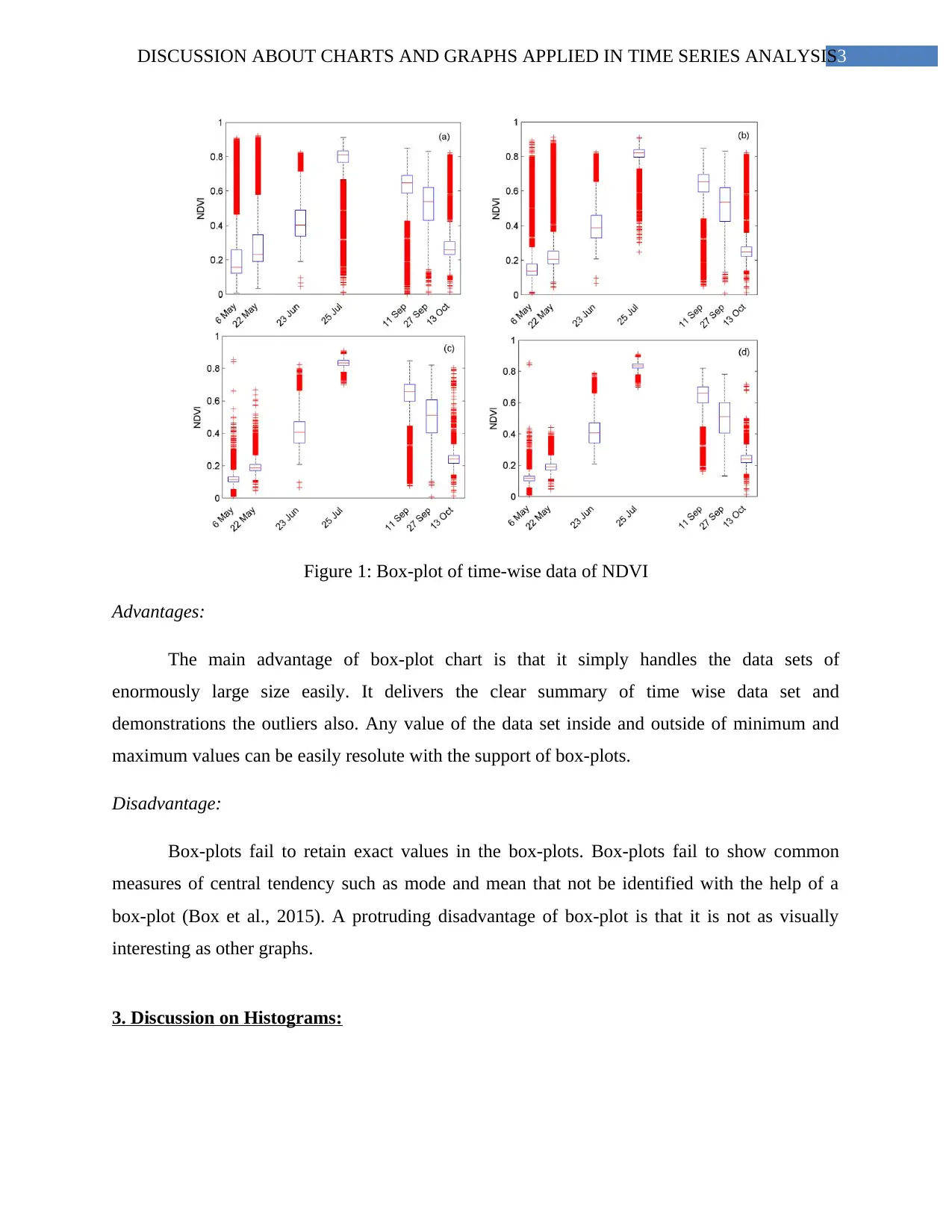
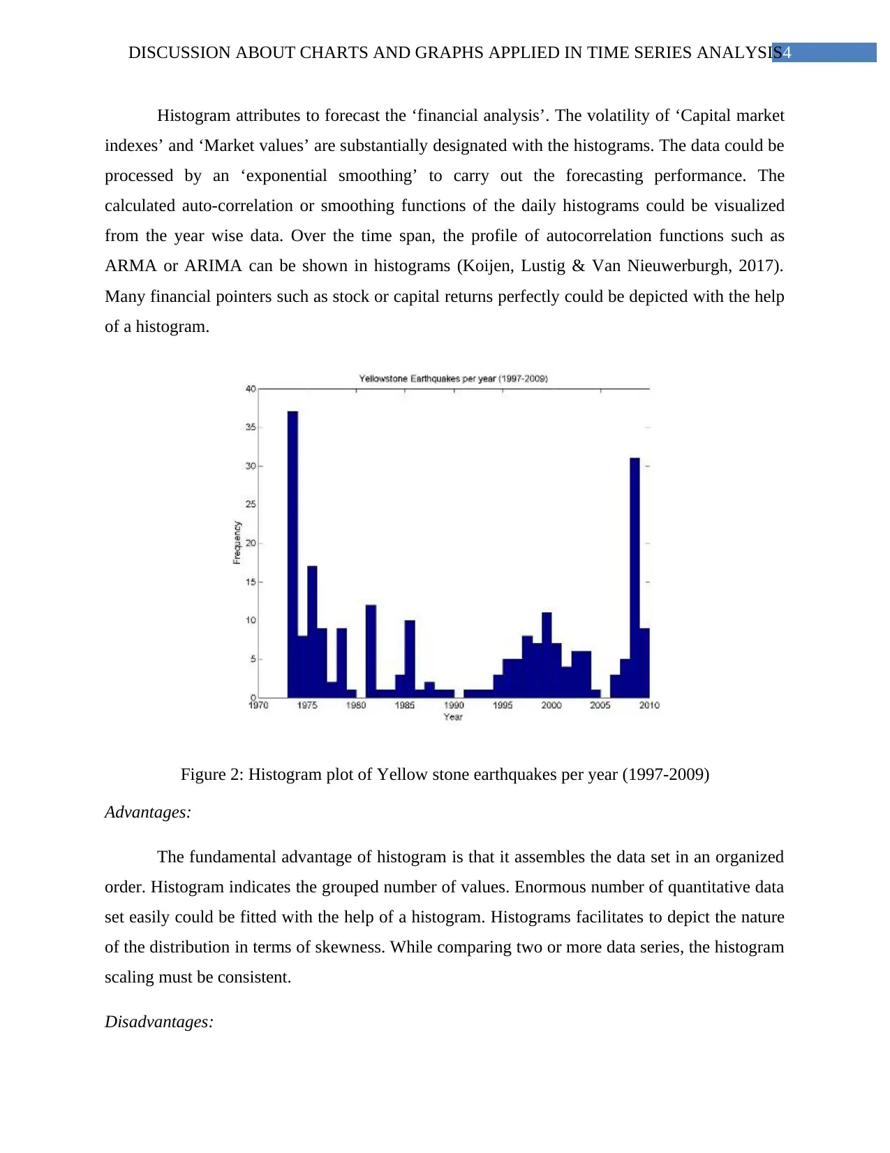
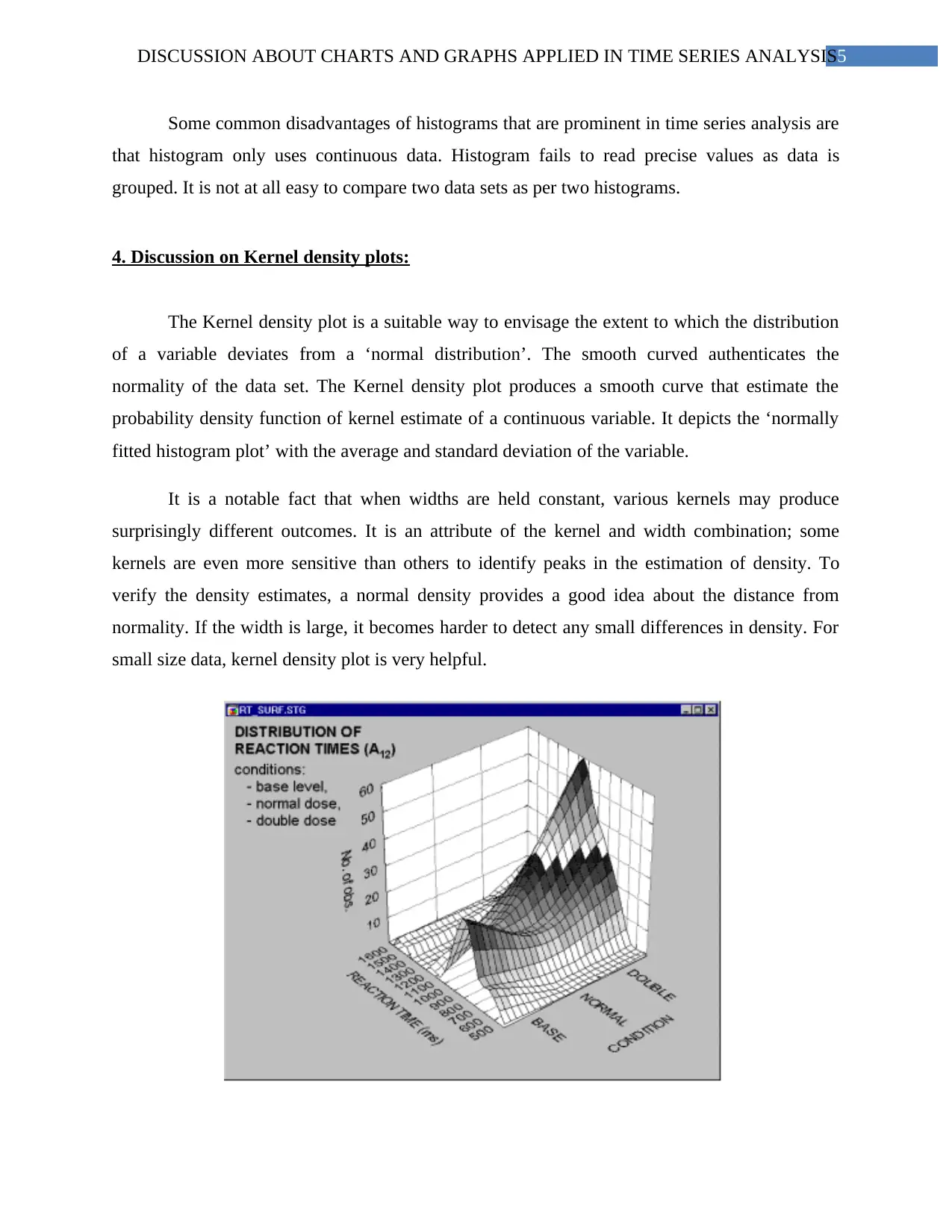
This report discusses the application of various charts and graphs in time series analysis, focusing on boxplots, histograms, and kernel density plots. It highlights the advantages and disadvantages of each type of visualization for understanding time-series data. Boxplots are effective for summarizing large datasets and identifying outliers, while histograms are useful for forecasting financial analysis and depicting data distribution. Kernel density plots provide a smooth curve for estimating probability density and assessing normality. The report concludes that visualizations are crucial for exploring time-series data, identifying seasonal variations, and planning budgets, though more complex analyses may require line graphs and scatterplots. Desklib offers similar solved assignments for students.

Running Head: DISCUSSION ABOUT CHARTS AND GRAPHS APPLIED IN TIME SERIES
ANALYSIS
Discussion about Charts and Graphs applied in Time Series Analysis
Name of the student:
Name of the university:
Course ID:
ANALYSIS
Discussion about Charts and Graphs applied in Time Series Analysis
Name of the student:
Name of the university:
Course ID:
Paraphrase This Document
Need a fresh take? Get an instant paraphrase of this document with our AI Paraphraser

1DISCUSSION ABOUT CHARTS AND GRAPHS APPLIED IN TIME SERIES ANALYSIS
Table of Contents
1. Introduction and aim:...................................................................................................................2
2. Discussion on Boxplots:..............................................................................................................2
3. Discussion on Histograms:..........................................................................................................3
4. Discussion on Kernel density plots:............................................................................................3
5. Findings:......................................................................................................................................4
6. Reference list:..............................................................................................................................5

2DISCUSSION ABOUT CHARTS AND GRAPHS APPLIED IN TIME SERIES ANALYSIS
1. Introduction and aim:
The time series plots investigate the ‘inherent pattern’ of the data set. Histogram valued
data are necessary for degeneracy of sample variance process. Kernel density plot chart is a
variation of a histogram that utilizes the kernel smoothing for plotting values. It permits to have
smoother distributions by smoothing the noises. A business organization prefer to have a density
plot rather than histograms if they are better to determine the shape of the distribution as they are
not hampered by the number of groups utilized. The plots like box-plots and kernel-density plots
are very comfortable ways to depict the nature of the data (Hout, Smith & Marsden, 2015). The
time series data analysis is majorly focused towards exposure of pattern, classification and
clustering.
2. Discussion on Boxplots:
The box-plots represent a ‘five-number summary’ of large data which shows the three
quartiles, maximum and minimum of large data sets. Therefore, box-plot is entirely a location
indicating graph that organizes data in a well-organized way of dealing and managing.
⊘ This is a preview!⊘
Do you want full access?
Subscribe today to unlock all pages.

Trusted by 1+ million students worldwide

3DISCUSSION ABOUT CHARTS AND GRAPHS APPLIED IN TIME SERIES ANALYSIS
Figure 1: Box-plot of time-wise data of NDVI
Advantages:
The main advantage of box-plot chart is that it simply handles the data sets of
enormously large size easily. It delivers the clear summary of time wise data set and
demonstrations the outliers also. Any value of the data set inside and outside of minimum and
maximum values can be easily resolute with the support of box-plots.
Disadvantage:
Box-plots fail to retain exact values in the box-plots. Box-plots fail to show common
measures of central tendency such as mode and mean that not be identified with the help of a
box-plot (Box et al., 2015). A protruding disadvantage of box-plot is that it is not as visually
interesting as other graphs.
3. Discussion on Histograms:
Paraphrase This Document
Need a fresh take? Get an instant paraphrase of this document with our AI Paraphraser

4DISCUSSION ABOUT CHARTS AND GRAPHS APPLIED IN TIME SERIES ANALYSIS
Histogram attributes to forecast the ‘financial analysis’. The volatility of ‘Capital market
indexes’ and ‘Market values’ are substantially designated with the histograms. The data could be
processed by an ‘exponential smoothing’ to carry out the forecasting performance. The
calculated auto-correlation or smoothing functions of the daily histograms could be visualized
from the year wise data. Over the time span, the profile of autocorrelation functions such as
ARMA or ARIMA can be shown in histograms (Koijen, Lustig & Van Nieuwerburgh, 2017).
Many financial pointers such as stock or capital returns perfectly could be depicted with the help
of a histogram.
Figure 2: Histogram plot of Yellow stone earthquakes per year (1997-2009)
Advantages:
The fundamental advantage of histogram is that it assembles the data set in an organized
order. Histogram indicates the grouped number of values. Enormous number of quantitative data
set easily could be fitted with the help of a histogram. Histograms facilitates to depict the nature
of the distribution in terms of skewness. While comparing two or more data series, the histogram
scaling must be consistent.
Disadvantages:

5DISCUSSION ABOUT CHARTS AND GRAPHS APPLIED IN TIME SERIES ANALYSIS
Some common disadvantages of histograms that are prominent in time series analysis are
that histogram only uses continuous data. Histogram fails to read precise values as data is
grouped. It is not at all easy to compare two data sets as per two histograms.
4. Discussion on Kernel density plots:
The Kernel density plot is a suitable way to envisage the extent to which the distribution
of a variable deviates from a ‘normal distribution’. The smooth curved authenticates the
normality of the data set. The Kernel density plot produces a smooth curve that estimate the
probability density function of kernel estimate of a continuous variable. It depicts the ‘normally
fitted histogram plot’ with the average and standard deviation of the variable.
It is a notable fact that when widths are held constant, various kernels may produce
surprisingly different outcomes. It is an attribute of the kernel and width combination; some
kernels are even more sensitive than others to identify peaks in the estimation of density. To
verify the density estimates, a normal density provides a good idea about the distance from
normality. If the width is large, it becomes harder to detect any small differences in density. For
small size data, kernel density plot is very helpful.
⊘ This is a preview!⊘
Do you want full access?
Subscribe today to unlock all pages.

Trusted by 1+ million students worldwide

6DISCUSSION ABOUT CHARTS AND GRAPHS APPLIED IN TIME SERIES ANALYSIS
Figure 3: The kernel plot of time wise distribution of reaction times
Advantages:
If a kernel has similar width, the neighbors over mean is taken smaller that lead to less
generalization. The peaks of the kernel density plot exhibit the concentration of the values. The
kernel density estimator does not rely on detailed assumptions about the ‘shape’ of the
distribution (Silverman, 2018).
Disadvantages:
The kernel density plot is asymmetric for any economic, financial and environmental
time-series data. The kernel density plot of time-series values that depends strongly on the
selection of primary value and interval. In such type of plot, boundary region underestimates the
kernel function; it can generate negative estimators.
5. Findings:
The knowledge of time-series data could be effortlessly explored with the help of
visualizations and dashboards. Both histograms and kernel density plots are helpful for
summarizing the distribution of values. Box-whisker plot clearly indicates the outliers and
equates with the support of constant intervals. Visualization of time-wise ‘profitability’ and
‘budget planning’ could be capable to indicate the seasonal variation and cyclical variation of the
time-series values. However, the various types of fitting curve and complex series analysis
would not be easy to indicate vis box-plots, histograms or kernel plots; line graphs and
scatterplots are seamless for these.
Paraphrase This Document
Need a fresh take? Get an instant paraphrase of this document with our AI Paraphraser

7DISCUSSION ABOUT CHARTS AND GRAPHS APPLIED IN TIME SERIES ANALYSIS
6. Reference list:
Box, G. E., Jenkins, G. M., Reinsel, G. C., & Ljung, G. M. (2015). Time series analysis:
forecasting and control. John Wiley & Sons.
Koijen, R. S., Lustig, H., & Van Nieuwerburgh, S. (2017). The cross-section and time series of
stock and bond returns. Journal of Monetary Economics, 88, 50-69.
Silverman, B. W. (2018). Density estimation for statistics and data analysis. Routledge.
1 out of 8
Related Documents
Your All-in-One AI-Powered Toolkit for Academic Success.
+13062052269
info@desklib.com
Available 24*7 on WhatsApp / Email
Unlock your academic potential
Copyright © 2020–2026 A2Z Services. All Rights Reserved. Developed and managed by ZUCOL.


