CI 6310 User Experience Project
VerifiedAdded on 2019/09/18
|28
|9742
|537
Project
AI Summary
This document outlines the requirements for the CI 6310 User Experience project, which involves usability testing a desktop web application and redesigning it for mobile. The project is broken into several components, including a project definition, usability test report, design documentation, and a prototype. The document provides detailed instructions, assessment criteria, and guidance for each component, emphasizing a user-centered design approach. It also includes information on report writing, referencing, and feedback mechanisms. The project aims to develop students' skills in user experience design, research, analysis, prototyping, and evaluation.
2017-2018
Module: CI 6310 User Experience
Title of Assignment: Ux Project
Module weighting: 100% coursework
Submission details:
There are four reports, and two prototypes to hand-in. Hand-in of reports is covered here. Hand-in of the prototype is covered in
the prototype section.
Hand in of Reports, Cover Sheet & File Name Conventions
The maximum file size is 15MB (approx.), so please reduce the size of screenshots and other images, before you insert them into
your document. If you have problems uploading via Canvas, then please upload your files in a .zip to a shared folder on
www.box.com, e-mail me the link, and include a link to this folder in the Appendix of the report.
Please name your report file using the following convention - <FAMILY NAME_FIRST NAME_Knumber_ReportName_CIXXXX).
Your individual report will need to be identified using the title of the pdf, and titles such as ‘Ux coursework’ are very common!
Hand in of Prototypes
Please see the specific section for the Prototype(s)
Module Learning Outcomes assessed in this piece of coursework
The overall learning outcome for this module is to develop and explicit, structured and knowledge-based approach to user experience
design. You encountered the idea of ‘user-centered design’ earlier in the course.
The specific learning outcomes for this module are:
Paraphrase This Document
Need a fresh take? Get an instant paraphrase of this document with our AI Paraphraser
2017-2018
Research user needs and the implications of technology for work practice
Analyse users and their activities, and carry forward lessons learned
Design input modalities, output media and interactive content to appeal to an audience
Prototype interactions between humans and computers
Evaluate the quality of users’ experience
Reflect upon design practice and discuss the strengths and weaknesses of alternative techniques
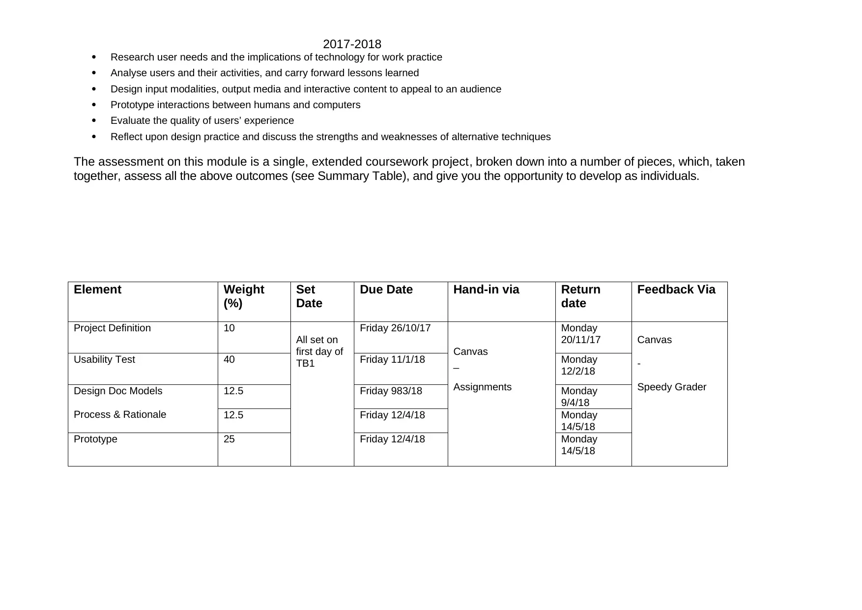
The assessment on this module is a single, extended coursework project, broken down into a number of pieces, which, taken
together, assess all the above outcomes (see Summary Table), and give you the opportunity to develop as individuals.
Element Weight
(%)
Set
Date
Due Date Hand-in via Return
date
Feedback Via
Project Definition 10
All set on
first day of
TB1
Friday 26/10/17
Canvas
_
Assignments
Monday
20/11/17 Canvas
-
Speedy Grader
Usability Test 40 Friday 11/1/18 Monday
12/2/18
Design Doc Models
Process & Rationale
12.5 Friday 983/18 Monday
9/4/18
12.5 Friday 12/4/18 Monday
14/5/18
Prototype 25 Friday 12/4/18 Monday
14/5/18
Research user needs and the implications of technology for work practice
Analyse users and their activities, and carry forward lessons learned
Design input modalities, output media and interactive content to appeal to an audience
Prototype interactions between humans and computers
Evaluate the quality of users’ experience
Reflect upon design practice and discuss the strengths and weaknesses of alternative techniques
The assessment on this module is a single, extended coursework project, broken down into a number of pieces, which, taken
together, assess all the above outcomes (see Summary Table), and give you the opportunity to develop as individuals.
Element Weight
(%)
Set
Date
Due Date Hand-in via Return
date
Feedback Via
Project Definition 10
All set on
first day of
TB1
Friday 26/10/17
Canvas
_
Assignments
Monday
20/11/17 Canvas
-
Speedy Grader
Usability Test 40 Friday 11/1/18 Monday
12/2/18
Design Doc Models
Process & Rationale
12.5 Friday 983/18 Monday
9/4/18
12.5 Friday 12/4/18 Monday
14/5/18
Prototype 25 Friday 12/4/18 Monday
14/5/18
2017-2018
Assignment Brief and assessment criteria (the coursework overall, and each individual piece, will be discussed within formally
timetabled classes)
A separate assignment brief and marking criteria is provided for each piece of the Ux project (see later).
Brief
The coursework project on this module is “usability test a desk-top web application of your choice, and then redesign and prototype
a mobile version that provides a better user experience. You should adopt a user-centered approach”.
The overall story for the coursework is as follows. First, you define and plan your project – what existing system are you going to
test, what users and tasks are you going to test, what kind of prototype are you going to develop. You then ‘usability test’ your
existing system, to identify some problems with it, and understand how it could be better. The usability test report is handed-in just
after Christmas. Then, you analyse your concerns, and redesign and otherwise innovate and augment your mobile version by well
before Easter. Driven by the usability problems you identified in the test, and your ‘new concepts’ you paper prototype your
improved experience. Hand in your user-centered models. Finally, you complete a hi-fidelity version of your redesign (either as
interactive wireframe or html/css or interactive wireframe) and explain, and reflect on your design process for just after Easter .
Within this general structure, every student’s Ux project will have unique features, so you will have many choices to make as you
complete your project :
You will be supported in your decisions as you go. Many options and variations are acceptable – so please discuss your project, its
on-going evolution, and get formative feedback on it, throughout the module with the module leader and workshop helpers.
Assessment Criteria
An individual marking scheme or ‘rubric’ for each coursework element is provided later, with that element. You can use these
marking schemes to assess your own work and revise it before you hand it in.
Criteria for Report Writing
The marking schemes under-emphasise general presentational expectations that ‘goes without saying’ at this level:
i. Headings and sub-headings clarify the structure and meaning of sections and paragraphs;
ii. Figures and tables have a title and a caption to clarify the point that is being made visually;
iii. Paragraphs open with a link to the previous paragraph, and close with a link to the next paragraph, to clarify the
flow of the argument
⊘ This is a preview!⊘
Do you want full access?
Subscribe today to unlock all pages.
Trusted by 1+ million students worldwide
2017-2018
iv. Sentences are relatively short and simple, and make one point at a time.
v. Text has been proof read for spelling mistakes, grammatical errors and awkward/ambiguous words.
When you put a draft of your work aside for a few days and then return to it, it should be a pleasure to read – is it?
Vi Screenshots and other images, possibly with annotations, are appropriately used to convey information and your
design thinking – it is a design module after all!
General, Academic and Industry-Facing Criteria
These are my version of some general criteria, applicable to all kinds of academic work.
A: Increasing quality of presentation, originality/novelty, coherence, insightfulness and completeness, including extension
into application and into relevant theory. Correct analysis. Critique of own project. Innovative
B: Increasing quality of presentation, level of analysis and background. Increasing relevance and completeness of
arguments. Increasing consideration of scope of the subject matter and application of knowledge. Decreasing error,
both analytical and proof reading. Mention of future work.
C: Decreasing quality of presentation. Decreasing relevance to the subject matter. Decreasing adequacy of arguments
or of depth of treatment.
D: Erroneous conclusions. Substantial incompleteness.
Fail: Increasing number and severity of errors. Increasing area of substantial incompleteness.
Here are some more ‘industry-facing’ criteria that ‘reality check’ the academic criteria. It is useful to see ourselves as the real world
sees us, sometimes, especially in the final year, when the real world is the next step.
A band: we would be proud to post this on course web pages, and show to other students as ‘an example to learn from’. If
we were a design agency, we would send the work to the client, and expect to be paid. The work is innovative and insightful
– but it could always be more so!.
B band: we would show it to the public as ‘work in progress’, and class mates would be interested. If we were a design
agency, we would hold the work back – some more to do. The work is explicit and structured, and increasingly complete, but
essentially familiar. We need to find an angle, some uniqueness, some precision that makes an audience say ‘Wow!’ or
‘Eureka!’
Paraphrase This Document
Need a fresh take? Get an instant paraphrase of this document with our AI Paraphraser
2017-2018
C: band: there is no reason to show the work in public, or to show it to class mates really. If we were a design agency, we
would need to talk – so far so good, but some sections need to be reworked. The work is somewhat generic – we need to
bring everything we’ve learnt to bear on our work, if we are to stay in business.
D band: it is best we keep working on it together, and ask your class mates for help. A design agency might want to be clear
about what we are getting out of this – the good points will show the way forward.
Feedback (including details of how and where feedback will be provided)
To access feedback on all elements of coursework, please click through the original Turnitin link about 3 weeks after hand-in, and
follow ‘view/complete’ and you should be able to see an annotated pdf, plus overall comments and rubric-based checkmarks (grey
tabs bottom right).
Formative feedback will be given verbally during workshops, and is auditable when there are summary e-mails.
All marks are preliminary pending moderation and confirmation by an Exam Board. Marks may be moderated up and down.
Further Guidance
Frequently Asked Questions (FAQ) Documents
Prepared answers to common student questions are in the Assessment section of the module on StudySpace. Please refer to
them as you go.
Example Structures
An example structure is provided for each coursework element.
These example structures indicate the kind of report that is expected, and is a default starting point for your work. They reflect a
standard approach to the coursework, and encourage good coverage of the brief. Good students will master the standard
approach. However, there is no generally ‘best’ report structure, or ‘best’ user-centered design approach. Excellent students will
be able to adapt the basic, standard approach to the unique characteristics of the interaction issues at hand.
2017-2018
So, initially, aim to produce deliverables that follow the example structure, and then adapt the structure, as you better understand
your problem, and realise how to tailor your work to the issues.
For example, if you are redesigning the ‘Glastonbury Festival’ app (which helps groups of friends find each other), you may want to
analyse your issues (and diagram them) as work for a group, rather than as a task for an individual. If you are designing
Betfair.com for experienced sports traders, you may need an interview, rather than just one simple question, to positively
distinguish ‘sports traders’ from just ‘experienced betters’ – it is difficult to spot the differences. So you will want to include this
additional interview in the Method section of your report.
Target Maximum Word Length
The maximum length stated does not include tables, illustrations, and Appendices.
The purpose of maximum word length is to draw your attention from the start to the importance of responding to the brief,
clearly and concisely. Please use design ‘products’ and ‘representations’ (personas, scenarios, diagrams) appropriately. A
picture can say 1000 words. A concise report that answers the brief, demonstrates the competences being assessed, and ‘adds
value’ by providing insight into your problem and its solution, will score very highly, even though it is short.
If you have exceeded the maximum word length, even by many hundreds of words, there is no automatic penalty. There
may be good reasons in your case for a ‘high’ word count - e.g. the total may include annotations, or user quotes, or paragraphs
that could have been presented in a table, or Appendix. Or your tasks might be unusually complex, and so take longer to
explain; or your procedures might be unusually complex - perhaps you used special equipment, or tested multiple conditions; or,
finally, your report might raise complex issues that need deeper consideration of the literature.
So, write a full draft, leave it for a few days, and then revisit it with a critical eye. Does each word, each line, provide new, valuable
information and so deserve its place in your report? Or could you cut it, and get to the point sooner? or could you convey the point
more clearly another way? If in doubt, it is much better to include relevant material, and exceed the word limit, than to miss out part
of the coursework.
There is a penalty for verbosity, irrelevance, repetition of textbook material, or blandishments a member of the public could
have guessed. It is harmful to hide or bury information that adds value – bring it to the surface.
Referencing and Plagiarism
Please use Harvard style referencing http://libweb.anglia.ac.uk/referencing/harvard.htm
⊘ This is a preview!⊘
Do you want full access?
Subscribe today to unlock all pages.
Trusted by 1+ million students worldwide

2017-2018
Paraphrase This Document
Need a fresh take? Get an instant paraphrase of this document with our AI Paraphraser
2017-2018
Faculty of Science, Engineering and Computing
Assessment Form
Module: CI 6310 User Experience
Title of Assignment: Project Definition Report Deadline: Friday 26 October 2017
Module weighting: 10%
Submission details: see Hand-in of Reports (p1)
Module Learning Outcomes assessed in this piece of coursework
The learning outcomes assessed in this piece of coursework are:
Research user needs and the implications of technology for work practice
Analyse users and their activities, and carry forward lessons learned
Evaluate the quality of users’ experience
Reflect upon design practice and discuss the strengths and weaknesses of alternative techniques
The coursework is also an opportunity for you to develop as individuals, and for employment (though this is not assessed)
To act as independent, self-guided problem-solvers and learners
To perceive opportunities for User Experience Design to achieve organisational objectives
Assignment Brief and assessment criteria (these will be discussed within a formally timetabled class)
This piece of coursework defines your Ux project, motivates the project, and sets the project in context. It states what you are
going to do, and why this would be important, and of general interest, in the real world. It also states how research literature will
help you in your endeavours.
2017-2018
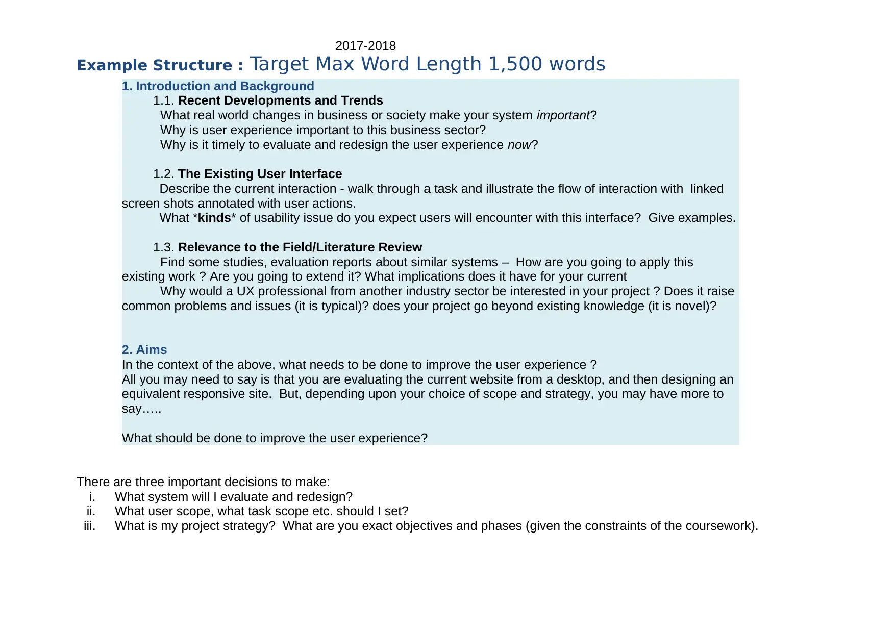
Example Structure : Target Max Word Length 1,500 words
1. Introduction and Background
1.1. Recent Developments and Trends
What real world changes in business or society make your system important?
Why is user experience important to this business sector?
Why is it timely to evaluate and redesign the user experience now?
1.2. The Existing User Interface
Describe the current interaction - walk through a task and illustrate the flow of interaction with linked
screen shots annotated with user actions.
What *kinds* of usability issue do you expect users will encounter with this interface? Give examples.
1.3. Relevance to the Field/Literature Review
Find some studies, evaluation reports about similar systems – How are you going to apply this
existing work ? Are you going to extend it? What implications does it have for your current
Why would a UX professional from another industry sector be interested in your project ? Does it raise
common problems and issues (it is typical)? does your project go beyond existing knowledge (it is novel)?
2. Aims
In the context of the above, what needs to be done to improve the user experience ?
All you may need to say is that you are evaluating the current website from a desktop, and then designing an
equivalent responsive site. But, depending upon your choice of scope and strategy, you may have more to
say…..
What should be done to improve the user experience?
There are three important decisions to make:
i. What system will I evaluate and redesign?
ii. What user scope, what task scope etc. should I set?
iii. What is my project strategy? What are you exact objectives and phases (given the constraints of the coursework).
⊘ This is a preview!⊘
Do you want full access?
Subscribe today to unlock all pages.
Trusted by 1+ million students worldwide
2017-2018
There is one important task to highlight – finding relevant research literature to help you.
A good Project Definition is complete, coherent, well-structured argument that persuades a Ux professional to support and follow
your work.
Feedback (including details of how and where feedback will be provided) As standard see p4
Further Guidance
Choice of System
The existing system you choose to evaluate and redesign should be an application or website, accessed from the desktop.
Options include:
I. Any application, system or site that that you are familiar with, either in the work-place or in everyday life, such as
fantasy football league, PC back-up in the cloud, workflow applications, online maps
II. web sites for e-commerce, search, learning, booking, networking are often popular
III. systems available to students on the KU network, such as web design and development tools, image editors,
drawing applications, spreadsheets, project management tools, citation and reference management tools, diagramming
applications.
IV. or computer games, communication tools, and media channels, linkedin, twitter, you tube etc.
Whatever system you choose, it should raise a variety of user experience issues - usability, learnability, engagement and persuasion -
and include significant amounts of data and content – most contemporary systems do.
Examples include: www.asos.com; www.agoogleaday.com; www.prezi.com; Gimp2.0; www.basecamp.com;
www.mindmeister.com. www.aptana.com
Criteria to Consider:
The application, system or website that your choose should be:
a. Of interest to you. You will spend the rest of the year working on it, so pick sites and applications that are interesting
to you. What software do you use to pursue your interests or hobbies?
Paraphrase This Document
Need a fresh take? Get an instant paraphrase of this document with our AI Paraphraser
2017-2018
b. Add to your track record. What do you want a future employer to see on your CV? Mobile phone retail, banking,
education, games, data analysis, science, programming, charities?
c. Requires resources you have. Where will you find participants for your usability test? (friends and family, other
students, work colleagues?), Can you take screen shots and/or record the existing interface? How will you give
usability test participants access to it? Do you have sufficient domain expertise?
d. Technically challenging. Often this might mean:
i. Innovative, leading edge systems, that have not been perfected by anyone yet
ii. Data intensive systems. Conveying large amounts of information clearly and intuitively, through a
small screen is difficult
iii. Non-core features. Developers typically spend most time perfecting the frequently used, business critical
features (such as checkout pages, editing tables), and have no time left to fix mistakes with less frequently
used, non-critical features (such as terms and conditions pages, organising references)
iv. Open source software, that need volunteers to finish it
v. Fit into a multi-channel and multi-touchpoint world. To be up to date, your topic will ideally concern user
experience on many types of device – smartphones, tablets, laptops, and desktops PCs – at many points in the
customer journey. For an e-commerce site, for example, this journey might include inspiration to go shopping via
e-mail, browsing for clothes on mobile, selection and payment for purchase on PC, sharing information about
purchase on iPad, arrange a return via telephone.
Choice of User and Task Scope
What part of the system do you want to focus on? you may focus your coursework on a sub-set of tasks. You do need not to
evaluate the entire product
You are encouraged to consider all dimensions of user experience as appropriate i.e. for web shops, consider engagement and
persuasion as well as ease of use. If you do need to consider ‘softer’ qualities of interaction and experience, such as
‘luxuriousness’ or ‘excitement’, please make ensure that user experience is usefully measurable to some extent.
Choice of Strategy
What needs to be done to most enhance the multi-channel, multi-touchpoint user experience of your system? (assuming your
desktop system is part of a constellation of interations and platforms). There are many possible answers, including:
2017-2018
a) improve and optimise the primary channel i.e. evaluate desk-top user experience, and optimise desk-top user
experience by redesigning it. For example, check-out processes, expert users performing high frequency tasks. This
can be too easy, especially if your usability test reveals there is nothing to fix! So, you might consider
comparing your system with a competitor - this raises the bar, for your system and for you. You might also consider
adding a significant new feature to the existing system and designing it using the lessons learned from the evaluation,
rather than just redesigning the given functionality – this increases the opportunity for innovation and novelty
b) complement existing desk-top access with tablet access i.e. evaluate the desk-top user experience, learn what is
important and why, apply the lessons learned to the design of an equivalent tablet app, or responsive website. For
example, create a responsive design to your favourite web shop (one that automatically adapts the display to the
width of the display). This is the kind of contribution I would suggest, by default. It is up to date and widely
applicable.
c) Expand an existing mobile app with desk-top enhancements i.e. a mobile app has outgrown its mobile home, and
needs desktop enhancements. Mobile first is an up to date approach, but you might learn more by evaluating a
relevant desktop application, than the existing mobile app. Capturing data from mobile devices is also more
difficult than from laptops, though it is getting easier. Please talk to the module leader!
Major mistakes
Simple, narrow problems with self-evident solutions that any person in the street could design, such as a 3-page photo kiosk, or a
10 button TV remote control are too easy – the overall challenge and level of difficulty of your topic will have a general impact on
your mark. SET YOURSELF A CHALLENGE.
Failing to include any literature in your Project Definition, and not working out how previous work relates to your topic.
Even more further guidance
Even more guidance is available in the FAQ documents in the Assessment section of study space for more details.
⊘ This is a preview!⊘
Do you want full access?
Subscribe today to unlock all pages.
Trusted by 1+ million students worldwide
1 out of 28
Related Documents


Your All-in-One AI-Powered Toolkit for Academic Success.
+13062052269
info@desklib.com
Available 24*7 on WhatsApp / Email
![[object Object]](/_next/static/media/star-bottom.7253800d.svg)
Unlock your academic potential
Copyright © 2020–2026 A2Z Services. All Rights Reserved. Developed and managed by ZUCOL.