Team Evaluation Report: Local Farm Shop Mobile App Case Study Analysis
VerifiedAdded on 2021/04/21
|15
|3131
|98
Report
AI Summary
This report presents a team evaluation of the user interface of a Local Farm Shop mobile application. The team employed the cognitive walkthrough method to assess the usability of the app's wireframes, focusing on how easily users could complete specific tasks. The evaluation covered key areas like the home page, product viewing, login, registration, payments, and bookings. The analysis identified usability issues such as unlabeled buttons, navigation difficulties within product categories, and the lack of a 'forgot password' option. The report provides detailed explanations of the evaluation process, identifying specific problems within each task and suggesting improvements to enhance the user experience and overall functionality of the mobile application. The findings highlight the importance of clear labeling, intuitive navigation, and comprehensive features for a user-friendly mobile app design. This analysis aims to provide actionable insights for improving the app's design and ensuring a seamless user experience. The report also mentions about the cognitive walkthrough approach which is an approach to usability evaluation based on tasks to examine whether the users are able to easily carry out the tasks in the given system.
Assessment Item 3 – Team Evaluation
A Case Study of Local Farm Shop
Student Name:
University Name:
A Case Study of Local Farm Shop
Student Name:
University Name:
Paraphrase This Document
Need a fresh take? Get an instant paraphrase of this document with our AI Paraphraser
Subject Code: [Please Fill] Subject Name: [Please Fill] Group Name: [Please Fill]
Table of Contents
1. Team work...................................................................................................................................2
2. Individual work............................................................................................................................2
2.1 Personas used for evaluation.................................................................................................2
2.2 Task being evaluated.............................................................................................................2
2.3 Explanation on conducting the evaluation.............................................................................4
2.4 Cognitive walkthrough Evaluation Method...........................................................................4
2.5 Identification of issues with each task...................................................................................9
3. Reasoning behind the evaluation decisions...............................................................................12
Bibliography..................................................................................................................................13
Student ID: [Please Fill] Student Name: [Please Fill] 1
Subject Code: [Please Fill] Subject Name: [Please Fill] Group Name: [Please Fill]
1. Team work
The team is evaluating the designed interfaces for mobile application of Local farm shop
with the help of Cognitive Walkthrough. This method has been chosen by the team for
evaluating the usability issues in the mobile app. The chosen method is suitable as it involves
evaluating the design in context of the support provided to users in learning task. The focus of
this method is on analyzing the goals and knowledge to determine whether the design leads the
user in generating correct goals.
2. Individual work
2.1 Personas used for evaluation
The designed wireframes of the Mobile app for Local farm shop has been chosen for
evaluation purposes to determine whether a new user can easily carry out the tasks within the
given system. The evaluation of the designed wireframes will help to understand the issues that
are existing within the system.
2.2 Task being evaluated
The tasks that has been chosen for evaluation purpose in context to the designed
wireframes of the mobile app are listed as below:
Home page: This task involved evaluating the main page or starting page that the user
sees whenever they open the mobile app. The user has access to the system through this page
only and all the functionalities are linked through this page.
Viewing Products: This task comprised of evaluating the design to determine whether
the user is able to easily access the products being offered by Local farm shop.
Student ID: [Please Fill] Student Name: [Please Fill] 2
⊘ This is a preview!⊘
Do you want full access?
Subscribe today to unlock all pages.
Trusted by 1+ million students worldwide
Subject Code: [Please Fill] Subject Name: [Please Fill] Group Name: [Please Fill]
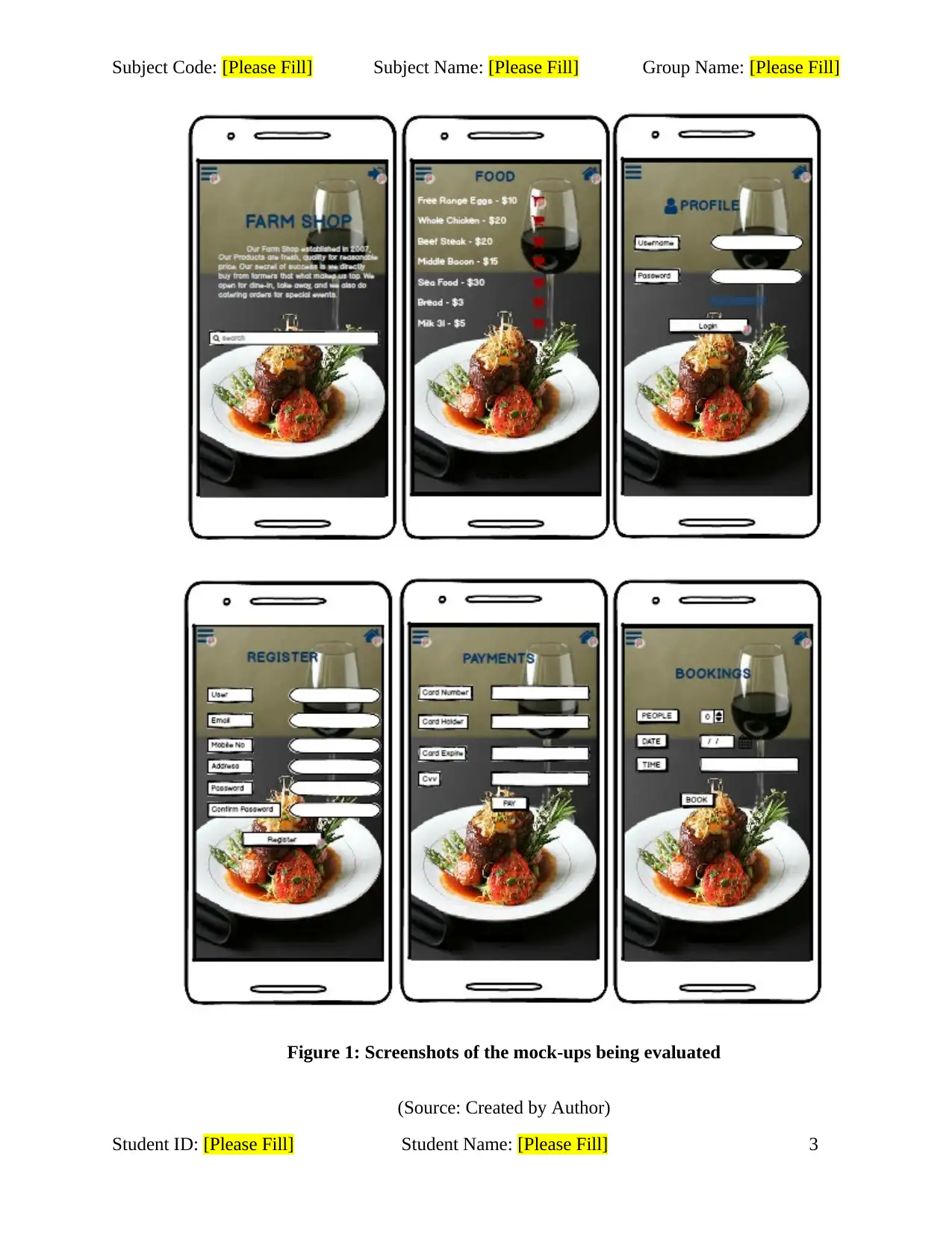
Figure 1: Screenshots of the mock-ups being evaluated
(Source: Created by Author)
Student ID: [Please Fill] Student Name: [Please Fill] 3
Figure 1: Screenshots of the mock-ups being evaluated
(Source: Created by Author)
Student ID: [Please Fill] Student Name: [Please Fill] 3
Paraphrase This Document
Need a fresh take? Get an instant paraphrase of this document with our AI Paraphraser
Subject Code: [Please Fill] Subject Name: [Please Fill] Group Name: [Please Fill]
Login to the system: This function is essential for any user of the mobile app as the user
will be able to access the offered services only after confirmation of login into the system.
Registration: The evaluation of this page has been chosen as the user will be able to
become a part of the system through this functionality only. After registration only, the user will
be able to login and gain access to the system.
Payments: This wireframe has been selected for evaluation to determine the issue that
may arise while user tries to make payment and place their order for purchasing products.
Bookings: This wireframe illustrates the functionality for restaurant booking offered by
the Local farm shop so that user can easily book the restaurant according to their requirement.
2.3 Explanation on conducting the evaluation
The tasks has been evaluated considering the Cognitive Walkthrough approach which is
an approach to usability evaluation based on tasks. The approach has been taken to examine
whether the users are able to easily carry out the tasks in the given system. The evaluation was
conducted by selecting some specific tasks that the users were asked to carry out so that the
issues can be easily identified.
2.4 Cognitive walkthrough Evaluation Method
Home page
In this designed wireframe, the interface is making assumptions about the level of
experience or knowledge of the user as every control has not been labelled properly. The
interface has been designed assuming that the user will be able to understand functionality of the
buttons in the top left and right corner.
Student ID: [Please Fill] Student Name: [Please Fill] 4
Subject Code: [Please Fill] Subject Name: [Please Fill] Group Name: [Please Fill]
The buttons being embedded in the top left and right corner of the Home page are
considered as hidden controls that are required for the task at hand. The user that has no
experience of using such mobile application will not be able to understand functionality of the
used buttons in the Home screen.
The user is able to achieve the outcome by performing correct action as linking of buttons
to functions has been done efficiently in the wireframes.
The user is aware of the progress that they are making as they are able to navigate to
other interfaces as per their requirement by clicking the buttons in the Home page.
Viewing Products
No assumptions about the level of experience or knowledge of the user is being made by
the interface for the “Products page”. The user notices that correct action is easily available to
them as labelling of elements in the interface defines the exact function being performed by that
element.
There are no hidden or obscured controls for this particular task however a major issue is
that the user faces difficulty while navigating for products or services offered by Local farm
shop. The users are unable to associate the correct action with the outcome they expect to
achieve.
The user is able to work out the task that they should perform to achieve their outcome
but with difficulty. The user is able to see the progress being made towards their intended
outcome as they are able to view the different products offered by the Local farm shop.
Student ID: [Please Fill] Student Name: [Please Fill] 5
⊘ This is a preview!⊘
Do you want full access?
Subscribe today to unlock all pages.
Trusted by 1+ million students worldwide
Subject Code: [Please Fill] Subject Name: [Please Fill] Group Name: [Please Fill]
The user is aware of the progress being made as they are able to navigate through the
mobile app by performing correct action.
Login to the system
The chosen wireframe is not making any assumptions about the level of user experience
or knowledge and it has been noticed by the user that correct action is available for them so that
they can easily perform their required task.
In context to the chosen wireframe, no hidden or obscured controls are required for
performing this particular task as the buttons and text fields have been labelled properly that
identifies the functionality of each element in the interface.
The user is able to easily work out the action that is needed to achieve their outcome. The
language being used in the interface is clear, unambiguous and jargon free. It is identified that
the performing of correct action by the user will show that progress is made towards their
intended outcome.
The user is aware of the progress being made in the chosen task as the user is able to
easily login to system and access the service or products offered by Local farm shop.
Registration
The designed interface is not making any assumptions in context to the level of user
experience or knowledge and the user notices that correct action is easily available to them for
carrying out the required task.
Student ID: [Please Fill] Student Name: [Please Fill] 6
Paraphrase This Document
Need a fresh take? Get an instant paraphrase of this document with our AI Paraphraser
Subject Code: [Please Fill] Subject Name: [Please Fill] Group Name: [Please Fill]
In context to performing this particular task, it has been identified that there is no
requirement for hidden or obscured controls as the buttons and text fields have been labelled
properly to demonstrate functionality of each element in the interface.
The user is able to easily perform the registration process so that they can become
customers of the Local farm shop. The interface is designed with application of clear,
unambiguous and jargon free language. It has been identified by the user that performing correct
action helps them to view the progress being made for achieving their requirements.
The user is well aware of the progress they are making in the task as they are being
redirected to different page as soon as they perform the registration process by clicking the
“Register” button.
Payments
From analysis of this chosen wireframe, it can be said that assumptions are being made
by the interface. The interface has not been implemented with cart facility so that users can view
and make modifications in their order.
For performing this particular task by the user, it has been identified that there is no
hidden or obscured controls required and the user is able to easily associate the correct action
required to achieve their required outcomes.
The user is able to easily identify the process for making payments as the labelling for
text boxes demonstrates the content that have to input in the text fields. The language used in
interface design is unambiguous and jargon free as the labels have been clearly stated. The
application of correct action leads the user to see progress being made and achieving desired
outcomes.
Student ID: [Please Fill] Student Name: [Please Fill] 7
Subject Code: [Please Fill] Subject Name: [Please Fill] Group Name: [Please Fill]
The user is not aware of the progress as there is no link embedded in the “Pay” button of
payments page and there is also no notification box designed so that the users can be aware
whether pavement has been done or not.
Bookings
For this particular wireframe, it can said that no assumptions are being made by the
interface and the labelling of each button or text box has been done accurately. The users are able
to easily determine the functions of different buttons or boxes in the wireframe so no
assumptions are being made on the level of user experience or knowledge. The users are able to
easily notice that correct action is available to them.
From the user perspective, it can be said that there is no requirement of any hidden or
obscured controls to complete the task that has been handed to the client. The users are able to
easily determine the correct action required to achieve their desired outcomes.
The users are able to easily to determine the actions that are needed to achieve their
desired outcomes as the labelling of every element in the interface has been done properly. The
language being used in the interface design is absolutely clear and jargon free such that it is
easier for the users to understand the function of every element. It has been identified that the
users are unable to view their progress in context to the booking process by performing correct
action as the button “Book” has not been linked to any page so the user stays on that page only.
The users are not aware of the progress being made in context to the given task as the
linking of “Book” button in the Bookings interface has not been linked to any other wireframe
and there is also no notification provided so that the users will be able to identify whether the
booking has been done or not.
Student ID: [Please Fill] Student Name: [Please Fill] 8
⊘ This is a preview!⊘
Do you want full access?
Subscribe today to unlock all pages.
Trusted by 1+ million students worldwide
Subject Code: [Please Fill] Subject Name: [Please Fill] Group Name: [Please Fill]
Student ID: [Please Fill] Student Name: [Please Fill] 9
Student ID: [Please Fill] Student Name: [Please Fill] 9
Paraphrase This Document
Need a fresh take? Get an instant paraphrase of this document with our AI Paraphraser
Subject Code: [Please Fill] Subject Name: [Please Fill] Group Name: [Please Fill]
2.5 Identification of issues with each task
Home page
The major issue identified in the Home page is that there is no button with labels as those
are only symbols. The Menu and Login buttons are placed at top left and right corner but those
are not labelled.
The issue is a problem as the users face difficulty in navigating through the system.
The issue is significant as if the users are unable to navigate through the system they will
not use the mobile app.
The Menu and Login buttons at top left and right corner can be replaced with labelled
buttons so that new users could easily understand functions of the designed buttons.
Viewing Products
The issue identified with Viewing Products as the products has been divided into
category but there is no option for navigating to other category from a specific category of
products.
The issue is a problem as the users have to go to Menu every time for viewing different
products according to category. For instance, a user is unable to view Wines from the Food
category and he/she has to visit Menu in top left corner to view Wines category.
The issue is significant as the users are most likely to feel frustrated if every time they
have to start over from Menu while navigating through the products.
A button can be placed in the products page within category so that the users can just go a
step back and easily access products from other category.
Student ID: [Please Fill] Student Name: [Please Fill] 10
Subject Code: [Please Fill] Subject Name: [Please Fill] Group Name: [Please Fill]
Login to the system
The issue identified in the Login page is that no link for “forgot password” is provided so
that the users could reset their password in case they forget their password. The “forgot
password” is placed just above the login button.
The issue is a problem as users will not be able to have access to their account or place an
order if they forget their password.
The issue is minor issue as a user can create a new account with registration for accessing
the system.
The issue can be resolved by placing a link to the “forgot password” button so that the
users can easily reset their password and gain access to the system.
Registration
The “Register” button redirects the users to “Login” screen hence, the issue determined
with this function is that the “Register” button is connected to login page. The register button
should redirect the users to Home page from where the users will be able to access services
offered by the system. The “Register” button is located at bottom of screen.
The issue is a problem as the users may feel this process to be complex and loose interest
in using the mobile app.
The issue is a minor issue as some user may be aware of this process of logging in after
registration.
The issue can be resolved by linking the “Register” button with Home page so that the
users can easily access the system.
Student ID: [Please Fill] Student Name: [Please Fill] 11
⊘ This is a preview!⊘
Do you want full access?
Subscribe today to unlock all pages.
Trusted by 1+ million students worldwide
1 out of 15
Related Documents


Your All-in-One AI-Powered Toolkit for Academic Success.
+13062052269
info@desklib.com
Available 24*7 on WhatsApp / Email
![[object Object]](/_next/static/media/star-bottom.7253800d.svg)
Unlock your academic potential
Copyright © 2020–2026 A2Z Services. All Rights Reserved. Developed and managed by ZUCOL.