COIT 20268 (Term 1, 2019) Portfolio 2: Robot Expo Website Development

Verified

Added on  2023/03/31

|13
|1133
|304
Practical Assignment
AI Summary
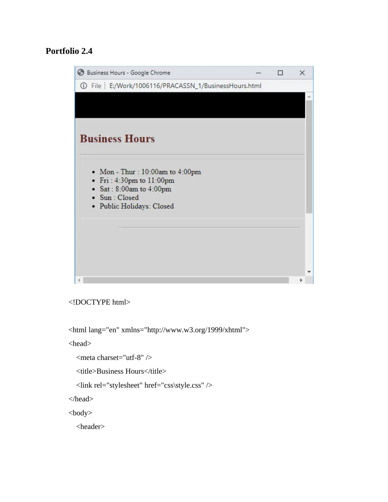
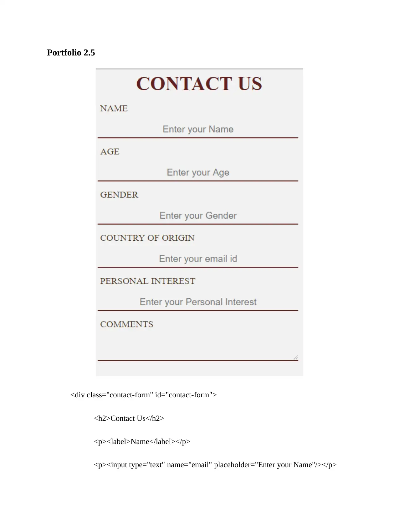
This document represents a practical assignment, Portfolio 2, for the COIT 20268 Responsive Web Design course. The assignment focuses on developing a website for the Robot Expo exhibition. The solution includes wireframes for the homepage, detailing the layout with a main menu, logo, heading, floor map, and robot descriptions. Navigation is implemented using HTML's , , and tags, with distinct pages for different robot categories. The CSS styling incorporates color schemes for headings, navigation, and text, ensuring clear visual hierarchy and mobile responsiveness. The document also provides HTML code for business hours, a contact form with unique styling, and a section on user testing and feedback. James, a neighbor, Alita, a website designer, and a batch mate reviewed the website's mobile responsiveness, design, and overall presentation, highlighting the importance of a user-friendly experience. The project showcases the integration of HTML, CSS, and JavaScript to achieve a responsive and user-friendly website design.
tabler-icon-diamond-filled.svg

Contribute Materials

Your contribution can guide someone’s learning journey. Share your documents today.
Document Page
Portfolio 2.1
The home page wireframe represents how the contents are managed over the screen. The
wireframe image shows that there is a main menu in the header. There is also a logo at the below
of main menu. The size of the logo is bigger than that of conventional size. There is also a
heading at the below of the logo. The floor map will be positioned at the center. There will be a
brief description of the robots along with definition of robots.
tabler-icon-diamond-filled.svg

Secure Best Marks with AI Grader

Need help grading? Try our AI Grader for instant feedback on your assignments.
Document Page
The page in which the robots will be defined will have the same stricture from menu to
the page heading. However, in terms of content, there are name of the robots and images of the
robots. The name of the robots will be just above the images. All the images will be of same size.
Document Page
The contact page is different from all the others. There is a form in the contact page that
will allow the website to store the details of the visitor. In order to store the details of the visitor,
the website need the visitor to enter the information in the input fields and submit the form.
There is also a heading and the details of the physical address such as street name, city and other
required details. If possible there will be a google map that will store the location actual google
map page.
Portfolio 2.2
The navigation has been used in the website for navigating through all the pages. The
main path of navigation is the main menu. The navigation is implemented using <nav> tag. The
entire navigation is implemented using UL and LI tags. There is a home, about and contact page
along with a separate page for the robots. As the pages are static different page for every
category of robot exists. There is a floor plan image that has circles labeled with different
category of robots. A map area tag is used for specifying clickable areas in the image. If the
visitor clicks on the domestic circle then visitor will be redirected to the domestic page. Sections
are used for containing the contents. Robot names and images will be stored within a section
with id named home.
The headings such as h1, h2, h3 to h5 will be colored with dark brown. The navigation
menu will be white in color and dark ash color in background. After hovering the mouse over the
menu item, the text color will be dark ash and background color will be white. This way the
website will distinguish the selected menu item from the others. The normal texts that are within
<p> tag will be colored with black. Each <p> tag is text aligned justified. Each content will have
proper distance from each other. The color can allow the visitor distinguish the important
contents quickly. Right colors can attract the visitor eyes quickly.
Document Page
No whitespace will be used between the contents. It will only increase the page size. The
website will have proper spacing between the contents. The alt and title attribute tags will be
used for each <img> tag. The title and alt will the same as the name of the image. Such as if the
name of the image is floor plan, then alt and title will be floor plan. All the images will be less
than 50% of the page size. For mobile devices, the size will be 70 to 80% maximum. All the
images will be of JPEG format. The browser default link presentation will be used in the website.
It will increase the usability.
Portfolio 2.3
tabler-icon-diamond-filled.svg

Secure Best Marks with AI Grader

Need help grading? Try our AI Grader for instant feedback on your assignments.
Document Page
Portfolio 2.4
<!DOCTYPE html>
<html lang="en" xmlns="http://www.w3.org/1999/xhtml">
<head>
<meta charset="utf-8" />
<title>Business Hours</title>
<link rel="stylesheet" href="css\style.css" />
</head>
<body>
<header>
Document Page
<br/> <br/> <br/>
</header>
<section id="home">
<h1>Business Hours </h1>
<HR >
<table>
<tr>
<td colspan="6">
<ul class="ultime">
<li>Mon - Thur : 10:00am to 4:00pm</li>
<li>Fri : 4:30pm to 11:00pm</li>
<li>Sat : 8:00am to 4:00pm</li>
<li>Sun : Closed</li>
<li>Public Holidays: Closed</li>
</ul>
</td>
</tr>
</table>
<p> <HR style="margin-left:80px; margin-right:20px; color:Black;"></p><br/>
</section>
<footer>
<ul>
<li>2019, Robot Expo</li>
Document Page
</ul>
</footer>
<script type="text/javascript" src="scripts\script.js"></script>
</body>
</html>
tabler-icon-diamond-filled.svg

Paraphrase This Document

Need a fresh take? Get an instant paraphrase of this document with our AI Paraphraser
Document Page
Portfolio 2.5
<div class="contact-form" id="contact-form">
<h2>Contact Us</h2>
<p><label>Name</label></p>
<p><input type="text" name="email" placeholder="Enter your Name"/></p>
Document Page
<p><label>Age</label></p>
<p><input type="text" name="email" placeholder="Enter your Age"/></p>
<p><label>Gender</label></p>
<p><input type="text" name="email" placeholder="Enter your Gender"/></p>
<p><label>Country of Origin</label></p>
<p><input type="text" name="email" placeholder="Enter your email id"/></p>
<p><label>Personal Interest</label></p>
<p><input type="text" name="email" placeholder="Enter your Personal
Interest"/></p>
<p><label>Comments</label></p>
<p><textarea></textarea></p>
<p><button class="contact-button" name="contact-submit"
onclick="">Submit</button>
</div>
The form does not have any backend server of database connectivity. This style of the
form is also very unique. The css of the form is as follows.
label {
color: #493320;
font-size: 120%;
padding: 5px 5px;
text-transform: uppercase;
Document Page
}
input[type=text], textarea{
background-color: Transparent;
background-repeat:no-repeat;
border: none;
text-align: center;
overflow: hidden;
width: 400px;
padding: 5px 5px;
border-bottom: 2px solid #602020;
-webkit-transition: width 2s; /* Safari */
transition: width .5s;
font-size: 120%;
}
input[type=text]:focus, textarea:focus{
width: 250px;
border-bottom: 2px solid #602020;
outline:none;
}
.contact-form {
background-color: rgba(255, 255, 255, 0.7);
width: 40%;
height: 700px;
padding: 5px 5px;
text-align: center;
margin: auto;
}
.contact-button {
background: none;
color: #964a1e;
tabler-icon-diamond-filled.svg

Secure Best Marks with AI Grader

Need help grading? Try our AI Grader for instant feedback on your assignments.
Document Page
width: 40%;
height: 50px;
transition:color 0.25s ease;
border: 1px solid #000000;
font-size: 130%;
border-radius: 10px;
transition: .6s;
overflow: hidden;
outline: none;
margin-top: 10%;
text-transform: uppercase;
}
.contact-button:hover {
color: white;
background-color: #602020;
}
.contact-button:after {
position: absolute;
content: '';
top:0;
left: 0;
width: 0;
height: 100%;
background-color: #602020;
transform-origin:left;
transition:width 0.25s ease;
z-index:-1;
}
.contact-button:hover:after {
width: 100%;
Document Page
}
.js {
background: none;
border: none;
outline: none;
}
h2 {
color: #602020;
text-transform: uppercase;
font-size: 40px;
margin-top: 1%;
font-family: 'Lora', serif;
padding:0;
margin:0;
}
Portfolio 2.6
Three people have been selected for reviewing the website. The first person is a neighbor
who works as a sales man in a local mobile shop. His name is James. James wants to access the
site from his mobile as he does not get much time to access internet from his desktops due to
long working time. James opened the website in a mobile device that has 500*720 pixel screen
size. He found that the clickable image in the home page is very cool. All the contents were
visible properly. The name and image of the robot were showing one above another. The only
issue was that the main content section was little bit wider than the screen.
Document Page
The second participant was a website designer. Her name is Alita. Alita tested the website
in both the desktop and mobile version. In both cases she found that mobile responsiveness
implementation is very good. She also reviewed that the main menu could be made better.
The third participant is a batch mate. He found the website interesting and very good. He
reviewed that the presentation of the responsiveness is very good. The floor plan map is also
responsive. Which is not the regular way to do things.
chevron_up_icon
1 out of 13
circle_padding
hide_on_mobile
zoom_out_icon
logo.png

Your All-in-One AI-Powered Toolkit for Academic Success.

Available 24*7 on WhatsApp / Email

[object Object]