COIT 20268 - Responsive Web Design: MCA Website Evaluation Report
VerifiedAdded on 2022/11/23
|13
|4435
|148
Report
AI Summary
This report provides a comprehensive evaluation of the Museum of Contemporary Arts Australia (MCA) website's responsive web design (RWD). The report begins with an introduction to the MCA and its website, followed by an explanation of RWD principles, including fluid grid systems, responsive images, and navigation. It then analyzes the MCA website across five different screen displays using the Google Chrome device simulator, detailing the website's features, characteristics, and mobile compatibility. The report also includes a discussion of the website's strengths and weaknesses, including navigation usability, user interface, content, and loading speed. User reviews and comments are incorporated, providing perspectives from two participants. Finally, the report concludes with recommendations for improving the MCA website's responsiveness and overall user experience. The report adheres to the assignment brief, focusing on the interactive and design aspects of the website's responsiveness.
Running head: COIT 20268 – RESPONSIVE WEB DESIGN
RESPONSIVE WEB DESIGN
Name of the Student
Name of the University
Author Note:
RESPONSIVE WEB DESIGN
Name of the Student
Name of the University
Author Note:
Paraphrase This Document
Need a fresh take? Get an instant paraphrase of this document with our AI Paraphraser
1COIT 20268 – RESPONSIVE WEB DESIGN
Table of Contents
Section 1: Introduction........................................................................................................2
Section 2: Discussion...........................................................................................................2
Section 2.1: RWD Principles...........................................................................................2
Section 2.2: Selected 5 devices........................................................................................3
Section 2.3: Details of the Nominated Website...............................................................5
Section 2.4: Characteristics of Nominated Website........................................................6
Section 2.5: Pros and Cons of the Nominated Website...................................................6
Section 2.6: Review and Comments from two participants............................................7
Section 2.7: Simulation Software Tool............................................................................7
Pros and Cons of simulation tool in review of RWD web pages................................8
Comment on similar tools available and review of RWD web pages.........................8
Recommendation...............................................................................................................10
Conclusion.........................................................................................................................10
References..........................................................................................................................11
2COIT 20268 – RESPONSIVE WEB DESIGN
Section 1: Introduction
The following report is evaluating nominated website of (MCA) Museum of
Contemporary Arts Australia. This particular nominated website has been reviewed by making
use of Google Chrome device simulator. MCA stands for Museum of Contemporary Arts
Australia is considered to be as one of the leading museum focused on exhibiting and collecting
contemporary Arts. The museum focus on collecting arts from various location of Australia and
global platform. MCA aims to highlight an engaging program for exhibition which is related to
the special events. It is from the major thematic and survey of artist, work by a new artist,
exhibition by solo artists. Also, it focuses on painting and sculpture to new media. MCA program
focuses on range and diversity for most of the contemporary arts (Hussain and Mkpojiogu 2015).
The museum is located on circular Quay which is known to be edge of Sydney harbour. MCA is
completely housed in the maritime service building which is the most suitable example of Art
Deco Architecture. MCA store is considered to be as one unique shopping destination in
Australia. It merely focuses on contemporary art and culture public and unique arts. MCA aims
to offer latest Australian cuisine and spectacular view of complete Sydney Harbor. The museum
actively focuses on encouraging its team members to collaborate and work as a team. The
museum promotes the concept of diverse perspective and idea from other section.
The report mainly focuses on providing a description of nominated website of museum of
contemporary arts Australia (MCA). An identification has been given concerning the main
features of MCA website. The next parts deal with pros and cons aspect of this MCA website. A
proper review and comment has been collected from two participants of this website. The last
part of this report focus on list of recommendation for this website.
Section 2: Discussion
Section 2.1: RWD Principles
Responsive design can be defined as the method of building a certain number of web
properties. It is mainly done so that devices can be used for analyzing the method in which the
site will be displayed. It is generally done by making use of principle of mobile-first where
experience is completely stated on mobile platform (Huang and Guo 2016). It is mainly scaled
up like smartphone and tablets which is scaled to some large screen. There is need for
understanding this approach as more and more people are accessing the mobile web. The access
of smartphone to the internet platform is much greater in comparison to traditional computers.
Responsive or Flexible Template: Responsive can be defined as the method in which a
particular web property can be developed. This is mainly done so that the devices are being used
for determining the method in which website will be displayed. It is considered to be great
solution for the multi-screen issue (Nogueira et al. 2017). On the contrary, it is difficult to get it
from the perspective of printing. There are mainly three principles for RDW that is fluid grid
system, fluid image use and media quarries. The website of MCA is completely responsive in
nature so that user can easily analyze it on range of platforms.
Responsive Image: Most of the mobile user have short span of time. Mobile user hates
the website which take aims to take long time that is more than three seconds for loading. The
site of MCA has been designed in such a way that it takes minimum time for navigation on range
⊘ This is a preview!⊘
Do you want full access?
Subscribe today to unlock all pages.
Trusted by 1+ million students worldwide
3COIT 20268 – RESPONSIVE WEB DESIGN
of devices (Feng, Suo and Luo 2015). The website of MCA makes use of latest technology like
catching and the responsive images are displayed for improving the loading time of the website.
Responsive Navigation: MCA website is completely responsive in nature which is
optimized for providing much better user experience to most of the visitors. It takes up minimum
time for sticking around for different areas and exploring various section.
Consistency: Consistency is defined as one golden rule which is followed for website
design. This is mainly used for providing quality experience to most of the user. Consistency is
considered to be an important factor which is needed for design and content of website (Turan
and ŞAHİN 2017). Consistency is one of the biggest factor which distinguishes in between
negative experience and positive experience.
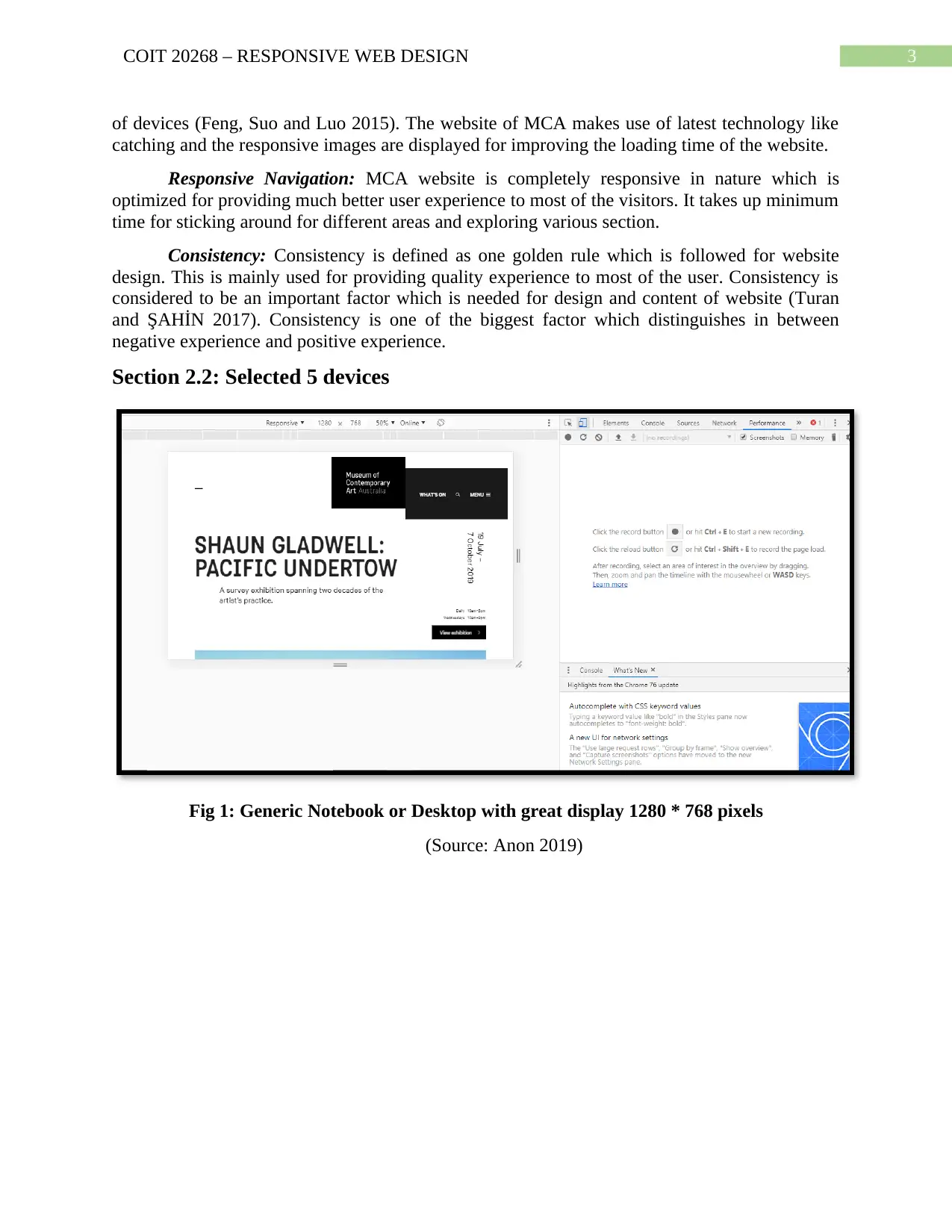
Section 2.2: Selected 5 devices
Fig 1: Generic Notebook or Desktop with great display 1280 * 768 pixels
(Source: Anon 2019)
of devices (Feng, Suo and Luo 2015). The website of MCA makes use of latest technology like
catching and the responsive images are displayed for improving the loading time of the website.
Responsive Navigation: MCA website is completely responsive in nature which is
optimized for providing much better user experience to most of the visitors. It takes up minimum
time for sticking around for different areas and exploring various section.
Consistency: Consistency is defined as one golden rule which is followed for website
design. This is mainly used for providing quality experience to most of the user. Consistency is
considered to be an important factor which is needed for design and content of website (Turan
and ŞAHİN 2017). Consistency is one of the biggest factor which distinguishes in between
negative experience and positive experience.
Section 2.2: Selected 5 devices
Fig 1: Generic Notebook or Desktop with great display 1280 * 768 pixels
(Source: Anon 2019)
Paraphrase This Document
Need a fresh take? Get an instant paraphrase of this document with our AI Paraphraser
4COIT 20268 – RESPONSIVE WEB DESIGN
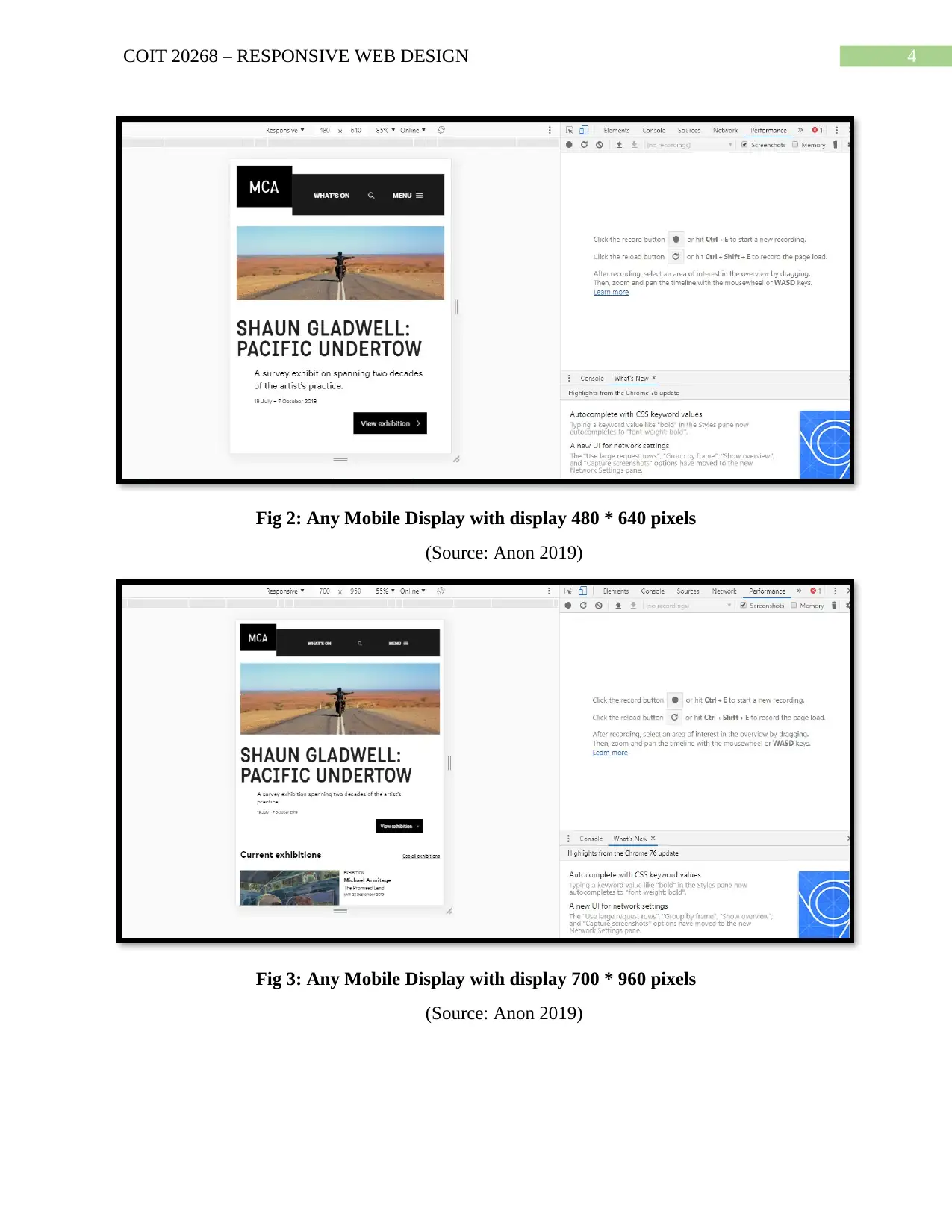
Fig 2: Any Mobile Display with display 480 * 640 pixels
(Source: Anon 2019)
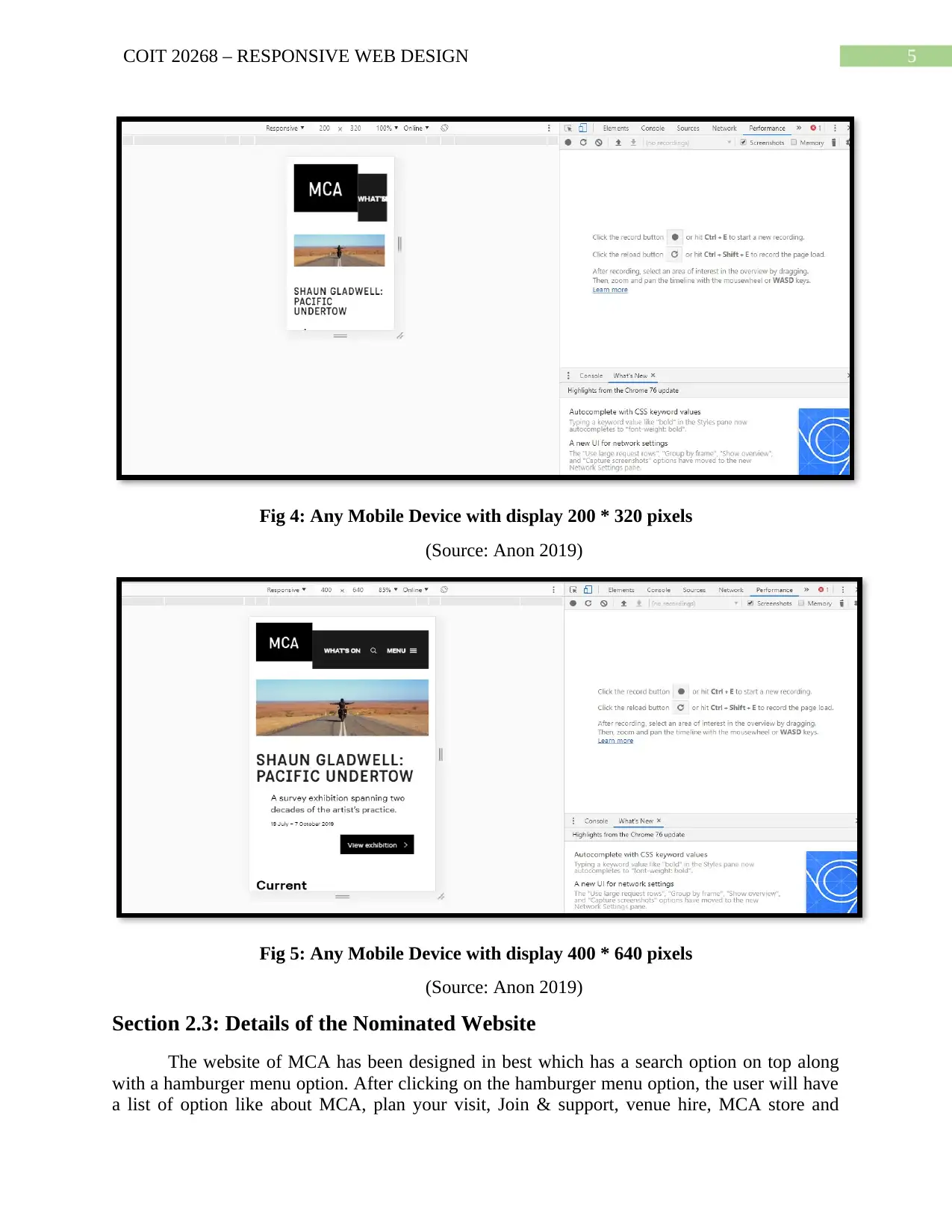
Fig 3: Any Mobile Display with display 700 * 960 pixels
(Source: Anon 2019)
Fig 2: Any Mobile Display with display 480 * 640 pixels
(Source: Anon 2019)
Fig 3: Any Mobile Display with display 700 * 960 pixels
(Source: Anon 2019)
5COIT 20268 – RESPONSIVE WEB DESIGN
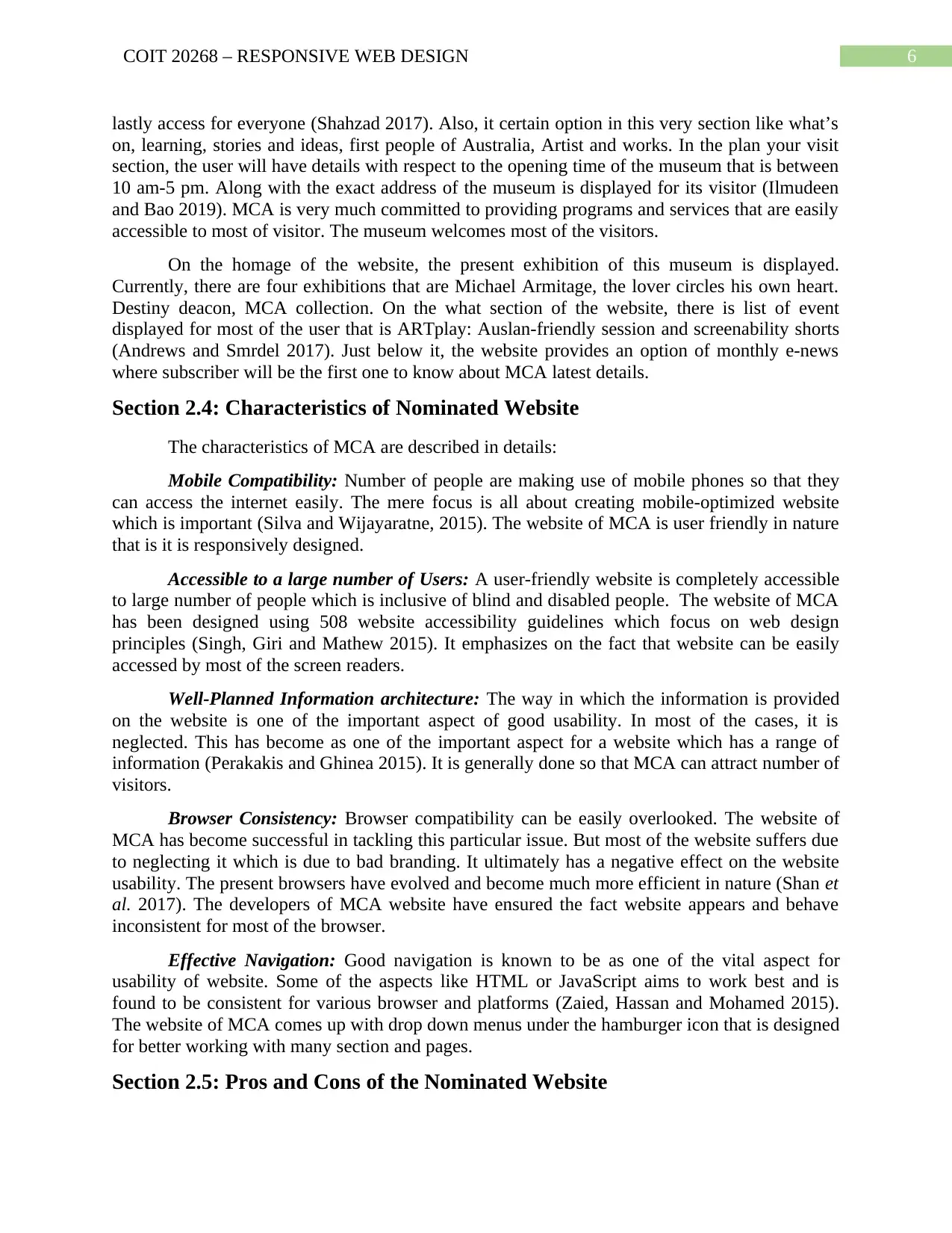
Fig 4: Any Mobile Device with display 200 * 320 pixels
(Source: Anon 2019)
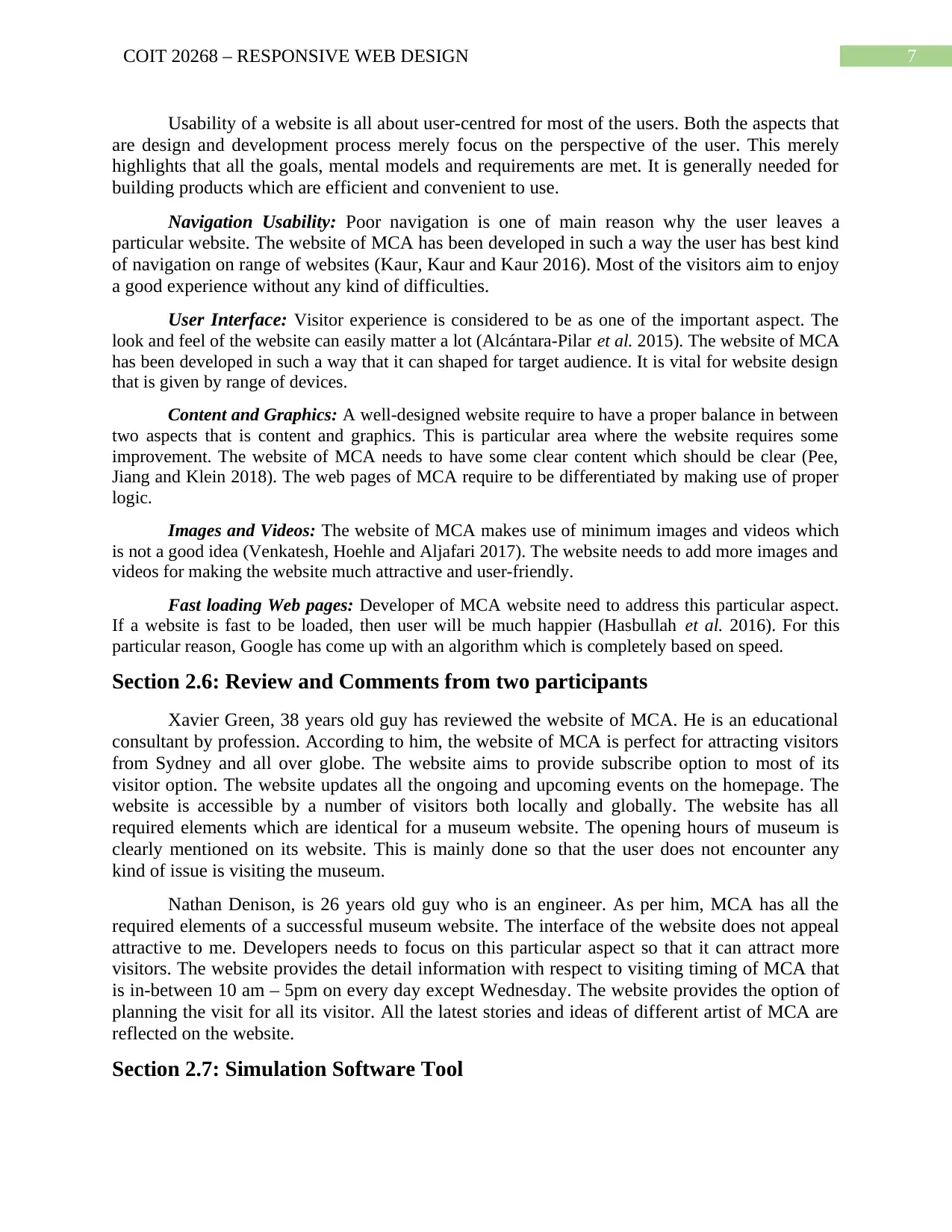
Fig 5: Any Mobile Device with display 400 * 640 pixels
(Source: Anon 2019)
Section 2.3: Details of the Nominated Website
The website of MCA has been designed in best which has a search option on top along
with a hamburger menu option. After clicking on the hamburger menu option, the user will have
a list of option like about MCA, plan your visit, Join & support, venue hire, MCA store and
Fig 4: Any Mobile Device with display 200 * 320 pixels
(Source: Anon 2019)
Fig 5: Any Mobile Device with display 400 * 640 pixels
(Source: Anon 2019)
Section 2.3: Details of the Nominated Website
The website of MCA has been designed in best which has a search option on top along
with a hamburger menu option. After clicking on the hamburger menu option, the user will have
a list of option like about MCA, plan your visit, Join & support, venue hire, MCA store and
⊘ This is a preview!⊘
Do you want full access?
Subscribe today to unlock all pages.
Trusted by 1+ million students worldwide
6COIT 20268 – RESPONSIVE WEB DESIGN
lastly access for everyone (Shahzad 2017). Also, it certain option in this very section like what’s
on, learning, stories and ideas, first people of Australia, Artist and works. In the plan your visit
section, the user will have details with respect to the opening time of the museum that is between
10 am-5 pm. Along with the exact address of the museum is displayed for its visitor (Ilmudeen
and Bao 2019). MCA is very much committed to providing programs and services that are easily
accessible to most of visitor. The museum welcomes most of the visitors.
On the homage of the website, the present exhibition of this museum is displayed.
Currently, there are four exhibitions that are Michael Armitage, the lover circles his own heart.
Destiny deacon, MCA collection. On the what section of the website, there is list of event
displayed for most of the user that is ARTplay: Auslan-friendly session and screenability shorts
(Andrews and Smrdel 2017). Just below it, the website provides an option of monthly e-news
where subscriber will be the first one to know about MCA latest details.
Section 2.4: Characteristics of Nominated Website
The characteristics of MCA are described in details:
Mobile Compatibility: Number of people are making use of mobile phones so that they
can access the internet easily. The mere focus is all about creating mobile-optimized website
which is important (Silva and Wijayaratne, 2015). The website of MCA is user friendly in nature
that is it is responsively designed.
Accessible to a large number of Users: A user-friendly website is completely accessible
to large number of people which is inclusive of blind and disabled people. The website of MCA
has been designed using 508 website accessibility guidelines which focus on web design
principles (Singh, Giri and Mathew 2015). It emphasizes on the fact that website can be easily
accessed by most of the screen readers.
Well-Planned Information architecture: The way in which the information is provided
on the website is one of the important aspect of good usability. In most of the cases, it is
neglected. This has become as one of the important aspect for a website which has a range of
information (Perakakis and Ghinea 2015). It is generally done so that MCA can attract number of
visitors.
Browser Consistency: Browser compatibility can be easily overlooked. The website of
MCA has become successful in tackling this particular issue. But most of the website suffers due
to neglecting it which is due to bad branding. It ultimately has a negative effect on the website
usability. The present browsers have evolved and become much more efficient in nature (Shan et
al. 2017). The developers of MCA website have ensured the fact website appears and behave
inconsistent for most of the browser.
Effective Navigation: Good navigation is known to be as one of the vital aspect for
usability of website. Some of the aspects like HTML or JavaScript aims to work best and is
found to be consistent for various browser and platforms (Zaied, Hassan and Mohamed 2015).
The website of MCA comes up with drop down menus under the hamburger icon that is designed
for better working with many section and pages.
Section 2.5: Pros and Cons of the Nominated Website
Paraphrase This Document
Need a fresh take? Get an instant paraphrase of this document with our AI Paraphraser
7COIT 20268 – RESPONSIVE WEB DESIGN
Usability of a website is all about user-centred for most of the users. Both the aspects that
are design and development process merely focus on the perspective of the user. This merely
highlights that all the goals, mental models and requirements are met. It is generally needed for
building products which are efficient and convenient to use.
Navigation Usability: Poor navigation is one of main reason why the user leaves a
particular website. The website of MCA has been developed in such a way the user has best kind
of navigation on range of websites (Kaur, Kaur and Kaur 2016). Most of the visitors aim to enjoy
a good experience without any kind of difficulties.
User Interface: Visitor experience is considered to be as one of the important aspect. The
look and feel of the website can easily matter a lot (Alcántara-Pilar et al. 2015). The website of MCA
has been developed in such a way that it can shaped for target audience. It is vital for website design
that is given by range of devices.
Content and Graphics: A well-designed website require to have a proper balance in between
two aspects that is content and graphics. This is particular area where the website requires some
improvement. The website of MCA needs to have some clear content which should be clear (Pee,
Jiang and Klein 2018). The web pages of MCA require to be differentiated by making use of proper
logic.
Images and Videos: The website of MCA makes use of minimum images and videos which
is not a good idea (Venkatesh, Hoehle and Aljafari 2017). The website needs to add more images and
videos for making the website much attractive and user-friendly.
Fast loading Web pages: Developer of MCA website need to address this particular aspect.
If a website is fast to be loaded, then user will be much happier (Hasbullah et al. 2016). For this
particular reason, Google has come up with an algorithm which is completely based on speed.
Section 2.6: Review and Comments from two participants
Xavier Green, 38 years old guy has reviewed the website of MCA. He is an educational
consultant by profession. According to him, the website of MCA is perfect for attracting visitors
from Sydney and all over globe. The website aims to provide subscribe option to most of its
visitor option. The website updates all the ongoing and upcoming events on the homepage. The
website is accessible by a number of visitors both locally and globally. The website has all
required elements which are identical for a museum website. The opening hours of museum is
clearly mentioned on its website. This is mainly done so that the user does not encounter any
kind of issue is visiting the museum.
Nathan Denison, is 26 years old guy who is an engineer. As per him, MCA has all the
required elements of a successful museum website. The interface of the website does not appeal
attractive to me. Developers needs to focus on this particular aspect so that it can attract more
visitors. The website provides the detail information with respect to visiting timing of MCA that
is in-between 10 am – 5pm on every day except Wednesday. The website provides the option of
planning the visit for all its visitor. All the latest stories and ideas of different artist of MCA are
reflected on the website.
Section 2.7: Simulation Software Tool
8COIT 20268 – RESPONSIVE WEB DESIGN
Chrome device simulator is all about making use of device mode for analyzing how a
particular web page look and perform on mobile platform. Device model is a collection of
features chrome Dev tools for simulating mobile devices. Responsive web tester is considered to
be a quick and easy method for testing responsive website (Hasbullah et al. 2016). In other
words, this can be defined as a type of software program that helps the user to emulate the web
pages on various screen sizes like mobile and tablet. This particular tool is needed for analyzing
the responsive of web pages of any website. Web-tester makes use of chrome device simulator
which is needed for analyzing the external behaviour of website like transaction and calculation
(Giraud, Thérouanne and Steiner 2018). It is known to be partial re-implementation of the
original software.
Web-tester will have to make choice of resolution for mobile screen in the tab for
analyzing the responsive of webpages (Pant 2015). Just after this, the present web pages will be
opened up in a separate window on the screen. Some of the characteristics of chrome device
simulator are discussed below:
It comes up some pre-defined screen sizes
Both kind of modes that is needed for both landscape and portrait view option are
available to users.
The software works much efficiently with local files
Mobile devices come up with same scrollbar
Pros and Cons of simulation tool in review of RWD web pages
There are many benefits of chrome device simulator like:
It helps the user in having close feel with real mobile devices at the time of testing the
device.
This particular software is considered to be much cost-efficient and helpful in providing
desired results of test when the tester does not have time for purchasing it.
This is an open source software which is easily downloadable and used by various
person.
It aims to provide the option of screenshot facility on office platform.
There is a list of drawbacks of using Chrome device simulator like:
The software fails to simulate any kind of issue which is related to battery
The simulator works much less in comparison to original devices at the same instant.
Comment on similar tools available and review of RWD web pages
Chrome DevTools: It is a device which is used for building full responsive website. This
is mainly needed for simulating devices and their overall capability.
⊘ This is a preview!⊘
Do you want full access?
Subscribe today to unlock all pages.
Trusted by 1+ million students worldwide
9COIT 20268 – RESPONSIVE WEB DESIGN
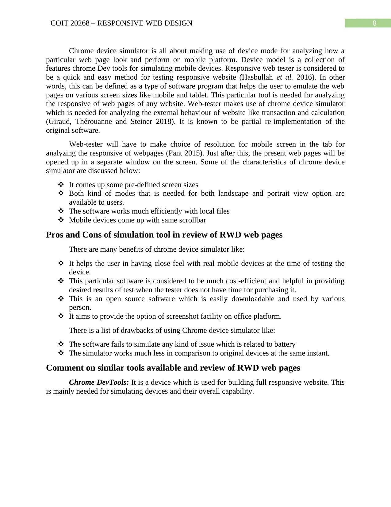
Fig 6: Chrome Dev Tools
(Source: Jano et al. 2015)
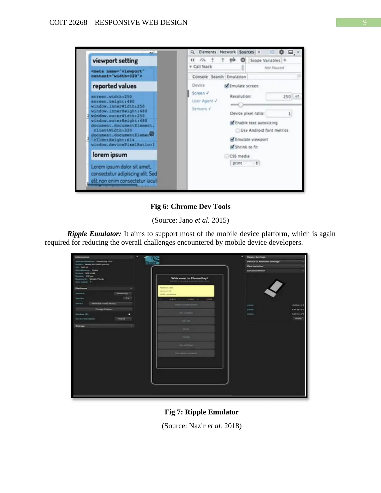
Ripple Emulator: It aims to support most of the mobile device platform, which is again
required for reducing the overall challenges encountered by mobile device developers.
Fig 7: Ripple Emulator
(Source: Nazir et al. 2018)
Fig 6: Chrome Dev Tools
(Source: Jano et al. 2015)
Ripple Emulator: It aims to support most of the mobile device platform, which is again
required for reducing the overall challenges encountered by mobile device developers.
Fig 7: Ripple Emulator
(Source: Nazir et al. 2018)
Paraphrase This Document
Need a fresh take? Get an instant paraphrase of this document with our AI Paraphraser
10COIT 20268 – RESPONSIVE WEB DESIGN
Recommendation
There is a list recommendation for MCA website which requires to maintain the
confidentiality of visitors:
SEO: Search engine like Google does not like any kind of frame; the subsidiary frames
will not be visited by any robots. It will merely render most of the content on the pages until and
unless considering search engine point of view. The website does not have any additional
paragraph which comprises of text. This particular text is not completely visible on-page and so
it can be ignored by most of the reach engine.
Response Time: User should always have his or her eye on overall loading time of
website. Most of the user bounce back if the website is taking a time of more than 4 seconds. The
average response time of MCA website is much so there is need for improvement in this
particular section. Website developer of MCA needs to make use of skeleton screen for solving
this particular issue.
Conversion Funnel: The website design is completely based on goals so the developer
needs to have a clear idea concerning the ultimate goal of the website. Depending on the
conversion rate, the design of conversion funnel should be done.
Enhancing accessibility: The point should be taken into consideration that the design
website is robust in nature so that the user can adjust the resolution as per requirement.
Developer of this website needs to focus on two aspects that is responsive and compatibility with
devices.
Conclusion
The point can be concluded that the report focus on evaluation of MCA website. This
particular website has been analyzed by the help of Google Chrome device simulator. In the
report, an identification of the nominated website has been done considering the overview and
description of it. An identification has been done concerning main plus point of the website. The
next part of the report deals with benefits and drawbacks with different aspect of this MCA
website. In this section, the mere focus is on the interaction and usability aspects of this website.
A proper review of two people for MCA website has been provided. The review has been done
using proper device setting. In the last section of the report, recommendations have been given
with respect to the fact how the given website can be improved. An analysis has been with
respect to chrome device simulator which needs to be reviewed. An overview has been provided
on the benefits and drawbacks of this tool. In addition, a search has been done on similar tools
which is there for review of RWD pages and testing. MCA stands for Museum of Contemporary
Arts Australia is located in Sydney, Australia. It is considered to be a sole Australian museum
which is mainly responsible for exhibiting, analyzing and gathering contemporary arts. It has
come into picture from both Australia and global places around the world. It aims to follow art
deco-style which is available from Maritime Service board on western part of Circular Quay. In
the year 1991, the museum was opened up as Museum of Contemporary Arts. It focused on an
underwent of around 58 million expanding and its re-development. The museum comes up with
4,000 work which is completed by Australian Artist. The collection span for all forms of arts is
with strong holding in painting, scripture, paper work and changing images. In addition, the
museum focus on representing the work by Aboriginal and Torres Strait Islander artist.
11COIT 20268 – RESPONSIVE WEB DESIGN
References
Alcántara-Pilar, J.M., del Barrio-García, S., Porcu, L. and Crespo-Almendros, E., 2015.
Motivational duality in online consumer behaviour: Website usability and flow state as
moderating factors. International Journal of Business and Economics, 14(1), p.79.
Andrews, K. and Smrdel, A., 2017, June. Responsive Data Visualisation. In EuroVis
(Posters) (pp. 113-115).
Anon, 2019. Australia’s home for contemporary art | MCA Australia. [online] Mca.com.au.
Available at: <https://www.mca.com.au/> [Accessed 12 Sep. 2019].
Feng, X., Suo, Z. and Luo, J., 2015, November. Responsive Web Design Based on Different-
Sized Devices. In 2015 International Conference on Electromechanical Control Technology and
Transportation. Atlantis Press.
Giraud, S., Thérouanne, P. and Steiner, D.D., 2018. Web accessibility: Filtering redundant and
irrelevant information improves website usability for blind users. International Journal of
Human-Computer Studies, 111, pp.23-35.
Hasbullah, N.A., Osman, A., Abdullah, S., Salahuddin, S.N., Ramlee, N.F. and Soha, H.M.,
2016. The relationship of attitude, subjective norm and website usability on consumer intention
to purchase online: An evidence of Malaysian youth. Procedia Economics and Finance, 35,
pp.493-502.
Hasbullah, N.A., Osman, A., Abdullah, S., Salahuddin, S.N., Ramlee, N.F. and Soha, H.M.,
2016. The relationship of attitude, subjective norm and website usability on consumer intention
to purchase online: An evidence of Malaysian youth. Procedia Economics and Finance, 35,
pp.493-502.
Huang, H.C. and Guo, S.H.M., 2016. Development of a Multimedia Dysphagia Assessment
Learning System Using Responsive Web Design: From e-Learning to m-Learning. In Nursing
Informatics (pp. 619-620).
Hussain, A. and Mkpojiogu, E.O., 2015. The effect of responsive web design on the user
experience with laptop and smartphone devices. Jurnal Teknologi (Sciences &
Engineering), 77(4), pp.41-47.
Ilmudeen, A. and Bao, Y., 2019. What obstruct customer acceptance of internet banking?
Security and privacy, risk, trust and website usability and the role of moderators. arXiv preprint
arXiv:1903.12551.
Jano, Z., Noor, S.M., Ahmad, R., Saad, M.S.M., Saadan, R., Bokhari, M. and Abdullah, A.N.,
2015. Website usability and cultural dimensions in Malaysian and Australian universities. Asian
Social Science, 11(9), p.1.
Kaur, S., Kaur, K. and Kaur, P., 2016, March. Analysis of website usability evaluation methods.
In 2016 3rd International Conference on Computing for Sustainable Global Development
(INDIACom) (pp. 1043-1046). IEEE.
⊘ This is a preview!⊘
Do you want full access?
Subscribe today to unlock all pages.
Trusted by 1+ million students worldwide
1 out of 13
Related Documents


Your All-in-One AI-Powered Toolkit for Academic Success.
+13062052269
info@desklib.com
Available 24*7 on WhatsApp / Email
![[object Object]](/_next/static/media/star-bottom.7253800d.svg)
Unlock your academic potential
Copyright © 2020–2026 A2Z Services. All Rights Reserved. Developed and managed by ZUCOL.