COIT20268: Analyzing Responsive Design of National Geographic Website
VerifiedAdded on 2024/05/30
|32
|3995
|80
Report
AI Summary
This report provides an in-depth analysis of the National Geographic website, focusing on its responsive web design and adherence to key principles. It begins with an overview of the website, detailing its main features, positive and negative aspects, and user reviews gathered through questionnaires. The report then delves into a comparison of responsive versus adaptive web design, examining the website's flow, relative units, breakpoints, minimum and maximum content stretch, shift of nested objects, and its approach to desktop-first or mobile-first design. Further analysis covers website and system fonts, as well as the use of bitmap, images, and vectors. The report concludes with recommendations for improvements to the website's design and functionality, aiming to enhance user experience and overall effectiveness. Desklib provides this and many other solved assignments for students.

COIT 20268
Responsive Web Design
Responsive Web Design
Paraphrase This Document
Need a fresh take? Get an instant paraphrase of this document with our AI Paraphraser
Table of Contents
1. Introduction..............................................................................................................................3
2. Overview..................................................................................................................................4
2.1 Main features of the website..................................................................................................4
2.2 Positive and negative aspects of website...............................................................................5
2.3 User reviews and feedbacks...................................................................................................7
2.4 Responsive web design..........................................................................................................9
Responsive web design V/s Adaptive web design................................................................10
Flow in the website................................................................................................................14
Relative units.........................................................................................................................16
Breakpoints............................................................................................................................17
Minimum-Maximum Content Stretch...................................................................................20
Shift of Nested Objects..........................................................................................................22
Desktop First or Mobile.........................................................................................................24
Website and System fonts......................................................................................................26
Bitmap/ Images/ Vector.........................................................................................................28
3. Recommendations..................................................................................................................31
4. Conclusion.............................................................................................................................31
References......................................................................................................................................32
List of Figures
Figure 1 Large display screen (1280*768)....................................................................................10
Figure 2 Medium Screen size (700*960).......................................................................................11
1
Figure 3- Medium Screen size (480*640).....................................................................................12
Figure 4 Tiny Screen size (400*640).............................................................................................13
Figure 5- Tiny Screen Size (200*320)...........................................................................................13
Figure 6- Desktop Screen size 2....................................................................................................14
Figure 7 Medium screen Size 2.....................................................................................................15
Figure 8 Low Screen size Screen 2................................................................................................15
Figure 9- High Resolution Screen 3..............................................................................................16
Figure 10 Medium resolution screen 3..........................................................................................16
Figure 11 Low resolution screen 3................................................................................................17
Figure 12-High resolution screen 4...............................................................................................17
Figure 13 Medium resolution screen 4..........................................................................................18
Figure 14 Low resolution screen 4................................................................................................19
Figure 15 High resolution screen 5................................................................................................20
Figure 16 Medium resolution screen 5..........................................................................................20
Figure 17 Low resolution screen 5................................................................................................21
Figure 18 High resolution screen 6................................................................................................22
Figure 19 Medium resolution screen 6..........................................................................................23
Figure 20 Low resolution screen 6................................................................................................24
Figure 21 High resolution screen 7................................................................................................24
Figure 22 Medium resolution screen 7..........................................................................................25
Figure 23 Low resolution screen 7................................................................................................26
Figure 24 High resolution screen 8................................................................................................26
Figure 25 Medium resolution screen 8..........................................................................................27
Figure 26 Low resolution screen 8................................................................................................28
Figure 27 High resolution screen 9................................................................................................29
Figure 28 Medium resolution screen 9..........................................................................................29
Figure 29 low resolution screen 9..................................................................................................30
List of Tables
Table 1- User Review Questionnaire 1............................................................................................7
Table 2- User 1 Review Description...............................................................................................8
Table 3-User Review Questionnaire 2.............................................................................................8
Table 4- User 2 Review Description...............................................................................................9
2
⊘ This is a preview!⊘
Do you want full access?
Subscribe today to unlock all pages.
Trusted by 1+ million students worldwide
1. Introduction
The report is based on the in-depth analysis of the allotted website, National Geographic
Website. The website will be analyzed according to the site responsiveness and the
understanding of the elements. There are nine principles for the analysis of the RWD
(Responsive Web Design) upon which the in-depth analysis can be carried out. The report will
discuss upon the things like what the website is all about, the website description, features of the
website and how does the website impact the people positively and negatively. The next section
comprises the comparison of the website features with the RWD principles. The reviews of two
users should also be collected as per the website effectiveness and the responsiveness upon the
various backgrounds. The report will also contain the improvements that could be suggested for
the website.
3
Paraphrase This Document
Need a fresh take? Get an instant paraphrase of this document with our AI Paraphraser
2. Overview
The National Geographic Website is a platform to gain the information regarding to the things
present on the entire planet. It explores various areas regarding the animals, engineering, history,
nature, people, science, space and travel. It is global platform which is a hub of all the researches
that have been done, which are ongoing or which can be done. The information is exclusively
read and uploaded under the guidance of the world’s renowned scientists, astronomers,
photographers, wildlife activists, filmmakers, journalists and travelers. The community of the
national geographic website have day to day and minute to minute conversations with the means
of books, travel and social and digital media platforms. The website aims at the providing the
information to mass of people so that they could be made aware of the amazing literary facts of
the universe (Geographic, 2018).
Description
The website’s primary focus rests on the education regarding the various national geographic
topics. The different topics related to the history, science and the events can be discussed on the
website. The exclusive topics which are highly rated in the world are also covered in the website.
The sensitive topics on the science, space and research can be included on the website. The main
focus of the website is that the website should focus on the quality of the content. The website
should also focus on the number of online and the offline events related to the topics. The
website also provides the users availability to access the website articles, photos and the ideas.
The subjects that are included in the science are biology, geology, animals, ecosystem,
engineering and weather. The users can choose by themselves the topics that they ant to explore
according to their own choices and the requirements. An online TV is also embedded in the
website that gives the recaps on the various episodes. The website also focusses on the providing
information through books and other literary stuffs that the users can purchase online from the
website platform itself. There are also slots of advertisements which the users can place on the
website. A part of revenue generated from the advertisements has to be shared with the national
geographic society.
2.1 Main features of the website
The national geographic website primarily focuses on the topic exploration and providing user
the information on various stuffs. Still, there are other numerous features of this website. The
following sections of the website deal with the following features:
The website enables the users to signup and login.
The website also facilitates external navigation, i.e., social media platforms such as
Facebook, Twitter, YouTube, Instagram and Tumblr.
Exploration, Video viewing, online TV viewing, shopping and traveling are the main
prime features on the website.
The internal navigation of the website is highly easy and user interactive.
4
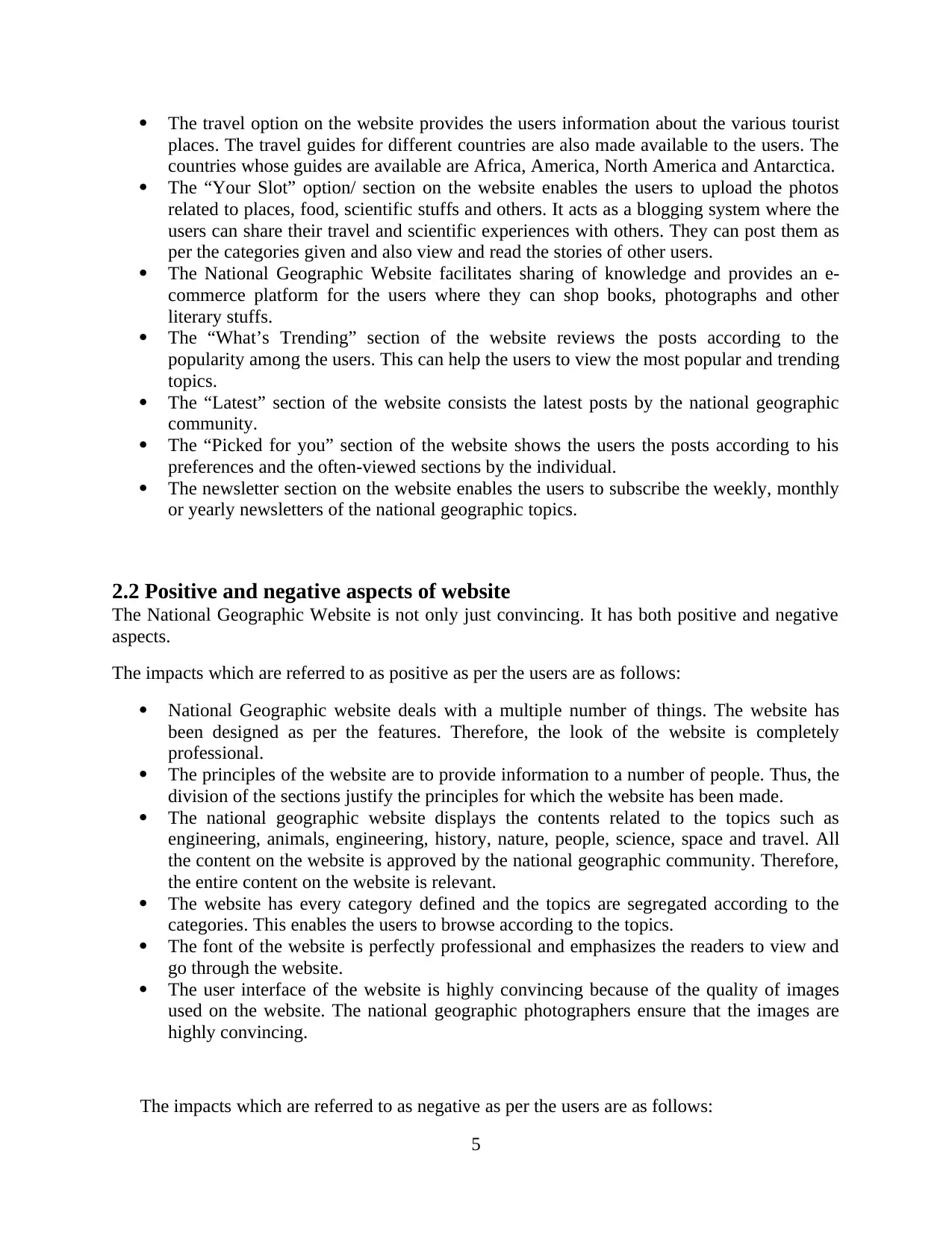
The travel option on the website provides the users information about the various tourist
places. The travel guides for different countries are also made available to the users. The
countries whose guides are available are Africa, America, North America and Antarctica.
The “Your Slot” option/ section on the website enables the users to upload the photos
related to places, food, scientific stuffs and others. It acts as a blogging system where the
users can share their travel and scientific experiences with others. They can post them as
per the categories given and also view and read the stories of other users.
The National Geographic Website facilitates sharing of knowledge and provides an e-
commerce platform for the users where they can shop books, photographs and other
literary stuffs.
The “What’s Trending” section of the website reviews the posts according to the
popularity among the users. This can help the users to view the most popular and trending
topics.
The “Latest” section of the website consists the latest posts by the national geographic
community.
The “Picked for you” section of the website shows the users the posts according to his
preferences and the often-viewed sections by the individual.
The newsletter section on the website enables the users to subscribe the weekly, monthly
or yearly newsletters of the national geographic topics.
2.2 Positive and negative aspects of website
The National Geographic Website is not only just convincing. It has both positive and negative
aspects.
The impacts which are referred to as positive as per the users are as follows:
National Geographic website deals with a multiple number of things. The website has
been designed as per the features. Therefore, the look of the website is completely
professional.
The principles of the website are to provide information to a number of people. Thus, the
division of the sections justify the principles for which the website has been made.
The national geographic website displays the contents related to the topics such as
engineering, animals, engineering, history, nature, people, science, space and travel. All
the content on the website is approved by the national geographic community. Therefore,
the entire content on the website is relevant.
The website has every category defined and the topics are segregated according to the
categories. This enables the users to browse according to the topics.
The font of the website is perfectly professional and emphasizes the readers to view and
go through the website.
The user interface of the website is highly convincing because of the quality of images
used on the website. The national geographic photographers ensure that the images are
highly convincing.
The impacts which are referred to as negative as per the users are as follows:
5
⊘ This is a preview!⊘
Do you want full access?
Subscribe today to unlock all pages.
Trusted by 1+ million students worldwide
There is a lot of content in a congested space on the homepage. This makes the first
look of the website a bit messy and confusing.
There is no proper labelling on the shop section on the homepage of the website. The
users would be confused as to what the section refers to.
Proper alignment of the posts in the What’s trending, Latest and the Picked for you
sections is not done which decreases the degree of effectiveness and degrades the
view of the website.
Lack of consistency in th3e font size through the website is not welcomed. This
degrades the look and consistency of the website.
The website does not have an advanced search option which hampers the user input
heuristic principle (MDN Web Docs, 2015).
2.3 User reviews and feedbacks
The website should be reviewed properly. For the proper in-depth analysis of the website, apart
from just analyzing the website from the personal aspect, there should be more users to review
the website. Below, a questionnaire has been developed for two users who have attempted them
and critically reviewed the website.
User 1
Table 1- User Review Questionnaire 1
Name: George, Age: 30, Gender: Male, Profession:
Traveler
S NO Questionnaire Rating (out of
10)
6
Paraphrase This Document
Need a fresh take? Get an instant paraphrase of this document with our AI Paraphraser
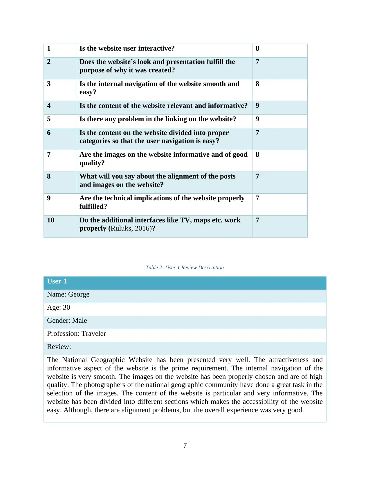
1 Is the website user interactive? 8
2 Does the website’s look and presentation fulfill the
purpose of why it was created?
7
3 Is the internal navigation of the website smooth and
easy?
8
4 Is the content of the website relevant and informative? 9
5 Is there any problem in the linking on the website? 9
6 Is the content on the website divided into proper
categories so that the user navigation is easy?
7
7 Are the images on the website informative and of good
quality?
8
8 What will you say about the alignment of the posts
and images on the website?
7
9 Are the technical implications of the website properly
fulfilled?
7
10 Do the additional interfaces like TV, maps etc. work
properly (Ruluks, 2016)?
7
Table 2- User 1 Review Description
User 1
Name: George
Age: 30
Gender: Male
Profession: Traveler
Review:
The National Geographic Website has been presented very well. The attractiveness and
informative aspect of the website is the prime requirement. The internal navigation of the
website is very smooth. The images on the website has been properly chosen and are of high
quality. The photographers of the national geographic community have done a great task in the
selection of the images. The content of the website is particular and very informative. The
website has been divided into different sections which makes the accessibility of the website
easy. Although, there are alignment problems, but the overall experience was very good.
7
User 2
Table 3-User Review Questionnaire 2
Name: Garcia, Age: 20, Gender: Female, Profession:
Photographer
S NO Questionnaire Rating (out of
10)
1 Is the website user interactive? 7
2 Does the website’s look and presentation fulfill the
purpose of why it was created?
9
3 Is the internal navigation of the website smooth and
easy?
9
4 Is the content of the website relevant and informative? 6
5 Is there any problem in the linking on the website? 7
6 Is the content on the website divided into proper
categories so that the user navigation is easy?
9
7 Are the images on the website informative and of good
quality?
7
8 What will you say about the alignment of the posts
and images on the website?
6
9 Are the technical implications of the website properly
fulfilled?
7
10 Do the additional interfaces like TV, maps etc. work
properly?
8
Table 4- User 2 Review Description
User 2
Name: Garcia
Age: 20
Gender: Female
Profession: Photographer
Review:
The user interface of the website was very interactive and appealing. As a user of the website,
8
⊘ This is a preview!⊘
Do you want full access?
Subscribe today to unlock all pages.
Trusted by 1+ million students worldwide
I can say that the content of the website is very informative. The images that have been chosen
for this website are intriguing and will make a user attracted towards the website. The
orientation of these images is perfectly chosen which goes along with the documentaries.
There was a slight problem in the user categories but overall the broader classification is
alright. On a whole, the website was appealing, informative and convincing.
The users have reviewed the website based on the desktop format. The reviews that were
collected from both of them revealed that the website on the whole looks convincing and the
images and the contents are informative, justifying the principle of the website. Based on the
limitations said by them, the website can be improvised and made more user interactive and
explanatory.
2.4 Responsive web design
The responsiveness of the website includes that the website is optimized enough to be properly
viewable from any user device (Design, 2018). The website should not hamper the view on any
device, neither should affect the viewability from any other device (Dynamics, 2017). The
following nine basic responsiveness principles should be followed for the website:
Responsive web design V/s Adaptive web design
The responsive and adaptive designs are the same, yet the difference between the two is very
minor reflecting the dependency of both of them upon the website contents. The National
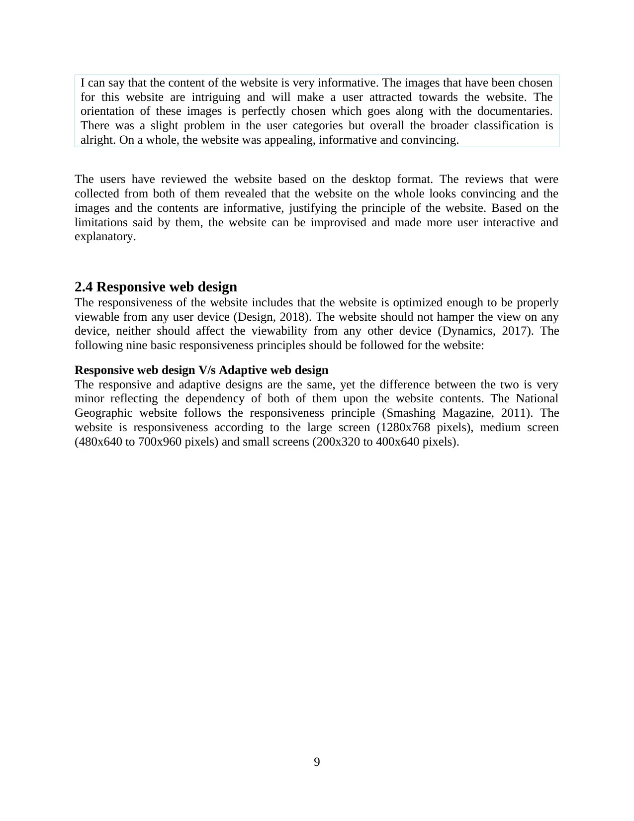
Geographic website follows the responsiveness principle (Smashing Magazine, 2011). The
website is responsiveness according to the large screen (1280x768 pixels), medium screen
(480x640 to 700x960 pixels) and small screens (200x320 to 400x640 pixels).
9
for this website are intriguing and will make a user attracted towards the website. The
orientation of these images is perfectly chosen which goes along with the documentaries.
There was a slight problem in the user categories but overall the broader classification is
alright. On a whole, the website was appealing, informative and convincing.
The users have reviewed the website based on the desktop format. The reviews that were
collected from both of them revealed that the website on the whole looks convincing and the
images and the contents are informative, justifying the principle of the website. Based on the
limitations said by them, the website can be improvised and made more user interactive and
explanatory.
2.4 Responsive web design
The responsiveness of the website includes that the website is optimized enough to be properly
viewable from any user device (Design, 2018). The website should not hamper the view on any
device, neither should affect the viewability from any other device (Dynamics, 2017). The
following nine basic responsiveness principles should be followed for the website:
Responsive web design V/s Adaptive web design
The responsive and adaptive designs are the same, yet the difference between the two is very
minor reflecting the dependency of both of them upon the website contents. The National
Geographic website follows the responsiveness principle (Smashing Magazine, 2011). The
website is responsiveness according to the large screen (1280x768 pixels), medium screen
(480x640 to 700x960 pixels) and small screens (200x320 to 400x640 pixels).
9
Paraphrase This Document
Need a fresh take? Get an instant paraphrase of this document with our AI Paraphraser
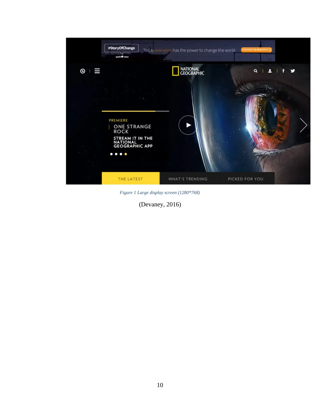
Figure 1 Large display screen (1280*768)
(Devaney, 2016)
10
(Devaney, 2016)
10
Figure 2 Medium Screen size (700*960)
11
11
⊘ This is a preview!⊘
Do you want full access?
Subscribe today to unlock all pages.
Trusted by 1+ million students worldwide
1 out of 32
Related Documents


Your All-in-One AI-Powered Toolkit for Academic Success.
+13062052269
info@desklib.com
Available 24*7 on WhatsApp / Email
![[object Object]](/_next/static/media/star-bottom.7253800d.svg)
Unlock your academic potential
Copyright © 2020–2026 A2Z Services. All Rights Reserved. Developed and managed by ZUCOL.