University Data Visualization and Interpretation Assignment
VerifiedAdded on 2021/02/20
|1
|618
|35
Practical Assignment
AI Summary
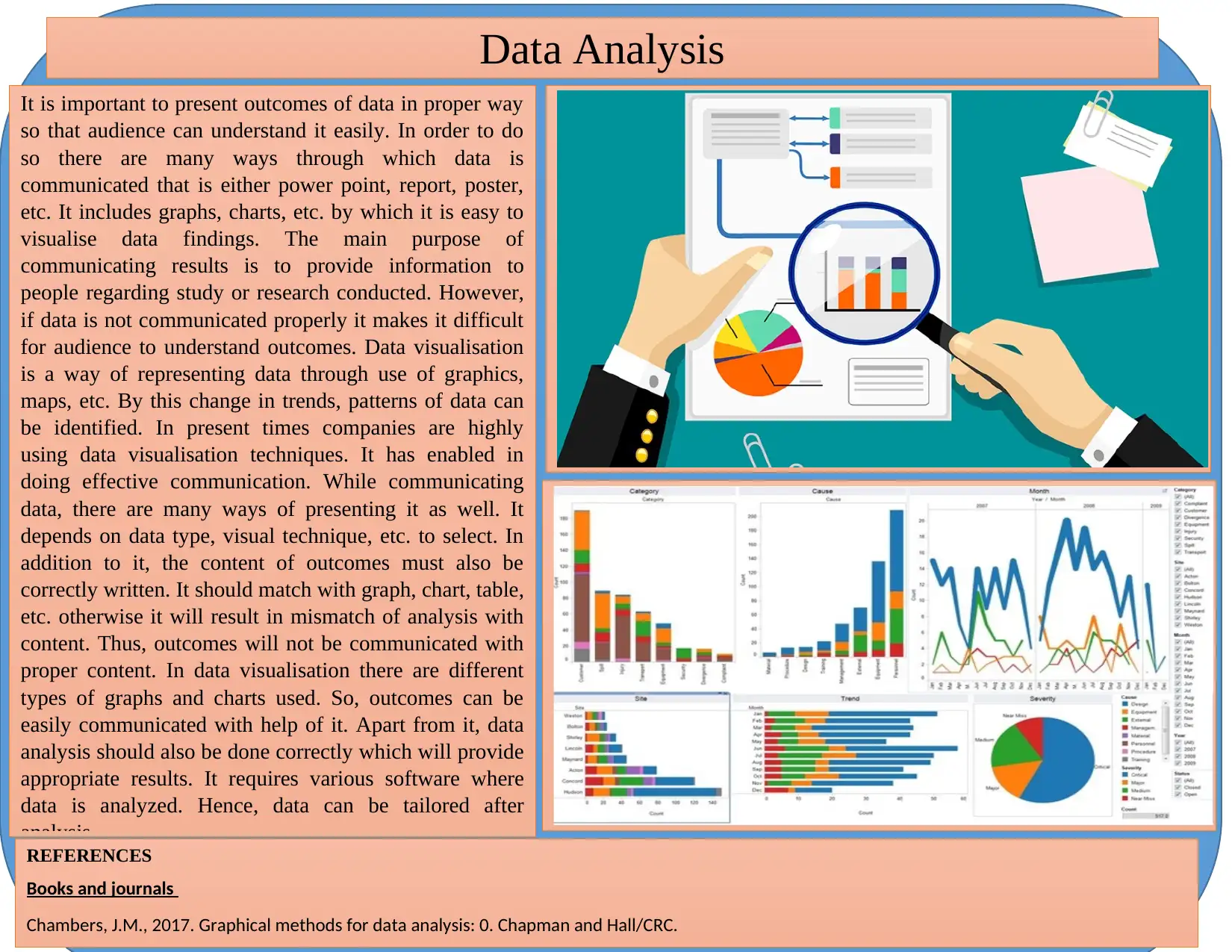
This assignment focuses on data visualization and interpretation, emphasizing the effective communication of data findings through various visual mediums. It explores the use of graphs, charts, and other techniques to present data in a clear and understandable manner. The assignment highlights the ...

Data Analysis
It is important to present outcomes of data in proper way
so that audience can understand it easily. In order to do
so there are many ways through which data is
communicated that is either power point, report, poster,
etc. It includes graphs, charts, etc. by which it is easy to
visualise data findings. The main purpose of
communicating results is to provide information to
people regarding study or research conducted. However,
if data is not communicated properly it makes it difficult
for audience to understand outcomes. Data visualisation
is a way of representing data through use of graphics,
maps, etc. By this change in trends, patterns of data can
be identified. In present times companies are highly
using data visualisation techniques. It has enabled in
doing effective communication. While communicating
data, there are many ways of presenting it as well. It
depends on data type, visual technique, etc. to select. In
addition to it, the content of outcomes must also be
correctly written. It should match with graph, chart, table,
etc. otherwise it will result in mismatch of analysis with
content. Thus, outcomes will not be communicated with
proper content. In data visualisation there are different
types of graphs and charts used. So, outcomes can be
easily communicated with help of it. Apart from it, data
analysis should also be done correctly which will provide
appropriate results. It requires various software where
data is analyzed. Hence, data can be tailored after
analysis.
REFERENCES
Books and journals
Chambers, J.M., 2017. Graphical methods for data analysis: 0. Chapman and Hall/CRC.
Paraphrase This Document
Need a fresh take? Get an instant paraphrase of this document with our AI Paraphraser
1 out of 1
Related Documents

Your All-in-One AI-Powered Toolkit for Academic Success.
+13062052269
info@desklib.com
Available 24*7 on WhatsApp / Email
Unlock your academic potential
© 2024 | Zucol Services PVT LTD | All rights reserved.