Effective Business Decisions: Data Analysis & Graphical Presentation

Verified

Added on  2023/04/22

|14
|488
|376
Report
AI Summary
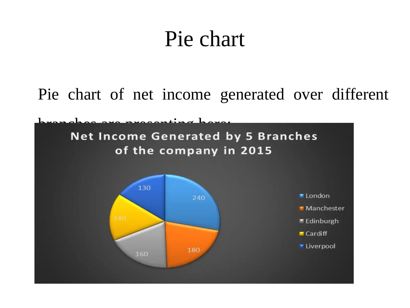
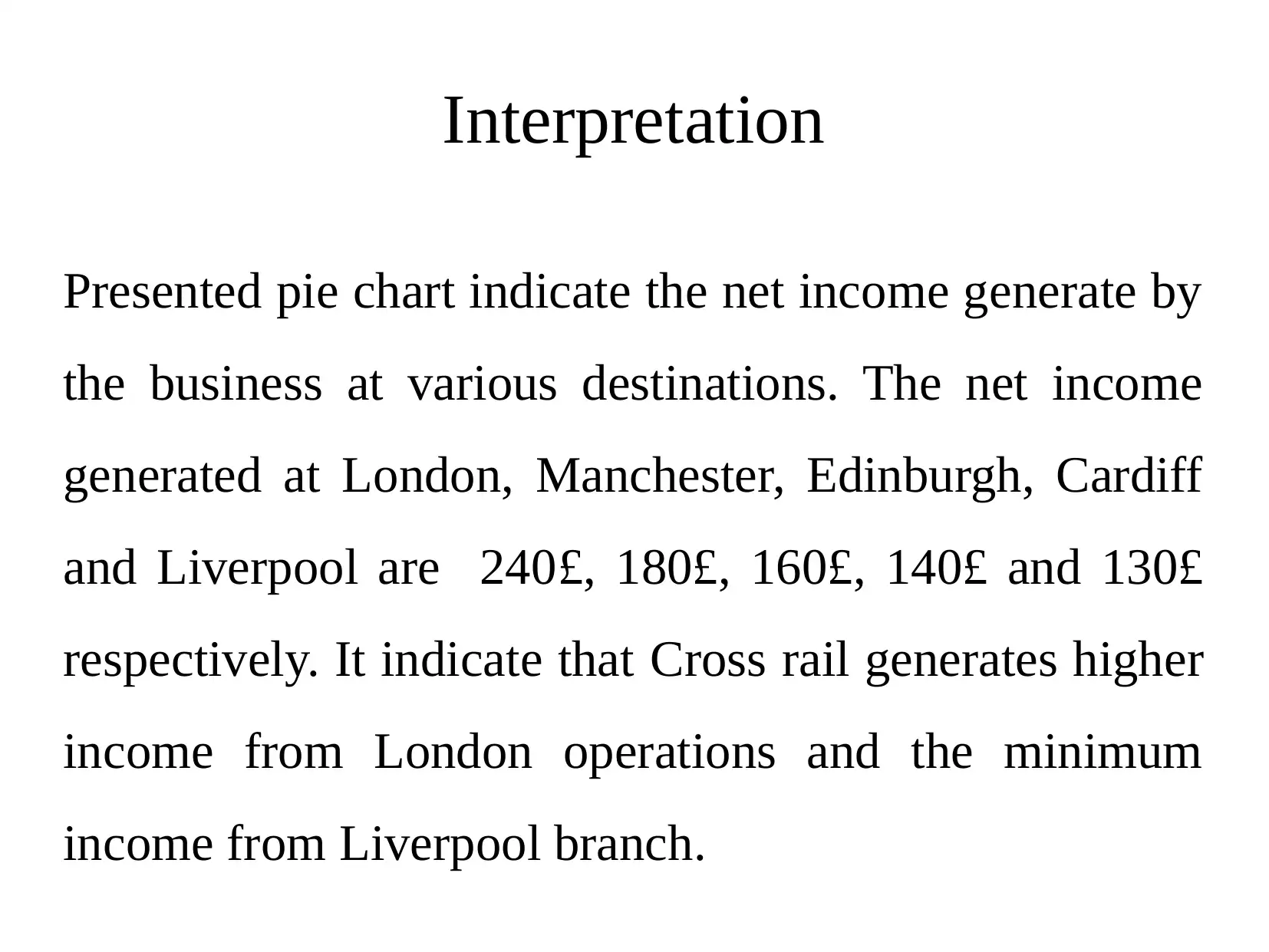
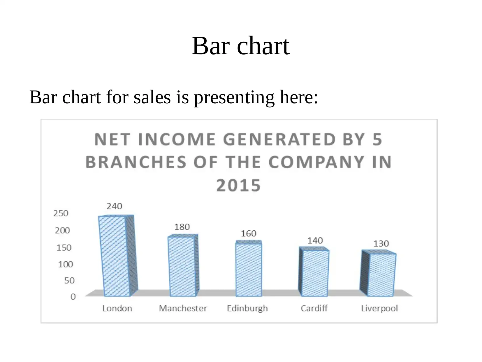
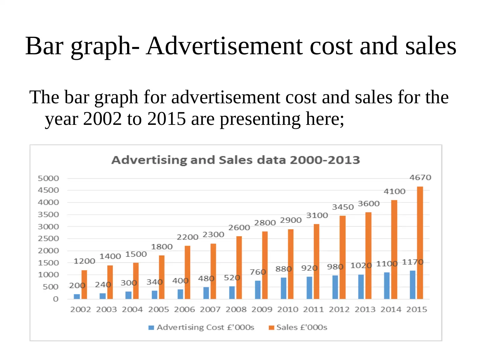
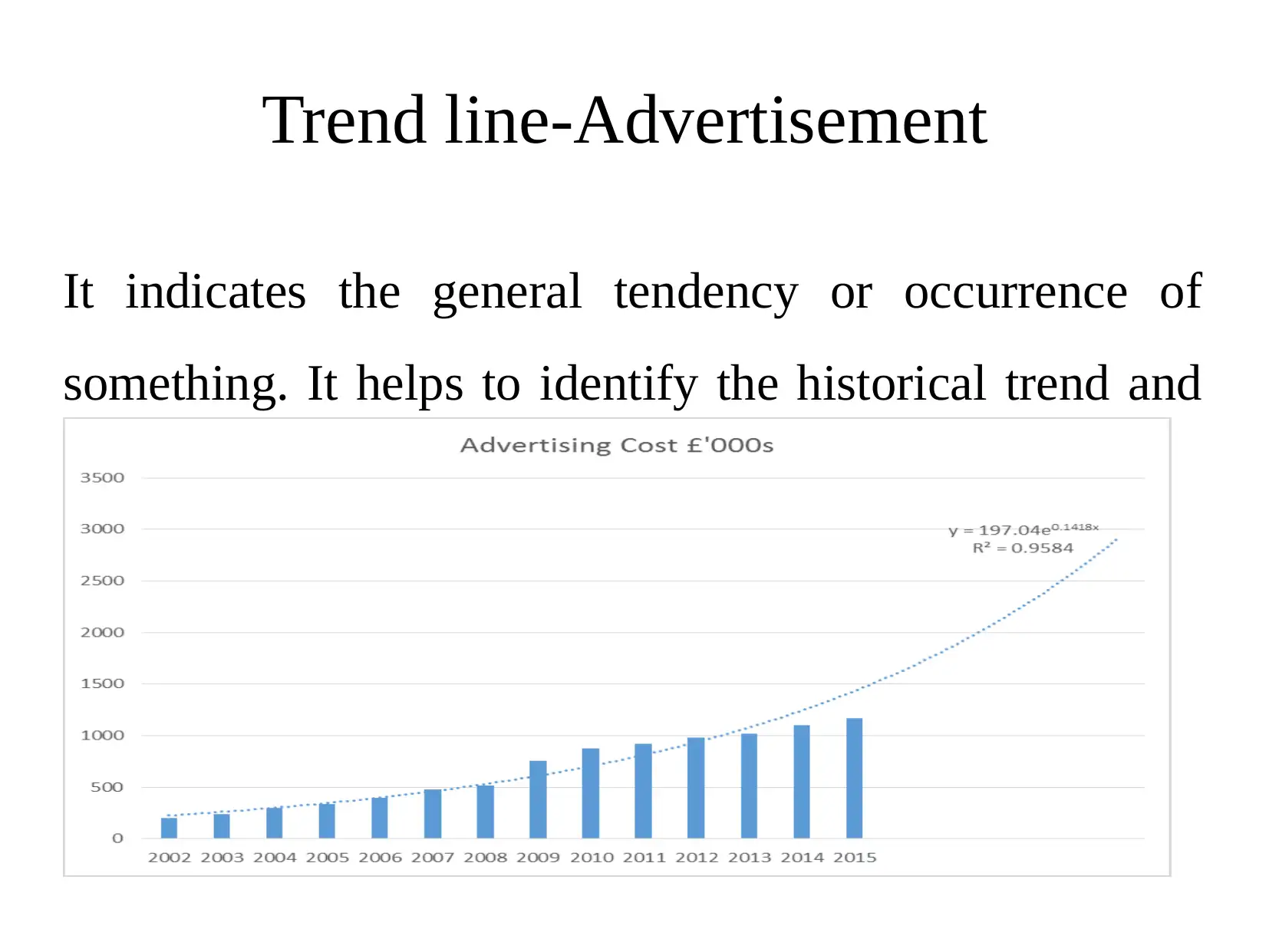
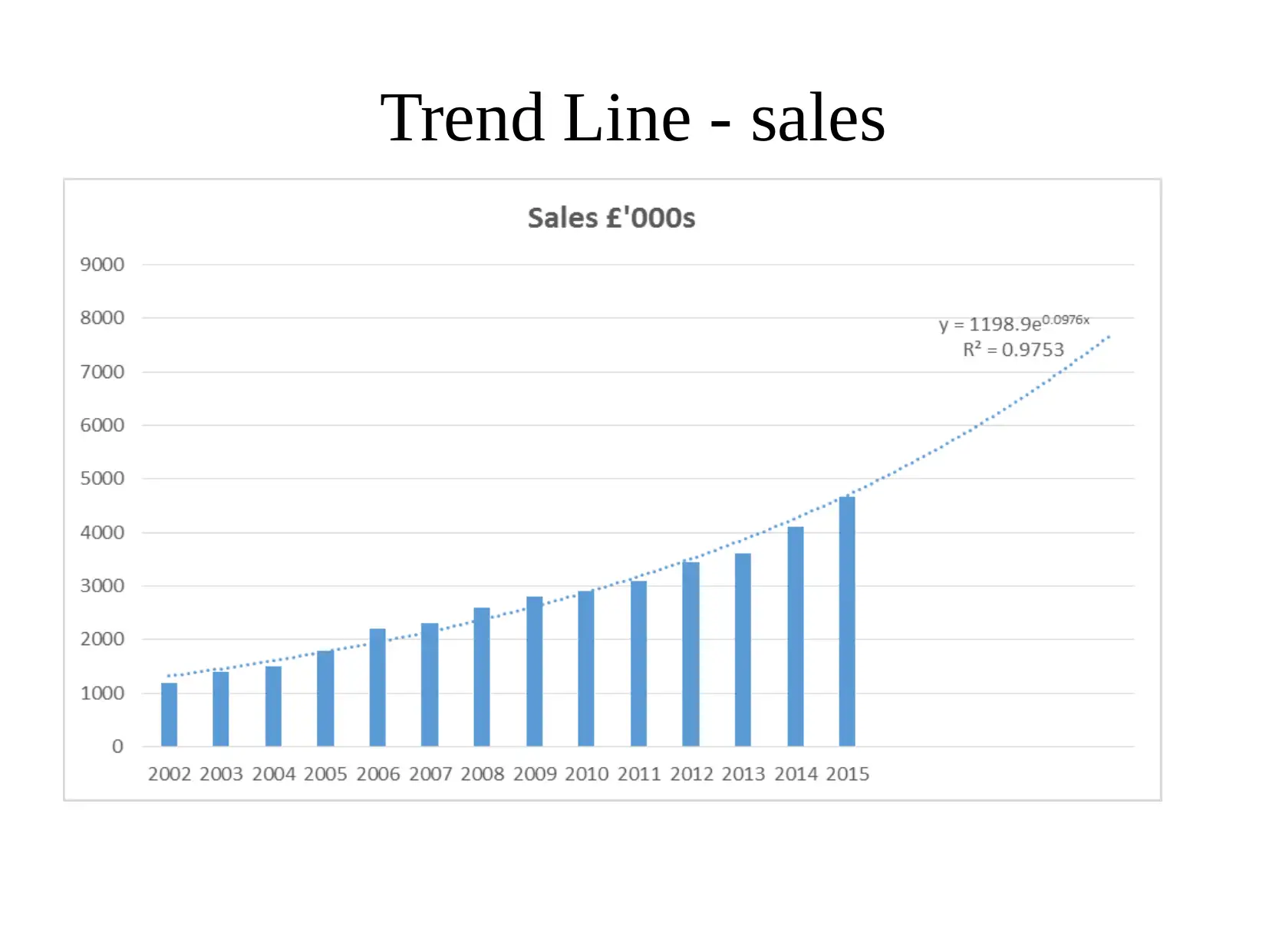
This report examines the use of data analysis and graphical presentation in making effective business decisions. It uses pie charts to analyze net income across different branches (London, Manchester, Edinburgh, Cardiff, and Liverpool), revealing London as the highest income generator. Bar charts are employed to compare net income by operations across branches and to track advertisement costs versus sales from 2002 to 2015, showing a significant rise in both. Trend lines further illustrate the increasing trends in sales and advertisement costs, suggesting continued growth and profitability in future years. The report highlights the importance of these analytical tools in understanding market trends and supporting informed decision-making in business.
Document Page
TASK 3
AC 3.3
tabler-icon-diamond-filled.svg

Paraphrase This Document

Need a fresh take? Get an instant paraphrase of this document with our AI Paraphraser
Document Page
Introduction
Every business needs to take effective business decisions
to achieve its set targets or objectives. Data analysis is a
special requirement for such purpose. It can be done by
adopting different analytical tools such as graphical
presentation. The presentation depicts at analyzing the
data using different graphs such as pie chart and bar chart.
Moreover, trend line is also constructed for such purpose
so as to determine future market trend.
Document Page
Graphical presentation
Graphical presentation helps to analyze the data
over a period in order to take effective business
decisions.
Document Page
Pie chart
Pie chart of net income generated over different
branches are presenting here:
tabler-icon-diamond-filled.svg

Paraphrase This Document

Need a fresh take? Get an instant paraphrase of this document with our AI Paraphraser
Document Page
Interpretation
Presented pie chart indicate the net income generate by
the business at various destinations. The net income
generated at London, Manchester, Edinburgh, Cardiff
and Liverpool are 240£, 180£, 160£, 140£ and 130£
respectively. It indicate that Cross rail generates higher
income from London operations and the minimum
income from Liverpool branch.
Document Page
Bar chart
Bar chart for sales is presenting here:
Document Page
Interpretation
Bar chart is also prepared for making analysis of net
income by operations from different branches. It helps
to make the comparative net income analysis generated
by the company.
tabler-icon-diamond-filled.svg

Paraphrase This Document

Need a fresh take? Get an instant paraphrase of this document with our AI Paraphraser
Document Page
Bar graph- Advertisement cost and sales
The bar graph for advertisement cost and sales for the
year 2002 to 2015 are presenting here;
Document Page
Interpretation
The presented bar graph shows that sales and
advertisement cost tend to rise over the period. From
the year 2002 to 2008 it increase at lower rate. After
this, it tend to rise at very fast rate and get increased
from 520£ to 1170£ in the year 2015. Moreover, sales
also shows an increase trend and get increased from
1200£ to 4670£ respectively.
Document Page
Trend line-Advertisement
It indicates the general tendency or occurrence of
something. It helps to identify the historical trend and
forecast the future changes
tabler-icon-diamond-filled.svg

Paraphrase This Document

Need a fresh take? Get an instant paraphrase of this document with our AI Paraphraser
Document Page
Trend Line - sales
Document Page
Interpretation
Presented sales and advertisement cost graph shows
that both sales and cost are increasing continuously.
Therefore, it can be concluded that in Future years, it
also tend to rise. Therefore, the profitability also tend
to increase due to higher the sales of the business.
chevron_up_icon
1 out of 14
circle_padding
hide_on_mobile
zoom_out_icon
[object Object]