Data Analysis and Visualization: COVID-19 Impact on Deaths
VerifiedAdded on 2023/06/15
|5
|955
|285
Report
AI Summary
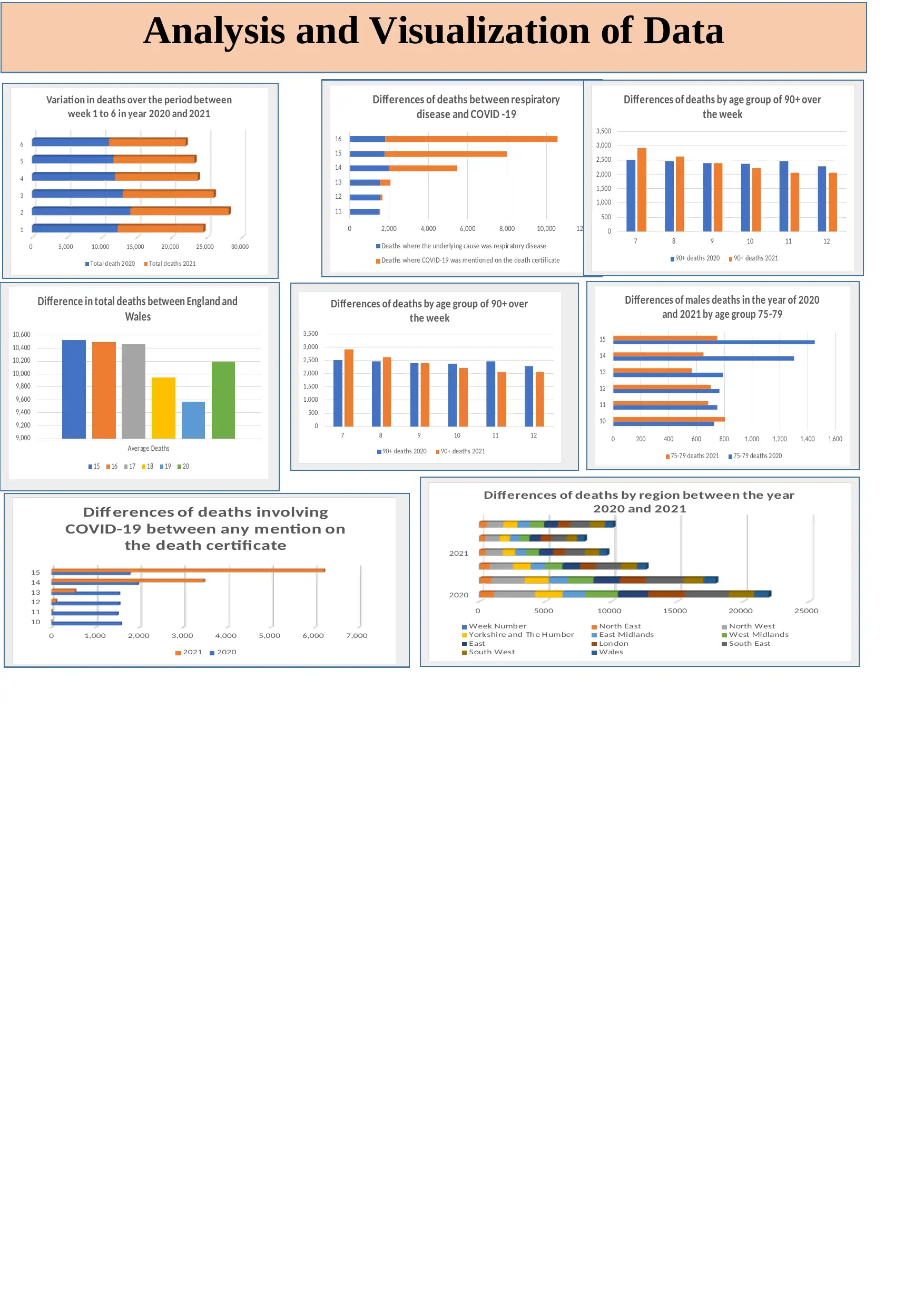
This report provides an analysis and visualization of data, focusing on the impact of COVID-19. It begins by evaluating an infographic titled 'COVID – 19 Accelerating Print Industry Transformation,' discussing its features, opportunities, weaknesses, and potential design improvements. The report t...
Read More
Contribute Materials
Your contribution can guide someone’s learning journey. Share your
documents today.

Analysis and Visualization of Data
Secure Best Marks with AI Grader
Need help grading? Try our AI Grader for instant feedback on your assignments.

Contents
MAIN BODY...............................................................................................................................................................................................................3
TASK 1.........................................................................................................................................................................................................................3
Consider “Infographic: COVID – 19 Accelerating Print Industry Transformation”. Give the features, opportunities, weaknesses and idea of
improving the design of infographic........................................................................................................................................................................3
TASK 2.........................................................................................................................................................................................................................3

MAIN BODY
TASK 1
Consider “Infographic: COVID – 19 Accelerating Print Industry Transformation”. Give the features, opportunities, weaknesses and idea of
improving the design of infographic.
An infographic is a visual representation of a topic that includes imagery, data visualisations such as pie charts and bar graphs, and
minimal text. Infographics are a great way to communicate visually. Because they capture our attention and don't let go, the most aesthetically
unique, imaginative infographics are frequently the most effective. However, it's important to remember that an infographic's images must do
more than just entertain and engage.
Uses and Features: It is good at simplifying difficult information. It is essential because:
Give a brief outline of a subject.
Explain a complicated procedure.
Display the results of a study or the results of a survey.
Write a summary of a lengthy blog post or report.
Compare and contrast several alternatives.
Raise public awareness about a problem or a cause.
Opportunities on Infographic:
Whatever sector you operate in, there is a PowerPoint Infographic template to suit your demands. You may motivate your team and
expose all of the prospects that await you in the future by using this PPT template. Our designer has depicted a white door on a black slide
background and a black door on a white background on this template. In addition, there is a numbered list for your content and data. This
template is useful for demonstrating the link between components and the whole. The information can be quickly and easily entered into editable
placeholders. It can be used for motivational presentations on a variety of topics. This template can be used with a regular desktop version of
PowerPoint or Google Slides, which is also a wonderful tool for presenters.
Cons of Infographics:
The creation of an infographic can take a long time. It does not just type some words, put them on the internet. To make the infographic a
meaningful experience, it will need to create an easy-to-read style, integrate pictures that correspond to the facts, and weave a storey
throughout the infographic. People are considerably better at remembering tales than they are at remembering seemingly random data.
An infographic's worth isn't always recognised by search engines: Many infographics are still handled as though they were just a digital
image. Many websites are publishing text content in addition to infographics so that they can rank highly in search results right away
rather than waiting for inbound links to naturally develop.
Information might be distorted by similar designs. It has commissioned an infographic from a freelancer. It does not realise is that the
freelancer utilised the same design for another customer, so your data seems to be identical when viewed online. If a visitor sees both
graphics, the information overload may lead them to seek assistance from someone else in your sector.
Ways of improving the design of Infographics:
It can make the design which looks more presentable or not gawky.
The graphs or charts which are used must be of same colour but different designs f presenting.
The certain graphs can be percentage and numbers.
Every data chart must obtain a heading and subheading, so it makes easy to interpret the data.
The graphics must be partitioned well which will make easy for the user to interpret it.
TASK 2

0 5000 10000 15000 20000 25000
2020
2021
Differences of deaths by region between the year
2020 and 2021
Week Number North East North West
Yorkshire and The Humber East Midlands West Midlands
East London South East
South West Wales
Analysis and Visualization of Data
0 5,000 10,000 15,000 20,000 25,000 30,000
1
2
3
4
5
6
Variation in deaths over the period between
week 1 to 6 in year 2020 and 2021
Total death 2020 Total deaths 2021
0 200 400 600 800 1,000 1,200 1,400 1,600
10
11
12
13
14
15
Differences of males deaths in the year of 2020
and 2021 by age group 75-79
75-79 deaths 2 021 75-79 deaths 2020
0 2,000 4,000 6,000 8,000 10,000 12,000
11
12
13
14
15
16
Differences of deaths between respiratory
disease and COVID -19
Deaths where the underlying cause was respiratory disease
Deaths where COVID-19 was mentioned on the death certificate
9,000
9,200
9,400
9,600
9,800
10,000
10,200
10,400
10,600
Average Deaths
Difference in total deaths between England and
Wales
15 16 17 18 19 20
0
500
1,000
1,500
2,000
2,500
3,000
3,500
7 8 9 10 11 12
Differences of deaths by age group of 90+ over
the week
90+ deaths 2020 90+ deaths 2021
0
500
1,000
1,500
2,000
2,500
3,000
3,500
7 8 9 10 11 12
Differences of deaths by age group of 90+ over
the week
90+ deaths 2020 90+ deaths 2021
0 1,000 2,000 3,000 4,000 5,000 6,000 7,000
10
11
12
13
14
15
Differences of deaths involving
COVID-19 between any mention on
the death certificate
2021 2020
Secure Best Marks with AI Grader
Need help grading? Try our AI Grader for instant feedback on your assignments.

1 out of 5

Your All-in-One AI-Powered Toolkit for Academic Success.
+13062052269
info@desklib.com
Available 24*7 on WhatsApp / Email
Unlock your academic potential
© 2024 | Zucol Services PVT LTD | All rights reserved.