Data Analysis and Forecasting Report: Electricity Bill Payments

Verified

Added on  2023/01/11

|11
|1671
|45
Report
AI Summary
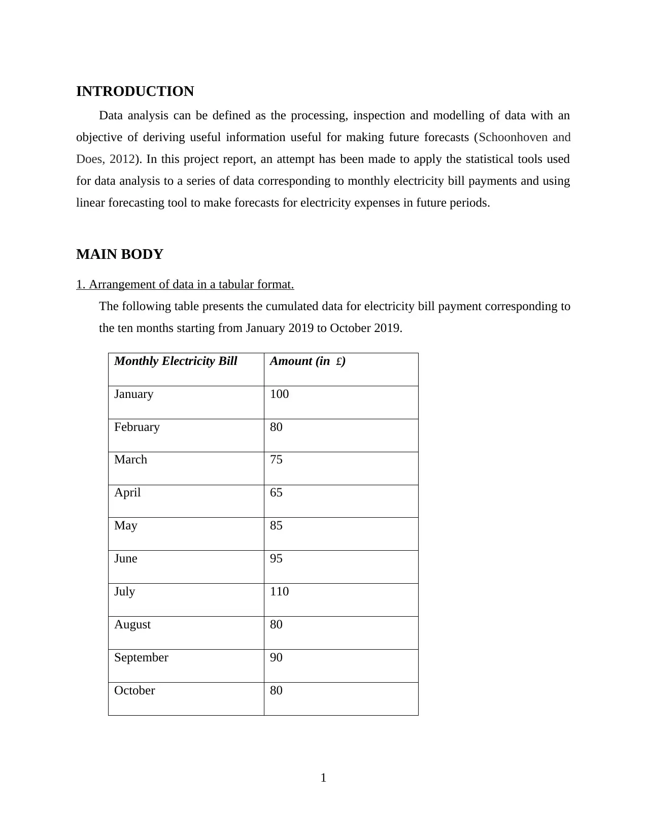
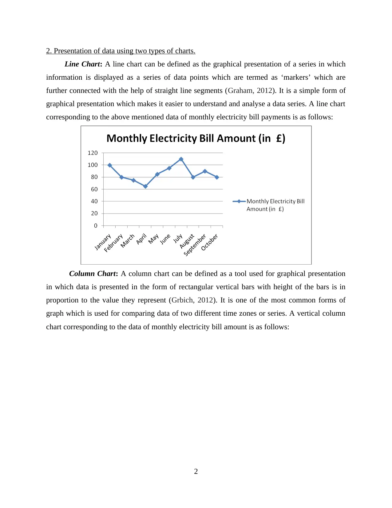
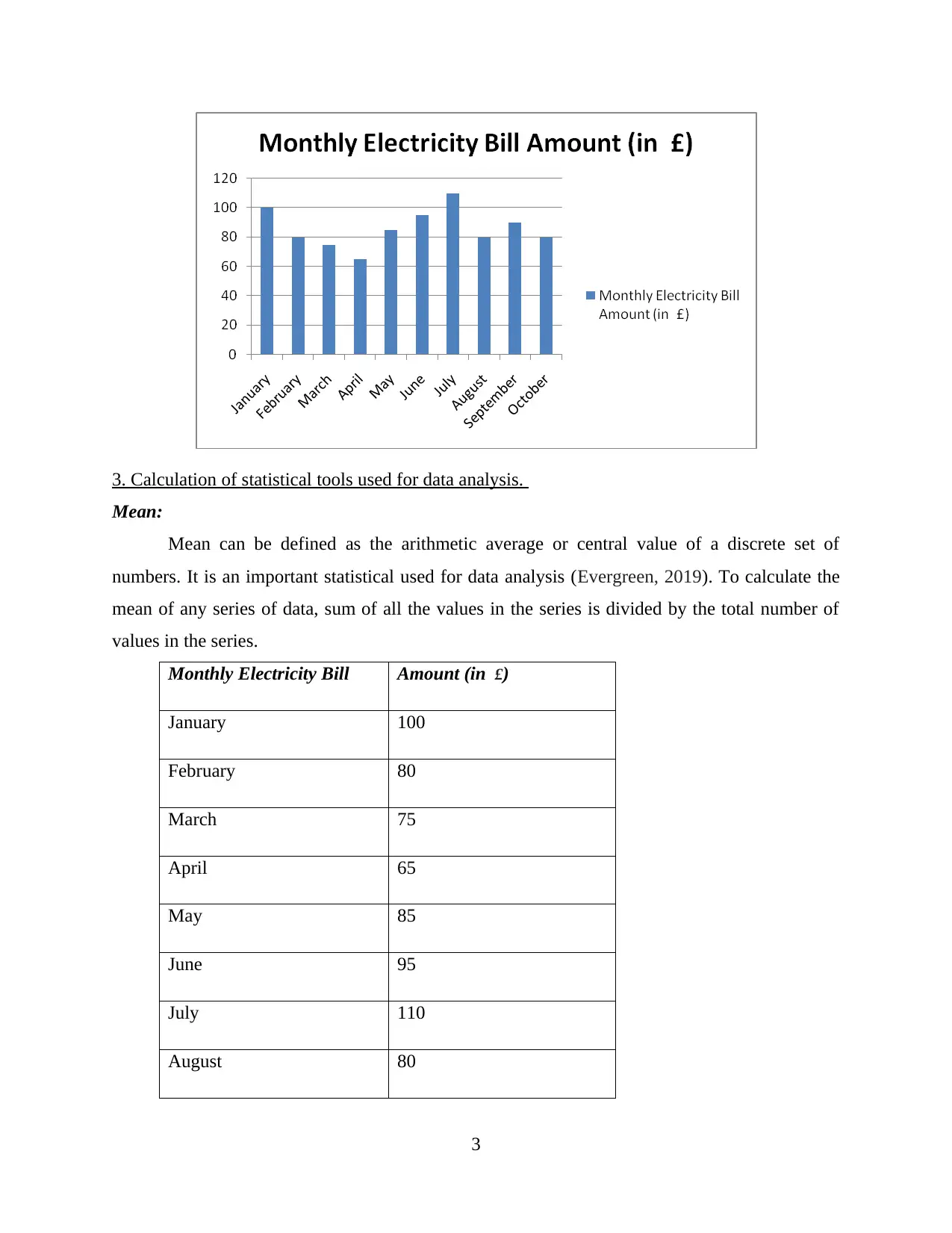
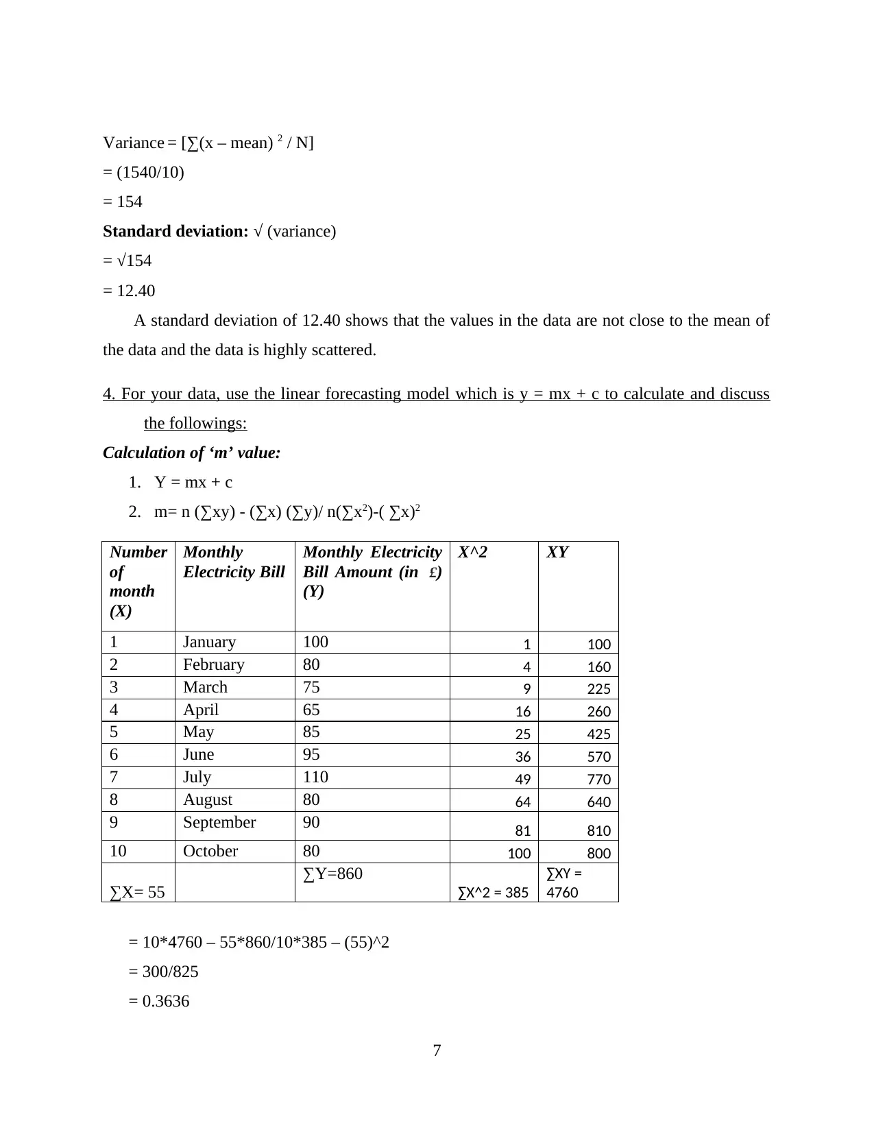
This report presents a comprehensive analysis of monthly electricity bill data from January 2019 to October 2019. The analysis begins with the arrangement of data in a tabular format, followed by the presentation of data using line and column charts for visualization. Statistical tools, including mean, mode, median, range, and standard deviation, are calculated and discussed to provide insights into the data's central tendencies and dispersion. Furthermore, the report utilizes a linear forecasting model (y = mx + c) to calculate and interpret the slope ('m') and constant ('c') values, enabling the forecasting of electricity expenses for the 12th and 14th months. The conclusion emphasizes the importance of statistical tools in data analysis and the effectiveness of linear forecasting for predicting future expenses. References to relevant literature are also provided.
tabler-icon-diamond-filled.svg

Contribute Materials

Your contribution can guide someone’s learning journey. Share your documents today.
Document Page
Data Analysis and
Forecasting
tabler-icon-diamond-filled.svg

Secure Best Marks with AI Grader

Need help grading? Try our AI Grader for instant feedback on your assignments.
Document Page
Contents
INTRODUCTION...........................................................................................................................1
MAIN BODY..................................................................................................................................1
1. Arrangement of data in a tabular format..................................................................................1
2. Presentation of data using two types of charts.........................................................................2
3. Calculation of statistical tools used for data analysis..............................................................3
4. For your data, use the linear forecasting model which is y = mx + c to calculate and discuss
the followings:.............................................................................................................................7
CONCLUSION................................................................................................................................8
REFERENCES..............................................................................................................................10
Document Page
INTRODUCTION
Data analysis can be defined as the processing, inspection and modelling of data with an
objective of deriving useful information useful for making future forecasts (Schoonhoven and
Does, 2012). In this project report, an attempt has been made to apply the statistical tools used
for data analysis to a series of data corresponding to monthly electricity bill payments and using
linear forecasting tool to make forecasts for electricity expenses in future periods.
MAIN BODY
1. Arrangement of data in a tabular format.
The following table presents the cumulated data for electricity bill payment corresponding to
the ten months starting from January 2019 to October 2019.
Monthly Electricity Bill Amount (in £)
January 100
February 80
March 75
April 65
May 85
June 95
July 110
August 80
September 90
October 80
1
Document Page
2. Presentation of data using two types of charts.
Line Chart: A line chart can be defined as the graphical presentation of a series in which
information is displayed as a series of data points which are termed as ‘markers’ which are
further connected with the help of straight line segments (Graham, 2012). It is a simple form of
graphical presentation which makes it easier to understand and analyse a data series. A line chart
corresponding to the above mentioned data of monthly electricity bill payments is as follows:
Column Chart: A column chart can be defined as a tool used for graphical presentation
in which data is presented in the form of rectangular vertical bars with height of the bars is in
proportion to the value they represent (Grbich, 2012). It is one of the most common forms of
graph which is used for comparing data of two different time zones or series. A vertical column
chart corresponding to the data of monthly electricity bill amount is as follows:
2
tabler-icon-diamond-filled.svg

Secure Best Marks with AI Grader

Need help grading? Try our AI Grader for instant feedback on your assignments.
Document Page
3. Calculation of statistical tools used for data analysis.
Mean:
Mean can be defined as the arithmetic average or central value of a discrete set of
numbers. It is an important statistical used for data analysis (Evergreen, 2019). To calculate the
mean of any series of data, sum of all the values in the series is divided by the total number of
values in the series.
Monthly Electricity Bill Amount (in £)
January 100
February 80
March 75
April 65
May 85
June 95
July 110
August 80
3
Document Page
September 90
October 80
TOTAL 860
MEAN = Sum of the values/Number of Values
= 860/10
= 86
It can be analysed that the arithmetic average of above mentioned series of data is 86.5
which denotes the central value of the data series.
Mode:
Mode can be termed as the most common value in a series or the value which has the
highest frequency. Frequency refers to the number of times a value repeats itself in a series of
data.
Monthly Electricity Bill Amount (in £)
January 100
February 80
March 75
April 65
May 85
June 95
July 110
August 80
September 90
October 80
4
Document Page
It can be observed in the above data table that the value 80 has the highest frequency of 3
so the mode for the series is 80.
Median:
Median can be defined as the value which separates the upper half of a data series from
the lower half when arranged in an ascending or descending order. It is known as the middle
value. Median can be calculated by using the formula as follows:
When data set is odd= (N+1)/2th item.
When data set is even= {N/2th item+ N/2th item + 1}2
Monthly
Electricity Bill
Amount (in
£)
April 65
March 75
February 80
August 80
October 80
May 85
September 90
June 95
January 100
July 110
In this series the data is even so median will be calculated as follows after arranging the
data in an increasing order:
N= 10
M= (10/2th item + 10/2th item + 1)/2
= (5th item+ 6th item)/2
= (80+85)/2
= 82.5
Range:
5
tabler-icon-diamond-filled.svg

Paraphrase This Document

Need a fresh take? Get an instant paraphrase of this document with our AI Paraphraser
Document Page
Range is termed as the difference between the highest value and the smallest value in a
series of data. For the above data, range can be calculated as under:
Highest Value: 110
Lowest Value: 65
Range = Highest Value – Lowest Value
= 110-65
= 45
Standard Deviation:
Standard deviation is defined as the statistical tool used to measure the magnitude of
dispersion or variation in a series of data. A low standard deviation indicates that all the values in
the data are close to the mean whereas a high standard deviation indicated that the data is highly
scattered (Elliott, 2012). Standard deviation is calculated with the help of finding deviations of
all the values from the mean and obtaining their squares. Squares are then divided by the number
of values to obtain the variance. The standard deviation for the above series of data of monthly
electricity bill payment is being calculated as follows:
Monthly
Electricity Bill
Amount (in
£) (X)
Deviation (X-M) (X-M)^2
April 65 -21 441
March 75
-11 121
February 80 -6 36
August 80 -6 36
October 80 -6 36
May 85 -1 1
September 90 4 16
June 95 9 81
January 100 14 196
July 110 24 576
Total 860 0 1540
Mean (M) 86
6
Document Page
Variance = [∑(x – mean) 2 / N]
= (1540/10)
= 154
Standard deviation: √ (variance)
= √154
= 12.40
A standard deviation of 12.40 shows that the values in the data are not close to the mean of
the data and the data is highly scattered.
4. For your data, use the linear forecasting model which is y = mx + c to calculate and discuss
the followings:
Calculation of ‘m’ value:
1. Y = mx + c
2. m= n (∑xy) - (∑x) (∑y)/ n(∑x2)-( ∑x)2
Number
of
month
(X)
Monthly
Electricity Bill
Monthly Electricity
Bill Amount (in £)
(Y)
X^2 XY
1 January 100 1 100
2 February 80 4 160
3 March 75 9 225
4 April 65 16 260
5 May 85 25 425
6 June 95 36 570
7 July 110 49 770
8 August 80 64 640
9 September 90 81 810
10 October 80 100 800
∑X= 55
∑Y=860
∑X^2 = 385
∑XY =
4760
= 10*4760 – 55*860/10*385 – (55)^2
= 300/825
= 0.3636
7
Document Page
M denotes the slope of a linear regression line and a positive value of ‘m’ as high as 0.3636 denotes that the
slope of the line is going up to the right. This indicates that the magnitude of change in the line is high
because m is the value which controls the increase or decrease in data.
Calculation of ‘c’ value:
C = [(∑y) / n] - m(∑x/n)
= 860/10 – 0.3636 (55/10)
= 86 – 1.9998
= 84.0002
The value of C determines the constant value in the data which is usually close to the
mean. It is the fixed value in case if the other variables are reduced to zero.
Forecasting the expenses for 12th month and 14th month:
Forecasting for 12th month:
y= mx+c
= 0.3636*12+84.0002
= 4.3632+84.0002
= 88.3634 is the amount of electricity bill forecasted for 12th month on the basis of
linear forecasting.
Forecasting for 14th month :
= 0.3636*14+84.0002
= 5.0904+84.0002
= 89.0924 is the amount of electricity bill forecasted for 14th month on the basis of
linear forecasting.
CONCLUSION
It can be concluded on the basis of above report that various statistical tools used for data
analysis such as mean, mode, median, range and standard deviations are very vital in
understanding and analysing a series of data in a better and effective manner. It can also be
concluded that linear forecasting is an important tool which can be used effectively to forecast
future expensed based on a series of data of expenses for past period.
8
tabler-icon-diamond-filled.svg

Secure Best Marks with AI Grader

Need help grading? Try our AI Grader for instant feedback on your assignments.
Document Page
REFERENCES
Books and Journals
Elliott, P.D., 2012. Probabilistic number theory I: Mean-value theorems (Vol. 239). Springer
Science & Business Media.
Evergreen, S.D., 2019. Effective data visualization: The right chart for the right data. Sage
Publications.
Graham, J.W., 2012. Missing data: Analysis and design. Springer Science & Business Media.
Grbich, C., 2012. Qualitative data analysis: An introduction. Sage.
Schoonhoven, M. and Does, R.J., 2012. A robust standard deviation control
chart. Technometrics. 54(1). pp.73-82.
9
chevron_up_icon
1 out of 11
circle_padding
hide_on_mobile
zoom_out_icon
logo.png

Your All-in-One AI-Powered Toolkit for Academic Success.

Available 24*7 on WhatsApp / Email

[object Object]