Statistics Assignment: Data Analysis and Presentation Techniques

Verified

Added on  2022/11/16

|3
|385
|90
Homework Assignment
AI Summary
This assignment delves into the effective representation of data using statistical tools. The student analyzes two datasets: clinic injury counts and patient waiting times, proposing the use of frequency, cumulative frequency, and relative frequency tables to organize the data. The assignment emphasizes the importance of choosing the appropriate table type based on the data's nature and the insights desired. Furthermore, the student recommends using bar plots for injury data and histograms or stem plots for waiting time data, explaining how these graphs help visualize data distributions and identify patterns. The assignment uses the OpenStax book and an additional scholarly source as references. The student explains the rationale behind each choice, highlighting the benefits of each method for data analysis and presentation.
Document Page
Running head: STATISTICS
Statistics
Name:
Institution:
tabler-icon-diamond-filled.svg

Paraphrase This Document

Need a fresh take? Get an instant paraphrase of this document with our AI Paraphraser
Document Page
STATISTICS
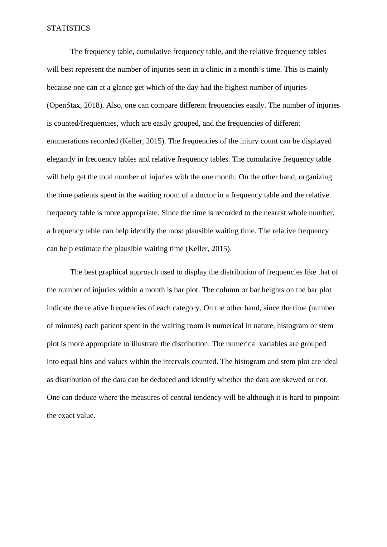
The frequency table, cumulative frequency table, and the relative frequency tables
will best represent the number of injuries seen in a clinic in a month’s time. This is mainly
because one can at a glance get which of the day had the highest number of injuries
(OpenStax, 2018). Also, one can compare different frequencies easily. The number of injuries
is counted/frequencies, which are easily grouped, and the frequencies of different
enumerations recorded (Keller, 2015). The frequencies of the injury count can be displayed
elegantly in frequency tables and relative frequency tables. The cumulative frequency table
will help get the total number of injuries with the one month. On the other hand, organizing
the time patients spent in the waiting room of a doctor in a frequency table and the relative
frequency table is more appropriate. Since the time is recorded to the nearest whole number,
a frequency table can help identify the most plausible waiting time. The relative frequency
can help estimate the plausible waiting time (Keller, 2015).
The best graphical approach used to display the distribution of frequencies like that of
the number of injuries within a month is bar plot. The column or bar heights on the bar plot
indicate the relative frequencies of each category. On the other hand, since the time (number
of minutes) each patient spent in the waiting room is numerical in nature, histogram or stem
plot is more appropriate to illustrate the distribution. The numerical variables are grouped
into equal bins and values within the intervals counted. The histogram and stem plot are ideal
as distribution of the data can be deduced and identify whether the data are skewed or not.
One can deduce where the measures of central tendency will be although it is hard to pinpoint
the exact value.
Document Page
STATISTICS
References
Keller, G. (2015). Statistics for Management and Economics, Abbreviated. Cengage
Learning.
OpenStax. (2018). Introductory Business Statistics. penStax Business Statistics . Retrieved
from https://legacy.cnx.org/content/col11776/1.35
chevron_up_icon
1 out of 3
circle_padding
hide_on_mobile
zoom_out_icon
[object Object]