Data Visualization and Discovery Report: Tableau Analysis and Insights
VerifiedAdded on 2022/11/29
|6
|1156
|390
Report
AI Summary
This report delves into the realm of data visualization, emphasizing its crucial role in understanding trends, patterns, and outliers within datasets. It highlights the significance of data visualization in business intelligence, particularly through the use of tools like Tableau. The report explores various data visualization elements, including tree maps and histograms, and their applications in analyzing data. It also examines the evolution of data visualization, from its historical roots to its current prevalence in business environments. Furthermore, it discusses the benefits of data visualization, such as improved business insights and user productivity, while also addressing potential inhibitors like poor visual design and visual overload. The report concludes by referencing key sources on data visualization techniques and best practices.
Data Visualization and Discovery
Data visualization and its variable not present in Tableau workbook.
The graphical representation of data and information using visual elements such as charts
so as to assist in the understanding of trend, patterns in data and outliers is usually referred to as
Data Visualization. Visualization of data analysis has many uses but it is normally questioned by
some analysts despite having a quantifiable outcome. Tableau can be a key tool in the making of
analysis even more efficient ant its immense importance brought out. In extensive data world ,
visualization is usually used in intense data analysis and data driven decision obtained. Some
types of data visualization elements that help in bringing data to life includes:
1) Tree map.
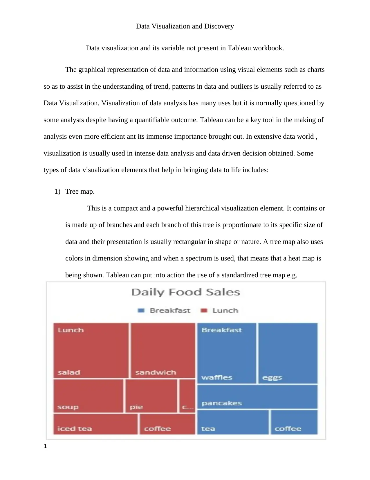
This is a compact and a powerful hierarchical visualization element. It contains or
is made up of branches and each branch of this tree is proportionate to its specific size of
data and their presentation is usually rectangular in shape or nature. A tree map also uses
colors in dimension showing and when a spectrum is used, that means that a heat map is
being shown. Tableau can put into action the use of a standardized tree map e.g.
1
Paraphrase This Document
Need a fresh take? Get an instant paraphrase of this document with our AI Paraphraser
Data Visualization and Discovery
2) Histogram.
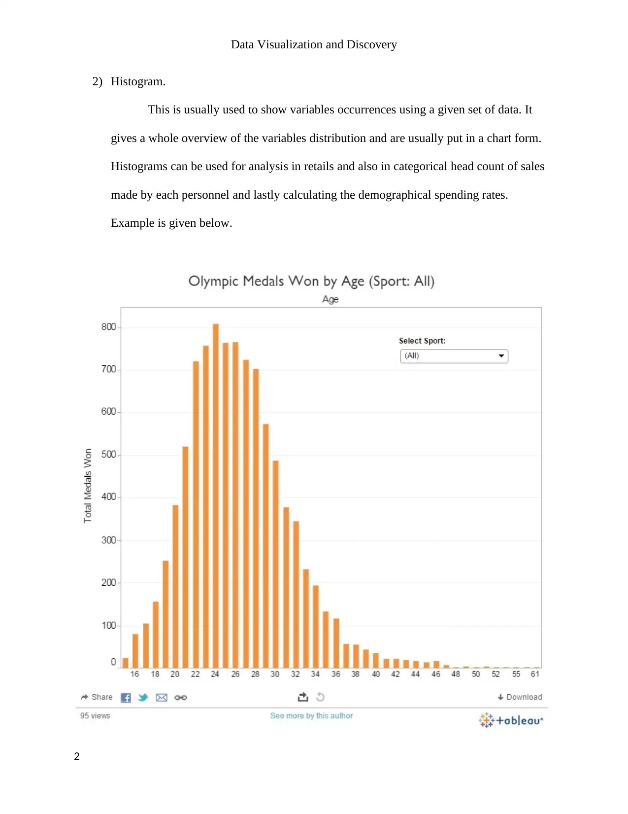
This is usually used to show variables occurrences using a given set of data. It
gives a whole overview of the variables distribution and are usually put in a chart form.
Histograms can be used for analysis in retails and also in categorical head count of sales
made by each personnel and lastly calculating the demographical spending rates.
Example is given below.
2
Data Visualization and Discovery
Notes.
Data visualization is increasingly an essential element of business intelligence (BI). No
longer restricted to specialized applications, data visualization in the form of charts, maps, and
other graphical representations is enabling business users to better understand data and use it to
achieve tactical and strategic objectives. This TDWI Best Practices Report, which is based on a
Web survey of BI professionals and interviews with BI practitioners and experts, finds that data
visualization is in the middle of a remarkable growth phase. It also reveals that data visualization
contributes impressively to improvements in business user insight and productivity, as well as
usage of dashboards (the preferred medium for data visualization).
Research Methodology
This report is designed for BI professionals and business users who develop and use
business dashboards and other means of visual reporting and analysis. This research for this
report includes a Web survey of BI professionals and business users that TDWI conducted in the
summer of 2010, as well as in-depth interviews with BI practitioners and data visualization
solutions providers.
Survey Respondent Profile. More than three-quarters (76%) of respondents are BI or IT
professionals. More than 70% are based in the United States. Financial services,
software/Internet, and healthcare are the most represented of more than two dozen industries.
The following charts highlight key characteristics of the respondent pool.
The Evolution of Data Visualization
3
⊘ This is a preview!⊘
Do you want full access?
Subscribe today to unlock all pages.

Trusted by 1+ million students worldwide
Data Visualization and Discovery
Long before there were servers and laptops, dashboards and drilldowns, OLAP and
AJAX, heat maps or histograms, there was data visualization.
The world’s first bar, line, and pie charts of any renown are believed to have been
devised in the late 1700s by a Scottish engineer and political economist, William Play fair
(1759–1823). Considered the founder of graphical data representation, Play fair produced a
number of visualizations on economic and political issues of interest to the British empire. For
instance, Play fair visually portrayed the growth of British debt from 1688 to 1800 in a graphic
called “Chart of the National Debt of England”
Data Visualization for Business
Graphical representations of data communicate patterns, trends, and outliers far more
quickly than tables of numbers and text. With visualization, users can spot issues and problems
needing attention at a glance and take appropriate action. In text-based reports and spreadsheets,
the trends and issues remain hidden among dizzying arrays of numbers and text. Because of its
power to communicate, data visualization is becoming more pervasive in business environments.
Data Visualization Inhibitors
Text Still Prevails Despite the growing popularity of data visualization, users still spend
almost two thirds (65%) of their time analyzing data in tables and text, according to our survey.
But only 12% of respondents ranked tables as “highly” useful in helping users glean insights and
make decisions. the big change being a move from static to interactive to collaborative business
intelligence.”
Poor Visual Design
4
Paraphrase This Document
Need a fresh take? Get an instant paraphrase of this document with our AI Paraphraser
Data Visualization and Discovery
Another problem is that many visual displays are so poorly designed that they actually
force users to work harder to get information they need. For example, users will reject a new
visual interface if it forces them to click one or more times to view related information that they
think should be on a single page. Users will become frustrated if the visual design is so
decorative that it is distracting or obscures the meaning of the data. Well-designed visualizations
should convey much more information at a glance than users can absorb by looking at numbers.
Visual Overload
In addition, some designers may pack too much information and functionality into a
visual reporting or analysis tool and overwhelm new users. The best visual displays introduce
new functionality and information gradually over time. As users become more familiar with the
new environment, they typically want to view more data on a single screen and request more
functions to manipulate the data.
Benefits of Data Visualization
Given the prevalence of text-based graphics, it’s clear that data visualization is in the early stages
of industry adoption, but its popularity is growing quickly. That’s largely because it’s so easy to
see (literally) and experience the benefits of data visualization’s research shows that data
visualization significantly improves business insights and user productivity (that is, accelerates
time to insight) and increases user adoption of BI tools. These benefits help explain the growing
popularity of data visualization in corporate environments.
Work cited.
Nandeshwar, Ashutosh. Tableau Data Visualization Cookbook: Over 70 Recipes for Creating
Visual Stories with Your Data Using Tableau . Birmingham: Packt, 2013. Print.
5

Data Visualization and Discovery
Knaflic, Cole Nussbaumer. Storytelling With Data: A Data Visualization Guide for Business
Professionals. Hoboken, New Jersey: John Wiley & Sons, Inc., 2015. Print.
6
Knaflic, Cole Nussbaumer. Storytelling With Data: A Data Visualization Guide for Business
Professionals. Hoboken, New Jersey: John Wiley & Sons, Inc., 2015. Print.
6
⊘ This is a preview!⊘
Do you want full access?
Subscribe today to unlock all pages.

Trusted by 1+ million students worldwide
1 out of 6
Related Documents
Your All-in-One AI-Powered Toolkit for Academic Success.
+13062052269
info@desklib.com
Available 24*7 on WhatsApp / Email
![[object Object]](/_next/static/media/star-bottom.7253800d.svg)
Unlock your academic potential
Copyright © 2020–2026 A2Z Services. All Rights Reserved. Developed and managed by ZUCOL.


