LCBB5000 - Data Handling: Excel for Business Intelligence
VerifiedAdded on 2023/06/18
|19
|3231
|172
Report
AI Summary
This report focuses on utilizing Excel for data pre-processing, analysis, and visualization. It discusses how Excel is used to transform raw data into an understandable format through tools like pivot tables, charts, and graphs. The report highlights Excel's capabilities in data analysis by converting data into analytical modes to determine trends and meanings. It also addresses the potential for human error during data entry in Excel. The analysis includes a case study on sales and profit trends, demonstrating a direct relationship between them using graphical representations. Furthermore, the report includes statistical analysis of customer data, including gender distribution, rice consumption preferences, and age demographics, using mean and median calculations. The report also touches upon clustering methods and compares the advantages and disadvantages of using SPSS over Excel for data analysis.

ASSESSMENT 2
Paraphrase This Document
Need a fresh take? Get an instant paraphrase of this document with our AI Paraphraser
Table of Contents
PART-1............................................................................................................................................3
Use of excel in pre-processing, analysing and visualizing the data............................................3
PART-2............................................................................................................................................6
Numbers of customers as male and female.................................................................................6
Number of customers eating rice.................................................................................................7
Mean and Median of the ages......................................................................................................8
Mean and Median of participants that eat rice.............................................................................8
Clustering...................................................................................................................................10
2.2 Data mining methods...........................................................................................................15
2.3 Advantages and disadvantages of SPSS over Excel............................................................15
REFERENCES................................................................................................................................1
PART-1
Use of excel in pre-processing, analysing and visualizing the data
Data refers to individual facts, statistics, information which is being collected from the
observation or the research of the specific aspects. It can be a set of qualitative and quantitative
value that may be related with respect to a person, or object (Vassakis, Petrakis and Kopanakis,
2018).
As the data are usually present in raw and unstructured mode that may need to be
integrated and combined into under-stable mode for making understanding. Excel is one of the
best tool that is being used with regard to making pre-processing and analysing the data. Pre-
processing refers to a data mining process under which a transformation of raw data into under-
stable mode is being performed (Baviskar and et.al., 2021). This will lead to have better
understanding of the data. Excel is one of the major tool with respect to this aspect. This is
because excel involves the collection of raw data and making its conversation into under-stable
mode. Under excel the data is filled in rows and columns in such a mode that it will lead to make
establishment of the relationship between them. This is being performed with the help of various
tools of excel including pivot tables, charts and graphs and various others. Excel is one of the
highly used tool with respect to data pre-processing because it will lead to make the data
conversion into under-stable mode.
Along with pre-processing, excel will also be used to make the analysis of the data. As
per this aspect excel through its tools say charts and graphs make the conversion of data into
analytical mode so that the trend and the related information and meaning of the data will be
determined. This means through the tools of the excel the data can be made analysed and its
concerned trends and meaning can be determined. It is also to be noted that as excel enable the
making of graphs and charts so it will automatically lead to visualization of data in such a mode
that with the help of prepared charts and graphs from the gathered information, visual effect in
terms of under-stable charts will be presented (Evergreen, 2019).
However, it is also to be noted that although with the help of excel, pre-processing of data
will be enabled but it also include the risk of occurrence of errors. This is because under excel
data need to be placed in the rows and the columns but while inserting the data in it there are
chances that the human error may occur and affect the extraction of the data and pre-processing
of data (Tsou, 2019). Likewise, it is also to be noted that it is also a difficult aspect to make
⊘ This is a preview!⊘
Do you want full access?
Subscribe today to unlock all pages.
Trusted by 1+ million students worldwide
insert of the vast value of raw data in excel rows and columns because it will raise the chances of
occurrence of human errors in terms of escaping the data or the wrong putting of data.
But on a wider scale excel is one of the major data mining tool with regard to making
pre-processing of data and its analysis. Along with excel its associated tools including pivot
tables, bars and graphs and others also plays an important role ith respect to the data processing
and its analysis. This is because when data will be arranged in rows and columns from raw mode
and when charts and graphs will be prepared from arranged data then all the aspects including
data processing, analysing and visualization will be able to performed in an effective manner
(Hossain, 2021).
In addition, of this it is also to be noted that graphs and charts is one of the major feature
of excel under which with the help of data, graph and charts will be drawn. With respect to the
current data the graphs and charts are used for the data pre-processing and analysing. Through
the adoption of the following steps charts and graphs can be created:
The process of integration of this technique starts with the application of filter function
which will lead to make emergence of relevant data and figures.
After the application of filter, range will be applied and selected so that the data of the
sales will be collected.
With the following of the rage of particular year, the sum formula is being applied so that
the sum total of sales of the specific year will come. In this way the sum total of sales of
2009, 2010, 2011 and 2012 will be gathered.
Similar steps starting from application of filter till the selection of range and imply sum
formula are also applied with respect to determination of the trends of profits of 2009,
2010, 2011 and 2012.
Later the range of the data will be selected followed by the selection of the graph and
chart function. This will lead to have a formation of the graph. Same practice will be
implied in both the aspects of discount and profit.
With the preparation of graph it is being analysed that there is an existence of direct
relation between sales and profit which means that with a rise in the value of sales the
profit proportion also raises.
Paraphrase This Document
Need a fresh take? Get an instant paraphrase of this document with our AI Paraphraser
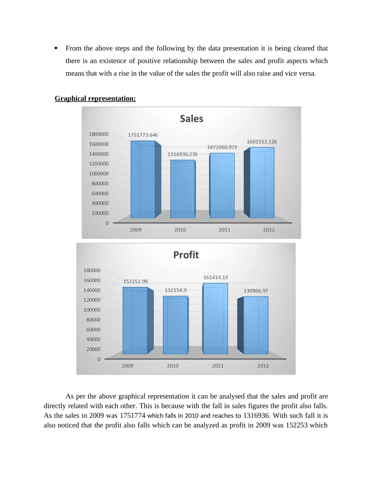
From the above steps and the following by the data presentation it is being cleared that
there is an existence of positive relationship between the sales and profit aspects which
means that with a rise in the value of the sales the profit will also raise and vice versa.
Graphical representation:
As per the above graphical representation it can be analysed that the sales and profit are
directly related with each other. This is because with the fall in sales figures the profit also falls.
As the sales in 2009 was 1751774 which falls in 2010 and reaches to 1316936. With such fall it is
also noticed that the profit also falls which can be analyzed as profit in 2009 was 152253 which
falls in 2010 and stuck at 132154. This means with a fall in sales the value of profit also falls.
The same case occurred in subsequent years wherein in 2011 the sales raised and reaches to
1472060 which is further followed in 2012 where the sales strikes to 1601552.126. With a
growing value of sales, the profit also raised as in 2011 it raised and stuck at 161414 from
132154 of 2010. However, falls in 2012 and stuck at 130967.
As per this analysis it can be evaluated that with a rise in the value of sales, profit value
also raised and when sales decline then the value of profit also falls. This means there is an
existence of positive relationship between sales and profit.
It is also evidenced form the literature with the views of Dijkhuizen and et.al., (2018)
which states that there is a positive and direct relationship between sales and profit value. As sale
value is the price which include the value of profit and cost of the operation. This means with a
rise in the proportion of sale the cost of operation are being covered and the profit value will
raised. Since sales refers to the selling of product of the company and if the sales will have raised
then this will lead to bringing of cash in the company which will further assist in the rise in the
value of profit.
Lutilsky, Liović and Marković, (2018) also states that sales include the sale of
commodity and bringing of sales revenue. However, profit is that amount which is being left
over after the incubation of all the expenses and operation cost. This also state a direct
relationship between sales and the profit. This is because with the sales of the product, sales
revenue will come. From that revenue all the cost will be covered and expenses will be bear
which will lead to enable the profit. This means with a rise in sales the profit will also raise and
vice versa too.
On a contra dictionary note Chen, Harford and Kamara, (2019) also state that although
sales and profit are directly linked with each other but at a certain point when the percentage of
cost and expenses will raise then the value of the profit is being affected. This means the profit
which is being earned after the coverage of expenses will be affected when the expenses will
start rising. This means that the along with sales, an analysis of the sales and making changes in
the sale price is also essential in order to establish the same positive relationship.
From the above analysis and the literature, it is cleared and analyzed that there is an
existence of direct relation between the aspects in the context of the organization. This is also
evidenced from the sales and profit trends of the Superstore data which shows a clear aspect that
the fall in sales value in 2009 to 2010 shows a subsequent fall in profit of 2009 and 2010. Thus,
it can be right to said from the data of superstore and the prepared graph of the data that the sales
and profit are directly linked with each other and a rise in one aspect will lead to rise in the other
also.
PART-2
Numbers of customers as male and female
⊘ This is a preview!⊘
Do you want full access?
Subscribe today to unlock all pages.
Trusted by 1+ million students worldwide
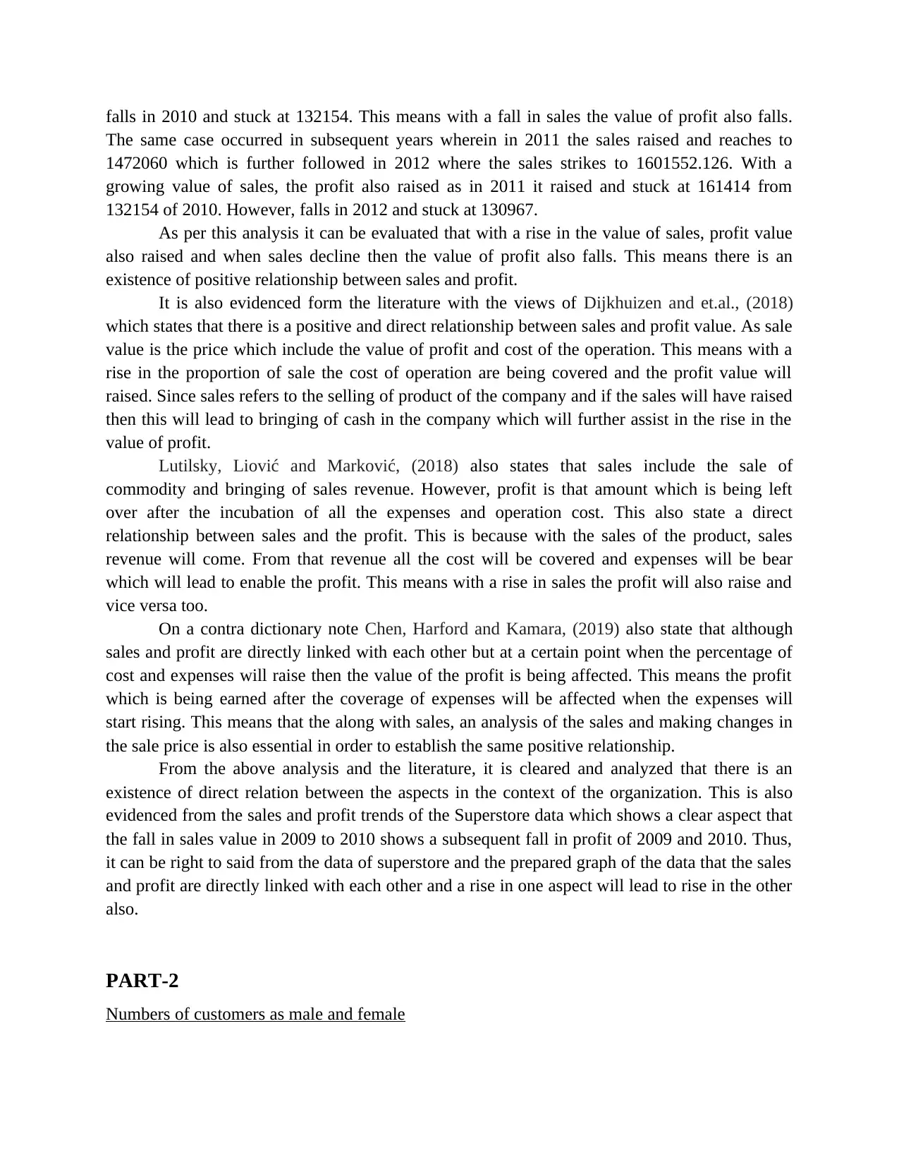
Gender
Frequency Percent Valid Percent Cumulative
Percent
Valid
Male 50 50.0 50.0 50.0
Female 50 50.0 50.0 100.0
Total 100 100.0 100.0
Interpretation: The above data shows that 50 percentages are male and 50 percentages are
female, which shows equal participation of gender is there, which shows smile clinic has equal
number of genders. It also enables to highlight importance on fact that there are equal number of
customers who come at clinic, and gender are male as well as female which shows efficiency in
system.
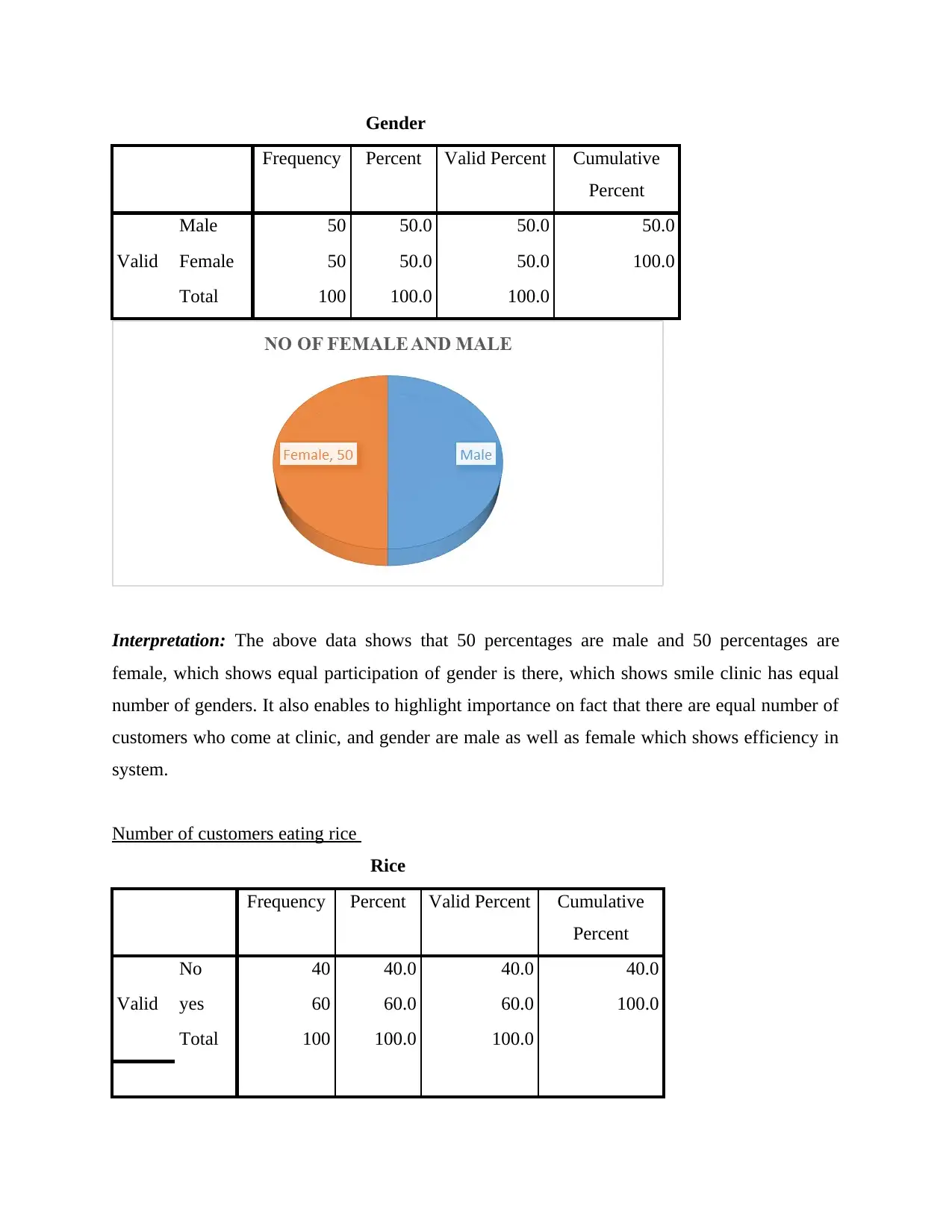
Number of customers eating rice
Rice
Frequency Percent Valid Percent Cumulative
Percent
Valid
No 40 40.0 40.0 40.0
yes 60 60.0 60.0 100.0
Total 100 100.0 100.0
Frequency Percent Valid Percent Cumulative
Percent
Valid
Male 50 50.0 50.0 50.0
Female 50 50.0 50.0 100.0
Total 100 100.0 100.0
Interpretation: The above data shows that 50 percentages are male and 50 percentages are
female, which shows equal participation of gender is there, which shows smile clinic has equal
number of genders. It also enables to highlight importance on fact that there are equal number of
customers who come at clinic, and gender are male as well as female which shows efficiency in
system.
Number of customers eating rice
Rice
Frequency Percent Valid Percent Cumulative
Percent
Valid
No 40 40.0 40.0 40.0
yes 60 60.0 60.0 100.0
Total 100 100.0 100.0
Paraphrase This Document
Need a fresh take? Get an instant paraphrase of this document with our AI Paraphraser
Interpretation: From the above data, it can be interpreted that people who eat rice are 60, and
who do not eat rice are 40 which shows that maximum number of people are those who prefer to
eat rice. 60 percentage of people prefer to eat rice and 40 percentages do not eat rice, which is
also clearly depicted by graph.
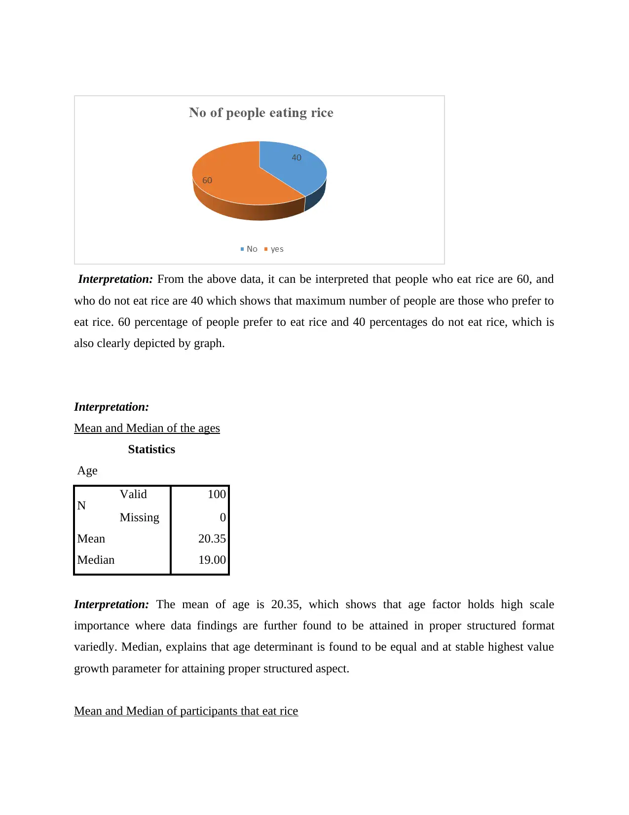
Interpretation:
Mean and Median of the ages
Statistics
Age
N Valid 100
Missing 0
Mean 20.35
Median 19.00
Interpretation: The mean of age is 20.35, which shows that age factor holds high scale
importance where data findings are further found to be attained in proper structured format
variedly. Median, explains that age determinant is found to be equal and at stable highest value
growth parameter for attaining proper structured aspect.
Mean and Median of participants that eat rice
who do not eat rice are 40 which shows that maximum number of people are those who prefer to
eat rice. 60 percentage of people prefer to eat rice and 40 percentages do not eat rice, which is
also clearly depicted by graph.
Interpretation:
Mean and Median of the ages
Statistics
Age
N Valid 100
Missing 0
Mean 20.35
Median 19.00
Interpretation: The mean of age is 20.35, which shows that age factor holds high scale
importance where data findings are further found to be attained in proper structured format
variedly. Median, explains that age determinant is found to be equal and at stable highest value
growth parameter for attaining proper structured aspect.
Mean and Median of participants that eat rice
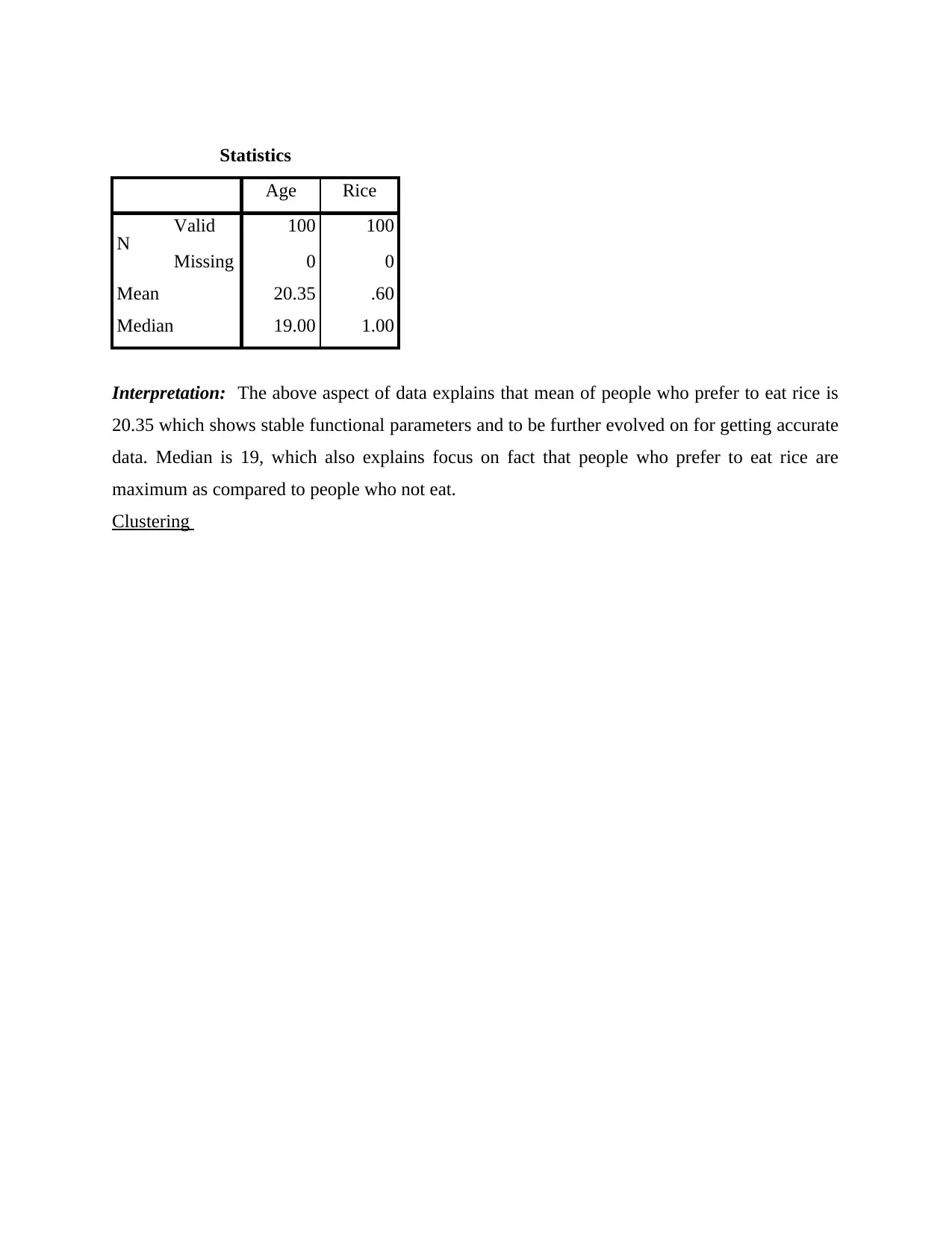
Statistics
Age Rice
N Valid 100 100
Missing 0 0
Mean 20.35 .60
Median 19.00 1.00
Interpretation: The above aspect of data explains that mean of people who prefer to eat rice is
20.35 which shows stable functional parameters and to be further evolved on for getting accurate
data. Median is 19, which also explains focus on fact that people who prefer to eat rice are
maximum as compared to people who not eat.
Clustering
⊘ This is a preview!⊘
Do you want full access?
Subscribe today to unlock all pages.
Trusted by 1+ million students worldwide
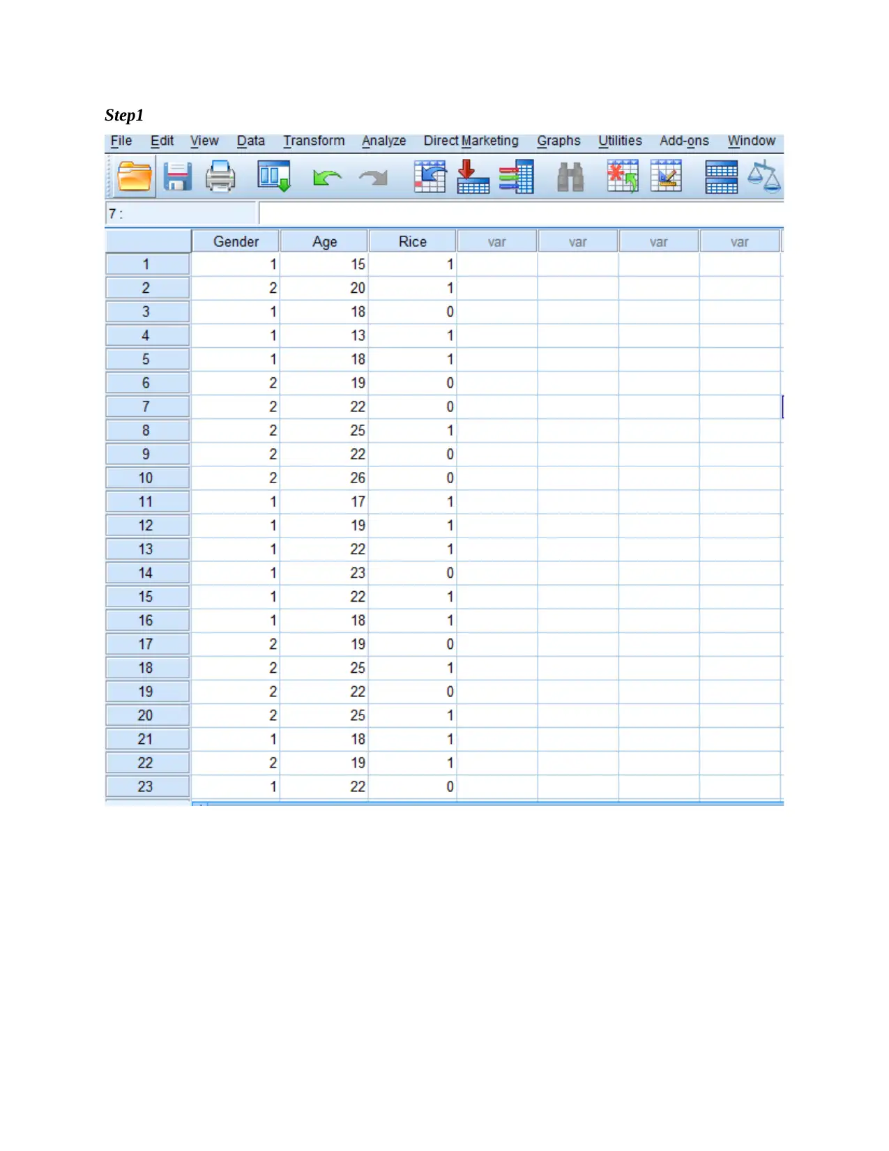
Step1
Paraphrase This Document
Need a fresh take? Get an instant paraphrase of this document with our AI Paraphraser
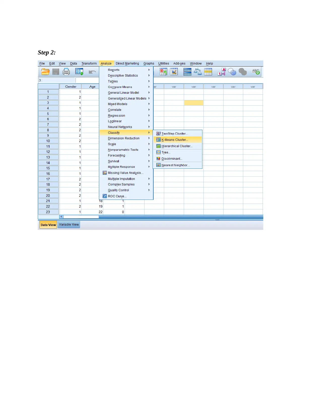
Step 2:
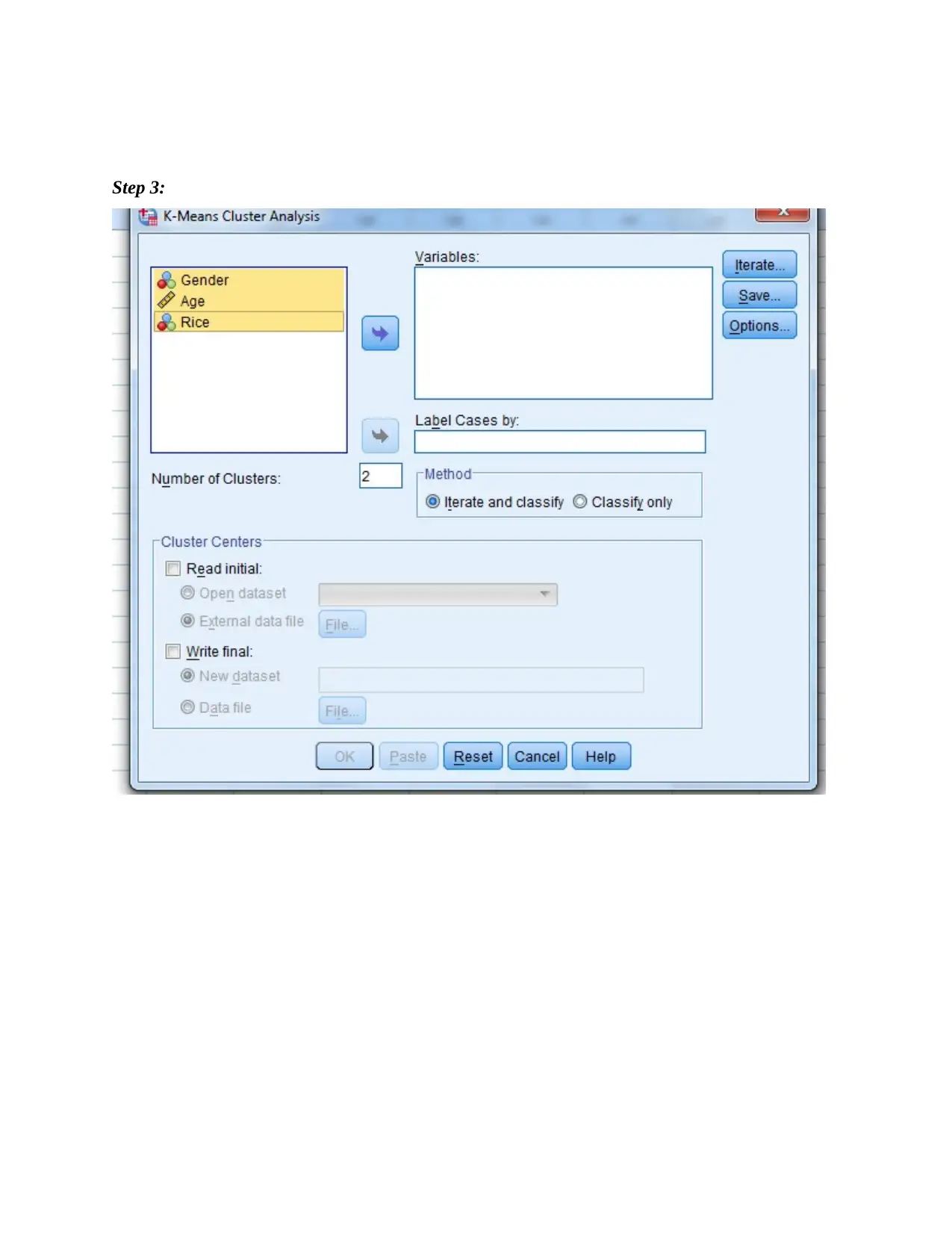
Step 3:
⊘ This is a preview!⊘
Do you want full access?
Subscribe today to unlock all pages.
Trusted by 1+ million students worldwide
1 out of 19
Related Documents


Your All-in-One AI-Powered Toolkit for Academic Success.
+13062052269
info@desklib.com
Available 24*7 on WhatsApp / Email
![[object Object]](/_next/static/media/star-bottom.7253800d.svg)
Unlock your academic potential
Copyright © 2020–2026 A2Z Services. All Rights Reserved. Developed and managed by ZUCOL.