LCBB5000: Data Handling and Business Intelligence - Report Analysis
VerifiedAdded on 2023/01/11
|13
|3553
|79
Report
AI Summary
This report delves into data handling and business intelligence, focusing on the use of Microsoft Excel and Weka for data analysis. Part 1 explores Excel's capabilities in data preprocessing, including the application of the IF function, VLOOKUP, and the creation of charts and graphs for data visualization. Part 2 utilizes the provided audidealership.csv dataset in conjunction with Weka to demonstrate clustering techniques. Furthermore, the report discusses common data mining methods relevant to business applications, providing real-world examples to illustrate their practical use. A comparative analysis of Weka and Excel highlights their respective advantages and disadvantages, and the report concludes with a comprehensive overview of the findings.

AUDI
Paraphrase This Document
Need a fresh take? Get an instant paraphrase of this document with our AI Paraphraser
Table of Contents
PART 1............................................................................................................................................3
1.1 Use of excel of pre-processing the data.................................................................................3
1.1.1 Use of IF function in Excel.............................................................................................4
1.1.2 Lookup............................................................................................................................5
1.1.3 Charts and Graphs...........................................................................................................6
PART 2............................................................................................................................................9
2.1 Using the audidealership.csv provided in conjunction with Weka give a specific example
of clustering.................................................................................................................................9
2.2 Explain the most common data mining methods that can be used in business with real
world examples..........................................................................................................................11
2.3 Advantages and disadvantages of Weka over excel............................................................13
REFERENCES..............................................................................................................................14
PART 1
1.1 Use of excel of pre-processing the data
MS Excel, whose full name is 'Microsoft Excel' and also known as 'Excel', is a Spread Sheet
Program, which allows to open, create, edit, formatting, calculate, share and print data in Tabular
format serves. MS Excel is developed by Microsoft. Microsoft Excel has become a part and
parcel of almost all types of industries, big or small. Software has many uses due to its key
features of handling, organizing, maintaining and interpreting data. Learning how to use
Microsoft Excel skills is always an added advantage for an aspirant in his future (Pashazadeh and
Navimipour, 2018).
Microsoft Excel skills are like bliss for everyone. Its utility is not limited to the business world
alone. Learning Microsoft Excel helps us create useful charts for presentation in academic life,
organize great amounts of data, and interpret future trends. The software may initially seem a bit
complicated but when you start using the basics it becomes a good tool to use and deliver results
in a reasonable amount of time. Some of the uses of Microsoft excel for pre-processing the data
are as follows:
1. Graphical user Interface: Excel is software based on the GUI (Graphical user Interface)
principle that means information is exchanged between the user and the software through
images, so that the software can be easily worked on.
2. Automatic Recalculation: If changes are made to the value of a formula in a table created in
Excel, Excel automatically recalculates and updates the result.
3. Use of Functions: Excel has a number of pre-built programs to perform many functions which
when used in calculation avoids the lengthy process of calculating the user and soon results are
obtained in various types of functions - mathematical, numerical, Financial, logical etc.
4. Formatting: Excel provides formatting to attract workbook. Excel text as well as Numbers,
date, time etc. are also allowed in various formats.
⊘ This is a preview!⊘
Do you want full access?
Subscribe today to unlock all pages.
Trusted by 1+ million students worldwide
5. Database: The data available in Excel can be stored and controlled appropriately, the user can
create reports according to the user according to the Sort, filter.
6. Creating Graph: In order to display the data effectively in Excel, the data can be displayed as a
graph so that they can be analyzed properly. Charts make data easy to read and understand Excel
has many types of charts like - Column, Bar, Line, Pie, XY Scatter, Doughnut, Surface, Bubble,
Stock etc (Young-Saver, and et.al., 2018).
7. Editing: Once the data is typed in an Excel worksheet, improvements can be made under the
correction, typing new data, deleting old data or making changes to it.
8. Saving and Printing: All worksheets created in Excel can be stored as files in secondary
storage for future and hard copy of worksheet can also be obtained by printer.
1.1.1 Use of IF function in Excel
It is the part of logical function of excel sheet; the IF function checks whether the condition is
met and the result has a value called 'False'. This formula checks whether the denominator equals
zero (or is empty). if so, an empty cell is displayed. Formula that uses the “if” functions:
Button icon logical test: the condition you want to check.
Button image value if true: value to return if the condition is true.
Button icon value if false: value to return if the condition is false.
To view more information in the cell if the divisor is empty or zero, type the necessary
information in the formula where the "" sign (quotation marks) is displayed. If you want to
display the text, type it in quotation marks. If you want to view any other element (values), type
it instead of the quotes (Hong, and et.al., 2019).
In this model, we will discover on which date deals and benefit declined and on which date
increments from superstore deals 2, and afterward perceive how to make the "IF Function" bit by
bit.
As a matter of first importance reorder date of request, deals and benefits on discrete
sheet.
Paraphrase This Document
Need a fresh take? Get an instant paraphrase of this document with our AI Paraphraser
Presently adjust the information taking old date first through arranging capacity of exceed
expectations sheet.
Select the cell where you need to make the "IF Function".
Type the code in the cell: = if (
Type condition with comma: B2>B3,
Type what you need to show when the condition is met. On the off chance that you need
to show content, compose inside quotes: "Decrease"
Type a comma:,
On the off chance that you don't satisfy the condition inside quotes, type: "Increment"
At that point close the section and press Enter key.
The IF work made above will resemble this: = if (B2>B3, "Decay", "Increment")
So IF work says on the off chance that the speed or incentive in cell B2 is more than B3,
at that point show Decline and in the event that it is under B3, at that point show Increase.
In the wake of squeezing the Enter key, you will get the consequence of cell B4. On the
off chance that you need to see the outcome, drag the handle of the cell on D4 down to
cell D8400.
1.1.2 Lookup
VLOOKUP is one of the most useful and important functions in Microsoft Excel. It is typically
used to visualize a particular value in large data sheets where it is difficult to manually search.
The VLOOKUP function supports approximate and exact matches, and wildcards. "V" means
"vertical". The word "Vertical" means that it can be used to view values vertically, so it can be
used to view values within a column. According to Microsoft Excel, VLOOKUP can be defined
as a function, which looks for a value in the left column of the table and then returns that value in
the same row from the column you specify (Zhou, and et.al., 2017). The syntax of VLOOKUP
consists of four types of information:
= VLOOKUP (value, table, col index, [range_lookup])
This syntax contains Arguments like this –
Value - The value of the first column of the table to be searched.
Table - The table from which to get this value.
Col_index - The column of the table or range from which to derive values.
It has two options which are optional -
TRUE = Approximate Match and FALSE = Exact Match | If you do not specify anything, TRUE
will be the default.
Demonstration of Look up work on given circumstance of Superstore Sale:
Utilizing the equivalent exceed expectations sheet, the accompanying advances will be taken:
Lookup Value: Select cell G2, H2 and I2 for putting the qualities for Order date, deals and
benefit. The outcomes will be appeared on G3, H3 and I3. Select the cell H3 and put work
Lookup; select cell G3 as a Lookup Value.
Table series: For this select entire range from A2 to C8400 (A2:C8400).
[Range_ lookup]: Select came about cell for deals; that is B2 to B8400 (B2:B8400).
1.1.3 Charts and Graphs
This is far too much to print out in the sidebar of a magazine article or a magazine story. While
graphs can be invaluable, allowing statisticians to provide a visual interpretation of complex
numerical stories. There are seven graphs that are commonly used in figures.
Good graphs convey information quickly and easily to the user. The graphs highlight the main
features of the data. They can show relationships that are not clear from the study of the list of
numbers. They can also provide a convenient way to compare different sets of data. Different
situations call for different types of graphs, and it helps to have a good knowledge of the types
available. The type of data often determines what graph is appropriate to use. Qualitative data,
quantitative data, and paired data each use different types of graphs:
1. Pareto diagram or bar graph: A Pareto diagram or bar graph is a way to visually represent
qualitative data. The data is displayed either horizontally or vertically and allows viewers to
compare items, such as quantity, characteristics, time and frequency. The bars are arranged in
order of frequency, so more important ranges are emphasized. By looking at all of the bars, it is
easy to tell categories in one set of data at a glance over others.
⊘ This is a preview!⊘
Do you want full access?
Subscribe today to unlock all pages.
Trusted by 1+ million students worldwide
2. Pie chart or circle graph: Another common way to graphically represent data is a pie chart. It
is just like a circular pie that has been cut into several slices, gets in the name of the way it looks.
A graph is thus helpful when its graph is qualitative data, where information describes an
attribute or feature and is not numeric.
3. Histogram: Another type of a histogram graph uses bars in its display. This type of graph is
used with quantitative data. The ranges of values, called classes, are listed below, and classes
with maximum frequencies have long bars. A histogram often looks similar to a bar graph, but
for some reason different levels of data are measured. Bar graphs measure the frequency of
explicit data. A categorical variable is two or more categories, such as one gender or hair color.
Histograms, in contrast, are used for data that include ordinal variables or things that are not
easily quantified, like feelings or opinions.
4. Dot plot: A dot plot is a hybrid between a histogram and a stem and leaf plot. Each
quantitative data value becomes a dot or issue that is placed above the appropriate square values.
Where histogram rectangles or use bars use these graphically dots, which are then joined
together with a simple line. According to dot plots, how long does it take a group of six or seven
individuals to compare, for example, to make breakfast, or provide a good way to show the
percentage of people in different countries that have access to electricity.
5. Scatter plots: A scatter plot displays data that is paired using a horizontal axis (x-axis), and a
vertical axis (y-axis). The statistical tools of correlation and regression are then used to show
trends on scatter plot. A scatter plot typically looks like a line or curve going from top to bottom
or left to right next to the graph "scattered" along the line.
Paraphrase This Document
Need a fresh take? Get an instant paraphrase of this document with our AI Paraphraser
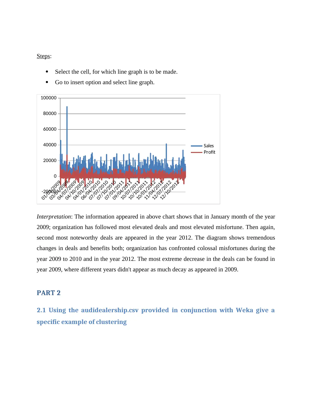
Steps:
Select the cell, for which line graph is to be made.
Go to insert option and select line graph.
01/01/2009
03/04/2009
04/07/2009
04/10/2009
04/01/2010
06/04/2010
07/07/2010
07/10/2010
07/01/2011
09/04/2011
10/07/2011
10/10/2011
10/01/2012
11/04/2012
12/07/2012
12/10/2012
-20000
0
20000
40000
60000
80000
100000
Sales
Profit
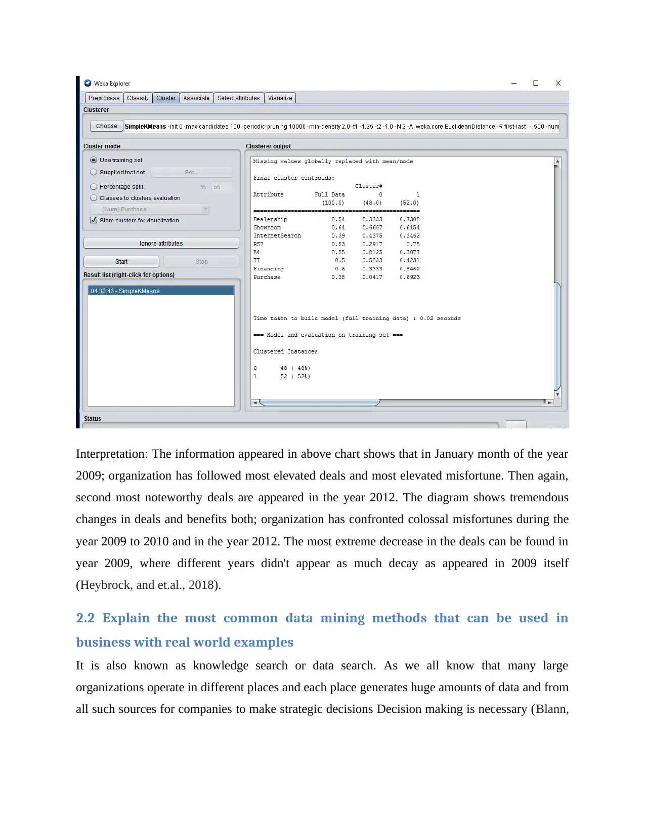
Interpretation: The information appeared in above chart shows that in January month of the year
2009; organization has followed most elevated deals and most elevated misfortune. Then again,
second most noteworthy deals are appeared in the year 2012. The diagram shows tremendous
changes in deals and benefits both; organization has confronted colossal misfortunes during the
year 2009 to 2010 and in the year 2012. The most extreme decrease in the deals can be found in
year 2009, where different years didn't appear as much decay as appeared in 2009.
PART 2
2.1 Using the audidealership.csv provided in conjunction with Weka give a
specific example of clustering
Select the cell, for which line graph is to be made.
Go to insert option and select line graph.
01/01/2009
03/04/2009
04/07/2009
04/10/2009
04/01/2010
06/04/2010
07/07/2010
07/10/2010
07/01/2011
09/04/2011
10/07/2011
10/10/2011
10/01/2012
11/04/2012
12/07/2012
12/10/2012
-20000
0
20000
40000
60000
80000
100000
Sales
Profit
Interpretation: The information appeared in above chart shows that in January month of the year
2009; organization has followed most elevated deals and most elevated misfortune. Then again,
second most noteworthy deals are appeared in the year 2012. The diagram shows tremendous
changes in deals and benefits both; organization has confronted colossal misfortunes during the
year 2009 to 2010 and in the year 2012. The most extreme decrease in the deals can be found in
year 2009, where different years didn't appear as much decay as appeared in 2009.
PART 2
2.1 Using the audidealership.csv provided in conjunction with Weka give a
specific example of clustering
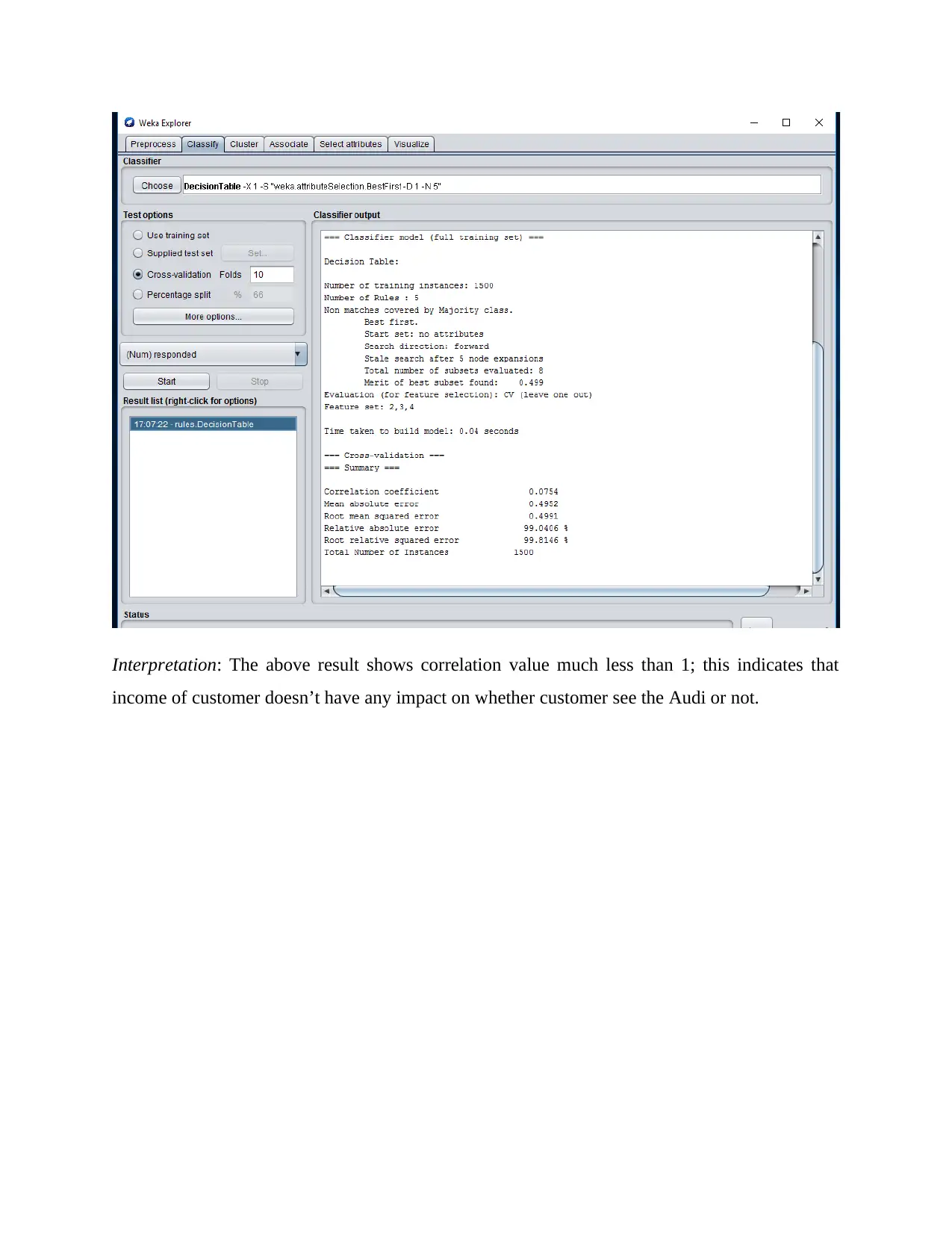
Interpretation: The above result shows correlation value much less than 1; this indicates that
income of customer doesn’t have any impact on whether customer see the Audi or not.
income of customer doesn’t have any impact on whether customer see the Audi or not.
⊘ This is a preview!⊘
Do you want full access?
Subscribe today to unlock all pages.
Trusted by 1+ million students worldwide
Interpretation: The information appeared in above chart shows that in January month of the year
2009; organization has followed most elevated deals and most elevated misfortune. Then again,
second most noteworthy deals are appeared in the year 2012. The diagram shows tremendous
changes in deals and benefits both; organization has confronted colossal misfortunes during the
year 2009 to 2010 and in the year 2012. The most extreme decrease in the deals can be found in
year 2009, where different years didn't appear as much decay as appeared in 2009 itself
(Heybrock, and et.al., 2018).
2.2 Explain the most common data mining methods that can be used in
business with real world examples
It is also known as knowledge search or data search. As we all know that many large
organizations operate in different places and each place generates huge amounts of data and from
all such sources for companies to make strategic decisions Decision making is necessary (Blann,
Paraphrase This Document
Need a fresh take? Get an instant paraphrase of this document with our AI Paraphraser
2018). We need to change across all domains to analyze, manage and make quick decisions. The
most common data mining methods have been discussed below:
1. The association: It is a method used to detect a relationship between two or more objects by
identifying hidden patterns in a data set and is therefore also called relationship analysis. This
method is used in market basket analysis to predict customer behavior.
There are two types of association rules:
Single dimensional association rules: These rules have a single attribute that is repeated.
Multidimensional association rules: These rules have many properties that are repeated.
2. Classification: This data mining method is used to distinguish the objects in a data set into
classes or groups. This helps to accurately predict the behavior of objects within the group. This
is a two-stage process:
Learning step (training phase): In this a classification algorithm creates a classifier by
analyzing a training set.
Classification phase: Test data is used to estimate the accuracy or precision of
classification rules.
For example, a banking company uses to identify loan applicants with low, medium or high debt
risk. Similarly, a medical researcher analyzes the cancer data to estimate which medication the
patient has to prescribe.
3. Clustering analysis: Clustering is almost similar to classification but based on similarity of
data items in this cluster. Different groups contain unequal or unrelated objects. It is also called
data segmentation because it divides huge data sets into clusters by analogy. Different clustering
methods are used:
Hierarchical accumulator methods
Grid-based methods
Division methods
Model based methods
Density-based methods
Similar example of loan applicants can also be considered here. There are some differences
which are indicated in the figure below.
4. Prediction: This method is used to predict the future based on past or present trends or data
sets. Prediction is mostly used in conjunction with other data mining methods such as
classification, pattern matching, trend analysis, and linkage. For example, if a supermarket's sales
manager wants to predict the amount of revenue that each item will generate based on past sales
data (Konstantopoulos and Pantziou, 2018). It models a continuous-valued function that predicts
missing numerical data values.
2.3 Advantages and disadvantages of Weka over excel
Weka is an open source information mining developer. This won't just assistance in computing
AI, yet in addition data plan and meta-understudies on the most proficient method to catch and
make essentialness. The whole grouping is written in Java, so it tends to be done on any stage.
The bundle contains three distinct assets (Patan and Babu, 2018): The order line interface, the
Explorer GUI interface (which permits you to assess a specific component, compute an
informational collection, and test the GUI interface) (one that permits) you perform various
figuring’s in a gathering And consider the outcomes).
Advantage over excel
The real state of a bundle like Weka is that it covers a whole range of data configurations,
including data determination and computation. This means that only one field of data is required
and imagining and examining ways to modify it is surprisingly simple. Packaging with the GUI
is the same, encouraging its use (Biffl, Lüder and Gerhard, 2017).
Disadvantages
Perhaps the biggest drawback of these mining offices is that they do not perform the latest
processes. For example, they performed MLP (helped support propeller excitation) and
computed basic preparations and SVM uses only polynomial components and does not develop
numerical approximations. Along these lines, it would be necessary to combine WEKA with a
wide range of devices, for example NetLab or SVM_torch. Another major disadvantage comes
from the zero output method: documentation for the GUI is explicitly blocked (Friese, 2019).
⊘ This is a preview!⊘
Do you want full access?
Subscribe today to unlock all pages.
Trusted by 1+ million students worldwide
1 out of 13
Related Documents


Your All-in-One AI-Powered Toolkit for Academic Success.
+13062052269
info@desklib.com
Available 24*7 on WhatsApp / Email
![[object Object]](/_next/static/media/star-bottom.7253800d.svg)
Unlock your academic potential
Copyright © 2020–2026 A2Z Services. All Rights Reserved. Developed and managed by ZUCOL.