Data Mining, WEKA Software Analysis, Warehousing, and Knowledge
VerifiedAdded on 2023/03/21
|20
|4254
|76
Homework Assignment
AI Summary
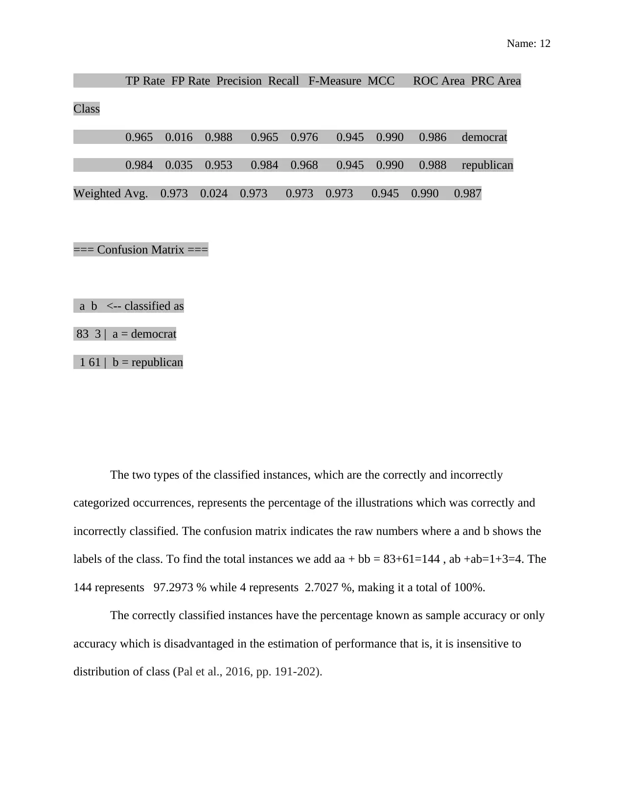
This assignment delves into the crucial aspects of data warehousing, data mining, and knowledge management within an organizational context. It begins by elucidating the significance of a knowledge management system, highlighting its benefits such as accelerated information access, enhanced decision-making, and promotion of innovation. The discussion extends to various technologies supporting knowledge management, including workflow systems, groupware, enterprise portals, and eLearning software. Furthermore, the assignment differentiates between databases and data warehouses, emphasizing the benefits of data warehouses for efficient data storage, analysis, and their pivotal role in business intelligence. A practical component involves utilizing WEKA software for data analysis, specifically classifying votes using the J48 classifier, and interpreting the resulting classification report, including metrics like correctly classified instances, confusion matrix, and their implications for predictive accuracy. The assignment concludes by demonstrating the successful application of WEKA in manipulating and analyzing data to generate transparent and insightful results.

Name: 1
BUSINESS INTELLIGENCE
by
Course Title
Tutor:
University/ Collage
Department
Date
BUSINESS INTELLIGENCE
by
Course Title
Tutor:
University/ Collage
Department
Date
Secure Best Marks with AI Grader
Need help grading? Try our AI Grader for instant feedback on your assignments.

Name: 2
Question 1 (4 marks)
Knowledge Management System
The knowledge management system is an Information Technology platform that
facilitates storage and retrieval of knowledge, enhances partnership, captures the purposes of
learning, finds the sources of information, and make use of experience through improving the
processes of knowledge management (Santoro et al., 2018)
Knowledge Management Importance in an Organisation
The knowledge management system has various benefits to an organization which
includes accelerating the access of information and knowledge, boosts information inventions
and innovations and change in culture, enhances decision-making processes, improves the
satisfaction of customers and improvement of effectiveness and efficiency of the operations of an
organization (Santoro et al, 2018)
Accelerate Access of Information.
Knowledge management in an organization makes it simple for the organization to find
the information required by the company or the people responsible for handling the information
that the organization needs to use (Hislop, Bosua and Helms, 2018). The knowledge
management system improves the productivity and efficiency of the business, and it also ensures
that the organization works better, which increases the tendency of business growth.
Enhances Decision-Making Processes.

Name: 3
The management and the top employees of the organization can enhance their decision-
making process by using the knowledge management system of the whole organization any time
they require the information. The business collaboration tools improve access to experiences and
the perspectives of various people during decision-making processes, which directly leads to
different options of the choices to be selected (Todorović, 2015, pp.772-783).
Promotes culture change and inventions.
Knowledge management system in an organization encourages and facilitate the sharing
of ideas, access to the updated information and teamwork in the organization (Honarpour, Jusoh,
and Md Nor, 2018, p. 801). The system furthermore makes people stimulate invention and
innovation, including the changes in culture required to transform the organization and meet the
continually changing needs of the business.
Improves Satisfaction of the Customer.
The collaboration and the knowledge sharing within and without the organization helps to
improve the value at which the customers are treated and attended to. The business is in the
position to provide expert answers within a short, which in turn improves the product.
Improves the efficiency of the organization.
The employees and the knowledge workers can effectively work due to the increasing
speed of information access and resources in the organization. According to (Omotayo, 2015,
pp.1-23.) the study that was undertaken where many executives of various organizations

Name: 4
underwent interview shows that social technologies for collaboration enhance the processes of
the business and the general performances.
Technologies used in support knowledge management
Various technologies can be used to support the knowledge management processes
discusses bellow;
Workflow system.
This is a system that enables process representation to be an association with its creation,
its use and how the organization will manage the knowledge such as the process of production
and utilization of the documents and forms (Ladd, 2016).
Groupware.
This a software used in the knowledge management system to enable sharing and
collaboration of the information. This software avails the tools for sharing of documents,
corporate emails, discussions among various features related to information sharing.
Enterprise Portals.
These are the software that collectively joins the information in the whole organization.
The knowledge management system uses this to provide information to various groups, which
include the project team (Kudryavtsev, and Gavrilova, 2016).
Secure Best Marks with AI Grader
Need help grading? Try our AI Grader for instant feedback on your assignments.

Name: 5
eLearning Software.
This is a software used by the knowledge management systems to promote organizations
in creation and facilitation of education and pieces of training which are customized such as the
lesson plans, process monitoring and classes which are mostly online (Liebowitz and Frank,
2016).
Question 2 (6 marks)
Distinctions on Database and Data warehouse
The Data warehouse.
It is a merged repository in an organization for all the collected data which is performed
by various working systems which can be logical or physical. It emphasizes on the collection of
data from different sources for analysis and access (Padmanabhan and Patki, 2016). The data
warehouse is housed in the mainframe computer of the organization or instead of the cloud in the
form of a relational database. This is where the information from diverse Online Transaction
Processing software is accurately captured for intelligent activities of the business, such as
supporting customer satisfaction and decision-making process.
Database.
The database is information which has been grouped, which is correctly organized for
efficient access, analysis, and updates. The data in the database is collected and stored in form s

Name: 6
or tables, columns, and rows are given indices for fast access of the essential data. The processes
of data deleting, updating, and expansion when the addition of new data. The workloads in the
database are processed to generate and update data independently, which can also enforce
queries the information in the database (Coronel and Morris, 2016).
Benefits of the Data Warehouse for Data Storage and Analysis
A data warehouse is important to the user for data storage since the warehouses are
premeditated to be able to store information and the analysis of the data which aims at high
speed of retrieval of information and the data analysis. The design of the data warehouse is
aligned at the purpose of storage of large amounts of the information which can easily be
analyzed and continuous queries. The analytical platform of a data warehouse is the design
which aims at the modification and generation of the information (Wullink, Moura, Müller and
Hesselman, 2016, pp. 913-918). Moreover, the data warehouse can take significant burdens of
the system to be removed from the operational situation and efficiently shares loads of the
system within the technological infrastructure of the organization.
Role of data warehouse in BI
Data warehouse promotes Business Intelligence through the knowledge gained from the
enhanced access to the information. The top officials of the organization, such as the managers,

Name: 7
will improve in the way they make decisions due to the presence of extensive knowledge. The
crucial decisions with significant impacts on the business will be made according to the valid
facts that will come with evidence and the real data of the organization. Besides, the executive
responsible for decision making will be in a better position to provide decisions as they will have
the ability to query the real data and they will also have an opportunity to get information based
on their preferences. The related business intelligence and the data warehouse can be directly
used in the business process, such as management of finances, inventory management, sales, and
marketing (Fekete, 2016, pp. 50-55).
Question 3
WEKA software
Understanding of WEKA software and data analysis
Weka software is made up of various tools and algorithms such which are used for the
data analysis using tools such as visualization platforms which also leads to the generation of
models such as those used in prediction, the tools work concurrently with the user interface to
make the process of access simple and the use of the functions. The initial Weka did not use
Java; it made use of the front end algorithms for modeling. The implementation of the modeling
algorithms was done using C programming, making use of the utilities in the language (Hall et
al., 2009, pp.10-18). The files were created using the experiences gained from learning the
machine languages and the systems which were based in makefile platform.
Paraphrase This Document
Need a fresh take? Get an instant paraphrase of this document with our AI Paraphraser

Name: 8
Weka software has been able to do data analysis due to its availability, Weka if free and
open source through the GNU public license. It is also portable and can be used in any the latest
and current computers because it has been implemented using the dominant programming
language, which is java. Weka contains numerous and immense techniques such as modeling
techniques, data analysing, and inclusive data collection methods (Agapito, Guzzi, and
Cannataro, 2018, p.17). It is easy to use Weka due to its properly design graphical user interface
with correctly design buttons.
The Weka software promotes many data mining techniques such as classification of data,
information clustering, preprocessing of data, selection of features, and visualization of
information. The data collected by the weka software is assumed to be data from a disorganized
file or a flat file; therefore, procedures of weka capable working in this data. Weka can enable
the results to be returned by the database query through the use of the Java database connectivity
where SQL database is used.
Weka facilitates the process of extensive learning using deep learning utility. Collection
of linked databases can also be converted to one table that can be processed using Weka
software.
The user interface of weka software is the explorer, which is the main however similar
functions performed by the Explorer can be achieved by the knowledge flow interface, which is a
component-based interface through the command line. The experimenter is also the part of the
user interface which facilitates the organized comparison of the Weka's performance of
prediction on the algorithms of machine learning on the groups of various datasets (Varouqa, and
Hammo, 2016, pp.359-371).

Name: 9
Analysis of Classification Results
The data taken into the weka software has been subject to various techniques for it to be
analyzed where trees have been generated. Below is the output of the classifiers
=== Run information ===
Scheme: weka.classifiers.trees.J48 -C 0.25 -M 2
Relation: vote
Instances: 435
Attributes: 17
handicapped-infants
water-project-cost-sharing
adoption-of-the-budget-resolution
physician-fee-freeze
el-salvador-aid
religious-groups-in-schools
anti-satellite-test-ban
aid-to-nicaraguan-contras
mx-missile
immigration
synfuels-corporation-cutback
education-spending
superfund-right-to-sue

Name: 10
crime
duty-free-exports
export-administration-act-south-africa
Class
Test mode: split 66.0% train, remainder test
=== Classifier model (full training set) ===
J48 pruned tree
------------------
physician-fee-freeze = n: democrat (253.41/3.75)
physician-fee-freeze = y
| synfuels-corporation-cutback = n: republican (145.71/4.0)
| synfuels-corporation-cutback = y
| | mx-missile = n
| | | adoption-of-the-budget-resolution = n: republican (22.61/3.32)
| | | adoption-of-the-budget-resolution = y
| | | | anti-satellite-test-ban = n: democrat (5.04/0.02)
| | | | anti-satellite-test-ban = y: republican (2.21)
| | mx-missile = y: democrat (6.03/1.03)
Number of Leaves: 6
Secure Best Marks with AI Grader
Need help grading? Try our AI Grader for instant feedback on your assignments.

Name: 11
Size of the tree : 11
Time is taken to build model: 0.24 seconds
=== Evaluation on test split ===
Time taken to test model on test split: 0.06 seconds
=== Summary ===
Correctly Classified Instances 144 97.2973 %
Incorrectly Classified Instances 4 2.7027 %
Kappa statistic 0.9447
Mean absolute error 0.0608
Root mean squared error 0.1539
Relative absolute error 12.6846 %
Root relative squared error 31.0328 %
Total Number of Instances 148
=== Detailed Accuracy By Class ===

Name: 12
TP Rate FP Rate Precision Recall F-Measure MCC ROC Area PRC Area
Class
0.965 0.016 0.988 0.965 0.976 0.945 0.990 0.986 democrat
0.984 0.035 0.953 0.984 0.968 0.945 0.990 0.988 republican
Weighted Avg. 0.973 0.024 0.973 0.973 0.973 0.945 0.990 0.987
=== Confusion Matrix ===
a b <-- classified as
83 3 | a = democrat
1 61 | b = republican
The two types of the classified instances, which are the correctly and incorrectly
categorized occurrences, represents the percentage of the illustrations which was correctly and
incorrectly classified. The confusion matrix indicates the raw numbers where a and b shows the
labels of the class. To find the total instances we add aa + bb = 83+61=144 , ab +ab=1+3=4. The
144 represents 97.2973 % while 4 represents 2.7027 %, making it a total of 100%.
The correctly classified instances have the percentage known as sample accuracy or only
accuracy which is disadvantaged in the estimation of performance that is, it is insensitive to
distribution of class (Pal et al., 2016, pp. 191-202).

Name: 13
Conclusion
In conclusion, the WEKA software has successfully manipulated and analyzed the data
which was in form or ".rff" to a properly represented in the form of trees. The output above is
more transparent and a direct and self-explanatory than the output from the GUI platforms where
we have the values of accuracy or the independent confidence for every instance. The focus can
be drawn to specific points such as the prediction where there are confidence and certainty. The
reports have focused on explaining how the weka software has analyzed the information to
generate the decision trees. This has enhanced the ability of the raw data to be used in decision
making.
Question 4
How business performance is illustrated
The business performance can be represented in various ways where the use of key
performance indicators are used which act as a cornerstone of dashboards and scorecard. The
critical performance has made it possible for the organizations to express their return to the top
management, such as the executives and managers. Business intelligence focuses on designing
visual metaphors to represent the business performance, and the tropes include the arrow,
gauges, or even dials (Prajogo, and Oke, 2016, pp.974-994).
Dashboard
Paraphrase This Document
Need a fresh take? Get an instant paraphrase of this document with our AI Paraphraser

Name: 14
A data dashboard is a tool used in the management of information which graphically
analyses, tracks and shows the key performance indicators measures and the essential points in
managing the growth of the business or a subsection of an organization. Any of the department
or the business needs can be achieved since the dashboards are customizable since it has a direct
connection to the information of the business such as the files, services and attachments and
transforms them into graphs, tables, gauges and bars charts (Smith, 2013, pp.21-45). The
dashboard is the best way of managing various sources of information since it gives a centralized
platform where business can accurately monitor the business process and the activities which
enable analysis and monitoring of the organization's performance. The on-time tracking of
information shortens the time of data analysis, which has been a problem in the past.
Information in Dashboard
The dashboard, in this case, contains the various clickable links in the home page, it is
web-based, and therefore, the links lead to more detailed information about the relationships. The
dashboard belongs to the Australian Energy Market Operator(AEMO). Two main titles have
been used to represent the gas and the electricity products, making it possible for an executive to
choose directly the type of the product they wish to monitor their performance. The two titles
have various links which come in the form of a drop-down list (Few, 2006).
The next page has a graph which can be changed to display various elements to be tested;
various links have been provided to be used. The combined line graph shows the variation in
prices of fuels over time against the predicted rates. The operator can easily navigate over the
chart since the hovering of a pointer triggers a function which displays the spot prices of the gas

Name: 15
and the electricity at that point of time. The information included in the graph is the scheduled
demand, forecast spot price, and the spot price within time (Mou, 2018, p.298).
The visual objects in the dashboard
The Australian Energy Market Operator has represented the data using various ways in
the panel. The objects used include the tables, graphs, flow charts, aggregated data files, and
maps. The tables, in this case, represent different types of information through entries of reals
values in numbers such as settlement date, spot prices in Megawatts per hour, schedule demand
and the kind of prediction which can either be actual or the forecast. The gas, which represents
explicitly the gas product has been colored differently and showing the distribution in various
cities in Australia, which includes the Adeline, Sydney, Brisbane, and Victoria. It has used
combined line and bar graph representing the current price and the current demand respectively
and the forecast after each day. The Australian map has also been used to describe the energy
networks in the country across different states (Breedvelt-Schouten, 2016).
Quantitative or Qualitative Measures
The Quantitative measures have been used in the data dashboard to represent specific
values of the money and the quality of energy being consumed in a given location at a specified
period that is one day. The qualitative measures have been depicted in the use of graphs, which
only shows the patterns and little information. The quality of the energy consumed at a given city
has been highlighted in the graph. The dashboard has used these measures to summarize the
information in tables and the excel sheets (Stoel, Ballou and Heitger, 2017, pp.53-69).

Name: 16
The information in this particular dashboard appears to be an online dashboard where
values keep changing over time depending on the updates at that time which directly update the
graphs, tables and even the energy network in the map.
Critique of the dashboard design
The Australian Energy Market Operator has to make its dashboard look better by making
few changes to the panel to present information the best of their way. The AEMO should
consider redesigning the dashboard by simplifying the data through data visualization which is
the most critical point in the business dashboard and to ensure swift communication which will
enable the users to get the quickly understand the performance of the business.
Information Data Dashboard
The AEMO can quickly improve the dashboard by using the different panel for different
information instead of using the same dashboard to represent every data. Creation of many
dashboards will enable the users, and the metrics of the business since the dashboards will be
related to each other but more organized. The strategic planning of multiple dashboards for
different products and departments. AEMO needs to have a separate dashboard for gas and the
electricity separately to avoid having much information in a single dashboard which is equally
confusing to the users, and this will make the work more comfortable for the departmental
managers to access and monitor the performance of the departments (Sedrakyan, Mannens, and
Verbert, 2018).
The layout of the dashboard has not followed the complete principles of the design such
as the proximity whereby in this case the dashboard has not grouped the data elements according
Secure Best Marks with AI Grader
Need help grading? Try our AI Grader for instant feedback on your assignments.

Name: 17
to their relationships, and the spacing is not appealing. Another data dashboard design that
AEMO has to consider is the contrast, the color of the dashboard has to stand out and fit, the size
of the dashboard should also be large enough especially for the graphs and the tables to enhance
visibility. Furthermore, all text should be left aligned and be in line with each other
(Pathirannehelage et al, 2018, p. 165)
Information dashboard should conform to the dashboard design principles to ensure the
creation of better and the recommended data dashboard which simplifies the jobs of the
executive for easy comprehension and the monitoring process of the critical performance
measures. The data dashboard design should take into consideration the following issues; the
user of the data dashboard, information to be presented, knowledge about the metrics, the
experience they have with the data and the perspective of the users in terms of the colors and
visuals

Name: 18
Reference
Agapito, G., Guzzi, P., and Cannataro, M., 2018. A Parallel Software Pipeline for DMET
Microarray Genotyping Data Analysis. High-throughput, 7(2), p.17.
Breedvelt-Schouten, I.M., International Business Machines Corp, 2016. Pattern representation
images for business intelligence dashboard objects. U.S. Patent 9,240,061.
Coronel, C. and Morris, S., 2016. Database systems: design, implementation, & management.
Cengage Learning.
Fekete, D., 2016. The GOBI Method: Fusing Data Warehouses and Big Data in a Goal-Oriented
BI Architecture. In GvD (pp. 50-55).
Few, S., 2006. Information dashboard design.
Hall, M., Frank , E., Holmes, G., Pfahringer, B., Reutemann, P., and Witten, I.H., 2009. The
WEKA data mining software: an update. ACM SIGKDD explorations newsletter, 11(1),
pp.10-18.
Hislop, D., Bosua, R., and Helms, R., 2018. Knowledge management in organizations: A critical
introduction. Oxford University Press.
Honarpour, A., Jusoh, A. and Md Nor, K., 2018. Total quality management, knowledge
management, and innovation: an empirical study in R&D units. Total Quality
Management & Business Excellence, 29(7-8), pp.798-816.
Ladd, D.F., 2016. Extending Two-Dimensional Knowledge Management System Theory with
Organizational Activity Systems' Workflow Dynamics.
Mou, D., 2018. Wind power development and energy storage under China’s electricity market
reform—A case study of Fujian Province. Sustainability, 10(2), p.298.

Name: 19
Omotayo, F.O., 2015. Knowledge Management as an essential tool in Organisational
Management: A Review of Literature. Library Philosophy and Practice, 1(2015), pp.1-23.
Padmanabhan, R. and Patki, A.U., Infosys Ltd, 2016. Automated data warehouse migration. U.S.
Patent 9,430,505.
Pal, D., Jain, A., Saxena, A. and Agarwal, V., 2016. Comparing Various Classifier Techniques
for Mining of Data. (pp. 191-202). Springer, Singapore.
Pathirannehelage, S., Kumarapeli, P., Byford, R., Yonova, I., Ferreira, F. and de Lusignan, S.,
2018, May. Uptake of a Dashboard Designed to Give Real-time Feedback to a Sentinel
Network About Key Data Required for Influenza Vaccine Effectiveness Studies.
In MIE (pp. 161-165).
Santoro, G., Vrontis, D., Thrassou, A. and Dezi, L., 2018. The Internet of Things: Building a
knowledge management system for open innovation and knowledge management
capacity. Technological Forecasting and Social Change, 136, pp.347-354.
Sedrakyan, G., Mannens, E. and Verbert, K., 2018. Guiding the choice of learning dashboard
visualizations: Linking dashboard design and data visualization concepts. Journal of
Visual Languages and Computing, 50.
Smith, V.S., 2013. Data dashboard as evaluation and research communication tool. New leadfor
evaluation, 2013(140), pp.21-45.
Stoel, M.D., Ballou, B. and Heitger, D.L., 2017. The Impact of Quantitative versus Qualitative
Risk Reporting on Risk Professionals' Strategic and Operational Risk
Judgments. Accounting Horizons, 31(4), pp.53-69.
Paraphrase This Document
Need a fresh take? Get an instant paraphrase of this document with our AI Paraphraser

Name: 20
Todorović, M.L., Petrović, D.Č., Mihić, M.M., Obradović, V.L. and Bushuyev, S.D., 2015.
Project success analysis framework: A knowledge-based approach in project
management. Project Management, International Journal 33(4), pp.772-783.
Viroqua, M. and Hammo, B., 2016. WIT: Weka interface translator. International Journal of
Speech Technology, 19(2), pp.359-371.
Wullink, M., Moura, G.C., Müller, M. and Hesselman, C., 2016, April. ENTRADA: A high-
performance network traffic data streaming warehouse. In NOMS 2016-2016 IEEE/IFIP
Network Operations and Management Symposium (pp. 913-918). IEEE.
1 out of 20
Related Documents

Your All-in-One AI-Powered Toolkit for Academic Success.
+13062052269
info@desklib.com
Available 24*7 on WhatsApp / Email
Unlock your academic potential
© 2024 | Zucol Services PVT LTD | All rights reserved.