Data Visualization using R: BUS5VA Assignment 2, Semester 2 2019

Verified

Added on  2022/10/11

|10
|4553
|9
Practical Assignment
AI Summary
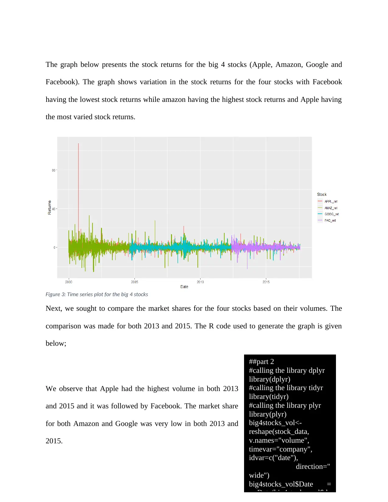
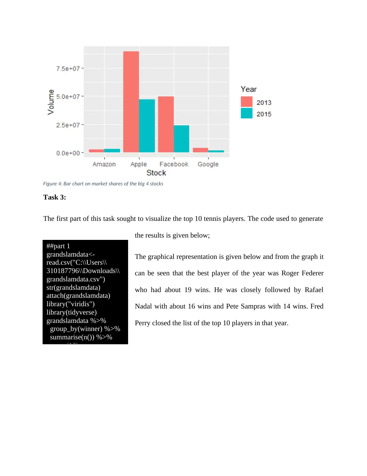
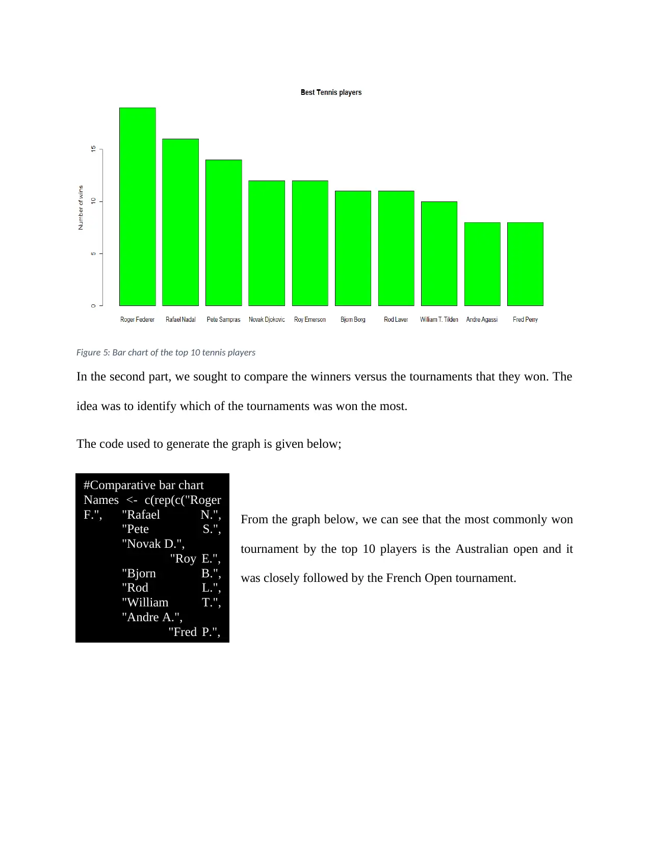
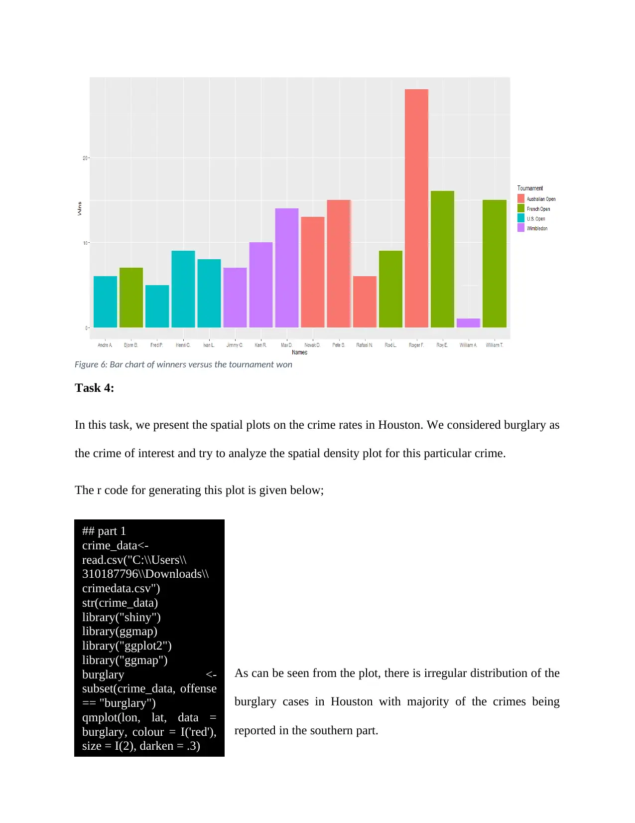
This assignment solution demonstrates data visualization techniques using R, addressing four tasks. Task 1 analyzes health condition proportions over time using bar charts, exploring changes between 2001 and 2018. Task 2 visualizes stock returns for top companies like Apple, Amazon, Google, and Facebook, identifying risky stocks and comparing market shares based on volume. Task 3 focuses on tennis player analysis, visualizing top players and comparing winners across tournaments using bar charts. Task 4 presents spatial plots to analyze crime rates, specifically burglary, in Houston. The solution includes R code for data import, manipulation, and visualization, along with interpretations of the generated plots and charts.
Document Page
Visual Analytics
Student Name:
Instructor Name:
Course Number:
25th September 2019
tabler-icon-diamond-filled.svg

Paraphrase This Document

Need a fresh take? Get an instant paraphrase of this document with our AI Paraphraser
Document Page
Task 1:
Part 1:
In this section, we sought to analyze the trends in the disease proportions for the various health
conditions. There were a total of nine health conditions and the aim was to present a trend
analysis visualization plot that shows how the different health conditions compared in both 2001
and 2018. To perform analysis, ggplot function was used in r. The codes used to generate the plot
are presented below;
From the plot, it was observed that in 2001, three health
conditions (Arthritis, Asthma and back problems) had
proportions greater than 10% with back problems being the
condition with the highest proportion followed by arthritis and
asthma at the third place. In 2018, four health conditions
(arthritis, asthma, back problems and mental behavioural
problems) had proportions greater than 10% with mental
behavioural problems being the condition with the highest proportion followed by back
problems, arthritis and asthma in that order.
#task 1
##part 1
#Import data into R
health_data<-read.csv("C:\\
Users\\Downloads\\
aushealth.csv")
#Attach the data
attach(health_data)
#check the ctructure of the
imported data
str(raw_data)
#check the dimensions of
data
dim(health_data)
#View data
Document Page
Figure 1: bar chart on Disease proportions in 2001 and 2008
Apart from visualizing on the trend of the disease conditions, we also sought to check on how the
diseases compare in terms of the change in proportions from 2001 to 2018. A chart showing
changes in the disease proportions was constructed. The code used to generate the plot is
provided below;
##part 2
#call the tidyverse library
library(tidyverse)
#converting the data to dide format
health_data_wide = health_data %>%
spread(year, prop_population)
#checking the structure of the dataframe
str(health_data_wide)
#changing the column names
colnames(health_data_wide)<- c("Disease","Year2001","Year2018")
#Computing the new variable on the percentage change
health_data_wide_new<-health_data_wide %>%
mutate(prop_change = ((Year2018-Year2001)/Year2001)*100)
Document Page
From the graph presented below, it is evident that kidney disease has been on the rise recording
about 400% increase in 2018 compared to 2001. On the other hand, back problems recorded the
highest drop. In general only two health conditions recorded a drop in their proportions in 2018
when compared to 2001. These health conditions are the back problems and asthma.
Figure 2: Bar chart on change in proportion of health conditions from 2001 to 2018
Task 2:
Part 1:
In this task, we are presented with stock data. We are tasked with visualizing the returns for the
top 4 stocks (Apple, Amazon, Google and Facebook). The aim is identify the risky and non-risky
stocks. The code used to generate the graph is given below;
tabler-icon-diamond-filled.svg

Paraphrase This Document

Need a fresh take? Get an instant paraphrase of this document with our AI Paraphraser
Document Page
The graph below presents the stock returns for the big 4 stocks (Apple, Amazon, Google and
Facebook). The graph shows variation in the stock returns for the four stocks with Facebook
having the lowest stock returns while amazon having the highest stock returns and Apple having
the most varied stock returns.
Figure 3: Time series plot for the big 4 stocks
Next, we sought to compare the market shares for the four stocks based on their volumes. The
comparison was made for both 2013 and 2015. The R code used to generate the graph is given
below;
We observe that Apple had the highest volume in both 2013
and 2015 and it was followed by Facebook. The market share
for both Amazon and Google was very low in both 2013 and
2015.
##part 2
#calling the library dplyr
library(dplyr)
#calling the library tidyr
library(tidyr)
#calling the library plyr
library(plyr)
big4stocks_vol<-
reshape(stock_data,
v.names="volume",
timevar="company",
idvar=c("date"),
direction="
wide")
big4stocks_vol$Date =
as.Date(big4stocks_vol$da
Document Page
Figure 4: Bar chart on market shares of the big 4 stocks
Task 3:
The first part of this task sought to visualize the top 10 tennis players. The code used to generate
the results is given below;
The graphical representation is given below and from the graph it
can be seen that the best player of the year was Roger Federer
who had about 19 wins. He was closely followed by Rafael
Nadal with about 16 wins and Pete Sampras with 14 wins. Fred
Perry closed the list of the top 10 players in that year.
##part 1
grandslamdata<-
read.csv("C:\\Users\\
310187796\\Downloads\\
grandslamdata.csv")
str(grandslamdata)
attach(grandslamdata)
library("viridis")
library(tidyverse)
grandslamdata %>%
group_by(winner) %>%
summarise(n()) %>%
top_n(10)
Document Page
Figure 5: Bar chart of the top 10 tennis players
In the second part, we sought to compare the winners versus the tournaments that they won. The
idea was to identify which of the tournaments was won the most.
The code used to generate the graph is given below;
From the graph below, we can see that the most commonly won
tournament by the top 10 players is the Australian open and it
was closely followed by the French Open tournament.
#Comparative bar chart
Names <- c(rep(c("Roger
F.", "Rafael N.",
"Pete S.",
"Novak D.",
"Roy E.",
"Bjorn B.",
"Rod L.",
"William T.",
"Andre A.",
"Fred P.",
tabler-icon-diamond-filled.svg

Paraphrase This Document

Need a fresh take? Get an instant paraphrase of this document with our AI Paraphraser
Document Page
Figure 6: Bar chart of winners versus the tournament won
Task 4:
In this task, we present the spatial plots on the crime rates in Houston. We considered burglary as
the crime of interest and try to analyze the spatial density plot for this particular crime.
The r code for generating this plot is given below;
As can be seen from the plot, there is irregular distribution of the
burglary cases in Houston with majority of the crimes being
reported in the southern part.
## part 1
crime_data<-
read.csv("C:\\Users\\
310187796\\Downloads\\
crimedata.csv")
str(crime_data)
library("shiny")
library(ggmap)
library("ggplot2")
library("ggmap")
burglary <-
subset(crime_data, offense
== "burglary")
qmplot(lon, lat, data =
burglary, colour = I('red'),
size = I(2), darken = .3)
Document Page
Figure 7: Spatial plot of the burglary cases in Houston
In the second part, we considered all the crimes and no particular crime in mind. We also
considered the data from 1st March 2010 to 31st May 2010. The code for generating the graph is
given below;
The spatial density plot for all the crimes in Houston for the
period 1st March 2010 to 31st May 2010 is presented below.
crime_data$date <-
as.Date(crime_data$date)
crime_data_new=with(cri
me_data, crime_data[(date
>= "1/3/2010" & date <=
"31/5/2010"),])
myvars <- c("offense",
"lon", "lat")
all_crimes <-
crime_data_new[myvars]
str(all_crimes)
qmplot(lon, lat, data =
all_crimes, colour =
I('green'), size = I(2),
darken = .3)
Document Page
Figure 8: Spatial density plot of all the crimes in Houston
The spatial density plot above shows that the crime rates are more concentrated in the southern
part of the region with very few if not none cases reported in the northern part.
chevron_up_icon
1 out of 10
circle_padding
hide_on_mobile
zoom_out_icon
[object Object]