Data Visualization Report: Analyzing US Real GDP Data and Trends
VerifiedAdded on 2022/09/17
|6
|645
|25
Report
AI Summary
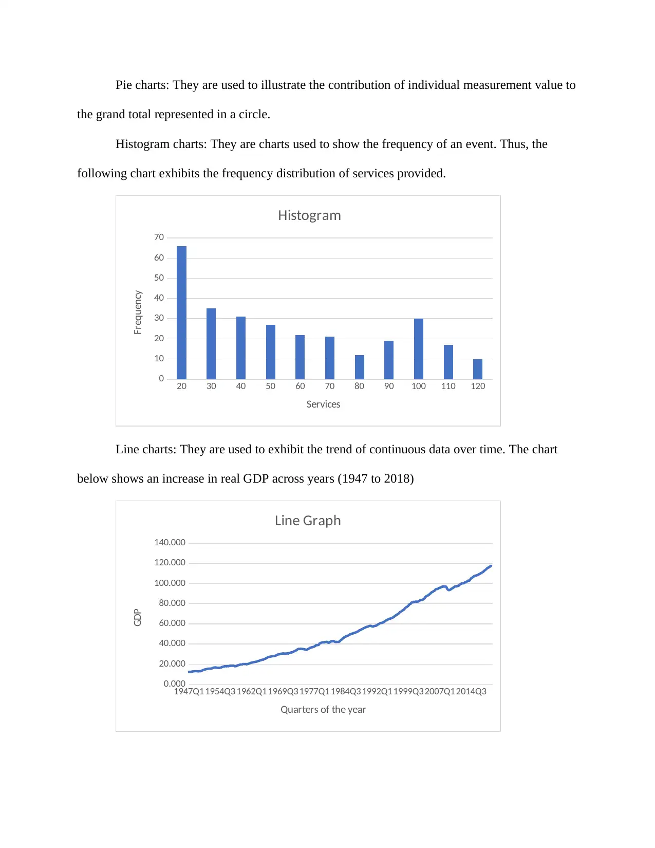
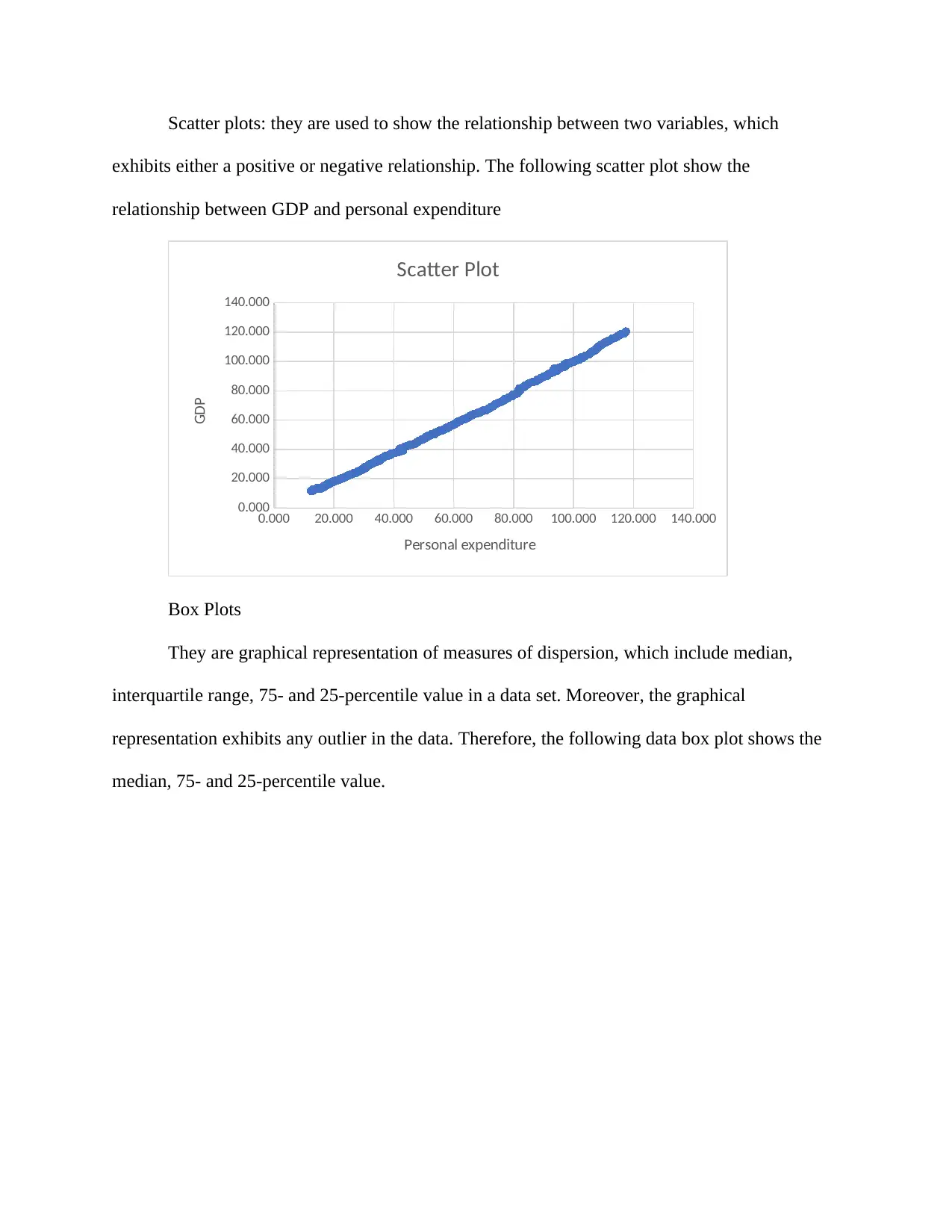
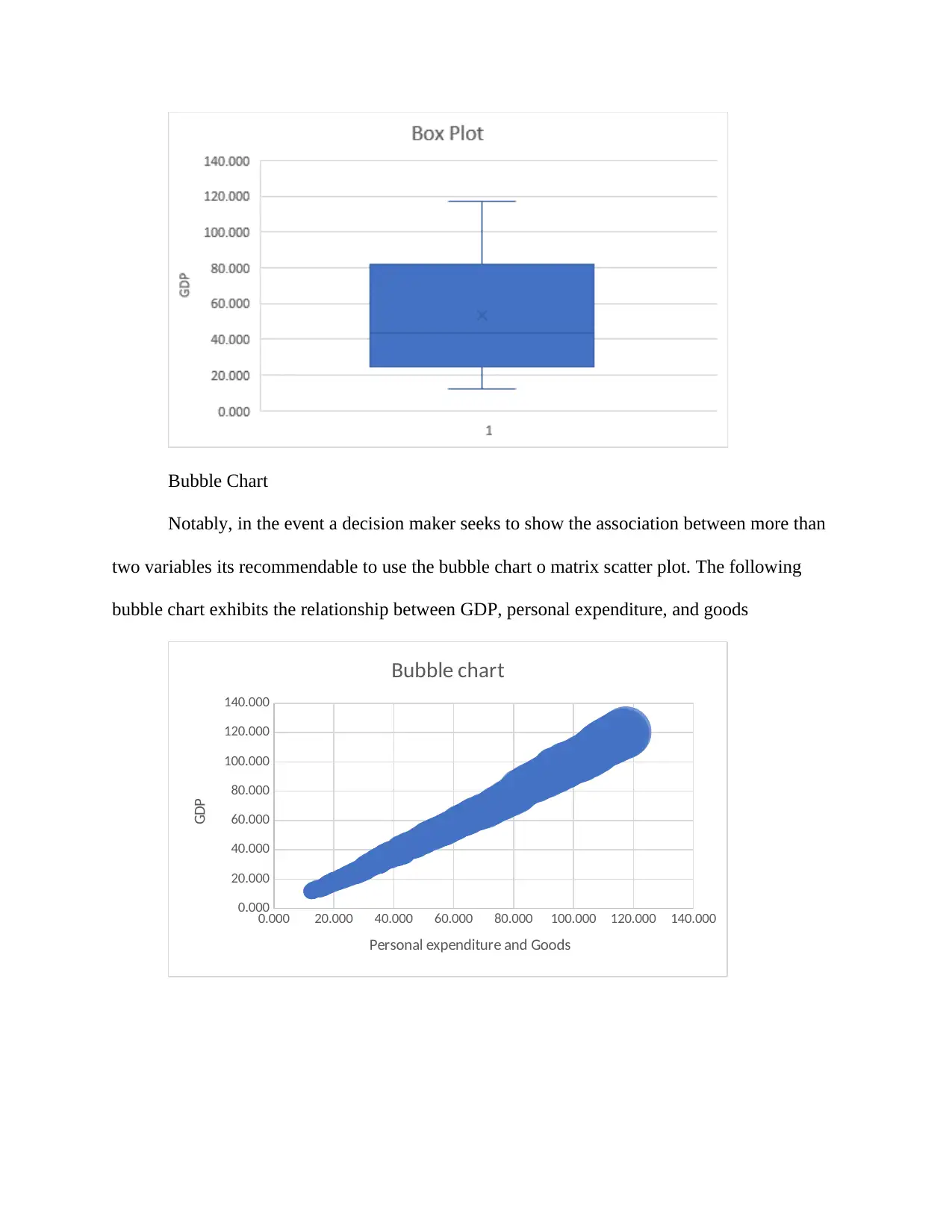
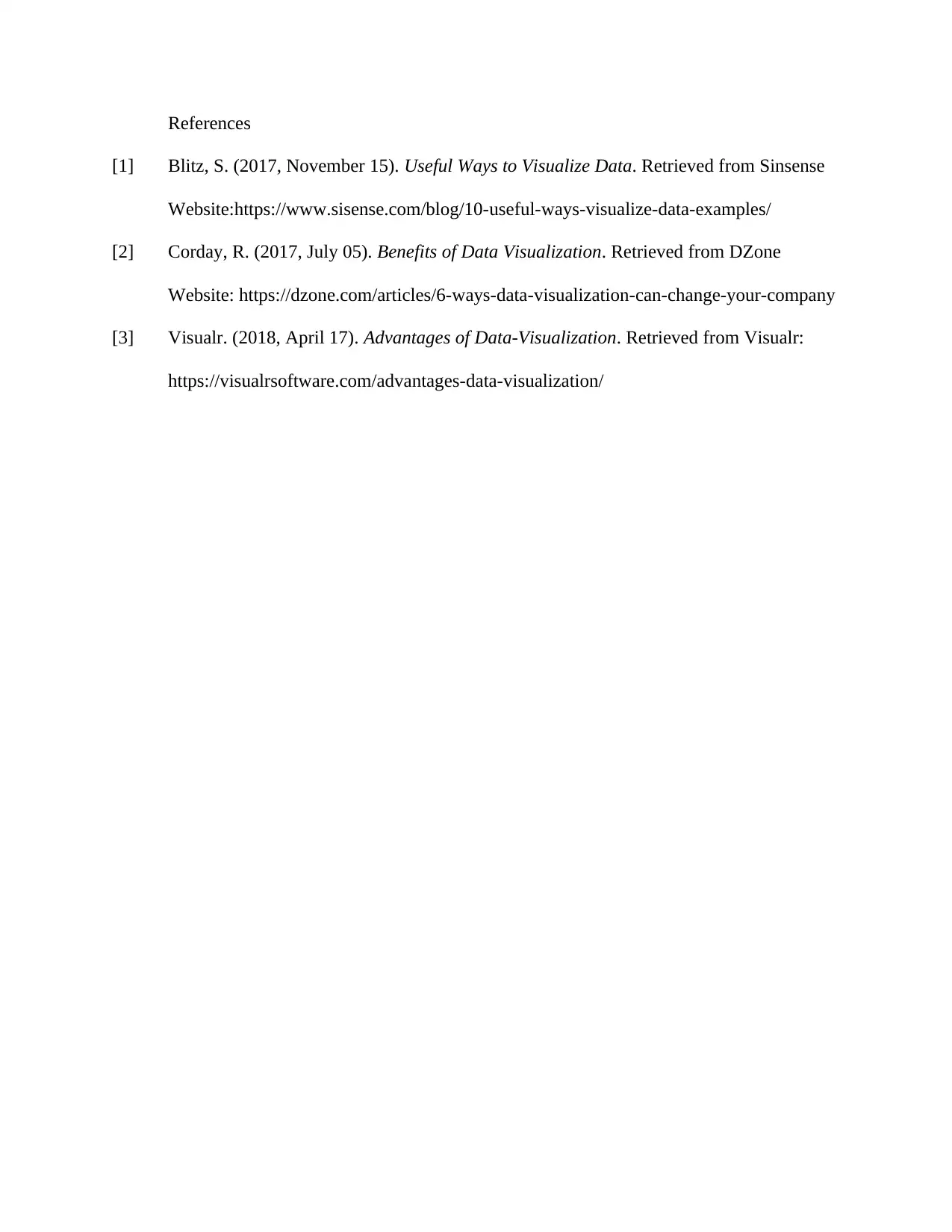
This report provides an overview of data visualization techniques and their application in analyzing US real GDP data. It discusses the importance of data visualization in business intelligence and decision-making, highlighting its role in identifying trends and patterns within data. The report explores various data visualization methods, including bar charts, pie charts, histogram charts, line charts, scatter plots, box plots, and bubble charts. Each method is explained with its specific use case and benefits. The report analyzes the US real GDP data from 1947 to 2018, using these visualization techniques to showcase trends and relationships. The report also includes a section on the benefits of data visualization, such as enhanced assimilation of business information, rapid identification of latest trends, and predictive analysis. The report concludes by emphasizing the significance of data visualization in various sectors, enabling informed decision-making based on data insights. The assignment is to be published on Desklib, a platform that provides AI-based study tools for students.
1 out of 6
Related Documents


Your All-in-One AI-Powered Toolkit for Academic Success.
+13062052269
info@desklib.com
Available 24*7 on WhatsApp / Email
![[object Object]](/_next/static/media/star-bottom.7253800d.svg)
Copyright © 2020–2026 A2Z Services. All Rights Reserved. Developed and managed by ZUCOL.