Data Visualization Project: Sales, Profit, and Shipping Analysis
VerifiedAdded on 2022/10/19
|22
|858
|499
Project
AI Summary
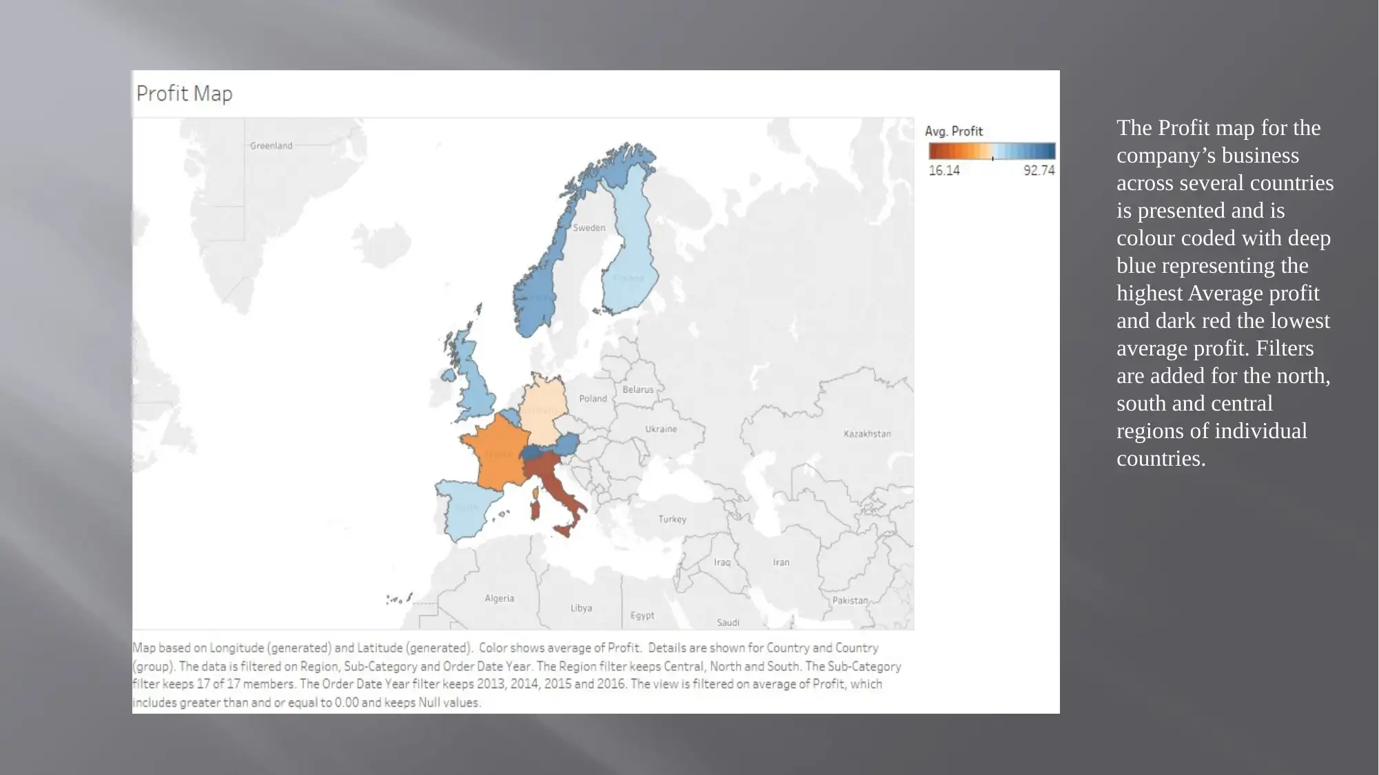
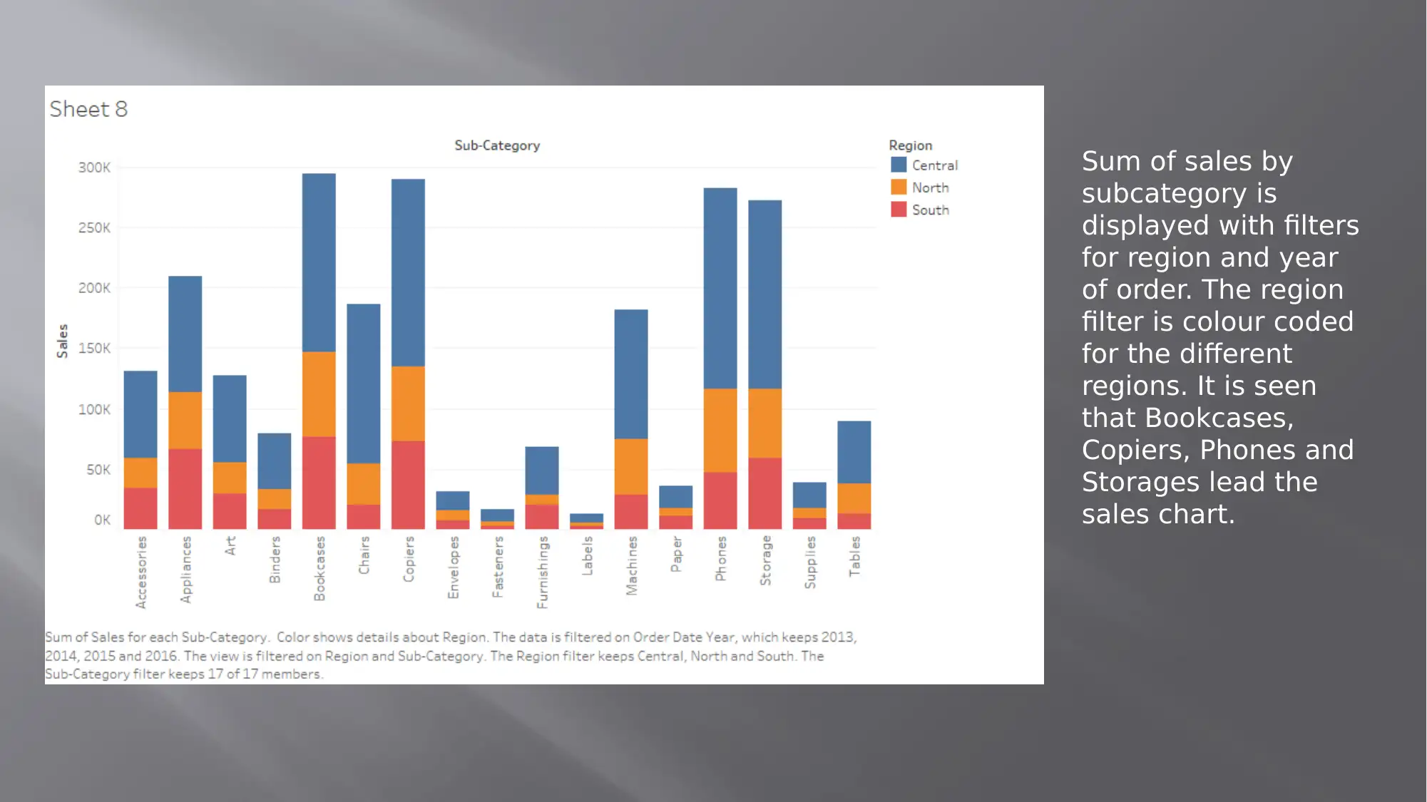
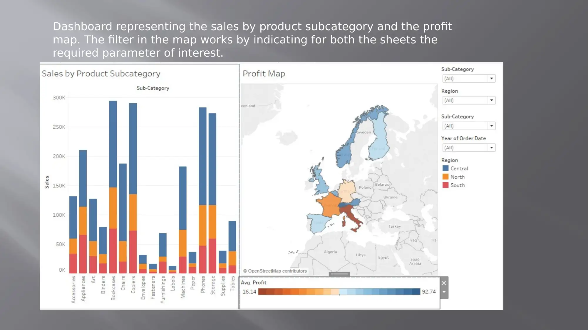
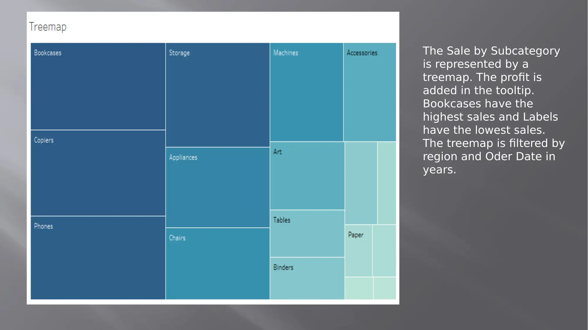
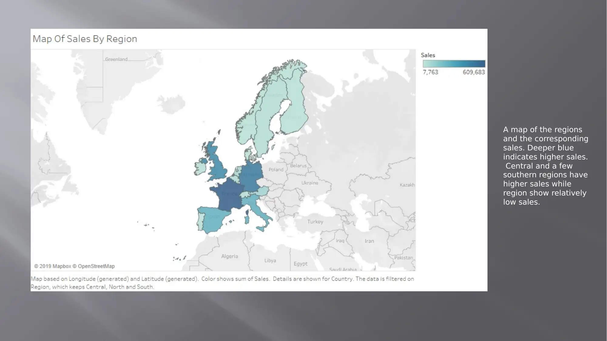
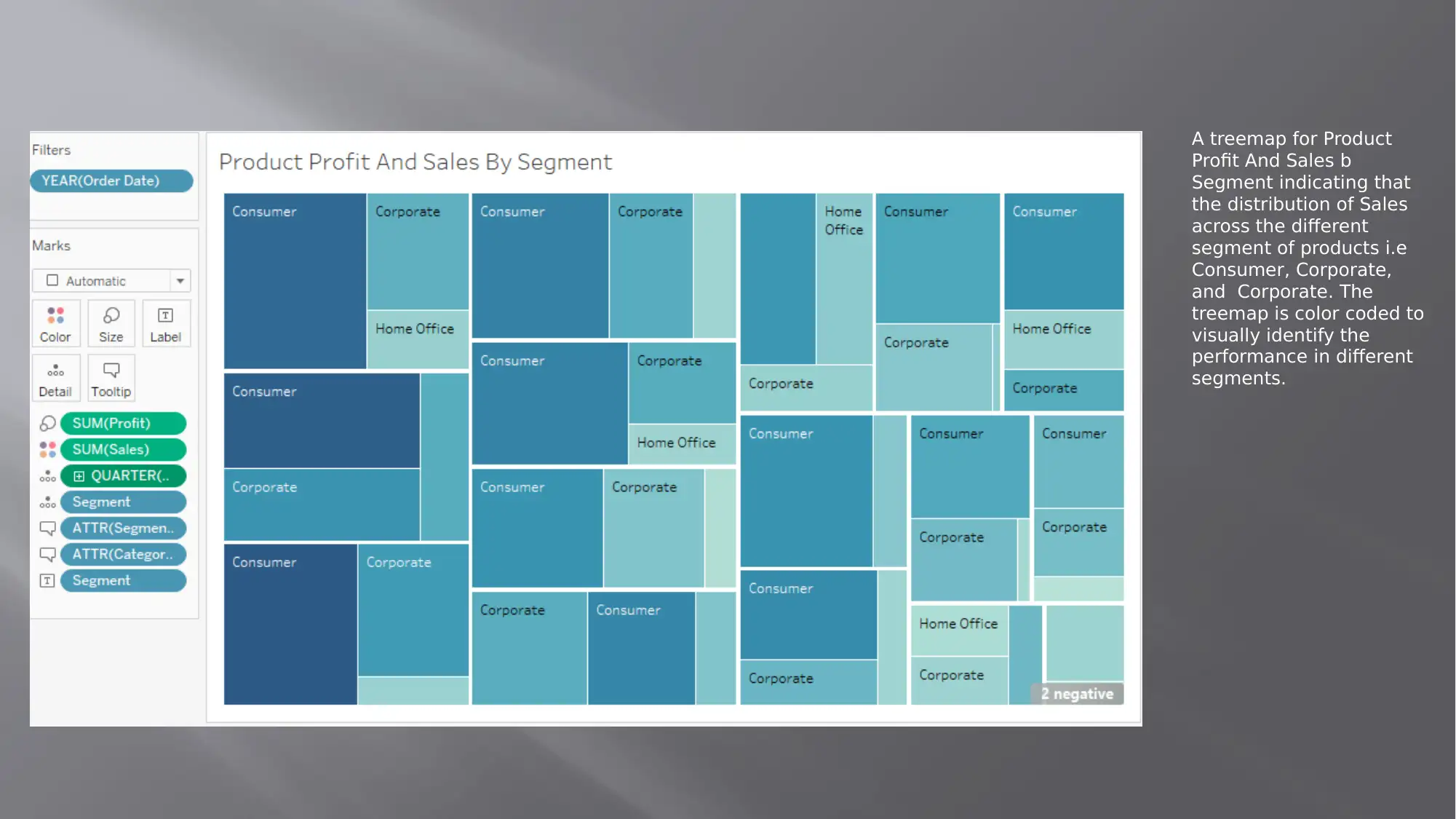
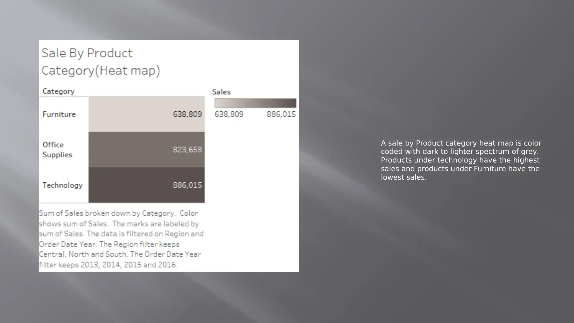
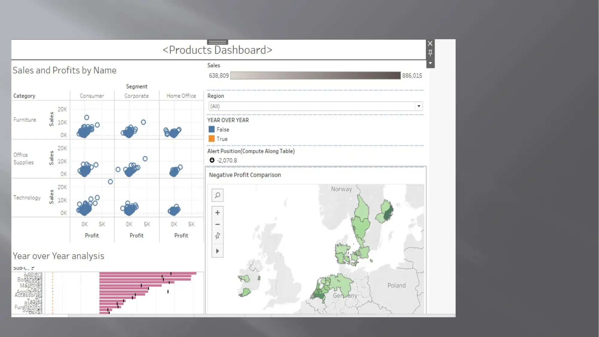
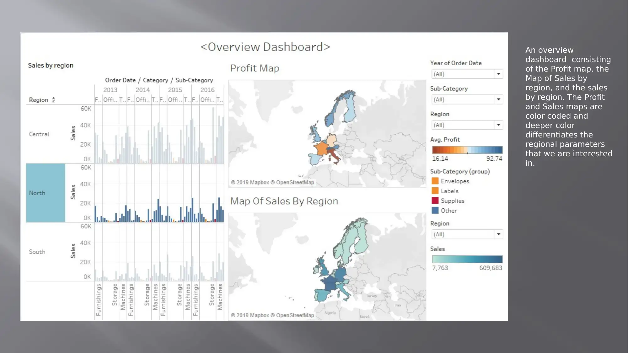
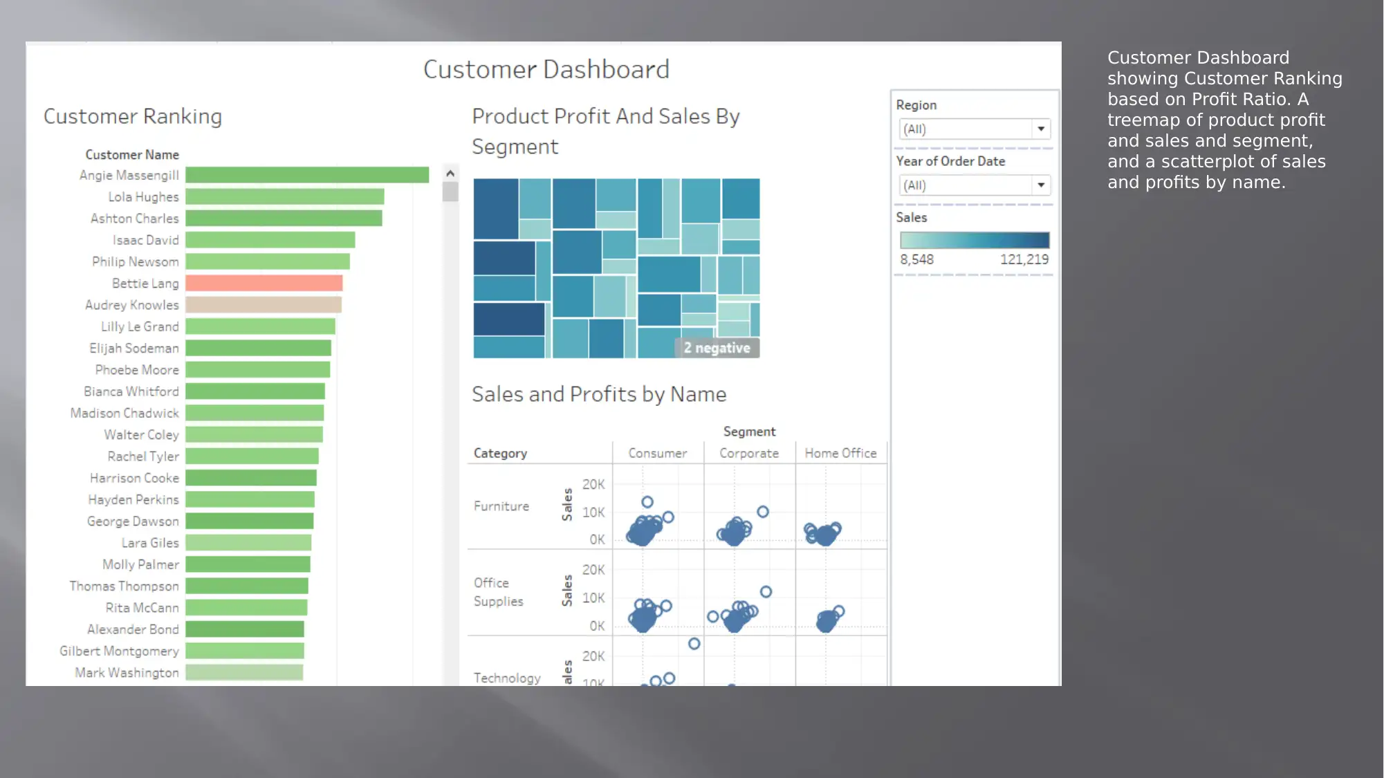
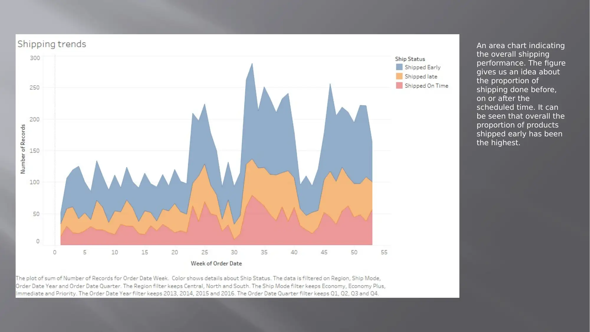
This project presents a comprehensive data visualization analysis of sales, profit, and shipping data using various charts and dashboards. The analysis includes a profit map color-coded by average profit across countries, filtered by region. Sales by subcategory are displayed using treemaps, with profit added in the tooltip, and further filtered by region and order date. A map of regions illustrates sales distribution, and a treemap visualizes product profit and sales by segment. A sales by product category heatmap is also included. The project features a customer ranking dashboard based on profit ratio and an area chart indicating overall shipping performance. Shipping trends are analyzed by region, with color-coded charts showing shipped early, late, and on-time orders. Year-over-year sales comparisons are conducted for different regions, highlighting product performance changes. The project references several sources on data visualization and business intelligence.

1 out of 22
Your All-in-One AI-Powered Toolkit for Academic Success.
+13062052269
info@desklib.com
Available 24*7 on WhatsApp / Email
![[object Object]](/_next/static/media/star-bottom.7253800d.svg)
Copyright © 2020–2026 A2Z Services. All Rights Reserved. Developed and managed by ZUCOL.