School of Computing Data Visualization Report - Assignment 1 - 301112
VerifiedAdded on 2022/11/13
|11
|2153
|355
Report
AI Summary
This report delves into the realm of relational data visualization, focusing on techniques such as graph and tree visualizations, with a particular emphasis on the use of JavaScript and the D3.js library. It explores the advantages and disadvantages of various visualization methods, including bar charts and network diagrams, and their effectiveness in handling large datasets. The report provides a technical overview of these techniques and compares them with other methods found in the literature. It also presents the analysis results and findings derived from the data sets, emphasizing the insights gained through interactive data exploration. The report concludes with a discussion on the critical thinking aspects of data visualization, offering recommendations for selecting appropriate tools and theories for visualizing data, and highlighting the significance of JavaScript in web-based applications. It also includes a detailed review of the literature on the subject.
Running head: VISUALIZATION OF DATA
DATA VISUALIZATION
Name of the Student
Name of the University
Author Note
DATA VISUALIZATION
Name of the Student
Name of the University
Author Note
Paraphrase This Document
Need a fresh take? Get an instant paraphrase of this document with our AI Paraphraser
1VISUALIZATION OF DATA
Table of Contents
Introduction:...............................................................................................................................2
Visualization Techniques for Tree:............................................................................................2
Visualization Techniques for Bar Graph:..................................................................................3
Tree – Map over Bar – Chart:....................................................................................................4
Tree – maps vs Bar Chart – The differences:.........................................................................4
Visualizing Large Data:.............................................................................................................5
Bar chart:................................................................................................................................5
Network Diagram:..................................................................................................................5
Review of work and critical thinking on the visualization:.......................................................6
Conclusion:................................................................................................................................7
References:.................................................................................................................................8
2VISUALIZATION OF DATA
Introduction:
While most of the visualization techniques mentioned up to now specialize in the
display of information value and their attributes, another necessary application of
visualization is that the transference of relative information as example, however knowledge
things or records are associated with one another. In this report we have mentioned the
technics of visualization using JavaScript (Ebert, Fisher and Gaither 2018). In this report we
are going to talk about visualization techniques of graph and tree that we have developed for
the visualization some relational data information. This presentation, however, can simply be
the tip of the iceberg, as tree and graph image is well – established field, with its own
software packages, and algorithms.
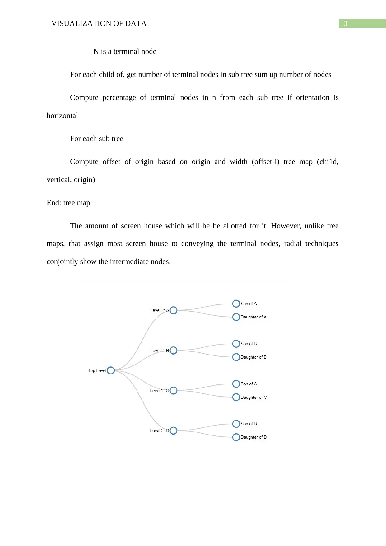
Visualization Techniques for Tree:
The method described higher than are structured exploitation horizontal and vertical
divisions to convey. Variety of different approaches are possible, however, like those who
divide radially (Scarsbrook et al. 2018). These techniques follow an analogous strategy to
tree map, in this the number of terminal nodes during a sub tree determines.
Start: main program
Width = width of tree
Height = height of tree
Node = root node of the tree
Origin = position
Tree map (node, origin, width, height)
Tree map (node n, o, position origin)
Introduction:
While most of the visualization techniques mentioned up to now specialize in the
display of information value and their attributes, another necessary application of
visualization is that the transference of relative information as example, however knowledge
things or records are associated with one another. In this report we have mentioned the
technics of visualization using JavaScript (Ebert, Fisher and Gaither 2018). In this report we
are going to talk about visualization techniques of graph and tree that we have developed for
the visualization some relational data information. This presentation, however, can simply be
the tip of the iceberg, as tree and graph image is well – established field, with its own
software packages, and algorithms.
Visualization Techniques for Tree:
The method described higher than are structured exploitation horizontal and vertical
divisions to convey. Variety of different approaches are possible, however, like those who
divide radially (Scarsbrook et al. 2018). These techniques follow an analogous strategy to
tree map, in this the number of terminal nodes during a sub tree determines.
Start: main program
Width = width of tree
Height = height of tree
Node = root node of the tree
Origin = position
Tree map (node, origin, width, height)
Tree map (node n, o, position origin)
⊘ This is a preview!⊘
Do you want full access?
Subscribe today to unlock all pages.
Trusted by 1+ million students worldwide
3VISUALIZATION OF DATA
N is a terminal node
For each child of, get number of terminal nodes in sub tree sum up number of nodes
Compute percentage of terminal nodes in n from each sub tree if orientation is
horizontal
For each sub tree
Compute offset of origin based on origin and width (offset-i) tree map (chi1d,
vertical, origin)
End: tree map
The amount of screen house which will be be allotted for it. However, unlike tree
maps, that assign most screen house to conveying the terminal nodes, radial techniques
conjointly show the intermediate nodes.
Paraphrase This Document
Need a fresh take? Get an instant paraphrase of this document with our AI Paraphraser
4VISUALIZATION OF DATA
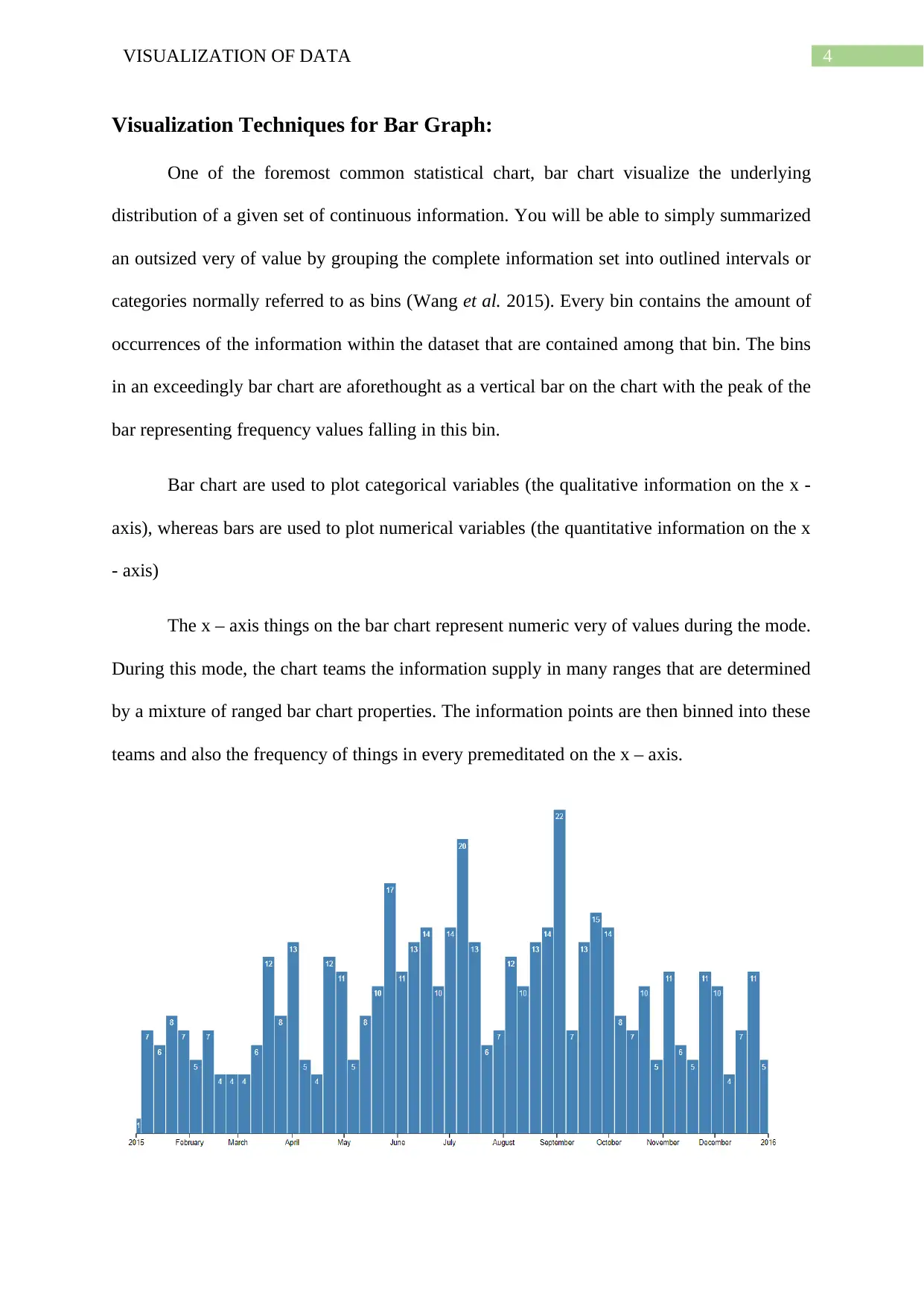
Visualization Techniques for Bar Graph:
One of the foremost common statistical chart, bar chart visualize the underlying
distribution of a given set of continuous information. You will be able to simply summarized
an outsized very of value by grouping the complete information set into outlined intervals or
categories normally referred to as bins (Wang et al. 2015). Every bin contains the amount of
occurrences of the information within the dataset that are contained among that bin. The bins
in an exceedingly bar chart are aforethought as a vertical bar on the chart with the peak of the
bar representing frequency values falling in this bin.
Bar chart are used to plot categorical variables (the qualitative information on the x -
axis), whereas bars are used to plot numerical variables (the quantitative information on the x
- axis)
The x – axis things on the bar chart represent numeric very of values during the mode.
During this mode, the chart teams the information supply in many ranges that are determined
by a mixture of ranged bar chart properties. The information points are then binned into these
teams and also the frequency of things in every premeditated on the x – axis.
5VISUALIZATION OF DATA
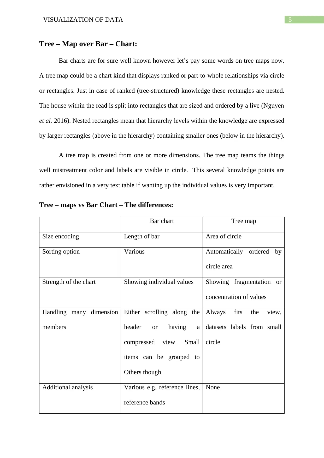
Tree – Map over Bar – Chart:
Bar charts are for sure well known however let’s pay some words on tree maps now.
A tree map could be a chart kind that displays ranked or part-to-whole relationships via circle
or rectangles. Just in case of ranked (tree-structured) knowledge these rectangles are nested.
The house within the read is split into rectangles that are sized and ordered by a live (Nguyen
et al. 2016). Nested rectangles mean that hierarchy levels within the knowledge are expressed
by larger rectangles (above in the hierarchy) containing smaller ones (below in the hierarchy).
A tree map is created from one or more dimensions. The tree map teams the things
well mistreatment color and labels are visible in circle. This several knowledge points are
rather envisioned in a very text table if wanting up the individual values is very important.
Tree – maps vs Bar Chart – The differences:
Bar chart Tree map
Size encoding Length of bar Area of circle
Sorting option Various Automatically ordered by
circle area
Strength of the chart Showing individual values Showing fragmentation or
concentration of values
Handling many dimension
members
Either scrolling along the
header or having a
compressed view. Small
items can be grouped to
Others though
Always fits the view,
datasets labels from small
circle
Additional analysis Various e.g. reference lines,
reference bands
None
⊘ This is a preview!⊘
Do you want full access?
Subscribe today to unlock all pages.
Trusted by 1+ million students worldwide
6VISUALIZATION OF DATA
Limitation on the values of
the measure
None Size can only be zero or
positive, no measure with
negative values.
Visualizing Large Data:
Today, organizations generate and collect knowledge every minute (Limberger et al.
2016). The huge amount of information produced, called huge knowledge, introduce fresh
difficulties to visual picture due to the speed, size and range of information to consider. A
business requires the quantity, choice and rate of such data information to technologically
exit its temperature to drive intelligence for efficient choice. New and many refined visual
image techniques supported core information analysis fundamentals not only take into
account the cardinality, but also the structure and hence the origin of such data.
Bar chart:
Bar charts is used for comparison of the quantities of various classes and teams
(Agrawal Dai and Andres 2015). With the help of bars, class values are described and
intended with either vertical or horizontal bars, with the length or height of each bar
representing the value.
Network Diagram:
The Network Diagram is also a visualization process that may be used for semi
structured or unstructured knowledge is that the network diagram (Nair Shetty and Shetty
2016). Network diagrams depict interactions as nodes (individual actors within the network)
and links (individual relationships). As an instance for analyzing social networks and
mapping product revenues across geographic fields, they are used in several apps.
Paraphrase This Document
Need a fresh take? Get an instant paraphrase of this document with our AI Paraphraser
7VISUALIZATION OF DATA
Review of work and critical thinking on the visualization:
The HBR Insight Center highlights rising thinking around today’s most significant
business ideas. During this Insight Center, we’ll explore the ability of victimization
knowledge visualization to drive business strategy (Smilkov et al. 2017). We’ll mention once
(and when not) to use visualization, the way to start, how to know if you’re obtaining an
honest come on your knowledge visualization investment, and more.
Since the on the market digital data grows speedily, the employment of the knowledge
visualization develops of utmost position to make advanced knowledge examination
responsibilities. With the help of the visualizations, concealed details concerning the info like
designs, outliers and tendencies will be unconcealed (Gallo 2017). Tactical choices will be
established with the insights gained throughout the interactive knowledge survey.
The newest growths in web browser technology have allowed web designers to create
attractive web-based visualizations to focus on broader audience (Pavlopoulos et al. 2015).
This proposition is devoted to examine usage of JavaScript in net applications. When
describing the most concepts and frameworks within the data visual image poetry, variety of
the visualization tools are presented. D3.js is chosen because the visual image structure to
visualize metropolis Unit for Computer-Human Interaction analysis Center’s publication
data.
According to the style issues and research increased from mental image of the
web-based publication info, it's doable to make powerful and reusable interactive
visualizations with JavaScript frameworks (Guldamlasioglu 2015). Concepts and frameworks
stated within the works review worked as a suggestion whereas visualizing the web-based
info.
8VISUALIZATION OF DATA
Conclusion:
Visualization based on JavaScript discussed in this internet document. Data has been
visualized to validate the web-based visualization property of JavaScript. In this report D3.js
has been selected because the structure whereas emerging the attractive charts. Main reasons
to select D3.js because the frame of the picture includes direct manipulation of DOM,
abstractions of information and interaction. Image tasks were performed through the direct
use of the DOM interface. In addition, knowledge abstractions with JSON
objects not solely diode to having recyclable charts, however conjointly allowed the applying
of the Reference Model. After introducing the most principles and ideas of knowledge mental
image, this theory explains web-based tools for visualizing the info. Then, it introduces D3.js
framework for web-based applications and validates the instance suitcases wherever D3.js is
used for visualizing web-based datasets. Finally, it administers the mentioned
characteristics of D3.js to the applying of web-based information mental image. These results
can be used as a suggestion once choosing the suitable tools and theories for
visualizing data. At last the report conclude the review and the critical thinking on the data
visualization.
References:
Ebert, D.S., Fisher, B. and Gaither, K., 2018, January. Introduction to the Minitrack on
Interactive Visual Analytics and Visualization for Decision Making: Making Sense of Big
Data. In Proceedings of the 51st Hawaii International Conference on System Sciences.
Scarsbrook, J.D., Ko, R.K., Rogers, B. and Bainbridge, D., 2018, May. MetropolJS:
visualizing and debugging large-scale Javascript program structure with treemaps.
In Proceedings of the 26th Conference on Program Comprehension (pp. 389-392). ACM.
⊘ This is a preview!⊘
Do you want full access?
Subscribe today to unlock all pages.
Trusted by 1+ million students worldwide
9VISUALIZATION OF DATA
Wang, R., Perez‐Riverol, Y., Hermjakob, H. and Vizcaíno, J.A., 2015. Open source libraries
and frameworks for biological data visualisation: A guide for developers. Proteomics, 15(8),
pp.1356-1374.
Nguyen, H.T., Wei, L., Bhatele, A., Gamblin, T., Boehme, D., Schulz, M., Ma, K.L. and
Bremer, P.T., 2016, November. Vipact: a visualization interface for analyzing calling context
trees. In 2016 Third Workshop on Visual Performance Analysis (VPA) (pp. 25-28). IEEE.
Limberger, D., Scheibel, W., Lemme, S. and Döllner, J., 2016, July. Dynamic 2.5 D treemaps
using declarative 3D on the web. In Proceedings of the 21st International Conference on
Web3D Technology (pp. 33-36). ACM.
Agrawal, R., Kadadi, A., Dai, X. and Andres, F., 2015, October. Challenges and
opportunities with big data visualization. In Proceedings of the 7th International Conference
on Management of computational and collective intElligence in Digital EcoSystems (pp. 169-
173). ACM.
Nair, L., Shetty, S. and Shetty, S., 2016. Interactive visual analytics on Big Data: Tableau vs
D3. js. Journal of e-Learning and Knowledge Society, 12(4).
Smilkov, D., Carter, S., Sculley, D., Viégas, F.B. and Wattenberg, M., 2017. Direct-
manipulation visualization of deep networks. arXiv preprint arXiv:1708.03788.
Gallo, A., 2017. HBR Guide to Dealing with Conflict (HBR Guide Series). Harvard Business
Review Press.
Pavlopoulos, G.A., Malliarakis, D., Papanikolaou, N., Theodosiou, T., Enright, A.J. and
Iliopoulos, I., 2015. Visualizing genome and systems biology: technologies, tools,
implementation techniques and trends, past, present and future. Gigascience, 4(1), p.38.
Paraphrase This Document
Need a fresh take? Get an instant paraphrase of this document with our AI Paraphraser

10VISUALIZATION OF DATA
Guldamlasioglu, S., 2015. Web-based information visualization using JavaScript (Master's
thesis).
Guldamlasioglu, S., 2015. Web-based information visualization using JavaScript (Master's
thesis).
1 out of 11

Your All-in-One AI-Powered Toolkit for Academic Success.
+13062052269
info@desklib.com
Available 24*7 on WhatsApp / Email
![[object Object]](/_next/static/media/star-bottom.7253800d.svg)
Unlock your academic potential
Copyright © 2020–2026 A2Z Services. All Rights Reserved. Developed and managed by ZUCOL.