CERTIFICATE IN E-COMMERCE MANAGEMENT LEVEL 3: Software and Solutions
VerifiedAdded on 2020/11/30
|28
|4951
|126
Report
AI Summary
This report, part of the Certificate in E-Commerce Management Level 3, Unit 2, delves into e-commerce software options and solutions. It begins by evaluating different software types, including content management systems and e-commerce server packages, and discusses the importance of web hosting and its associated considerations like bandwidth, uptime, and customization. The report then explores various software options, such as "out of the box" solutions like Shopify, specialized software, custom designs, and in-house solutions. The second part of the report focuses on building an online store, covering essential elements like domain names, site organization, the top-level page, and the importance of a clear call to action. It also examines website navigation, including search boxes and menus. Finally, the report addresses product pages, highlighting essential elements such as product names, descriptions, images, and customer reviews, as well as the features of a shopping cart and effective checkout processes.
CERTIFICATE IN E-COMMERCE MANAGEMENT LEVEL 3
P a g e 1 | 28
3
Learning Outcomes
By the end of this unit the learner will be able to:
Evaluate e-commerce software options.
Build an online store with product pages, supporting features, a shopping
cart, and an effective checkout process
UNIT-2 Software Options and
Solutions
P a g e 1 | 28
3
Learning Outcomes
By the end of this unit the learner will be able to:
Evaluate e-commerce software options.
Build an online store with product pages, supporting features, a shopping
cart, and an effective checkout process
UNIT-2 Software Options and
Solutions
Paraphrase This Document
Need a fresh take? Get an instant paraphrase of this document with our AI Paraphraser
CERTIFICATE IN E-COMMERCE MANAGEMENT LEVEL 3
P a g e 2 | 28
Unit 2
Software Options and Solutions
Looking at the Options
Software and Services Required for E-Commerce Businesses
An e-commerce business typically requires two types of software. The first element is a content
management system, which will host all the back-end features for your business (such as inventory
management and web page content). The second element is an e-commerce server package, which will
host all the customer-facing (front-end) features for your business, such as online catalogs and credit
card processing. These two systems may be separate software packages that can be connected together,
or they may be part of an integrated software suite.
You will also need a web host that will broadcast your site to the Internet. Most e-commerce businesses
choose a hosting company to do this for them. When evaluating hosting companies, be sure to find out:
How many pages are included with a site package
What the site size limit is
What the bandwidth is
How many users are supported
If there is a guaranteed uptime percentage
What content management systems and e-commerce server packages they support, or if
certain features (such as shopping cart services) are built in
What level of customization is supported (for example, can users make changes to web
pages or does the hosting company make all site changes)
All fees and taxes
Be sure to test some sites that are currently hosted by the company that you are looking at to evaluate
their speed and functionality.
Options for Your Business
Let’s take a look at the most common options for e-commerce server software.
Out of the Box
Your first option is to choose an online service that provides all the tools you will need via an online
interface, as well as templates to get started. Shopify, Yahoo! Small Business, Volusion, and Amazon all
provide this type of service. This option is best if you have a small budget and a simple business.
CERTIFICATE IN E-COMMERCE MANAGEMENT LEVEL 3
P a g e 3 | 28
Specialized Software
There are also a number of more advanced software options that are highly customizable, such as IBM
WebSphere Commerce, Magelia WebStore, and NetSuite. This is the route chosen by most start-up e-
commerce businesses, as it maximizes customizability and features while keeping costs low.
Custom Design
Another option is to have a technical design firm create a custom solution for your company, built from
the ground up. Although this option is quite expensive, it is often used by large retailers who have
specific needs and a large budget.
In-House Solution
The final option is to build a solution in-house from the ground up. This is ideal if your business has the
experience required, but it can be a time-consuming endeavor.
Test Driving
Set up and test an e-commerce site.
As of this writing, free trials were available from the following sites:
Shopify.com (http://www.shopify.com/free-trial)
Volusion (http://www.volusion.com/free-trial)
Pinnacle Cart (https://www.pinnaclecart.com/trial/)
Please note : the sites listed above are for reference purposes only and we do not endorse any of the
listed sites. These links were accurate at the time of publication.
Use the space below to record your observations about the e-commerce site you chose.
⊘ This is a preview!⊘
Do you want full access?
Subscribe today to unlock all pages.
Trusted by 1+ million students worldwide
CERTIFICATE IN E-COMMERCE MANAGEMENT LEVEL 3
P a g e 4 | 28
Building Your Online Store
Your Internet Address
The setup of your e-commerce store will depend on your company and what products and/or services
you offer. However, there are some basic elements that all stores contain and that should be optimized.
First, let’s look at what customers will see first: your domain name and your top-level page.
Domain Name
Your domain name will be your business’ Internet address, so make sure that it is easy to remember and
type. Consider using an alternative top-level domain like .biz or .info if the .com version is taken. As of
this writing, top-level domain names are becoming more diverse and experts are predicting that they will
take on more importance in the coming years.
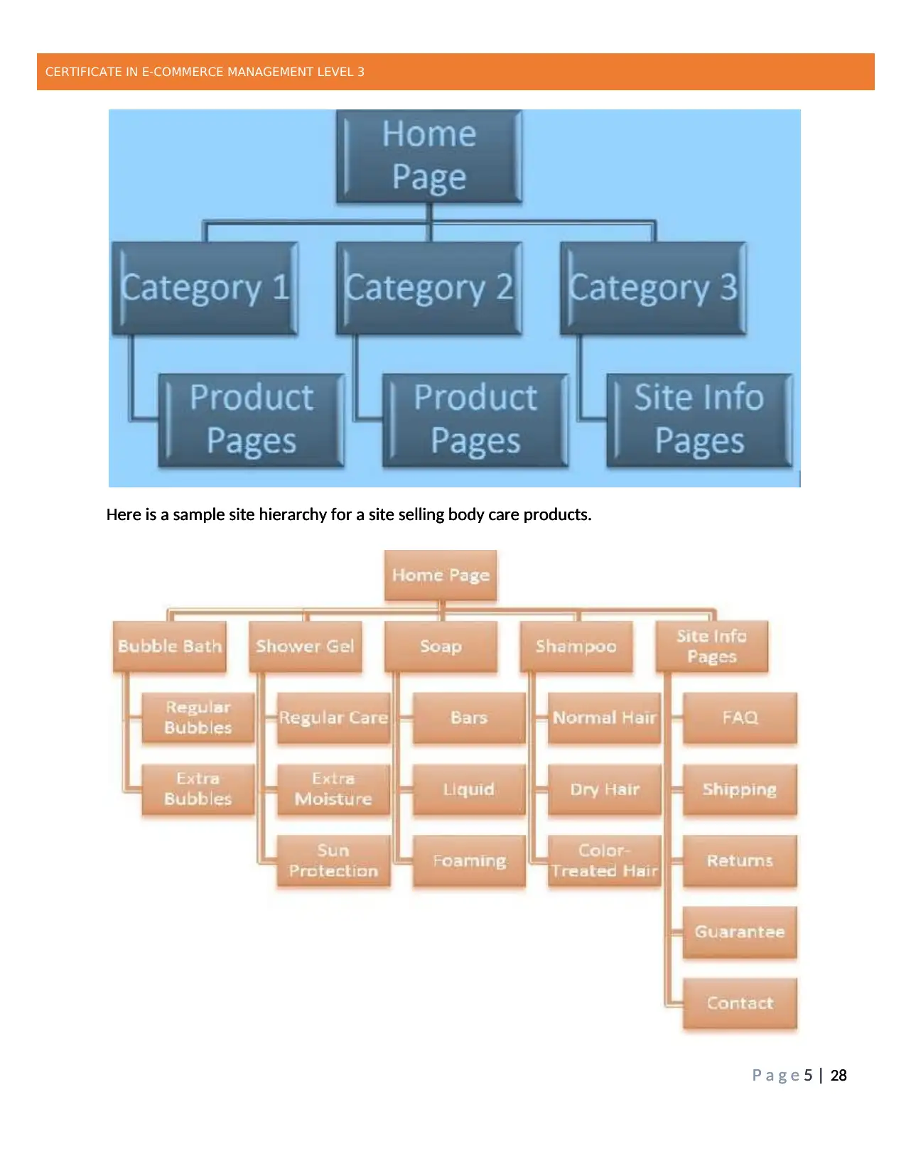
Overall Site Organization
Typically, a website will have a three-tier setup that makes it easy to navigate through the site and find
information. Product pages are typically organized by category (and sometimes further by sub-category),
with an additional category for site information pages. Links to these information pages are usually
displayed in the footer of every site page for easy access.
P a g e 4 | 28
Building Your Online Store
Your Internet Address
The setup of your e-commerce store will depend on your company and what products and/or services
you offer. However, there are some basic elements that all stores contain and that should be optimized.
First, let’s look at what customers will see first: your domain name and your top-level page.
Domain Name
Your domain name will be your business’ Internet address, so make sure that it is easy to remember and
type. Consider using an alternative top-level domain like .biz or .info if the .com version is taken. As of
this writing, top-level domain names are becoming more diverse and experts are predicting that they will
take on more importance in the coming years.
Overall Site Organization
Typically, a website will have a three-tier setup that makes it easy to navigate through the site and find
information. Product pages are typically organized by category (and sometimes further by sub-category),
with an additional category for site information pages. Links to these information pages are usually
displayed in the footer of every site page for easy access.
Paraphrase This Document
Need a fresh take? Get an instant paraphrase of this document with our AI Paraphraser
CERTIFICATE IN E-COMMERCE MANAGEMENT LEVEL 3
P a g e 5 | 28
Here is a sample site hierarchy for a site selling body care products.
CERTIFICATE IN E-COMMERCE MANAGEMENT LEVEL 3
P a g e 5 | 28
Here is a sample site hierarchy for a site selling body care products.
CERTIFICATE IN E-COMMERCE MANAGEMENT LEVEL 3
P a g e 5 | 28
Here is a sample site hierarchy for a site selling body care products.
P a g e 5 | 28
Here is a sample site hierarchy for a site selling body care products.
CERTIFICATE IN E-COMMERCE MANAGEMENT LEVEL 3
P a g e 5 | 28
Here is a sample site hierarchy for a site selling body care products.
CERTIFICATE IN E-COMMERCE MANAGEMENT LEVEL 3
P a g e 5 | 28
Here is a sample site hierarchy for a site selling body care products.
CERTIFICATE IN E-COMMERCE MANAGEMENT LEVEL 3
P a g e 6 | 28
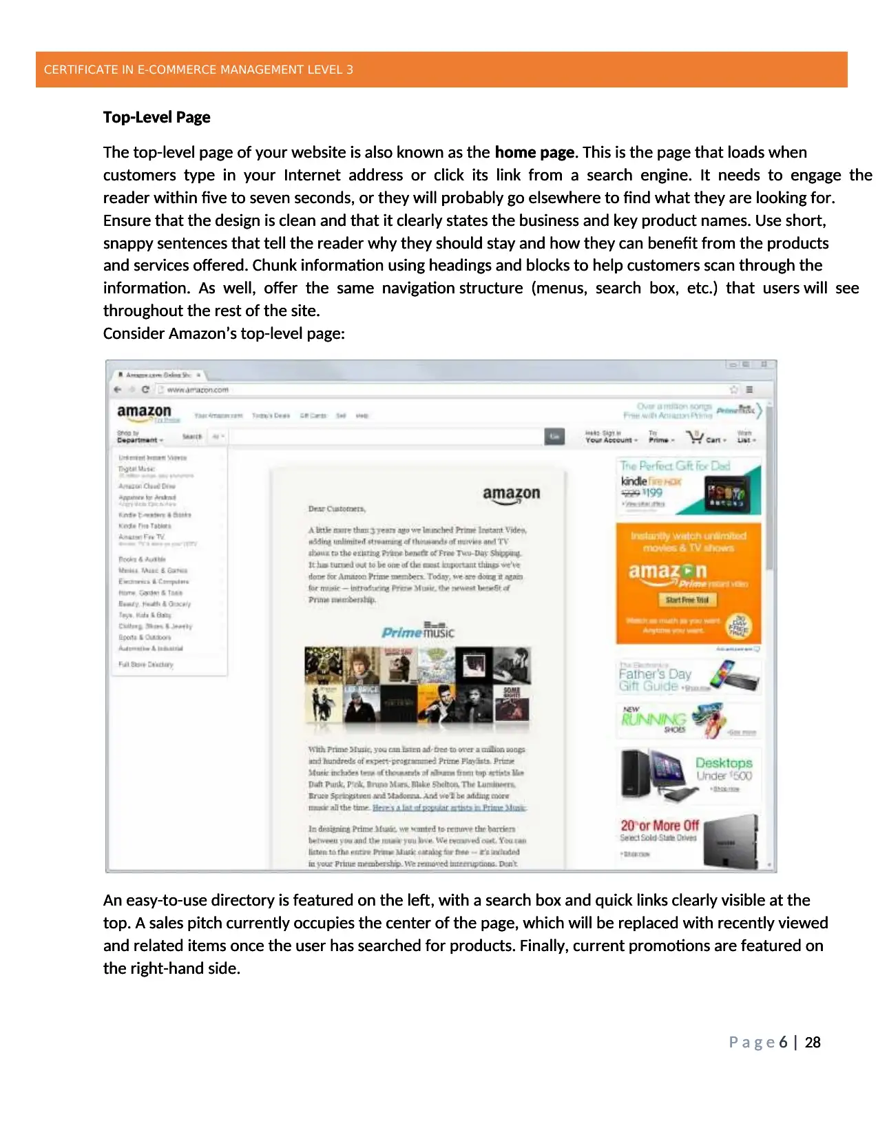
Top-Level Page
The top-level page of your website is also known as the home page. This is the page that loads when
customers type in your Internet address or click its link from a search engine. It needs to engage the
reader within five to seven seconds, or they will probably go elsewhere to find what they are looking for.
Ensure that the design is clean and that it clearly states the business and key product names. Use short,
snappy sentences that tell the reader why they should stay and how they can benefit from the products
and services offered. Chunk information using headings and blocks to help customers scan through the
information. As well, offer the same navigation structure (menus, search box, etc.) that users will see
throughout the rest of the site.
Consider Amazon’s top-level page:
An easy-to-use directory is featured on the left, with a search box and quick links clearly visible at the
top. A sales pitch currently occupies the center of the page, which will be replaced with recently viewed
and related items once the user has searched for products. Finally, current promotions are featured on
the right-hand side.
CERTIFICATE IN E-COMMERCE MANAGEMENT LEVEL 3
P a g e 6 | 28
Top-Level Page
The top-level page of your website is also known as the home page. This is the page that loads when
customers type in your Internet address or click its link from a search engine. It needs to engage the
reader within five to seven seconds, or they will probably go elsewhere to find what they are looking for.
Ensure that the design is clean and that it clearly states the business and key product names. Use short,
snappy sentences that tell the reader why they should stay and how they can benefit from the products
and services offered. Chunk information using headings and blocks to help customers scan through the
information. As well, offer the same navigation structure (menus, search box, etc.) that users will see
throughout the rest of the site.
Consider Amazon’s top-level page:
An easy-to-use directory is featured on the left, with a search box and quick links clearly visible at the
top. A sales pitch currently occupies the center of the page, which will be replaced with recently viewed
and related items once the user has searched for products. Finally, current promotions are featured on
the right-hand side.
CERTIFICATE IN E-COMMERCE MANAGEMENT LEVEL 3
P a g e 6 | 28
Top-Level Page
The top-level page of your website is also known as the home page. This is the page that loads when
customers type in your Internet address or click its link from a search engine. It needs to engage the
reader within five to seven seconds, or they will probably go elsewhere to find what they are looking for.
Ensure that the design is clean and that it clearly states the business and key product names. Use short,
snappy sentences that tell the reader why they should stay and how they can benefit from the products
and services offered. Chunk information using headings and blocks to help customers scan through the
information. As well, offer the same navigation structure (menus, search box, etc.) that users will see
throughout the rest of the site.
Consider Amazon’s top-level page:
An easy-to-use directory is featured on the left, with a search box and quick links clearly visible at the
top. A sales pitch currently occupies the center of the page, which will be replaced with recently viewed
and related items once the user has searched for products. Finally, current promotions are featured on
the right-hand side.
⊘ This is a preview!⊘
Do you want full access?
Subscribe today to unlock all pages.
Trusted by 1+ million students worldwide
CERTIFICATE IN E-COMMERCE MANAGEMENT LEVEL 3
P a g e 7 | 28
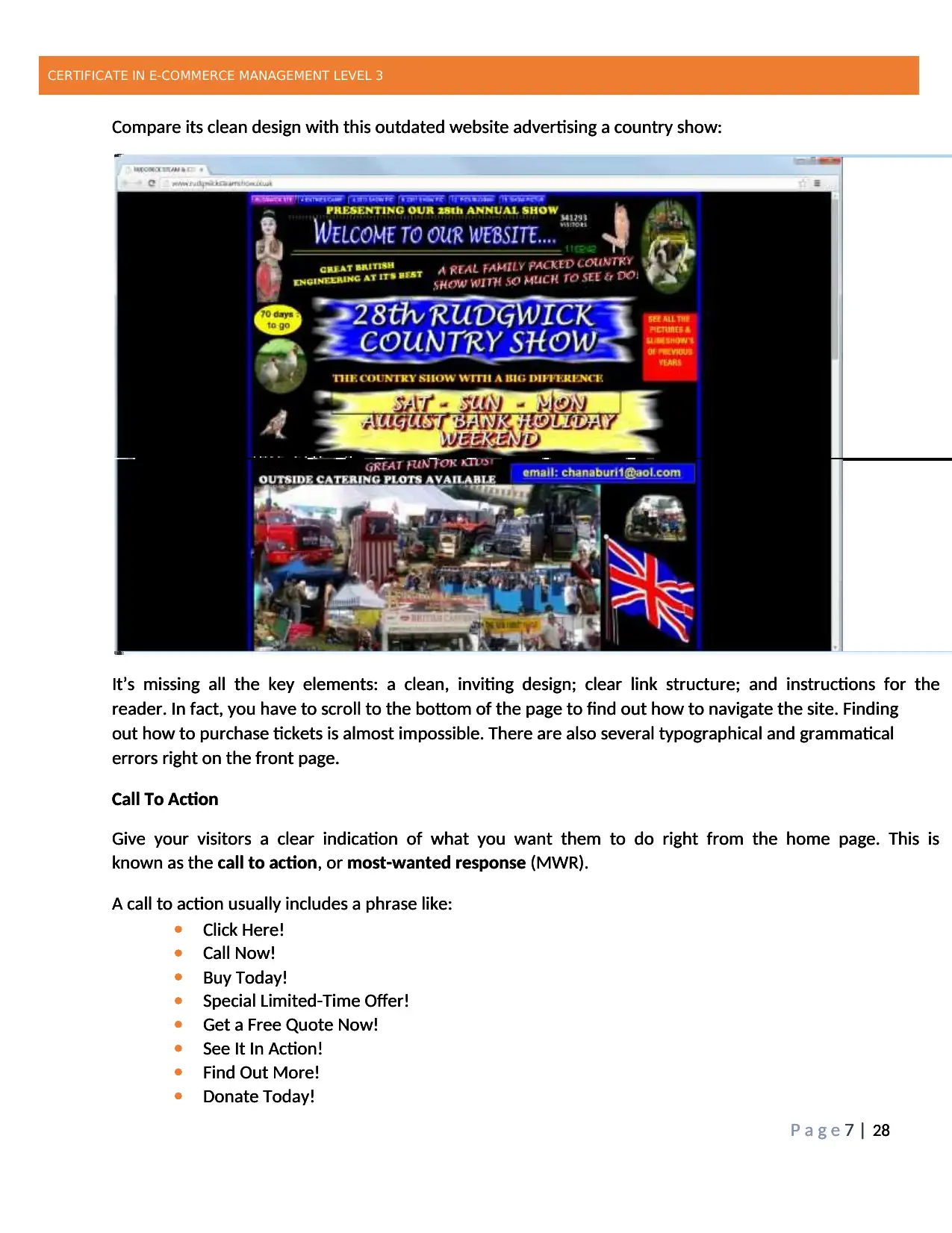
Compare its clean design with this outdated website advertising a country show:
It’s missing all the key elements: a clean, inviting design; clear link structure; and instructions for the
reader. In fact, you have to scroll to the bottom of the page to find out how to navigate the site. Finding
out how to purchase tickets is almost impossible. There are also several typographical and grammatical
errors right on the front page.
Call To Action
Give your visitors a clear indication of what you want them to do right from the home page. This is
known as the call to action, or most-wanted response (MWR).
A call to action usually includes a phrase like:
Click Here!
Call Now!
Buy Today!
Special Limited-Time Offer!
Get a Free Quote Now!
See It In Action!
Find Out More!
Donate Today!
CERTIFICATE IN E-COMMERCE MANAGEMENT LEVEL 3
P a g e 7 | 28
Compare its clean design with this outdated website advertising a country show:
It’s missing all the key elements: a clean, inviting design; clear link structure; and instructions for the
reader. In fact, you have to scroll to the bottom of the page to find out how to navigate the site. Finding
out how to purchase tickets is almost impossible. There are also several typographical and grammatical
errors right on the front page.
Call To Action
Give your visitors a clear indication of what you want them to do right from the home page. This is
known as the call to action, or most-wanted response (MWR).
A call to action usually includes a phrase like:
Click Here!
Call Now!
Buy Today!
Special Limited-Time Offer!
Get a Free Quote Now!
See It In Action!
Find Out More!
Donate Today!
CERTIFICATE IN E-COMMERCE MANAGEMENT LEVEL 3
P a g e 7 | 28
Compare its clean design with this outdated website advertising a country show:
It’s missing all the key elements: a clean, inviting design; clear link structure; and instructions for the
reader. In fact, you have to scroll to the bottom of the page to find out how to navigate the site. Finding
out how to purchase tickets is almost impossible. There are also several typographical and grammatical
errors right on the front page.
Call To Action
Give your visitors a clear indication of what you want them to do right from the home page. This is
known as the call to action, or most-wanted response (MWR).
A call to action usually includes a phrase like:
Click Here!
Call Now!
Buy Today!
Special Limited-Time Offer!
Get a Free Quote Now!
See It In Action!
Find Out More!
Donate Today!
Paraphrase This Document
Need a fresh take? Get an instant paraphrase of this document with our AI Paraphraser
CERTIFICATE IN E-COMMERCE MANAGEMENT LEVEL 3
P a g e 8 | 28
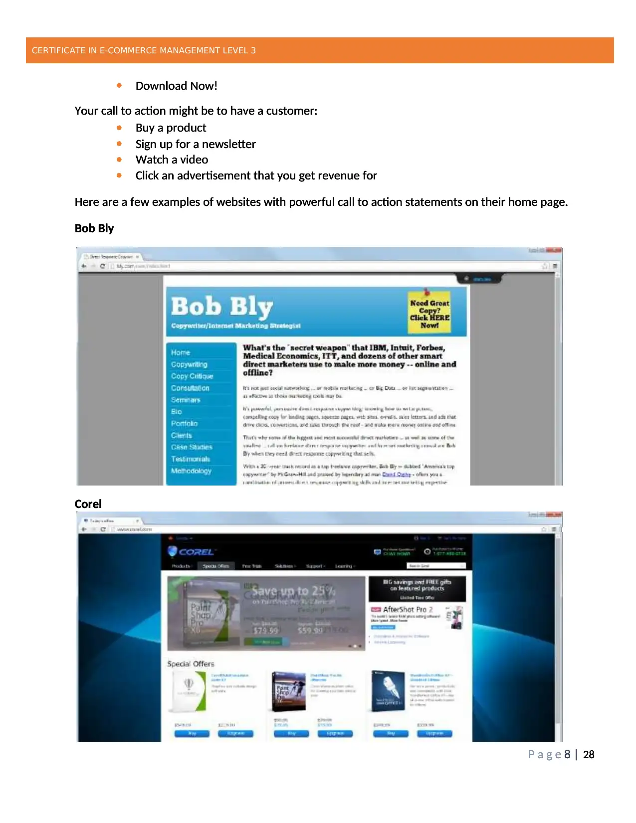
Download Now!
Your call to action might be to have a customer:
Buy a product
Sign up for a newsletter
Watch a video
Click an advertisement that you get revenue for
Here are a few examples of websites with powerful call to action statements on their home page.
Bob Bly
Corel
CERTIFICATE IN E-COMMERCE MANAGEMENT LEVEL 3
P a g e 8 | 28
Download Now!
Your call to action might be to have a customer:
Buy a product
Sign up for a newsletter
Watch a video
Click an advertisement that you get revenue for
Here are a few examples of websites with powerful call to action statements on their home page.
Bob Bly
Corel
P a g e 8 | 28
Download Now!
Your call to action might be to have a customer:
Buy a product
Sign up for a newsletter
Watch a video
Click an advertisement that you get revenue for
Here are a few examples of websites with powerful call to action statements on their home page.
Bob Bly
Corel
CERTIFICATE IN E-COMMERCE MANAGEMENT LEVEL 3
P a g e 8 | 28
Download Now!
Your call to action might be to have a customer:
Buy a product
Sign up for a newsletter
Watch a video
Click an advertisement that you get revenue for
Here are a few examples of websites with powerful call to action statements on their home page.
Bob Bly
Corel
CERTIFICATE IN E-COMMERCE MANAGEMENT LEVEL 3
P a g e 9 | 28
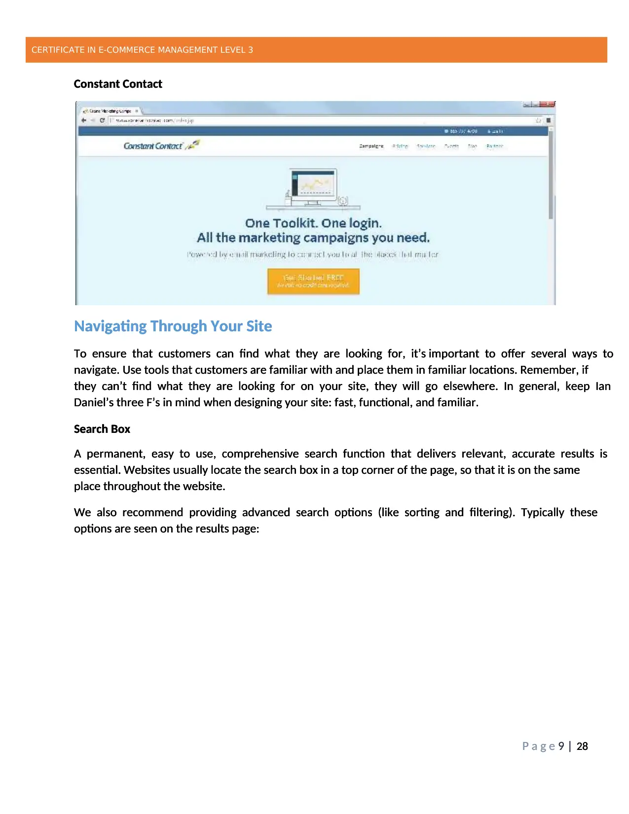
Constant Contact
Navigating Through Your Site
To ensure that customers can find what they are looking for, it’s important to offer several ways to
navigate. Use tools that customers are familiar with and place them in familiar locations. Remember, if
they can’t find what they are looking for on your site, they will go elsewhere. In general, keep Ian
Daniel’s three F’s in mind when designing your site: fast, functional, and familiar.
Search Box
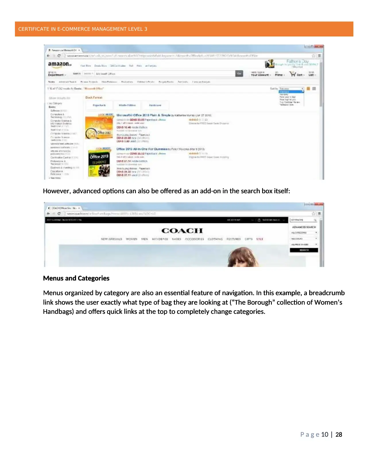
A permanent, easy to use, comprehensive search function that delivers relevant, accurate results is
essential. Websites usually locate the search box in a top corner of the page, so that it is on the same
place throughout the website.
We also recommend providing advanced search options (like sorting and filtering). Typically these
options are seen on the results page:
CERTIFICATE IN E-COMMERCE MANAGEMENT LEVEL 3
P a g e 9 | 28
Constant Contact
Navigating Through Your Site
To ensure that customers can find what they are looking for, it’s important to offer several ways to
navigate. Use tools that customers are familiar with and place them in familiar locations. Remember, if
they can’t find what they are looking for on your site, they will go elsewhere. In general, keep Ian
Daniel’s three F’s in mind when designing your site: fast, functional, and familiar.
Search Box
A permanent, easy to use, comprehensive search function that delivers relevant, accurate results is
essential. Websites usually locate the search box in a top corner of the page, so that it is on the same
place throughout the website.
We also recommend providing advanced search options (like sorting and filtering). Typically these
options are seen on the results page:
CERTIFICATE IN E-COMMERCE MANAGEMENT LEVEL 3
P a g e 9 | 28
Constant Contact
Navigating Through Your Site
To ensure that customers can find what they are looking for, it’s important to offer several ways to
navigate. Use tools that customers are familiar with and place them in familiar locations. Remember, if
they can’t find what they are looking for on your site, they will go elsewhere. In general, keep Ian
Daniel’s three F’s in mind when designing your site: fast, functional, and familiar.
Search Box
A permanent, easy to use, comprehensive search function that delivers relevant, accurate results is
essential. Websites usually locate the search box in a top corner of the page, so that it is on the same
place throughout the website.
We also recommend providing advanced search options (like sorting and filtering). Typically these
options are seen on the results page:
⊘ This is a preview!⊘
Do you want full access?
Subscribe today to unlock all pages.
Trusted by 1+ million students worldwide
CERTIFICATE IN E-COMMERCE MANAGEMENT LEVEL 3
P a g e 10 | 28
However, advanced options can also be offered as an add-on in the search box itself:
Menus and Categories
Menus organized by category are also an essential feature of navigation. In this example, a breadcrumb
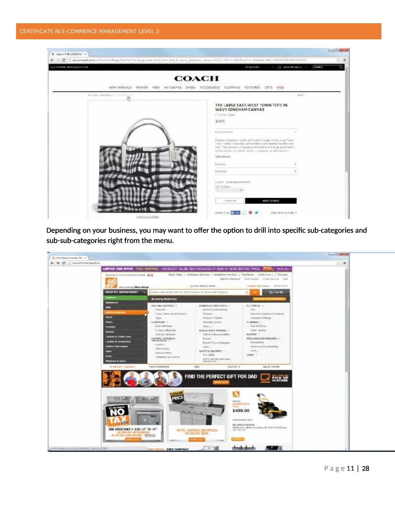
link shows the user exactly what type of bag they are looking at (“The Borough” collection of Women’s
Handbags) and offers quick links at the top to completely change categories.
CERTIFICATE IN E-COMMERCE MANAGEMENT LEVEL 3
P a g e 10 | 28
However, advanced options can also be offered as an add-on in the search box itself:
Menus and Categories
Menus organized by category are also an essential feature of navigation. In this example, a breadcrumb
link shows the user exactly what type of bag they are looking at (“The Borough” collection of Women’s
Handbags) and offers quick links at the top to completely change categories.
CERTIFICATE IN E-COMMERCE MANAGEMENT LEVEL 3
P a g e 10 | 28
However, advanced options can also be offered as an add-on in the search box itself:
Menus and Categories
Menus organized by category are also an essential feature of navigation. In this example, a breadcrumb
link shows the user exactly what type of bag they are looking at (“The Borough” collection of Women’s
Handbags) and offers quick links at the top to completely change categories.
Paraphrase This Document
Need a fresh take? Get an instant paraphrase of this document with our AI Paraphraser
CERTIFICATE IN E-COMMERCE MANAGEMENT LEVEL 3
P a g e 11 | 28
Depending on your business, you may want to offer the option to drill into specific sub-categories and
sub-sub-categories right from the menu.
CERTIFICATE IN E-COMMERCE MANAGEMENT LEVEL 3
P a g e 11 | 28
Depending on your business, you may want to offer the option to drill into specific sub-categories and
sub-sub-categories right from the menu.
CERTIFICATE IN E-COMMERCE MANAGEMENT LEVEL 3
P a g e 11 | 28
Depending on your business, you may want to offer the option to drill into specific sub-categories and
sub-sub-categories right from the menu.
P a g e 11 | 28
Depending on your business, you may want to offer the option to drill into specific sub-categories and
sub-sub-categories right from the menu.
CERTIFICATE IN E-COMMERCE MANAGEMENT LEVEL 3
P a g e 11 | 28
Depending on your business, you may want to offer the option to drill into specific sub-categories and
sub-sub-categories right from the menu.
CERTIFICATE IN E-COMMERCE MANAGEMENT LEVEL 3
P a g e 11 | 28
Depending on your business, you may want to offer the option to drill into specific sub-categories and
sub-sub-categories right from the menu.
CERTIFICATE IN E-COMMERCE MANAGEMENT LEVEL 3
P a g e 12 | 28
Test Your Knowledge
What experiences they you had with website search tools. Have you ever left a site and gone
elsewhere because you couldn’t find what you needed? What can you take away from this?
Building Effective Product Pages
Essential Page Elements
Each product should be displayed on its own page with the same layout. Here are some things that you
might want to include:
Product name using optimized keywords for search engine indexing
Product description in bullet points, focusing on what it offers the customer
Good-quality image or video that includes alternative text (consider having zoom-in
functionality or links to larger images)
List of available options, such as color or size
Add to Cart/Add to Basket link with options to customize products in the order (quantity,
color, size, model, etc.)
Related information, such as shipping or warranty details
Customer reviews or third-party reviews and ratings
Social media and sharing links
Make the information easy to navigate using headings, tabs, and menus. Provide as much information on
the page as you can without overwhelming the customer. One way to do this is to link to more detailed
information, like manufacturer’s specification pages or FAQ pages.
⊘ This is a preview!⊘
Do you want full access?
Subscribe today to unlock all pages.
Trusted by 1+ million students worldwide
1 out of 28
Related Documents


Your All-in-One AI-Powered Toolkit for Academic Success.
+13062052269
info@desklib.com
Available 24*7 on WhatsApp / Email
![[object Object]](/_next/static/media/star-bottom.7253800d.svg)
Unlock your academic potential
Copyright © 2020–2026 A2Z Services. All Rights Reserved. Developed and managed by ZUCOL.