IMAT 5209 - E-commerce Website Evaluation: Usability and UX Report
VerifiedAdded on 2023/06/14
|26
|6383
|437
Report
AI Summary
This report provides a comprehensive evaluation of an e-commerce website, focusing on usability and user experience. It includes the creation of user personas to represent potential users with varying levels of expertise and needs, a prioritization of user experience issues categorized as high, medium, and low, and a usability specification outlining the desired improvements. The evaluation methodology is detailed, followed by a critique of the website's design and functionality. The report identifies key areas for improvement to enhance the website's effectiveness and user satisfaction, ultimately aiming to increase potential sales and improve the overall user experience for ATARI's online presence.
Running head: EVALUATION OF AN E-COMMERCE WEBSITE
EVALUATION OF AN E-COMMERCE WEBSITE
Name of the Student
Name of the University
Author Note
EVALUATION OF AN E-COMMERCE WEBSITE
Name of the Student
Name of the University
Author Note
Paraphrase This Document
Need a fresh take? Get an instant paraphrase of this document with our AI Paraphraser
1
EVALUATION OF AN E-COMMERCE WEBSITE
Table of Contents
Part ONE: Personas.........................................................................................................................2
Part TWO: User Experience Priorities............................................................................................6
Part THREE: Usability Specification............................................................................................10
Part FOUR: Evaluation Methodology...........................................................................................12
Part FIVE: Evaluation....................................................................................................................13
Part SIX: Critique..........................................................................................................................17
Part SEVEN: Assignment Report..................................................................................................19
Bibliography:.................................................................................................................................20
2
EVALUATION OF AN E-COMMERCE WEBSITE
Part ONE: Personas
This part of the report presents four different personas who is responsible for evaluating
the website. This four different persons are presented as hypothetical users of the interactive
system. This individuals will evaluate the www.best-electronics-ca.com and detailed critique of
the websites focusing on Usability issues. This individuals are chosen for their different expertize
as they will provide different viewpoint that will allow a successful evaluation of the current
website. Under those four individuals, two of them are chosen for the standard reason as they
consists of field knowledge such as website designing and software developing. One of them can
be termed as user of non-standard reason for contributing in evaluation process. Last one is the
user with disabilities as she only has basic interface knowledge of the evaluation process. This
four personas are followed-
Person 1
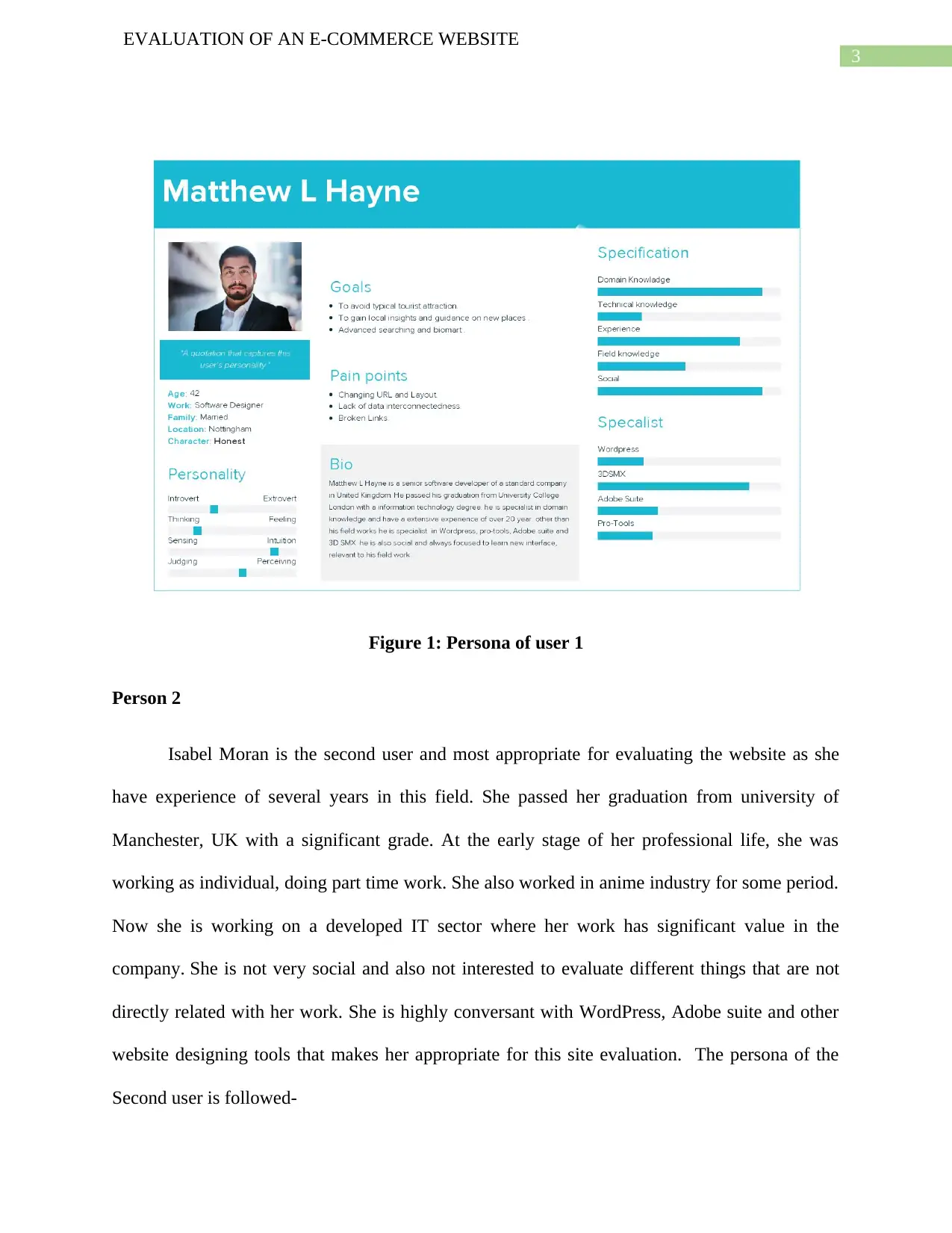
The name of the first user is Matthew L Hayne, a senior software developer of a standard
company in United Kingdom. He passed his graduation from University College London with an
information technology degree. He is specialist in domain knowledge and have an extensive
experience of over 20 year. Other than his field works he is specialist in WordPress, pro-tools,
Adobe suite and 3D SMX. He is also social and always focused to learn new interface,
relevant to his field work. As he is a specialist in the software developer field, he is chosen for
standard reason to evaluate the website in an efficient manner. User 1 persona is followed-
EVALUATION OF AN E-COMMERCE WEBSITE
Part ONE: Personas
This part of the report presents four different personas who is responsible for evaluating
the website. This four different persons are presented as hypothetical users of the interactive
system. This individuals will evaluate the www.best-electronics-ca.com and detailed critique of
the websites focusing on Usability issues. This individuals are chosen for their different expertize
as they will provide different viewpoint that will allow a successful evaluation of the current
website. Under those four individuals, two of them are chosen for the standard reason as they
consists of field knowledge such as website designing and software developing. One of them can
be termed as user of non-standard reason for contributing in evaluation process. Last one is the
user with disabilities as she only has basic interface knowledge of the evaluation process. This
four personas are followed-
Person 1
The name of the first user is Matthew L Hayne, a senior software developer of a standard
company in United Kingdom. He passed his graduation from University College London with an
information technology degree. He is specialist in domain knowledge and have an extensive
experience of over 20 year. Other than his field works he is specialist in WordPress, pro-tools,
Adobe suite and 3D SMX. He is also social and always focused to learn new interface,
relevant to his field work. As he is a specialist in the software developer field, he is chosen for
standard reason to evaluate the website in an efficient manner. User 1 persona is followed-
⊘ This is a preview!⊘
Do you want full access?
Subscribe today to unlock all pages.
Trusted by 1+ million students worldwide
3
EVALUATION OF AN E-COMMERCE WEBSITE
Figure 1: Persona of user 1
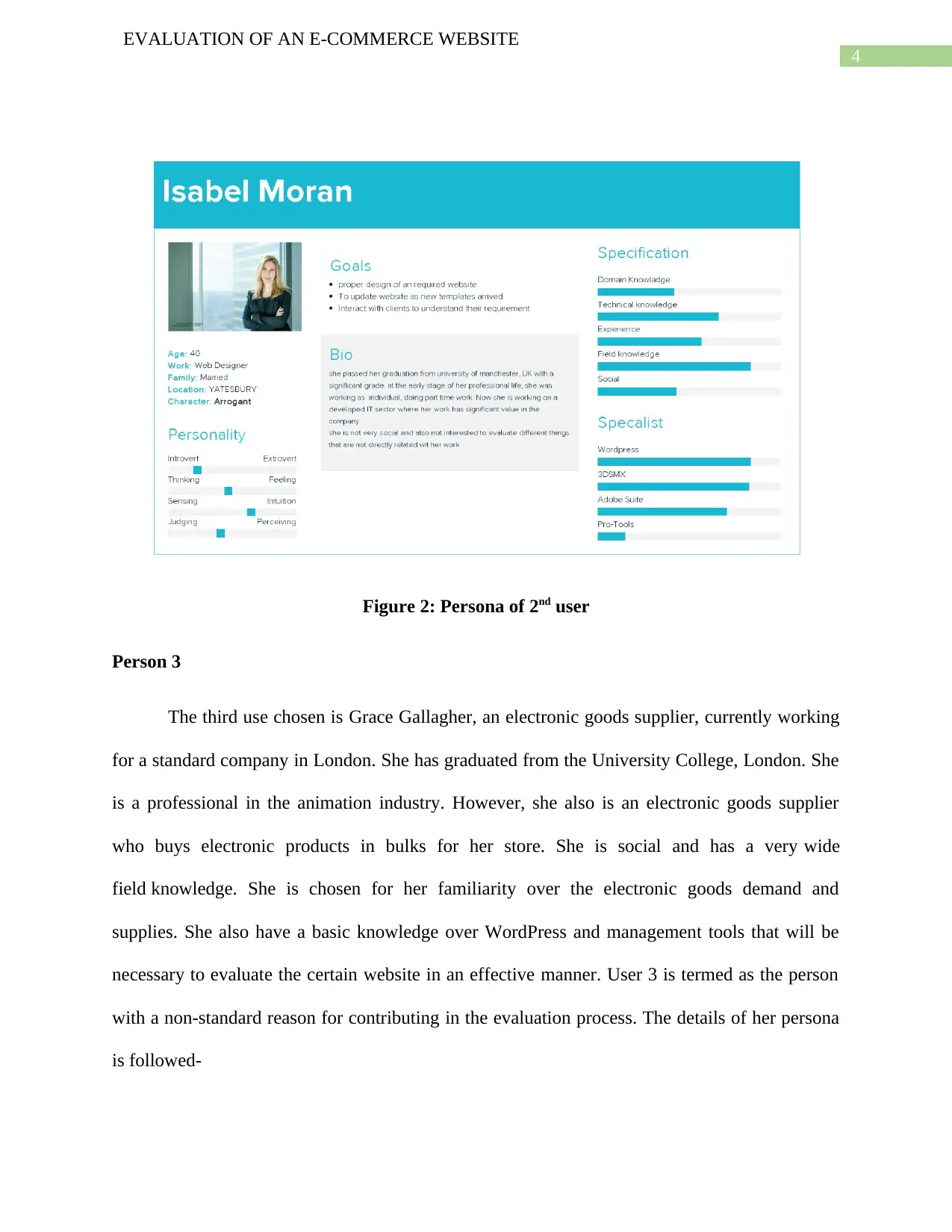
Person 2
Isabel Moran is the second user and most appropriate for evaluating the website as she
have experience of several years in this field. She passed her graduation from university of
Manchester, UK with a significant grade. At the early stage of her professional life, she was
working as individual, doing part time work. She also worked in anime industry for some period.
Now she is working on a developed IT sector where her work has significant value in the
company. She is not very social and also not interested to evaluate different things that are not
directly related with her work. She is highly conversant with WordPress, Adobe suite and other
website designing tools that makes her appropriate for this site evaluation. The persona of the
Second user is followed-
EVALUATION OF AN E-COMMERCE WEBSITE
Figure 1: Persona of user 1
Person 2
Isabel Moran is the second user and most appropriate for evaluating the website as she
have experience of several years in this field. She passed her graduation from university of
Manchester, UK with a significant grade. At the early stage of her professional life, she was
working as individual, doing part time work. She also worked in anime industry for some period.
Now she is working on a developed IT sector where her work has significant value in the
company. She is not very social and also not interested to evaluate different things that are not
directly related with her work. She is highly conversant with WordPress, Adobe suite and other
website designing tools that makes her appropriate for this site evaluation. The persona of the
Second user is followed-
Paraphrase This Document
Need a fresh take? Get an instant paraphrase of this document with our AI Paraphraser
4
EVALUATION OF AN E-COMMERCE WEBSITE
Figure 2: Persona of 2nd user
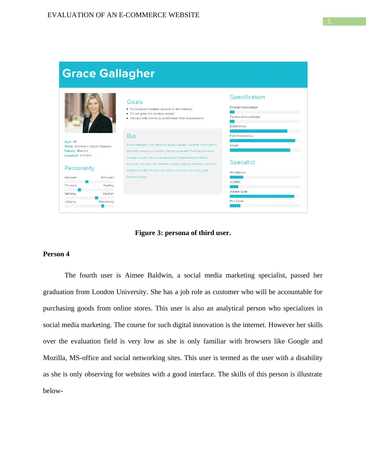
Person 3
The third use chosen is Grace Gallagher, an electronic goods supplier, currently working
for a standard company in London. She has graduated from the University College, London. She
is a professional in the animation industry. However, she also is an electronic goods supplier
who buys electronic products in bulks for her store. She is social and has a very wide
field knowledge. She is chosen for her familiarity over the electronic goods demand and
supplies. She also have a basic knowledge over WordPress and management tools that will be
necessary to evaluate the certain website in an effective manner. User 3 is termed as the person
with a non-standard reason for contributing in the evaluation process. The details of her persona
is followed-
EVALUATION OF AN E-COMMERCE WEBSITE
Figure 2: Persona of 2nd user
Person 3
The third use chosen is Grace Gallagher, an electronic goods supplier, currently working
for a standard company in London. She has graduated from the University College, London. She
is a professional in the animation industry. However, she also is an electronic goods supplier
who buys electronic products in bulks for her store. She is social and has a very wide
field knowledge. She is chosen for her familiarity over the electronic goods demand and
supplies. She also have a basic knowledge over WordPress and management tools that will be
necessary to evaluate the certain website in an effective manner. User 3 is termed as the person
with a non-standard reason for contributing in the evaluation process. The details of her persona
is followed-
5
EVALUATION OF AN E-COMMERCE WEBSITE
Figure 3: persona of third user.
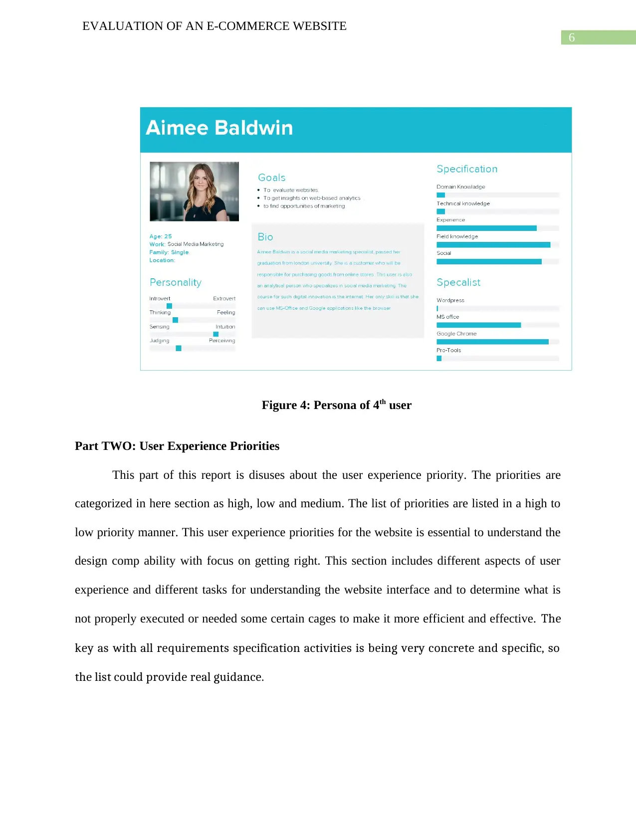
Person 4
The fourth user is Aimee Baldwin, a social media marketing specialist, passed her
graduation from London University. She has a job role as customer who will be accountable for
purchasing goods from online stores. This user is also an analytical person who specializes in
social media marketing. The course for such digital innovation is the internet. However her skills
over the evaluation field is very low as she is only familiar with browsers like Google and
Mozilla, MS-office and social networking sites. This user is termed as the user with a disability
as she is only observing for websites with a good interface. The skills of this person is illustrate
below-
EVALUATION OF AN E-COMMERCE WEBSITE
Figure 3: persona of third user.
Person 4
The fourth user is Aimee Baldwin, a social media marketing specialist, passed her
graduation from London University. She has a job role as customer who will be accountable for
purchasing goods from online stores. This user is also an analytical person who specializes in
social media marketing. The course for such digital innovation is the internet. However her skills
over the evaluation field is very low as she is only familiar with browsers like Google and
Mozilla, MS-office and social networking sites. This user is termed as the user with a disability
as she is only observing for websites with a good interface. The skills of this person is illustrate
below-
⊘ This is a preview!⊘
Do you want full access?
Subscribe today to unlock all pages.
Trusted by 1+ million students worldwide
6
EVALUATION OF AN E-COMMERCE WEBSITE
Figure 4: Persona of 4th user
Part TWO: User Experience Priorities
This part of this report is disuses about the user experience priority. The priorities are
categorized in here section as high, low and medium. The list of priorities are listed in a high to
low priority manner. This user experience priorities for the website is essential to understand the
design comp ability with focus on getting right. This section includes different aspects of user
experience and different tasks for understanding the website interface and to determine what is
not properly executed or needed some certain cages to make it more efficient and effective. The
key as with all requirements specification activities is being very concrete and specific, so
the list could provide real guidance.
Paraphrase This Document
Need a fresh take? Get an instant paraphrase of this document with our AI Paraphraser
7
EVALUATION OF AN E-COMMERCE WEBSITE
1. Lack of Professional Design: - The basic priorities for making an efficient website is the
design. This website is very poorly designed. The whole structure of this website is
lengthy and the interface is very peculiar. The design is very incongruous as it is literally
impossible to understand the goal of the website as what this website about and what it is
for. A decent website must has an effective design that can be define as highest priority
where this websites lack intensely.
2. Dynamic Site-Links: - The website is very long and consist of more than 28 sections
while it does not have any navigation tabs. Every section is thoroughly consist in a
similar lengthy page and also no quick navigation link is available to access those section
quickly and in an efficient manner. Users can not even identify all section by visiting the
website index page as they need to scroll through all the pages for accessing some
specific section they are searching for. For this specific reason it is also pointed as a high
priority risk.
3. Text complicity:- This website is mostly consist of enormous text from the top to
bottom. As a result, customers are not impressed by the design that is responsible for
slowing down of potential sales. The text are also not projected in suitable way as the text
sizes and fonts are vague and not well maintained. There are several colored text used
throughout the whole page and for hyperlinks the text colors are not highlighted in an
efficient manner. This is also considered as high priority.
4. Lack of product Showcasing: this website is mostly consist of text about the company’s
legacy and showcase of some most popular products. This website lacks to provide more
product showcasing and detailed specification of this products. Customers will not able to
8
EVALUATION OF AN E-COMMERCE WEBSITE
get correct and desired specification of some certain products they may want to purchase
as it may decrease the potential sale rate. This lacks are considered as medium priority.
5. Lack of information about company: This can be considered as medium priority risk as
customer needs brand information and validation in order to gain trust on ATARI. All
the information is their legacy related and does not provide clear understanding of their
current service availability.
6. Index page Design: - firstly, the hyperlink for the index is poorly designed. Inside the
index page the contents are also not organized and summarized. Some of the sentences
are also unfinished as does not produce any meaning. All the sections in the index page
merged together without proper header that makes it ineffective. Also sections such as
“Reach us” were repeated twice one in the top and also in bottom. Repetition of same
content makes it more ineffective so it can be considered as medium priority lack.
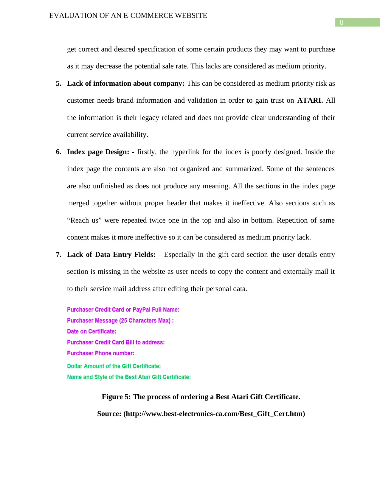
7. Lack of Data Entry Fields: - Especially in the gift card section the user details entry
section is missing in the website as user needs to copy the content and externally mail it
to their service mail address after editing their personal data.
Figure 5: The process of ordering a Best Atari Gift Certificate.
Source: (http://www.best-electronics-ca.com/Best_Gift_Cert.htm)
EVALUATION OF AN E-COMMERCE WEBSITE
get correct and desired specification of some certain products they may want to purchase
as it may decrease the potential sale rate. This lacks are considered as medium priority.
5. Lack of information about company: This can be considered as medium priority risk as
customer needs brand information and validation in order to gain trust on ATARI. All
the information is their legacy related and does not provide clear understanding of their
current service availability.
6. Index page Design: - firstly, the hyperlink for the index is poorly designed. Inside the
index page the contents are also not organized and summarized. Some of the sentences
are also unfinished as does not produce any meaning. All the sections in the index page
merged together without proper header that makes it ineffective. Also sections such as
“Reach us” were repeated twice one in the top and also in bottom. Repetition of same
content makes it more ineffective so it can be considered as medium priority lack.
7. Lack of Data Entry Fields: - Especially in the gift card section the user details entry
section is missing in the website as user needs to copy the content and externally mail it
to their service mail address after editing their personal data.
Figure 5: The process of ordering a Best Atari Gift Certificate.
Source: (http://www.best-electronics-ca.com/Best_Gift_Cert.htm)
⊘ This is a preview!⊘
Do you want full access?
Subscribe today to unlock all pages.
Trusted by 1+ million students worldwide
9
EVALUATION OF AN E-COMMERCE WEBSITE
This is poor interface as user need to put abundant effort to complete the procedure. There
must be a data field entry section from where user can book services directly from the website.
This is also considered as medium priority lack.
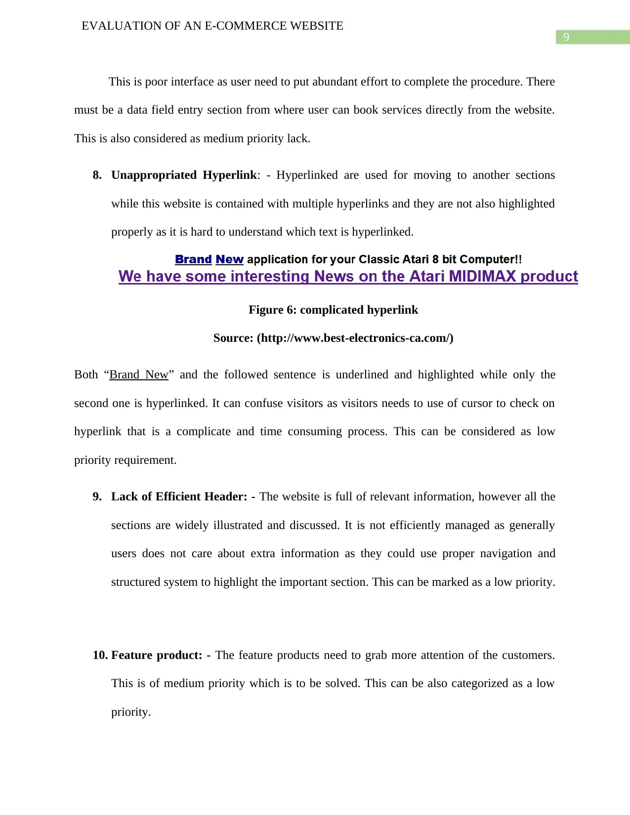
8. Unappropriated Hyperlink: - Hyperlinked are used for moving to another sections
while this website is contained with multiple hyperlinks and they are not also highlighted
properly as it is hard to understand which text is hyperlinked.
Figure 6: complicated hyperlink
Source: (http://www.best-electronics-ca.com/)
Both “Brand New” and the followed sentence is underlined and highlighted while only the
second one is hyperlinked. It can confuse visitors as visitors needs to use of cursor to check on
hyperlink that is a complicate and time consuming process. This can be considered as low
priority requirement.
9. Lack of Efficient Header: - The website is full of relevant information, however all the
sections are widely illustrated and discussed. It is not efficiently managed as generally
users does not care about extra information as they could use proper navigation and
structured system to highlight the important section. This can be marked as a low priority.
10. Feature product: - The feature products need to grab more attention of the customers.
This is of medium priority which is to be solved. This can be also categorized as a low
priority.
EVALUATION OF AN E-COMMERCE WEBSITE
This is poor interface as user need to put abundant effort to complete the procedure. There
must be a data field entry section from where user can book services directly from the website.
This is also considered as medium priority lack.
8. Unappropriated Hyperlink: - Hyperlinked are used for moving to another sections
while this website is contained with multiple hyperlinks and they are not also highlighted
properly as it is hard to understand which text is hyperlinked.
Figure 6: complicated hyperlink
Source: (http://www.best-electronics-ca.com/)
Both “Brand New” and the followed sentence is underlined and highlighted while only the
second one is hyperlinked. It can confuse visitors as visitors needs to use of cursor to check on
hyperlink that is a complicate and time consuming process. This can be considered as low
priority requirement.
9. Lack of Efficient Header: - The website is full of relevant information, however all the
sections are widely illustrated and discussed. It is not efficiently managed as generally
users does not care about extra information as they could use proper navigation and
structured system to highlight the important section. This can be marked as a low priority.
10. Feature product: - The feature products need to grab more attention of the customers.
This is of medium priority which is to be solved. This can be also categorized as a low
priority.
Paraphrase This Document
Need a fresh take? Get an instant paraphrase of this document with our AI Paraphraser
10
EVALUATION OF AN E-COMMERCE WEBSITE
Part THREE: Usability Specification
This section of the report provides a board discussion about the usability specification of
the current design and compare both what is required for an effective approach and what can be
measured. This part also includes how the current website can be modified for getting more
suitable interface and increase the rate of potential sale for ATARI. And it also evaluates how
the new design will help the company to get their desired requirement. The evaluation is strictly
focused on efficiency, learnability, error, satisfaction and memorability with the associate
requirement of ATARI.
Overview
This report is propose of evaluation of current and desired ATARI website. Through
suitable use of various analytical tools the results can be concluded successfully. This section of
this report will present the broad that whether the website will be able to achieve its business
goals. The main purpose of the website is to provide ATARI’s service and connect to various
user all over the world. ATARI is specialize in replacement of electronic parts and accessories
for all consumer based ATARI game systems and ATARI computers for the consumer. Current
design is the basic interface of the ATARI as it is more focused on details more than efficient
design. The current design of the website is constructed by utilizing proper technologies such
that it can achieve the expertness of the owner and stakeholders. Generally, the usability of
website be contingent on the desired goal of the proposed website and the visitors who are
targeted as ATARI product consumers. There is several conflicts which are directly involved for
the adoption of visitor interactions.
11
EVALUATION OF AN E-COMMERCE WEBSITE
A new process of common industry format for requirement is being developed as CIF-R. Mainly
there is three related activities needs to consider while specified the requirement such as
analyzing the context of use, defining scenarios that can be tested and specifying requirements
for efficiency, effectiveness and satisfaction for each section.
Current Website and proposed new design
The current design is vague as it is not well maintained and structured that will probly not
attract users’ attention. The mainly focused audience of the website are the electronic products
buyer including service and replacement seeker. However, the current website is unable to
produce any significant result and attract audience due to the lack of graphics and efficient
design. The competition also increased as ever, that backdated interface of their current website
is holding them down. Also the lack of proper navigation bar and bad graphics presentation is
turning the website ineffective and inefficient. The new design must involve smart graphics
interface. It also need to be structured and new CGI is must for proposed an effective system.
There are certain other aspects needs to update in order to increase potential sale rate. This will
help a customer to reach out to their required product without the need to evaluate the location of
the product. These are the specific requirement need for usability.
There is some learnability requirements to initially captured stakeholders expectation.
Design: the design needs to be changed significantly as the old interface is very dull and
insignificant to attract user attraction.
Accessibility is also needs to be considered as broad a group of people as possible
including people with disabilities.
User friendliness is also required as the current website is incapable of doing so.
⊘ This is a preview!⊘
Do you want full access?
Subscribe today to unlock all pages.
Trusted by 1+ million students worldwide
1 out of 26


Your All-in-One AI-Powered Toolkit for Academic Success.
+13062052269
info@desklib.com
Available 24*7 on WhatsApp / Email
![[object Object]](/_next/static/media/star-bottom.7253800d.svg)
Unlock your academic potential
Copyright © 2020–2026 A2Z Services. All Rights Reserved. Developed and managed by ZUCOL.