ECON7200 - Comparative Study of Income Inequality: Australia & Canada

Verified

Added on  2023/04/25

|9
|1324
|279
Project
AI Summary
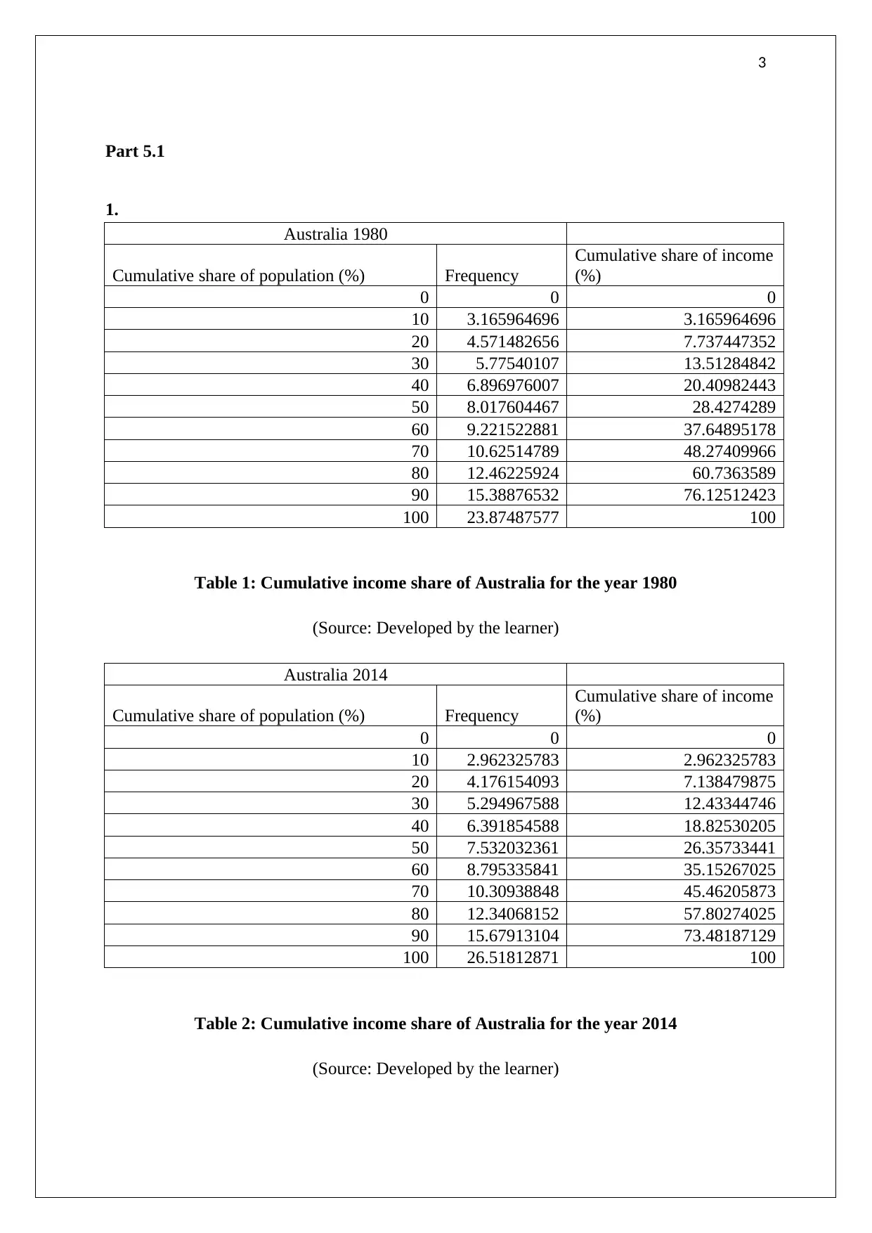
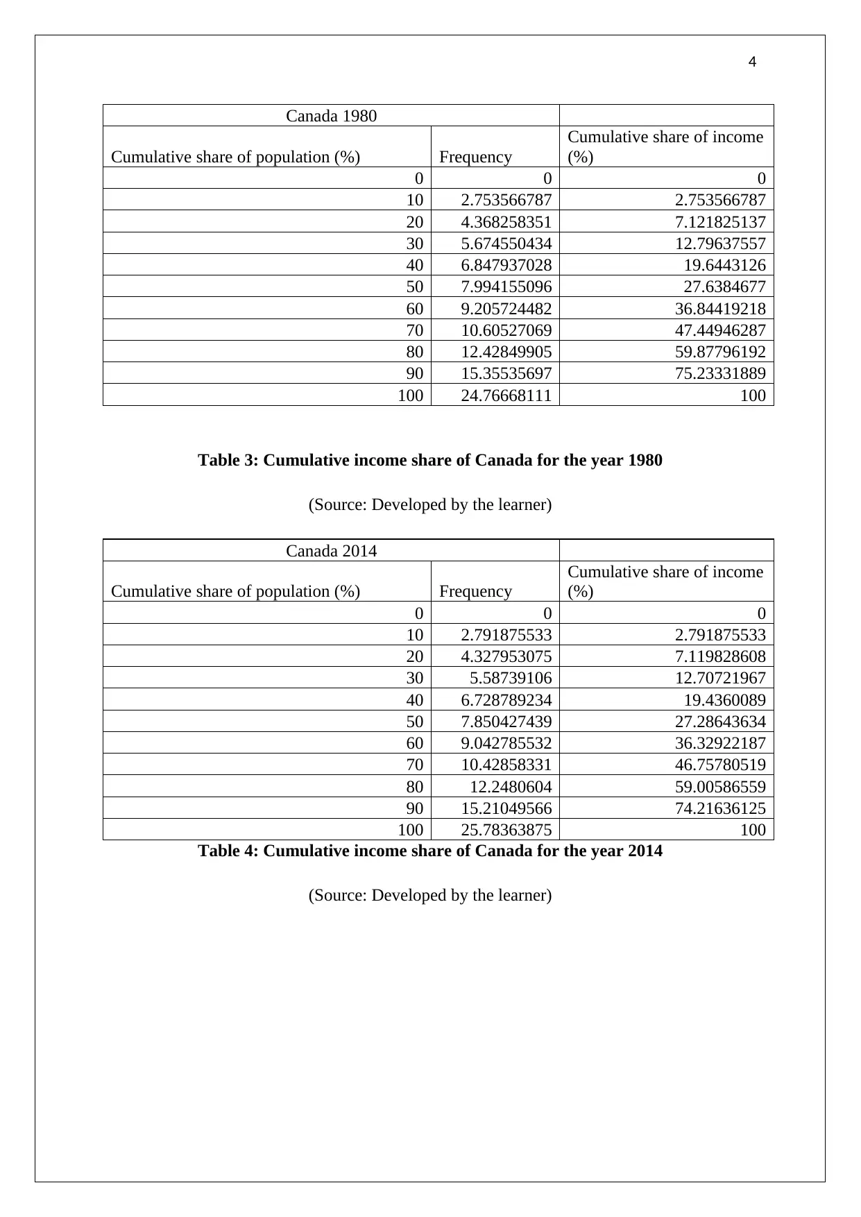
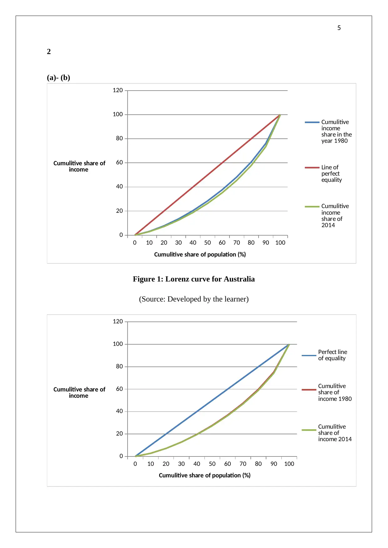
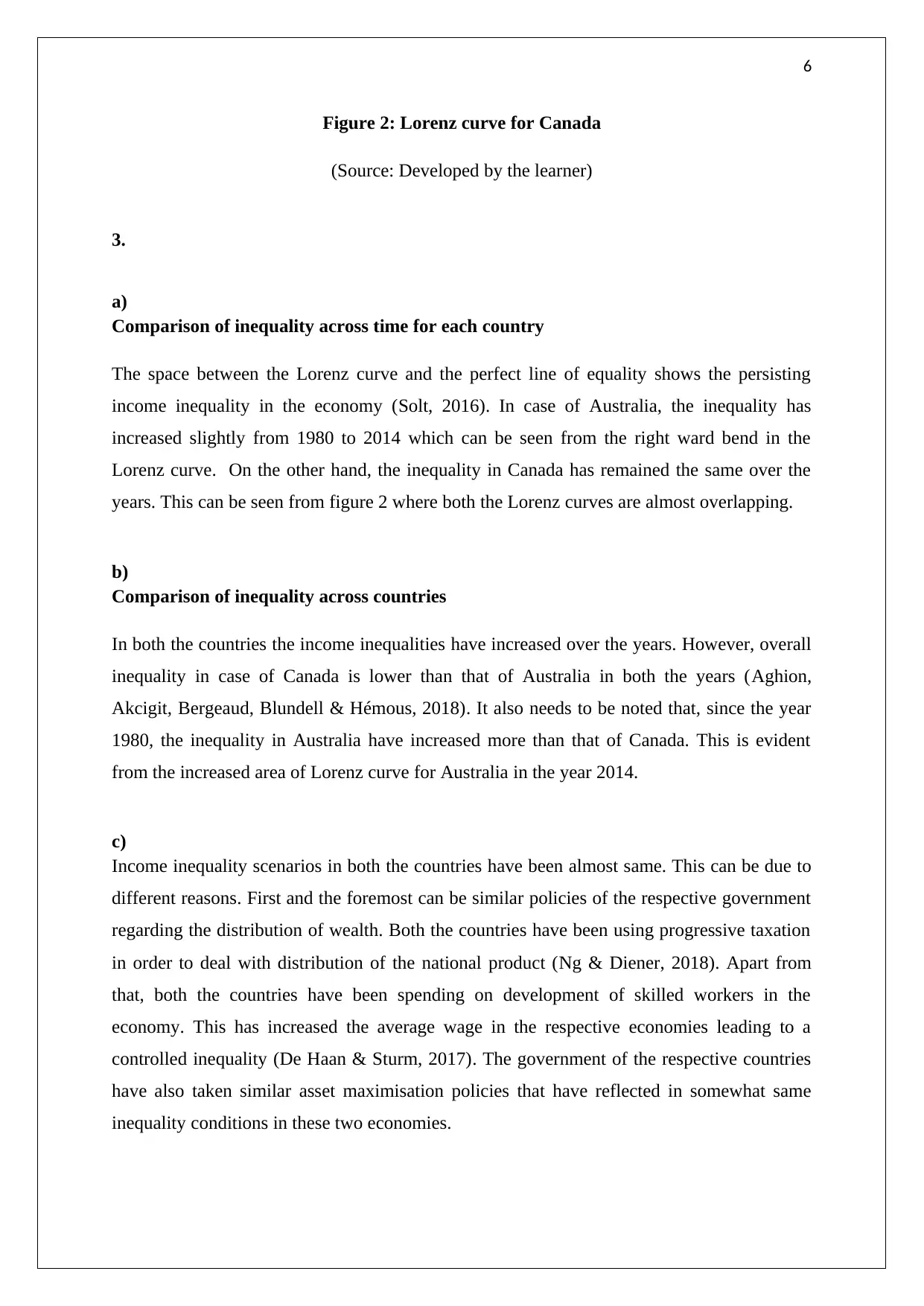
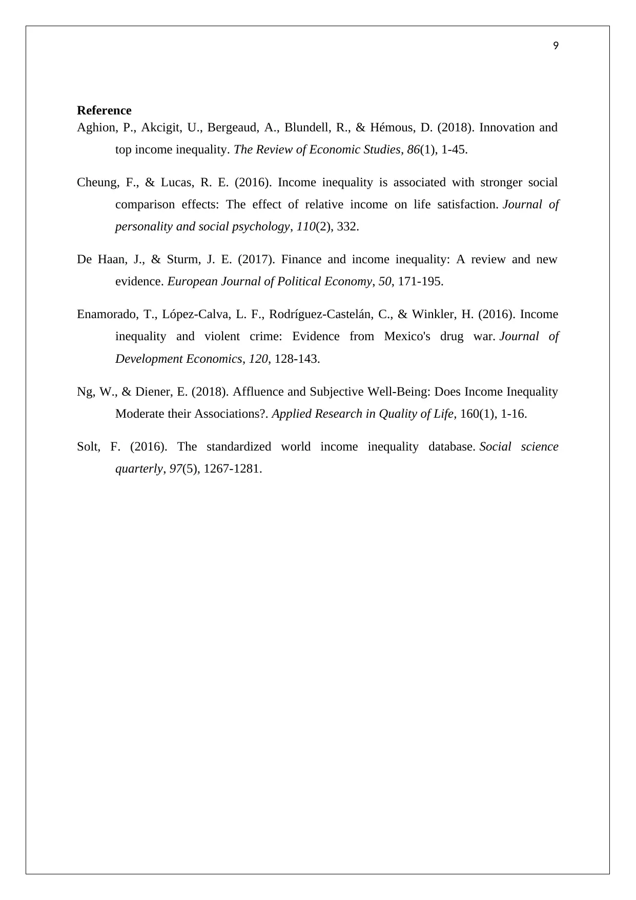
This project provides a comparative analysis of income inequality in Australia and Canada between 1980 and 2014. It utilizes Lorenz curves and Gini coefficients to measure and compare income distribution in both countries. The analysis includes a discussion of the factors contributing to income inequality and a comparison of the effectiveness of government policies in addressing these disparities. The project concludes that while income inequality has increased in both countries, the extent of the increase and the overall levels of inequality differ, with Canada exhibiting lower levels of inequality compared to Australia. The study also highlights the similarities in policy approaches adopted by both countries in managing income distribution.
Document Page
1
ECONOMICS ASSIGNMENT
tabler-icon-diamond-filled.svg

Secure Best Marks with AI Grader

Need help grading? Try our AI Grader for instant feedback on your assignments.
Document Page
2
Contents
Part 5.1.......................................................................................................................................3
1..................................................................................................................................................3
2..................................................................................................................................................5
(a)- (b)........................................................................................................................................5
3..................................................................................................................................................6
a).................................................................................................................................................6
b)................................................................................................................................................6
c).................................................................................................................................................6
4..................................................................................................................................................7
Comparison of the information contained in Lorenz curve.......................................................7
Reference....................................................................................................................................9
Document Page
3
Part 5.1
1.
Australia 1980
Cumulative share of population (%) Frequency
Cumulative share of income
(%)
0 0 0
10 3.165964696 3.165964696
20 4.571482656 7.737447352
30 5.77540107 13.51284842
40 6.896976007 20.40982443
50 8.017604467 28.4274289
60 9.221522881 37.64895178
70 10.62514789 48.27409966
80 12.46225924 60.7363589
90 15.38876532 76.12512423
100 23.87487577 100
Table 1: Cumulative income share of Australia for the year 1980
(Source: Developed by the learner)
Australia 2014
Cumulative share of population (%) Frequency
Cumulative share of income
(%)
0 0 0
10 2.962325783 2.962325783
20 4.176154093 7.138479875
30 5.294967588 12.43344746
40 6.391854588 18.82530205
50 7.532032361 26.35733441
60 8.795335841 35.15267025
70 10.30938848 45.46205873
80 12.34068152 57.80274025
90 15.67913104 73.48187129
100 26.51812871 100
Table 2: Cumulative income share of Australia for the year 2014
(Source: Developed by the learner)
Document Page
4
Canada 1980
Cumulative share of population (%) Frequency
Cumulative share of income
(%)
0 0 0
10 2.753566787 2.753566787
20 4.368258351 7.121825137
30 5.674550434 12.79637557
40 6.847937028 19.6443126
50 7.994155096 27.6384677
60 9.205724482 36.84419218
70 10.60527069 47.44946287
80 12.42849905 59.87796192
90 15.35535697 75.23331889
100 24.76668111 100
Table 3: Cumulative income share of Canada for the year 1980
(Source: Developed by the learner)
Canada 2014
Cumulative share of population (%) Frequency
Cumulative share of income
(%)
0 0 0
10 2.791875533 2.791875533
20 4.327953075 7.119828608
30 5.58739106 12.70721967
40 6.728789234 19.4360089
50 7.850427439 27.28643634
60 9.042785532 36.32922187
70 10.42858331 46.75780519
80 12.2480604 59.00586559
90 15.21049566 74.21636125
100 25.78363875 100
Table 4: Cumulative income share of Canada for the year 2014
(Source: Developed by the learner)
tabler-icon-diamond-filled.svg

Secure Best Marks with AI Grader

Need help grading? Try our AI Grader for instant feedback on your assignments.
Document Page
5
2
(a)- (b)
0 10 20 30 40 50 60 70 80 90 100
0
20
40
60
80
100
120
Cumulitive
income
share in the
year 1980
Line of
perfect
equality
Cumulitive
income
share of
2014
Cumulitive share of population (%)
Cumulitive share of
income
Figure 1: Lorenz curve for Australia
(Source: Developed by the learner)
0 10 20 30 40 50 60 70 80 90 100
0
20
40
60
80
100
120
Perfect line
of equality
Cumulitive
share of
income 1980
Cumulitive
share of
income 2014
Cumulitive share of population (%)
Cumulitive share of
income
Document Page
6
Figure 2: Lorenz curve for Canada
(Source: Developed by the learner)
3.
a)
Comparison of inequality across time for each country
The space between the Lorenz curve and the perfect line of equality shows the persisting
income inequality in the economy (Solt, 2016). In case of Australia, the inequality has
increased slightly from 1980 to 2014 which can be seen from the right ward bend in the
Lorenz curve. On the other hand, the inequality in Canada has remained the same over the
years. This can be seen from figure 2 where both the Lorenz curves are almost overlapping.
b)
Comparison of inequality across countries
In both the countries the income inequalities have increased over the years. However, overall
inequality in case of Canada is lower than that of Australia in both the years (Aghion,
Akcigit, Bergeaud, Blundell & Hémous, 2018). It also needs to be noted that, since the year
1980, the inequality in Australia have increased more than that of Canada. This is evident
from the increased area of Lorenz curve for Australia in the year 2014.
c)
Income inequality scenarios in both the countries have been almost same. This can be due to
different reasons. First and the foremost can be similar policies of the respective government
regarding the distribution of wealth. Both the countries have been using progressive taxation
in order to deal with distribution of the national product (Ng & Diener, 2018). Apart from
that, both the countries have been spending on development of skilled workers in the
economy. This has increased the average wage in the respective economies leading to a
controlled inequality (De Haan & Sturm, 2017). The government of the respective countries
have also taken similar asset maximisation policies that have reflected in somewhat same
inequality conditions in these two economies.
Document Page
7
4.
0
20
40
60
80
100
0
20
40
60
80
100
120
Cumulitive income share in the
year 1980
Line of perfect equality
Cumulitive income share of 2014
Cumulitive share of population (%)
Cumulitive share of
income Gini coeff- 0.308
Gini coeff- 0.341
Figure 3: The Lorenz curve of Australia labelled with Gini coefficient values
(Source: Developed by the learner)
0
20
40
60
80
100
0
20
40
60
80
100
120
Perfect line of equality
Cumulitive share of income 1980
Cumulitive share of income 2014
Cumulitive share of population (%)
Cumulitive share of
income
Gini Coeff- 0.321
Gini coeff- 0.329
Figure 4: The Lorenz curve of Canada labelled with Gini coefficient values
(Source: Developed by the learner)
Comparison of the information contained in Lorenz curve and Gini Coefficient
The information in the Lorenz curve for two of the countries shows that for the countries the
income distribution have worsen over the years. However, the increase in the income
inequality has been more in case of Australia than in case of Canada. There would be no
tabler-icon-diamond-filled.svg

Paraphrase This Document

Need a fresh take? Get an instant paraphrase of this document with our AI Paraphraser
Document Page
8
differences in the analysis if i had only looked at the Gini coefficient alone. This is due to the
fact that, Lorenz curve is the graphical representation of the Gini coefficient (Cheung &
Lucas,2016). The Gini coefficient is calculated by the part of the area under the line of
equality which is encapsulated between the line of equality and the Lorenz curve.
Nevertheless, the Gini coefficient provides a numeric representation of the situation
compared to the Lorenz curve (Enamorado, López-Calva, Rodríguez-Castelán & Winkler,
2016).
Document Page
9
Reference
Aghion, P., Akcigit, U., Bergeaud, A., Blundell, R., & Hémous, D. (2018). Innovation and
top income inequality. The Review of Economic Studies, 86(1), 1-45.
Cheung, F., & Lucas, R. E. (2016). Income inequality is associated with stronger social
comparison effects: The effect of relative income on life satisfaction. Journal of
personality and social psychology, 110(2), 332.
De Haan, J., & Sturm, J. E. (2017). Finance and income inequality: A review and new
evidence. European Journal of Political Economy, 50, 171-195.
Enamorado, T., López-Calva, L. F., Rodríguez-Castelán, C., & Winkler, H. (2016). Income
inequality and violent crime: Evidence from Mexico's drug war. Journal of
Development Economics, 120, 128-143.
Ng, W., & Diener, E. (2018). Affluence and Subjective Well-Being: Does Income Inequality
Moderate their Associations?. Applied Research in Quality of Life, 160(1), 1-16.
Solt, F. (2016). The standardized world income inequality database. Social science
quarterly, 97(5), 1267-1281.
chevron_up_icon
1 out of 9
circle_padding
hide_on_mobile
zoom_out_icon
logo.png

Your All-in-One AI-Powered Toolkit for Academic Success.

Available 24*7 on WhatsApp / Email

[object Object]