Economics for Decision-Making: Production, Cost, and Market Analysis
VerifiedAdded on 2023/06/09
|17
|2475
|196
Homework Assignment
AI Summary
This economics assignment provides detailed solutions and explanations for various economic concepts. It covers the construction and interpretation of production possibility curves, including the impact of increasing opportunity cost and resource utilization. The assignment further analyzes market dynamics, focusing on shifts in supply and demand, consumer and producer surplus, and the effects of government interventions like taxes. Price elasticity of demand is explored, with specific examples like hot doughnuts and cigarettes. Finally, the assignment delves into production costs, including fixed, variable, and marginal costs, to determine profit-maximizing output levels for firms operating in perfect markets. Desklib provides students access to similar solved assignments and past papers to aid in their studies.
Running head: ECONOMICS FOR DECISION-MAKING
Economics for Decision-making
Name of the Student
Name of the University
Author’s Note
Economics for Decision-making
Name of the Student
Name of the University
Author’s Note
Paraphrase This Document
Need a fresh take? Get an instant paraphrase of this document with our AI Paraphraser
1ECONOMICS FOR DECISION- MAKING
Table of Contents
Answer 1..........................................................................................................................................2
Answer 2..........................................................................................................................................4
Answer 3:.........................................................................................................................................7
Answer 4:.......................................................................................................................................12
Answer 5........................................................................................................................................13
References......................................................................................................................................15
2ECONOMICS FOR DECISION- MAKING
Answer 1
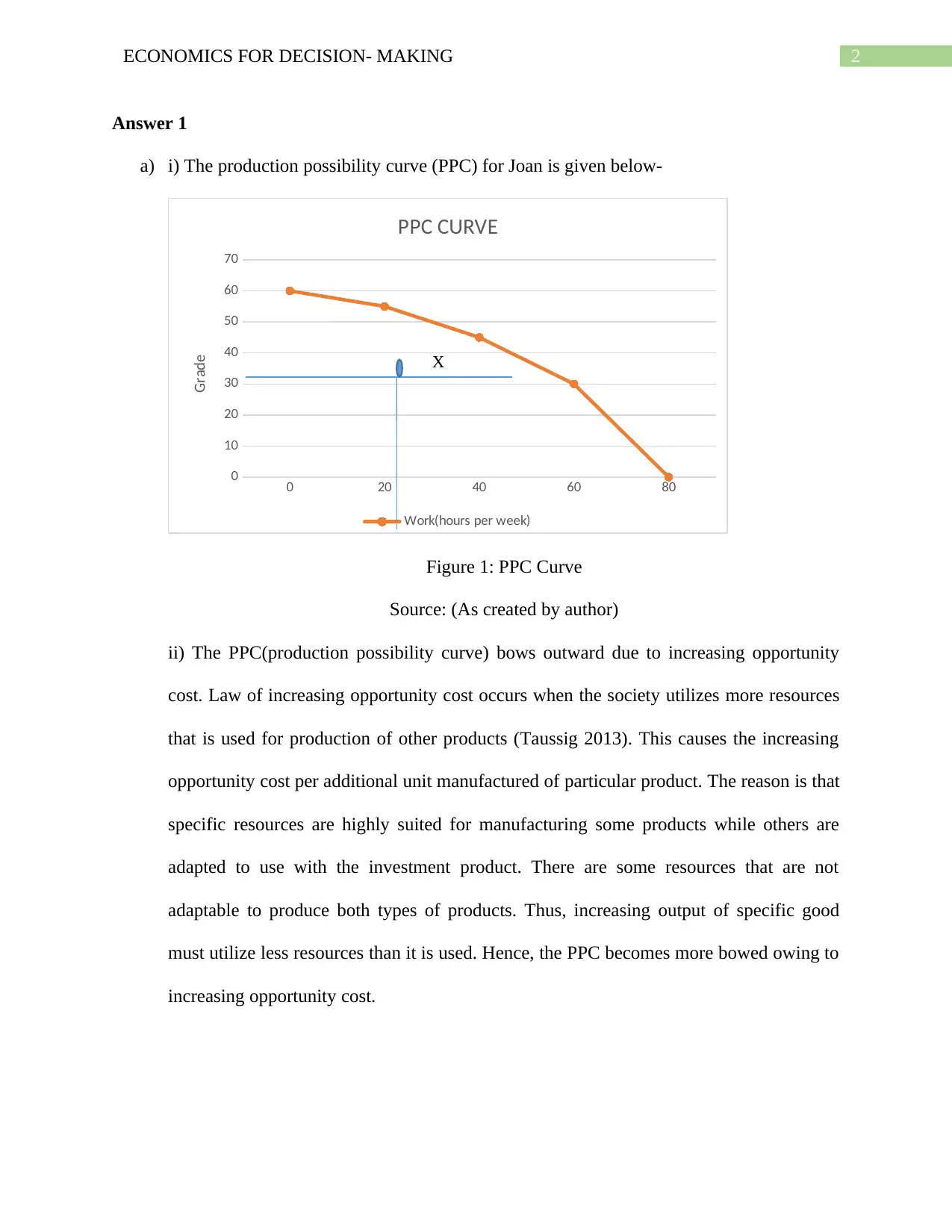
a) i) The production possibility curve (PPC) for Joan is given below-
0 20 40 60 80
0
10
20
30
40
50
60
70
PPC CURVE
Work(hours per week)
Grade X
Figure 1: PPC Curve
Source: (As created by author)
ii) The PPC(production possibility curve) bows outward due to increasing opportunity
cost. Law of increasing opportunity cost occurs when the society utilizes more resources
that is used for production of other products (Taussig 2013). This causes the increasing
opportunity cost per additional unit manufactured of particular product. The reason is that
specific resources are highly suited for manufacturing some products while others are
adapted to use with the investment product. There are some resources that are not
adaptable to produce both types of products. Thus, increasing output of specific good
must utilize less resources than it is used. Hence, the PPC becomes more bowed owing to
increasing opportunity cost.
⊘ This is a preview!⊘
Do you want full access?
Subscribe today to unlock all pages.

Trusted by 1+ million students worldwide
3ECONOMICS FOR DECISION- MAKING
Work per hour
Grade
A
B
C
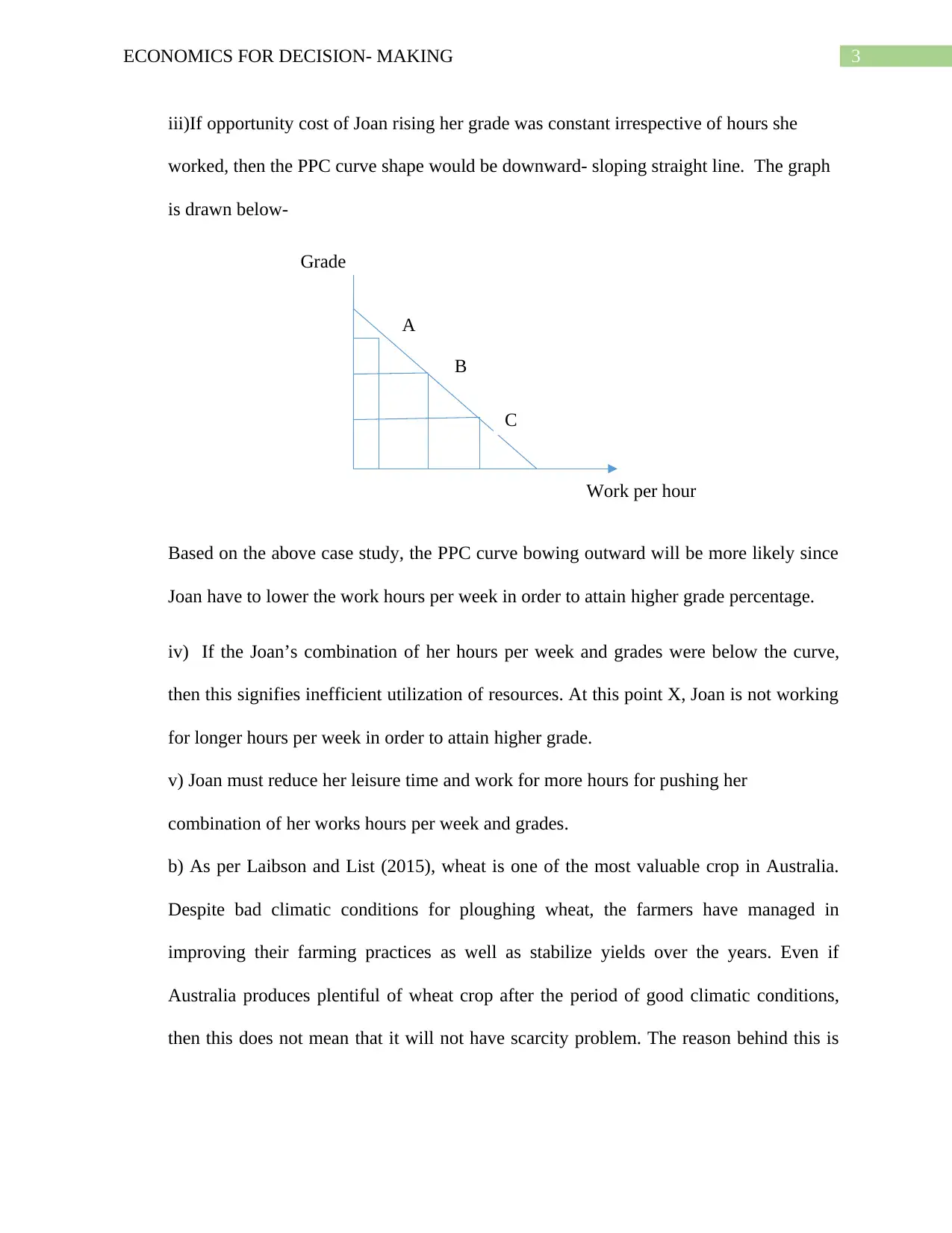
iii)If opportunity cost of Joan rising her grade was constant irrespective of hours she
worked, then the PPC curve shape would be downward- sloping straight line. The graph
is drawn below-
Based on the above case study, the PPC curve bowing outward will be more likely since
Joan have to lower the work hours per week in order to attain higher grade percentage.
iv) If the Joan’s combination of her hours per week and grades were below the curve,
then this signifies inefficient utilization of resources. At this point X, Joan is not working
for longer hours per week in order to attain higher grade.
v) Joan must reduce her leisure time and work for more hours for pushing her
combination of her works hours per week and grades.
b) As per Laibson and List (2015), wheat is one of the most valuable crop in Australia.
Despite bad climatic conditions for ploughing wheat, the farmers have managed in
improving their farming practices as well as stabilize yields over the years. Even if
Australia produces plentiful of wheat crop after the period of good climatic conditions,
then this does not mean that it will not have scarcity problem. The reason behind this is
Paraphrase This Document
Need a fresh take? Get an instant paraphrase of this document with our AI Paraphraser
4ECONOMICS FOR DECISION- MAKING
Quantity of wheat
Price
P
Q
D
D D1
D1
P1
Q1
S
S
S1
S1
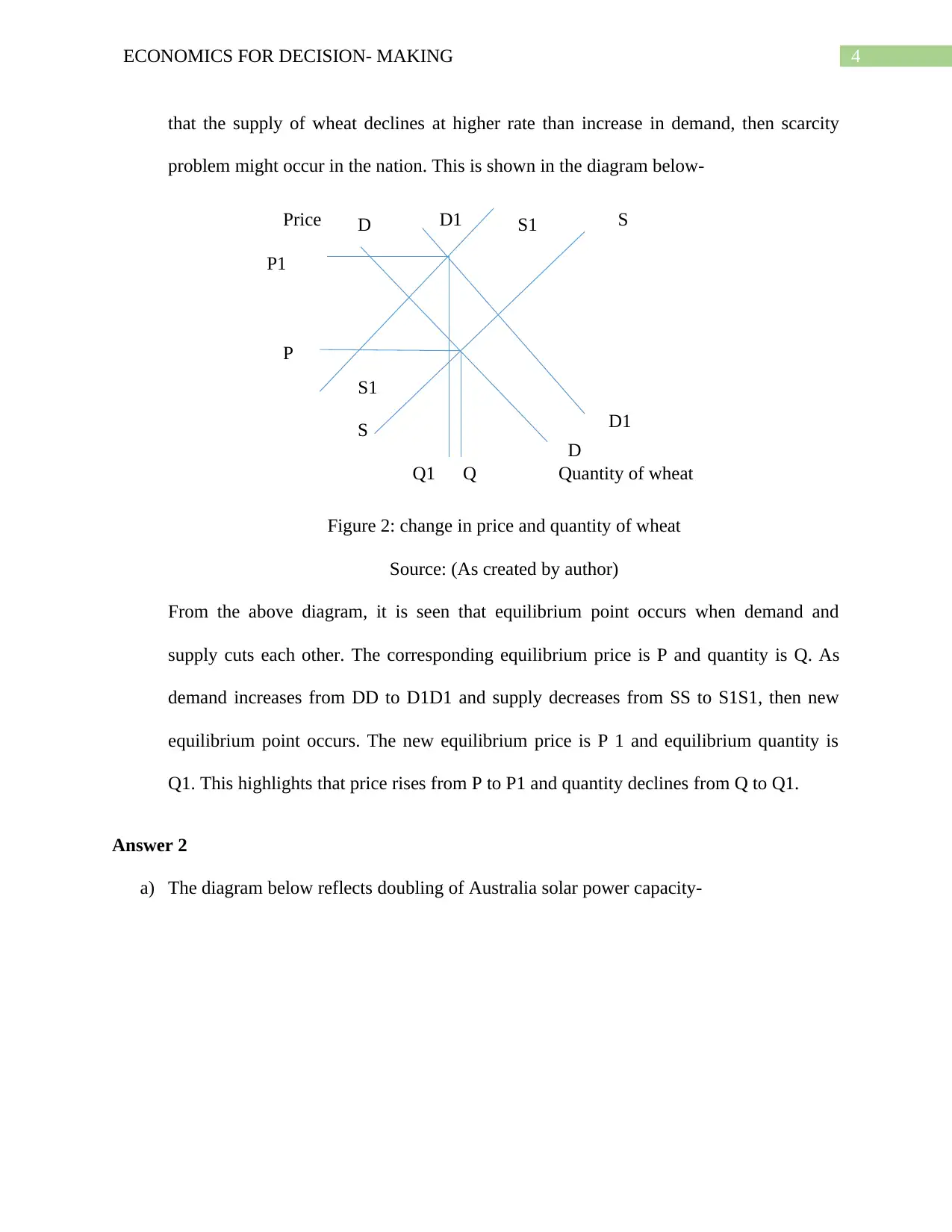
that the supply of wheat declines at higher rate than increase in demand, then scarcity
problem might occur in the nation. This is shown in the diagram below-
Figure 2: change in price and quantity of wheat
Source: (As created by author)
From the above diagram, it is seen that equilibrium point occurs when demand and
supply cuts each other. The corresponding equilibrium price is P and quantity is Q. As
demand increases from DD to D1D1 and supply decreases from SS to S1S1, then new
equilibrium point occurs. The new equilibrium price is P 1 and equilibrium quantity is
Q1. This highlights that price rises from P to P1 and quantity declines from Q to Q1.
Answer 2
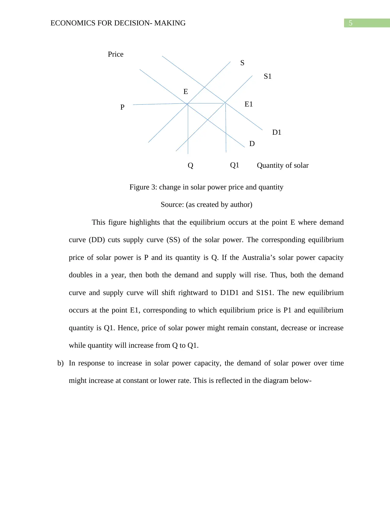
a) The diagram below reflects doubling of Australia solar power capacity-
5ECONOMICS FOR DECISION- MAKING
Quantity of solar
Price
P
D1
D
S
S1
Q Q1
E
E1
Figure 3: change in solar power price and quantity
Source: (as created by author)
This figure highlights that the equilibrium occurs at the point E where demand
curve (DD) cuts supply curve (SS) of the solar power. The corresponding equilibrium
price of solar power is P and its quantity is Q. If the Australia’s solar power capacity
doubles in a year, then both the demand and supply will rise. Thus, both the demand
curve and supply curve will shift rightward to D1D1 and S1S1. The new equilibrium
occurs at the point E1, corresponding to which equilibrium price is P1 and equilibrium
quantity is Q1. Hence, price of solar power might remain constant, decrease or increase
while quantity will increase from Q to Q1.
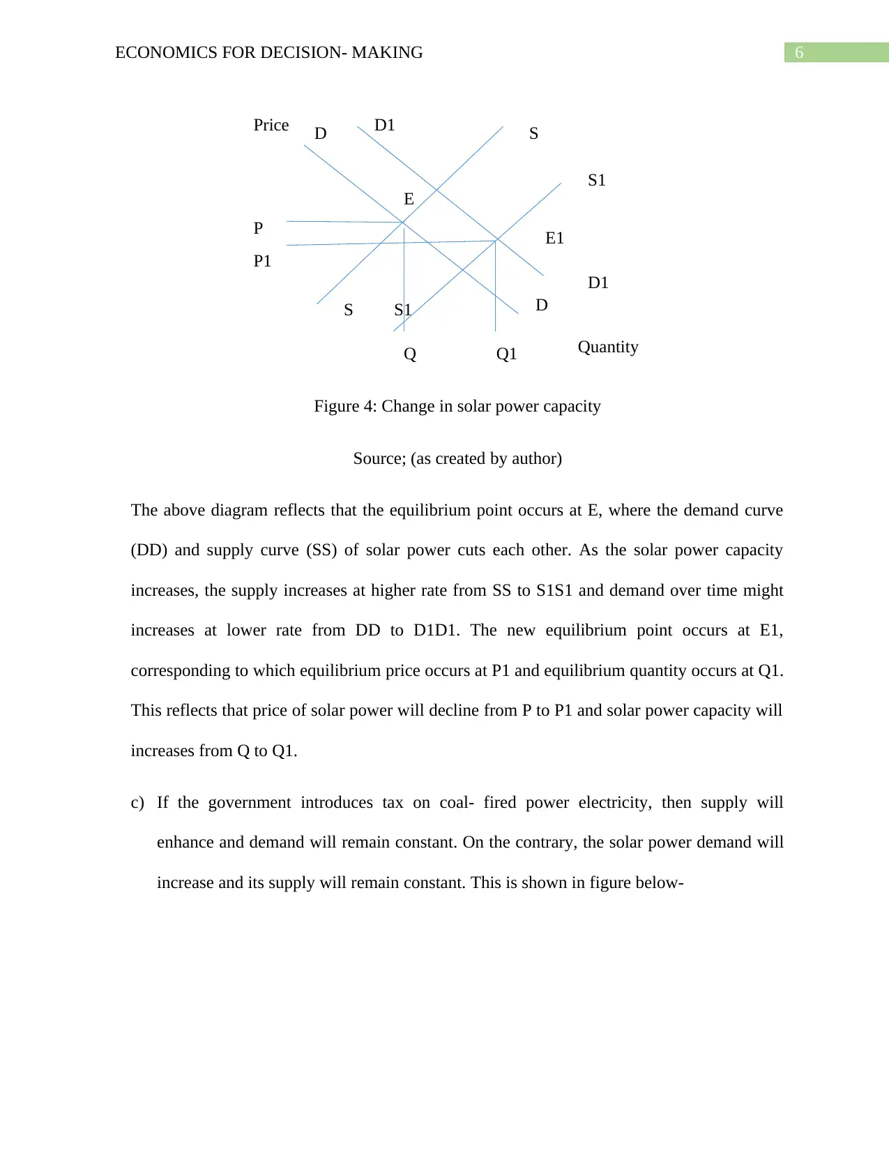
b) In response to increase in solar power capacity, the demand of solar power over time
might increase at constant or lower rate. This is reflected in the diagram below-
⊘ This is a preview!⊘
Do you want full access?
Subscribe today to unlock all pages.

Trusted by 1+ million students worldwide
6ECONOMICS FOR DECISION- MAKING
Quantity
Price
D
D S
S
P
Q
D1
D1
S1
S1
Q1
P1
E
E1
Figure 4: Change in solar power capacity
Source; (as created by author)
The above diagram reflects that the equilibrium point occurs at E, where the demand curve
(DD) and supply curve (SS) of solar power cuts each other. As the solar power capacity
increases, the supply increases at higher rate from SS to S1S1 and demand over time might
increases at lower rate from DD to D1D1. The new equilibrium point occurs at E1,
corresponding to which equilibrium price occurs at P1 and equilibrium quantity occurs at Q1.
This reflects that price of solar power will decline from P to P1 and solar power capacity will
increases from Q to Q1.
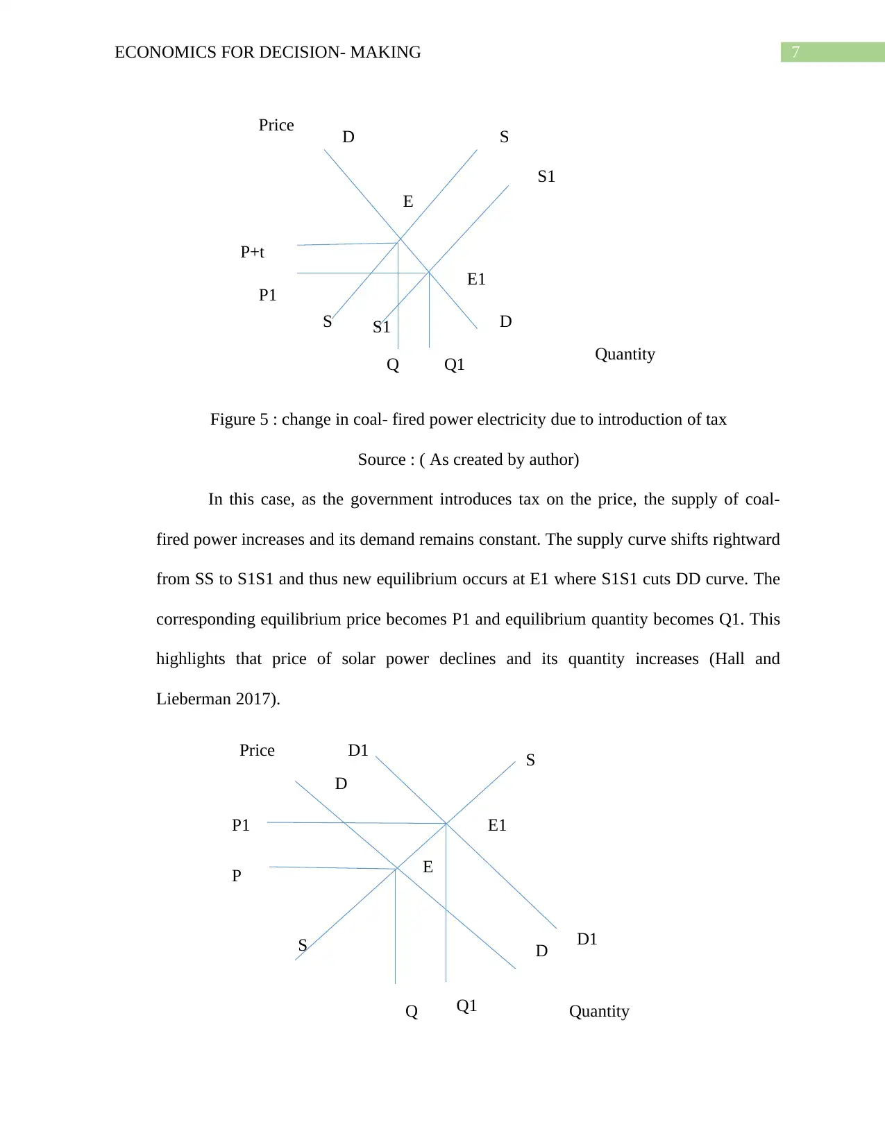
c) If the government introduces tax on coal- fired power electricity, then supply will
enhance and demand will remain constant. On the contrary, the solar power demand will
increase and its supply will remain constant. This is shown in figure below-
Paraphrase This Document
Need a fresh take? Get an instant paraphrase of this document with our AI Paraphraser
7ECONOMICS FOR DECISION- MAKING
Quantity
Price
D
D S
S
S1
S1
E
E1
P+t
Q
P1
Q1
Quantity
Price S
S D
D
E
P
Q
P1
Q1
E1
D1
D1
Figure 5 : change in coal- fired power electricity due to introduction of tax
Source : ( As created by author)
In this case, as the government introduces tax on the price, the supply of coal-
fired power increases and its demand remains constant. The supply curve shifts rightward
from SS to S1S1 and thus new equilibrium occurs at E1 where S1S1 cuts DD curve. The
corresponding equilibrium price becomes P1 and equilibrium quantity becomes Q1. This
highlights that price of solar power declines and its quantity increases (Hall and
Lieberman 2017).
Quantity
Price
D
D S
S
S1
S1
E
E1
P+t
Q
P1
Q1
Quantity
Price S
S D
D
E
P
Q
P1
Q1
E1
D1
D1
Figure 5 : change in coal- fired power electricity due to introduction of tax
Source : ( As created by author)
In this case, as the government introduces tax on the price, the supply of coal-
fired power increases and its demand remains constant. The supply curve shifts rightward
from SS to S1S1 and thus new equilibrium occurs at E1 where S1S1 cuts DD curve. The
corresponding equilibrium price becomes P1 and equilibrium quantity becomes Q1. This
highlights that price of solar power declines and its quantity increases (Hall and
Lieberman 2017).

8ECONOMICS FOR DECISION- MAKING
Supply curve
Demand curve
O Output
Price
Qe
Pe
Consumer Surplus
Producer surplus
Figure 6: Change in price and quantity of solar power due to introduction of tax
Source; (as created by author)
In this case, as the government introduces tax, the demand for solar power
increases and its supply remains constant. The demand curve shifts rightward from DD to
D1D1 and thus new equilibrium occurs at point E1 where the D1D1 cuts the supply curve
(SS). The corresponding equilibrium price becomes P1 and quantity becomes Q1. This
reflects that both price and quantity of solar power will increase.
Answer 3:
a)
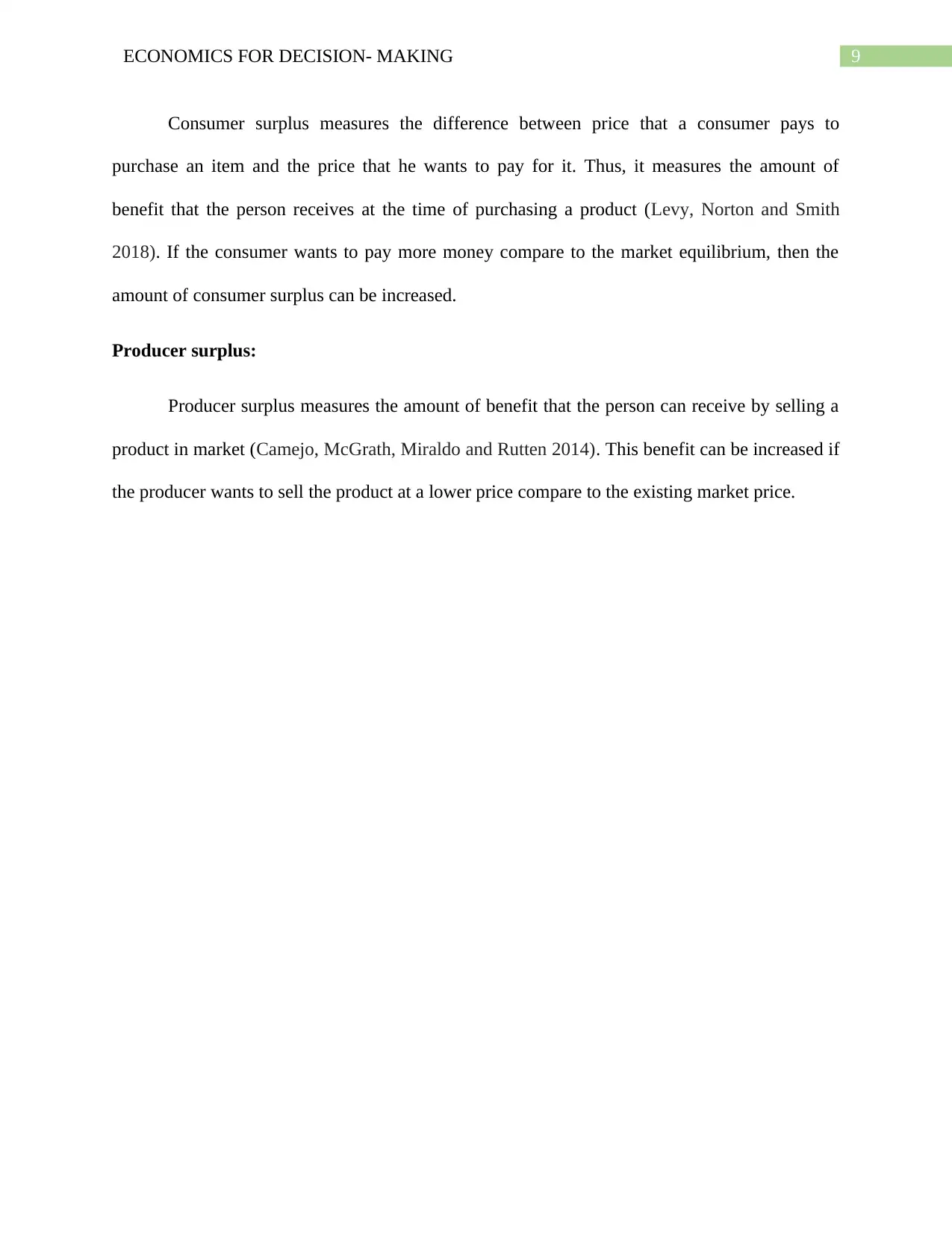
Figure 7: Consumer Surplus and Producer Surplus
Source: (created by author)
Consumer surplus:
⊘ This is a preview!⊘
Do you want full access?
Subscribe today to unlock all pages.

Trusted by 1+ million students worldwide
9ECONOMICS FOR DECISION- MAKING
Consumer surplus measures the difference between price that a consumer pays to
purchase an item and the price that he wants to pay for it. Thus, it measures the amount of
benefit that the person receives at the time of purchasing a product (Levy, Norton and Smith
2018). If the consumer wants to pay more money compare to the market equilibrium, then the
amount of consumer surplus can be increased.
Producer surplus:
Producer surplus measures the amount of benefit that the person can receive by selling a
product in market (Camejo, McGrath, Miraldo and Rutten 2014). This benefit can be increased if
the producer wants to sell the product at a lower price compare to the existing market price.
Paraphrase This Document
Need a fresh take? Get an instant paraphrase of this document with our AI Paraphraser
10ECONOMICS FOR DECISION- MAKING
S0
Demand curveO
Output
Price
Pe
Consumer Surplus
Producer surplus
S1
b)
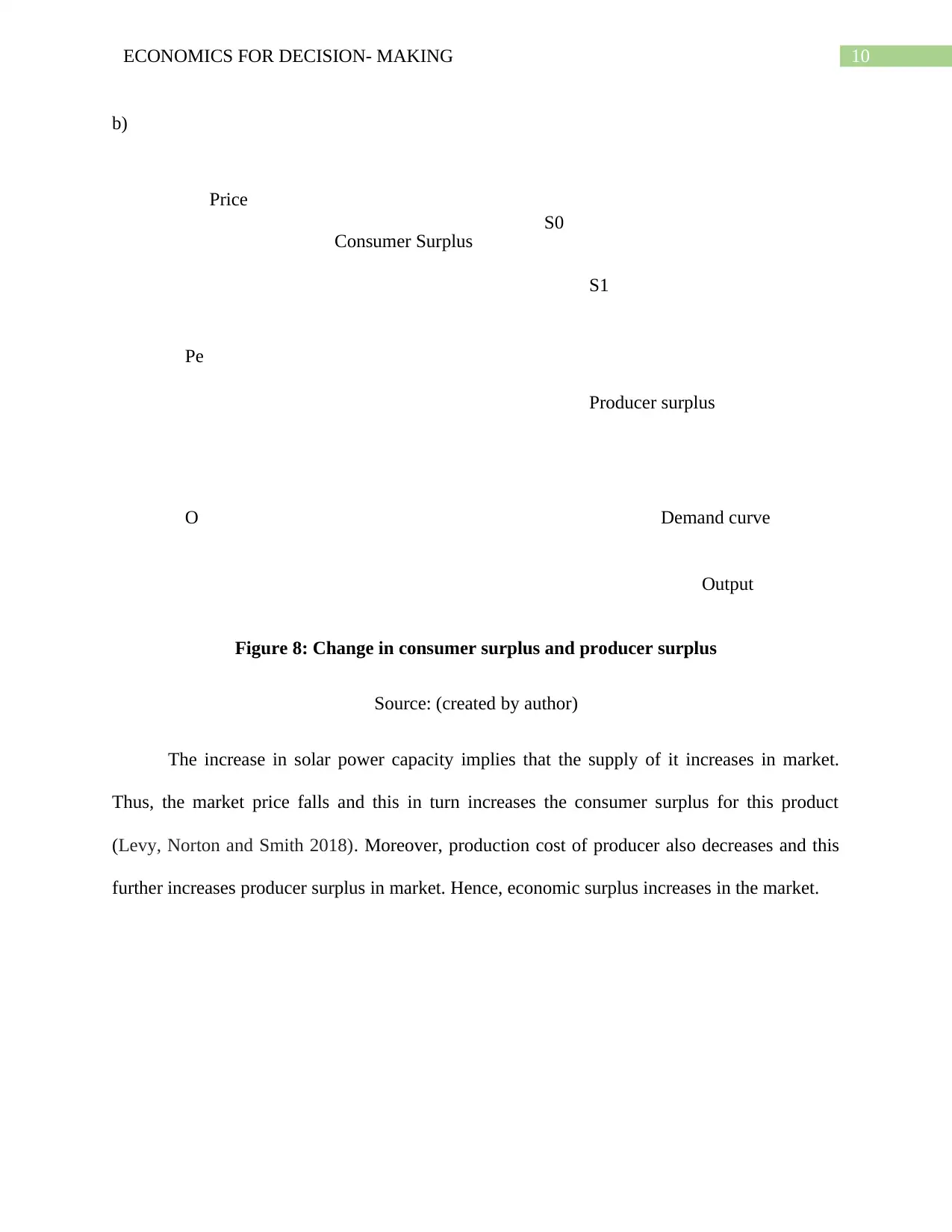
Figure 8: Change in consumer surplus and producer surplus
Source: (created by author)
The increase in solar power capacity implies that the supply of it increases in market.
Thus, the market price falls and this in turn increases the consumer surplus for this product
(Levy, Norton and Smith 2018). Moreover, production cost of producer also decreases and this
further increases producer surplus in market. Hence, economic surplus increases in the market.
11ECONOMICS FOR DECISION- MAKING
Supply curve
D0
O Labour
Wage
L0
W0
D1
L1
W1
c)
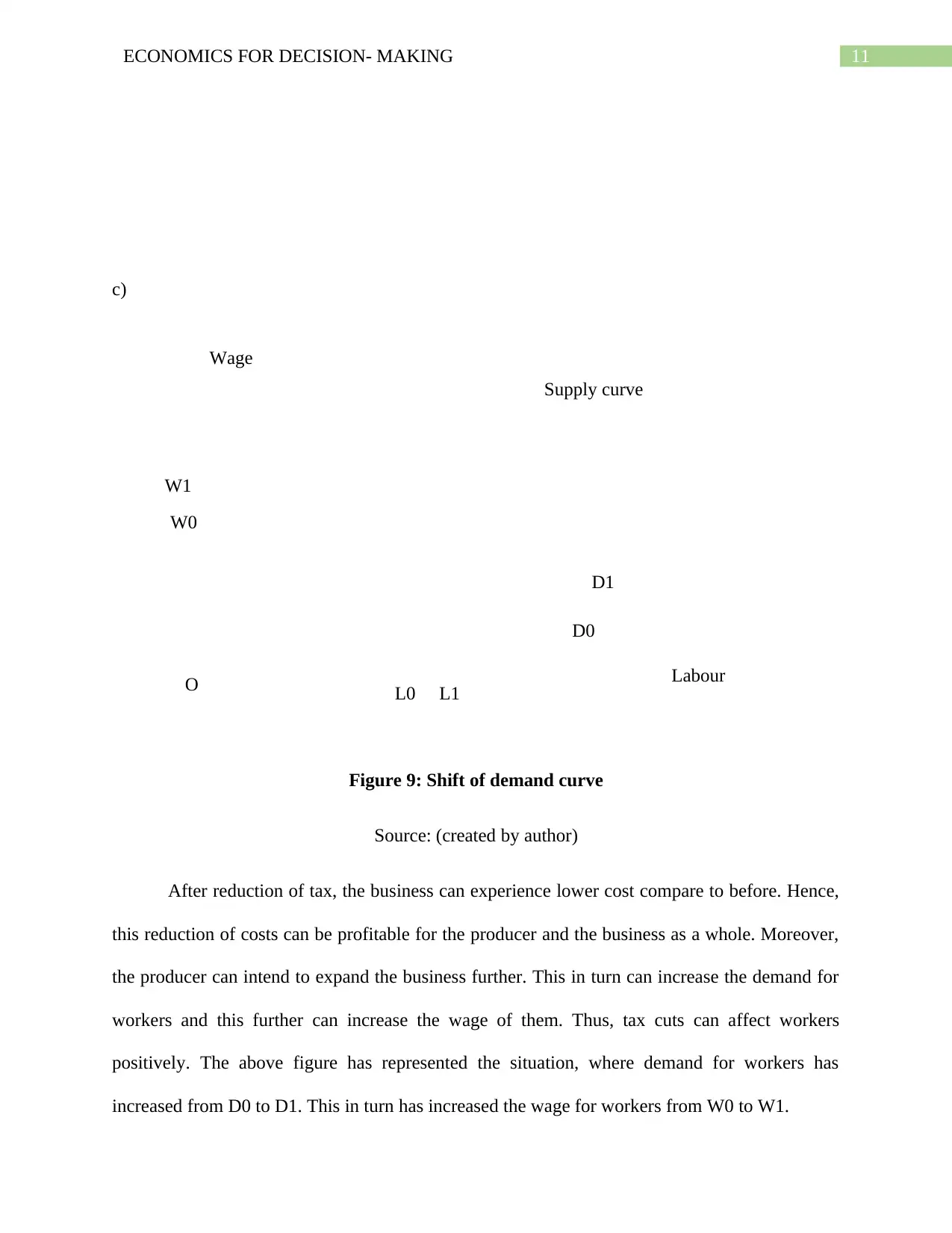
Figure 9: Shift of demand curve
Source: (created by author)
After reduction of tax, the business can experience lower cost compare to before. Hence,
this reduction of costs can be profitable for the producer and the business as a whole. Moreover,
the producer can intend to expand the business further. This in turn can increase the demand for
workers and this further can increase the wage of them. Thus, tax cuts can affect workers
positively. The above figure has represented the situation, where demand for workers has
increased from D0 to D1. This in turn has increased the wage for workers from W0 to W1.
⊘ This is a preview!⊘
Do you want full access?
Subscribe today to unlock all pages.

Trusted by 1+ million students worldwide
1 out of 17
Related Documents
Your All-in-One AI-Powered Toolkit for Academic Success.
+13062052269
info@desklib.com
Available 24*7 on WhatsApp / Email
![[object Object]](/_next/static/media/star-bottom.7253800d.svg)
Unlock your academic potential
Copyright © 2020–2026 A2Z Services. All Rights Reserved. Developed and managed by ZUCOL.


