Ellerson Furniture Company: Data Analysis and Visualization Case Study
VerifiedAdded on 2023/01/18
|17
|3160
|67
Case Study
AI Summary
This case study analyzes data from the Ellerson Furniture Company to identify and address customer complaints and manufacturing issues. The analysis includes Pareto charts, frequency distributions, and hypothesis testing to pinpoint the most common defects and their impact. The study further explores weighted cost analysis, comparing frequency and cost Pareto charts to prioritize complaints based on severity. It also examines the relationship between specific items, facilities, and complaint types using cause-and-effect diagrams and capability analysis. The engineer's report and subsequent analysis delves into the causes of manufacturing defects, such as incorrect parts and fitting issues, and evaluates process capability. The results indicate that the system is not capable, with a high percentage of diameters falling outside of the specified limits. Finally, the study provides recommendations for improvement efforts, emphasizing cost reduction and process optimization, as well as descriptive statistics and capability analysis for initial and new data on pin diameter and overall system performance.
Running head: DATA ANALYSIS AND VISUALIZATION 1
Data Analysis and Visualization Paper
Student’s Name
Professor’s Name
Affiliation
Date
Data Analysis and Visualization Paper
Student’s Name
Professor’s Name
Affiliation
Date
Paraphrase This Document
Need a fresh take? Get an instant paraphrase of this document with our AI Paraphraser
DATA ANALYSIS AND VISUALIZATION 2
Data Analysis and Visualization
Part A
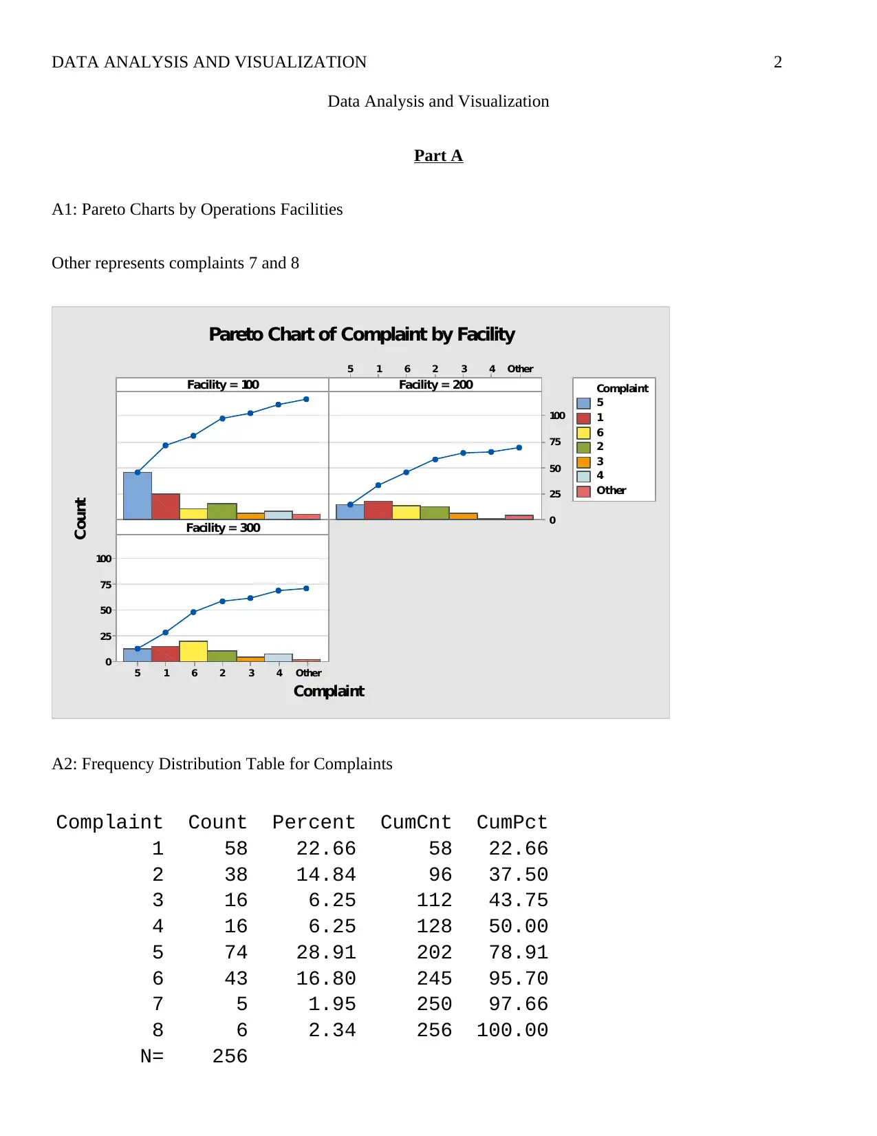
A1: Pareto Charts by Operations Facilities
Other represents complaints 7 and 8
Other432615
100
75
50
25
0
Other432615
100
75
50
25
0
Facility = 100
Complaint
Count
Facility = 200
Facility = 300
5
1
6
2
3
4
Other
Complaint
Pareto Chart of Complaint by Facility
A2: Frequency Distribution Table for Complaints
Complaint Count Percent CumCnt CumPct
1 58 22.66 58 22.66
2 38 14.84 96 37.50
3 16 6.25 112 43.75
4 16 6.25 128 50.00
5 74 28.91 202 78.91
6 43 16.80 245 95.70
7 5 1.95 250 97.66
8 6 2.34 256 100.00
N= 256
Data Analysis and Visualization
Part A
A1: Pareto Charts by Operations Facilities
Other represents complaints 7 and 8
Other432615
100
75
50
25
0
Other432615
100
75
50
25
0
Facility = 100
Complaint
Count
Facility = 200
Facility = 300
5
1
6
2
3
4
Other
Complaint
Pareto Chart of Complaint by Facility
A2: Frequency Distribution Table for Complaints
Complaint Count Percent CumCnt CumPct
1 58 22.66 58 22.66
2 38 14.84 96 37.50
3 16 6.25 112 43.75
4 16 6.25 128 50.00
5 74 28.91 202 78.91
6 43 16.80 245 95.70
7 5 1.95 250 97.66
8 6 2.34 256 100.00
N= 256
DATA ANALYSIS AND VISUALIZATION 3
Hence the three most common defects/complaints are 5 (28.91%), 1 (22.66%), and 6 (16.80%). With regard to
the Pareto principle we can see that a sizable number of complaints are related to a few specific defects.
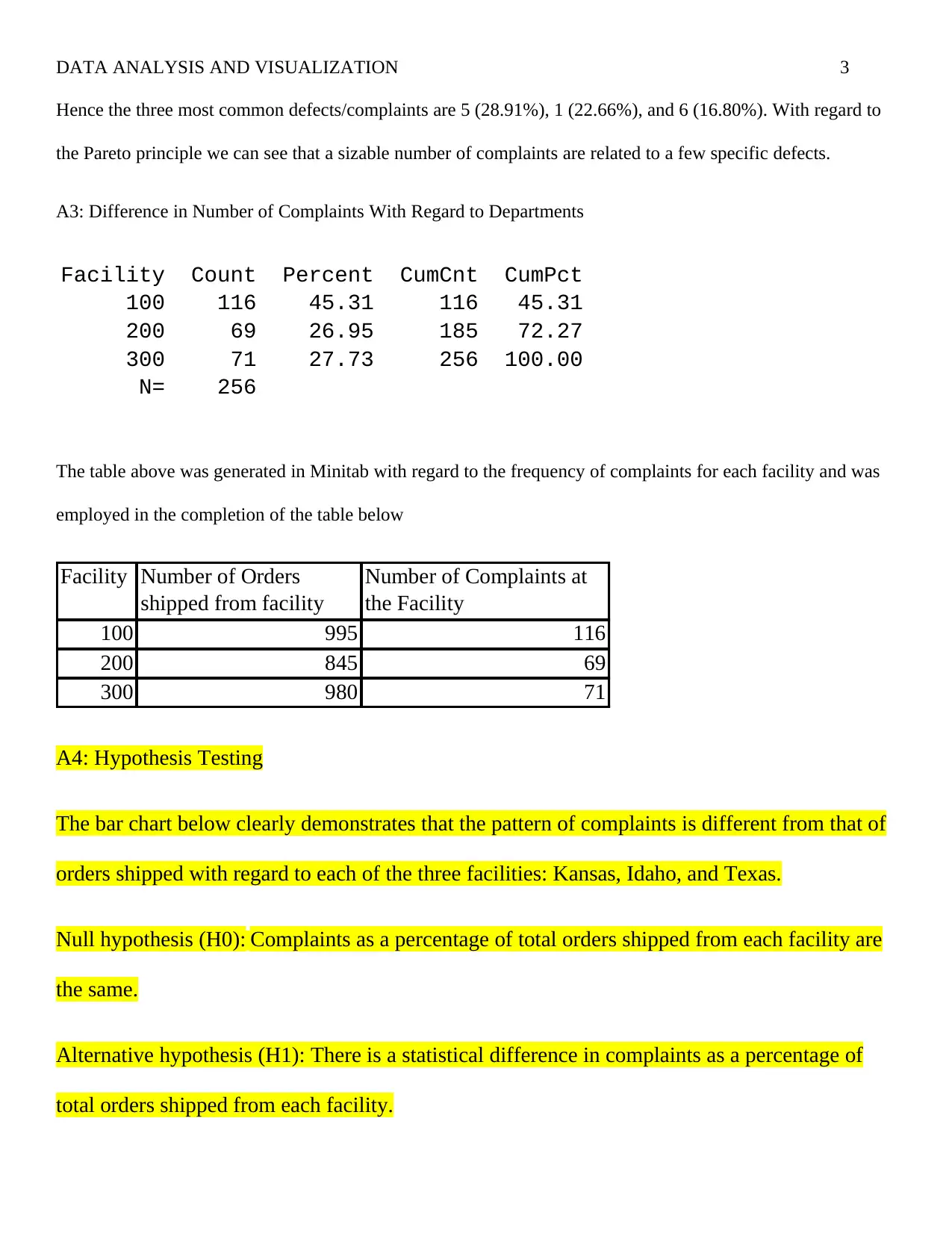
A3: Difference in Number of Complaints With Regard to Departments
Facility Count Percent CumCnt CumPct
100 116 45.31 116 45.31
200 69 26.95 185 72.27
300 71 27.73 256 100.00
N= 256
The table above was generated in Minitab with regard to the frequency of complaints for each facility and was
employed in the completion of the table below
Facility Number of Orders
shipped from facility
Number of Complaints at
the Facility
100 995 116
200 845 69
300 980 71
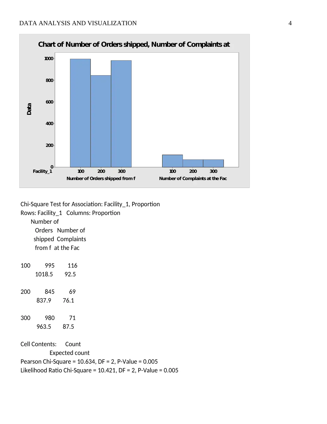
A4: Hypothesis Testing
The bar chart below clearly demonstrates that the pattern of complaints is different from that of
orders shipped with regard to each of the three facilities: Kansas, Idaho, and Texas.
Null hypothesis (H0): Complaints as a percentage of total orders shipped from each facility are
the same.
Alternative hypothesis (H1): There is a statistical difference in complaints as a percentage of
total orders shipped from each facility.
Hence the three most common defects/complaints are 5 (28.91%), 1 (22.66%), and 6 (16.80%). With regard to
the Pareto principle we can see that a sizable number of complaints are related to a few specific defects.
A3: Difference in Number of Complaints With Regard to Departments
Facility Count Percent CumCnt CumPct
100 116 45.31 116 45.31
200 69 26.95 185 72.27
300 71 27.73 256 100.00
N= 256
The table above was generated in Minitab with regard to the frequency of complaints for each facility and was
employed in the completion of the table below
Facility Number of Orders
shipped from facility
Number of Complaints at
the Facility
100 995 116
200 845 69
300 980 71
A4: Hypothesis Testing
The bar chart below clearly demonstrates that the pattern of complaints is different from that of
orders shipped with regard to each of the three facilities: Kansas, Idaho, and Texas.
Null hypothesis (H0): Complaints as a percentage of total orders shipped from each facility are
the same.
Alternative hypothesis (H1): There is a statistical difference in complaints as a percentage of
total orders shipped from each facility.
⊘ This is a preview!⊘
Do you want full access?
Subscribe today to unlock all pages.
Trusted by 1+ million students worldwide
DATA ANALYSIS AND VISUALIZATION 4
Facility_1
Number of Complaints at the FacNumber of Orders shipped from f
300200100300200100
1000
800
600
400
200
0
Data
Chart of Number of Orders shipped, Number of Complaints at
Chi-Square Test for Association: Facility_1, Proportion
Rows: Facility_1 Columns: Proportion
Number of
Orders Number of
shipped Complaints
from f at the Fac
100 995 116
1018.5 92.5
200 845 69
837.9 76.1
300 980 71
963.5 87.5
Cell Contents: Count
Expected count
Pearson Chi-Square = 10.634, DF = 2, P-Value = 0.005
Likelihood Ratio Chi-Square = 10.421, DF = 2, P-Value = 0.005
Paraphrase This Document
Need a fresh take? Get an instant paraphrase of this document with our AI Paraphraser
DATA ANALYSIS AND VISUALIZATION 5
Looking at the results of the chi-square test for association presented above we see that the p-
value is 0.005. Since, the p-value is less than alpha (0.05) we will reject the null hypothesis and
conclude that there is a statistical difference in complaints as a percentage of total orders
shipped from each facility
Part B
The table for weighted cost can be represented as follows the weighted cost is a product if count
and cost. It is clear that complaints with high frequency (count) do not necessary have high
weighted cost figures.
Complaint Count Cost Weighted Cost
1 58 $40 $2,320
2 38 $5 $190
3 16 $12 $192
4 16 $40 $640
5 74 $6 $444
6 43 $40 $1,720
7 5 $84 $420
8 6 $80 $480
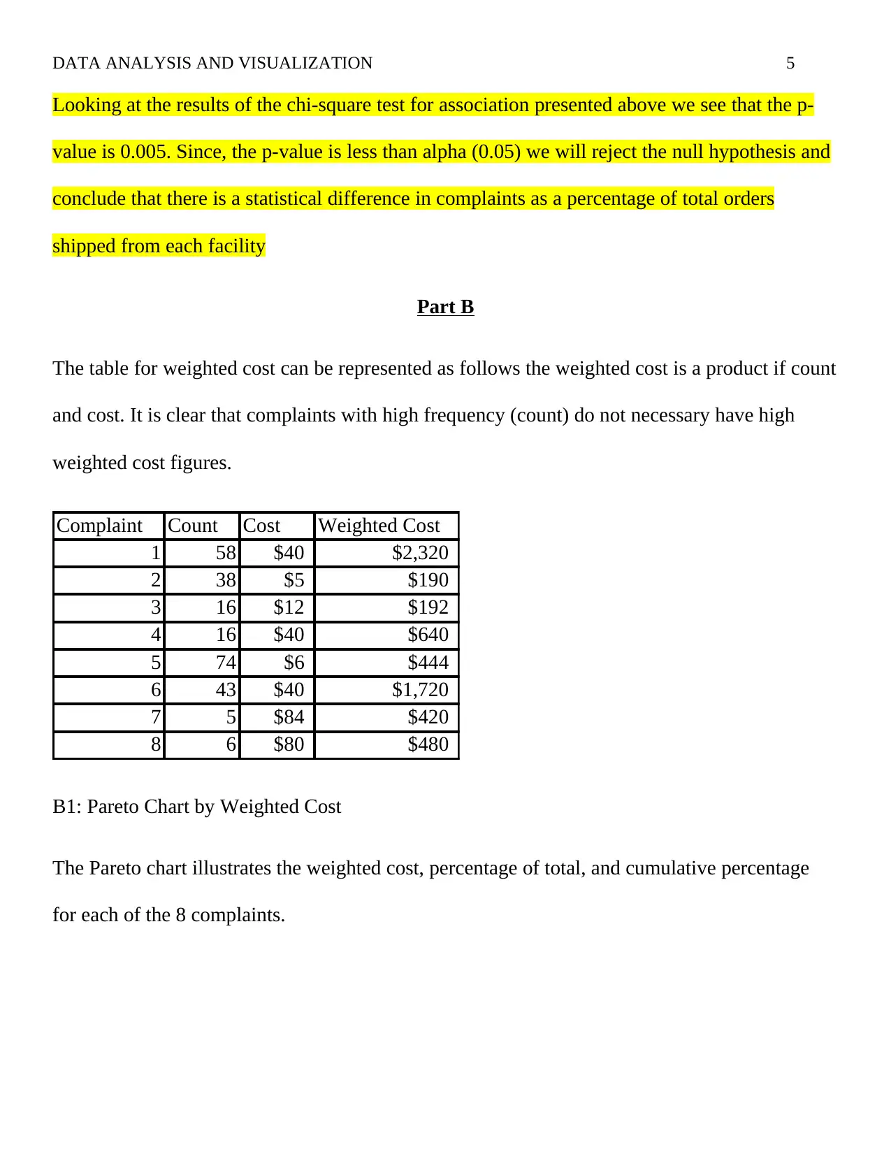
B1: Pareto Chart by Weighted Cost
The Pareto chart illustrates the weighted cost, percentage of total, and cumulative percentage
for each of the 8 complaints.
Looking at the results of the chi-square test for association presented above we see that the p-
value is 0.005. Since, the p-value is less than alpha (0.05) we will reject the null hypothesis and
conclude that there is a statistical difference in complaints as a percentage of total orders
shipped from each facility
Part B
The table for weighted cost can be represented as follows the weighted cost is a product if count
and cost. It is clear that complaints with high frequency (count) do not necessary have high
weighted cost figures.
Complaint Count Cost Weighted Cost
1 58 $40 $2,320
2 38 $5 $190
3 16 $12 $192
4 16 $40 $640
5 74 $6 $444
6 43 $40 $1,720
7 5 $84 $420
8 6 $80 $480
B1: Pareto Chart by Weighted Cost
The Pareto chart illustrates the weighted cost, percentage of total, and cumulative percentage
for each of the 8 complaints.
DATA ANALYSIS AND VISUALIZATION 6
Weighted Cost 2320 1720 640 480 444 420 192 190
Percent 36.2 26.8 10.0 7.5 6.9 6.6 3.0 3.0
Cum % 36.2 63.1 73.1 80.5 87.5 94.0 97.0 100.0
Complaint_1 Other3758461
7000
6000
5000
4000
3000
2000
1000
0
100
80
60
40
20
0
Weighted Cost
Percent
Pareto Chart of Complaint by Weighted Cost
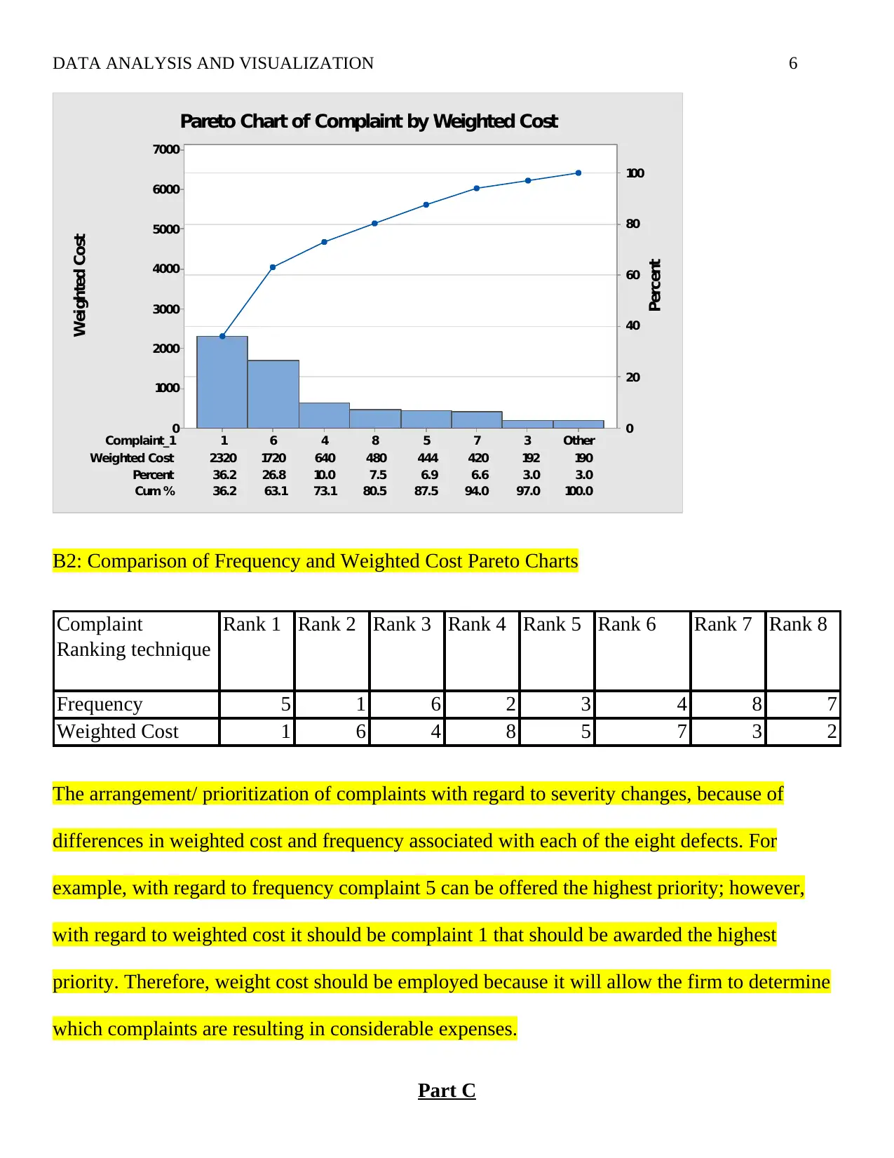
B2: Comparison of Frequency and Weighted Cost Pareto Charts
Complaint
Ranking technique
Rank 1 Rank 2 Rank 3 Rank 4 Rank 5 Rank 6 Rank 7 Rank 8
Frequency 5 1 6 2 3 4 8 7
Weighted Cost 1 6 4 8 5 7 3 2
The arrangement/ prioritization of complaints with regard to severity changes, because of
differences in weighted cost and frequency associated with each of the eight defects. For
example, with regard to frequency complaint 5 can be offered the highest priority; however,
with regard to weighted cost it should be complaint 1 that should be awarded the highest
priority. Therefore, weight cost should be employed because it will allow the firm to determine
which complaints are resulting in considerable expenses.
Part C
Weighted Cost 2320 1720 640 480 444 420 192 190
Percent 36.2 26.8 10.0 7.5 6.9 6.6 3.0 3.0
Cum % 36.2 63.1 73.1 80.5 87.5 94.0 97.0 100.0
Complaint_1 Other3758461
7000
6000
5000
4000
3000
2000
1000
0
100
80
60
40
20
0
Weighted Cost
Percent
Pareto Chart of Complaint by Weighted Cost
B2: Comparison of Frequency and Weighted Cost Pareto Charts
Complaint
Ranking technique
Rank 1 Rank 2 Rank 3 Rank 4 Rank 5 Rank 6 Rank 7 Rank 8
Frequency 5 1 6 2 3 4 8 7
Weighted Cost 1 6 4 8 5 7 3 2
The arrangement/ prioritization of complaints with regard to severity changes, because of
differences in weighted cost and frequency associated with each of the eight defects. For
example, with regard to frequency complaint 5 can be offered the highest priority; however,
with regard to weighted cost it should be complaint 1 that should be awarded the highest
priority. Therefore, weight cost should be employed because it will allow the firm to determine
which complaints are resulting in considerable expenses.
Part C
⊘ This is a preview!⊘
Do you want full access?
Subscribe today to unlock all pages.
Trusted by 1+ million students worldwide
DATA ANALYSIS AND VISUALIZATION 7
MISSING WORKSHEET
Part D
D1: Improvement Efforts
Improvement efforts should be focuses on cost reduction; as such, the company should strongly
focus on mitigating defects/complaints that result in expensive problem resolution measures e.g.
the shipment of a different product from what was ordered by the customer.
D2: Additional Information
Comparing the items against the facilities allows us to see which items are associated with a
given facility. Therefore we are able to see where a given number of items were manufactured.
Comparing the items against complaints allows us to see the different types of complaints
associated with a given product. The information allows us to institute safeguard to mitigate
complaints linked to specific items.
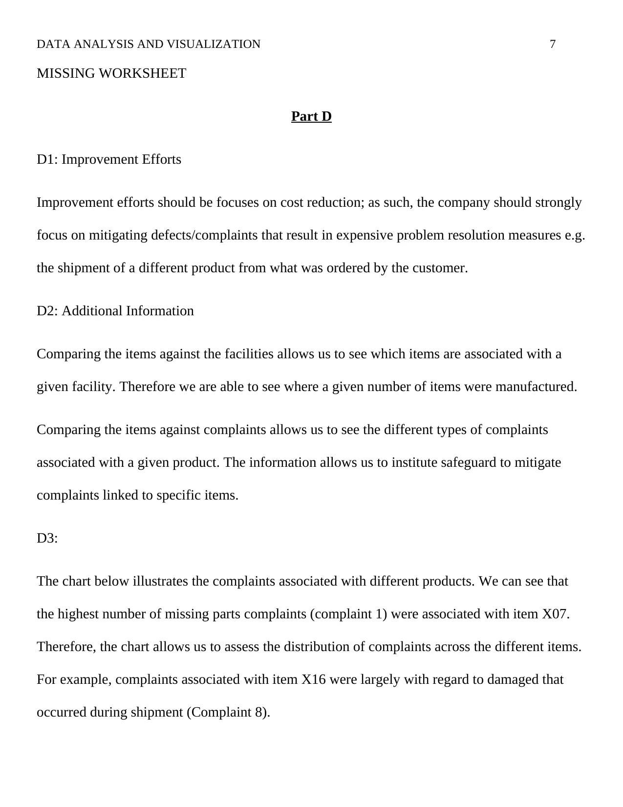
D3:
The chart below illustrates the complaints associated with different products. We can see that
the highest number of missing parts complaints (complaint 1) were associated with item X07.
Therefore, the chart allows us to assess the distribution of complaints across the different items.
For example, complaints associated with item X16 were largely with regard to damaged that
occurred during shipment (Complaint 8).
MISSING WORKSHEET
Part D
D1: Improvement Efforts
Improvement efforts should be focuses on cost reduction; as such, the company should strongly
focus on mitigating defects/complaints that result in expensive problem resolution measures e.g.
the shipment of a different product from what was ordered by the customer.
D2: Additional Information
Comparing the items against the facilities allows us to see which items are associated with a
given facility. Therefore we are able to see where a given number of items were manufactured.
Comparing the items against complaints allows us to see the different types of complaints
associated with a given product. The information allows us to institute safeguard to mitigate
complaints linked to specific items.
D3:
The chart below illustrates the complaints associated with different products. We can see that
the highest number of missing parts complaints (complaint 1) were associated with item X07.
Therefore, the chart allows us to assess the distribution of complaints across the different items.
For example, complaints associated with item X16 were largely with regard to damaged that
occurred during shipment (Complaint 8).
Paraphrase This Document
Need a fresh take? Get an instant paraphrase of this document with our AI Paraphraser
DATA ANALYSIS AND VISUALIZATION 8
80
40
0
Other
x02
x14
x08
x15
x13
x04
x07
x12
x16
x05
Other
x02
x14
x08
x15
x13
x04
x07
x12
x16
x05
80
40
0
Other
x02
x14
x08
x15
x13
x04
x07
x12
x16
x05
80
40
0
Complaint = 1
Item
Count
Complaint = 2 Complaint = 3
Complaint = 4 Complaint = 5 Complaint = 6
Complaint = 7 Complaint = 8
x02
Other
x05
x16
x12
x07
x04
x13
x15
x08
x14
Item
Pareto Chart of Item by Complaint
Part E
E1: Engineer’s Report
The report from the engineer explains two complaints made by customers: complaint 4
(incorrect part) and complaint 6 (correct part not fitting). A client may assume that a part is
incorrect because it does not fit the assembly point; likewise, another customer is able to see
that the part sent is correct but it fails to fit into its designated slot. The engineer indicates that
these two types of complaints are caused by overestimation and underestimation errors in parts
during the manufacturing process.
E2: Capability Analysis Output
80
40
0
Other
x02
x14
x08
x15
x13
x04
x07
x12
x16
x05
Other
x02
x14
x08
x15
x13
x04
x07
x12
x16
x05
80
40
0
Other
x02
x14
x08
x15
x13
x04
x07
x12
x16
x05
80
40
0
Complaint = 1
Item
Count
Complaint = 2 Complaint = 3
Complaint = 4 Complaint = 5 Complaint = 6
Complaint = 7 Complaint = 8
x02
Other
x05
x16
x12
x07
x04
x13
x15
x08
x14
Item
Pareto Chart of Item by Complaint
Part E
E1: Engineer’s Report
The report from the engineer explains two complaints made by customers: complaint 4
(incorrect part) and complaint 6 (correct part not fitting). A client may assume that a part is
incorrect because it does not fit the assembly point; likewise, another customer is able to see
that the part sent is correct but it fails to fit into its designated slot. The engineer indicates that
these two types of complaints are caused by overestimation and underestimation errors in parts
during the manufacturing process.
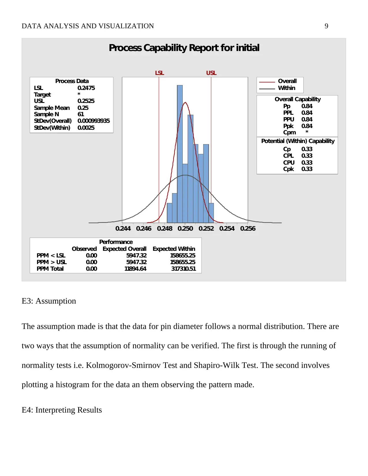
E2: Capability Analysis Output
DATA ANALYSIS AND VISUALIZATION 9
0.2560.2540.2520.2500.2480.2460.244
LSL 0.2475
Target *
USL 0.2525
Sample Mean 0.25
Sample N 61
StDev(Overall) 0.000993935
StDev(Within) 0.0025
Process Data
Pp 0.84
PPL 0.84
PPU 0.84
Ppk 0.84
Cpm *
Cp 0.33
CPL 0.33
CPU 0.33
Cpk 0.33
Potential (Within) Capability
Overall Capability
PPM < LSL 0.00 5947.32 158655.25
PPM > USL 0.00 5947.32 158655.25
PPM Total 0.00 11894.64 317310.51
Observed Expected Overall Expected Within
Performance
LSL USL
Overall
Within
Process Capability Report for initial
E3: Assumption
The assumption made is that the data for pin diameter follows a normal distribution. There are
two ways that the assumption of normality can be verified. The first is through the running of
normality tests i.e. Kolmogorov-Smirnov Test and Shapiro-Wilk Test. The second involves
plotting a histogram for the data an them observing the pattern made.
E4: Interpreting Results
⊘ This is a preview!⊘
Do you want full access?
Subscribe today to unlock all pages.
Trusted by 1+ million students worldwide
DATA ANALYSIS AND VISUALIZATION 10
There are two conditions given for assessing where the system being analyzed is capable. The
first is that the values of Cp’s (potential capability) and Pp’s (Overall capability) are similar.
Secondly the values for Cp’s and Pp’s have to be greater than or equal to a value of 1.33.
Looking at out result we see that the Cp’s and Pp’s are different; similarly, we can see that there
individual values are less that the stipulated value of 1.33. Therefore, we conclude that the
system is not capable.
E5: Out of Specified Lower and Upper limits
Looking at the values or CPL and CPU we see that only 33% will be within the desire lower
and upper limits respectively. As such, we expect that 67% of diameters made in future will be
out of the specified upper and lower limits.
Part F
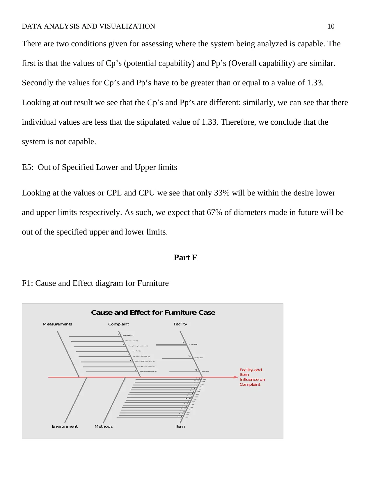
F1: Cause and Effect diagram for Furniture
Complaint
Influence on
Item
Facility and
Environment
Measurements
Methods
Complaint
Item
Facility
Texas (300)
Idaho (200)
Kansas (100)
X16
X15
X14
X13
X12
X11
X10
X09
X08
X07
X06
X05
X04
X03
X02
X01
Shipment Damaged (8)
Wrong product Shipped (7)
Correct Part Would not Fit (6)
Instructions Confusing (5)
Incorrect Part (4)
M issing/Wrong Instructions (3)
Shipment Late (2)
M issing Part (1)
Cause and Effect for Furniture Case
There are two conditions given for assessing where the system being analyzed is capable. The
first is that the values of Cp’s (potential capability) and Pp’s (Overall capability) are similar.
Secondly the values for Cp’s and Pp’s have to be greater than or equal to a value of 1.33.
Looking at out result we see that the Cp’s and Pp’s are different; similarly, we can see that there
individual values are less that the stipulated value of 1.33. Therefore, we conclude that the
system is not capable.
E5: Out of Specified Lower and Upper limits
Looking at the values or CPL and CPU we see that only 33% will be within the desire lower
and upper limits respectively. As such, we expect that 67% of diameters made in future will be
out of the specified upper and lower limits.
Part F
F1: Cause and Effect diagram for Furniture
Complaint
Influence on
Item
Facility and
Environment
Measurements
Methods
Complaint
Item
Facility
Texas (300)
Idaho (200)
Kansas (100)
X16
X15
X14
X13
X12
X11
X10
X09
X08
X07
X06
X05
X04
X03
X02
X01
Shipment Damaged (8)
Wrong product Shipped (7)
Correct Part Would not Fit (6)
Instructions Confusing (5)
Incorrect Part (4)
M issing/Wrong Instructions (3)
Shipment Late (2)
M issing Part (1)
Cause and Effect for Furniture Case
Paraphrase This Document
Need a fresh take? Get an instant paraphrase of this document with our AI Paraphraser
DATA ANALYSIS AND VISUALIZATION 11
The problem I selected was the assessment of facility and item influence on complaint type. It is
correct to assume that given items will results in specific complaints and likewise it is correct to
hypothesize that a given facility may be responsible for a significant number of the complaints
F2: the Causes
The causes are facility of manufacturing and items being manufactured. There are small
differences with regard to the procedures used by different facilities of the same company. It is
these small differences that result in the occurrence of errors that will result in customer
complaint. It is therefore appropriate to review and amend any undesirable practices at either
one of the three facilities. The second issue is with regard to the item being manufactured some
items are easy to manufacture and assemble at home; while others are complicated to
manufacturer and configure at home. Therefore clear guidelines and instructions should be set
in place to ensure that products are manufactured at the highest quality and the customer is
awarded all the necessary information on how to put together the ordered item.
Part G
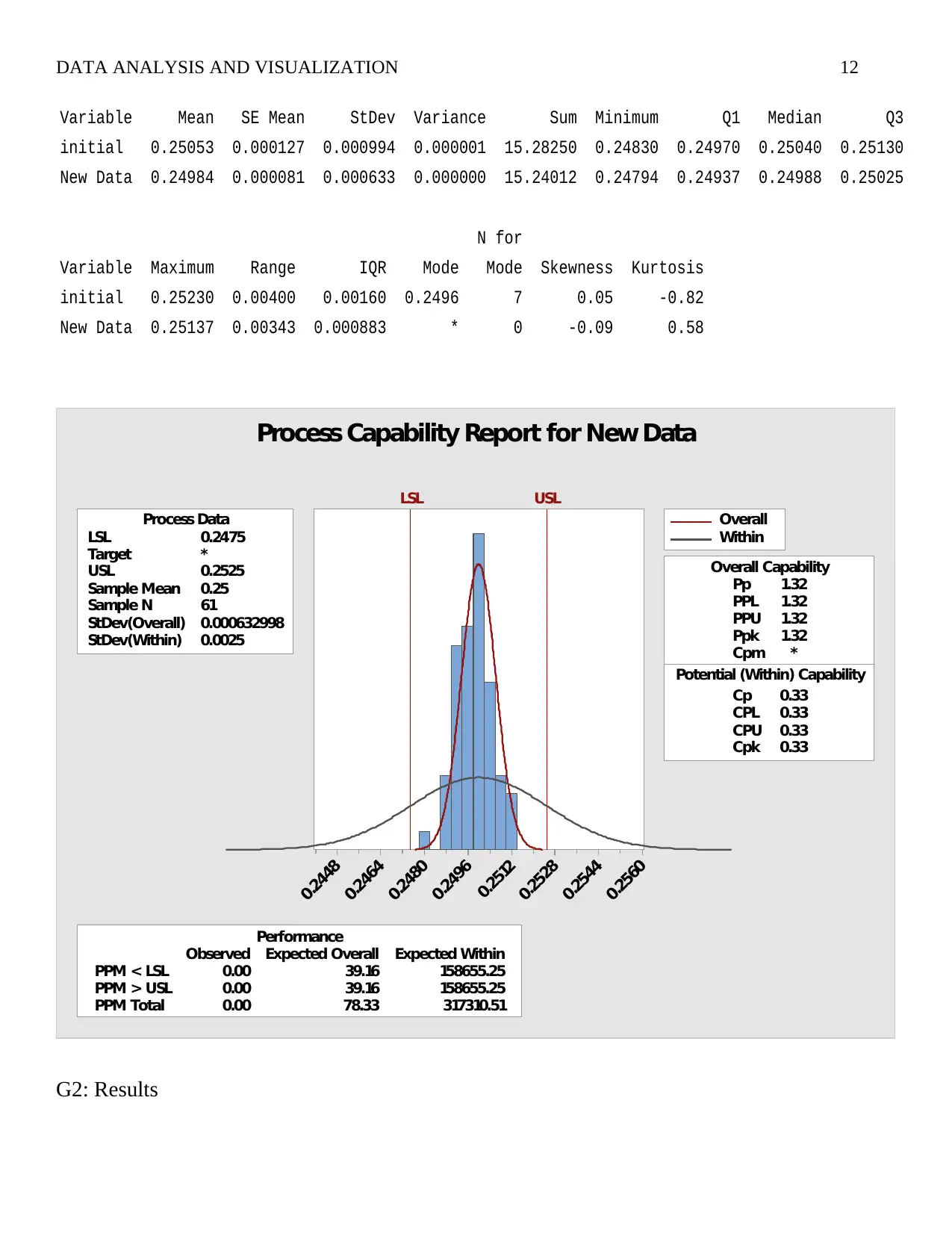
G1: Descriptive Statistics and Capability Analysis
The results for the descriptive analysis for initial and new data on pin diameter are presented
below. Also given is the capability analysis output that illustrates
The problem I selected was the assessment of facility and item influence on complaint type. It is
correct to assume that given items will results in specific complaints and likewise it is correct to
hypothesize that a given facility may be responsible for a significant number of the complaints
F2: the Causes
The causes are facility of manufacturing and items being manufactured. There are small
differences with regard to the procedures used by different facilities of the same company. It is
these small differences that result in the occurrence of errors that will result in customer
complaint. It is therefore appropriate to review and amend any undesirable practices at either
one of the three facilities. The second issue is with regard to the item being manufactured some
items are easy to manufacture and assemble at home; while others are complicated to
manufacturer and configure at home. Therefore clear guidelines and instructions should be set
in place to ensure that products are manufactured at the highest quality and the customer is
awarded all the necessary information on how to put together the ordered item.
Part G
G1: Descriptive Statistics and Capability Analysis
The results for the descriptive analysis for initial and new data on pin diameter are presented
below. Also given is the capability analysis output that illustrates
DATA ANALYSIS AND VISUALIZATION 12
Variable Mean SE Mean StDev Variance Sum Minimum Q1 Median Q3
initial 0.25053 0.000127 0.000994 0.000001 15.28250 0.24830 0.24970 0.25040 0.25130
New Data 0.24984 0.000081 0.000633 0.000000 15.24012 0.24794 0.24937 0.24988 0.25025
N for
Variable Maximum Range IQR Mode Mode Skewness Kurtosis
initial 0.25230 0.00400 0.00160 0.2496 7 0.05 -0.82
New Data 0.25137 0.00343 0.000883 * 0 -0.09 0.58
0.2560
0.2544
0.2528
0.2512
0.2496
0.2480
0.2464
0.2448
LSL 0.2475
Target *
USL 0.2525
Sample Mean 0.25
Sample N 61
StDev(Overall) 0.000632998
StDev(Within) 0.0025
Process Data
Pp 1.32
PPL 1.32
PPU 1.32
Ppk 1.32
Cpm *
Cp 0.33
CPL 0.33
CPU 0.33
Cpk 0.33
Potential (Within) Capability
Overall Capability
PPM < LSL 0.00 39.16 158655.25
PPM > USL 0.00 39.16 158655.25
PPM Total 0.00 78.33 317310.51
Observed Expected Overall Expected Within
Performance
LSL USL
Overall
Within
Process Capability Report for New Data
G2: Results
⊘ This is a preview!⊘
Do you want full access?
Subscribe today to unlock all pages.
Trusted by 1+ million students worldwide
1 out of 17
Your All-in-One AI-Powered Toolkit for Academic Success.
+13062052269
info@desklib.com
Available 24*7 on WhatsApp / Email
![[object Object]](/_next/static/media/star-bottom.7253800d.svg)
Unlock your academic potential
Copyright © 2020–2026 A2Z Services. All Rights Reserved. Developed and managed by ZUCOL.