Interface Design and Activity Description: Farm Shop Mobile App
VerifiedAdded on 2023/06/13
|12
|1541
|327
Project
AI Summary
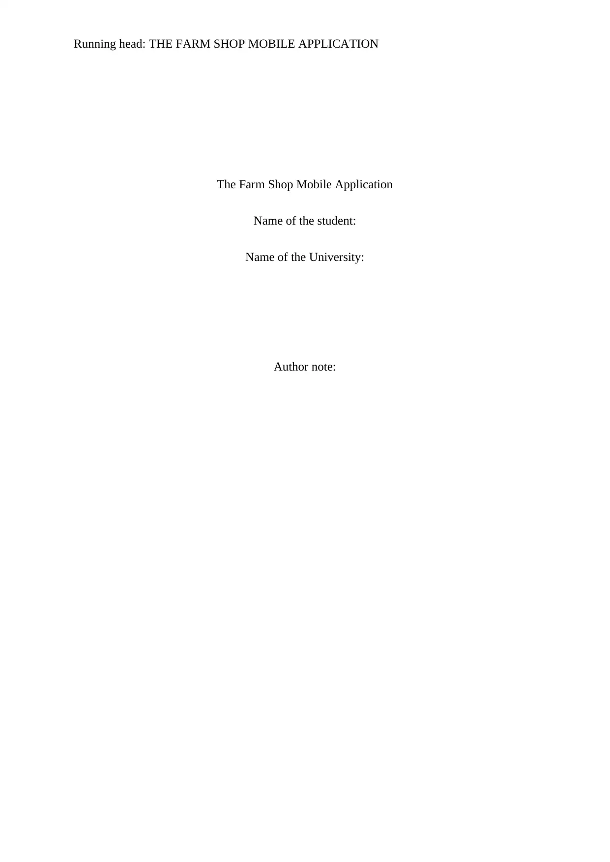
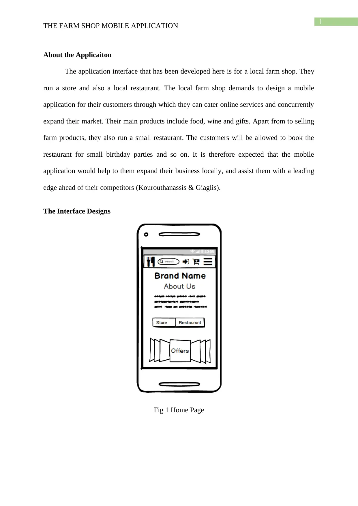
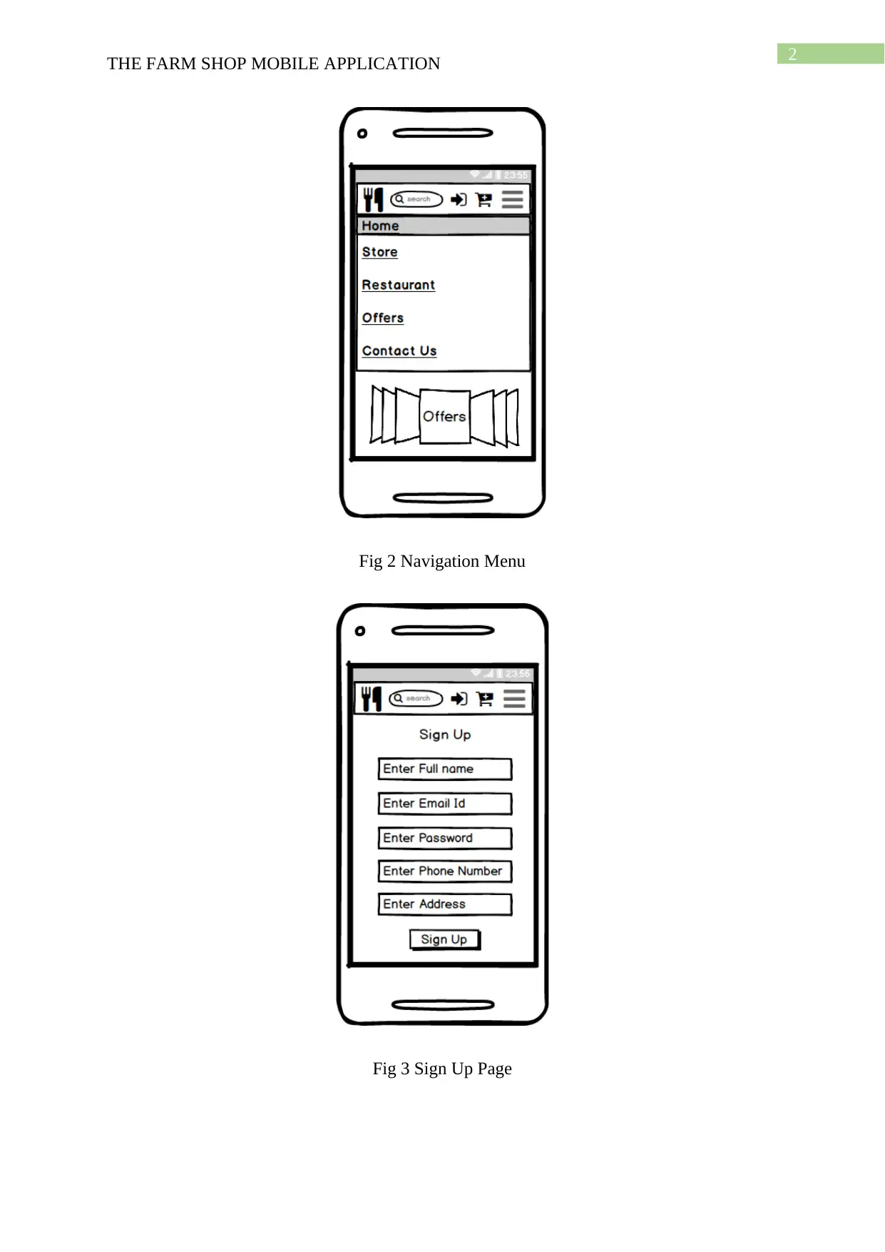
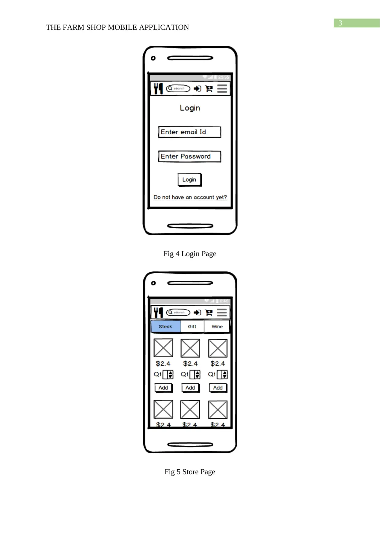
This project outlines the design of a mobile application for a local farm shop, aiming to expand their market and cater to customers online. The app includes key features such as a home page, navigation menu, user registration and login, a store page for browsing products (food, wine, gifts), a cart page, payment options, restaurant booking, and a contact/find us page with map integration. Design decisions prioritize user experience, efficient screen space utilization, and consistent navigation, adhering to UX design principles and Shneiderman's rules for interface consistency. The design incorporates features like a collapsible navigation menu, visible cart status, and direct access to important tools, while also considering accessibility for visually impaired users. The inclusion of date-time pickers and map options enhances the user interface, providing a comprehensive mobile solution for the farm shop's customers.

Running head: THE FARM SHOP MOBILE APPLICATION
The Farm Shop Mobile Application
Name of the student:
Name of the University:
Author note:
The Farm Shop Mobile Application
Name of the student:
Name of the University:
Author note:
Paraphrase This Document
Need a fresh take? Get an instant paraphrase of this document with our AI Paraphraser

1
THE FARM SHOP MOBILE APPLICATION
About the Applicaiton
The application interface that has been developed here is for a local farm shop. They
run a store and also a local restaurant. The local farm shop demands to design a mobile
application for their customers through which they can cater online services and concurrently
expand their market. Their main products include food, wine and gifts. Apart from to selling
farm products, they also run a small restaurant. The customers will be allowed to book the
restaurant for small birthday parties and so on. It is therefore expected that the mobile
application would help to them expand their business locally, and assist them with a leading
edge ahead of their competitors (Kourouthanassis & Giaglis).
The Interface Designs
Fig 1 Home Page

2
THE FARM SHOP MOBILE APPLICATION
Fig 2 Navigation Menu
Fig 3 Sign Up Page
THE FARM SHOP MOBILE APPLICATION
Fig 2 Navigation Menu
Fig 3 Sign Up Page
⊘ This is a preview!⊘
Do you want full access?
Subscribe today to unlock all pages.

Trusted by 1+ million students worldwide

3
THE FARM SHOP MOBILE APPLICATION
Fig 4 Login Page
Fig 5 Store Page
THE FARM SHOP MOBILE APPLICATION
Fig 4 Login Page
Fig 5 Store Page
Paraphrase This Document
Need a fresh take? Get an instant paraphrase of this document with our AI Paraphraser

4
THE FARM SHOP MOBILE APPLICATION
Fig 6 Cart Page
THE FARM SHOP MOBILE APPLICATION
Fig 6 Cart Page

5
THE FARM SHOP MOBILE APPLICATION
Fig 7 Payment Page
Fig 8 Restaurant Page
THE FARM SHOP MOBILE APPLICATION
Fig 7 Payment Page
Fig 8 Restaurant Page
⊘ This is a preview!⊘
Do you want full access?
Subscribe today to unlock all pages.

Trusted by 1+ million students worldwide

6
THE FARM SHOP MOBILE APPLICATION
Fig 9 Party Book Date/Time picker
Fig 10 Contact/Find Us Page
THE FARM SHOP MOBILE APPLICATION
Fig 9 Party Book Date/Time picker
Fig 10 Contact/Find Us Page
Paraphrase This Document
Need a fresh take? Get an instant paraphrase of this document with our AI Paraphraser

7
THE FARM SHOP MOBILE APPLICATION
Choice of Design and Activity Description
The application is meant to have 9 specific pages or activities, each having particular
responsibility. The Home page as it can be seen in the Fig 1 above, is significantly the
landing page of the application. The home page provides the basic details about the company
and the application. The home page also assists the user to peep into the offers section. The
offers section would lead the user to the specific products, on clicking. The small menu
buttons guides the user into the store or the restaurant page of the application, from the home
screen. This page offers quite a handsome information to enlighten any visitor about the parts
and participles of the farm app and their services.
As it can be seen in fig 2, the navigational menu has been coupled into one small
navigation icon on the top-right corner of the screen. On clicking this icon, the navigational
menu drops down, from where the visitor can navigate to any page within the application.
This offers a versatility to the application and is certainly one of the most important factors of
this design. The reason behind making this design choice shall be discussed in a later section
of the report.
On clicking the Login icon on the top menu bar, the user will be directed to the login
page, where he or she can enter a valid registered username and password and login to the
system. However, if the user is not registered to the application, he can opt to choose the “Not
a member yet?” icon and get directed to the Sign Up page. Here the user will be asked to
enter his or her personal details and also would be required to create a password for security
login purposes. The login and the sign-Up page can be referred to from fig 3 and 4
respectively.
The Store Page in fig 5 allows user to browse the various product-based services that
the farm-shop offers. This ranges from a wide range of food items to wine and gifts. The user

8
THE FARM SHOP MOBILE APPLICATION
can navigate between these sections within the store page, just by clicking on the respective
sub-menu buttons. The respective products available under each category would be visible in
a scrollable area, below. The customer may choose to add one or more of these items to the
cart by switching between categories and finally press the checkout button to view the cart
status.
Fig 6 shows a gist view of the cart page. All items added by the customer will be
visible here with an option to remove items from the cart. In addition, the users will have to
login (if they are not already logged in) before proceeding to checkout with payment.
The payment page shown in the interface designs only highlight the card payment
screen. The business may also offer their customers with the option for Cash on Delivery or
other payment option.
For the restaurant services, the application allows the customers to book tables
directly using the application by choosing the number of tables to be booked, the date and the
time. Also can the customer opt to book the restaurant for a complete day in order to
celebrate a party.
The last image shows the contacts page with the contact details and the links to the
social media handles. The Find Us section can also be found in this page with a google map
like interface.
Design Decisions
It can be clearly seen from the designs that one of the main aims was to utilize every
available screen space, keeping in mind the golden rules of design. The 8 golden rules of
interface or UX design clearly mention that a design must comprehend the ability of constant
navigation between the most important pages within the environment. The icon-based
⊘ This is a preview!⊘
Do you want full access?
Subscribe today to unlock all pages.

Trusted by 1+ million students worldwide

9
THE FARM SHOP MOBILE APPLICATION
navigation menu fulfils this criteria. In addition, it averts the need for a fully laid out
navigation bar which would have otherwise taken up a lot of place (Neil, 2014).
The brand logo, search option, the login and the cart status option is visible in every
page in the menu bar on the tab. This allows the users to access the most important tools or
options whenever they prefer to. As per the Shneiderman's rules, in order to maintain
consistence in design, the same menu bar layout have been used in all the pages alongside a
similar image and font style and size (Mazumder & Das, 2014). This allows the users to stay
connected to the application instead of bottling them off with confusing option layouts on
every other page.
The back button has been discarded from the UI so as to encourage the use of the
device back button. This saved up space for using other buttons. On a mobile device, it is
necessary to present the user with all important options at their fingertip on a small screen,
which demanded the back button to be discarded and in return persuade the user to use the
system button. The presence of the price tags and the removal button on the cart page would
allow the users to remove items depending on their net costing, at the last moment of
checkout. This design choice helped to keep the user from returning back to the store page for
editing the cart.
Finally, the date-time picker and the map options can be highlighted. These could
have been achieved via simple text tabs or native interface options, but the external API
based look and feel adds to the design. The map points two types of locations, the red and the
large one denotes the Store and the black pointer, the restaurant. This allows the customers to
easily reach the company. The phone number and the social media handles would also allow
them to share reviews or concerns with the company. This too was crucial design
implementation. One last concern that the design was meant to serve was that certain
Paraphrase This Document
Need a fresh take? Get an instant paraphrase of this document with our AI Paraphraser

10
THE FARM SHOP MOBILE APPLICATION
elements within the application were designed in relatively larger visuals, so as to server the
visually impaired of older adults (de Barros, Leitão, & Ribeiro, 2014).
THE FARM SHOP MOBILE APPLICATION
elements within the application were designed in relatively larger visuals, so as to server the
visually impaired of older adults (de Barros, Leitão, & Ribeiro, 2014).

11
THE FARM SHOP MOBILE APPLICATION
References
de Barros, A. C., Leitão, R., & Ribeiro, J. (2014). Design and evaluation of a mobile user
interface for older adults: navigation, interaction and visual design
recommendations. Procedia Computer Science, 27, 369-378.
Kourouthanassis, P. E., & Giaglis, G. M. (2012). Introduction to the special issue mobile
commerce: the past, present, and future of mobile commerce research. International
Journal of Electronic Commerce, 16(4), 5-18.
Mazumder, F. K., & Das, U. (2014). Usability guidelines for usable user
interface. International Journal of Research in Engineering and Technology, 3(9), 79-
82.
Neil, T. (2014). Mobile design pattern gallery: UI patterns for smartphone apps. " O'Reilly
Media, Inc.".
⊘ This is a preview!⊘
Do you want full access?
Subscribe today to unlock all pages.

Trusted by 1+ million students worldwide
1 out of 12
Related Documents

Your All-in-One AI-Powered Toolkit for Academic Success.
+13062052269
info@desklib.com
Available 24*7 on WhatsApp / Email
Unlock your academic potential
Copyright © 2020–2025 A2Z Services. All Rights Reserved. Developed and managed by ZUCOL.