FIT1043 Assignment 2: Data Science Project - Ocean Atmosphere Analysis

Verified

Added on  2022/11/09

|9
|921
|62
Project
AI Summary
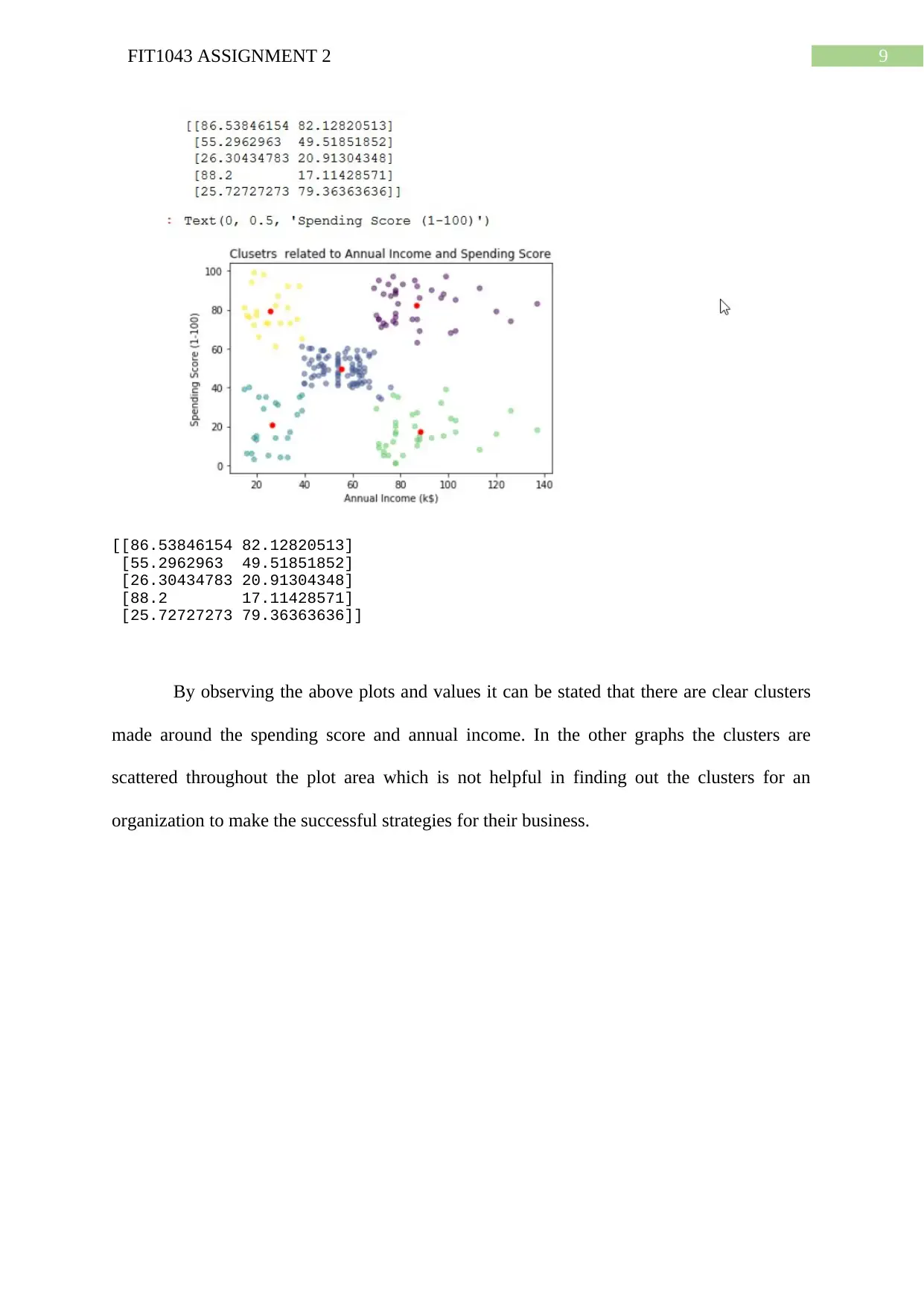
This document presents a comprehensive solution for FIT1043 Assignment 2, a data science project focused on analyzing the Tropical Atmosphere Ocean (TAO) dataset using Python. The assignment involves reading and extracting data, performing data exploration, data wrangling, and analysis. The solution includes calculating descriptive statistics (minimum and maximum values), data type conversions, handling missing values, and generating visualizations such as box plots and heatmaps to depict sea surface temperature trends, precipitation measurements, and attribute correlations. Furthermore, the solution implements decision tree and regression models for prediction and also provides the analysis of customer segmentation data using K-means clustering. The accuracy of the decision tree model is evaluated, and the predicted values are compared with the original data. The assignment demonstrates the application of Python libraries like pandas, matplotlib, and scikit-learn for data manipulation, analysis, and machine learning tasks. The solution also discusses the creation of clusters based on annual income and spending scores.
Document Page
Running head: FIT1043 ASSIGNMENT 2
FIT1043 Assignment 2
Name of the Student
Name of the University
Authors note
tabler-icon-diamond-filled.svg

Paraphrase This Document

Need a fresh take? Get an instant paraphrase of this document with our AI Paraphraser
Document Page
2FIT1043 ASSIGNMENT 2
Task A
A1
There are 35136 rows and 8 columns in the provided dataset which are 'Timestamp',
'YYYYMMDD', 'HHMMSS', 'PREC', 'AIRT', 'SST', 'RH', 'Q'.
A2
In order to get the minimum, maximum values for the columns 'PREC', 'AIRT',
'SST', 'RH', the describe function is used on the dataset and the results are depicted in the
table below.
PREC AIRT SST RH
min -9.990000 -99.900000 -99.900000 -99.900000
max 75.770000 31.570000 31.346000 98.100000
A3
When we tried to get the month from the data, it is found that the “YYYYMMDD”
were in the int format usng the dtypes commands.
Timestamp int64
YYYYMMDD int64
HHMMSS int64
PREC float64
AIRT float64
SST float64
RH float64
Q object
dtype: object
after changing the format to date time, and in the further analysis of the dataset, the
following table of records are found.
HHMMSS PREC AIRT SST RH Q YEAR
MONTH
1 4464 4464 4464 4464 446 4464 4464
Document Page
3FIT1043 ASSIGNMENT 2
4
2 4032 4032 4032 4032 403
2
4032 4032
3 4464 4464 4464 4464 446
4
4464 4464
4 4320 4320 4320 4320 432
0
4320 4320
5 4464 4464 4464 4464 446
4
4464 4464
6 4320 4320 4320 4320 432
0
4320 4320
7 4464 4464 4464 4464 446
4
4464 4464
8 4464 4464 4464 4464 446
4
4464 4464
9 144 144 144 144 144 144 144
A4
As there are four column that may contain the missing values as their values,
Timestamp 0
YYYYMMDD 0
HHMMSS 0
PREC 401
AIRT 90
SST 46
RH 90
Q 0
dtype: int64
From the above output table, it can be stated that the three are total (401+90+46+90)
=627 missing values.
A5
Using the matplotlib and sns library the following box plot is generated that depicts
the sea surface temperature over the different months.
Document Page
4FIT1043 ASSIGNMENT 2
Here it can be stated that, the boxplot are considered as the standardized plotting
technique in order to displaying of a certain data column value distribution depending on
the five factors which are minimum value, first quartile values, median, third quartile and
finally the maximum value. This plots can inform the audience about the outliers in the
selected dataset and their values. From the above box plot it can be seen that maximum
median value is recorded for the 6th month of the year or in the month of June. There is no
consistent growth or decrease in the SST values. The lowest value is recorded in the month of
February.
A6
From the selected dataset the following precipitation measurements trend over
different timestamps.
tabler-icon-diamond-filled.svg

Paraphrase This Document

Need a fresh take? Get an instant paraphrase of this document with our AI Paraphraser
Document Page
5FIT1043 ASSIGNMENT 2
A7
The correlation between the different attributes is presented in the following heat
map.
From the above correlation heat map it is evident that, the PREC and the SST has the
lowest liner association among them and on the other hand the RH and AIRT has the highest
linear association between them.
Document Page
6FIT1043 ASSIGNMENT 2
A8
For this part the following code section is used in order to get build the model and get
the accuracy is computed;
mport pandas as pd
from sklearn.tree import DecisionTreeClassifier
from sklearn.model_selection import train_test_split
from sklearn import metrics
clsf = DecisionTreeClassifier()
clsf = clsf.fit(X_train,y_train)
y_predict = clsf.predict(X_test)
Here, it can be stated that the developed model is quite accurate that provides the
accuracy value up to 99.8%.
A9
For the prediction the following is the predicted mode for the dataset which produces
the result for the 2nd September 2006 as 82.2 for the Relative humidity.
Document Page
7FIT1043 ASSIGNMENT 2
With the new model, the value for the RH is generated as 79.6 and can be said that
it is better fit for this data when we compared the values in decision tree produced in the
previous stages.
A10
Using the regression model, the missing data which is defined for the numbers -
9.99999 and -99.99999 the data was replaced.
Task B
For this part the customer segmentation data was selected which is provided along
with the code file attached folder. In the developed K-means clustering process there are
multiple clusters are created that are dependent on the different attributes or the factors in the
dataset. The link for the data set is given by;
https://www.kaggle.com/vjchoudhary7/customer-segmentation-tutorial-in-python.
Following are some of the clustering plots that are created for this task,
tabler-icon-diamond-filled.svg

Paraphrase This Document

Need a fresh take? Get an instant paraphrase of this document with our AI Paraphraser
Document Page
8FIT1043 ASSIGNMENT 2
25.06451613 59.48387097]
[ 36.6 109.7 ]
[ 29.53658537 27.24390244]
[ 56.62 48.48 ]
[ 38.25862069 78.15517241]]
[[44.70588235 38.76470588]
[30.1754386 82.35087719]
[43.28205128 11.84615385]
[60.36666667 51.16666667]
[25.775 50.775 ]]
Document Page
9FIT1043 ASSIGNMENT 2
[[86.53846154 82.12820513]
[55.2962963 49.51851852]
[26.30434783 20.91304348]
[88.2 17.11428571]
[25.72727273 79.36363636]]
By observing the above plots and values it can be stated that there are clear clusters
made around the spending score and annual income. In the other graphs the clusters are
scattered throughout the plot area which is not helpful in finding out the clusters for an
organization to make the successful strategies for their business.
chevron_up_icon
1 out of 9
circle_padding
hide_on_mobile
zoom_out_icon
[object Object]