Global Toys Website Development Review Report - [Course Name]
VerifiedAdded on 2023/04/21
|12
|2137
|426
Report
AI Summary
This report provides a comprehensive review of the Global Toys website, a platform designed to assist customers in navigating the physical store and selecting products. The report covers essential aspects of the website development project, including its purpose, communication strategies, typography, color scheme, navigation, and layout. It features a user acceptance test to evaluate usability among diverse users, highlighting walkthroughs and assessments of functionality and ease of use. Based on the evaluation results, the report recommends improvements such as enhancing website descriptiveness, incorporating an 'image-hover' feature, and adding an image slider for new toy collections. The goal is to make the website more engaging, reflective, and user-friendly, paving the way for future e-commerce capabilities. The report concludes that developing the website was a positive step, provided the recommended design principles and evaluation results are incorporated.
Global Toys Website report
[Course Name]
[Course Name]
Paraphrase This Document
Need a fresh take? Get an instant paraphrase of this document with our AI Paraphraser
Contents
1 Introduction........................................................................................................................2
Content...................................................................................................................................2
Purpose...................................................................................................................................2
Communication......................................................................................................................2
Typefaces...............................................................................................................................3
Colour.....................................................................................................................................3
Navigation..............................................................................................................................3
Layout....................................................................................................................................4
2 Features..............................................................................................................................7
3 User Acceptance Test.........................................................................................................7
Usability / Walkthroughs.......................................................................................................8
Functionality and Ease of Use................................................................................................9
4 Recommendation..............................................................................................................10
5 Conclusion........................................................................................................................10
6 References........................................................................................................................11
1
1 Introduction
Global Toys, is a proprietary firm that sells toys. They have a shop in the metropolitan city in
the area of one acre. The shop is large enough which makes it difficult for customers to find
their way through it while shopping. Any store in the modern world today use website to
promote and sell themselves. It helps them a platform to show the world information about
the company, products, and services. It also provides them opportunities for marketing and
selling through the ecommerce solutions. A website was developed for the toy store that
helps customers to understand the store layout and select products to buy. This is a review
report of the project that covers the essentials of the website development project including
its scope, development purpose, and user evaluation. Based on this evaluation, certain
recommendations have been provided for the website.
Content
Websites can be very dynamic and can house huge information. With new technologies used
in development, complex web-systems are created that have to be managed by developers.
Not just the technical but also the understanding of design principles that would make the
website best for customers also need to be followed. A website needs a minimal design, clear
information hierarchy, easy interface, navigational excellence, appropriate typography and
font, and should take care of hermeneutics. Common guidelines are available on development
when considering all these areas. A website made with these guidelines followed would have
high chances of getting success in the online space.
Purpose
The objective of the website is to make it easy for Global toy customers to find their products
in the store. The website contains information about the store such as its opening times,
contact details, addresses, company information, terms, and policies, and the product details.
Product details include descriptions, images, colours, specifications, prices, and shipping
details. Products are more focused on the website including on the web page as they are most
important for customers. Thus, products are showcased in all major pages and also provided
with easy navigation through menu.
Communication
The website has a contact form feature that allows customers to communicate with the brand
by sending an email. Besides this, the contact page also has company contact details like
email, phone numbers and store address. This gives visitors a choice which they can make by
2
⊘ This is a preview!⊘
Do you want full access?
Subscribe today to unlock all pages.
Trusted by 1+ million students worldwide
either contacting the company themselves using given details or letting the company call
them back by posting their contact details.
Typefaces
Text makes an important piece for a website as it is what customers or prospects would read
to learn about the company and its products. An appropriate typeface could make a website
look poor and thus, standard typefaces that are widely accepted by ecommerce companies
must be chosen. H1, H2, and H3 tags should be used for creating highlighted tests. The fonts
selected should be widely adopted ones and not the fancy ones.
Colour
The colour creates an impact on a visitor and thus, needs to be carefully selected. The website
should have colour that can be associated with business theme so that recognition is better.
The website used light and pleasing colours as it is targeted to children stuff. The choice of
colour is appropriate for the store that has to appeal the parents or the kids.
Navigation
The website uses a simple navigation through all major pages connected via menu items.
Navigation can be local or global. In global navigation, users are guided through the different
sections of the website while local navigation allows them to shift to different sections within
pages. The website used local navigation so that customers could scroll through sections of
the website faster and with ease (Eberts, 2012). Within product page, a user or customer
would be able to scroll through different sections to find the needed information.
3
Paraphrase This Document
Need a fresh take? Get an instant paraphrase of this document with our AI Paraphraser
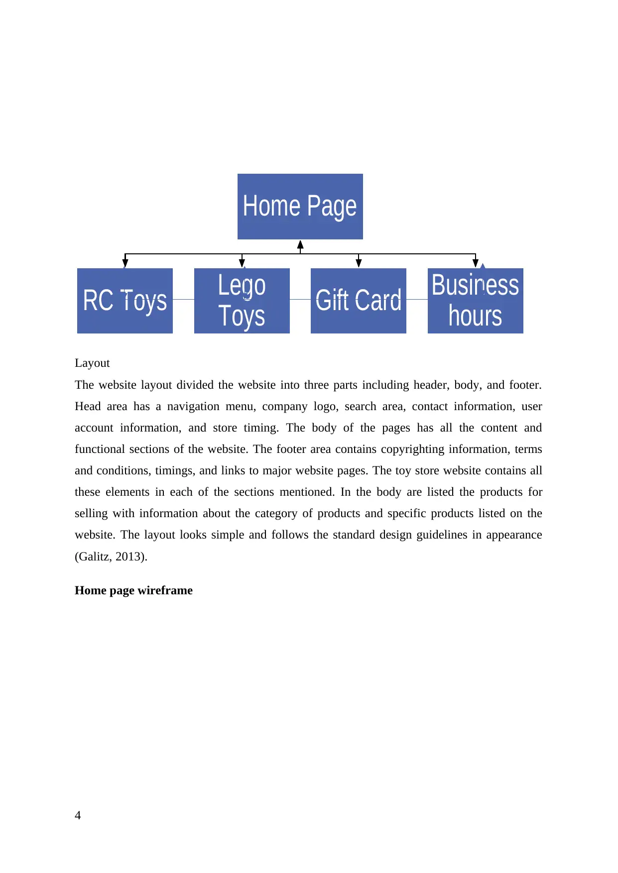
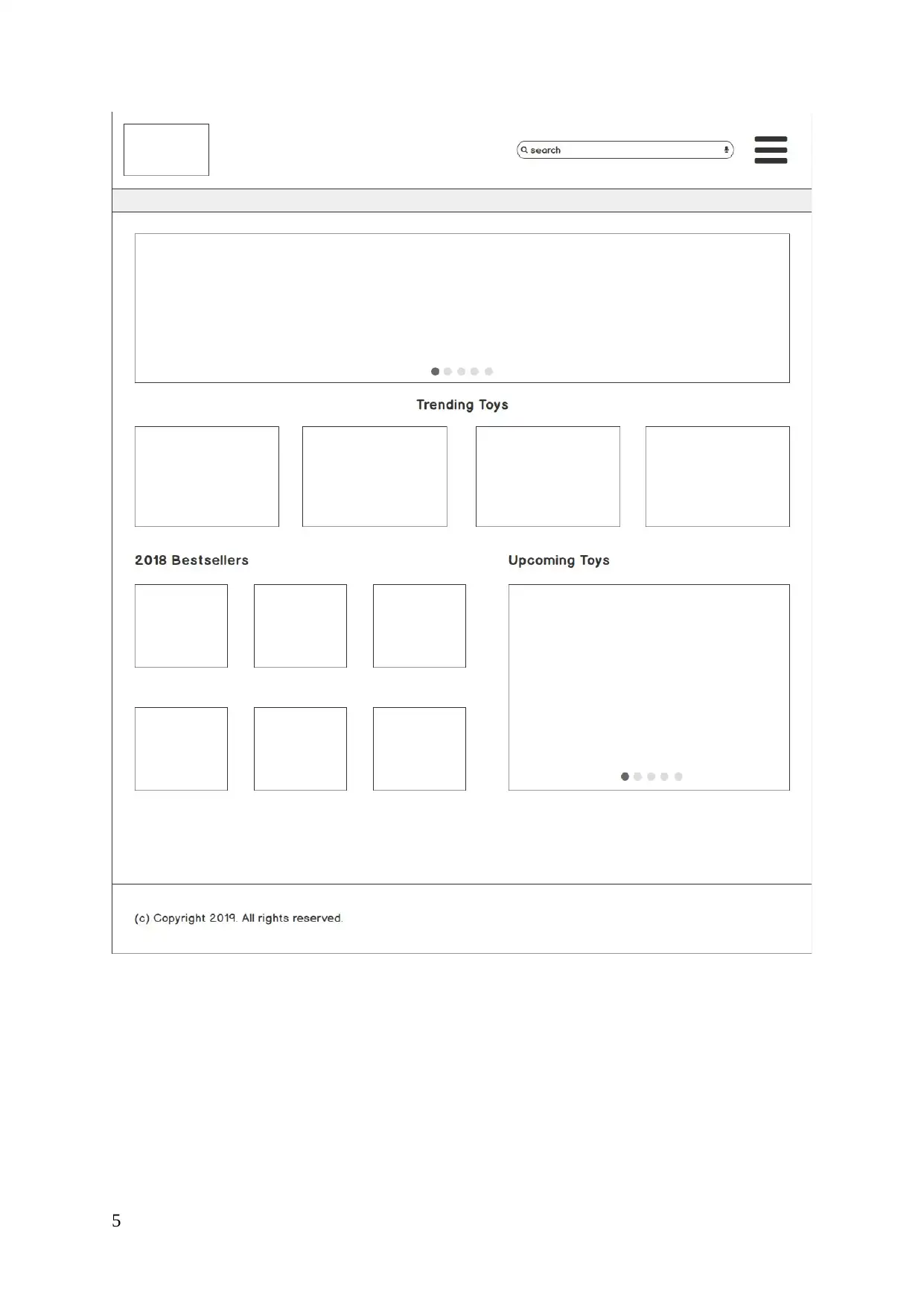
Layout
The website layout divided the website into three parts including header, body, and footer.
Head area has a navigation menu, company logo, search area, contact information, user
account information, and store timing. The body of the pages has all the content and
functional sections of the website. The footer area contains copyrighting information, terms
and conditions, timings, and links to major website pages. The toy store website contains all
these elements in each of the sections mentioned. In the body are listed the products for
selling with information about the category of products and specific products listed on the
website. The layout looks simple and follows the standard design guidelines in appearance
(Galitz, 2013).
Home page wireframe
4
Home Page
RC Toys Lego
Toys Gift Card Business
hours
5
⊘ This is a preview!⊘
Do you want full access?
Subscribe today to unlock all pages.
Trusted by 1+ million students worldwide
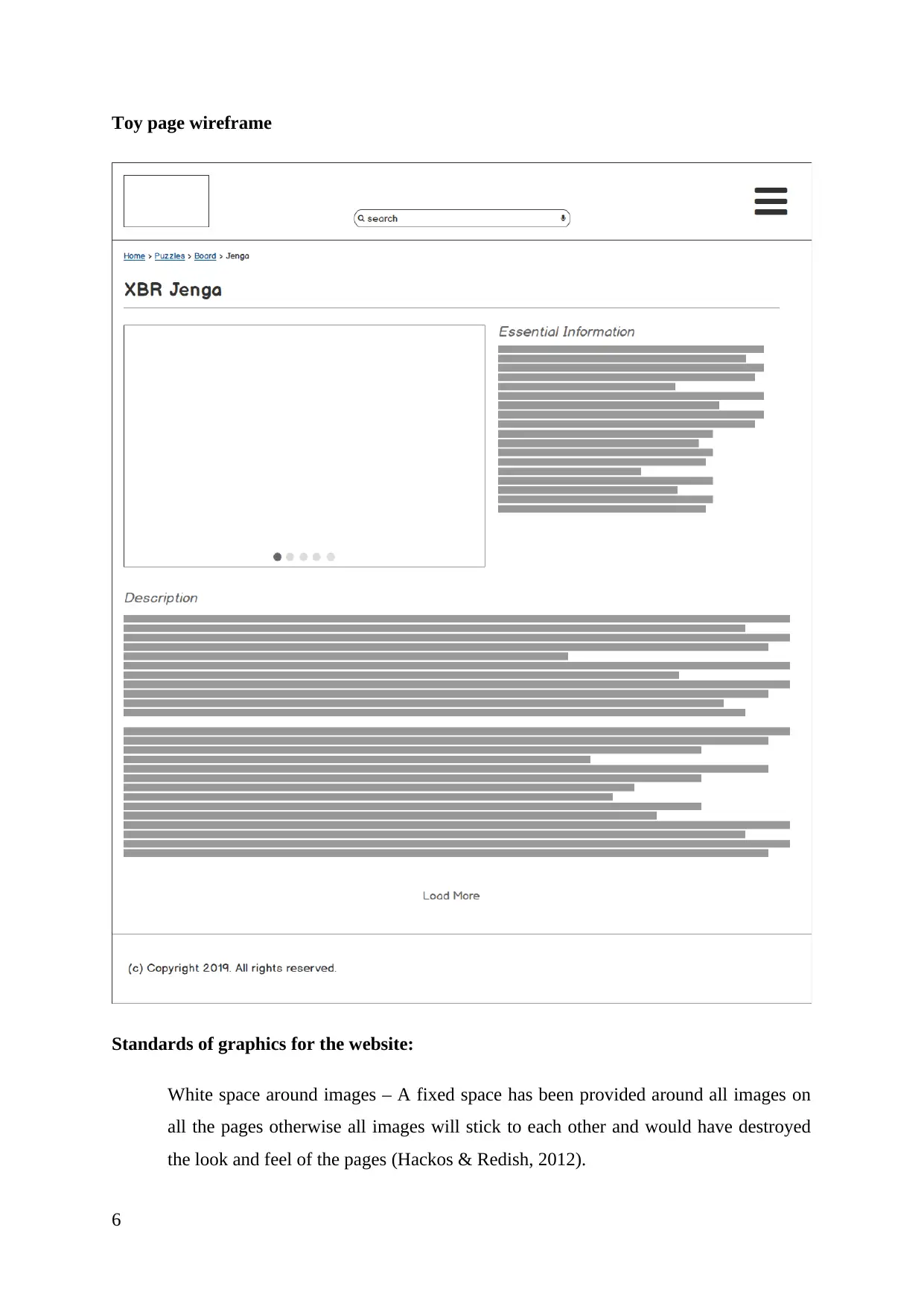
Toy page wireframe
Standards of graphics for the website:
White space around images – A fixed space has been provided around all images on
all the pages otherwise all images will stick to each other and would have destroyed
the look and feel of the pages (Hackos & Redish, 2012).
6
Standards of graphics for the website:
White space around images – A fixed space has been provided around all images on
all the pages otherwise all images will stick to each other and would have destroyed
the look and feel of the pages (Hackos & Redish, 2012).
6
Paraphrase This Document
Need a fresh take? Get an instant paraphrase of this document with our AI Paraphraser
img tag attributes – src attribute is mandatory for all images.
Alt and titles attributes were not used but if they would have been used then following
naming convention should have been used:
o Alt - <pageName>_<imageName>
o Title - <pageName>_<imageName>_<description>
Color of visited links – Blue
2 Features
The Global Toys website would be having two distinct features. The first feature is an
interactive floor plan. This plan links each of the department to another and displays a picture
of the same. It is important that the picture is displayed in a format that can be adapted to
different screens and sizes without skewing the ratio too much, such that it becomes unusable
on a different device or resolution. Another key feature is having an option to contact the
store owners via a customer feedback form (Lauesen, 2012). This would allow the users to
contact the store owners while at the same time allow store owners to help generate leads for
their stores. Other features such as the copyright information, legal disclaimer and search
would be present on all pages. Additionally, all other pages would be made as engaging as
possible using engagement driving content, captivating images among others.
3 User Acceptance Test
The user acceptance test helps in identifying if the website is usable among different class of
audience. These audience may range from different background and with a varied level of
computer literacy. The result of the test would allow us to understand whether the users
would be able to use the site as it’s intended and if the site remains functional for them with a
short learning curve. User acceptance test is important in the respect that it allows to uncover
many hidden pitfalls in the website (Stone, 2013). These pitfalls are not readily apparent but
are definitely present. These pitfalls hinder the functionality and the usability of the website.
Also, it is important to have a variety of different test subjects who would carry out the user
acceptance testing to include as much diversity in testing as possible. This is primarily
because, not every class or level of user may be able to uncover the issues present in the
design that can be attributed to a different class of user. For instance, a young and computer
literate user may readily understand the more dynamic and complex user interactions of the
website, but the same may not work for an elderly person who is less computer literate
(Wood, 2017).
7
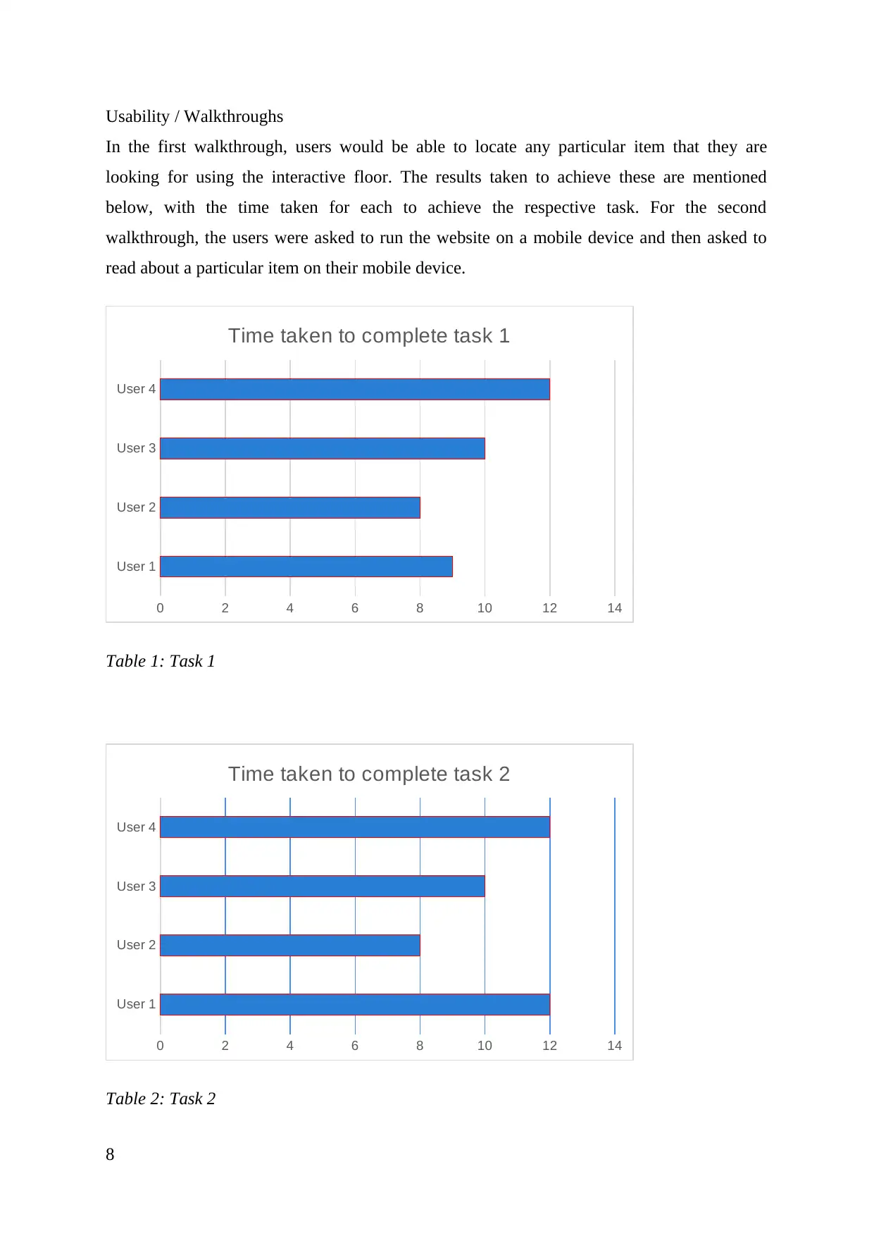
Usability / Walkthroughs
In the first walkthrough, users would be able to locate any particular item that they are
looking for using the interactive floor. The results taken to achieve these are mentioned
below, with the time taken for each to achieve the respective task. For the second
walkthrough, the users were asked to run the website on a mobile device and then asked to
read about a particular item on their mobile device.
User 1
User 2
User 3
User 4
0 2 4 6 8 10 12 14
Time taken to complete task 1
Table 1: Task 1
User 1
User 2
User 3
User 4
0 2 4 6 8 10 12 14
Time taken to complete task 2
Table 2: Task 2
8
⊘ This is a preview!⊘
Do you want full access?
Subscribe today to unlock all pages.
Trusted by 1+ million students worldwide
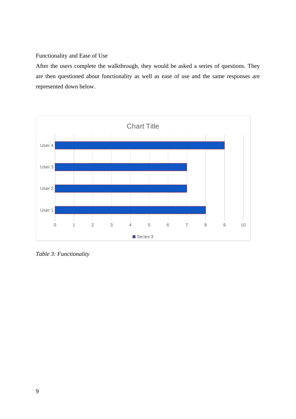
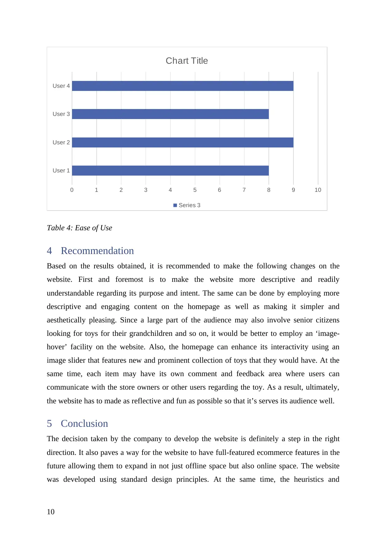
Functionality and Ease of Use
After the users complete the walkthrough, they would be asked a series of questions. They
are then questioned about functionality as well as ease of use and the same responses are
represented down below.
User 1
User 2
User 3
User 4
0 1 2 3 4 5 6 7 8 9 10
Chart Title
Series 3
Table 3: Functionality
9
Paraphrase This Document
Need a fresh take? Get an instant paraphrase of this document with our AI Paraphraser
User 1
User 2
User 3
User 4
0 1 2 3 4 5 6 7 8 9 10
Chart Title
Series 3
Table 4: Ease of Use
4 Recommendation
Based on the results obtained, it is recommended to make the following changes on the
website. First and foremost is to make the website more descriptive and readily
understandable regarding its purpose and intent. The same can be done by employing more
descriptive and engaging content on the homepage as well as making it simpler and
aesthetically pleasing. Since a large part of the audience may also involve senior citizens
looking for toys for their grandchildren and so on, it would be better to employ an ‘image-
hover’ facility on the website. Also, the homepage can enhance its interactivity using an
image slider that features new and prominent collection of toys that they would have. At the
same time, each item may have its own comment and feedback area where users can
communicate with the store owners or other users regarding the toy. As a result, ultimately,
the website has to made as reflective and fun as possible so that it’s serves its audience well.
5 Conclusion
The decision taken by the company to develop the website is definitely a step in the right
direction. It also paves a way for the website to have full-featured ecommerce features in the
future allowing them to expand in not just offline space but also online space. The website
was developed using standard design principles. At the same time, the heuristics and
10
evaluations were also carried out. The results of the evaluation are presented in the report
above and the same needs to be incorporated in the final website design.
6 References
Eberts, R. (2012). User interface design (2nd ed., pp. 12-14). Englewood Cliffs, N.J.:
Prentice-Hall.
Galitz, W. (2013). The Essential guide to user interface design (2nd ed., pp. 15-18).
Indianapolis, IN: John Wiley.
Hackos, J., & Redish, J. (2012). User and task analysis for interface design (1st ed., pp. 24-
26). New York: Wiley.
Lauesen, S. (2012). User interface design (1st ed., pp. 20-22). Harlow: Pearson/Addison-
Wesley.
Stone, D. (2013). User interface design and evaluation (2nd ed., pp. 33-34). Amsterdam:
Morgan Kaufmann.
Wood, L. (2017). User Interface Design (2nd ed., pp. 11-13). Boca Raton: Chapman and
Hall/CRC.
11
⊘ This is a preview!⊘
Do you want full access?
Subscribe today to unlock all pages.
Trusted by 1+ million students worldwide
1 out of 12
Related Documents


Your All-in-One AI-Powered Toolkit for Academic Success.
+13062052269
info@desklib.com
Available 24*7 on WhatsApp / Email
![[object Object]](/_next/static/media/star-bottom.7253800d.svg)
Unlock your academic potential
Copyright © 2020–2026 A2Z Services. All Rights Reserved. Developed and managed by ZUCOL.