Analyzing Healthcare Quality: A Case Study of Hallenvale Hospital

Verified

Added on  2022/11/28

|7
|1419
|453
Report
AI Summary
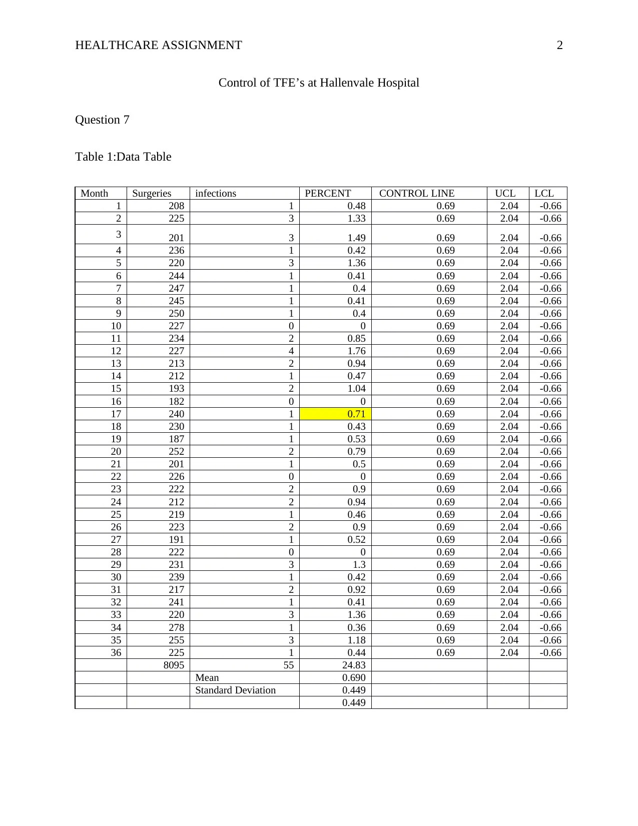
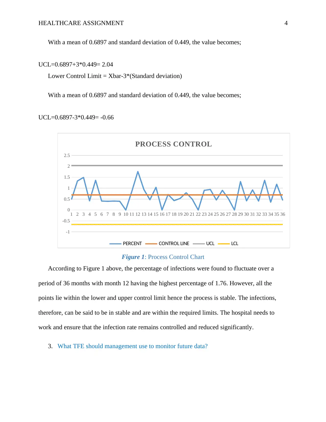
This report analyzes infection rates at Hallenvale Hospital using statistical process control methods. It calculates the average percentage of infections, constructs a control chart with upper and lower control limits, and determines whether the infection control process is statistically stable. The analysis reveals that while infection rates fluctuate, the process remains stable, and management should maintain monitoring within established thresholds. Additionally, the report discusses appropriate quality tools for addressing specific problems, such as using flow charts to improve documentation accuracy, cause-and-effect diagrams to reduce customer wait times, and run charts to manage call volume variations. This assignment showcases the application of quality control principles in a healthcare setting, emphasizing continuous improvement and data-driven decision-making.
Document Page
Running head: HEALTHCARE ASSIGNMENT 1
Health Care Assignment
Student’s name
Course name and number
Instructor’s name
Date
tabler-icon-diamond-filled.svg

Paraphrase This Document

Need a fresh take? Get an instant paraphrase of this document with our AI Paraphraser
Document Page
HEALTHCARE ASSIGNMENT 2
Control of TFE’s at Hallenvale Hospital
Question 7
Table 1:Data Table
Month Surgeries infections PERCENT CONTROL LINE UCL LCL
1 208 1 0.48 0.69 2.04 -0.66
2 225 3 1.33 0.69 2.04 -0.66
3 201 3 1.49 0.69 2.04 -0.66
4 236 1 0.42 0.69 2.04 -0.66
5 220 3 1.36 0.69 2.04 -0.66
6 244 1 0.41 0.69 2.04 -0.66
7 247 1 0.4 0.69 2.04 -0.66
8 245 1 0.41 0.69 2.04 -0.66
9 250 1 0.4 0.69 2.04 -0.66
10 227 0 0 0.69 2.04 -0.66
11 234 2 0.85 0.69 2.04 -0.66
12 227 4 1.76 0.69 2.04 -0.66
13 213 2 0.94 0.69 2.04 -0.66
14 212 1 0.47 0.69 2.04 -0.66
15 193 2 1.04 0.69 2.04 -0.66
16 182 0 0 0.69 2.04 -0.66
17 240 1 0.71 0.69 2.04 -0.66
18 230 1 0.43 0.69 2.04 -0.66
19 187 1 0.53 0.69 2.04 -0.66
20 252 2 0.79 0.69 2.04 -0.66
21 201 1 0.5 0.69 2.04 -0.66
22 226 0 0 0.69 2.04 -0.66
23 222 2 0.9 0.69 2.04 -0.66
24 212 2 0.94 0.69 2.04 -0.66
25 219 1 0.46 0.69 2.04 -0.66
26 223 2 0.9 0.69 2.04 -0.66
27 191 1 0.52 0.69 2.04 -0.66
28 222 0 0 0.69 2.04 -0.66
29 231 3 1.3 0.69 2.04 -0.66
30 239 1 0.42 0.69 2.04 -0.66
31 217 2 0.92 0.69 2.04 -0.66
32 241 1 0.41 0.69 2.04 -0.66
33 220 3 1.36 0.69 2.04 -0.66
34 278 1 0.36 0.69 2.04 -0.66
35 255 3 1.18 0.69 2.04 -0.66
36 225 1 0.44 0.69 2.04 -0.66
8095 55 24.83
Mean 0.690
Standard Deviation 0.449
0.449
Document Page
HEALTHCARE ASSIGNMENT 3
1. Using the data in Table 8.8, what is the average percentage of infections?
Average of the percentage of infections can be referred to as the mean number of infections
likely to be experienced each month.
Average Infections = Sum of the Percentage of infections/Number of Months
Average Infections=24.83/36=0.6897
2. Construct an appropriate control chart, compute the upper and lower control limits, plot
the data on a control chart, and determine if the process is in statistical control. Based on
your analysis, what action, if any, should management take?
Process control is a concept that is adopted by many firms to ensure that the processes that
occur in the manufacturing process are kept under control (Mitra,2016). This prevents the
increase of defective items or the output getting out of control that will lead to loss of market.
Similarly, in the medical field, it can be used to monitor if the infection that patients get after
surgery is normal or they can get to abnormal standards. To measure this, Hallenvale Hospital
collected monthly data on the number of infections after surgeries. Process control will,
therefore, be able to show any months that experienced the highest infections and if they are
below or above normal.
The whole process will be said to be stable if the average and standard deviation percentage
infections from the sample data collected is stable over a period of time. In a process control
chart, the mean values form the control line/ center line while the lower control limit (LCL) and
upper control limit (UCL) is a line below and above the control line with 3 times the standard
deviation respectively.
Upper Control Limit = Xbar+3*(Standard deviation)
Document Page
HEALTHCARE ASSIGNMENT 4
With a mean of 0.6897 and standard deviation of 0.449, the value becomes;
UCL=0.6897+3*0.449= 2.04
Lower Control Limit = Xbar-3*(Standard deviation)
With a mean of 0.6897 and standard deviation of 0.449, the value becomes;
UCL=0.6897-3*0.449= -0.66
1 2 3 4 5 6 7 8 9 10 11 12 13 14 15 16 17 18 19 20 21 22 23 24 25 26 27 28 29 30 31 32 33 34 35 36
-1
-0.5
0
0.5
1
1.5
2
2.5
PROCESS CONTROL
PERCENT CONTROL LINE UCL LCL
Figure 1: Process Control Chart
According to Figure 1 above, the percentage of infections were found to fluctuate over a
period of 36 months with month 12 having the highest percentage of 1.76. However, all the
points lie within the lower and upper control limit hence the process is stable. The infections,
therefore, can be said to be in stable and are within the required limits. The hospital needs to
work and ensure that the infection rate remains controlled and reduced significantly.
3. What TFE should management use to monitor future data?
tabler-icon-diamond-filled.svg

Paraphrase This Document

Need a fresh take? Get an instant paraphrase of this document with our AI Paraphraser
Document Page
HEALTHCARE ASSIGNMENT 5
The management needs to focus on the required thresholds for evaluation to be between -
0.66 and 2.04 percentage infections. Any percentage attained should not be allowed to exceed
2.04 since it will be above the limit
7. Discuss what would be the most appropriate tool to use to attack each of these problems:
b. The publication team for an engineering department wants to improve the accuracy of its user
documentation but is unsure of why documents aren't error-free.
Flow charts are diagrams are explanatory diagrams used to show the sequence of actions
that are taken is a given complex activity (Lockwood,2012). This graphically shows the flow of
even hence making it easier to realize any errors and gaps that might arise from a given process.
Flowcharts, in this case, can be used to create a better understanding of the process that is
involved in the creation of documents. They also have cause and effect diagrams which are
important in the determination of the type of errors the relevant sources. It also shows all sheets
and documentation.
c. A rental car agency is getting numerous complaints about the length of time that customers
have to wait to obtain a car. They need to get a better handle on the factors that relate to the wait
time.
This scenario would need to use a cause and effect diagram. A cause and effect diagram
is widely used in instances when a number of factors lead to a certain result. The waiting time of
customer can be caused by various factors. The waiting time of cars can be attributed to an
inadequate number of employees in the department, inadequate vehicles among others. The
Fishbone Diagram (cause and effect diagram) helps the organization in detecting of the likely
causes of defects in a process. Through brainstorming the organization is able to highlight the
Document Page
HEALTHCARE ASSIGNMENT 6
major causes of a defect in the organization hence resulting in improved quality (Evans &
Lindsay,2014).
g. A travel agency is interested in gaining a better understanding of how call volume varies by
time of year in order to adjust staffing schedules.
The travel agent can use the run-chart (r-chart) to show how the call volume varies
overtime. This, therefore, will be ideal for the travel agency to determine the reason why and
how all volumes vary by time of year. In an r-chart, the quality assurance manager of the travel
agency will be able to estimate the exact times the expect high call volumes hence allocating
more staff members to ease the huge workload. The r-chart chart is able to show the times when
call volumes are low hence reduce the staff numbers at this period. Many also can be allowed to
utilize their leave days at this period. In process control, the r-chart is a tool used to show time
series flow of information ranging from the first to last point. (Barsalou,2015). A run chart will,
therefore, show be importance to display tend and shift the will occur over the period of time.
Document Page
HEALTHCARE ASSIGNMENT 7
References
Barsalou, M. A. (2015). The Quality Improvement Field Guide: Achieving and Maintaining
Value in Your Organization. Productivity Press.
Evans, J. R., & Lindsay, W. M. (2014). An introduction to Six Sigma and process improvement.
Cengage Learning.
Lockwood, A. (2012). Diagrams: A Visual Survey of Graphs, Maps, Charts, and Diagrams for
the Graphic Designer.
Mitra, A. (2016). Fundamentals of quality control and improvement. John Wiley & Sons.
chevron_up_icon
1 out of 7
circle_padding
hide_on_mobile
zoom_out_icon
[object Object]