Human Computer Interaction: Interface Design Analysis Report
VerifiedAdded on 2020/02/24
|10
|1217
|167
Report
AI Summary
This report provides an analysis of Human-Computer Interaction (HCI), focusing on both effective and ineffective interface designs. It explores the principles of good interface design, using examples like Tilt Brush, Things, and Meter.Me, highlighting their intuitive and user-friendly features. Conversely, the report critiques bad interface designs, such as the Apple Watch, the USS Vincennes control system, and BMW iDrive, detailing their usability issues and potential consequences. The report emphasizes the impact of interface design on user experience and the importance of considering usability in the development of computer systems, websites, and applications. References are provided to support the analysis and findings.
Running head: HUMAN COMPUTER INTERACTION
HUMAN COMPUTER INTERACTION
Name of the Student
Name of the University
Author Note
HUMAN COMPUTER INTERACTION
Name of the Student
Name of the University
Author Note
Paraphrase This Document
Need a fresh take? Get an instant paraphrase of this document with our AI Paraphraser
2HUMAN COMPUTER INTERACTION
Table of Contents
Introduction......................................................................................................................................3
Good interface design......................................................................................................................3
1. Tilt Brush.................................................................................................................................3
2. Things......................................................................................................................................3
3. Meter. Me................................................................................................................................3
Bad interface design........................................................................................................................3
1. Apple Watch............................................................................................................................3
2. The USS Vincennes control System........................................................................................4
3. BMW iDrive............................................................................................................................4
Conclusion.......................................................................................................................................4
References........................................................................................................................................5
3HUMAN COMPUTER INTERACTION
Introduction
The design of the user interface can be considered as the design factor of the computer,
websites and applications with its main focus on the experience of the user and the interaction
factor with the implementation.
The report puts direct focus on three good interface designs and three bad user interfaces.
Good interface design
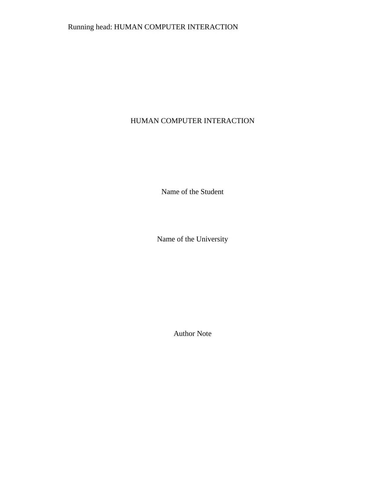
1. Tilt Brush
Figure 1: IMPLEMENTATION OF TILT BRUSH IN PAINTING
(Source: Bi and Zhai 2017).
Introduction
The design of the user interface can be considered as the design factor of the computer,
websites and applications with its main focus on the experience of the user and the interaction
factor with the implementation.
The report puts direct focus on three good interface designs and three bad user interfaces.
Good interface design
1. Tilt Brush
Figure 1: IMPLEMENTATION OF TILT BRUSH IN PAINTING
(Source: Bi and Zhai 2017).
⊘ This is a preview!⊘
Do you want full access?
Subscribe today to unlock all pages.
Trusted by 1+ million students worldwide
4HUMAN COMPUTER INTERACTION
Virtual reality is in the verge of frontier territory taking into consideration the UX and
UX. The main concept behind the implementation of the technique was that working on the flat
screen doesn’t do a good job when related to Virtual reality. On the other hand building up of a
useful and effective virtual reality application that can be used for hours without the concern of
motion sickness was a challenge. So taking into such consideration product that Google Tilt
Brush came into existence. This user interface would directly help in building up 3D painting in
an environment which is virtual (Qin et al., 2016)
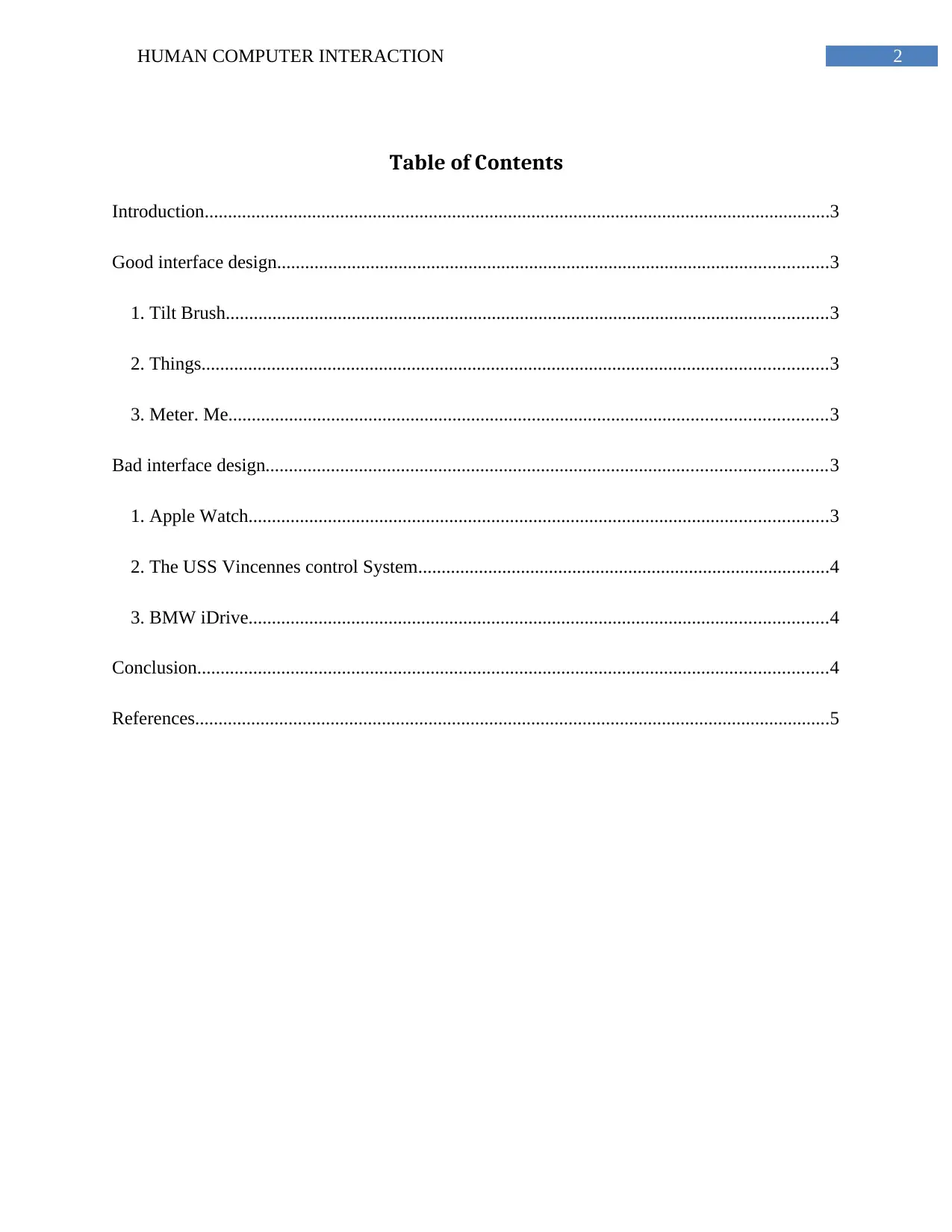
2. Things
Figure 2: THINGS USER INTERFACE
(Source: Bi and Zhai 2017).
Virtual reality is in the verge of frontier territory taking into consideration the UX and
UX. The main concept behind the implementation of the technique was that working on the flat
screen doesn’t do a good job when related to Virtual reality. On the other hand building up of a
useful and effective virtual reality application that can be used for hours without the concern of
motion sickness was a challenge. So taking into such consideration product that Google Tilt
Brush came into existence. This user interface would directly help in building up 3D painting in
an environment which is virtual (Qin et al., 2016)
2. Things
Figure 2: THINGS USER INTERFACE
(Source: Bi and Zhai 2017).
Paraphrase This Document
Need a fresh take? Get an instant paraphrase of this document with our AI Paraphraser
5HUMAN COMPUTER INTERACTION
The interface can be used in iOS and Mac. This interface is mainly a popular task
management application which is rewarded an award for the design that intuitive and very easy
to pick up, it is very similar to, to do list concept. As stated by the creator its main motive behind
the implementation was to make life easier. The application can help to categorize a user the task
assigned for the day. The urgent task go into the today list, slight less urgent task go into next
and accordingly its schedules the task.
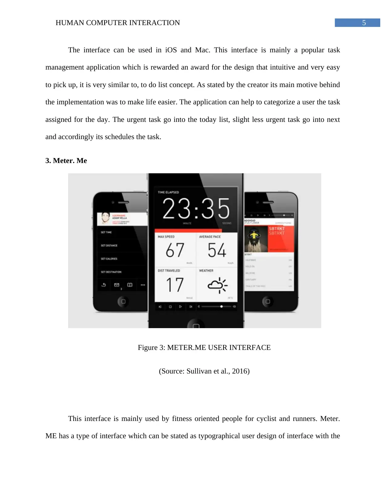
3. Meter. Me
Figure 3: METER.ME USER INTERFACE
(Source: Sullivan et al., 2016)
This interface is mainly used by fitness oriented people for cyclist and runners. Meter.
ME has a type of interface which can be stated as typographical user design of interface with the
The interface can be used in iOS and Mac. This interface is mainly a popular task
management application which is rewarded an award for the design that intuitive and very easy
to pick up, it is very similar to, to do list concept. As stated by the creator its main motive behind
the implementation was to make life easier. The application can help to categorize a user the task
assigned for the day. The urgent task go into the today list, slight less urgent task go into next
and accordingly its schedules the task.
3. Meter. Me
Figure 3: METER.ME USER INTERFACE
(Source: Sullivan et al., 2016)
This interface is mainly used by fitness oriented people for cyclist and runners. Meter.
ME has a type of interface which can be stated as typographical user design of interface with the
6HUMAN COMPUTER INTERACTION
main implementation of simple swiping gestures that indirectly enables the user to navigate
through the options while they are in motion rather than fiddling with the menus and setting. The
interface helps in displaying relevant data which is sorted and accordingly displayed in real time,
tracked and then condensed the report format for references (Bi and Zhai 2017).
Bad interface design
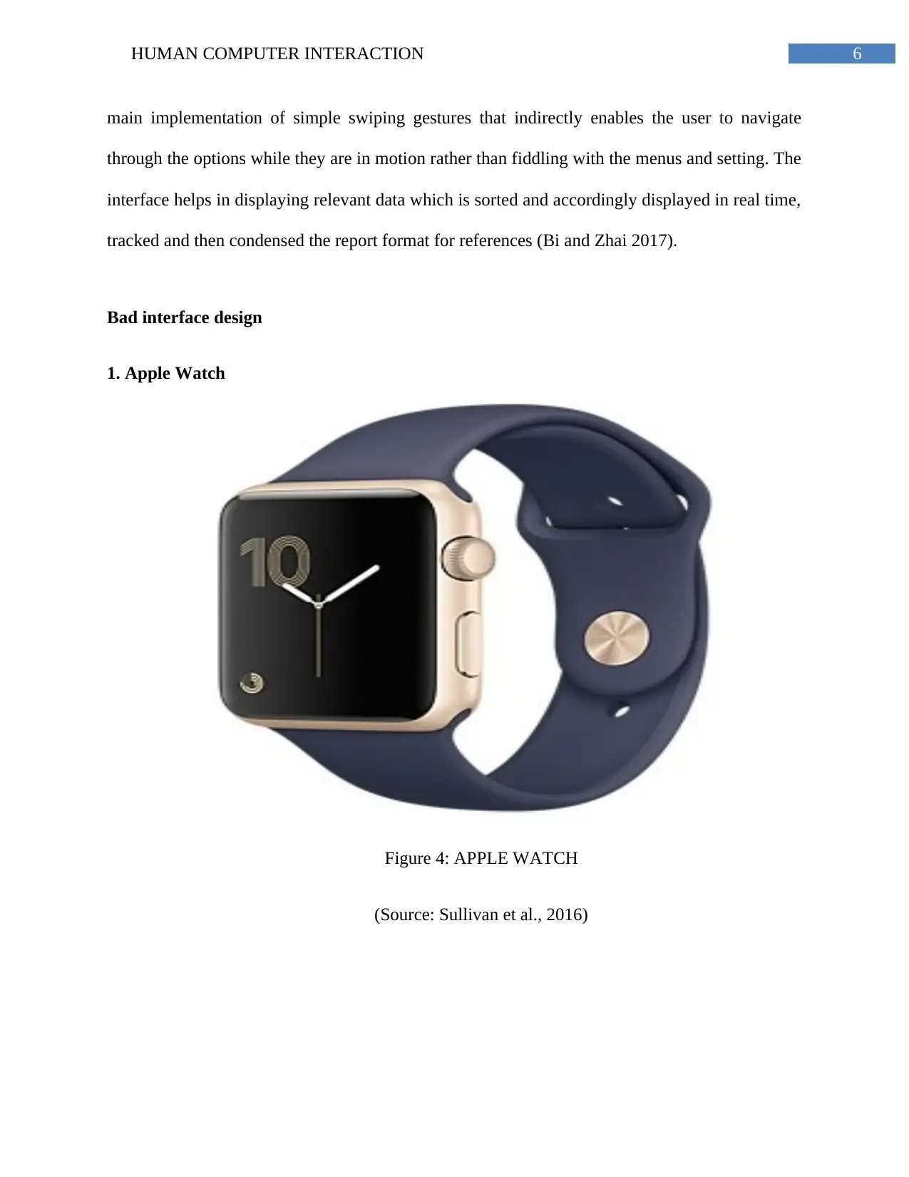
1. Apple Watch
Figure 4: APPLE WATCH
(Source: Sullivan et al., 2016)
main implementation of simple swiping gestures that indirectly enables the user to navigate
through the options while they are in motion rather than fiddling with the menus and setting. The
interface helps in displaying relevant data which is sorted and accordingly displayed in real time,
tracked and then condensed the report format for references (Bi and Zhai 2017).
Bad interface design
1. Apple Watch
Figure 4: APPLE WATCH
(Source: Sullivan et al., 2016)
⊘ This is a preview!⊘
Do you want full access?
Subscribe today to unlock all pages.
Trusted by 1+ million students worldwide
7HUMAN COMPUTER INTERACTION
The apple company has not released any sales figure for the Apple watch which can be a
negative aspect from the view of the company. The main reason behind it can be that the user
interface in which the Apple watch is made is very complicated to use. There are mainly eight
way to interact with the interface: tap or hold the bottom screen, hard press the screen, knob on
the side and tap the screen normally (Sullivan et al., 2016). The worst scenario requiring learning
a mental map with regards to the tiny watch screen which is laid out like an inverted T. recent
notification appears as a vertical list scrolling.
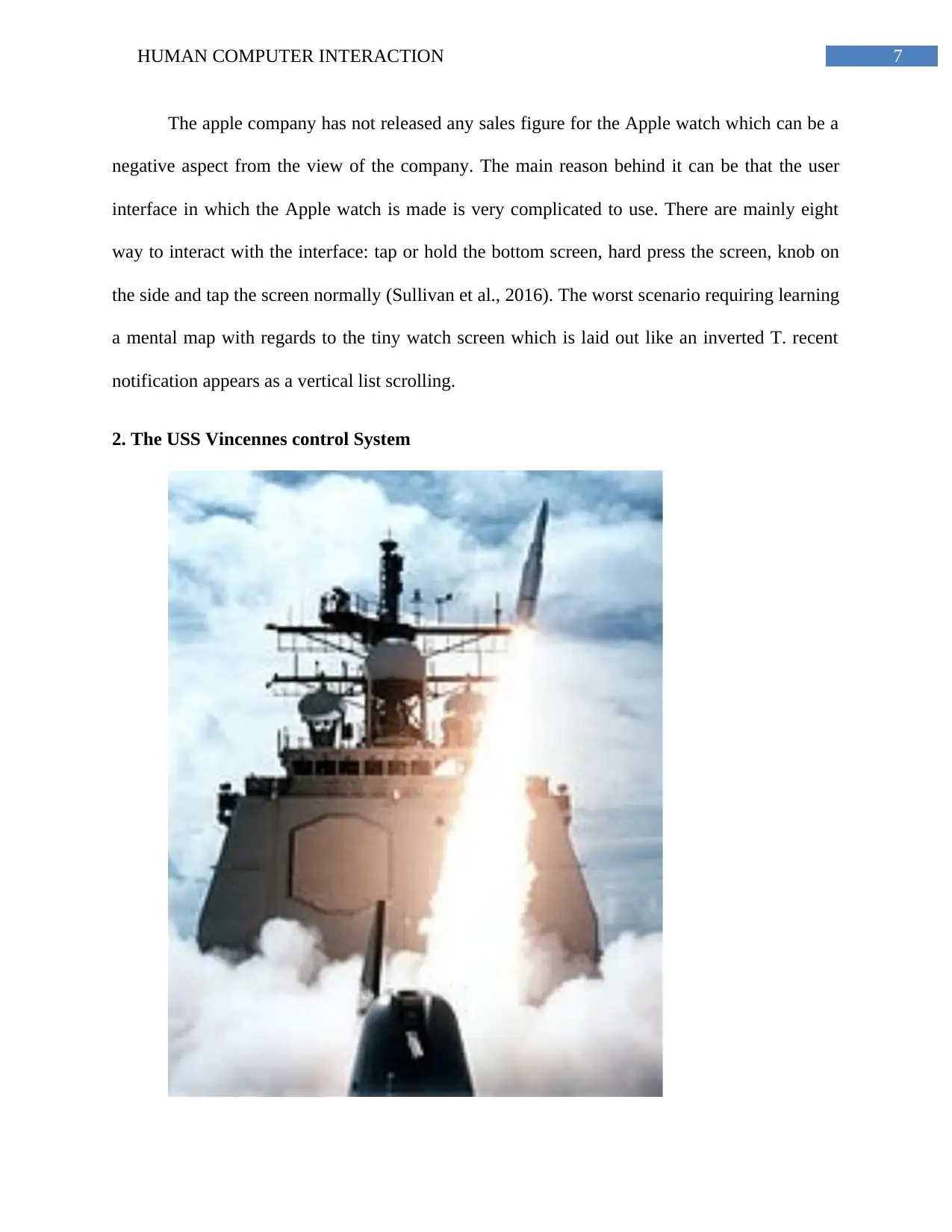
2. The USS Vincennes control System
The apple company has not released any sales figure for the Apple watch which can be a
negative aspect from the view of the company. The main reason behind it can be that the user
interface in which the Apple watch is made is very complicated to use. There are mainly eight
way to interact with the interface: tap or hold the bottom screen, hard press the screen, knob on
the side and tap the screen normally (Sullivan et al., 2016). The worst scenario requiring learning
a mental map with regards to the tiny watch screen which is laid out like an inverted T. recent
notification appears as a vertical list scrolling.
2. The USS Vincennes control System
Paraphrase This Document
Need a fresh take? Get an instant paraphrase of this document with our AI Paraphraser
8HUMAN COMPUTER INTERACTION
Figure 5: US NAVY WAR PLANE
(Source: Sullivan et al., 2016)
Bad interface can be a drawback which may involve waste of time, money and mood, but
in the some cases it can even cost life. On July 3, 1988 a U.S navy a war plane fired two missiles
at a particular airline and killed all 900 passengers who were on board (Felt et al., 2016). The
navy caption based the decision of firing on the basis of a computer display of Aegis, which is
the navy combat system (Chen, Paul and Proepper 2017). The interface usually provided three
huge screens showing all the airplanes in the air but didn’t give any indication of the flight speed,
altitude and the speed. With emphasis on the operation which summon that information manually
and it would appear on a screen size which was of 12 inch screen. On the other hand it did not
give any information about the plane gaining and losing altitude information.
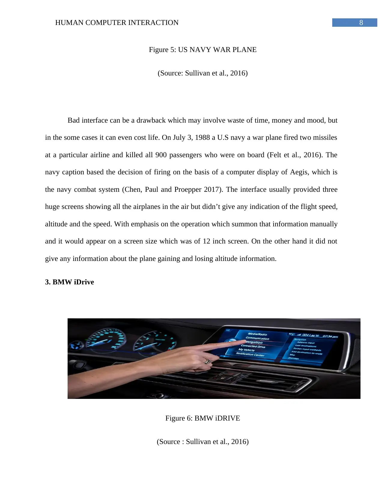
3. BMW iDrive
Figure 6: BMW iDRIVE
(Source : Sullivan et al., 2016)
Figure 5: US NAVY WAR PLANE
(Source: Sullivan et al., 2016)
Bad interface can be a drawback which may involve waste of time, money and mood, but
in the some cases it can even cost life. On July 3, 1988 a U.S navy a war plane fired two missiles
at a particular airline and killed all 900 passengers who were on board (Felt et al., 2016). The
navy caption based the decision of firing on the basis of a computer display of Aegis, which is
the navy combat system (Chen, Paul and Proepper 2017). The interface usually provided three
huge screens showing all the airplanes in the air but didn’t give any indication of the flight speed,
altitude and the speed. With emphasis on the operation which summon that information manually
and it would appear on a screen size which was of 12 inch screen. On the other hand it did not
give any information about the plane gaining and losing altitude information.
3. BMW iDrive
Figure 6: BMW iDRIVE
(Source : Sullivan et al., 2016)
9HUMAN COMPUTER INTERACTION
In the year 2007 the BMW Company attempted a very ambitious activity. It nearly
assigned around 700 cars with a function of a crazy knob between the two seats – a knob that
could push, turn or bump in any eight directions as indicated. The overall system was recognized
as iDrive and it turned to be one of the biggest interface disasters for the company. Putting
emphasis on the new users learning the BMW’s idrive concept was very much disheartening and
was considered surely to be daunting task for the owners (Gold et al., 2016)
Conclusion
It can be concluded from the above report that the user interface has many advantage that
can be related to many aspect but on the other hand it also have some bad affects on the overall
approach of the concept
⊘ This is a preview!⊘
Do you want full access?
Subscribe today to unlock all pages.
Trusted by 1+ million students worldwide
10HUMAN COMPUTER INTERACTION
References
Bi, X. and Zhai, S., Google Inc., 2017. Display screen with graphical user interface. U.S. Patent
D785,037.
Chen, Paul, and Martin Proepper. "Display screen or portion thereof with graphical user
interface." U.S. Patent No. D777,177. 24 Jan. 2017.
Felt, M., Gharachorloo, N., Relyea, D.H. and Sharma, M., Verizon Patent and Licensing Inc.,
2017. Systems and methods for casting a graphical user interface display of a mobile device to a
display screen associated with a set-top-box device. U.S. Patent 9,706,241.
Gold, J., Vaccaro, B., Peschan, M., Drzewinski, M. and Neal, J., Makerbot Industries, Llc, 2016.
Display screen with graphical user interface. U.S. Patent D749,129.
Qin, J., Bek, R., Gaiser, J.W. and Utley, D.S., Mederi Therapeutics, Inc., 2017. Graphical user
interface for monitoring and controlling use of medical devices. U.S. Patent 9,675,403.
Sullivan, K., Rodrig, M. and Baber, J., Microsoft Corporation, 2017. Display screen with
graphical user interface. U.S. Patent D788,145.
1 out of 10
Your All-in-One AI-Powered Toolkit for Academic Success.
+13062052269
info@desklib.com
Available 24*7 on WhatsApp / Email
![[object Object]](/_next/static/media/star-bottom.7253800d.svg)
Unlock your academic potential
Copyright © 2020–2026 A2Z Services. All Rights Reserved. Developed and managed by ZUCOL.