HCI Principles and Interface Design for AppaHci Mobile App Evaluation

Verified

Added on  2023/04/21

|4
|1163
|216
Report
AI Summary
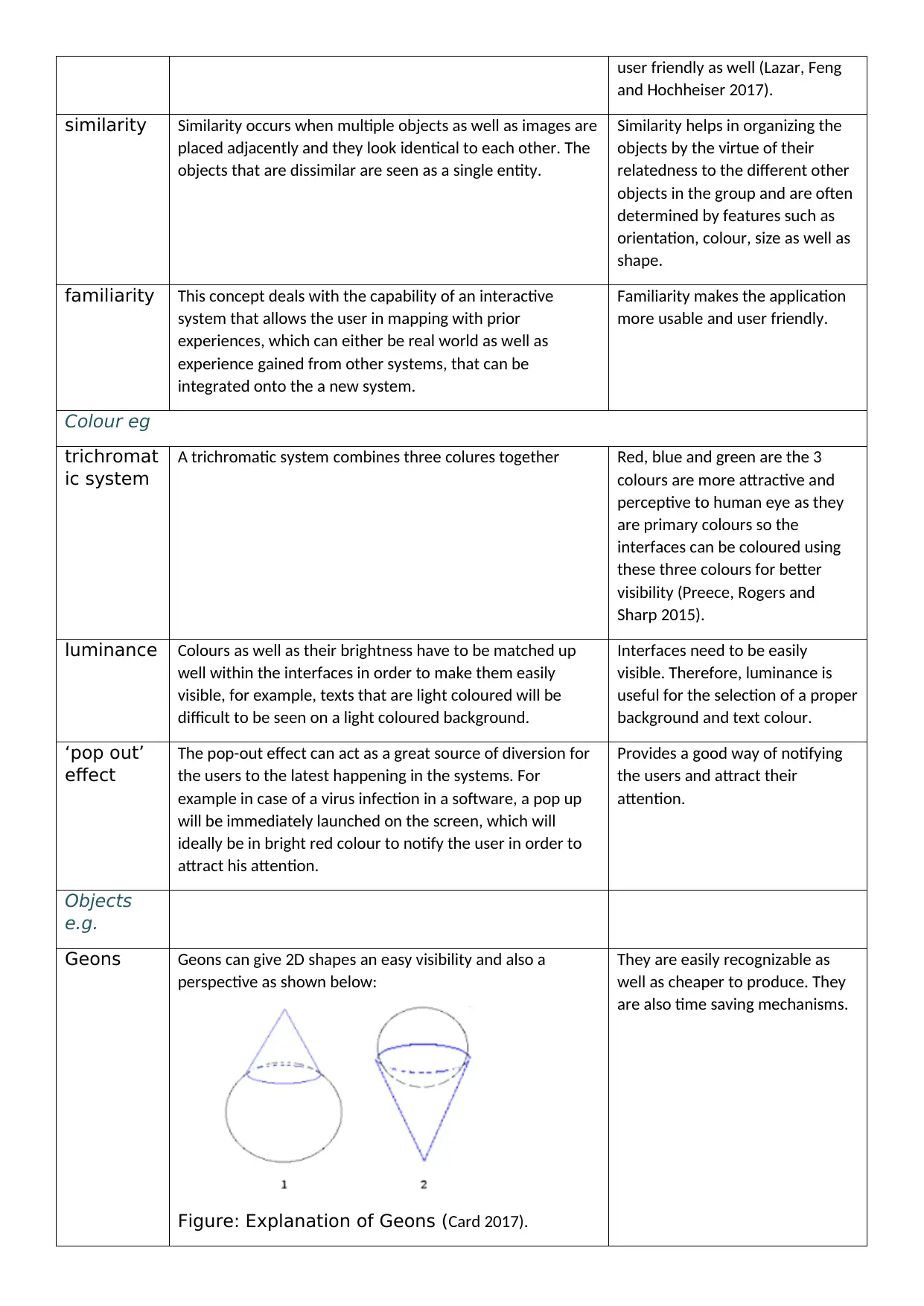
This report addresses the application of Human-Computer Interaction (HCI) principles in the context of interface design, specifically for a mobile app company named AppaHci. It includes a detailed table explaining and illustrating key HCI principles such as perception (proximity, continuity, closure, symmetry, similarity, familiarity), color considerations (trichromatic system, luminance, 'pop out' effect), object representation (Geons, 3D shapes), and behavior models (Fitts' Law, Guiard's Model). The report also touches upon information processing, including an overview of the GOMS model to identify the working procedure of a self-scan shopping application, covering goals, methods, and selection based on market research and user interaction. This analysis provides a foundational understanding of how HCI principles can be practically applied to create effective and user-friendly interfaces.
Document Page
ASSESSMENT BRIEF
Assessment Title: The effect of HCI on society, the economy and culture
Scenario
(must be programme orientated
and relevant to module under
study)
You have applied for a job as Interface Design Technician for a new mobile
phone app company called AppaHci. As part of the assessment to check your
suitability for the job they ask you to show your knowledge by filling in the
following table relating to the basic principles of Human Computer Interfacing.
The second part of the assessment criteria is to produce a presentation showing
your ideas for the outline of a mobile phone app to be used during self-scan
shopping in a supermarket; (You may base the assignment on an alternative app
of your own choice, however this must be agreed with assessor before
commencement)
Task1
Complete the Principles of Design table, giving explanations and illustrations of each concept, along with how one
should consider this when designing an interface
Principle Explanation with illustration Importance of this
principle in design
PERCEPTION:
Pattern eg
proximity It can be defined as a is a sense of the distance of how far
the objects are from one another. In HCI it can mean how
close or far the devices or aspects are from each other.
Proximity ison of the strongest
principles to understand the
relatedness of different objects,
and helps us in understanding
information in a more faster and
efficient way.
continuity
and
closure
Continuity in HCI help in distinguishing the technologies
since their modelling needs notions from mathematics that
is continuous (Helander 2014). Closure can be defined as the
tendency to interpret many elements as single and a
recognizable pattern instead of multiple or individual
subparts.
Continuous objects can be spotted
easily by the human brains.
Closure can be used to reduce the
information needed to transmit
visual data, therefore reducing
complexity. It is also often used to
design company logos since it can
easily communicate the brand's
identity.
symmetry Symmetry helps in duplication of multiple shapes and
objects.
Symmetry help in making the
objects look more consistent as
well as easier to notice and design
balancing of the software. It is
tabler-icon-diamond-filled.svg

Secure Best Marks with AI Grader

Need help grading? Try our AI Grader for instant feedback on your assignments.
Document Page
user friendly as well (Lazar, Feng
and Hochheiser 2017).
similarity Similarity occurs when multiple objects as well as images are
placed adjacently and they look identical to each other. The
objects that are dissimilar are seen as a single entity.
Similarity helps in organizing the
objects by the virtue of their
relatedness to the different other
objects in the group and are often
determined by features such as
orientation, colour, size as well as
shape.
familiarity This concept deals with the capability of an interactive
system that allows the user in mapping with prior
experiences, which can either be real world as well as
experience gained from other systems, that can be
integrated onto the a new system.
Familiarity makes the application
more usable and user friendly.
Colour eg
trichromat
ic system
A trichromatic system combines three colures together Red, blue and green are the 3
colours are more attractive and
perceptive to human eye as they
are primary colours so the
interfaces can be coloured using
these three colours for better
visibility (Preece, Rogers and
Sharp 2015).
luminance Colours as well as their brightness have to be matched up
well within the interfaces in order to make them easily
visible, for example, texts that are light coloured will be
difficult to be seen on a light coloured background.
Interfaces need to be easily
visible. Therefore, luminance is
useful for the selection of a proper
background and text colour.
‘pop out’
effect
The pop-out effect can act as a great source of diversion for
the users to the latest happening in the systems. For
example in case of a virus infection in a software, a pop up
will be immediately launched on the screen, which will
ideally be in bright red colour to notify the user in order to
attract his attention.
Provides a good way of notifying
the users and attract their
attention.
Objects
e.g.
Geons Geons can give 2D shapes an easy visibility and also a
perspective as shown below:
Figure: Explanation of Geons (Card 2017).
They are easily recognizable as
well as cheaper to produce. They
are also time saving mechanisms.
Document Page
use of
gross 3D
shapes
2D shapes are being given the illusion of being perceived as
3D under in this concept.
A blueprint of a particular object is
kept slightly higher or lower as
compared to the original in order
to give it a 3D appearance since
some users may have difficulties
to see 3D vision.
BEHAVIOUR MODELS:
Predictive models
Fitts’ Law This law shows that the required time to move rapidly to a
target area is a functional ratio between the distance from
the target and the target width.
It helps in highlighting the
important points while pointing
crucial tasks such as accuracy,
pointing speed, target distance as
well as size of the target.
Descriptive models
Guiard’s
Model
Guiard's model helps in the identification of how human's
make use of their hands in most of the daily tasks, for
instance playing a sport, writing, drawing as well as
manipulating different objects. It is a quite descriptive model
that does not have mathematical rigor but quite rich in the
power of expressive.
This model helps in understanding
that users do not have much
probability to perform identical
actions with their both hands, to
the same degree of effectiveness
as compared to the effectiveness
of either hand.
INFORMATION PROCESSING:
Humans as a component; this is done through interpretation of the concepts
Overview of GOMS – just explain the principle below and then set out the GOM for your design on
a separate document
goals To identify the working procedure of a self-scan shopping application for a market
operators Mobile phones, interaction with customers and shopkeepers
methods Primary data collection such as interaction with shopkeepers etc.
selection Based on the results from surveys and interactions in the markets.
Document Page
References:
Card, S.K., 2017. The psychology of human-computer interaction. CRC Press.
Preece, J., Rogers, Y. and Sharp, H., 2015. Interaction design: beyond human-computer interaction.
Lazar, J., Feng, J.H. and Hochheiser, H., 2017. Research methods in human-computer interaction. Morgan Kaufmann.
Helander, M.G. ed., 2014. Handbook of human-computer interaction. Elsevier.
chevron_up_icon
1 out of 4
circle_padding
hide_on_mobile
zoom_out_icon
logo.png

Your All-in-One AI-Powered Toolkit for Academic Success.

Available 24*7 on WhatsApp / Email

[object Object]